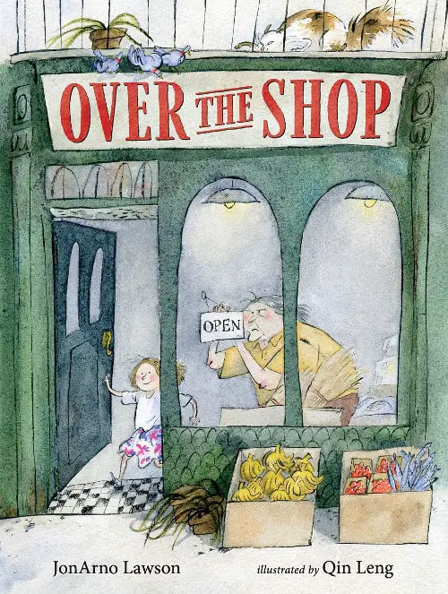
Over The Shop is a wordless picturebook by JonArno Lawson, illustrated by Qin Leng, published 2021. Here’s something we all owe to the trans community: By pushing the conventional and arbitrary rules of gender, all of us are more free to be who we are. This picturebook is a celebration of these hardwon freedoms.
SETTING OF OVER THE SHOP
The setting of this story sits somewhere between ‘backdrop’ and ‘integral’. Could this story happen anywhere? No, because as mentioned below, this story utilises symbolism specific to the city and to the era.
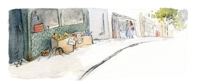
The shop appears to be somewhere in a dank part of an inner city. (Currency on the shop items is in pounds.) We only know from the signs on the shop that this is an English-speaking place, but it could easily be set in many places around the world. They’re drizzling Canadian maple syrup on their pancakes (but then, so do we, in Australia.)
We never see customers coming and going from this shop. Times are tough.
This is a Storybook World; it does not entirely mimic reality. Outside, a box of storybook fish is there for plot purposes, to entice the hungry (but surprisingly plump) alley cat. We don’t worry about refrigeration, for instance.
The house is a shabby take on the Picturebook Dream House. The picturebook dream house is untidy but cosy and warm. This home doubles as a place of commerce. An early high-angle view of the ground-floor interior shows how home life melds into work life.
The house needs maintenance and TLC, and so do its inhabitants. This need manifests in various depictions of wilting pot plants all around the house. After the newcomers move in flowers bloom.
COLOURS AS SYMBOLS
Some of the colour symbolism in this book is universal. For instance, the change from dull to bright colour signifies a change from dull mood to more cheerful mood. This is understood across time and culture.
Separately, rainbow colours are a different type of colour symbolism in Over The Shop. The rainbow as marker of queer pride an important signifier when it comes to understanding this story.
The rainbow as a marker of queer pride has been around since 1977. Below, Australian drag queen Courtney Act explains some LGBTQIA+ flag history in time for the 2021 Mardi gras. This is Australia’s SBS channel (80% taxpayer funded). The existence of this clip shows that we might expect more and more mainstream viewers to be visually literate when it comes to queer flags (and reading queer conventional symbolism in picturebooks).
A reader transported from pre-1977 obviously wouldn’t catch the meaning of the rainbow in this contemporary picturebook. I’d like to point out that the history of blue for boys and pink for girls isn’t much older. The pink/blue girl/boy colour symbolism has only been around since WW2.
While ‘blue’ may be the universal symbol for water (at least, these days), the colour symbolism expressed in the rainbow flags is conventional. There is very little inherent relationship between the signifier and the signified. The colours of the flags have been discussed and created, sometimes from nothing.
I mention this because, likewise, there is nothing inherent about the symbols we use to mark gender. Gender markers are conventional. Gender markers (of colour, garment, make-up, hair and accoutrements) differ between cultures and differ even more between historical eras.
TIME
When 1950s technology is utilised in a picturebook, this is usually a cue for the contemporary reader to read the story atemporally. In this case we have the old-style cash register. (In atemporal picturebook homes you’ll often find a lack of plumbing and much use of candlesticks.)
So can we divorce this story from era? In some ways, no. (Remember the contemporary rainbow symbolism.)
Then I look at the spread which cycles through the four seasons, lending circularity to the overall vibe. Circular tropes put readers in mind of the circle of life.
In case that’s a stretch, take the staircase image, interesting for its triptych-like division. But this is not a true triptych, because the characters are in motion. The grandparent, visitor and child descend.
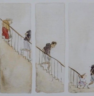
My twelve-year-old reader pointed out that grandparent and grandchild could be the same person, with the grandparent at the top, grandchild at the bottom, as if one has morphed into the other. (I discouraged the supernatural take, but accept their ‘circle of life’ take.) The more conservative read of that picture: The old person is slower to go down the stairs, and the kid is very keen to prevent the man from leaving.
LEVEL OF CONFLICT
Lacking signifiers which point to the contrary, we might assume that the level of bigotry directed at the rainbow population in this fictional setting correlates with bigotry of our 2021 veridical world. As such, these characters must find their own family (related or otherwise). Earning potential and accommodation options are more limited.
THE EMOTIONAL LANDSCAPE
This refers to the difference between what is real in the world of the story and how a character perceives it — never exactly as it is, but rather influenced by their own preconceptions, biases, desires and personal histories.
We might expect that children are more open to embracing all types of people, as children are (hopefully) yet to absorb many prejudices conferred by the dominant culture. It’s possible that the grandparent represents the older, more tunnel-visioned generation, in contrast with the grandchild, who would welcome anyone into the home out of kindness and the wish to build community.
Also possible: the grandparent is themselves trans, non-binary or agender, alongside the next door neighbour (in the red trousers). Queer folk stick together, after all. I mindfully use the word ‘grandparent’, though I’ve noticed many readers lean towards ‘grandmother’, perhaps influenced by the fact that grandmothers are more likely to find themselves caring for grandchildren. This overrides an androgynous reading of the grandparent character, who is nonetheless depicted gender-neutrally.
STORY STRUCTURE OF OVER THE SHOP
There are two parallel but very much connected stories in Over The Shop. The first is a story about a child and an alleycat who is coaxed inside and becomes a housecat.
The second thread is the story including adults, about finding your people and building community.
As in any good story with two parallel threads, it’s interesting to consider how the stories relate. Sometimes one plot contrasts morally or thematically with the other. In this case, the story of the cat encourages a metaphorical reading, at least for those who are ready for it.
PARATEXT
EPITEXT
A lonely little girl and her grandparent need to fill the run-down apartment in their building. But taking over the quarters above their store will mean major renovations for the new occupants, and none of the potential renters can envision the possibilities of the space—until one special couple shows up. With their ingenuity, the little girl’s big heart, and heaps of hard work, the desperate fixer-upper begins to change in lovely and surprising ways. In this bustling wordless picture book, JonArno Lawson’s touching story and Qin Leng’s gentle illustrations capture all angles of the building’s transformation, as well as the evolving perspectives of the girl and her grandparent. A warm and subtly nuanced tale, Over the Shop throws open the doors to what it means to accept people for who they are and to fill your home with love and joy.
MARKETING COPY
PERITEXT
To cast the spell continued by the wordlessness within, the back cover copy of Over The Shop is limited only to some intraiconic text seen in the pictures: “Flat to rent. Enquire within.” The back cover copy gives nothing away, further encouraging individual readings of this text.
Next, we open the front cover. Linger on the front endpapers. Then, after you’ve finished reading, compare and contrast the front endpapers with the back. Endpapers are too often skipped when reading picturebooks, yet they often provide extra information. The endpapers of Over The Shop are especially valuable because they will help young readers enter the metaphorical layer of this story.
The front endpapers show a cat on a roof, scaring some scattered birds. The back endpapers show the other side of the roof. No crouching cat, just some calm birds, sitting together. My twelve-year-old pointed out the brighter colour of the sky. Where the twelve-year-old co-reader needed prompting: The role of the cat. (More on that below.)
The author’s dedication of this book is an especially interesting example of how peritextual information can alter a reading. The dedication of Over The Shop will almost certainly lead to a version of double address, but not between adults and children; rather, between those who know to read the story for queer representation and those who don’t. This in turn will depend on extraliterary experience readers bring to the page.
By dedicating the book to trans activists everywhere, this small part of the book’s peritext functions as a kind of parallepsis, in which trans identities are afforded visibility precisely by saying little or nothing overt about trans identity within the story. After reading the dedication, readers will naturally scour the pages for details they weren’t alert to before.
Studies show that when non-gendered characters appear in picturebooks, readers code them masculine by default.
This picturebook challenges our assumptions of masculo-normativity. Which of these characters is trans, we wonder?
My twelve-year-old non-binary kid picked a favourite. In fact, any or all of the characters in this story could be trans. This is one advantage of Qin Leng’s loose and sketchy style. I’m reminded of Wolf Comes To Town, which utilises similar loose line work, and for similar purpose. In the case of Wolf Comes To Town, the reader isn’t meant to know immediately whether a character is a human, or a wolf guising as human. Only by looking closely does this become more clear.
In Over The Shop, the loose and sketchy linework achieves a deliberate ambiguity to different end: The style precludes a casual coding of gender.
This is a masterful accomplishment as the ambiguity reflects life: In life, as in this picturebook, we cannot assume a person’s gender identity at a glance. We only know someone’s gender identity after talking to them, and sometimes only after getting to know them. This can sometimes take a while.
This picturebook therefore has a subtle pedagogical purpose: Surface readings (of texts and of people) can deceive.
A wordless picturebook is the perfect vehicle for such a message. A wordless picturebook, by its very nature, requires careful attention.
SHORTCOMING
The child and the grandparent are experiencing economic hardship, which puts them in a vulnerable position. The grandparent also seems to be having trouble lifting all of those boxes out to the front of the store each morning.
MORAL SHORTCOMING
The grandparent is possibly a little mean, and if so, that probably comes from years of penny-pinching. This reading is encouraged via the grandparent’s facial expression, which is unsmiling. The shape of the face is angular and triangular.
DESIRE
The grandparent sits down to do some sums (while the grandchild draws a cat at the same counter). I deduce the grandparent must take in tenants to make ends meet. Meanwhile, the girl’s picture of the cat shows a desire to build community from the get-go, starting with the alleycat.
OPPONENT
Many stories feature a double layer of opposition, and so does this one:
- Conflict between family members
- The Minotaur opponent
Conflict between family members: The grandparent doesn’t want the cat inside the house, so the child feeds the cat in secret (to begin with).
Minotaur opponent: You could also call the ‘Minotaur’ opponent the ‘cyclone’ (in a disaster movie) or the ‘evil spirit’ (in a horror story) or ‘horribly mean teacher’ (in a middle grade comedy). Minotaur opponents have no humanity about them and aren’t reasonable. I use ‘Minotaur opponent’ to mean a character who serves the function of bringing humans (usually family) together. They all band together against this evil force.
The Minotaur opponent of this story is symbolised by the cat. In picture books, cats are utilised in all the different ways, from sympathetic main characters (The Tale of Tom Kitten by Beatrix Potter) to evil Minotaurs (Fly Homer Fly by Bill Peet). What I find fascinating about this story: The cat is utilised in both of these ways.
In the story between girl and cat, the cat is a sympathetic, comically trickster creature in need of help (or not). This is a literal example of Save The Cat, and in fact serves triple duty, setting up the child as an empathetic character.
But those endpapers? The cat is also symbolising something dark, something evil, something indescribable, lurking just out of sight until we embrace it, and accept it into our homes. For me, this cat, waiting to pounce from the other side of the roof, scattering the ‘community’ (of birds), is the unseen force which drives human communities apart.
In a Minotaur reading of the alleycat, this cat symbolises bigotry.
PLAN
The grandparent puts a sign in the window: Flat To Rent. If they can attract paying tenants to the run-down room over the shop, they may be able to stay here.
THE BIG STRUGGLE
The struggle sequence of this story involves a grandparent who opens their heart to newcomers, who then become family. But first, a succession of possible tenants walk away in disgust. It’s especially galling to see the child walk away, and then even more galling to see the dog leave!
When the right couple arrive, notice how the girl stands at belt level. The belt is rainbow. It’s likely the girl has noticed the belt while the grandparent figure has not. In picturebooks, perspicacity is often a child’s superpower. Via noticing, children can save the day (and even solve mysteries).
My reading of the grandparent differs from others’. Consumer reviews alert me to another common take: The grandparent sees an interracial couple hoping to rent the room, and because they don’t approve of interracial copules, whips away the sign.
That didn’t cross my mind. I thought the grandparent had given up trying to find tenants. They remove the sign because they will need to vacate the premises. The cash register and the papers have alerted us to their signs of economic hardship.
In any case, this is the beauty of wordless picturebooks: Without the guidance of text, readers bring a more diverse range of readings to the page.
If my reading of the pictures is correct, the softening of the grandparent is apparent when the child no longer has to feed the cat in secret. The child seems to ask the grandparent for catfood (a big bag of it), and permission is given. A new kindness.
The full-page image of the grandparent startled as renovations take place above is a visual representation of the discomfort we experience when faced with any kind of change. Lampshades swing on the ceiling. Rubble falls. This is the Battle Scene. Likewise, progressive cultural change is never smooth.
ANAGNORISIS
By coaxing the cat into the house, the child ‘tames bigotry’. She has taken something which scares people, become familar with it, and helped the grandparent to open their heart as well.
A truism of bigotry: We fear that which we do not know. On the flipside, we love that which we do. What better way to know someone than to bring them into our home?
NEW SITUATION
The new tenants become more than tenants. Over the course of a year they become integral to the running of the shop. They are family. In a moving revelation, Lowell’s General Store has become Lowell & Friends General Store. (Z Is For Moose is moving in a similar way.) The neighbour paints their front door a brighter shade of pink. The child has found a same-age playmate.
EXTRAPOLATED ENDING
The building metaphor running throughout this picturebook is of interest. Picturebook plots (especially those with masculo-coded main characters) utilise building sequences as a way for a child to literally construct a way past a particular problem. (Creepy Carrots and The Monster At The End of This Book are two examples which spring to mind.)
I’m also reminded of a New Yorker short story for adults by Steven Millhauser: “Coming Soon“. After reading Over The Shop, I’m thinking of Millhauser’s story in a new way. The main character of “Coming Soon” meets a sorry demise, and this may partly be due to his passivity; he loves to watch construction going on around him. He has at no point taken charge of his own construction. Those who fail to construct their own narratives will have others construct them instead. This inevitably leads to tragedy, and is a take on the age-old ‘mask’ arc, in which a character who never lives life as their true selves is doomed to unhappiness forever.
The final doublespread of Over The Shop pulls out to reveal more of the street, which until now has been limited to the shop itself (sometimes in one-point perspective) and sometimes a little way down the street, from street level:
Now the ‘camera’ tilts skyward. We see who lives down the road via lights illuminating family life through windows. This is the visual representation of community. The most colourful family of all? The rainbow family on the balcony, above the rainbow flag.
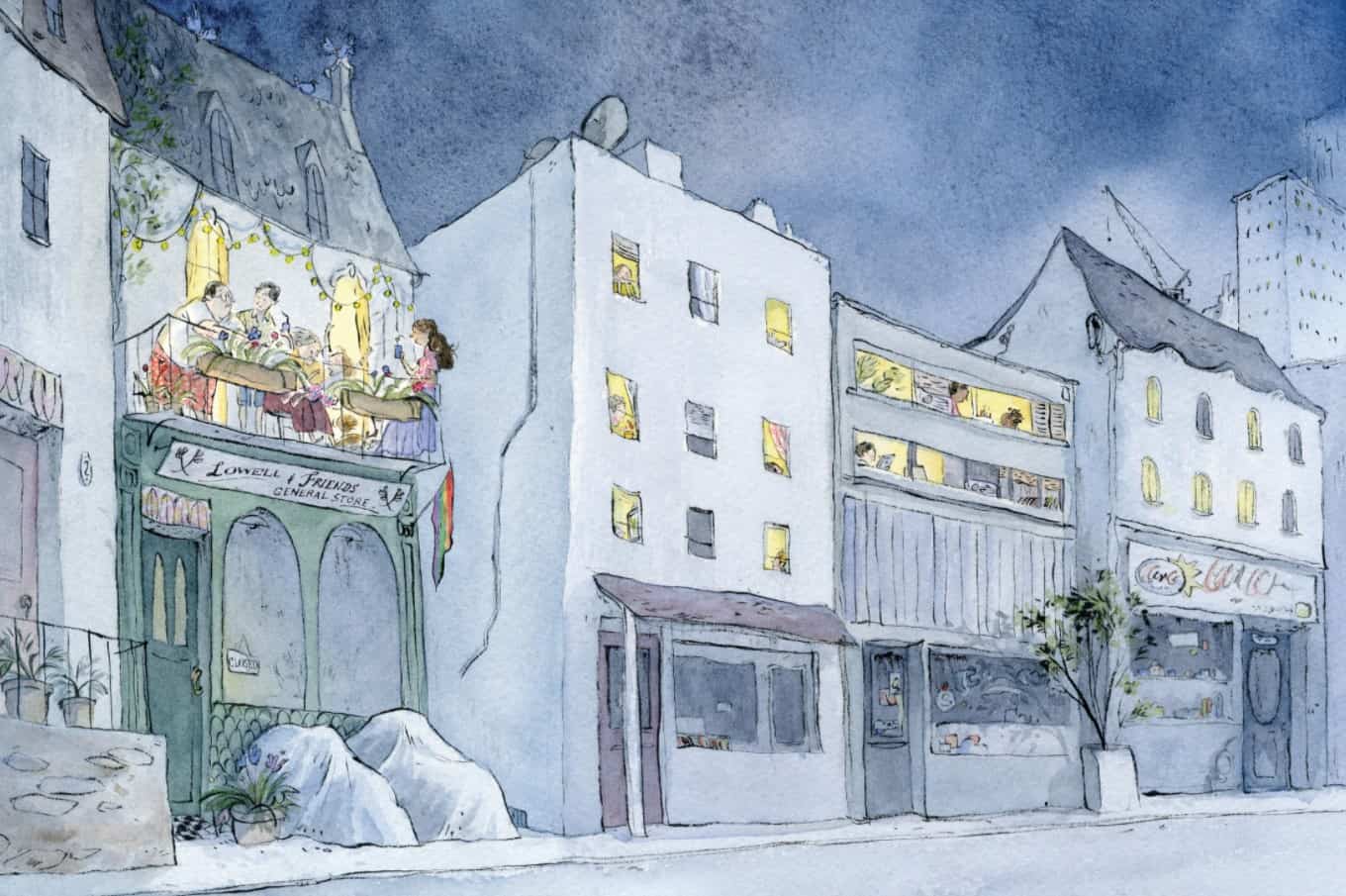
THE SIGNIFICANCE OF SKYLINE
More subtle in the doublespread above: the skyline. We’ve already seen this skyline feature of the crane through the front window, earlier in the story. Since this particular construction crane is on the skyline behind the shop, and the other is in the distance in front of the shop, we can deduce that this is a city under heavy (re-)construction. This is not just the story of a tiny community on a single street downtown; this is the story of an entire city, an entire culture undergoing significant cultural change.
POSTMODERN?
Another illustrator with significant skylines is Anthony Browne, famous for his Postmodern picturebooks. See Zoo and Voices In The Park. In Browne’s Postmodern picturebooks, the shapes of skylines change according to character viewpoint and mood.
Speaking of which, I wonder if we might even consider Over The Shop an example of Postmodernism:
- The reader is both invited and required to construct part of the story themselves. This ‘construction’ is happening at all levels: In the plot of renovation, in the metaphorical significance of constructing (family) and in the even more metaphorical sense of construction one’s identity and narrative for oneself.
- The plot is linear, but palimpsestic, as encouraged by the dedication.
- “Reality” appears in quotation marks, not because there’s no such thing as reality, but because reality will depend on how careful we are in our observations of those around us.
- Characters are flattened: The child in the red coat is an Every Child. (The red coat is seen across many illustrated stories for children, including in another by the same author (and different illustrator) Sidewalk Flowers. See also: Wolf in the Snow, Into The Forest, The Snowy Day and many others, no doubt influenced by Little Red Riding Hood, the ur-Red Coat Child.) The grandparent’s defining feature is that they are getting a little too old to do the heavy work of keeping a shop, which is the defining feature of elderly folk everywhere. These archetypes contrast against characters far less familiar in children’s literature thus far: genderqueer characters.
- In Postmodern work, there is a tendency to deconstruct binary oppositions. It is high time someone deconstructed binary gender, and here we are.
So far, academic literature has emphasised allusive, metafictional, parodic and playful books, designating those ones “Postmodern”. I am hoping for an expansion of the category, which will inevitably embrace more diverse content creators, and more diverse stories. This is important partly because Postmodern picturebooks are especially well-utilised in schools, often across generations.
As I keep reminding myself, there’s no such thing as a “Postmodern Text”, only a Postmodern reading of a text. I can confidently say that certain aspects of this picturebook encourage a Postmodern experience.
RESONANCE
Over the second half of the 20th century we saw a a number of picturebooks which encourage children to be who they are, Elmer the elephant style. Since the turn of the millennium, a subset of those ‘be yourself’ stories encourage children to challenge the rules of gender.
These stories most often focus on clothing. In another recent picturebook, My Shadow Is Pink, an assigned-male-at-birth child wears a dress and teaches us that clothing of all kinds can be worn by all kids. These stories are wonderful and important, but by their very nature, they hew to a binary view of gender. Inversion does not equal subversion. When we ‘invert’ clothing choices we do not subvert the idea that gender is far more complicated than the binary-view dictates.
Over The Shop is on the vanguard of a new crop of gender expansive stories for children. This picturebook dispenses with a binary view of gender altogether, reflecting the reality of gender as a spectrum.
By adding self-generated commentary to this wordless picturebook, I hope adult co-readers will interrogate our shared acculturated tendency to ascribe gender even to fictional characters where gender identity is never overt. Ideally, this will carry over into our readings of other stories, and eventually into our interactions with real people.♦