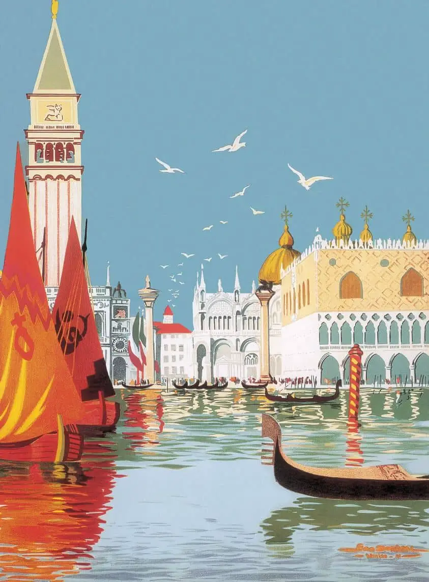
Colour is a language. Take the illustrations below, both of Venice. The first is a more typical depiction of Venice by Georges Dorival. Dorival was creating a travel poster, so of course he wanted Venice to look welcoming.
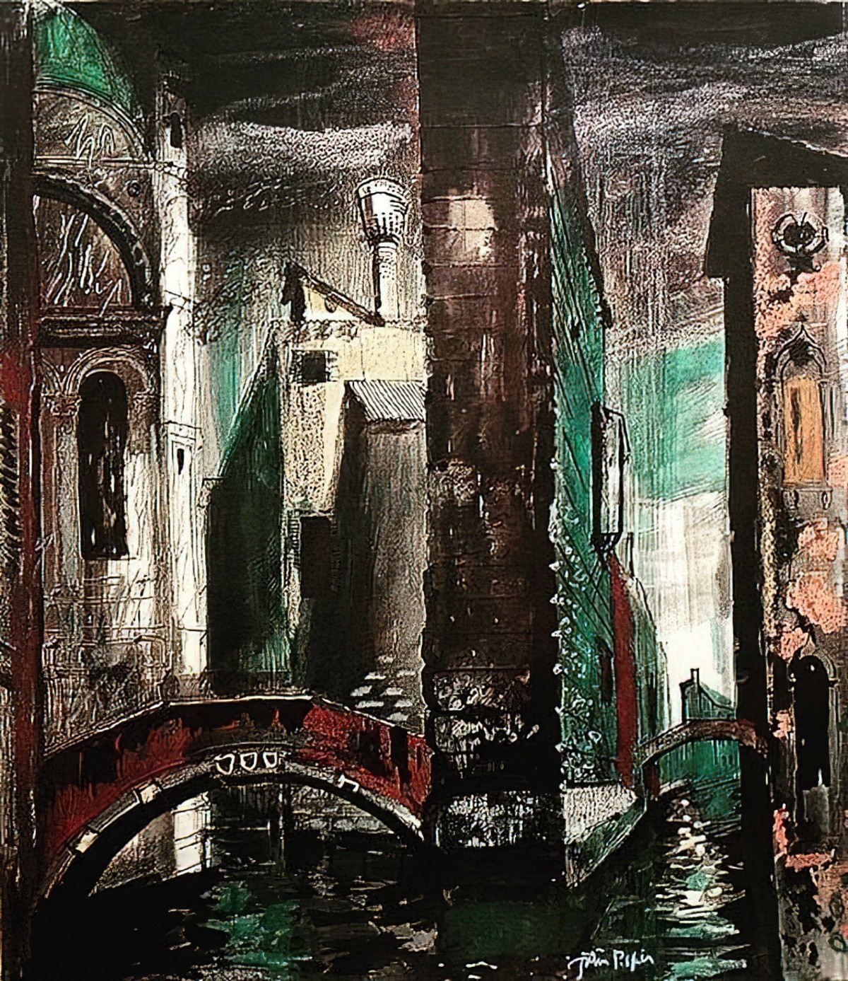
The second illustration is by John Piper for Death In Venice 2. This is a fare less typical choice of colour for depicting Venice, and the atmosphere is now completely different.
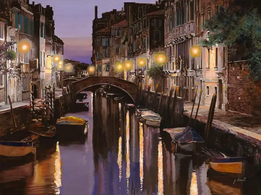
This third example is difference again.
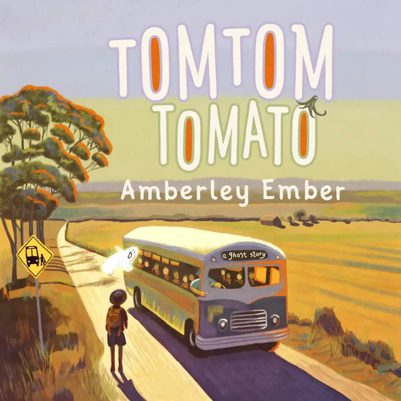
Naturally, in picture books too, colour has a language of its own.
THE IDEATIONAL ROLE OF COLOUR
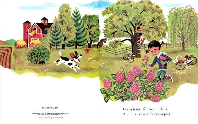
In its most basic role, colour is used by illustrators to represent the hue of things as we think they most often appear in the world. Despite the link to veridical reality, there is still a reliance upon archetypes. Not all cows are black and white, not by a long shot. Yet the cow as illustrated on your milk carton is probably black and white, because this is how we think of cows.
- Grass is green
- Sky is blue
- Cows on small farms are black and white
- Brick houses are red
- American barns are red
- Suns are yellow or white in the West, red in Japan
- and so on
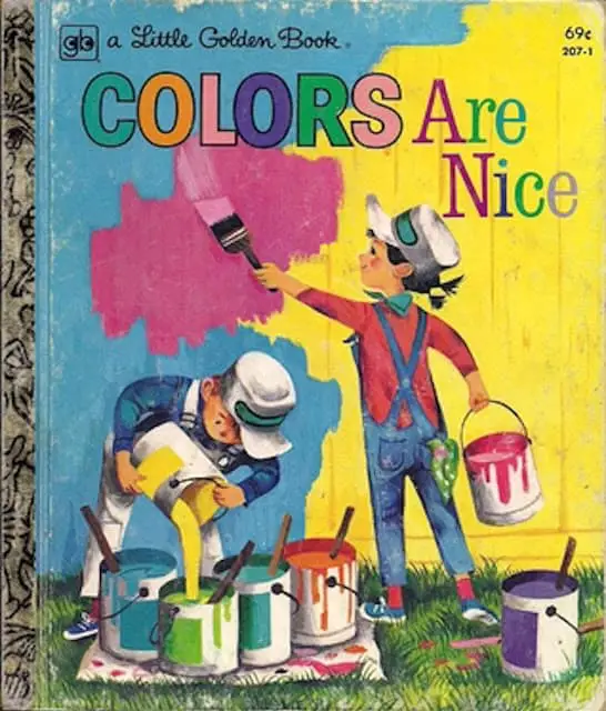
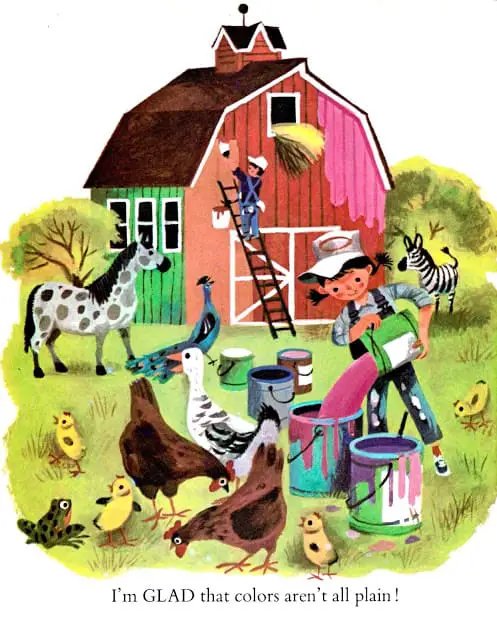
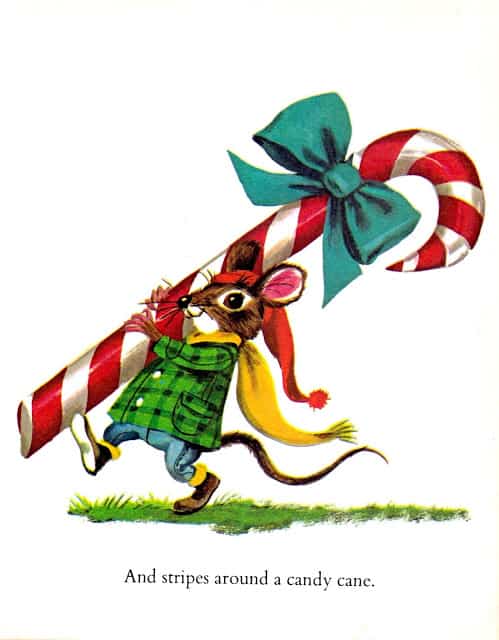
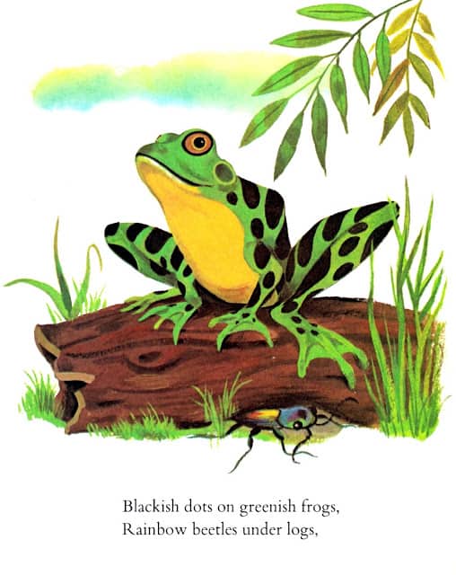
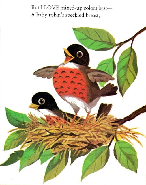
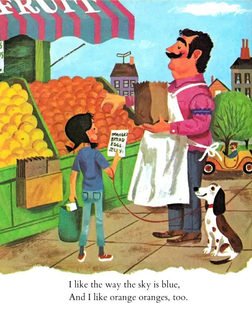
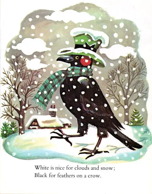
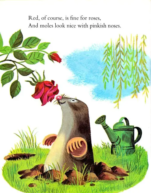
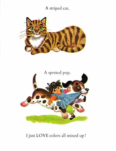
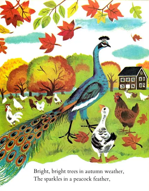
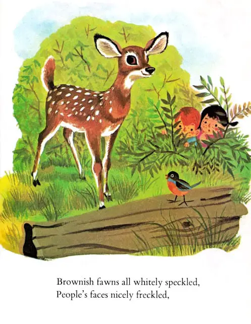
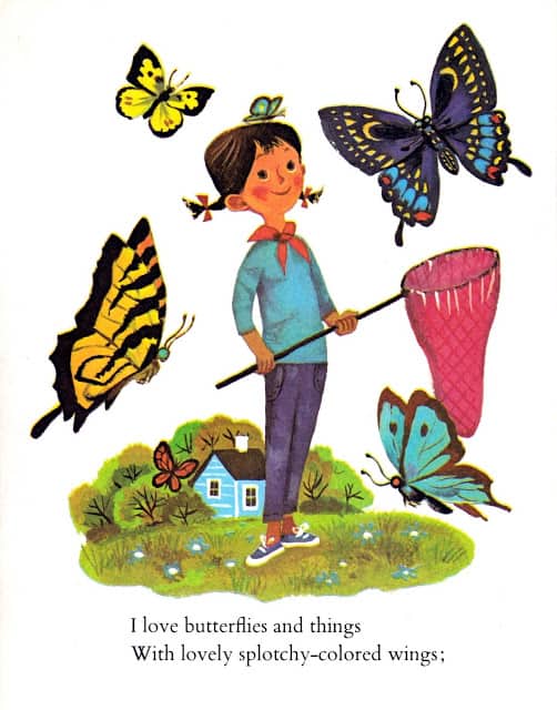
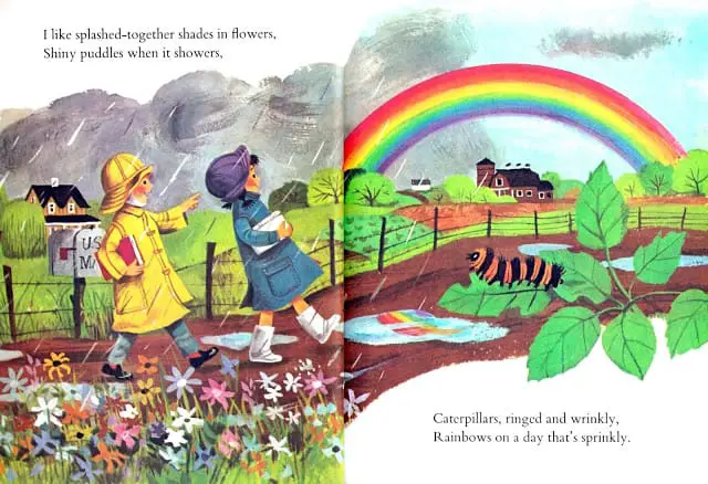
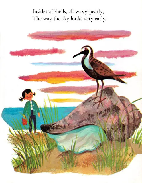
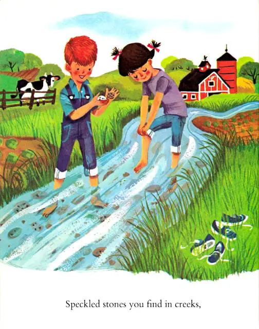
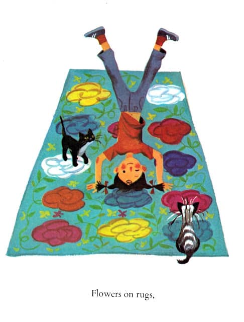
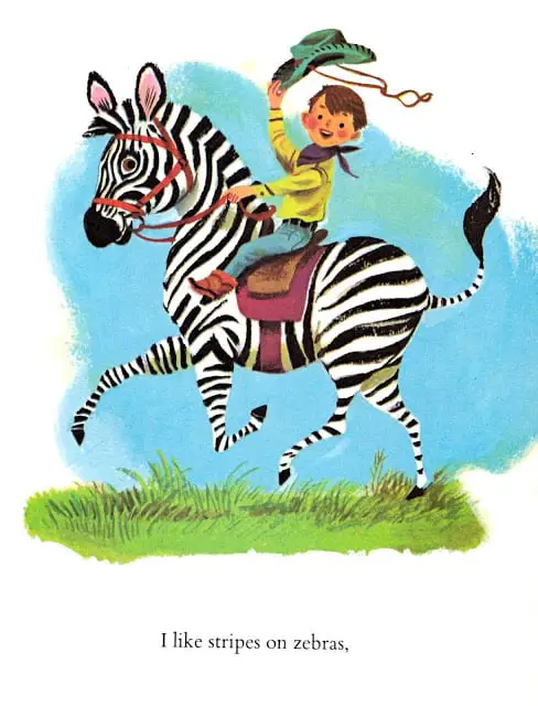
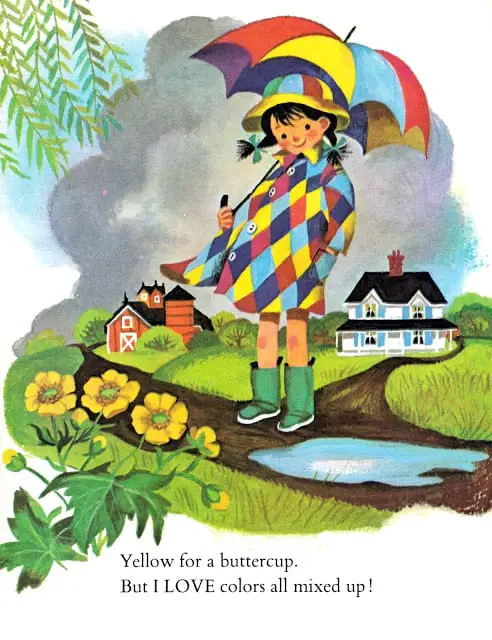
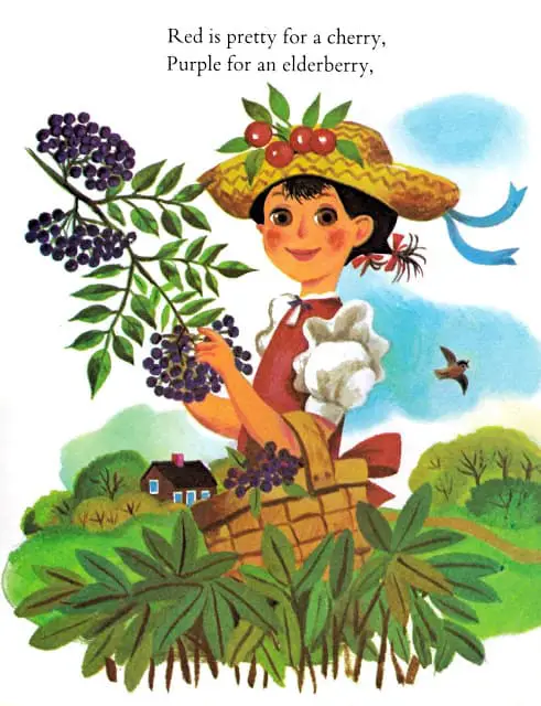
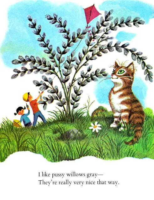
The following retro picture book (from 1962) is an excellent exhibit of how picture book illustrators depict ‘the colour of things’ in an unmarked way.

THE TEXTUAL ROLE OF COLOUR
- The same colour might be used over and over to create a meaningful imagistic pattern, like the colour red in the film Sixth Sense (a ‘colour motif‘).
- Colour may be used contrastively to highlight or foreground some element within a composition to make it especially salient to the viewer. Anthony Browne might use a square of light coming through a doorway to segregate one character from another, for example segregating daughter from father in Gorilla.
THE INTERPERSONAL ROLE OF COLOUR
This is about the emotional effect colour has on the viewer and refers to the visceral response we have, independent of the actual story being told. Other useful words are: ambience, mood, atmosphere.
A picture book filled with bright, light colours might feel childlike and joyous.
A picture book rendered in monochrome might make us feel melancholy or reflective or sombre.
Sepia tones put us in mind of an historicised story.
Colour and texture can be either infused or defused (I’ve also heard the term ‘diffused’ or we might say ‘drained’.)
Lighting effects can make a picture seem either dramatised (e.g. arte noir) or flat (by removing any aerial perspective).
We can speak in terms of vibrancy, which is another term for saturation (lots of colour, or tending more towards monochrome). Vibrancy creates excitement whereas muted colours create gentle, restrained feelings, or perhaps flat feelings. Note that ‘muted’ can refer to either light or dark images. Rosie’s Walk is muted but light, whereas Wolves In The Walls is muted but dark.
Vibrancy/saturation is tied directly to the variable of ‘value’ — the lights and darks — imagine the illustration blocked out in grey scale. That’s its value. (Illustrators often do a values sketch first, and digital illustrators often work by setting down the values and only adding colour on separate layers after all the value details have been finalised. This allows hue and vibrancy to be changed easily at any stage of the publishing process.)
We can speak in terms of warmth, according to how yellow/blue a picture is.
Warm colours and cool colours can signal the temperature of the environment but also the emotion of the characters, or both.
And here’s something not seen in digital art software: we can also speak in terms of ‘familiarity‘. Familiar illustrations will have more colour differentiation whereas ‘removed’ illustrations will have less. A ‘familiar’ ambience is made up of lots of ‘colour differentiation’. (Lots of different colours.) The reason it’s called ‘familiar’ is because the real world is also made up of lots of different colours, and we are familiar with the real world.
When illustrators make use of a reduced palette they are making the conscious decision to move readers away from the familiar and into the strange. There will be a reason for wanting to move us away from reality and it’s just a matter of working out what that reason is when analysing an illustration.
This removal from reality needn’t be in the literal sense — it might be figurative.
Vibrancy, warmth and familiarity are all simultaneously active — they don’t cancel each other out.
An opposite of the ‘familiar’ colour scheme might be described as ‘saudade‘, from Portuguese. Saudade describes a feeling of longing, melancholy or nostalgia. (Saudade Pinterest Boards)
A mixture of familiar and saudade colour palettes in the same book can show the difference between, say, characters who are enjoying life and a part of their environment and those who are removed. (As an example see Anthony Browne’s Piggyback — the father is depicted in vibrant colours while the mother is removed. Another is Cooke and Oxenbury’s So Much.)
In picture books you often see a foreground without background setting — a part of the scene has been pulled out and placed upon a blank (often white) background. This is done to draw the reader’s attention to the emotion in the picture rather than to encourage a focus on the ambience.
Splashes of colour within generally dark pictures usually mean something in the story, too. For example, a bright splash of colour that runs through a book might foreshadow a happy ending.
Another kind of colour contrast used in picture books: A coloured frame or margin that carries the ambience. Try dividing the picture into parts according to light and dark, in shadow or in light, warm or cool, and see how the composition looks now.
White margins don’t mean much in picture books because they’re neutral but black margins do have an effect. We’re less inclined to react emotionally to a picture when framed in black. (Art students are told to avoid black straight out of the tube altogether, presumably for this reason.)
When a children’s picture book is entirely black and white the decision has been made to forego the opportunity for ambience, or at least downplay it. Even in black and white pictures you still get the full continuum between simple black and white line drawings with no ambience to drawings that include shading, hatching and dotting to create texture and then there are those that emphasise lighting effects to create a greater sense of atmosphere. (These last kind have infused ambience rather than ‘defused’. Another word for ‘defused’ is ‘flat’.)
Notes are from Reading Visual Narratives (2013) by Painter, Martin and Unsworth
FURTHER READING
- Here’s a very nice resource for anyone who would like to know about the History and Science of Colour Temperature, at a website called Filmmaker IQ.
- The colours of hospital codes make for interesting insight into universal colour symbolism