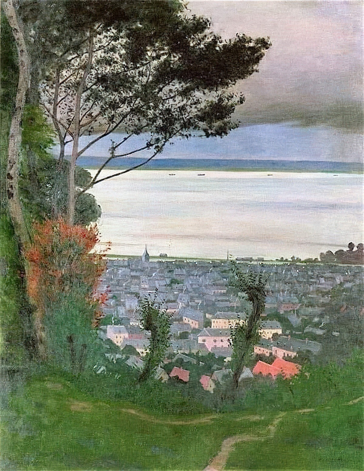
When looking at an image, how does the viewer get a sense of depth? The artist can add depth to an image using various tricks.
It starts with simple overlapping.
The chase for deep space begins by occluding one form with another. With overlapping shapes we easily decide which is in front and which is in back. From here we go on to explore other methods, color recession, linear and atmospheric perspective, texture gradient shifts, amalgamating textures, diminishing edge acuity, diminishing ratios of contrast and on and on.
David Dunlop
But there’s more to depicting space than simple occlusion: The ratio of contrast between light and dark diminishes over distance. This visual effect is known as aerial or atmospheric perspective.
Claude Lorrain introduced the glowing obscuring effects of atmospheric perspective in the 1600s. From the 1628 to 1668 we can trace Claude’s further development of atmospheric effects.
for examples see David Dunlop’s post
In an earlier post, Dunlop explains the Chinese history of this technique:
Long before Claude Lorraine introduced atmospheric perspective effects in the 1600s Chinese artists of the Song Dynasty had already developed these effects in their landscape painting in the 10th century 600 years earlier. Among their basic tenets was the principle of substance vs. absence. This meant that a misty amorphous air would lie in the space between receding forms, between mountains for example.
Atmosphere From China to Italy
Today there are various ways artists depict aerial perspective.
Change The Hue To Blue
Background scenery such as distant mountains tend to look more blue. (That’s especially true here in Australia, for anyone living within cooee of the Blue Mountains.)
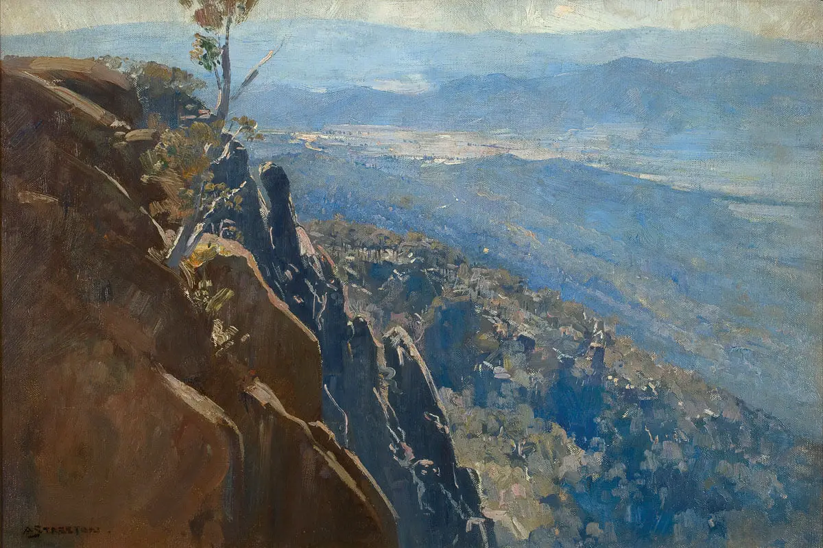
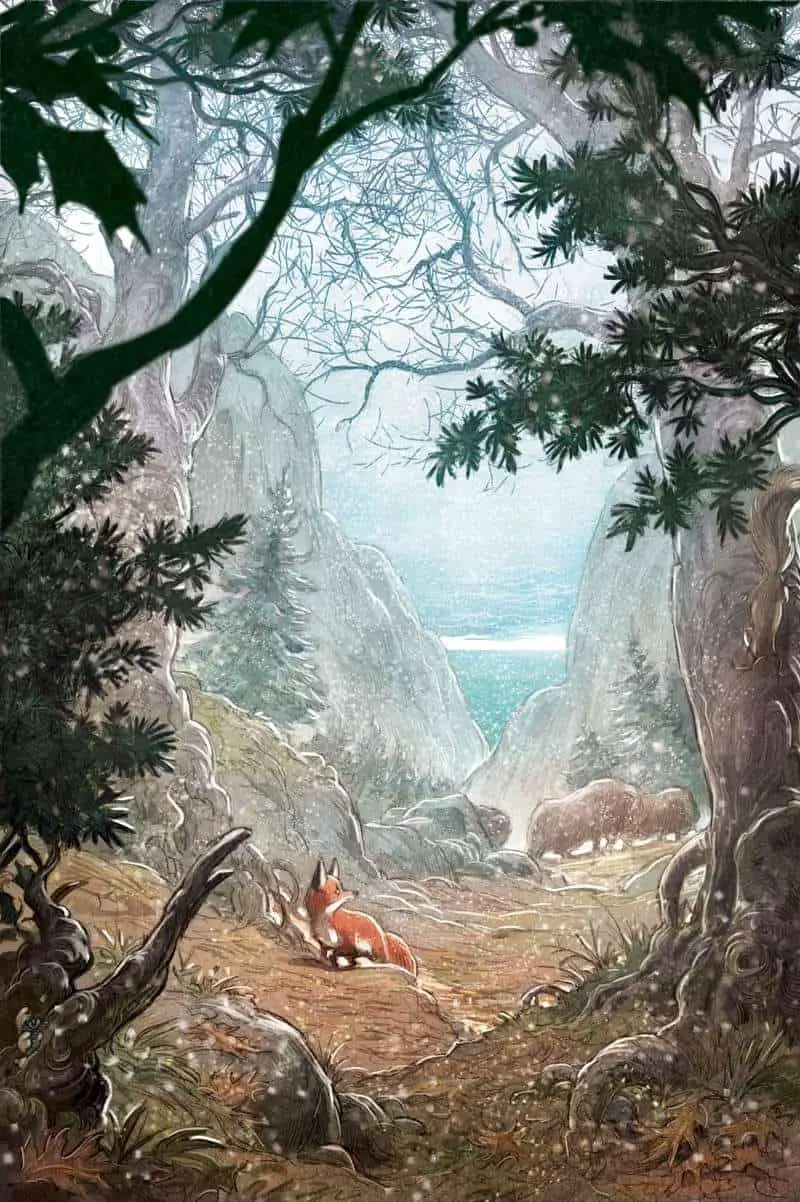
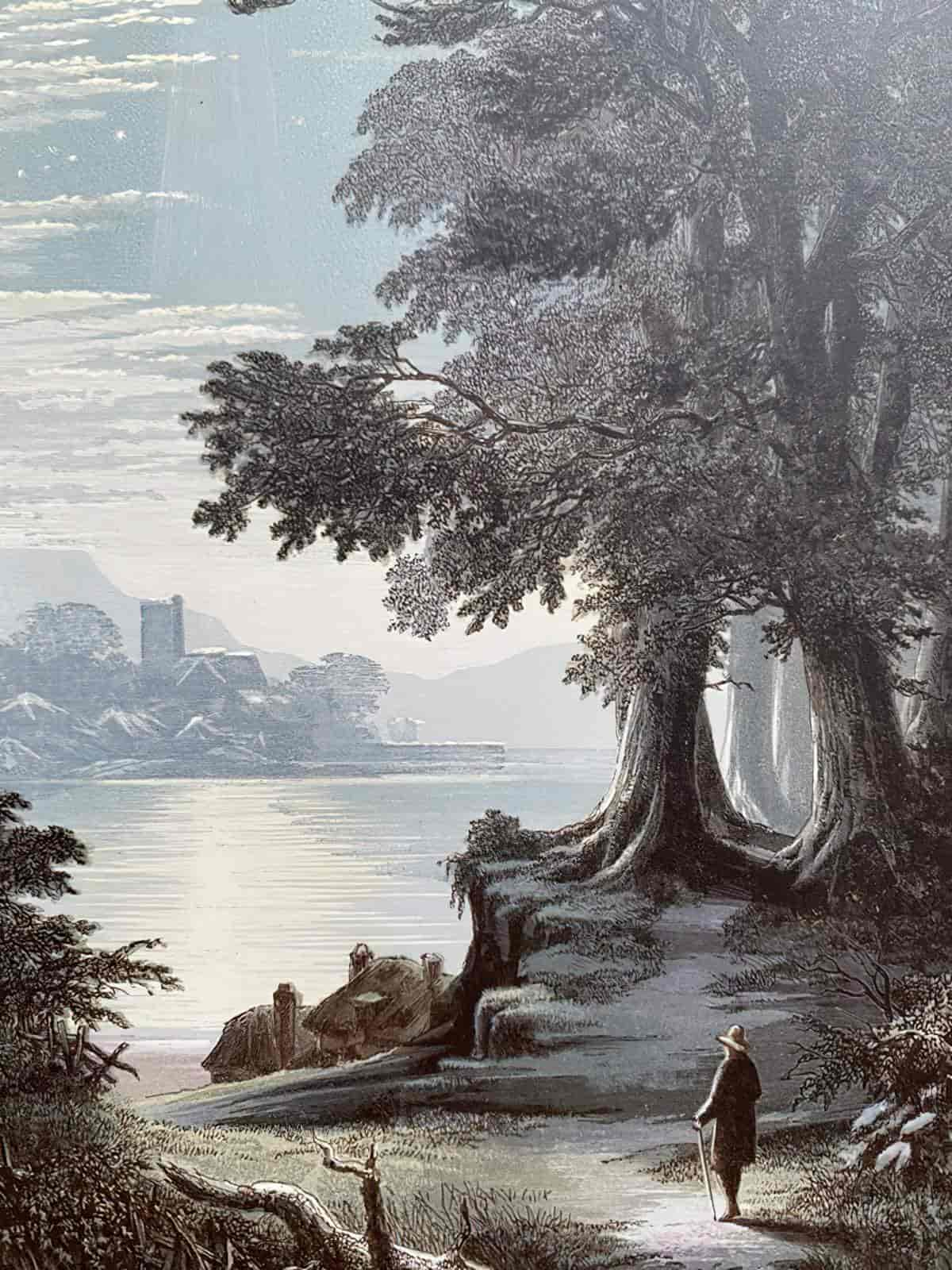
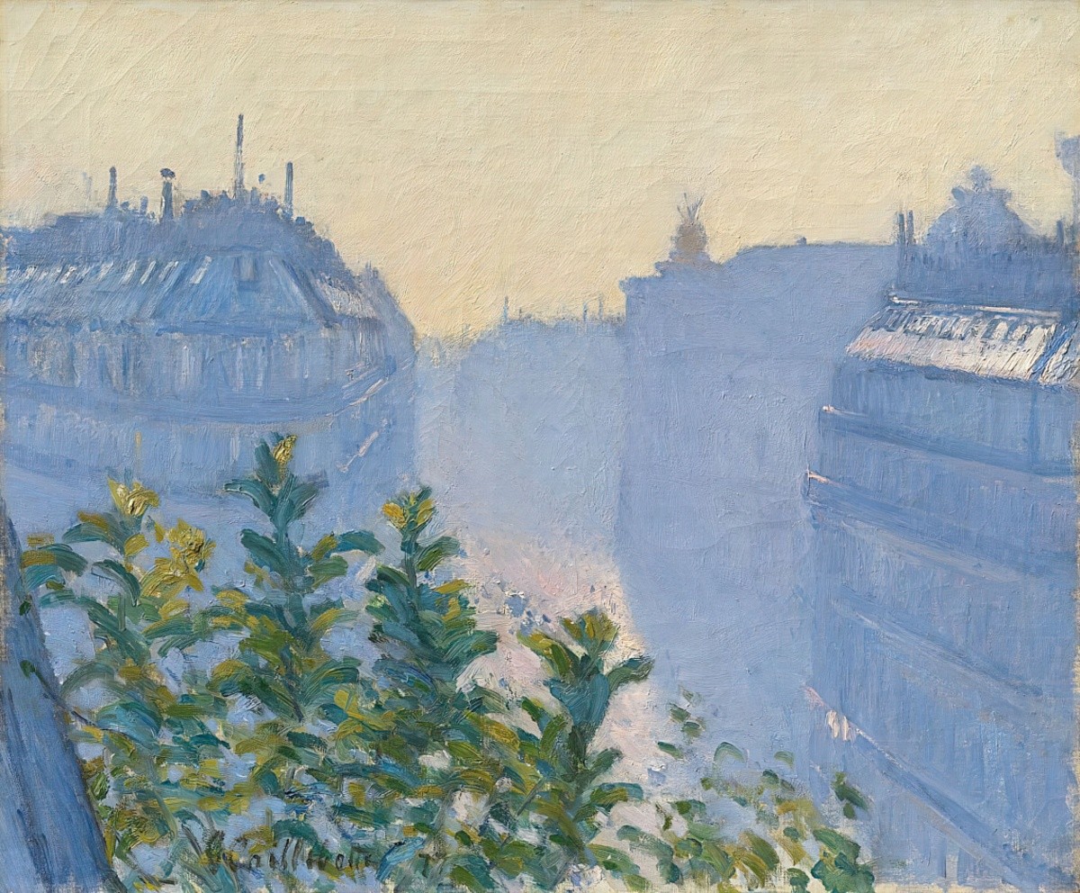
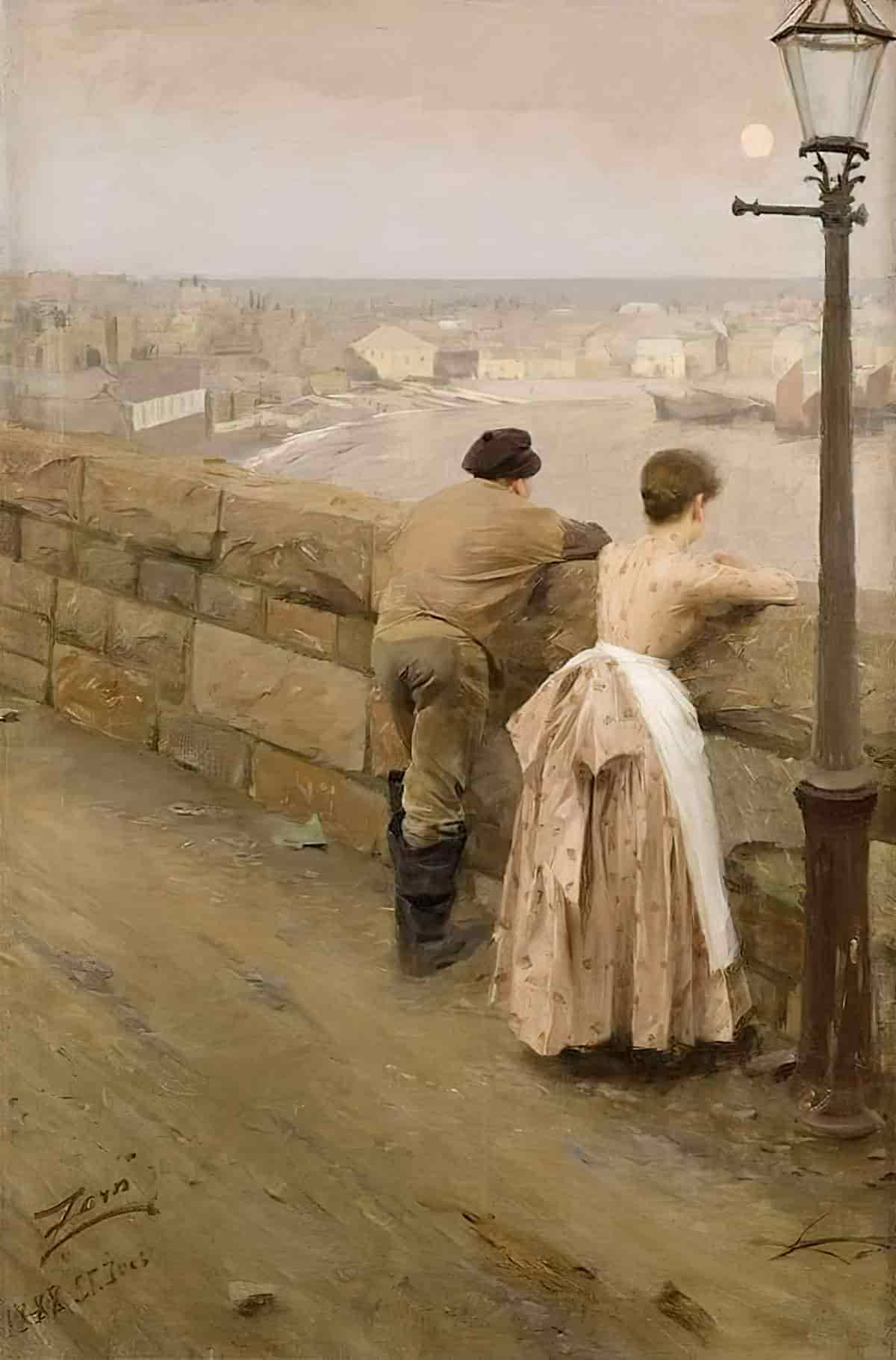
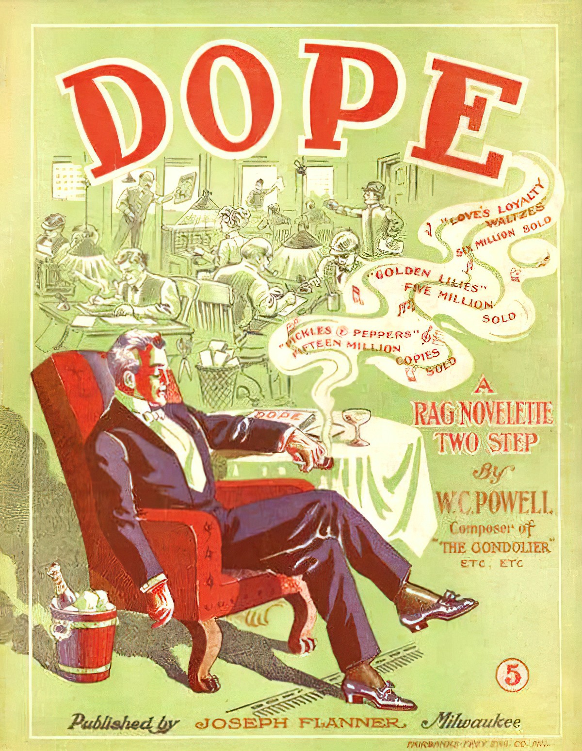
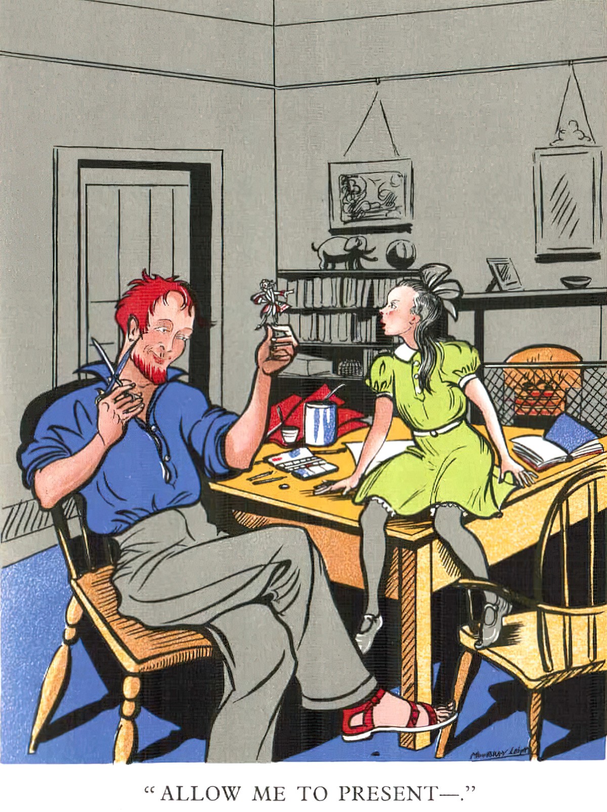
Perhaps inspired by landscapes, even buildings can be blued out, even if the building is obviously not that far away! This lets the detail of the foreground stand out.
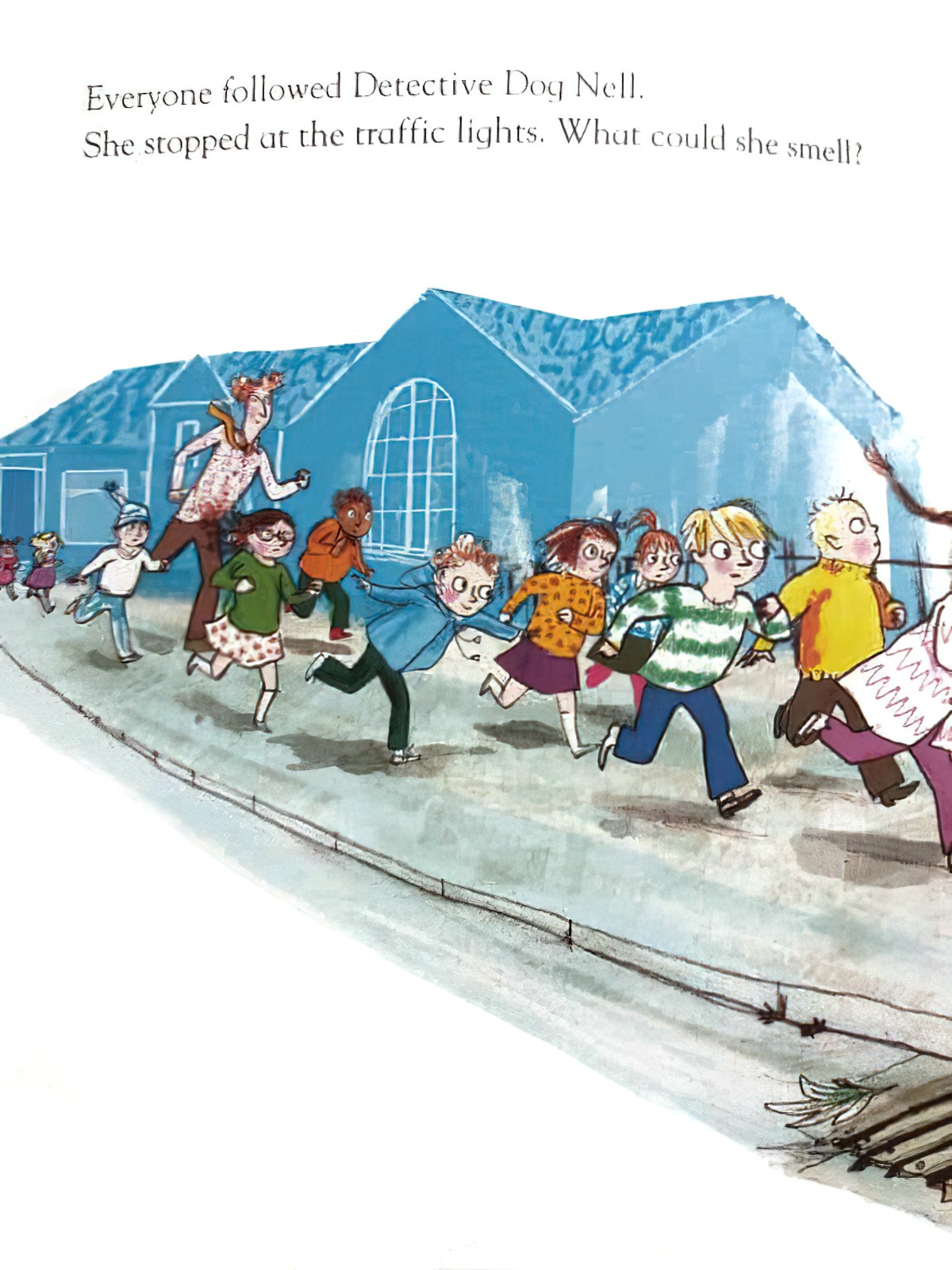
People can also be blued out:
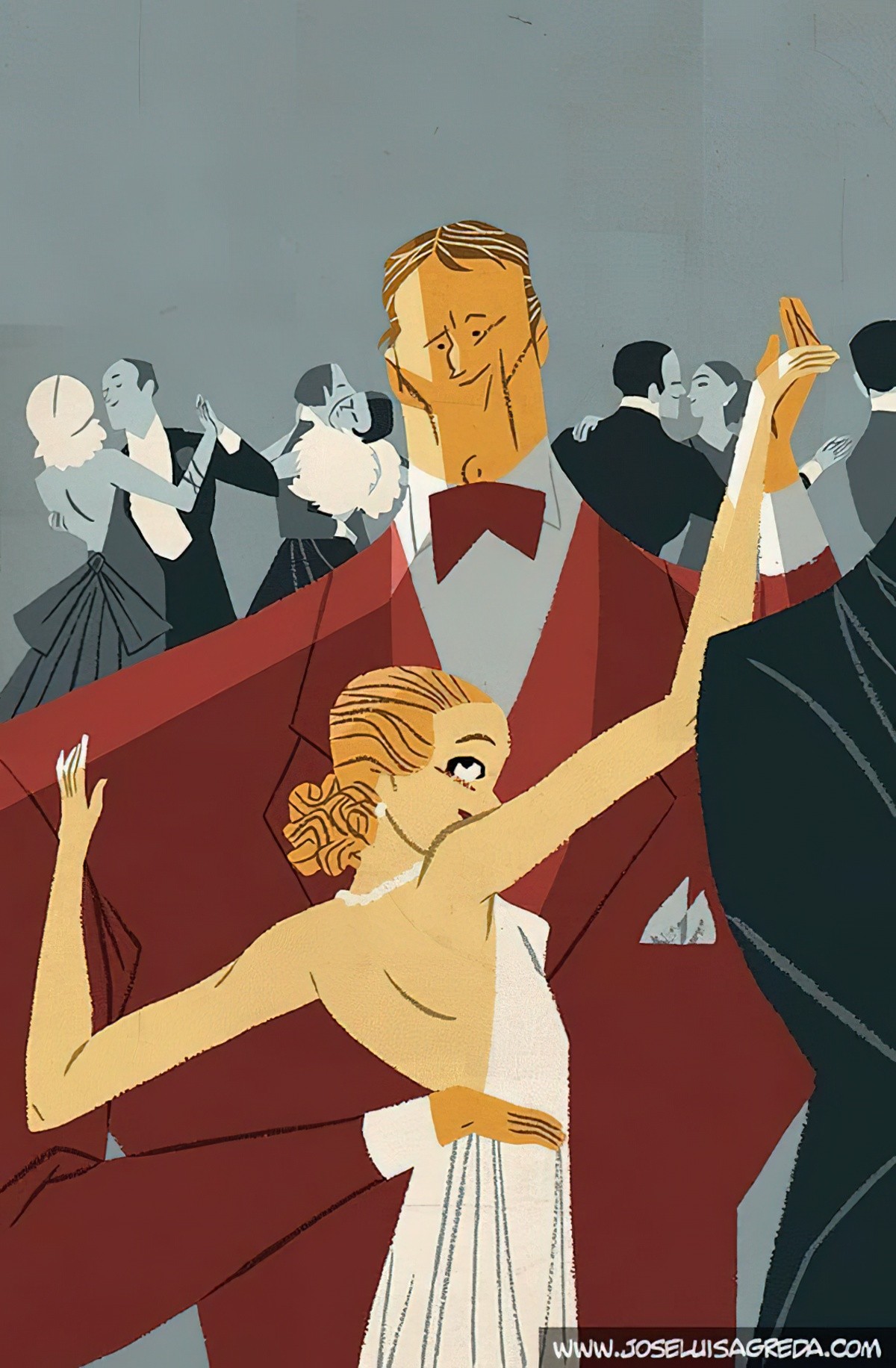
Or a blue outline may suffice.
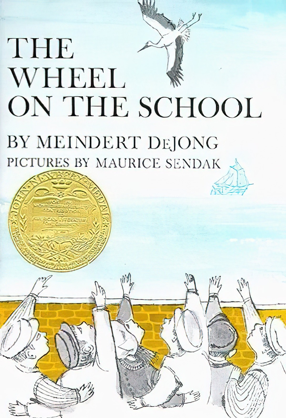
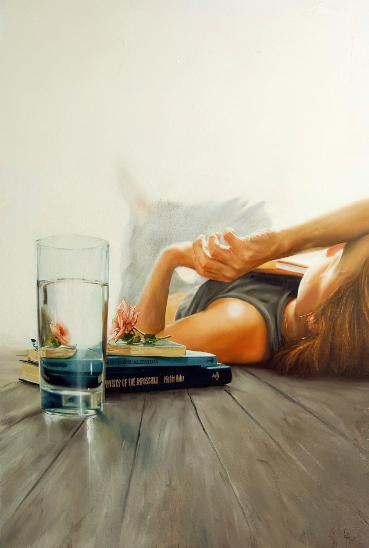
Whereas aerial perspective is more noticeable across vistas covering large distances, artists can also use it to create depth in very intimate settings, for instance when foreshortening:
At sunset, or in the (polluted) city, the blue is often swapped out for orange hues:
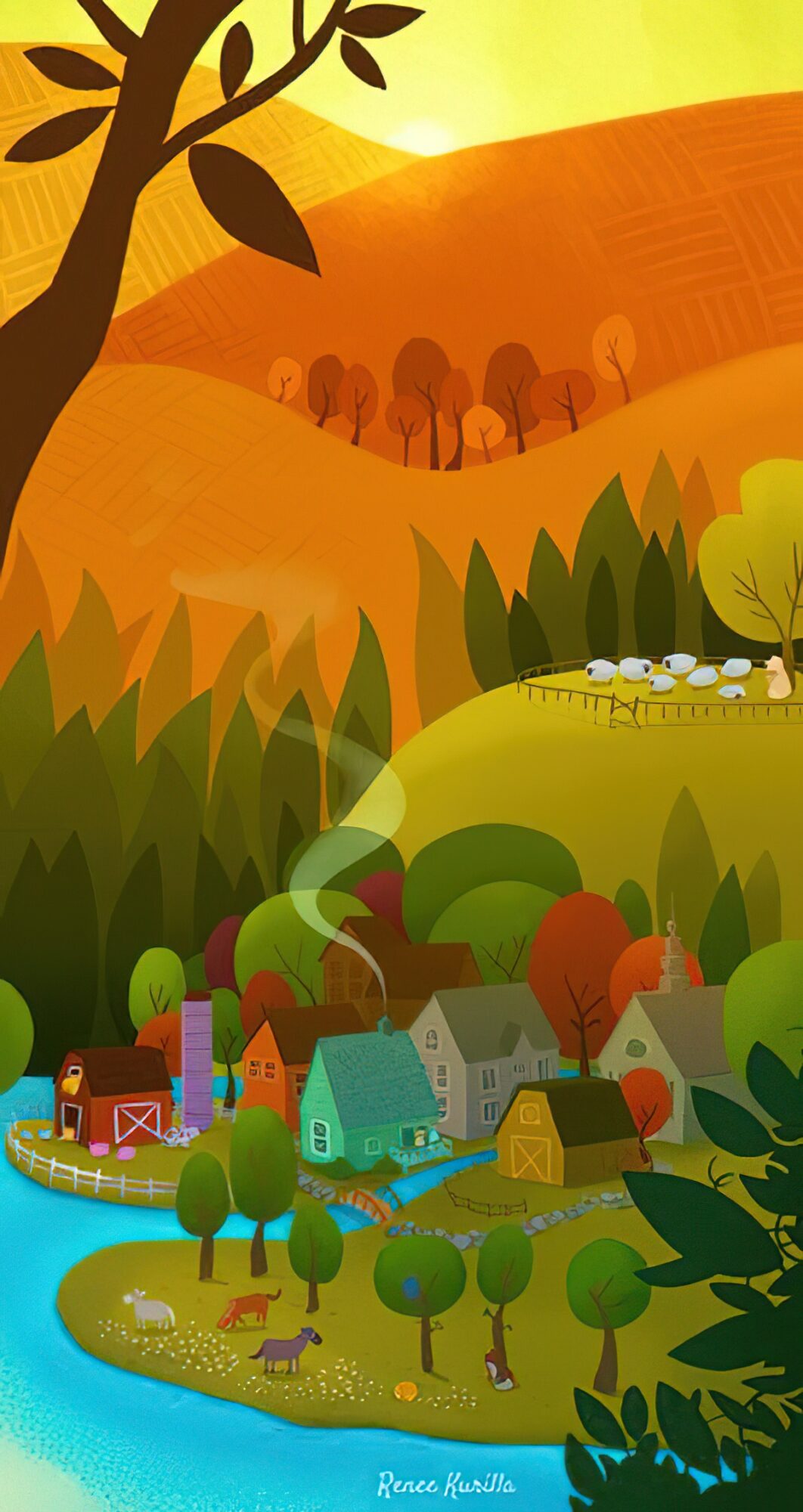
Warms in the background, blues in the foreground definitely convey the feeling of a place cooling down after a hot day.
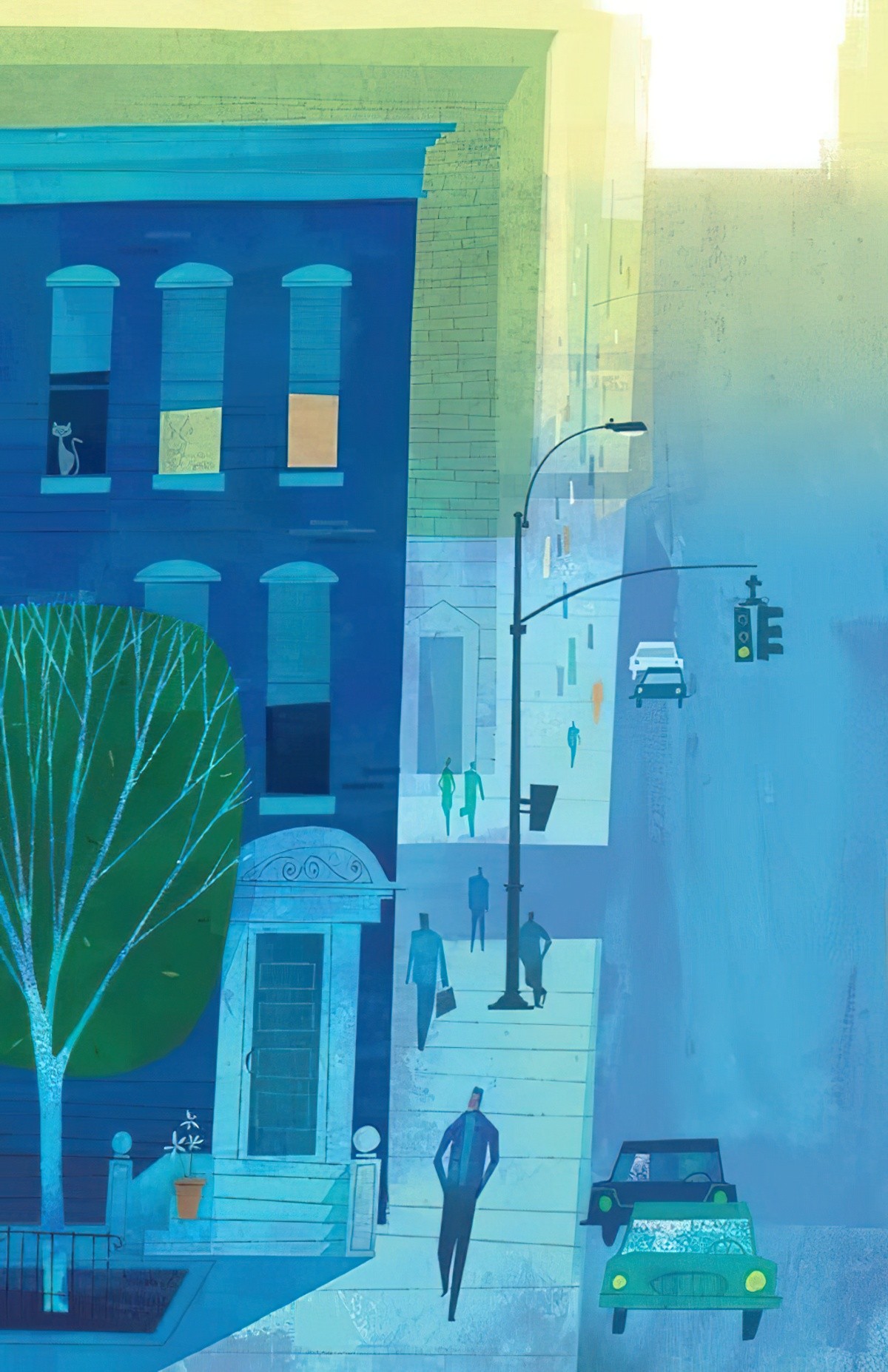
But not always. I feel the image below aims to convey atmosphere rather than time of day.
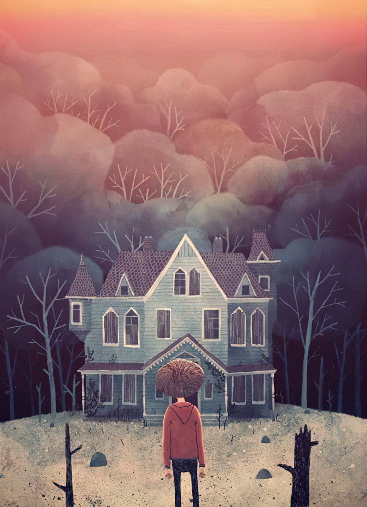
The general rule of cools in the background, warms in the foreground can also be inverted for a surreal, pop-art kind of look.
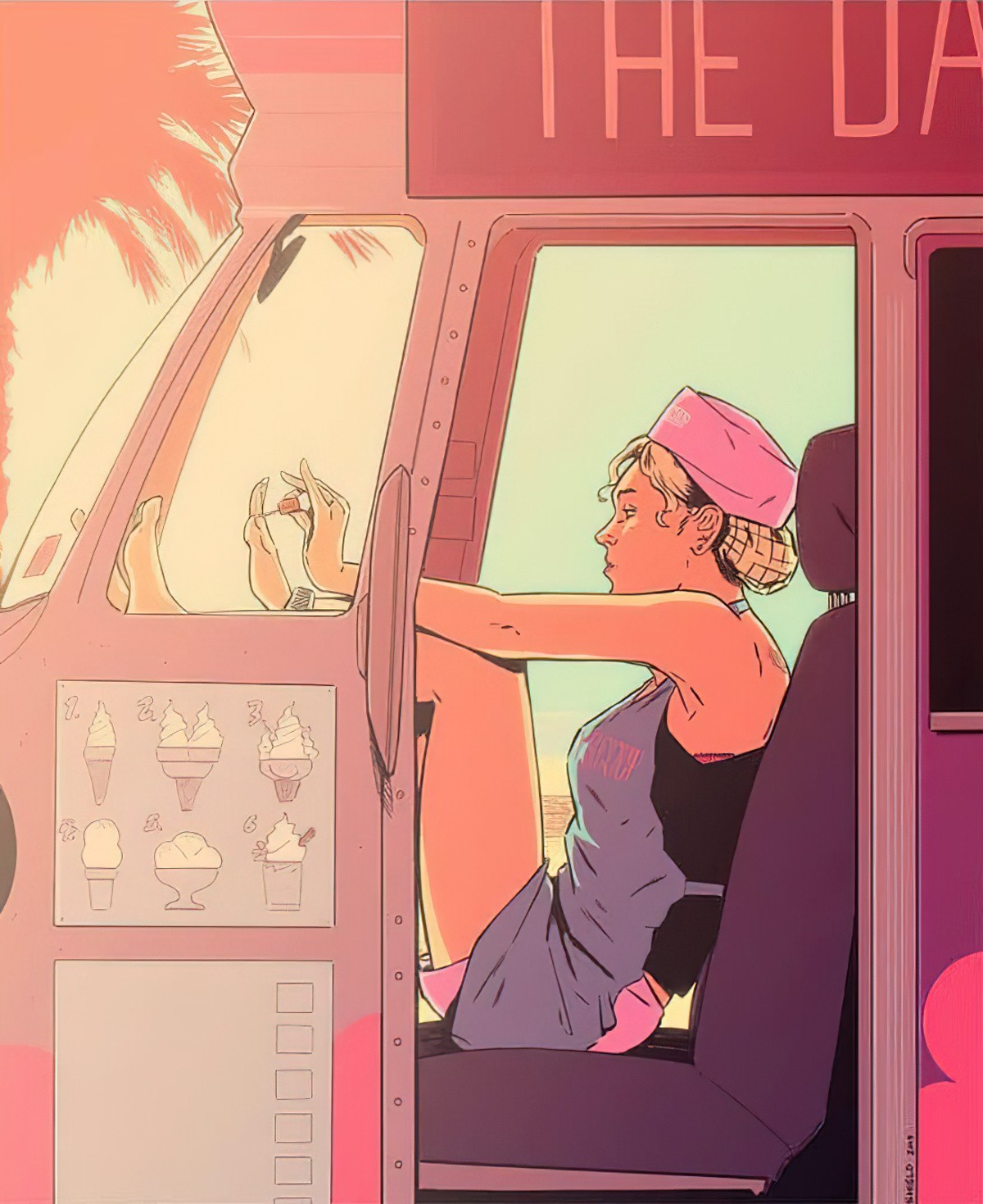
In a utopian setting where you don’t want any desaturation, you can change the palette. Often it will be cool colours for the background palette, warm for the foreground, but the cools are as bright as the warms.
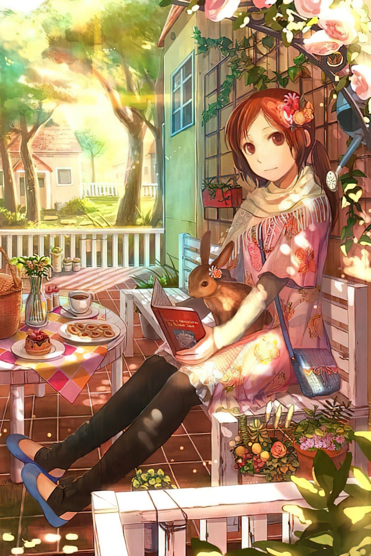
Lower Opacity/Fade
The further away, the less vivid the colours. Or even if there are no colours at all, the background will seem more see-through. In digital illustration, this can be achieved by lowering the opacity of the background images.
Fantasy illustrators tend to make heavy use of this technique as it creates a highly atmospheric image — often dystopian.
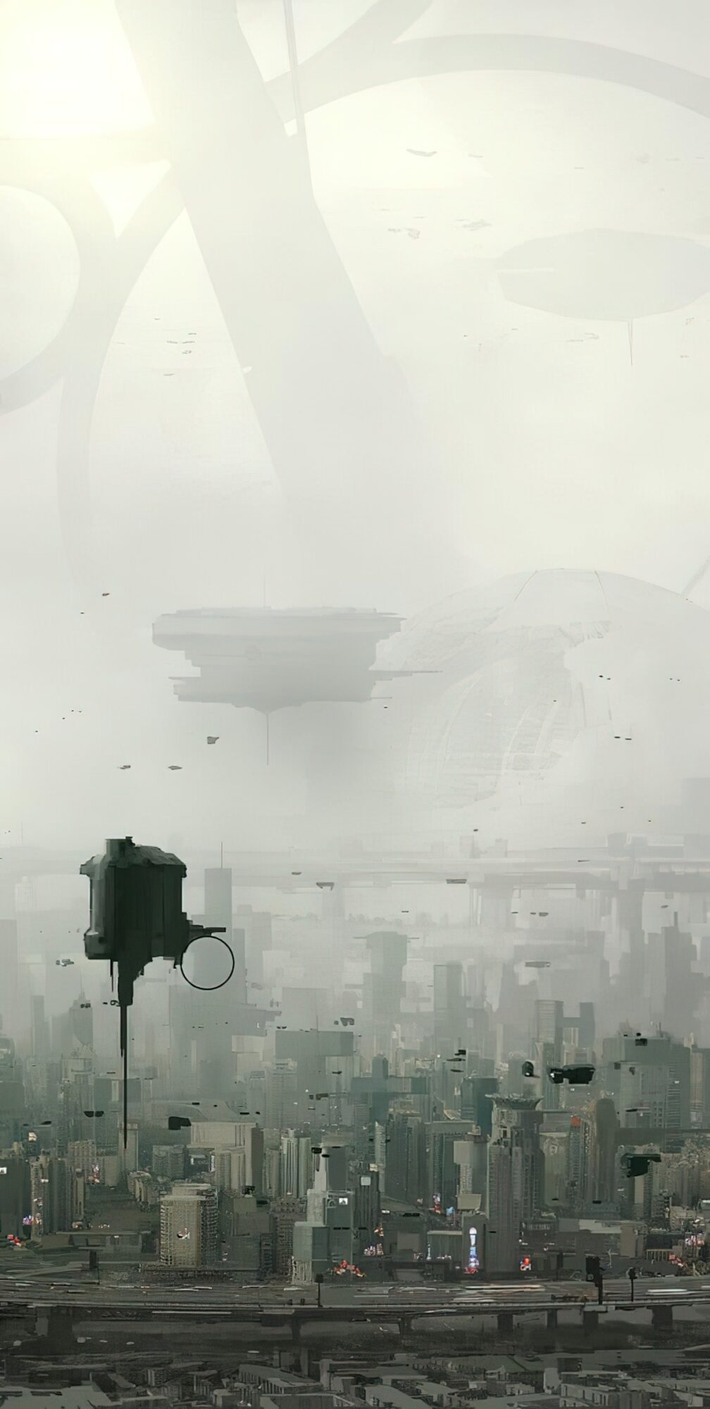
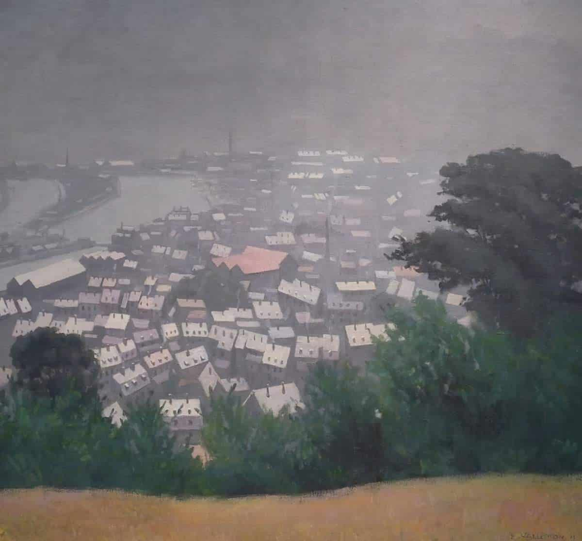
The inevitable result: These atmospheres look foggy. I often think there’s a helluva lot of fog in fantasy imaginations. Sfmato refers to the technique of allowing tones and colours to shade gradually into one another, producing softened outlines or hazy forms. It is not a modern invention:
500 years before DaVinci introduced sfumato’s smoky edges and misty landscape backgrounds for his portraits Sung Dynasty Chinese artists had already discovered the value of obscuring mist as a segue between mountains and a method for creating a feeling of mysterious space within a landscape. Claude Lorrain perfected the sensation of obscuring atmosphere for European landscape painters. 200 years later his atmospherics would be admired and imitated by J.M.W. Turner.
By the mid 19th century photographers and painters were both employing the mysterious benefits of fog. James Whistler worked on the reverse side of his canvases to exploit the neutral pebbly surface he found there which supported his soft edged misty evening landscapes.
David Dunlop
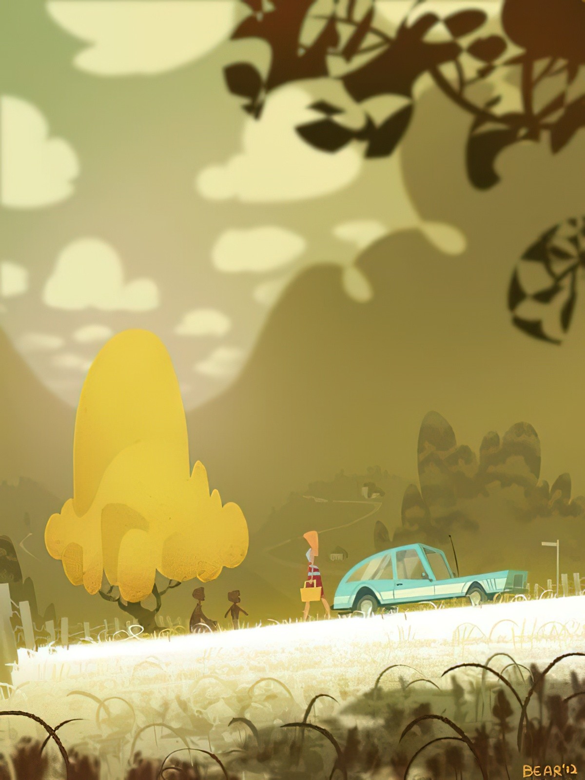
Blur
Background scenery might be more blurry if you want to draw attention to your foreground image. This is a natural consequence of taking a photograph using an SLR camera and can also be applied to art. (It’s also a natural consequence of being short-sighted…)
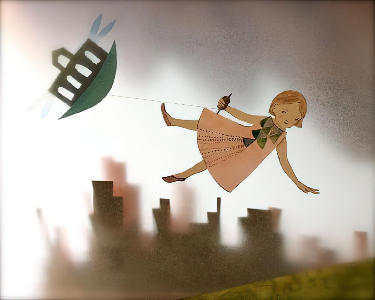
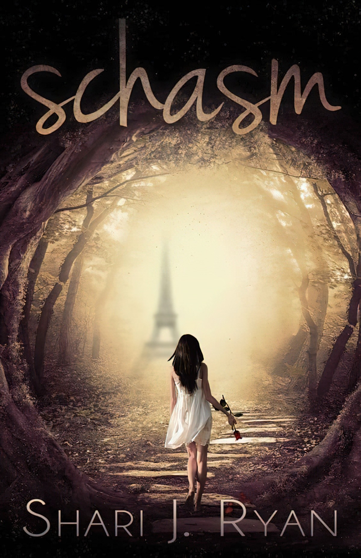
Or, you might blur out the foreground and leave the background layer in focus.
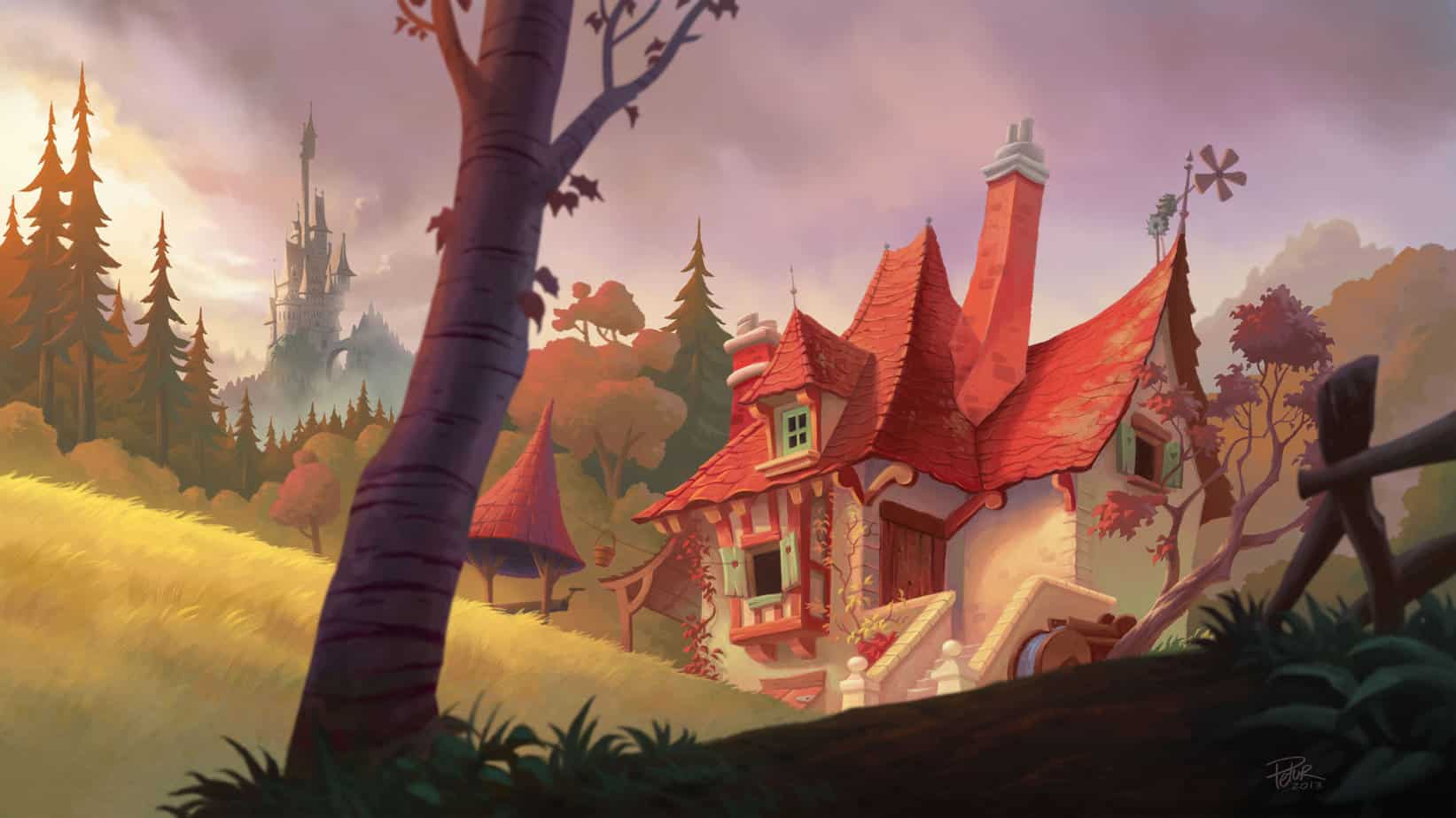
Frame With Very Dark Foreground
In this image of Beauty and the Beast’s castle, artist Petur Antonsson has used four distinct perspective layers, starting with almost black in the foreground, brightest for the focal point (the house), an ochre layer of trees and a misty, blue castle behind.
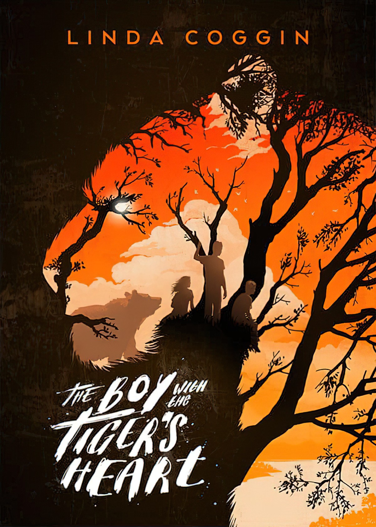
Darken foreground lines
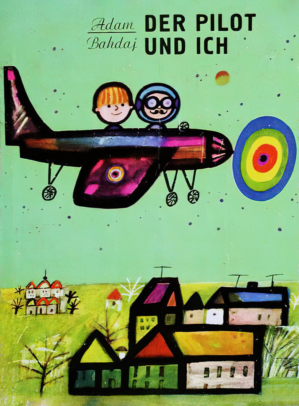
Change the amount of detail
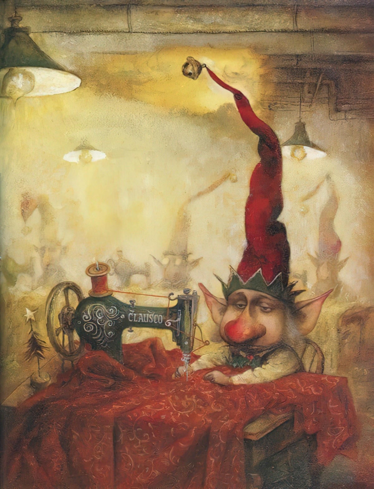
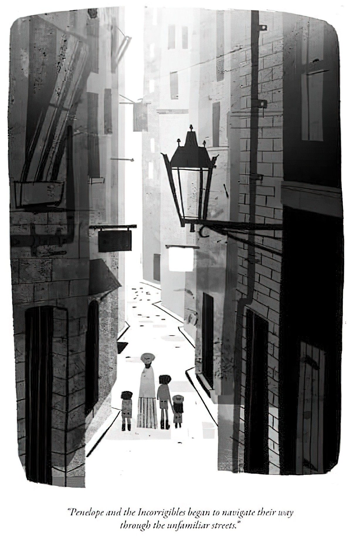
Use white lines as background scenery
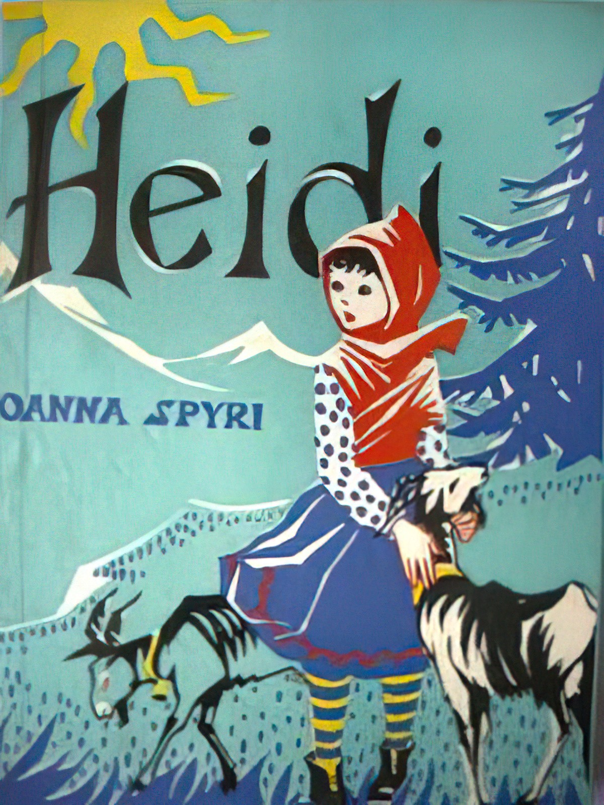
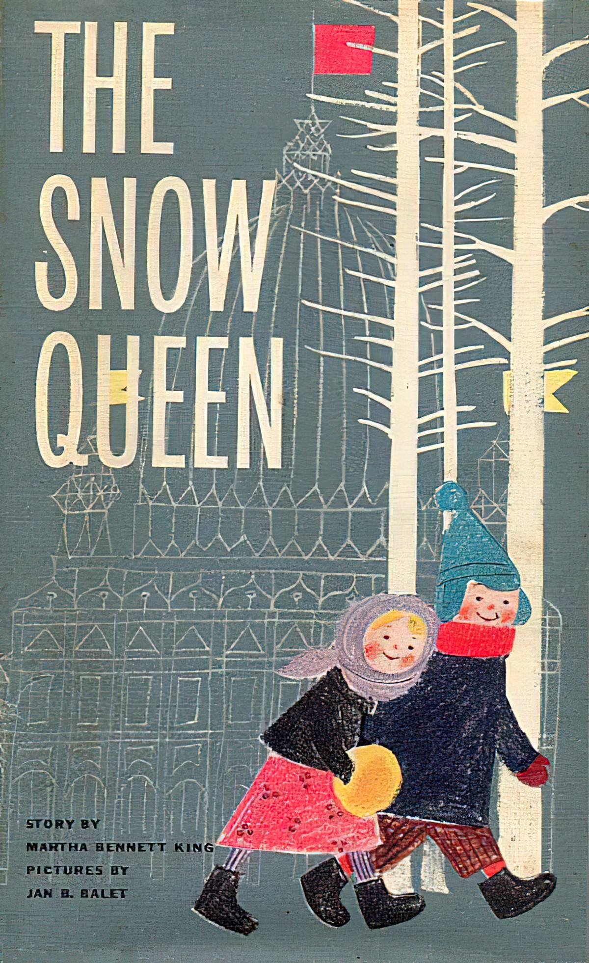
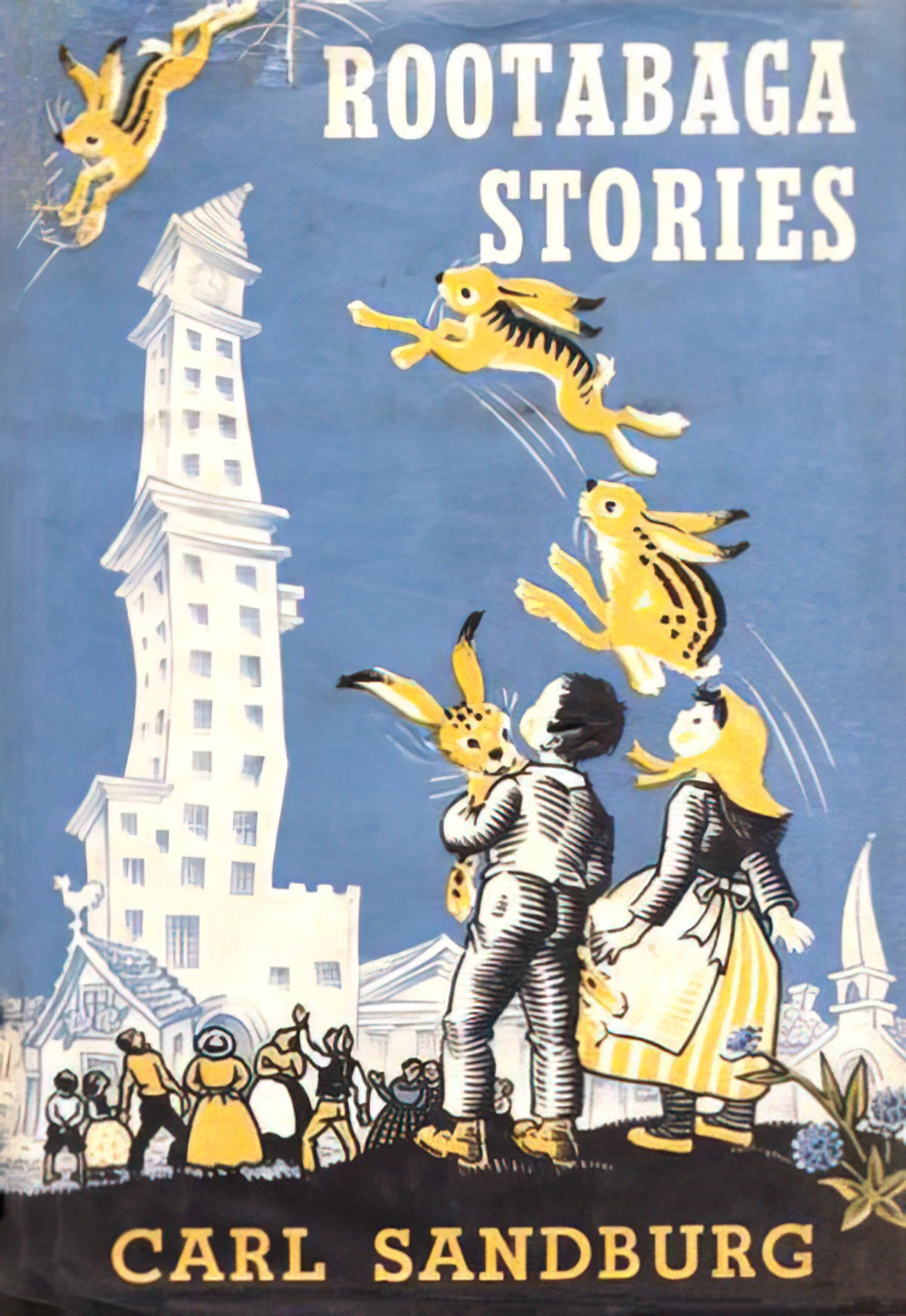
Use unfilled objects (with dark lines) as background scenery
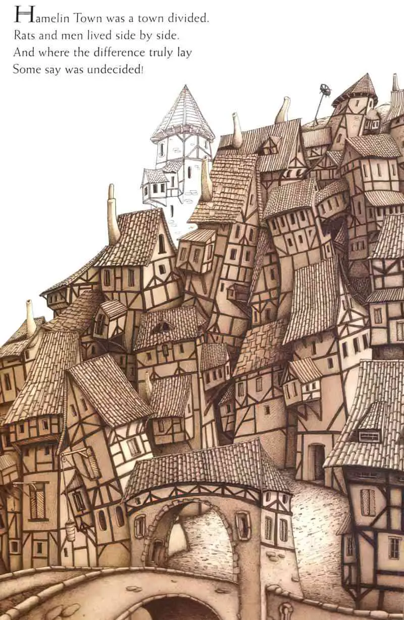
In Drahos Zac’s illustrations for The Pied Piper, there may be ominous reasons for avoiding the sepia fill on background buildings: The inhabitants of those particular buildings may have already died. This theory holds up when you consider some of the foreground characters are also left unfilled. This feels reminiscent of ghosts.
Silhouettes As Background Objects
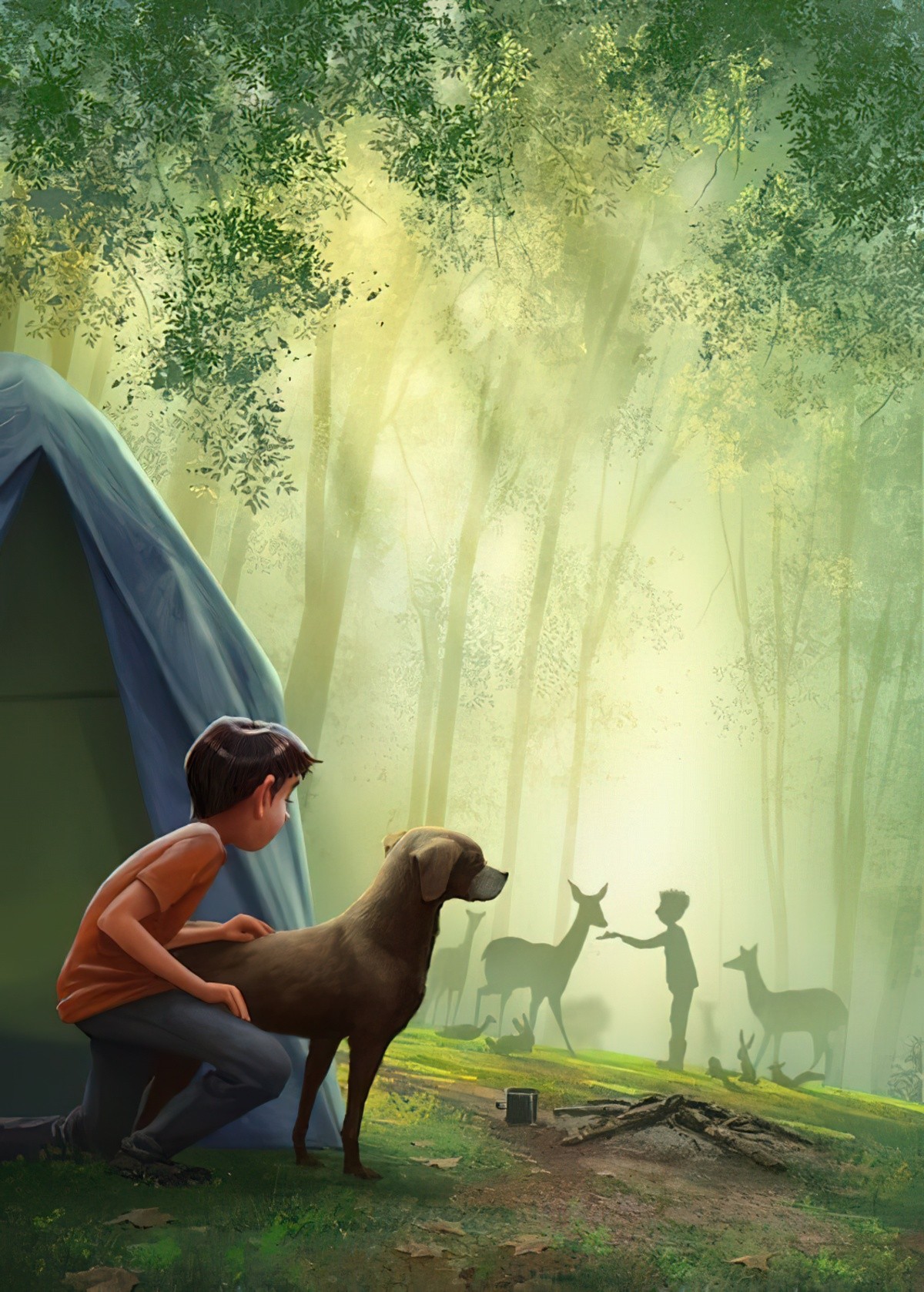
Or the silhouette might have a bit of detail. You can be as silhouette-y as you like.
FURTHER READING
The art term sfumato (roughly translated as ‘gone up in smoke’, or ‘faded away’) refers to soft, smoky visual effects that blur the edges of people and objects, so they merge seamlessly with their surroundings. It was a popular technique that emerged during the Italian Renaissance period, and the term is most commonly used by art historians to refer to the art of this time period.
What Is Sfumato in Art? (4 Key Examples) from The Collector
Header painting: Paul Klee, (1879-1940) The Hotel 1913
