1. THE AIR OF UNCOMPROMISING DETACHMENT
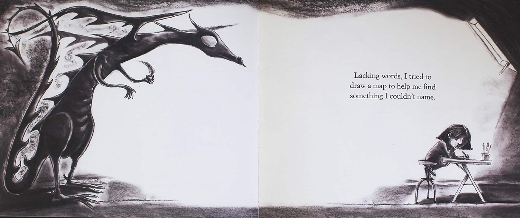
While some picturebooks are in black and white for economic reasons, serious picture-book artists who choose to aavoid color in a medium noted for its use of color often have similar special points to make.
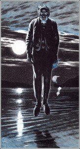
The obvious example is the work of Chris Van Allsburg. The black-and-white pictures in both The Garden of Abdul Gasazi and Jumanji evoke the feeling of black-and-white still photographs that have been slightly over-developed to emphasize their contrasts. They are uncompromisingly objective and detached—unlike the world we see subjectively with our own eyes simply because they are so much like photographs. Paradoxically, we commonly associate black and white with uncompromising truth, utter absence of subjective coloring: documentary. Van Allsburg’s pictures have the quality of documentary, of detached observation that shows exactly what there is to see without the frivolous intrusion of color, and they are unsettling simply because what we see so uncompromisingly is often magic and impossible.
Perry Nodelman, Words About Pictures
I look at black and white photography as being more pure. It’s really about the content of the frame and subject matter. Often, colour is just a distraction.
Roger Deakins, cinematographer
2. BLACK AND WHITE MAKES THINGS LOOK OLD, AND THEREFORE CLASSIC
The technology of photography has influenced picturebooks — and art in general — in a number of different ways.
One standout convention is that greyscale images make the reader think of the days before colour film was invented. This works even if the artwork is an illustration, not a photo. It works if the illustration is not even close to photo-realistic. The effect is made very clear when looking at these old images which have been realistically colorised. The effect is really quite stunning: We’re used to looking at wartime photos in black and white, which lends a comfortable distance to horrific world events. Yet when the same photos are colourised, the events seem much more recent and therefore have more impact.

The inverse works too. I recently watched The Last Picture Show, which was filmed in 1971 and therefore could have been shot in full colour, but the black and whiteness of it makes the town seem older. The story is set in the 1950s.
And the subtitle of the following article points out the defamiliarizing effect of black and white in photographs:
The Passionate Photo Colorizers Who Are Humanizing the Past: When black-and-white images can be hard to relate to, adding color evokes empathy. (at Atlas Obscura)
What about recently produced films set in the past? Why are more not set in black and white? Possibly it’s because in the digital age of film, cinematographers have ready access to coloured filters. A yellow hue cast over the background can lend an old-style look (as seen in Delicatessen, 1991).
I mention these films for adults because I’m not so sure the bulk of consumers and critics feel that ‘black and white’ is of any artistic use at all, let alone ‘appropriate for children’. Do adult gatekeepers accept the convention of black and white pictures in the stories they choose to buy for children?
Case study: After creating The Fanastic Flying Books Of Morris Lessmore, Moonbot Studios produced an app called The Numberlys, which baffled some reviewers because it was in black and white.
The opening of the app is gripping and quite dark (which makes sense given the inspiration), so it is unlikely to really capture the attention of pre-schoolers (I say this because as you’ll read later I have a hunch they are partly considered a key audience). It is in a black and white, slightly sepia tone and harks back to the type of animation that is aiming to appeal to both adults and children – though here it probably will be of greater interest to children of elementary school age and older.
review of The Numberlys from Wired
I sense the reviewer believes the youngest readers cannot be drawn in to a black and white/dark image. Is this something to do with physiology and the way humans have evolved to learn, or is it because two and three year olds have already learned from the culture that anything in bright colours is more likely to have been produced with them in mind? Perhaps this is what put the reviewer of Mac News World off the scent:
I must admit, I felt a bit duped by the description of the Numberlys app after I bought, downloaded and launched the app. I was expecting something bigger and longer that would appeal more to adults.
Was it the black and white look of the app which lead the reviewer to assume that The Numberlys was intended for an older audience?
Touch Arcade writes:
The story is told through beautiful black and white animated graphics which are clearly inspired by the classic sci-fi film Metropolis, but with a modern touch.
…thereby picking up that the black and white is influenced by work that has come before — in this case, the work of Fritz Lang. Will children appreciate any of this? The example of The Numberlys shows that regardless of what children themselves think, reviewers (and I guess adult consumers) are likely to assume that media produced in black and white will appeal to adult sensibilities. A black and white story for children, therefore, better make sure it lives up to the huge challenge of appealing to a dual audience of children and adults alike.
3. A BLACK AND WHITE IMAGE TYPICALLY CONVEYS EMOTIONS BETTER THAN A COLOUR ONE
Filmmaker IQ has a post on the reasons why we might still choose to desaturate an image, and this is one of them.
In a portrait with strong lighting, a calm face can suddenly look menacing, or vice versa. In this case, the lack of colour means that colour can’t interfere with the tonal contrast. The best example of this is the entire art noir movement.
Perry Nodelman continues with his example of Chris Van Allsburg, and the contrast one can achieve via black and white:
Furthermore, the heavy contrasts of these pictures emphasize the patterns created by the various shapes and so do the black lines that outline each shape, so that the relationships o these shapes on the flat surface of the page are as significant as the relationships of the figures the shapes represent in the three-dimensional picture space. As a result, and as happens in photographs with high contrast, the often intense action the pictures depict is slowed down, held by the patterns; like still pictures of people caught in moments of fast action, the pictures depends to a great extent on these paradoxical relationships between what is depicted and the photographic techniques used to depict it—between our expectations of documentary truth and our perception of magic, between activity and stopped time.
MODERN ALTERNATIVES TO BLACK AND WHITE IN PICTUREBOOKS
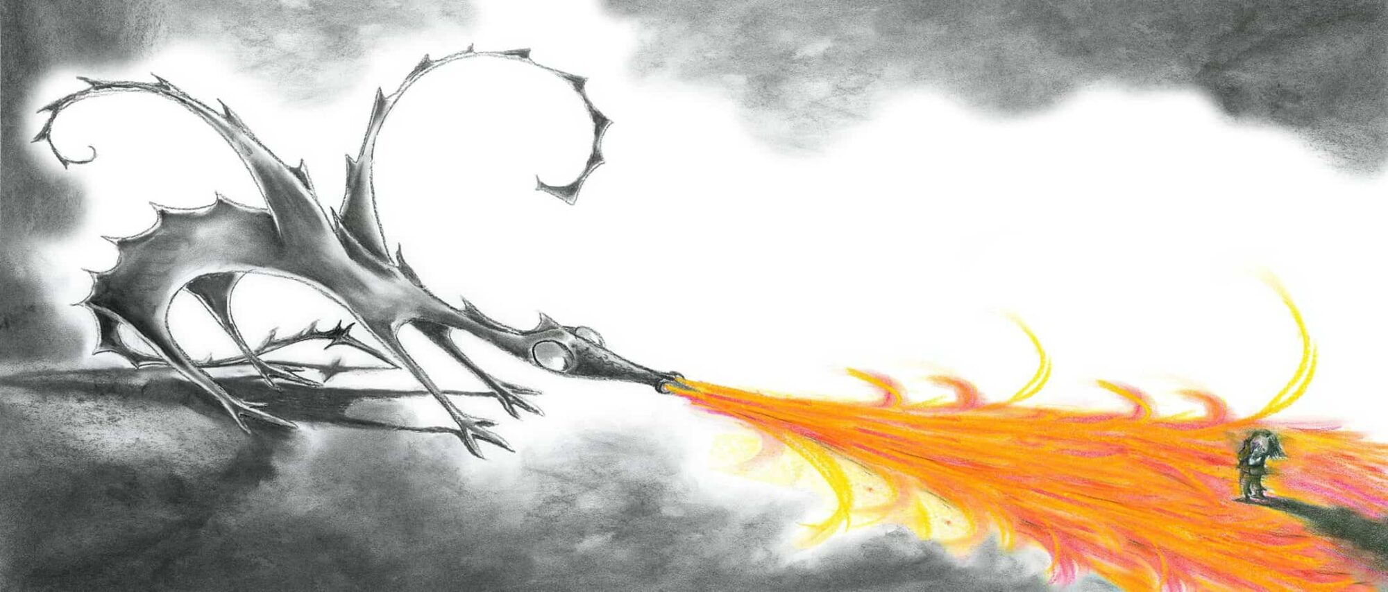
There is nothing wrong with black and white as an artistic decision. But is there a ‘hybrid’ decision that can be made about colour, one which will satisfy the artistic goals of a limited palette as well as consumer expectation that children need colour?
Yellow Filters
In the digital era, illustrators can put a yellow tint on a picture and it immediately looks a bit old, but not too old (in which case black and white is good). I have no idea whether ‘yellow’ meant ‘aged’ before that crappy film did the rounds in the seventies, but there you have it. (See Delicatessen, above.)
It will be interesting to see how further developments in technology influence colour choice in art. With everyone sticking filters on things, the filters themselves are sure to come and go. Perhaps when we look back at the twenty-teens, we’ll see ‘iPhone filter’ stamped all over our family shots. So why do we do this? Perhaps photography got too good. Maybe we like the overexposed look, because one thing black and white early photography was very good at was adding a touch of glamour. And who needs every blemish magnified with a 50 megapixel camera?
Limited Palette
If you want to create a retro-looking illustration, you can also limit your palette to the few colours that were available to printing houses way back when. Many older illustrations are red and black simply because the publishing houses couldn’t afford a wider range.


