Some children’s illustrators use paper collage to illustrate their books by painting and and decorating their own assortment of cut paper. Think The Very Hungry Caterpillar.
Eric Carle’s artwork is often shown in classrooms as a model for children creating paper collages. Today I’d like to introduce you to a few artists who create similar artwork. You might like to use those as models alongside the illustrations of Eric Carle.
THE ROLE OF COLLAGE IN CHILDREN’S ILLUSTRATION
First, let’s consider why collage is so popular in children’s illustration. The following paragraphs focus on the collage artwork of Lauren Child, but is about collage illustration more broadly:
Most of Child’s picture books are illustrated using mixed media collage. Collage lends itself to playfulness by its nature, as it constructs a new image out of remnants of others. In doing so it mimics children’s imaginative play, where ‘a stick can serve as a gun; the instant convertibility of one thing into another is the very condition of play violence … Objects aren’t even necessary. One can always point a finger as if it were a gun and emit shooting noises’ (Brown 1999/2000, p. 76). Child’s images are constructed from multiple media: paintings (generally for backgrounds), naïve drawings, fabric, photographs and digital media.
Collage gives a flatness to the image that draws attention to its constructedness. Doonan argues that ‘collage always makes for a distinctive tension between illusion and reality, for it partakes of both by its very nature’ (2001, p. 183). By using collage, Child plays with readers’ perceptions. From a very young age, children learn to read pictures, to identify, for example, a particular arrangement of line and colour as a human figure. By creating images out of several different materials—such as fabric over a line drawing over a watercolour background—Child draws attention to the image’s materiality and forces the reader to perceive it as two things at once: both a human figure and an artwork. This polysemy again recalls children’s imaginative play, where one object can stand-in for another.
The use of photographs alongside drawings within collages further plays with reader perceptions and visual conventions. Photographs are seen as ‘naturalistic, unmediated, uncoded representation[s] of reality’ (Kress and van Leeuwen 1996, p. 162) and in Western cultures constitute ‘a kind of standard for visual modality’ (1996, p. 168). Within one double-page spread from I Am Not Sleepy and I Will Not Go to Bed (‘And so Lola pops on her pyjamas’, depicting siblings Charlie and Lola’s bedroom) photographic images are used as framed images on the bedroom wall, as images in a book, as an applique on Charlie’s pillow and as their toys (building blocks, a tea set, a basketball, a globe and a pinball game). The first two uses can be seen as a kind of playful reversal, where the secondary worlds of the children’s books and pictures are more ‘real’ than the primary world of their bedroom.
Playfulness in Lauren Child’s Picture Books
Polysemy: the coexistence of many possible meanings for a word or phrase
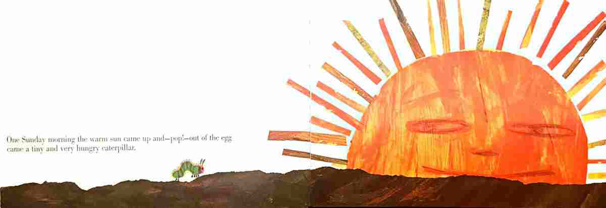
Eric Carle (1929 – 2021)
Eric Carle created his artwork using a highly recognisable collage technique. He painted texture onto tissue paper with acrylic paint then cut them into shapes and glued with liquid laundry starch the shapes to thick white board. This technique is called the ’tissue paper and liquid starch technique’.
If you live in Australia, like me, you may be wondering what on earth liquid laundry starch is. Apparently it’s used when ironing clothes, but I don’t iron, so I wouldn’t know how that works.
Good news: You can use watered down PVA glue instead. However, for use in a primary school classroom, apparently liquid laundry starch (e.g. the brand name STA-Flo) is much easier to clean up.
Carle used tissue paper because it can be torn as well as cut, which results in a variety of interesting edges. Also, if you layer coloured tissue, the semi-transparency allows for lower layers to show through, creating new and interesting colours.
(More on Eric Carle.) The white background allows the beautiful colours to pop. Eric Carle’s images look like paper covered in dye, then cut into shapes and glued onto a white surface. Images created in this way achieve a naive look which draws young readers in.
Carle’s college look is distinctive for its textures, in which the dye and the brushstrokes leave the hand of the artist visible.
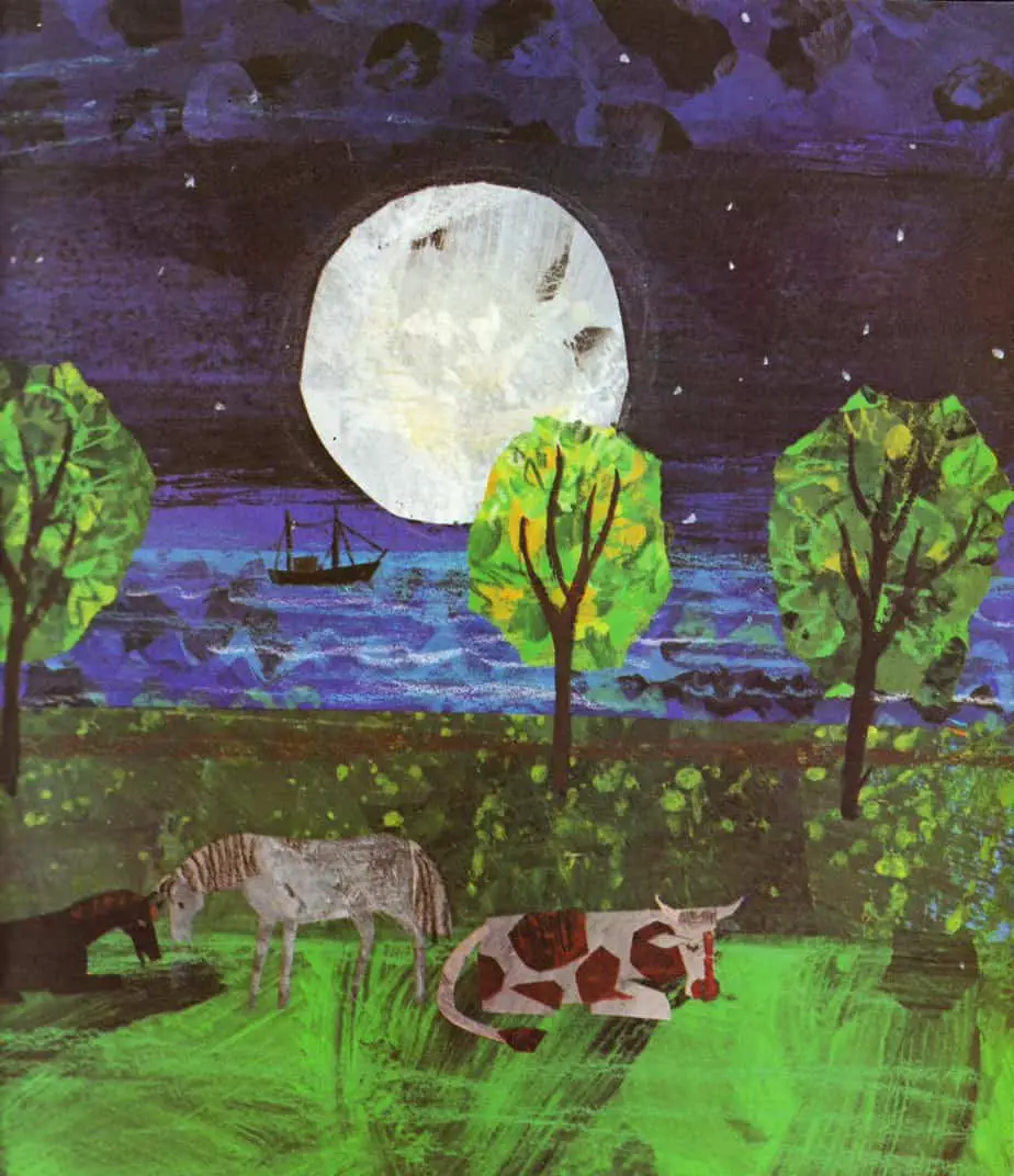
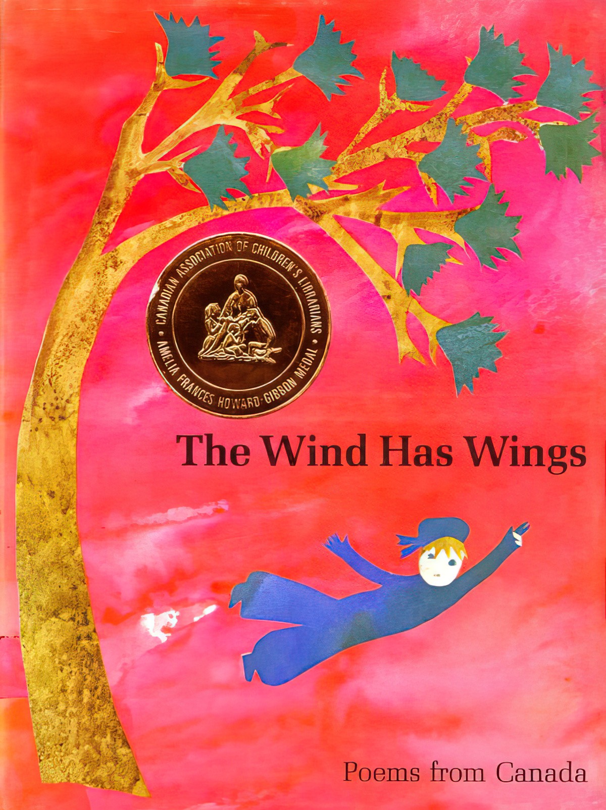
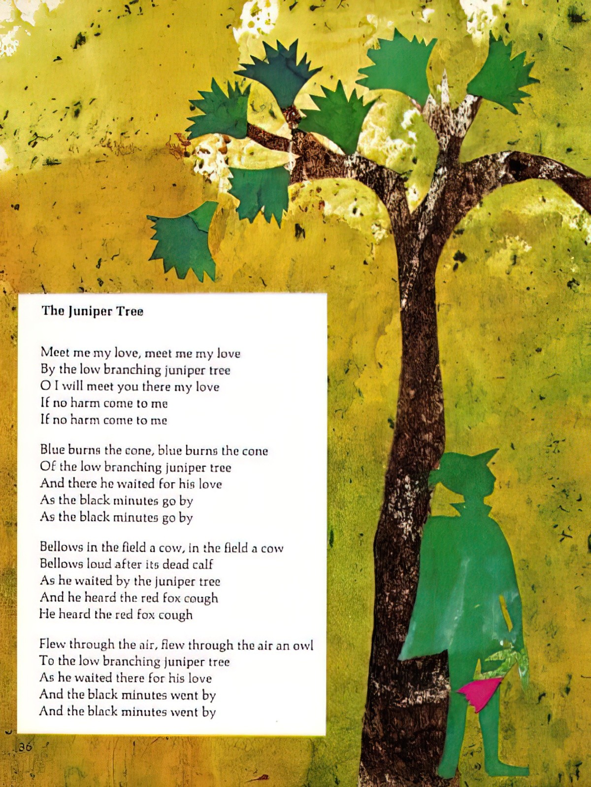
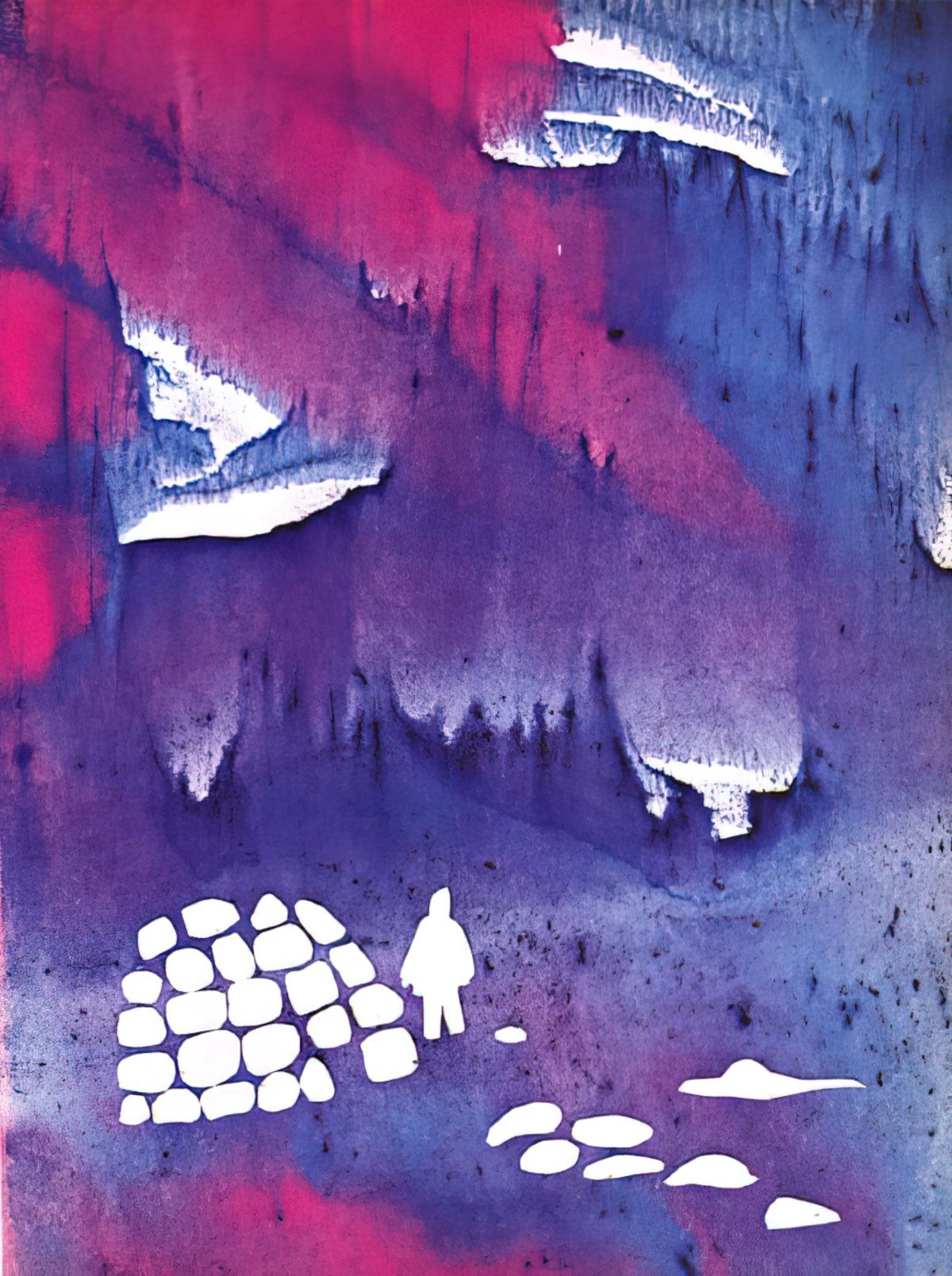
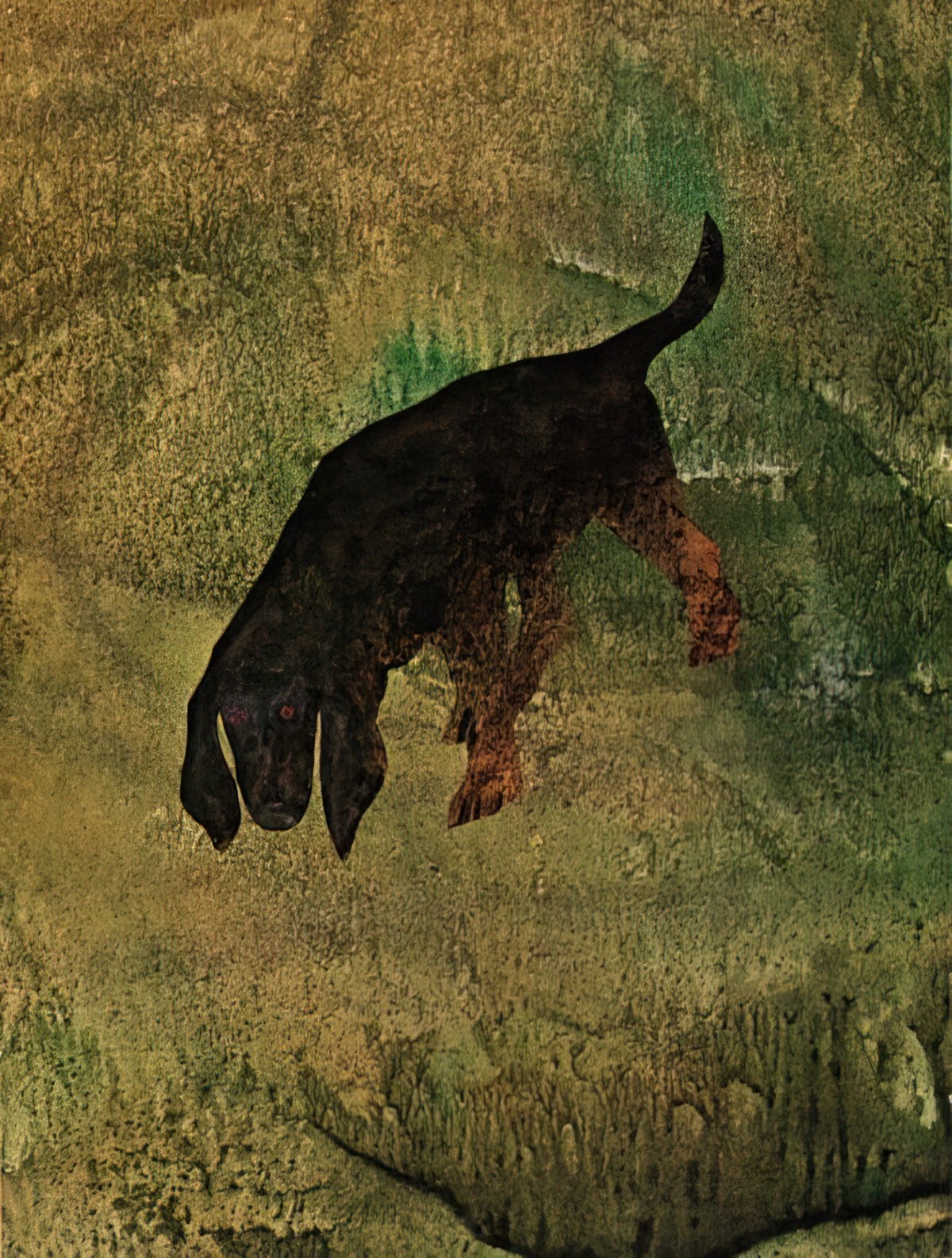
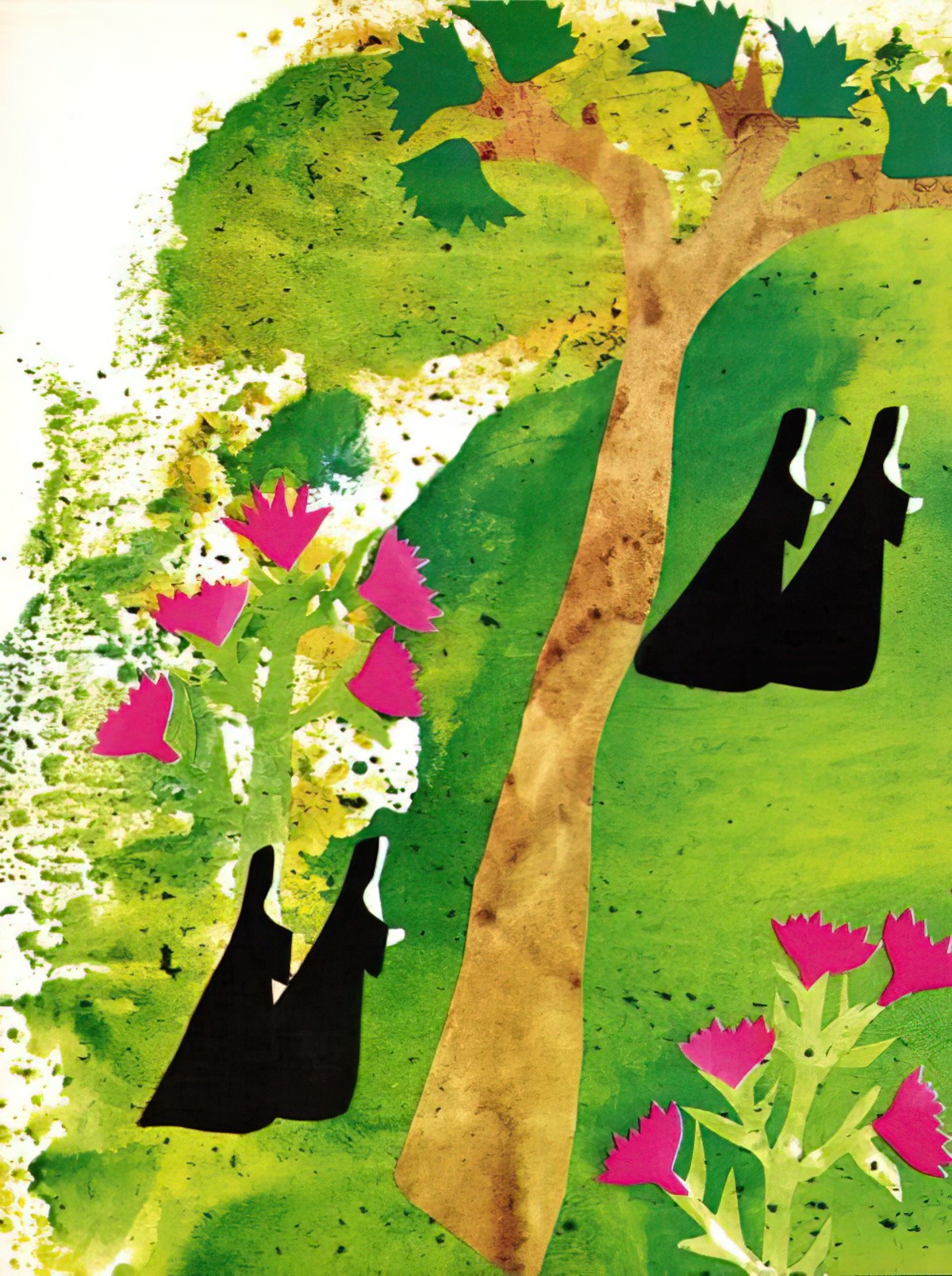
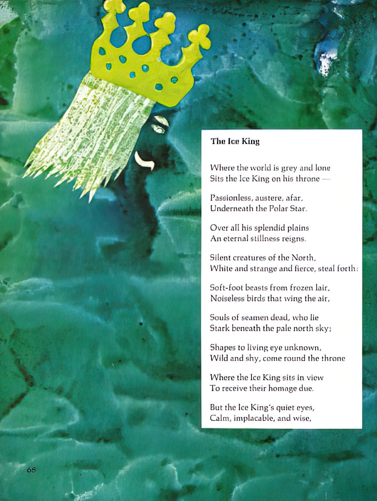
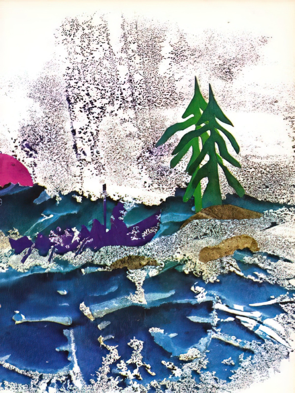
Elizabeth Cleaver (1935-1985)
In 1968 Elizabeth Cleaver (1939-1985) illustrated The Wind Has Wings: Poems From Canada. These illustrations seem to be richly textured dye backgrounds with clear-edged paper shapes glued on for definition and narrative input.
Charles Keeping (1924 – 1988)
Keeping’s illustrations for Alfie and the Ferryboat were highly experimental at the time.
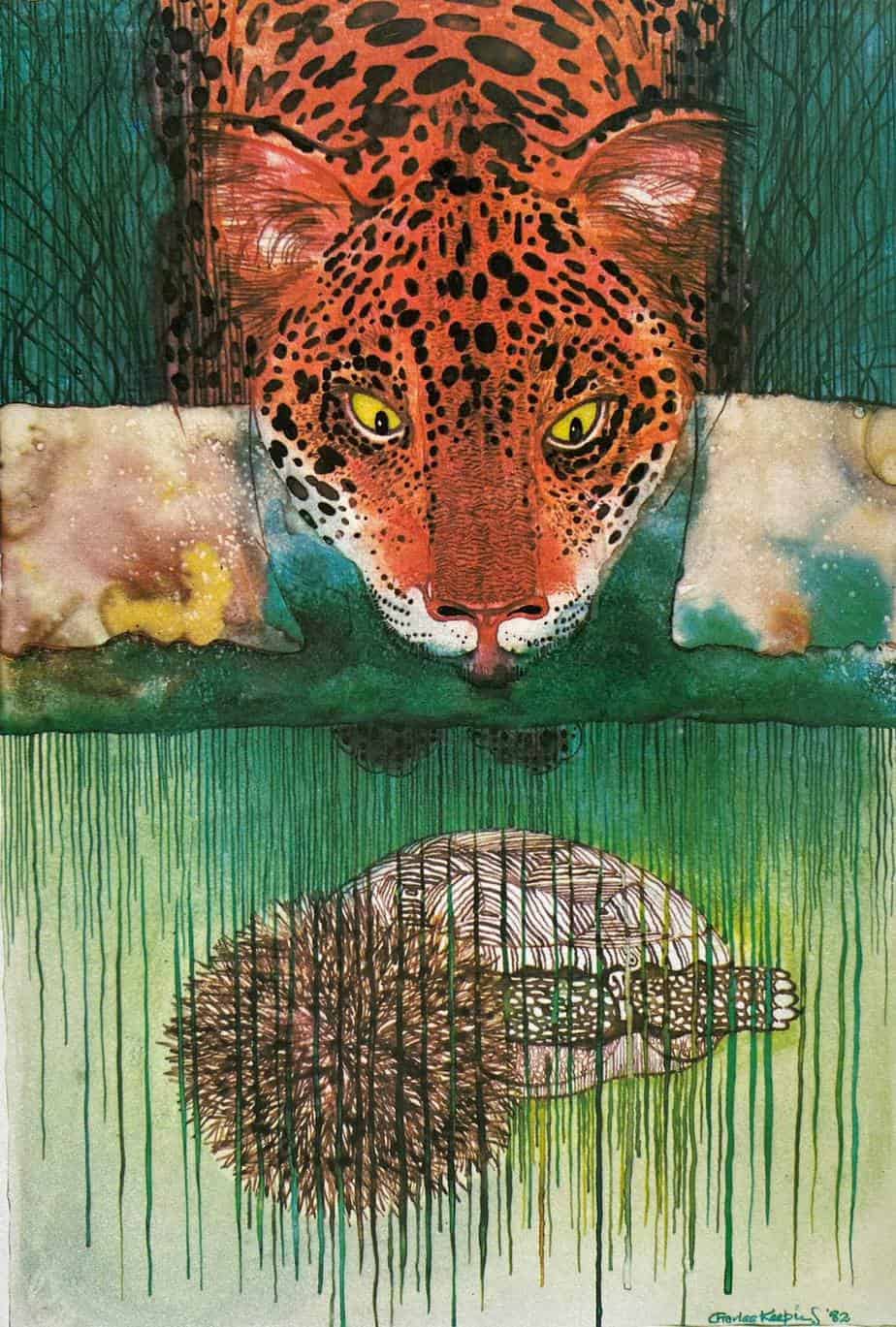
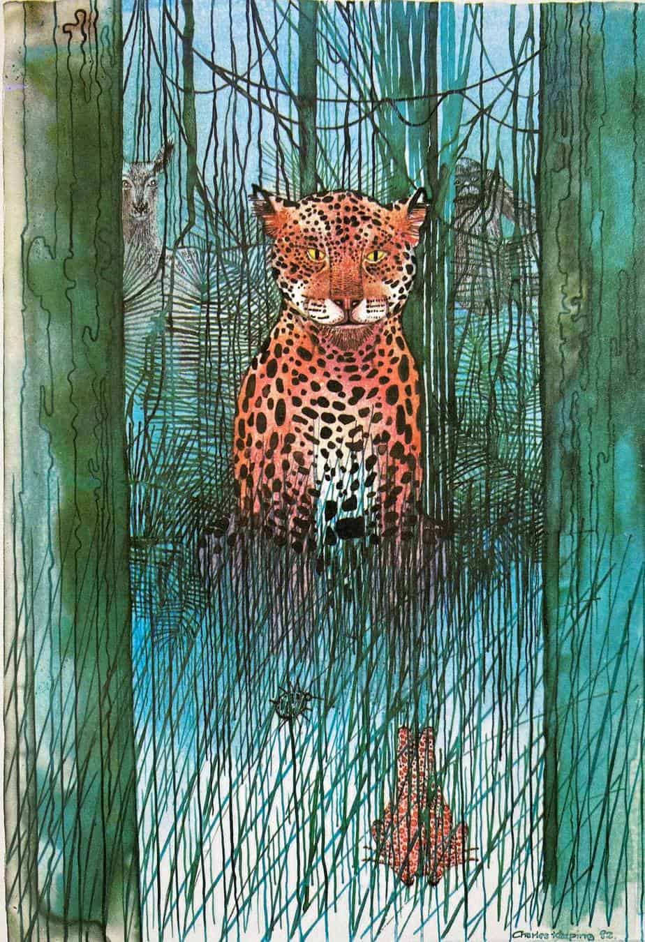
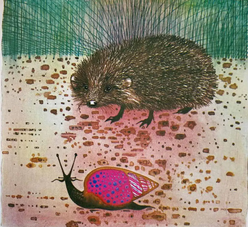
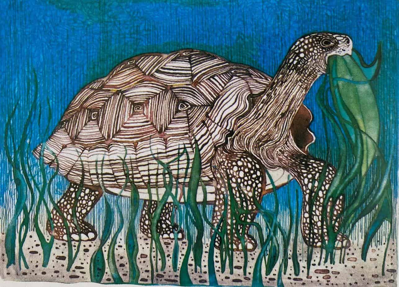
More Charles Keeping illustration (not always in this style).
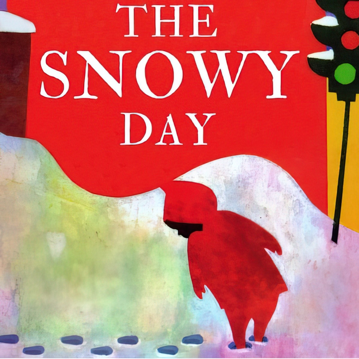
Ezra Jack Keats (1916 – 1983)
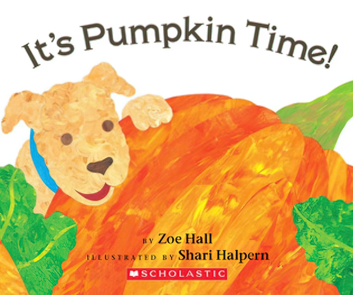
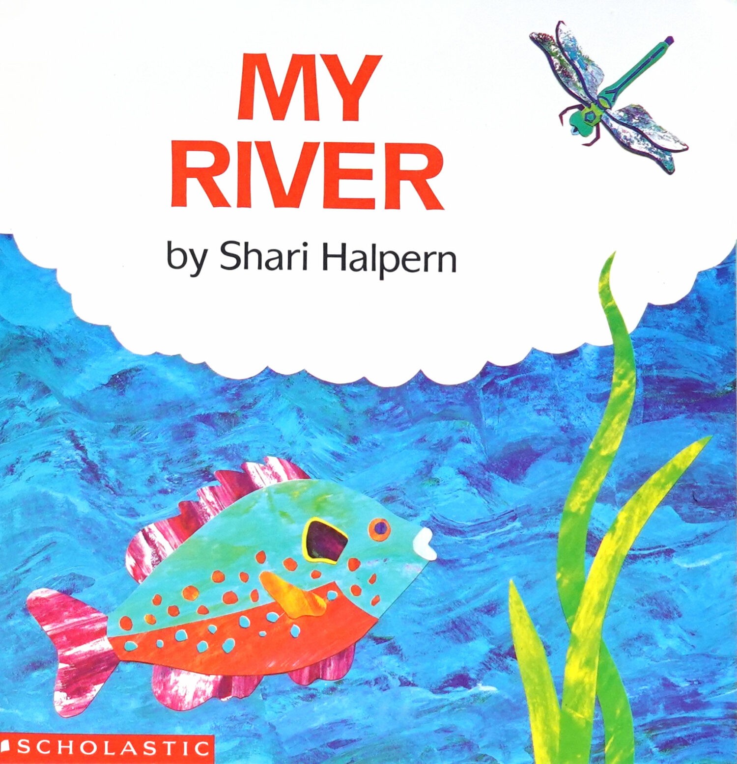
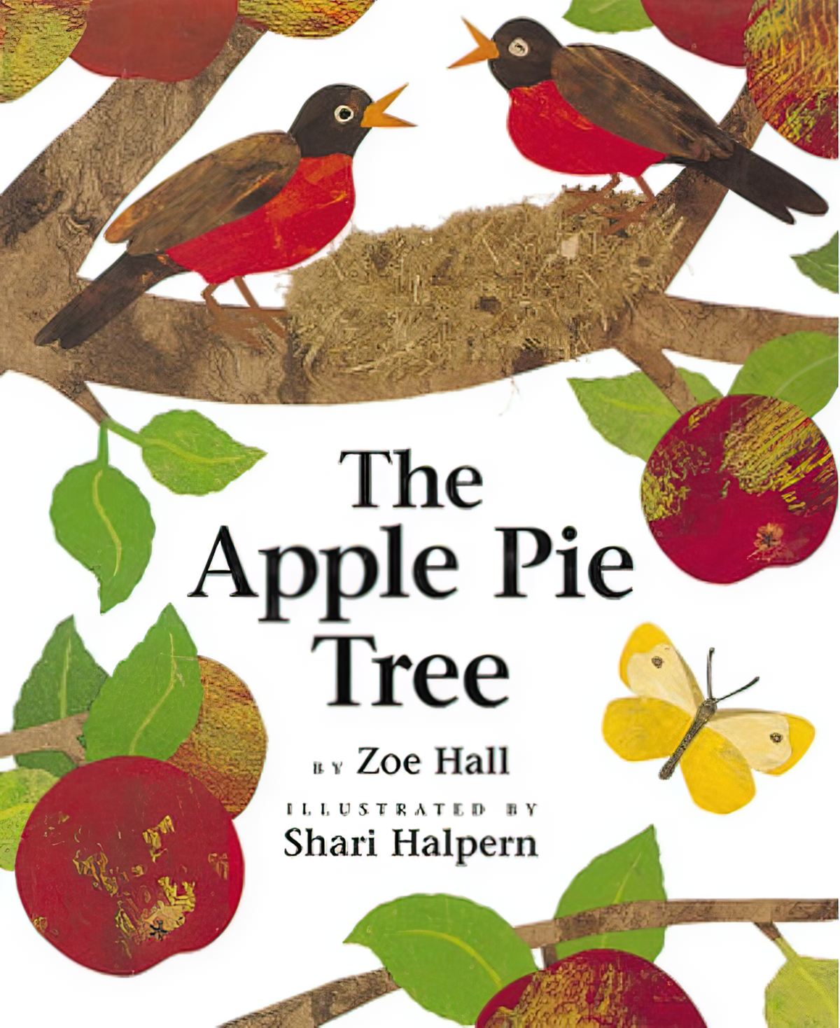
Shari Halpern
Shari Halpern, a graduate of the Rhode Island School of Design, illustrates children’s books using collage and gouache.
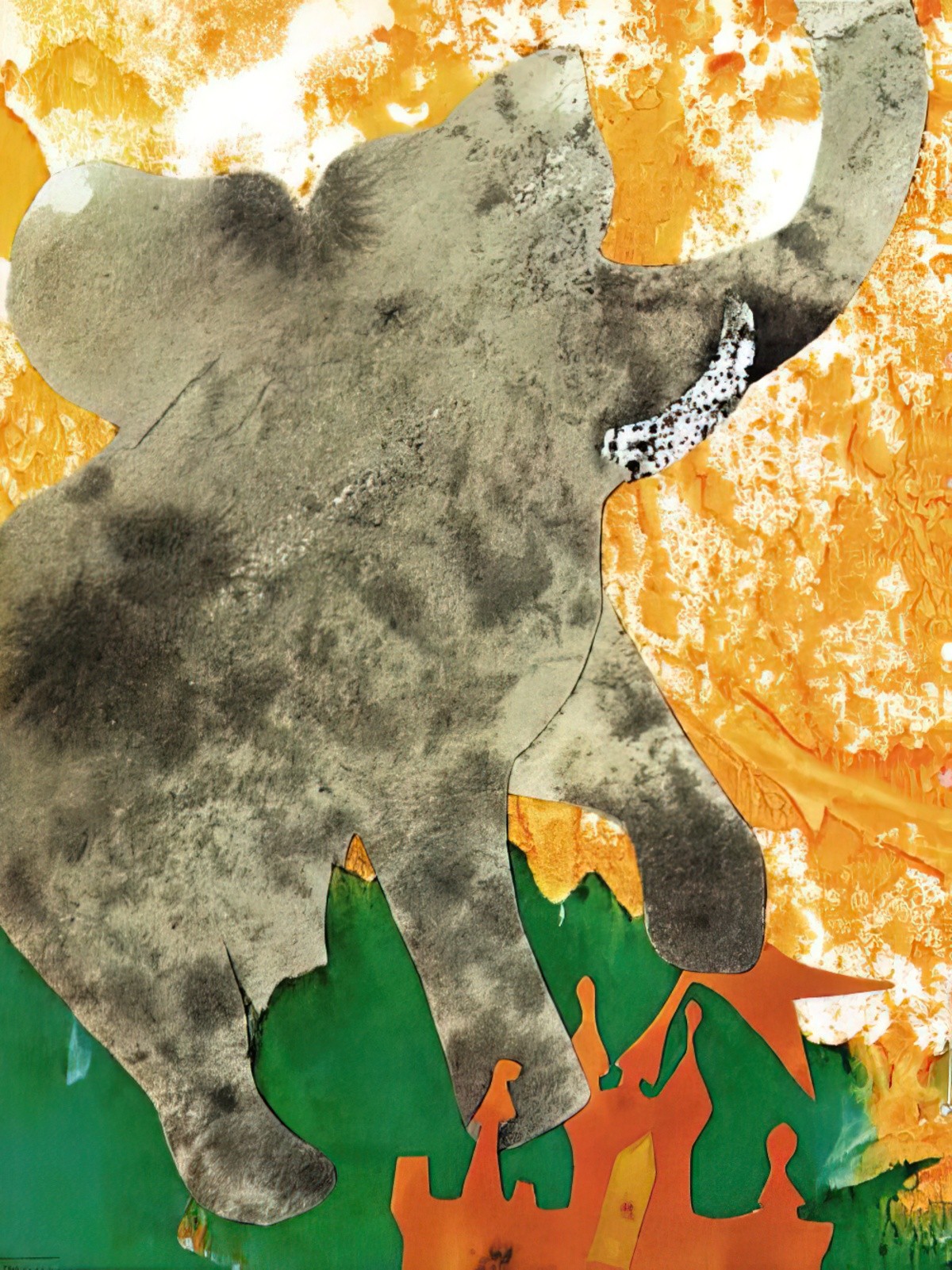
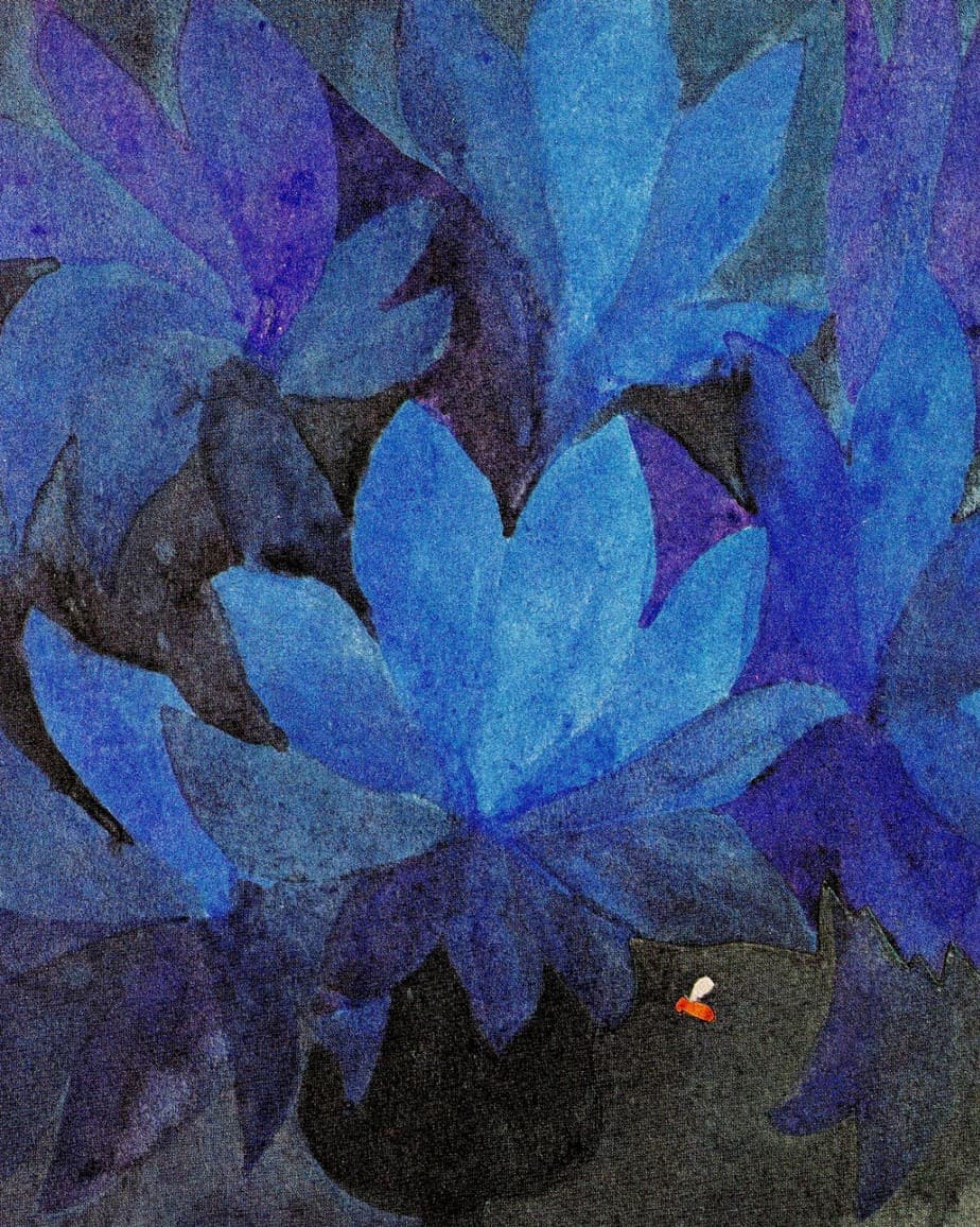
Colette Portal
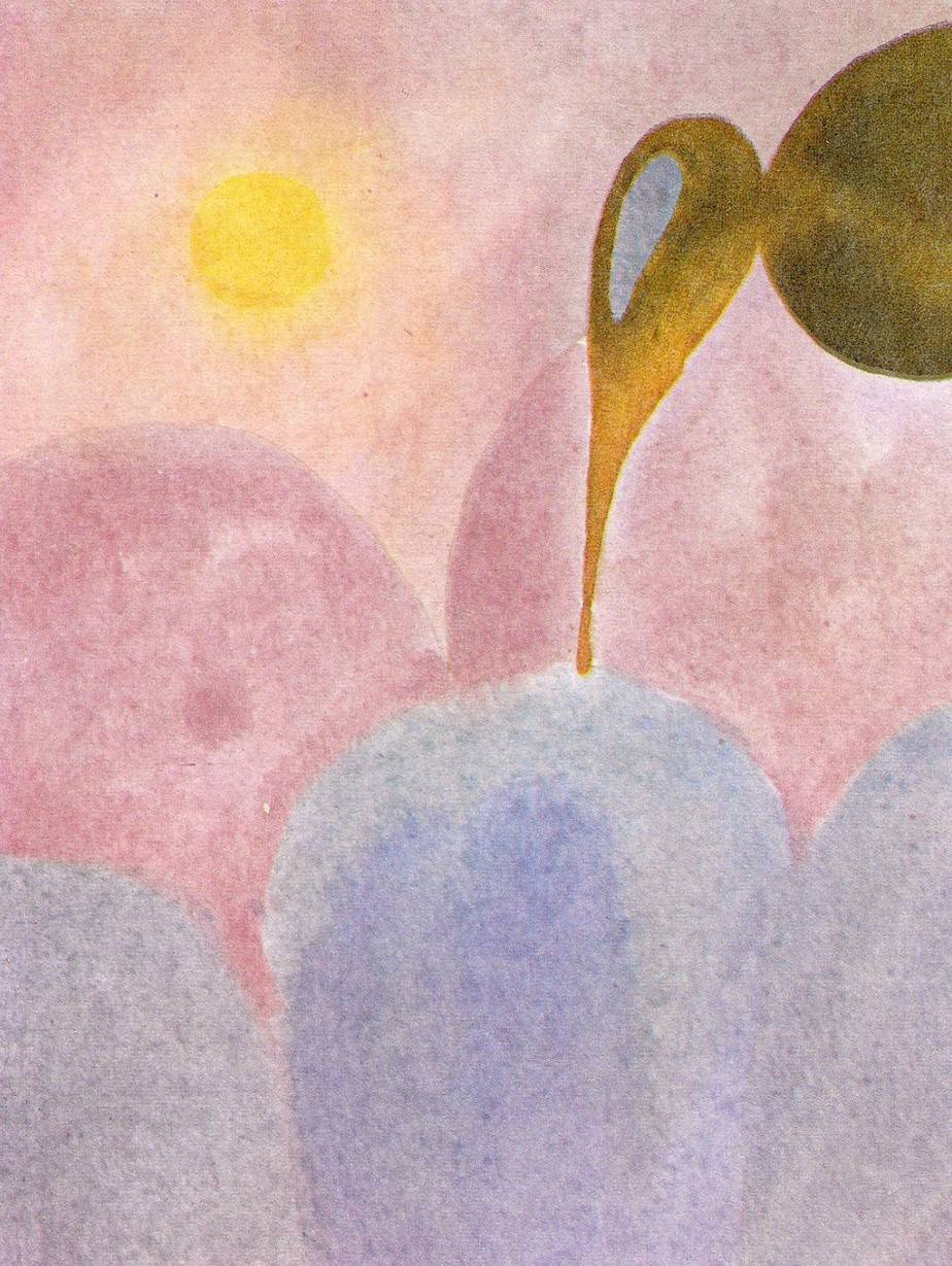
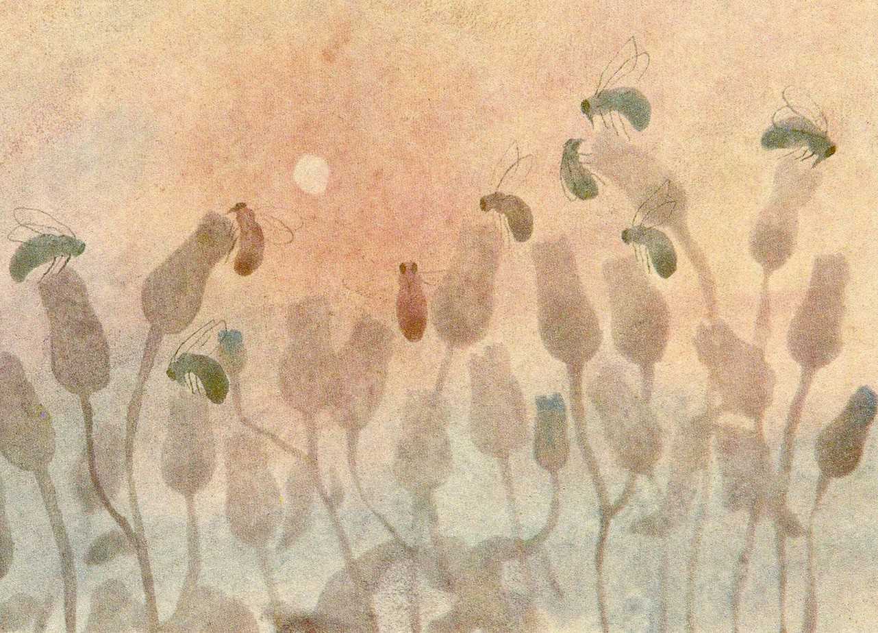
Colette Portal illustrated The Life of a Queen (1964), Nature Alive: In Words and Pictures, The Beauty of Birth and The First Cry.
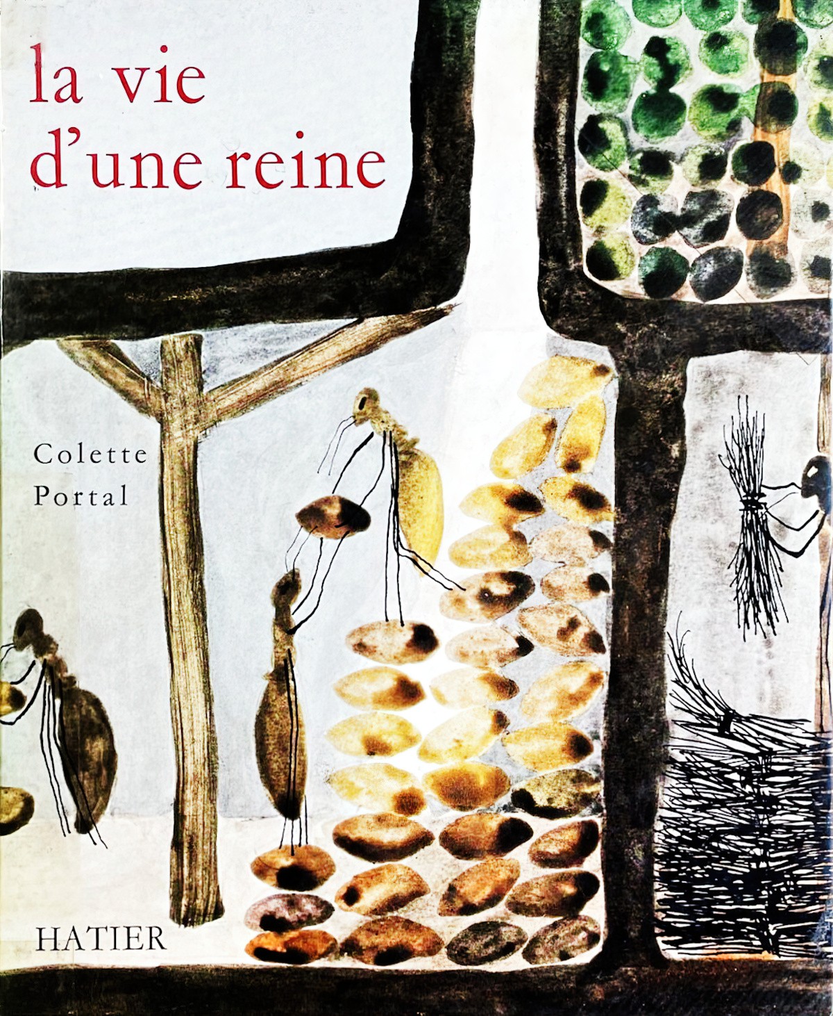
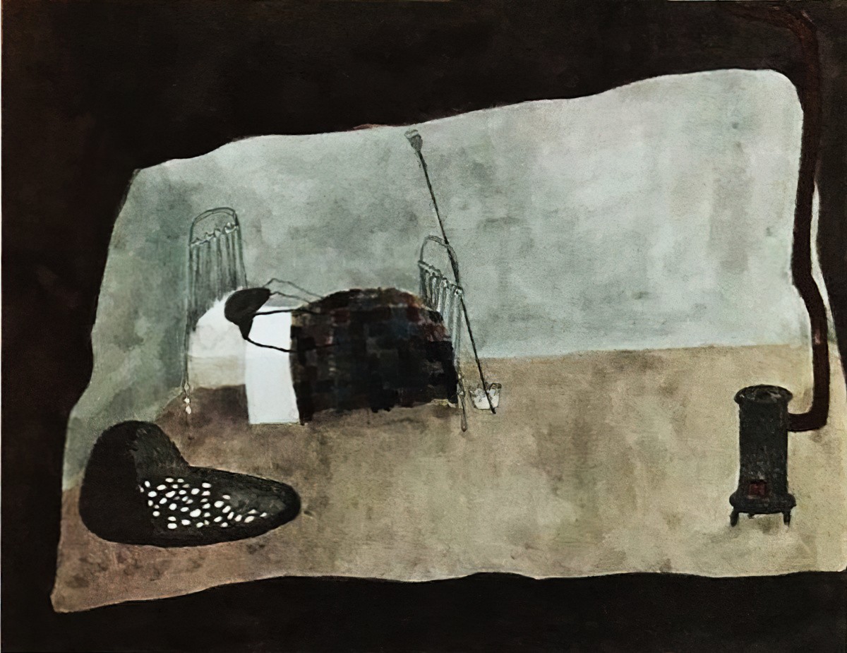
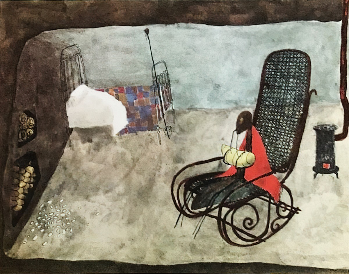
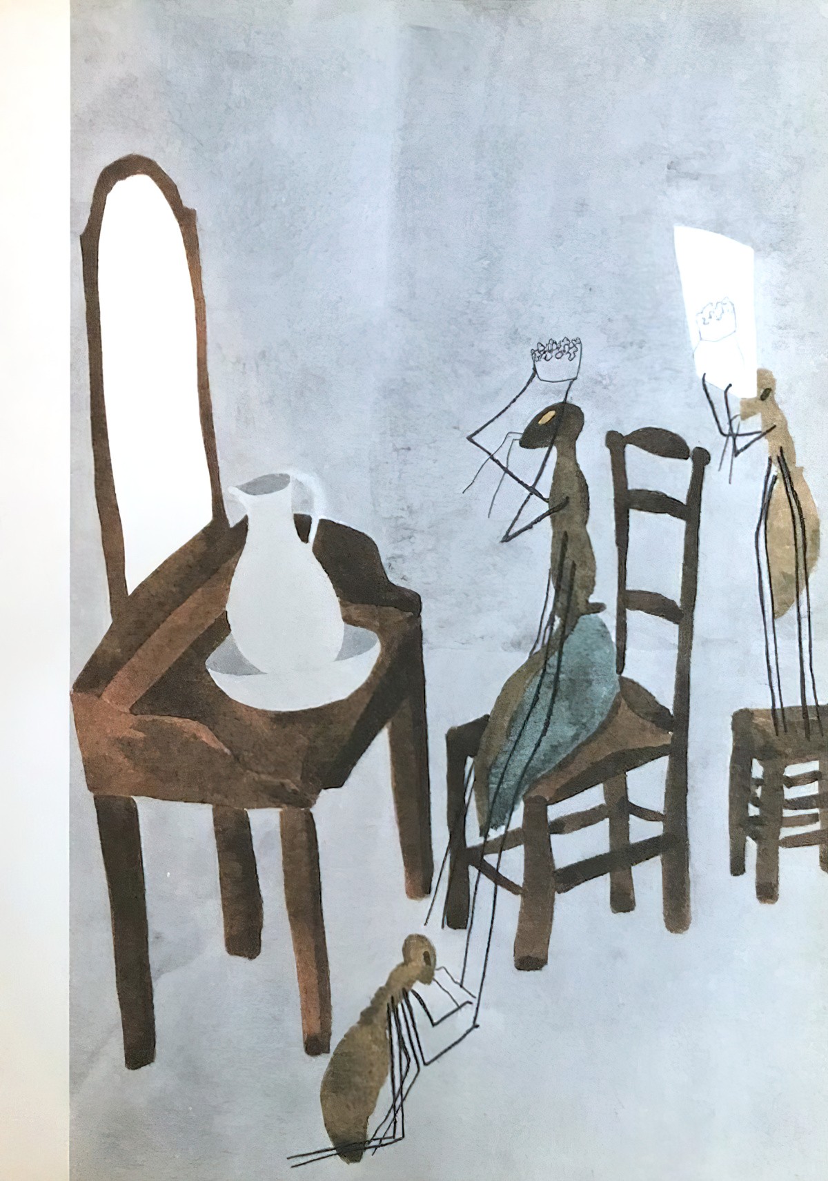
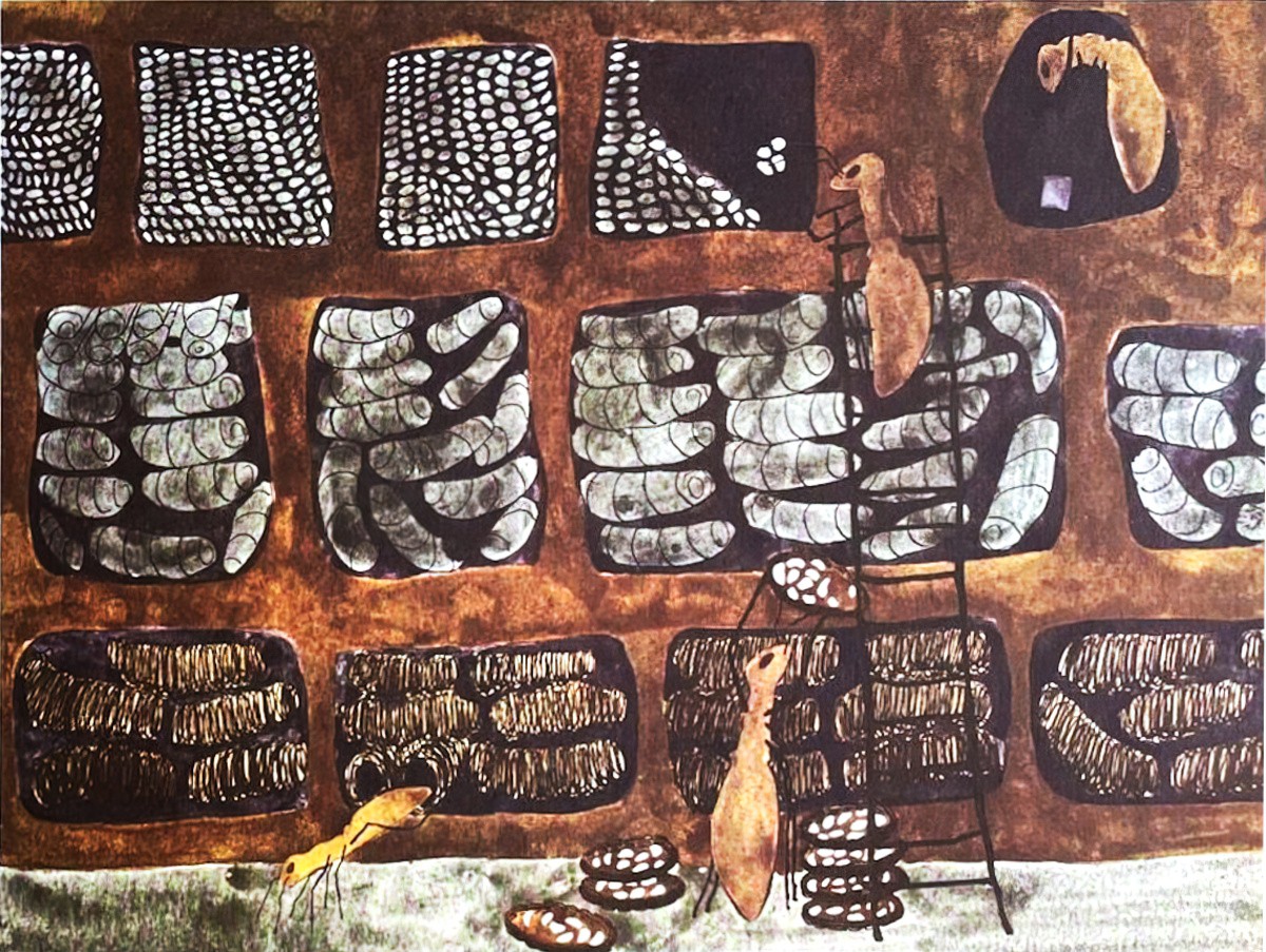
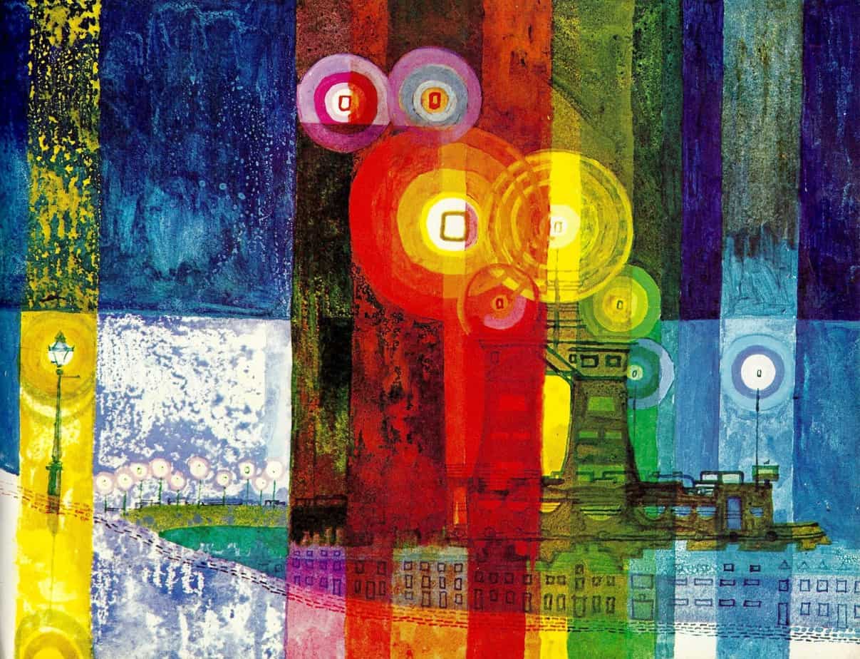
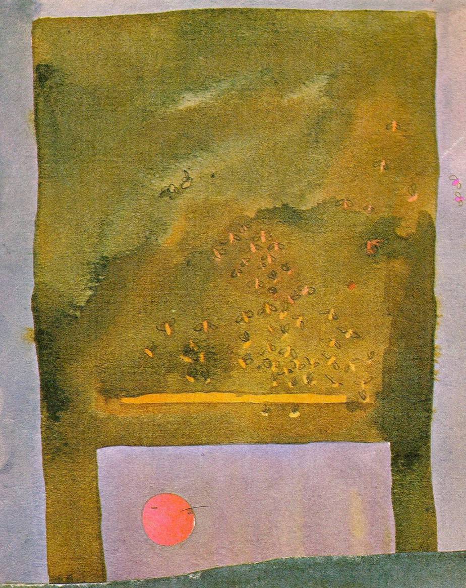
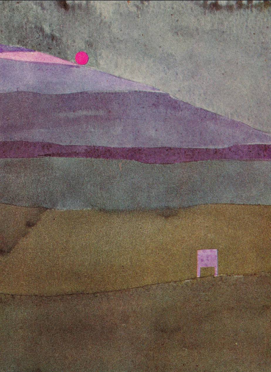
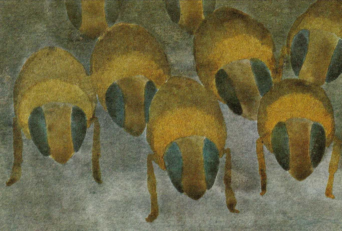
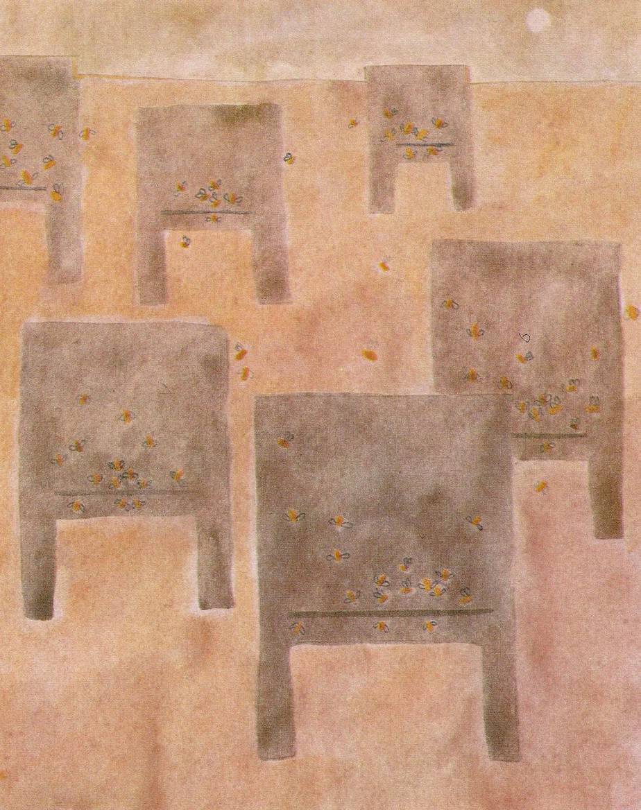
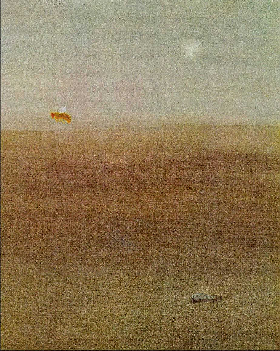
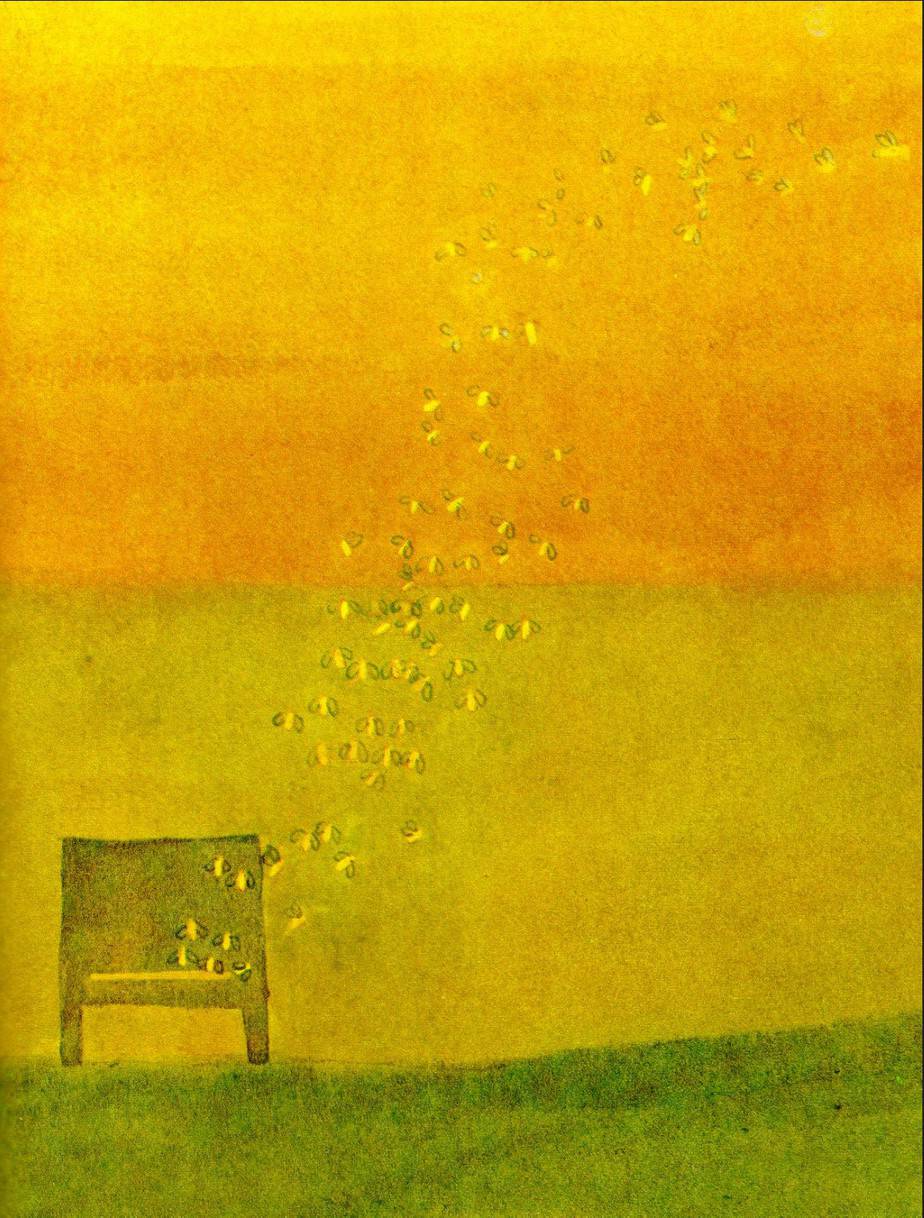
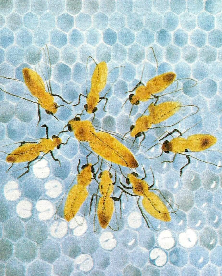
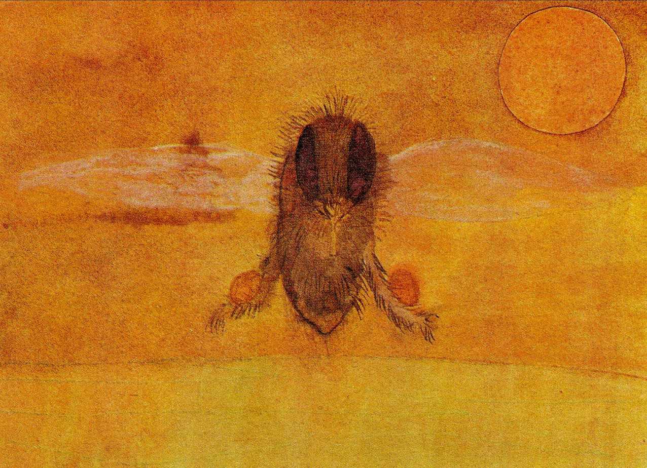
The following illustrations are from a 1967 picture book called The Honeybees written by Franklin Russell and illustrated by French artist Colette Portal. (The artist’s website.)


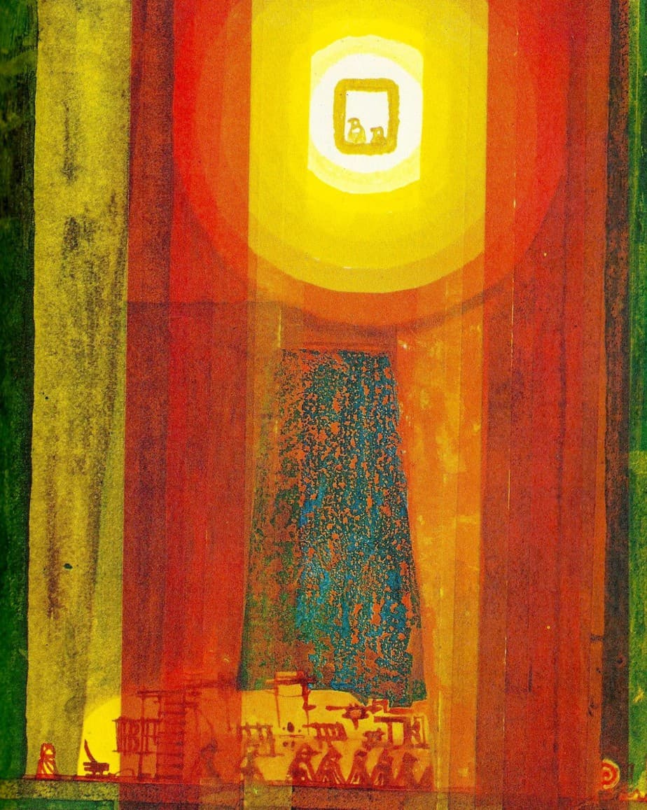
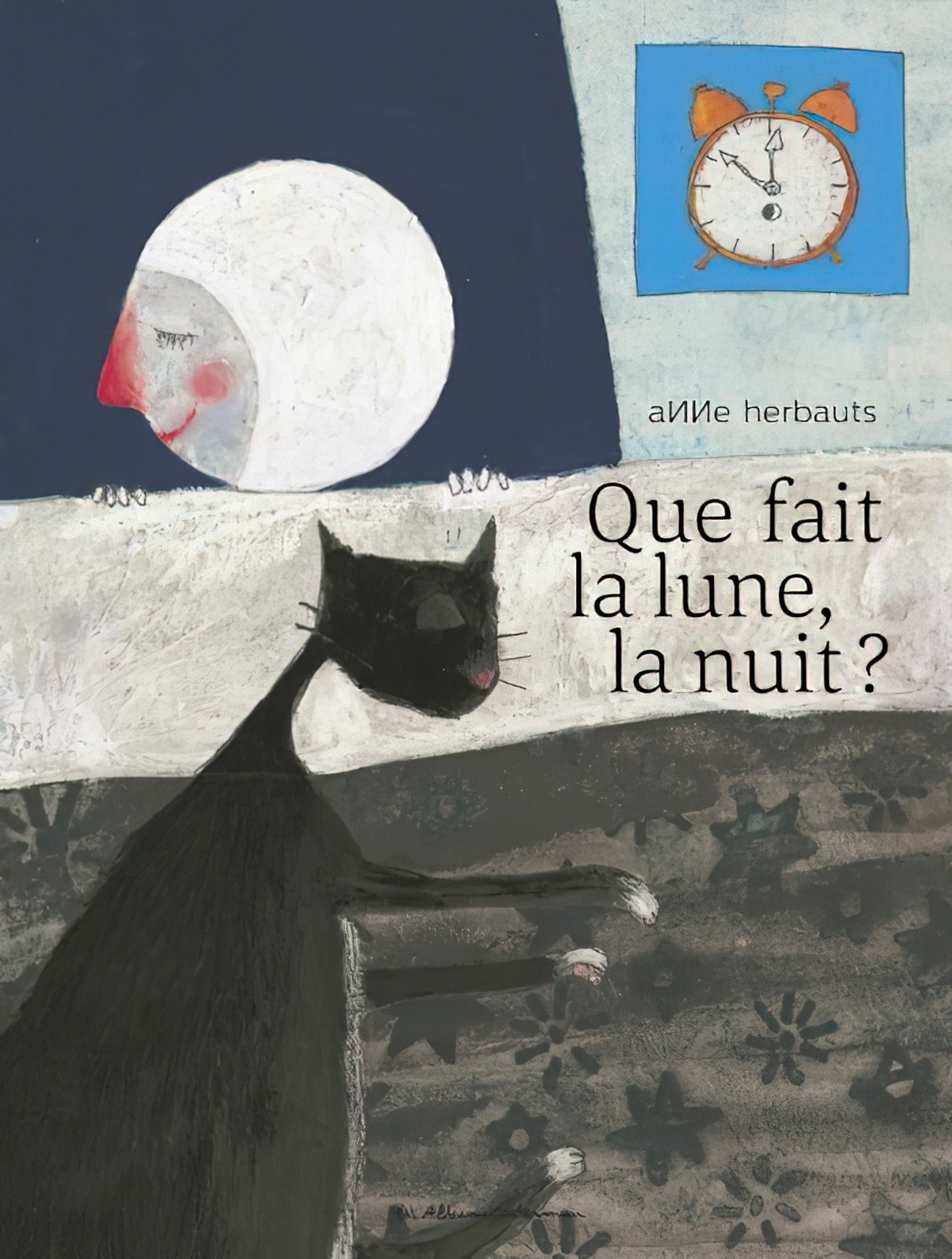
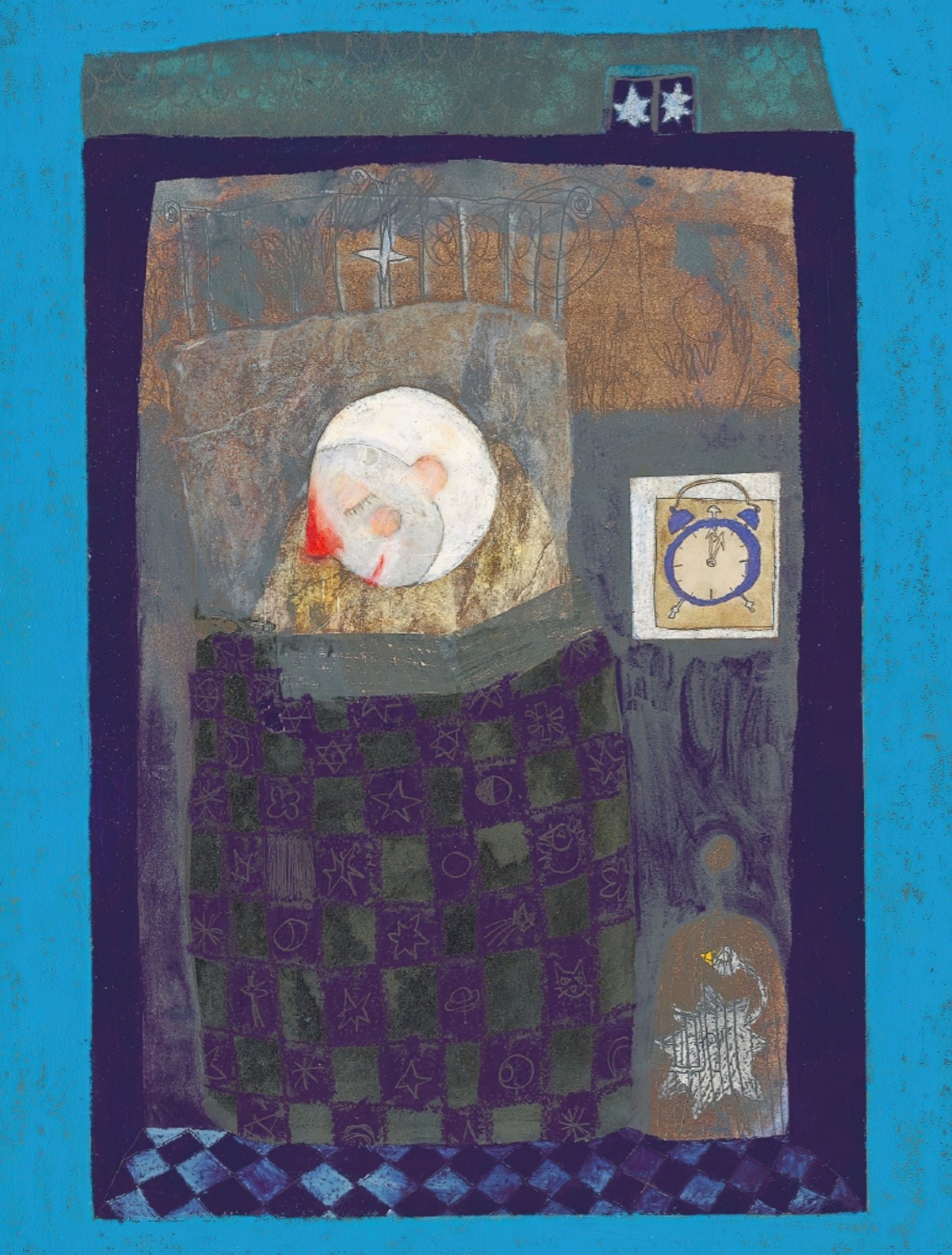
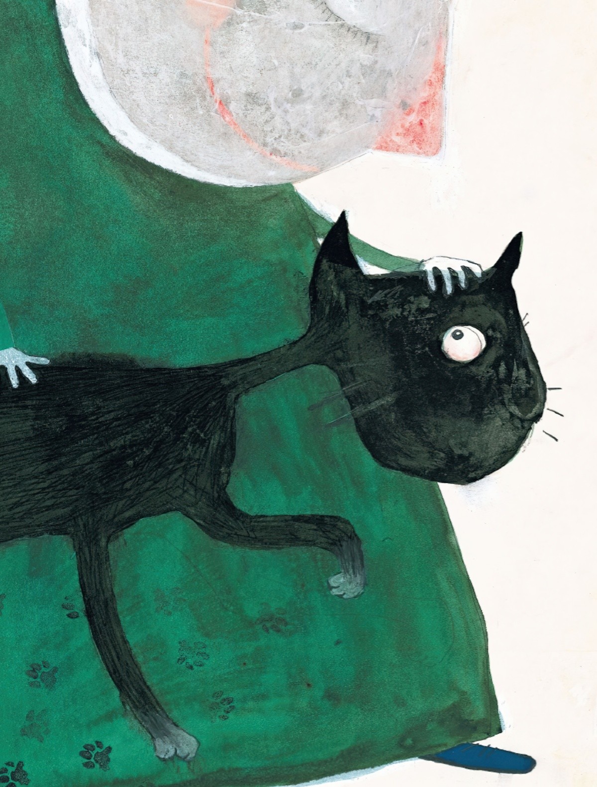
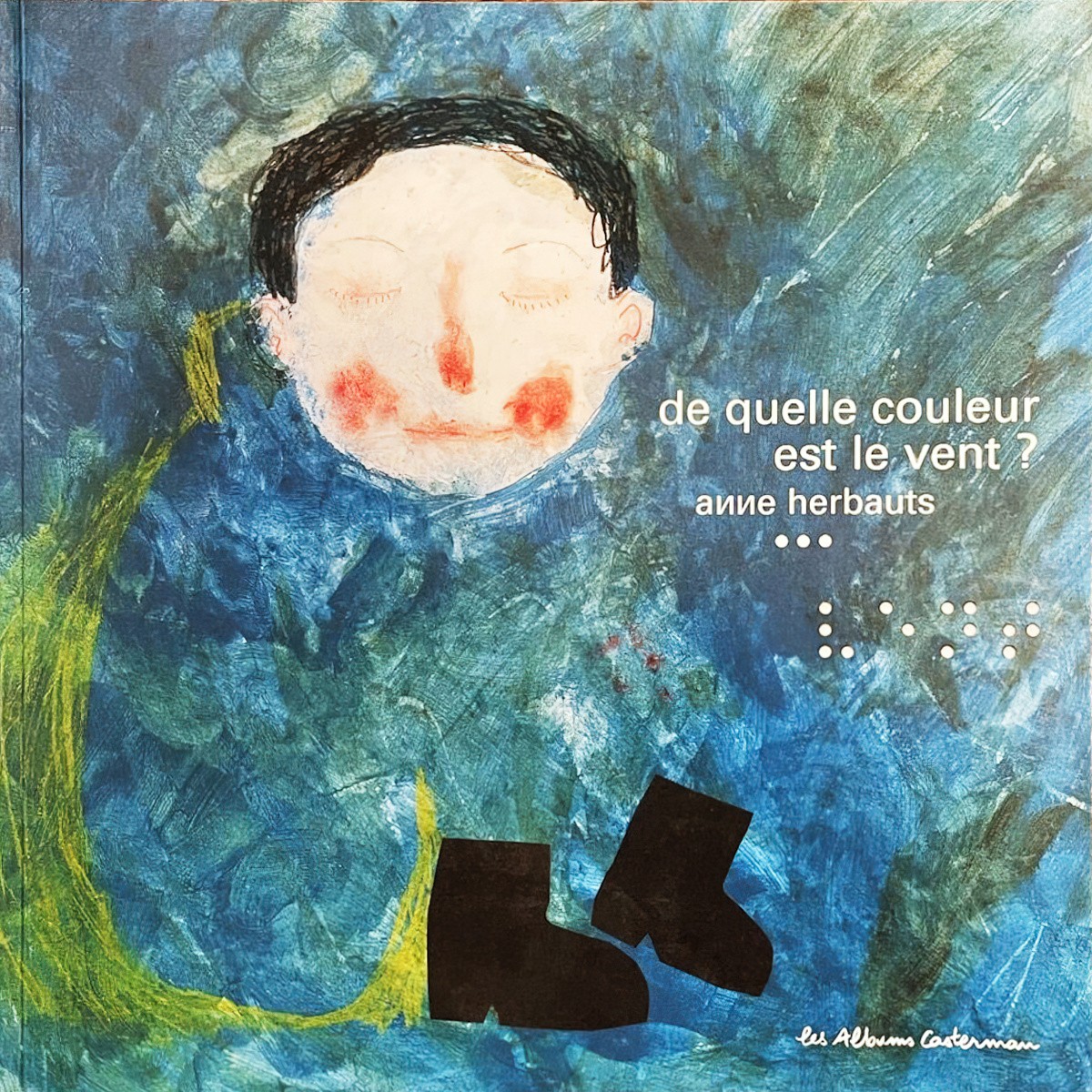
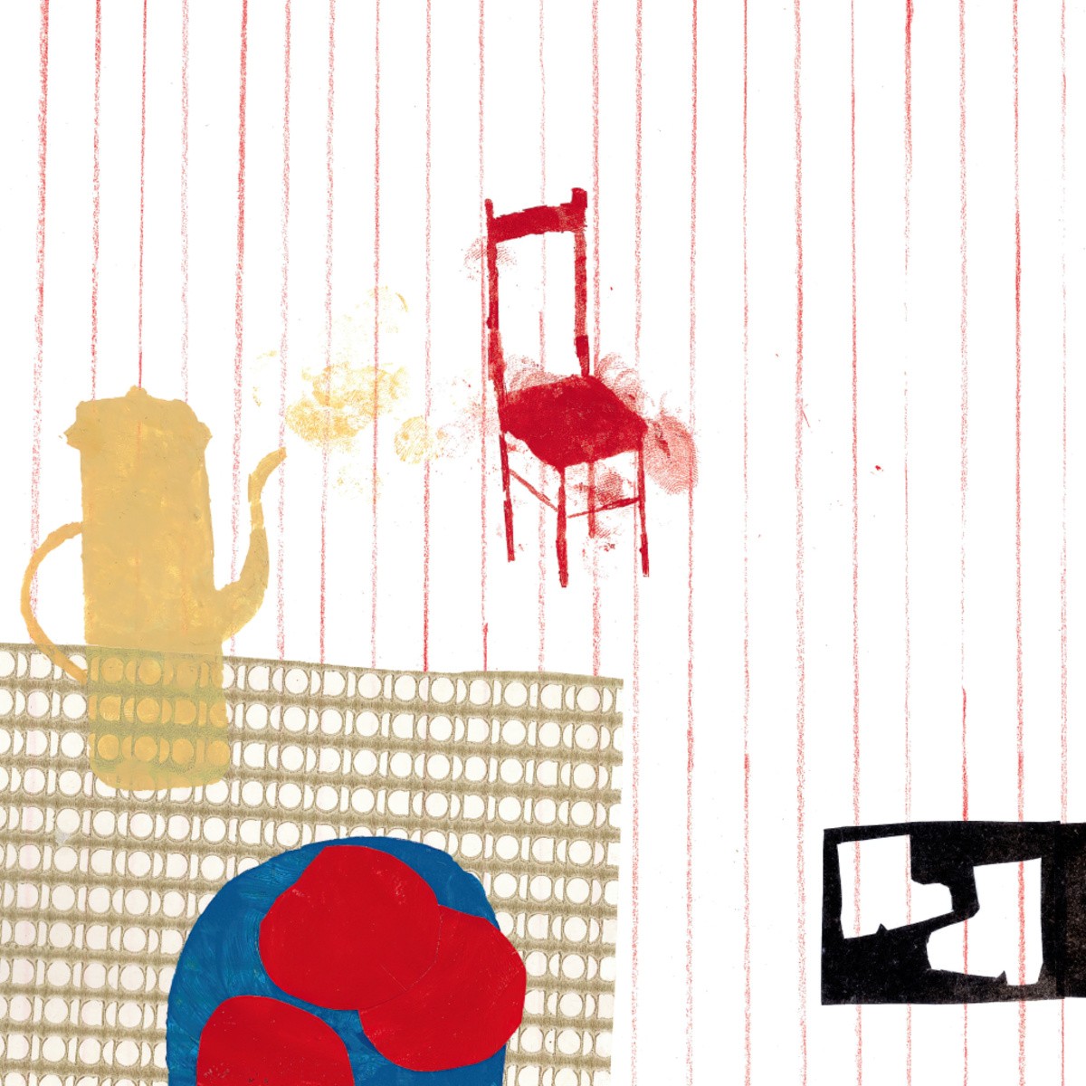
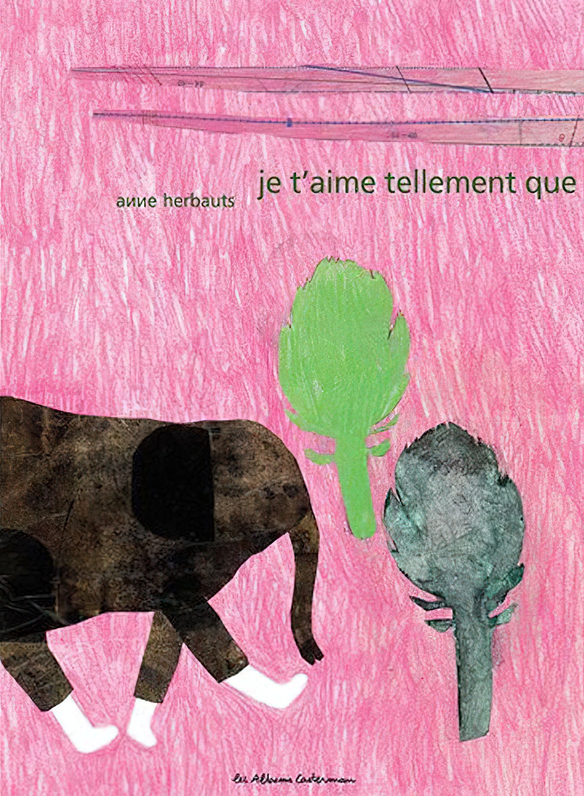
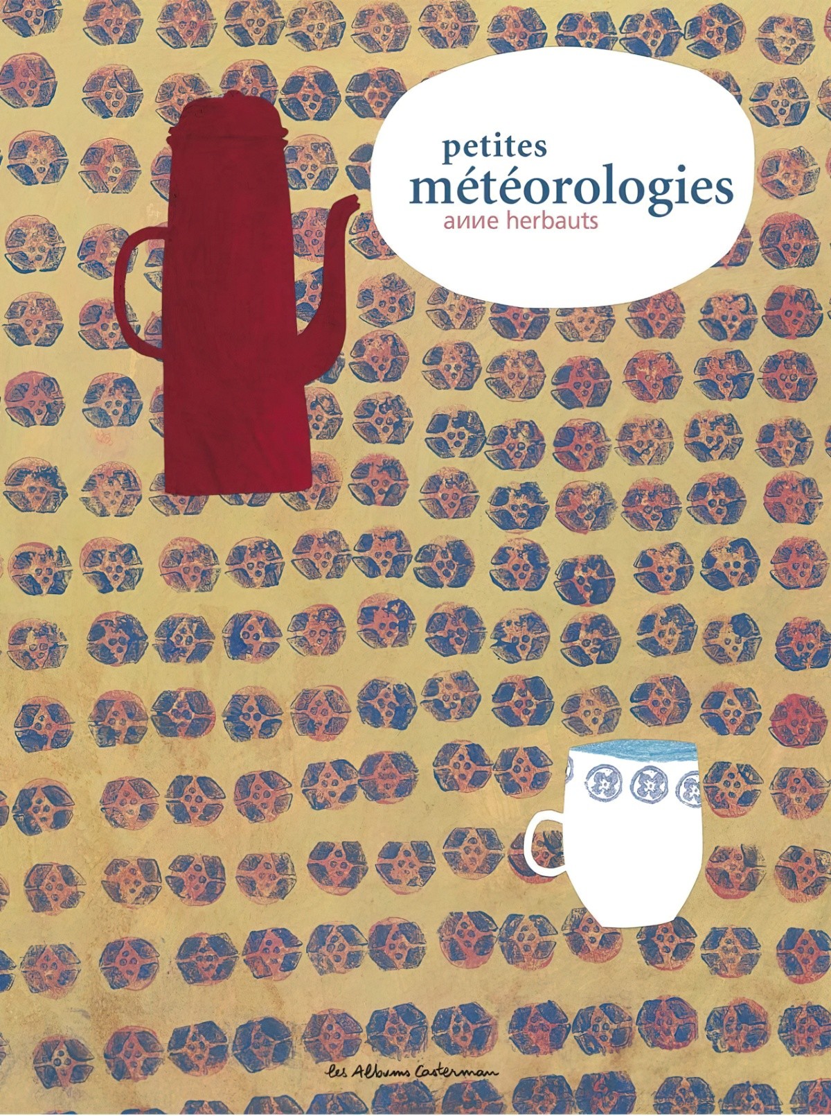
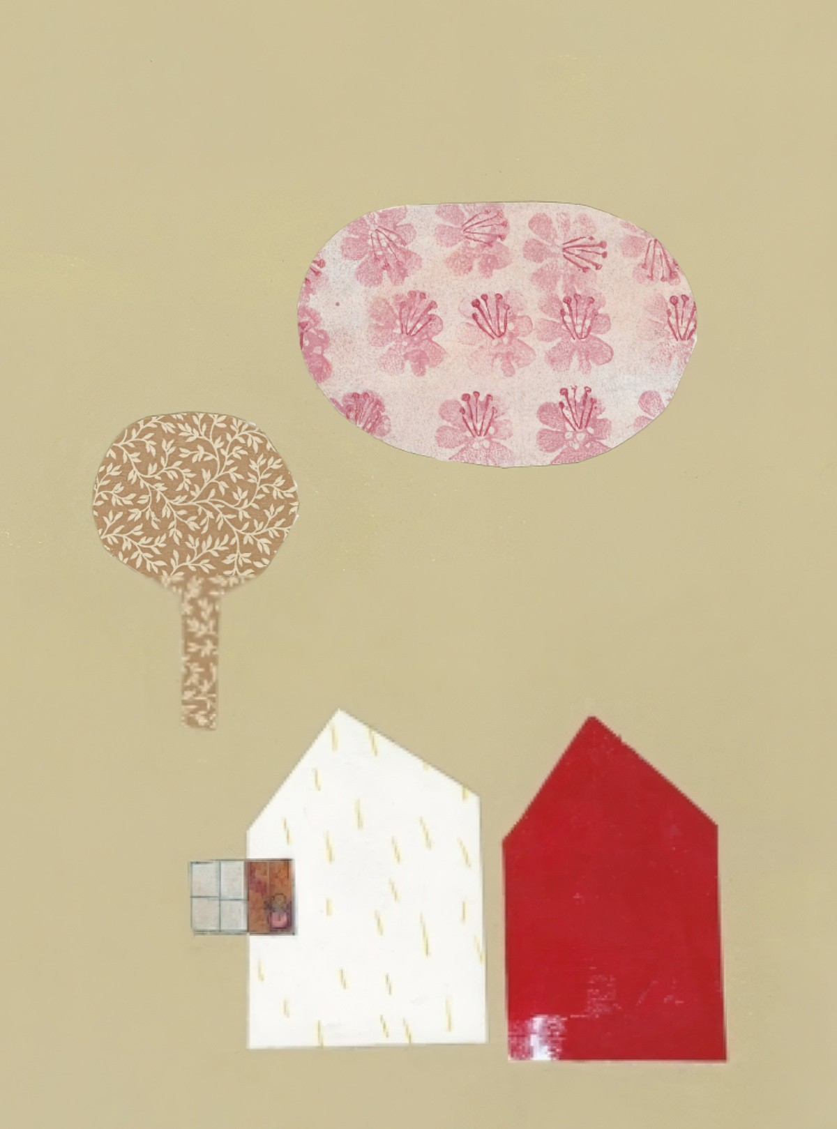
Anne Herbauts
Anne Herbauts is a contemporary illustrator who works with watercolour-type medium as well as coloured pencil. Sometimes she utilises these tools to make collage. Her subject matter and colour palette can be a little darker than Eric Carle’s illustrations for pre-schoolers, and may therefore appeal to middle school aged artists.
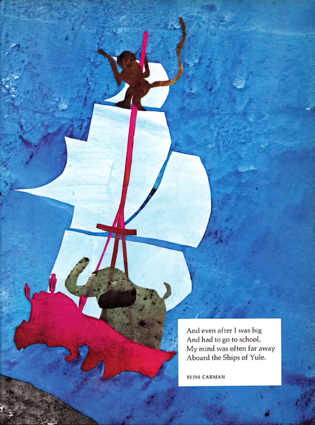
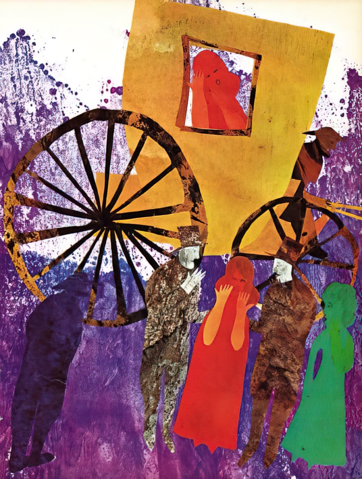
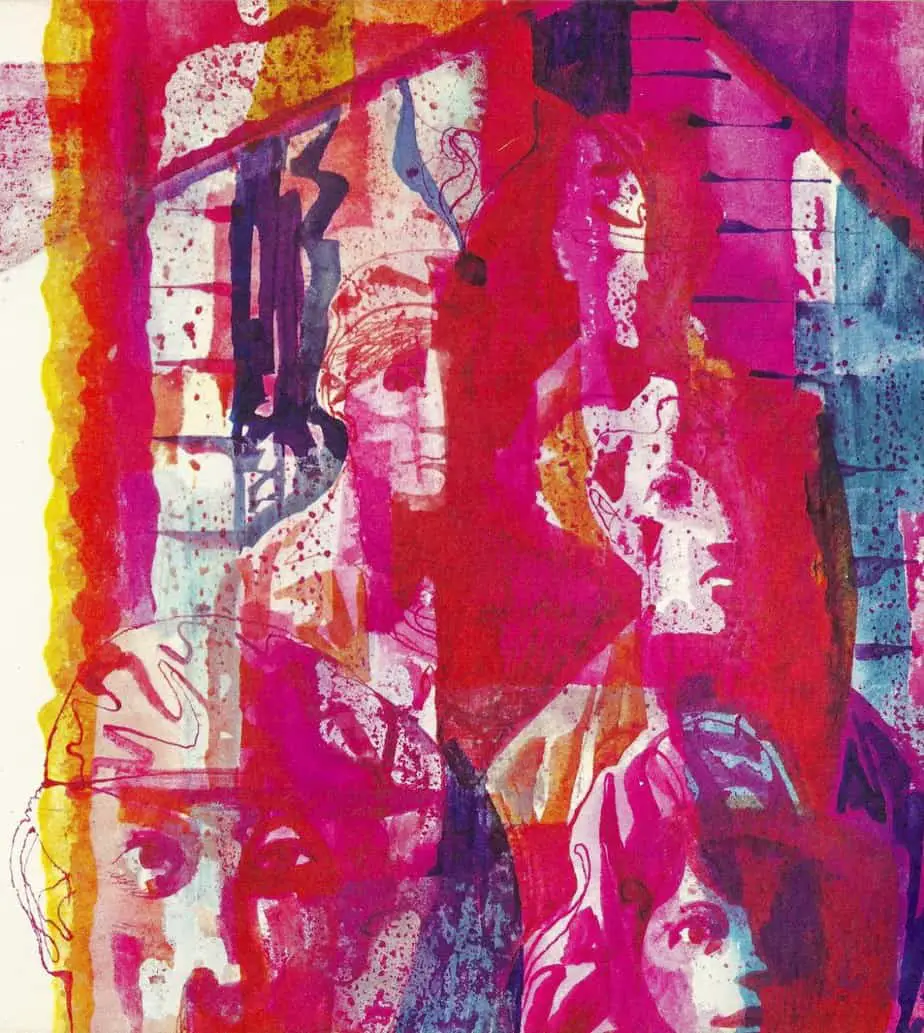
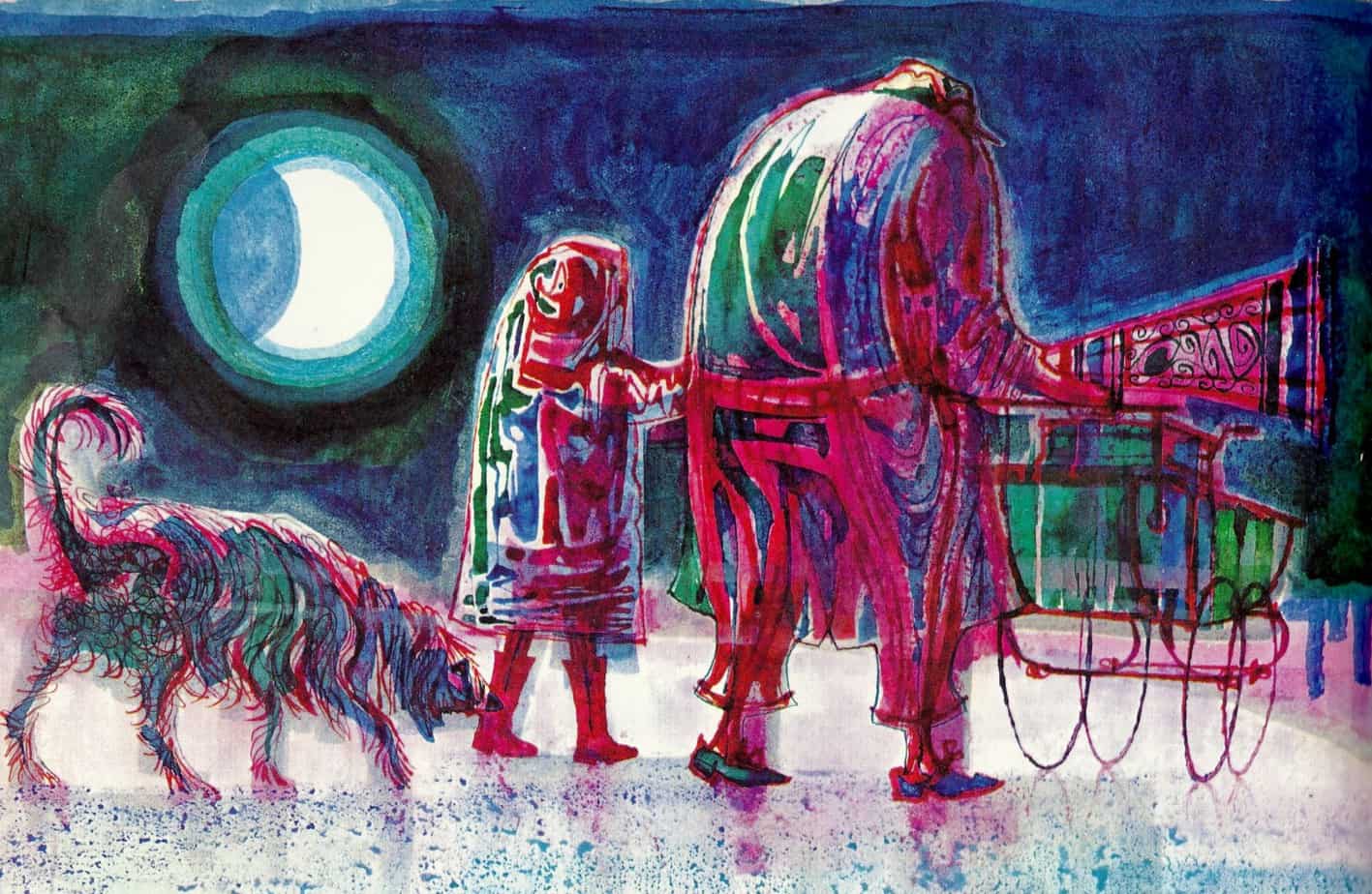
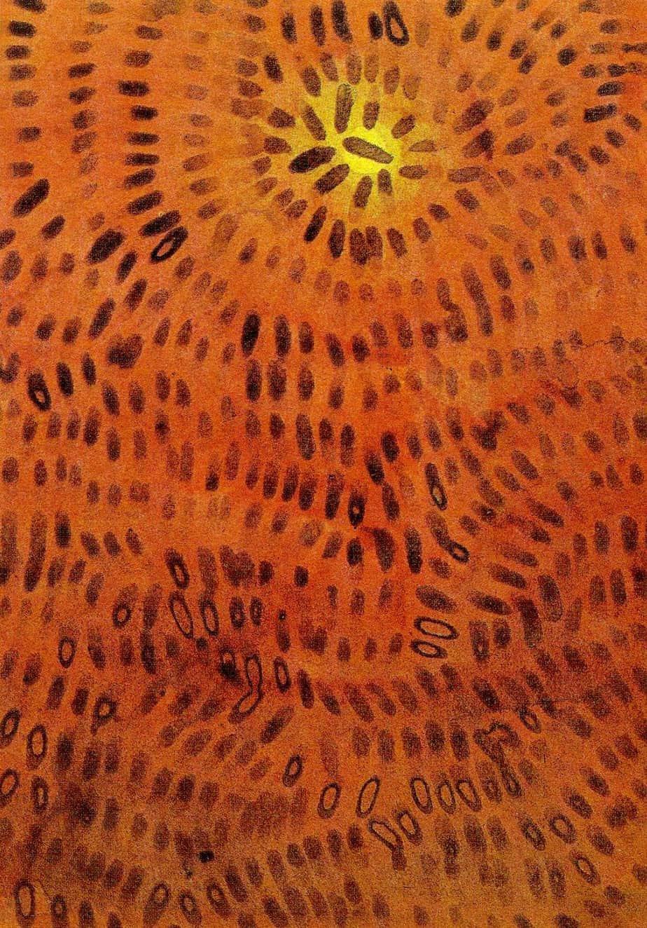
Václav Sivko (1923 – 1974)
Below are less cheery examples from a 1967 Czech children’s book featuring some fantastic collages and illustrations by Václav Sivko.
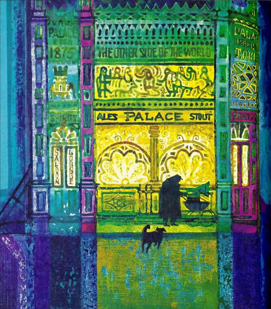
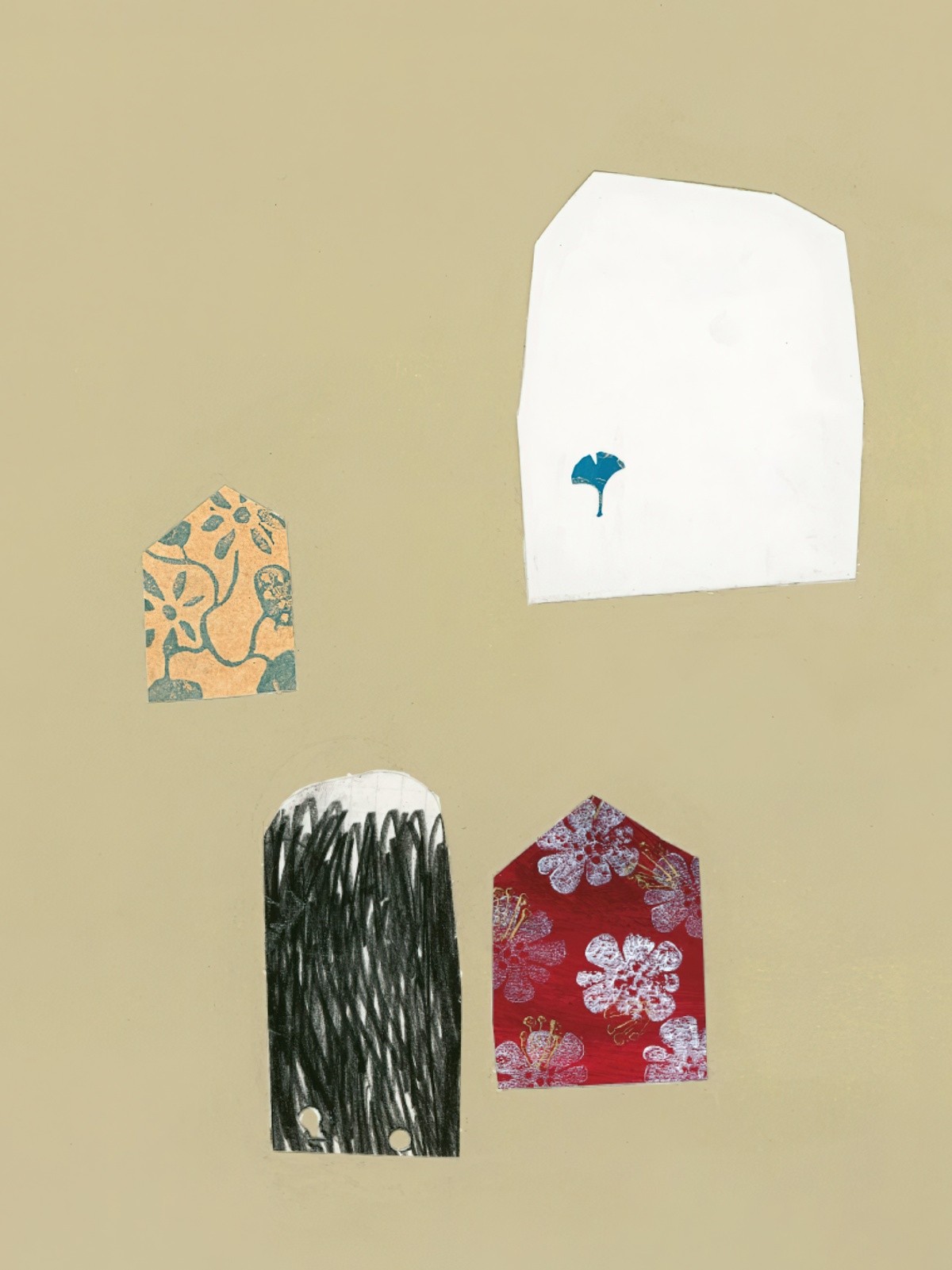
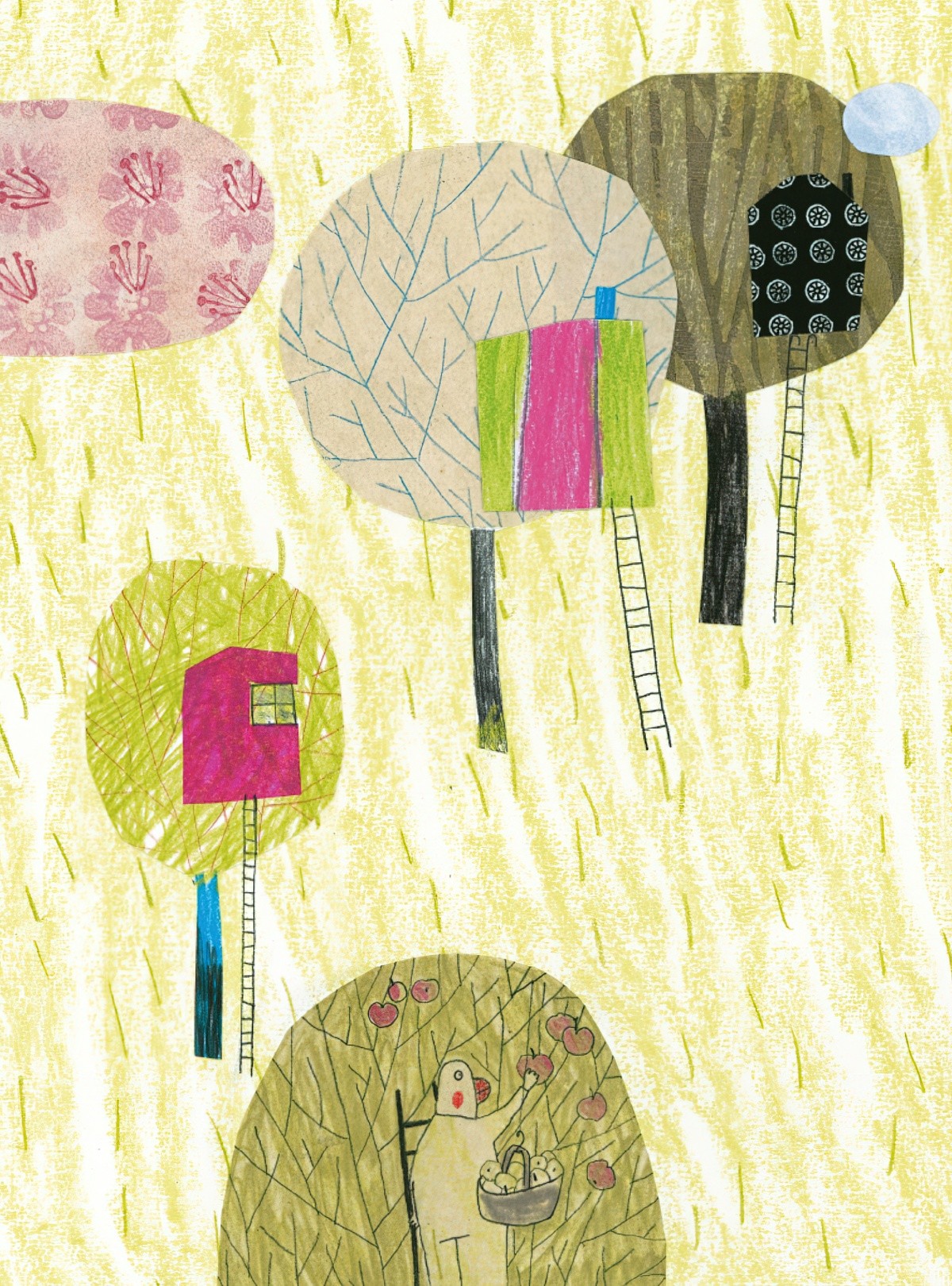
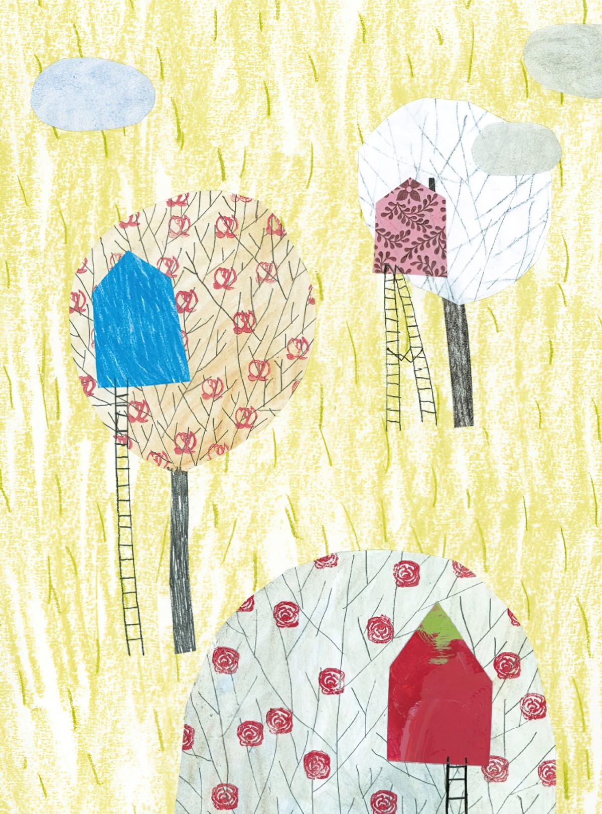
Calef Brown
Calef Brown is a contemporary author and illustrator. His artwork reminds me of a cross between Eric Carle and Jim Flora, who was an influential illustrator of jazz covers.
Calef Brown’s website is here.
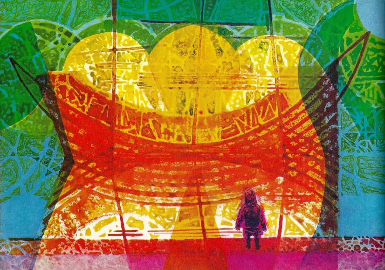
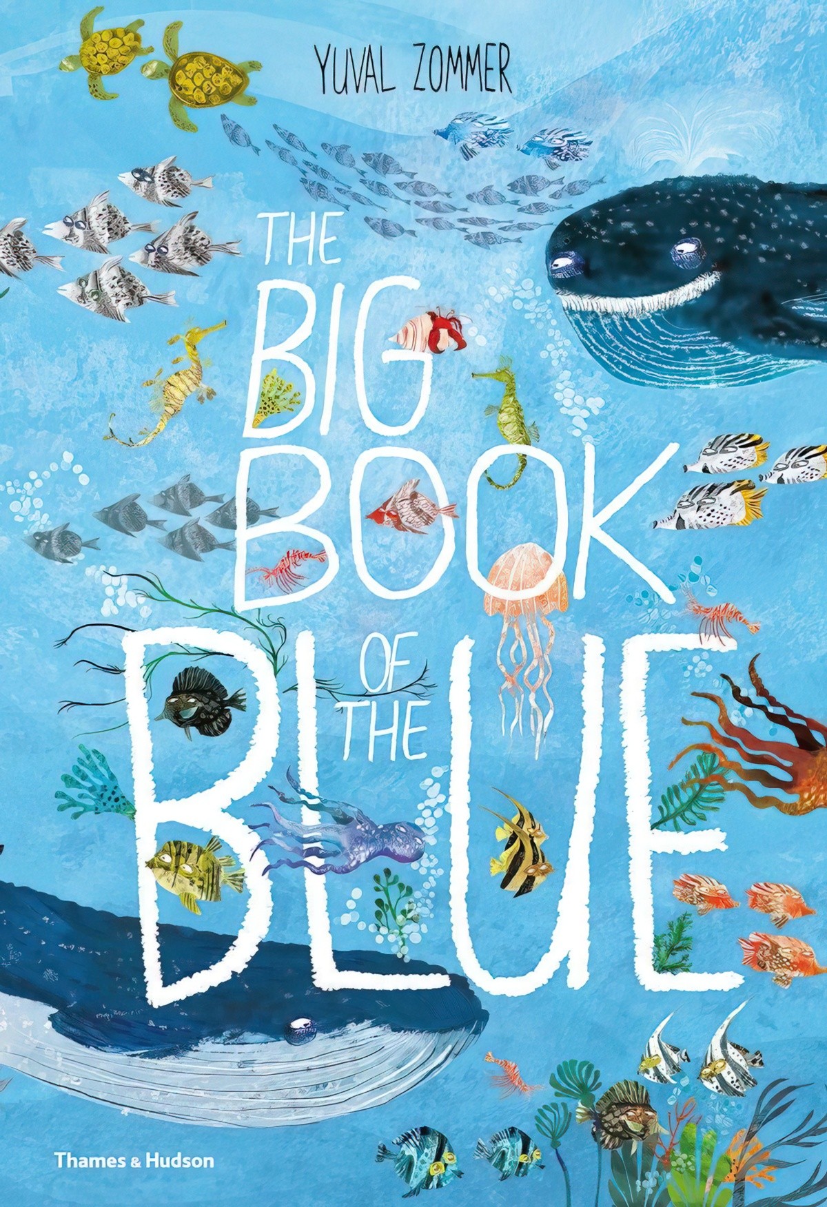
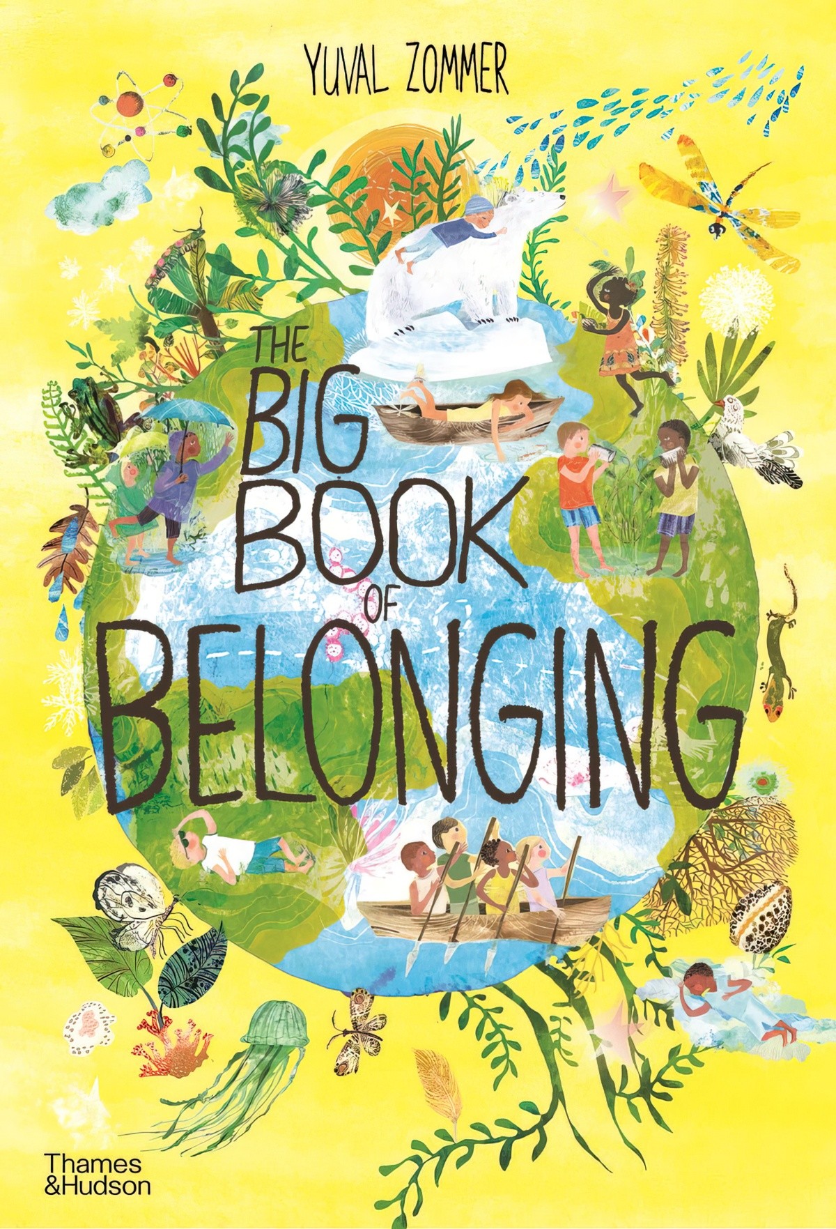
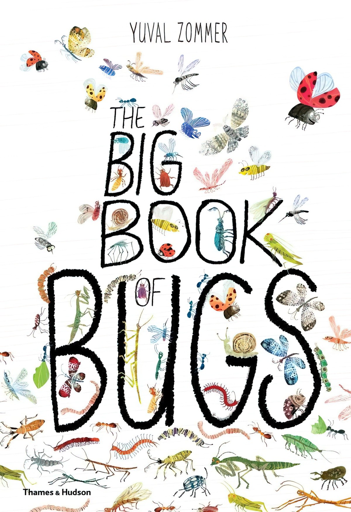
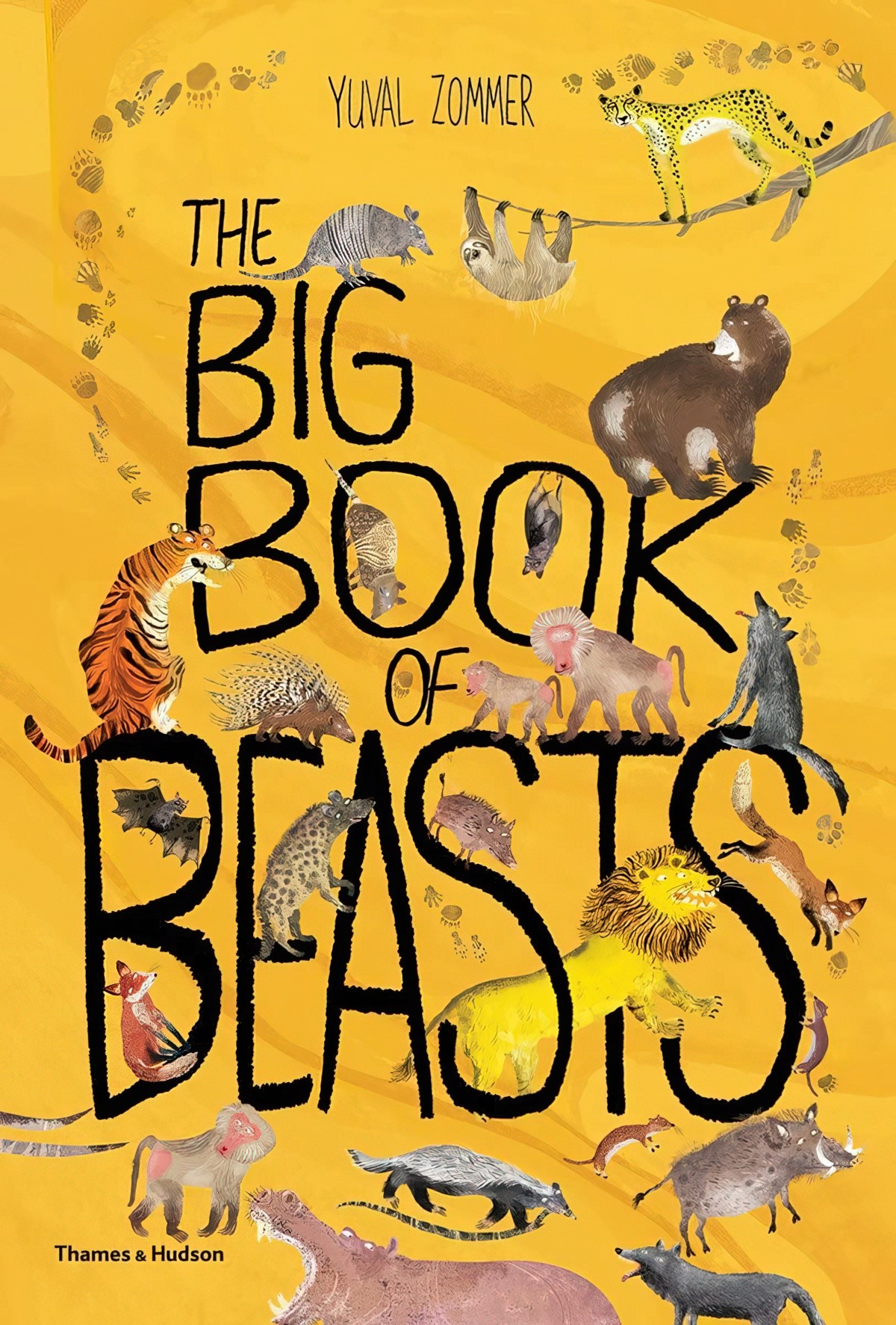
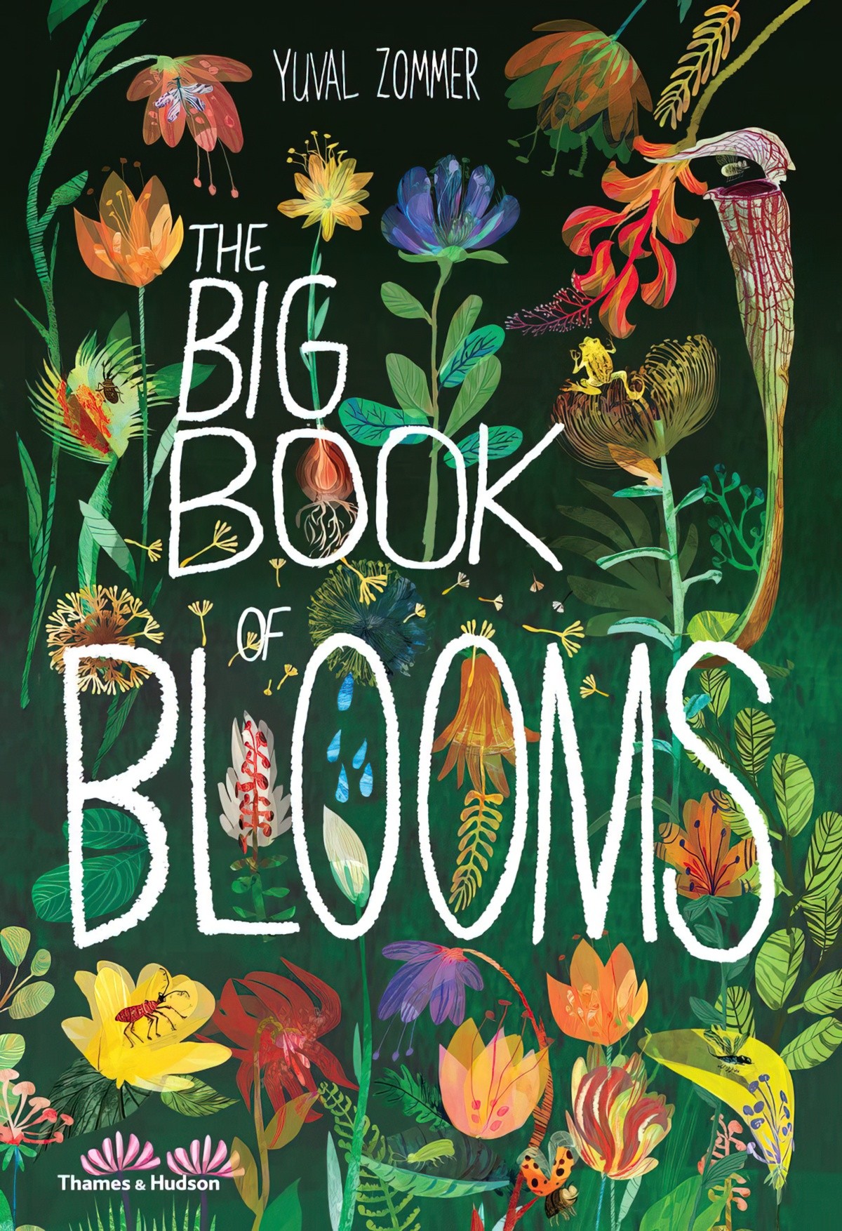
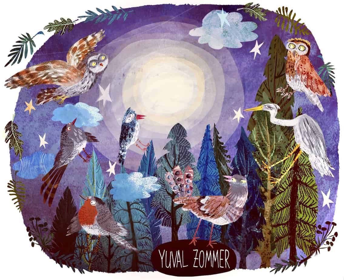
Yuval Zommer
Yuval Zommer is another contemporary illustrator, whose intricate illustrations are probably created quite differently but which nevertheless remind me of Eric Carle. Zommer is known for the ‘Big Book of…’ series.
Brian LaRossa
Brian LaRossa (he/him) is an executive art director in the hardcover picture book group at Scholastic Inc.
David Klein