-
Distorted Houses In Illustration
There’s a style of house, popular in Hallowe’en illustration and in children’s books about witches, which looks distorted and crooked. You know it when you see it. This house is a creepy inversion of The Dream House, so it is always two-storeyed with an attic, and you just know it has a basement as well. Why is it crooked and…
-
Compositions With Strong Vertical Divisions
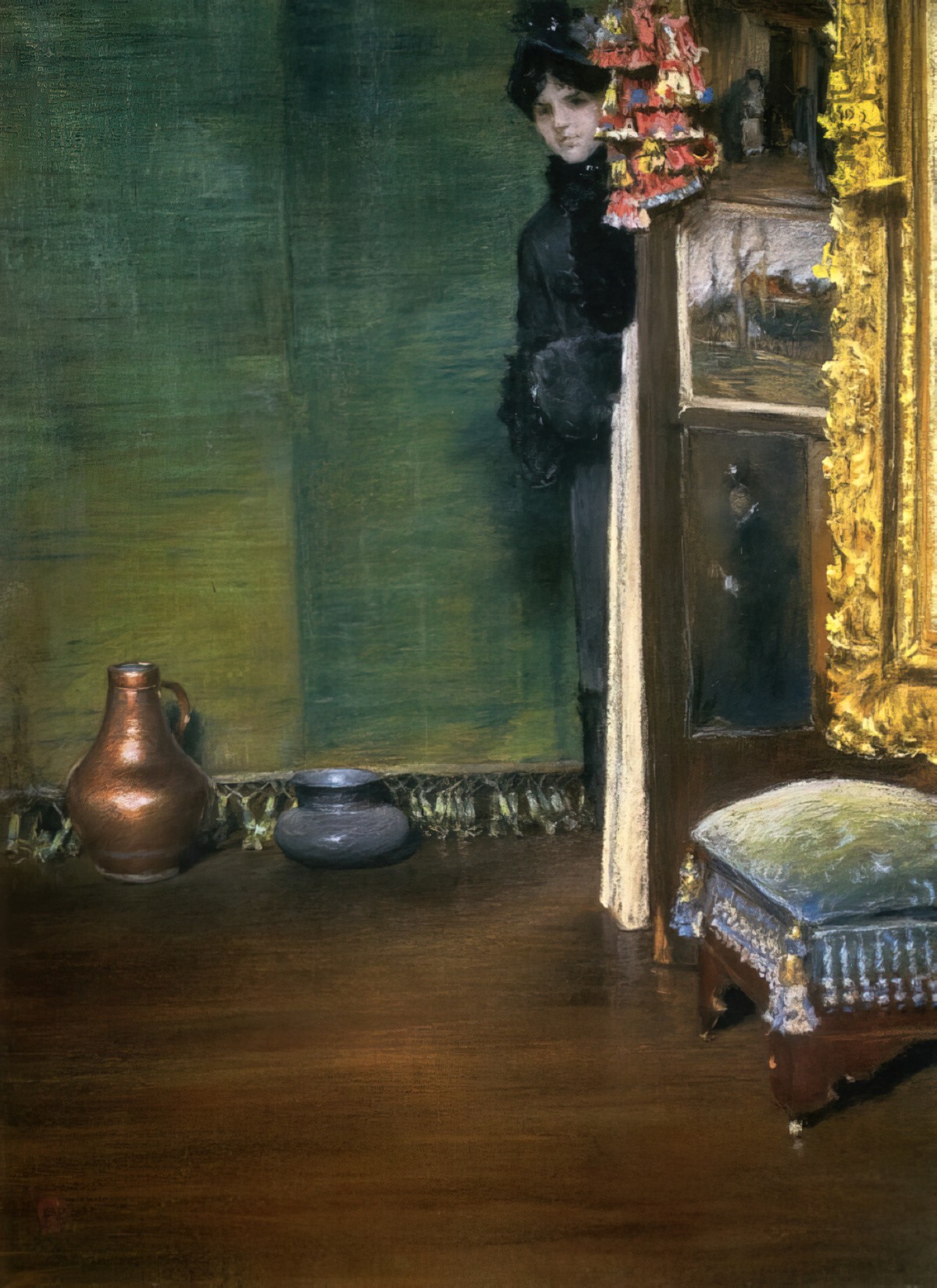
Header painting: William Merritt Chase. May I Come In, 1883, pastel
-
Balconies in Art and Illustration
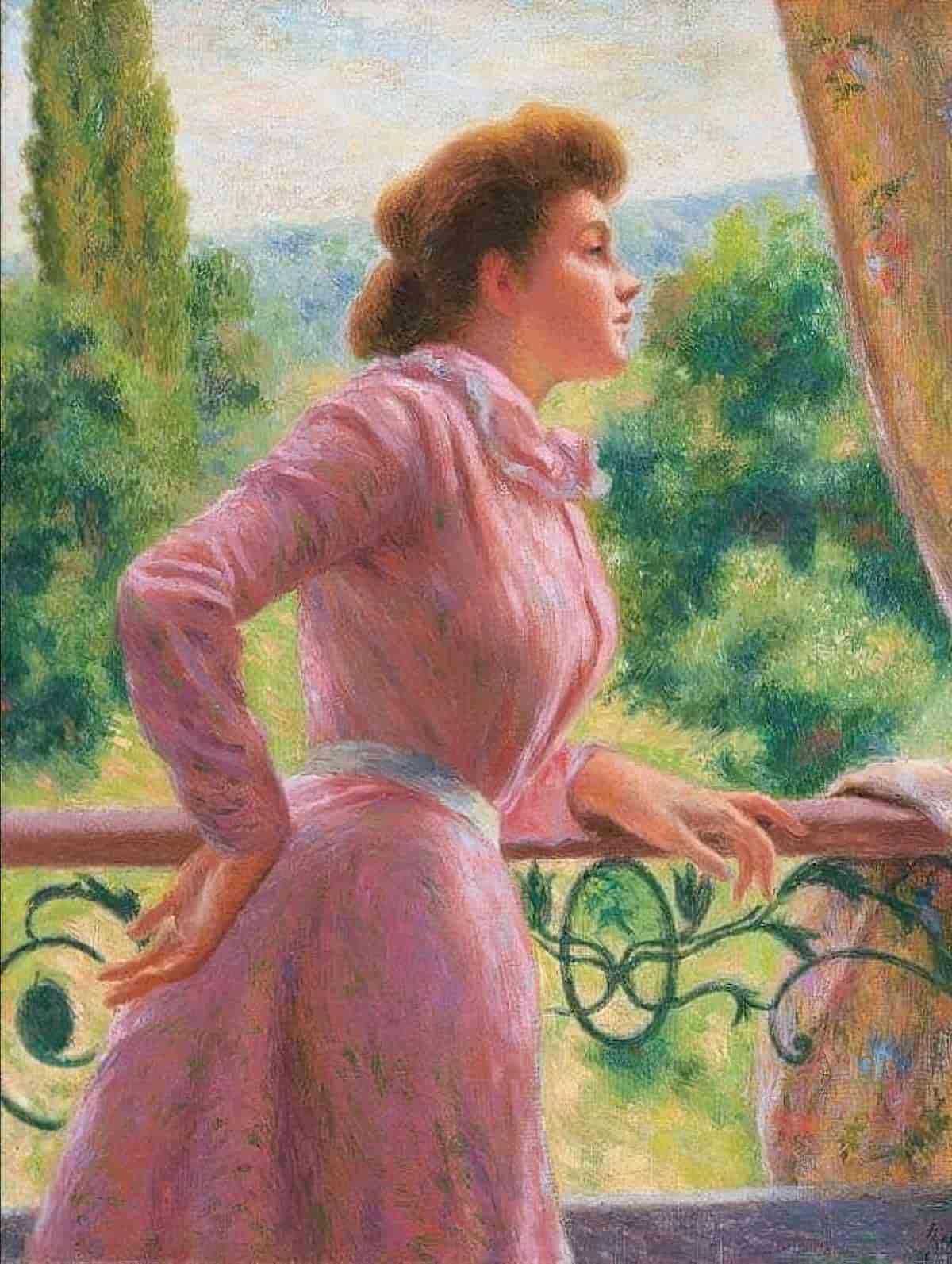
A collection of paintings and illustrations featuring balconies and view from balconies.
-
Illustrations With Castles In The Distance
Castles in the background of illustrations
-
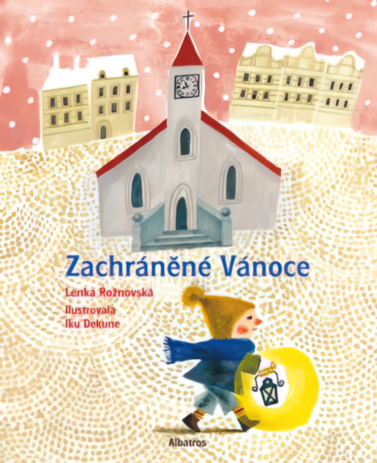
One Point Perspective Picture Book Houses
The one point perspective house is commonly when children draw when they first start drawing houses. Here’s an example from my own kid. I think they were about 8 years old when they drew this one.
-
Large Shapes In Illustration And Graphic Design

Below is a motley collection of illustrations but I feel they share something in common: They seem to have started from an assemblage of large shapes of colour. On top of those shapes, some are rendered and shaded while others aren’t.
-
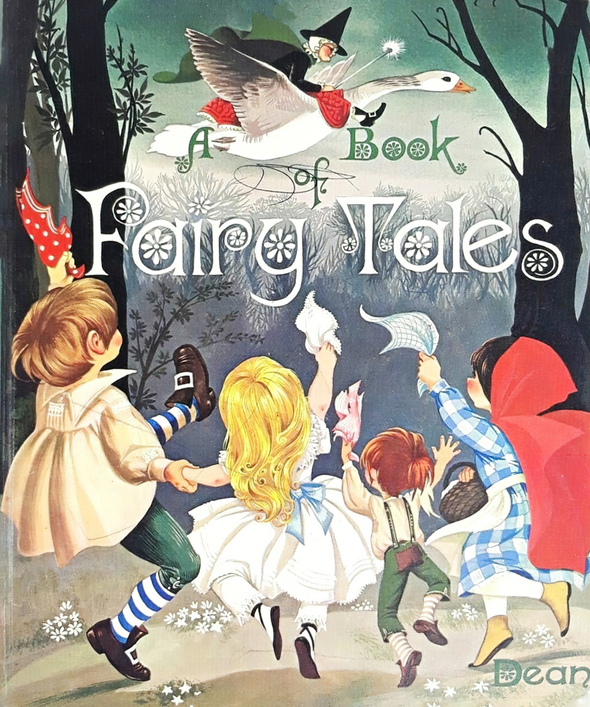
Movement Toward The Viewer in Illustration
Want to freak your audience out? How about a one point perspective illustration of something heading straight for them at speed?
-
The Cosy Little World In Illustration
Artists have various ways of deliberately distorting naturalistic perspective to achieve a certain mood, for example, a cosy little world.
-
Utilising The Foreground of Illustrations
One way to add depth to an illustration: Plonk something big and interesting into the foreground. Extend the picture as far back as the situation allows, all the way back to the hills, with detail in the middle distance. Utilise aerial perspective. This illustration of a sleeping cat is a perfect example:
-
Collage Sheet Illustration In Picture Books
Crafters sometimes talk about ‘collage sheets’ and we can use this term to describe a certain type of picture book illustration. Basically, I’m talking about a piece of art which looks a lot like a sticker sheet, or, if you’re a generation older than modern adhesive, like a sheet of paper dolls, yet to be cut out. Think also of…
-
Symmetry In Art and Storytelling
Symmetry is one of those words whose everyday usage is a little different from the scientific meaning. Everyday usage a sense of harmonious and most appealing proportion and balance Scientific meaning In biology, the repetition of the parts in an animal or plant in an orderly fashion. Specifically, symmetry refers to a correspondence of body parts, in size, shape, and relative position,…
-
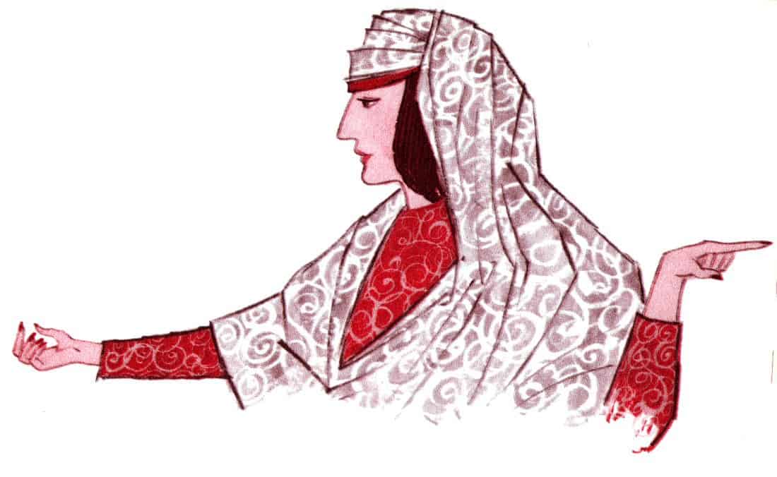
Eye Lines Guiding The Viewer in Illustration
Artists and illustrators use tricks which tell the viewer where to look. Since humans tend to naturally follow the gaze of others, one focusing trick is to create eye lines all pointing to the focus of the work.
-
Movement Through Picture Books
Western picture books are read from left to right. This affects the layout of a page, and the direction of character movement. Generally, characters also move through a picture book from left to right. When embarking upon a journey they will look to the right. When looking out a window, the window will often encourage readers to look to the…
-
Simultaneous Narrative Art
Let’s say there are 7 main categories of Narrative art. Narrative art is art which tells a story. This post is about the subcategory which has been called ‘Simultaneous Narrative’ art. The concept of simultaneous narrative art is interesting when it comes to picture books because if you take, say, an illustration of a country fair, where one person is…
-
The Axial Cut In Narrative Art
The axial cut is a film editing technique. It is a type of jump cut useful to the horror genres. In any ‘jump cut’, the viewer sees a ‘jump in the visual’. An axial cut is a type of jump cut, where the camera suddenly moves closer to or further away from its subject, along an invisible line drawn straight between the camera…