-
Many Small Items on Book Cover Design
René Magritte was a Belgian surrealist artist best known for his witty and thought-provoking images and his use of simple graphics and everyday imagery. The following book cover seems inspired by Magritte:
-
Text On Blocks Of Colour In Book Cover Design
In these examples the block of colour backgrounding the text serves the function of separating the text from its background, making it stand out. The shape is not otherwise part of the illustration. Oftentimes, these blocks of colour are part of a collage or mixed media design. (And when I say ‘colour’, this shape is…
-
Wood Block Print Etching Wild West Book Cover Design
Risograph Printing on Book Cover Design A Risogrph Machine is a retro photocopier which is no longer in mainstream use, but is used by artists to create a vintage photocopied look. That said, most people no longer have access to a Riso. Instead they are making use of Photoshop. For example, at various Design Assets…
-
Tilted, Rotated and Upside Down Elements on Book Covers
PAGE ELEMENTS TILTING UP ROTATED SIDEWAYS UPSIDE DOWN A fairly recent Internet trend: Upside down face emoji to indicate sarcasm or irony. Aside from indicating irony, ‘upside down’ also conveys an aside: “I know, right. This is complete understatement. There’s so much more to be said than that one pithy sentence.” Case in point, this…
-
Font Sizing In Book Cover Graphic Design
Sometimes graphic designers are so subtle about varying the size of text it’s barely noticeable to the audience. The third word in the title Ghost Girl, Banana is marginally smaller than the first two words: In fact you may not even believe me. Not sure I even believe myself, so I measured the height. The…
-
Geometric Design On Book Covers
TESSELLATION Another word for tiling. Importantly, the shapes in a tessellation don’t overlap. There are also no gaps. The most common shape used in a tessellation is therefore a square, equilateral triangle or a hexagon. What these shapes have in common: Their sides are equal. Their interior angles are equal. These are called ‘regular’ tessellations.…
-
Floral Book Cover Design
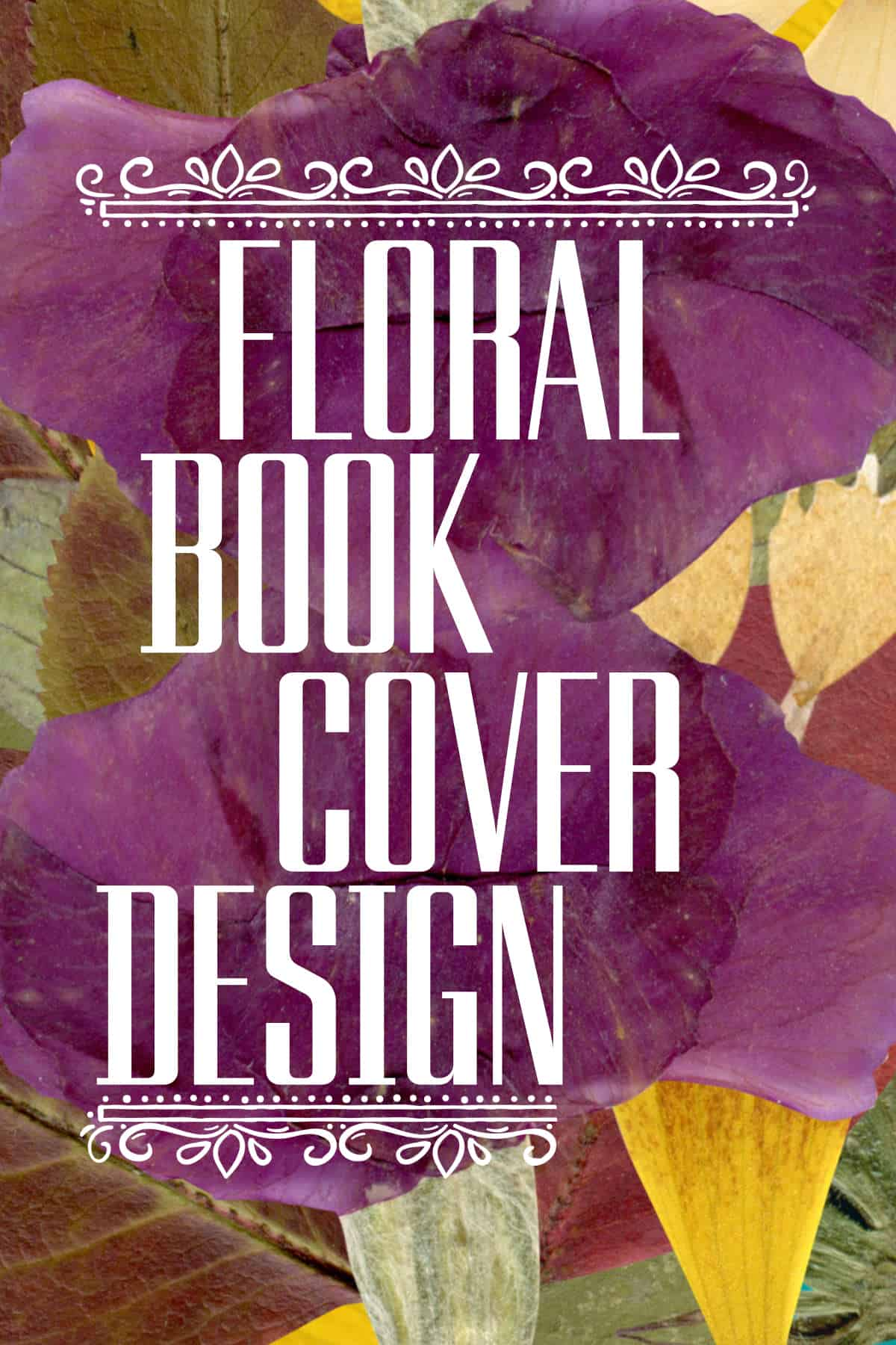
Here is a beautiful collection of floral book covers which make heavy use of foliage as graphic elements.
-
The Symbolism of Tea in Literature
COLONISATION AND IMPERIALISM Get Out (2017), a film by Jordan Peele An Australian example: “We were slaves to white families,” she said. Aunty Lorraine worked as a servant in rural New South Wales, from age 15. “The final part of your training was how to serve high tea to white families that you going to…
-
Disgust

Why would a storyteller or artist want to elicit disgust in their work? And if they want to do it, how do they typically do it?
-
Writing Consumer Book Reviews
What is the function of consumer reviews? Should we feel bad for posting negative takes on other people’s books? Do consumer reviews have a real impact on sales? To what extent? Is a review a work of art in its own right?
-
Clever and Beautiful Word Art On Book Covers
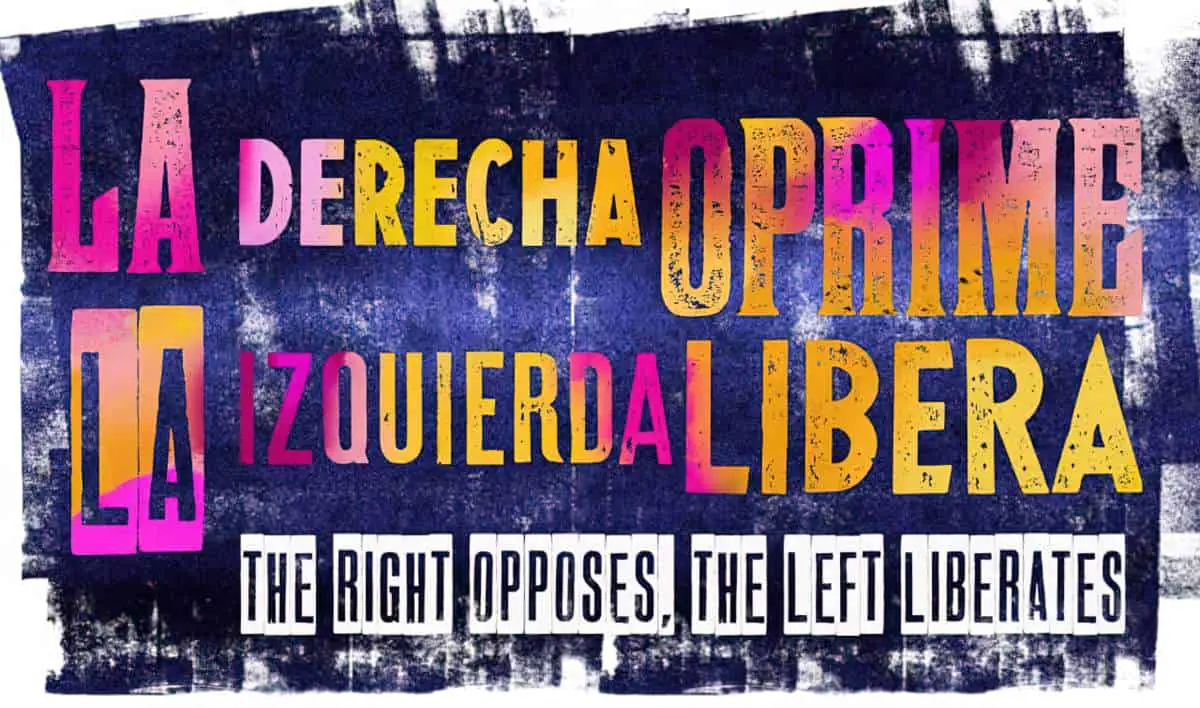
Let’s talk about typography as standalone artwork. Below are a collection of favourite typographical book covers.
-
Brush Lettering in Graphic Design of Book Covers
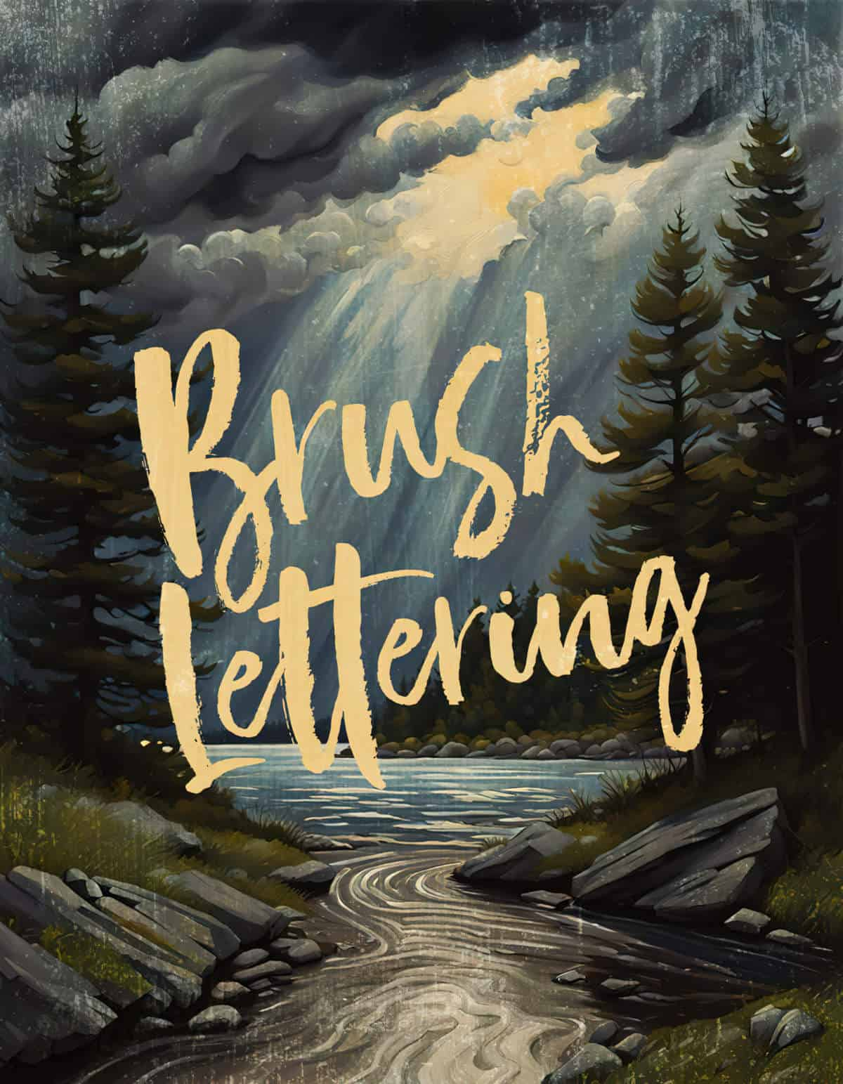
I have a lot of brush and felt-tip typefaces in my library. They are appealing, but don’t tend to look good unless I play with the tilt, sizing and get the typeface combo exactly right.
-
Reshaping the Baseline of Text on Book Covers
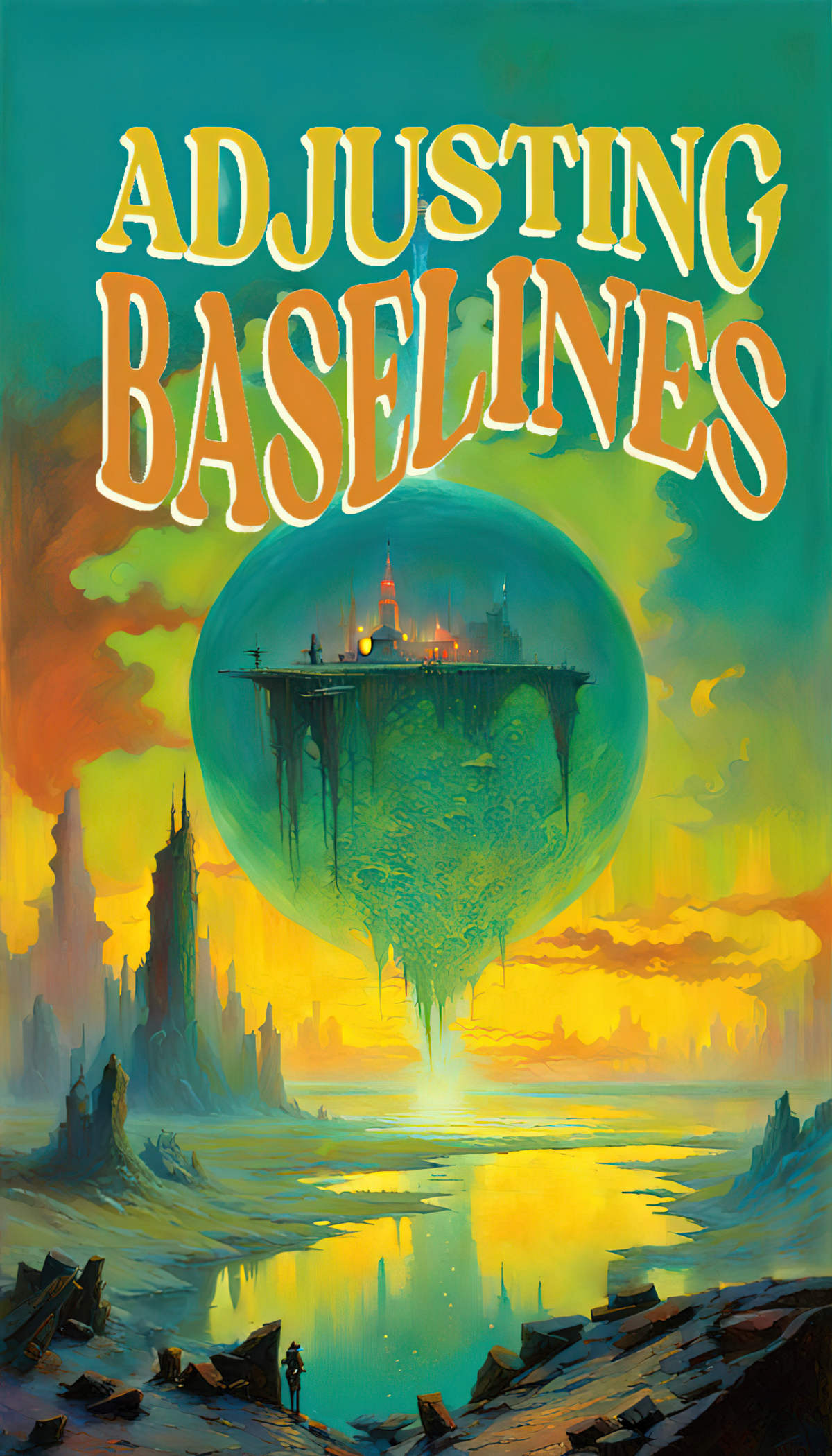
Let’s take a close look at how book cover designers alter the baselines of text to create a variety of interesting effects.
-
Getting Lost And Storytelling
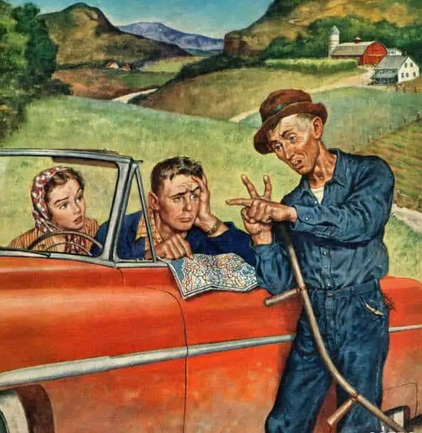
Stories that scare me the most often involve getting lost. The scariest Australian stories are, to me, the ones where a little boy goes out into the wilderness and dies in the heat, unable to find his house.
-
Overcoming Perfectionism
Perfectionism can be a superpower but can hinder us in getting things done. Framing perfectionism as fear is one way to harness it.