Note that, for book designers of young adult literature, a huge swathe of Gen Z is no longer able to read running writing. (This includes my own teenager who, despite being a good reader in general, requires me to read birthday cards handwritten by grandparents.)
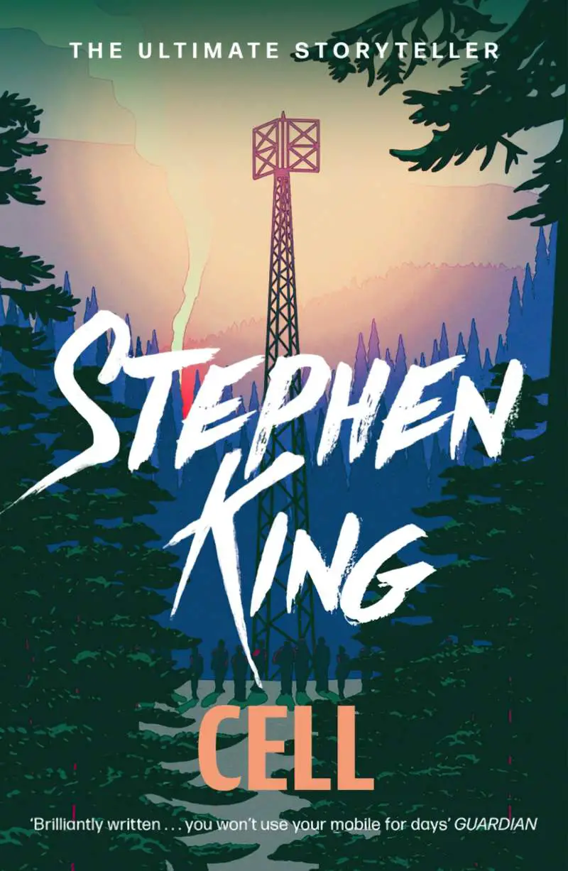
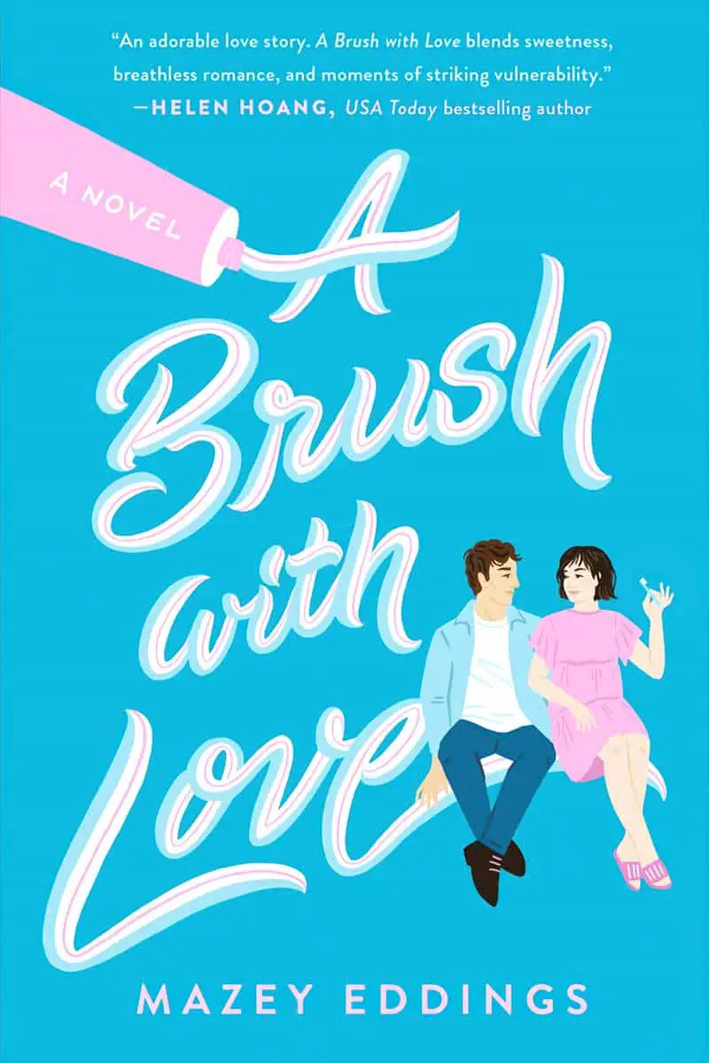
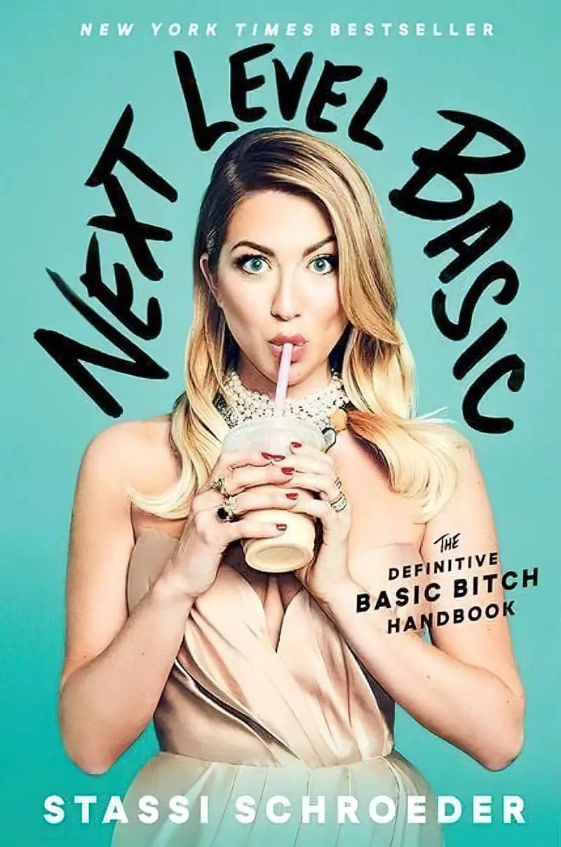
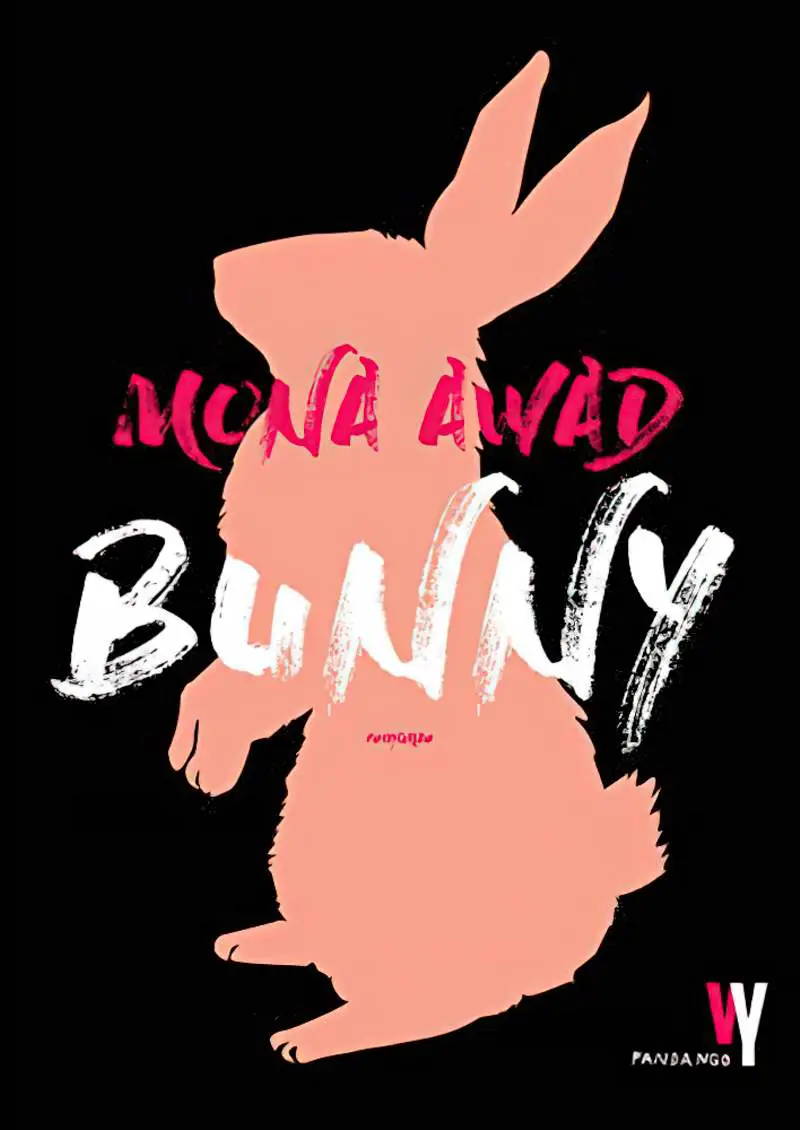
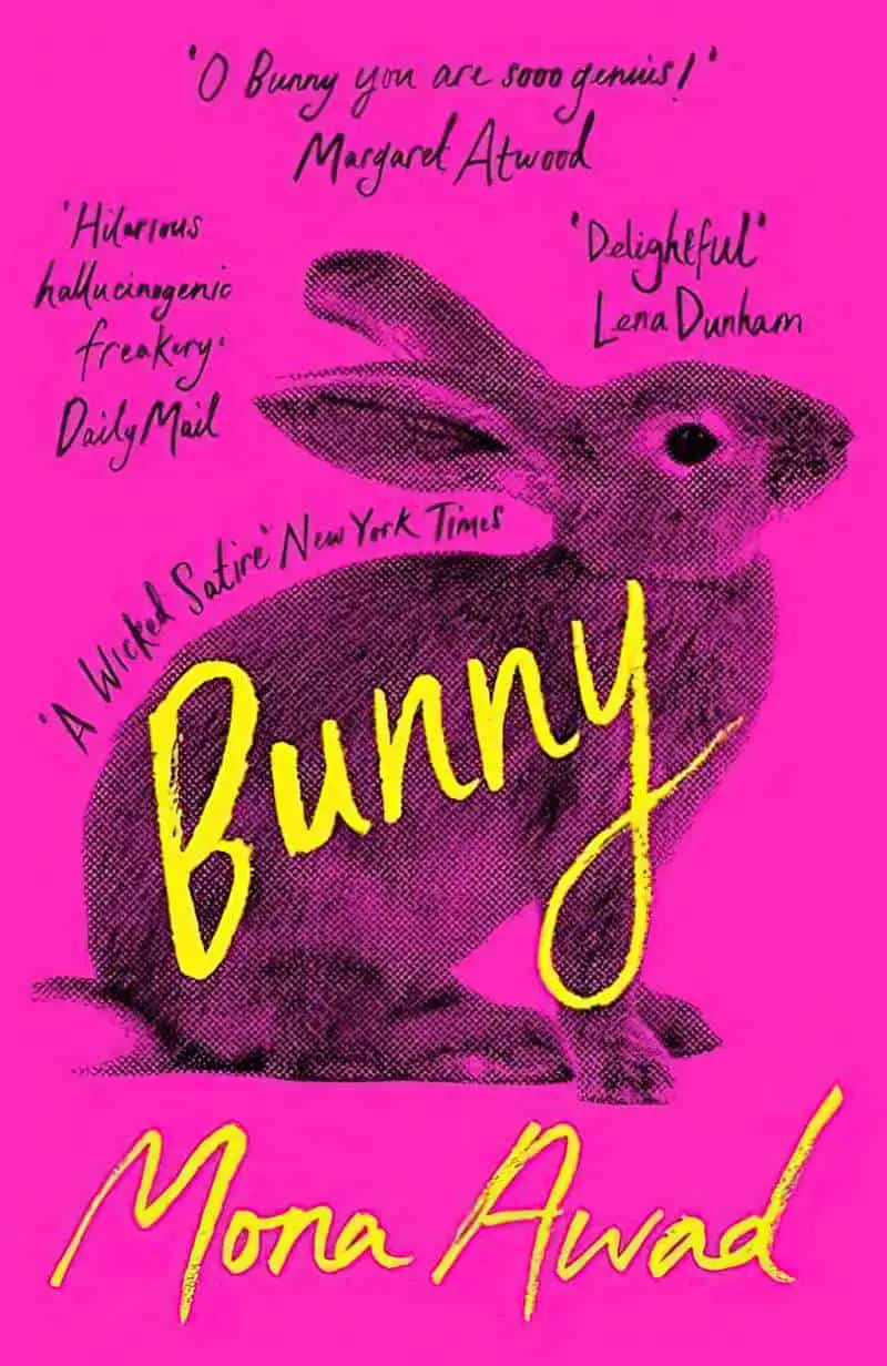
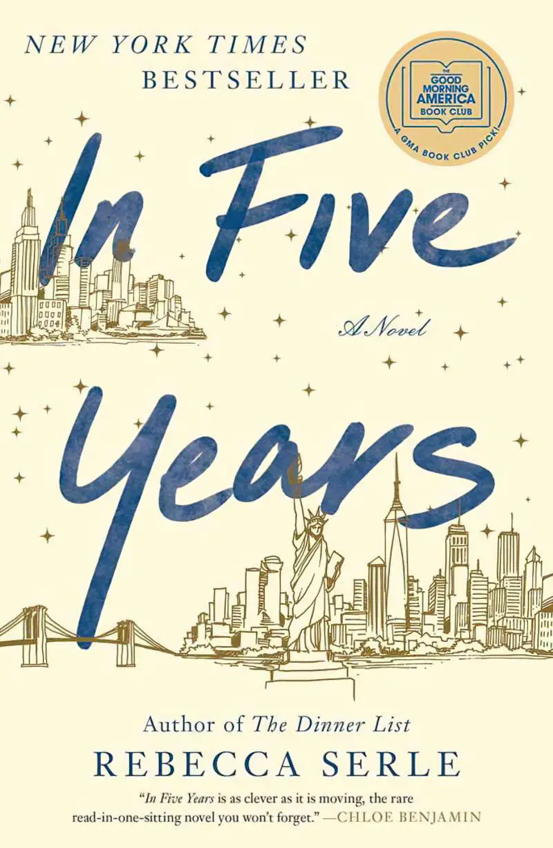
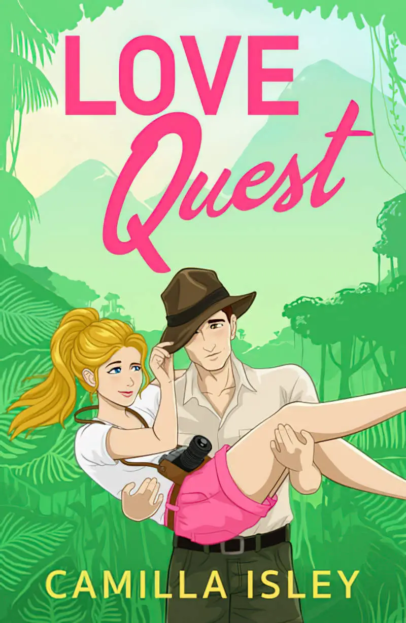
First, the most recognisable brush lettering on book covers in the world:
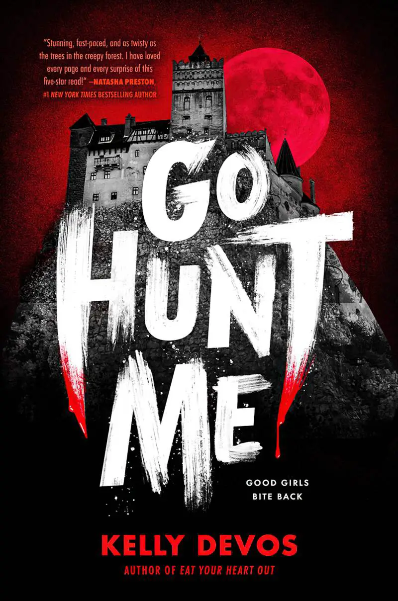
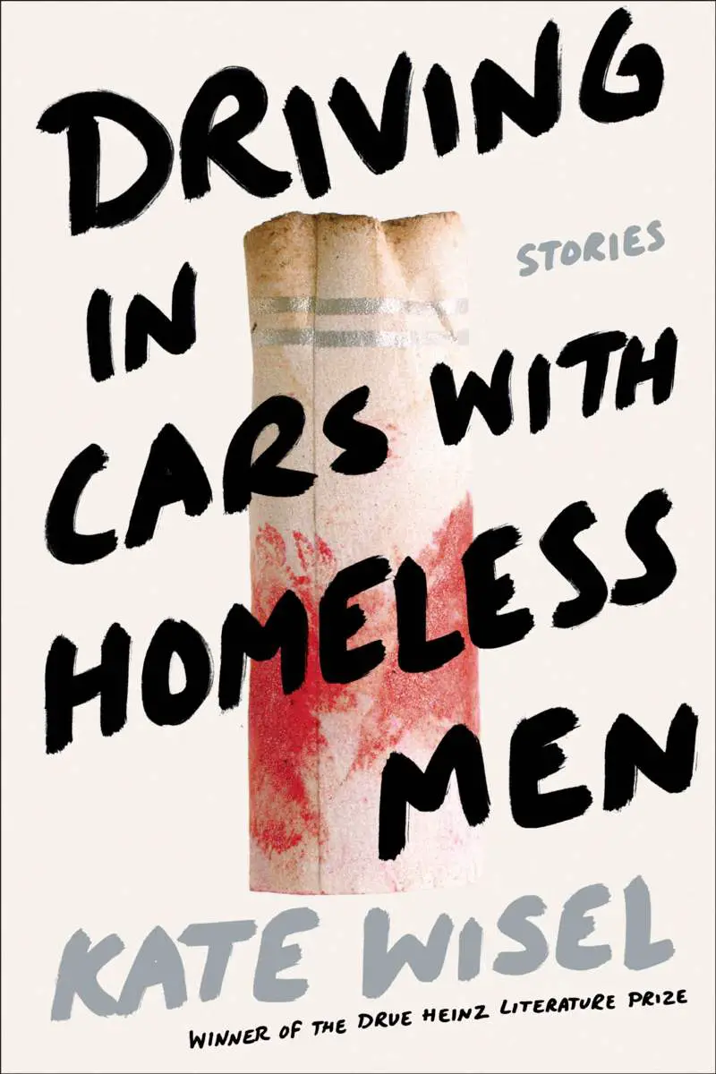
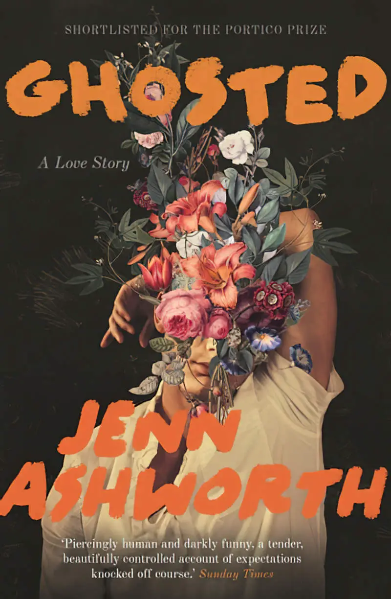
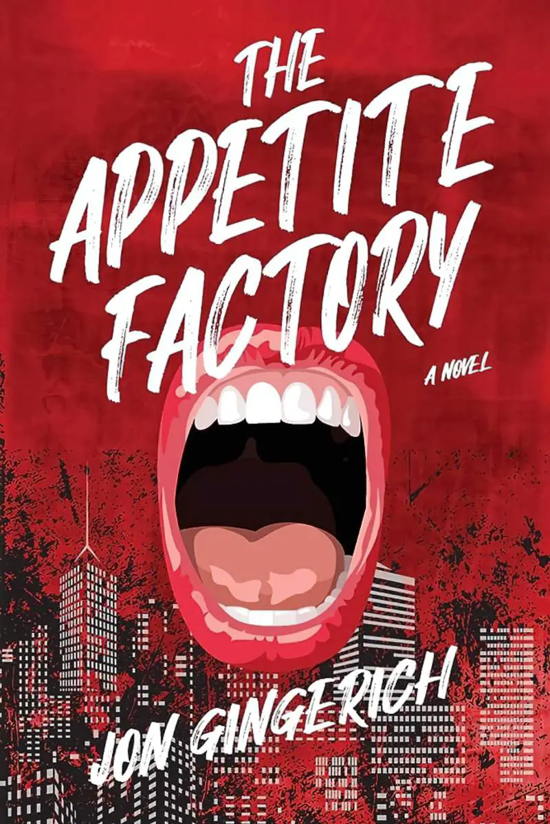
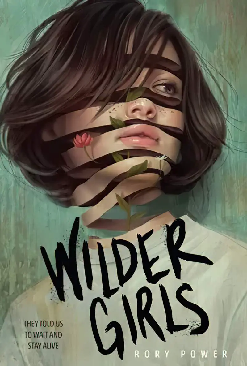
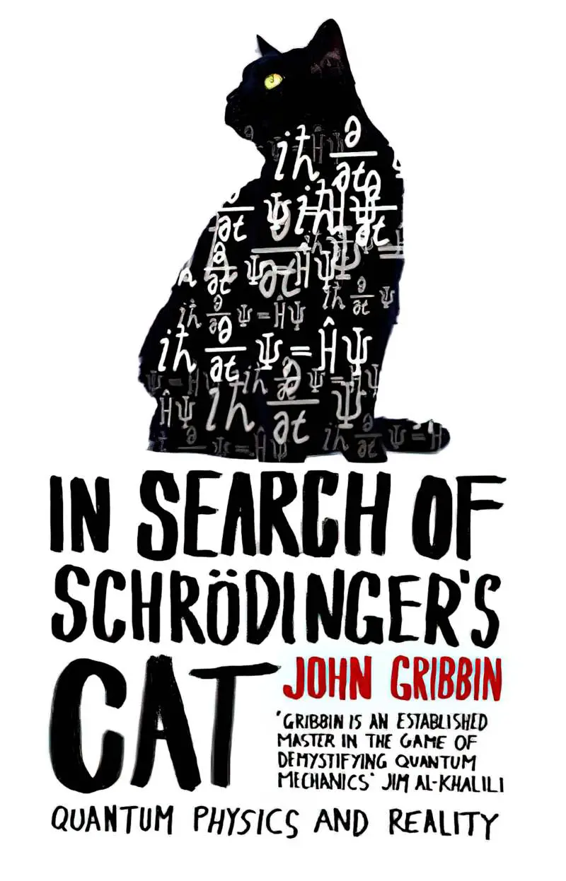
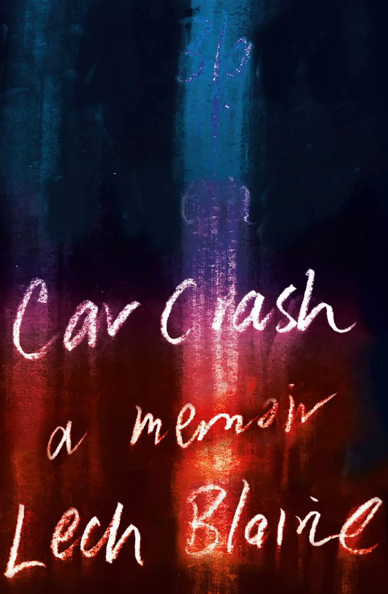
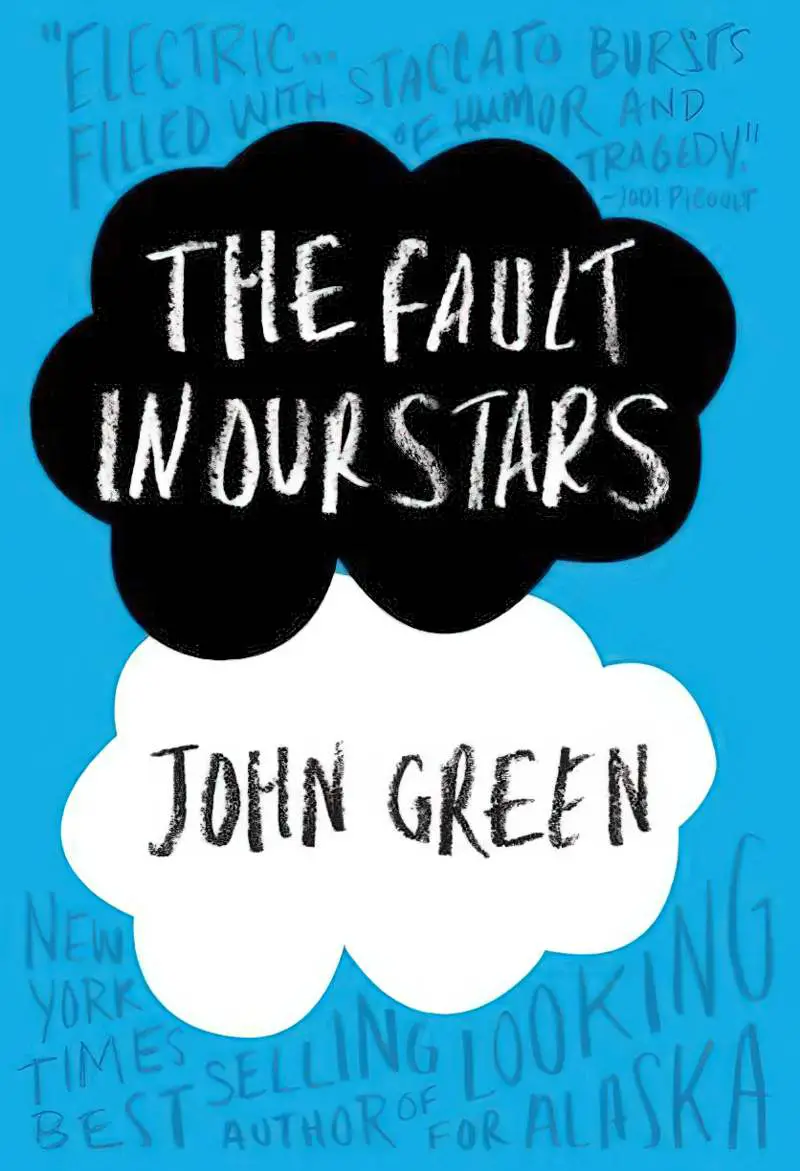
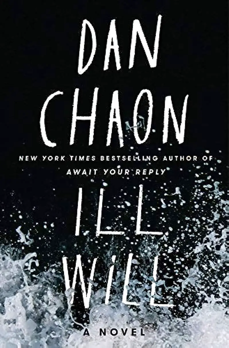
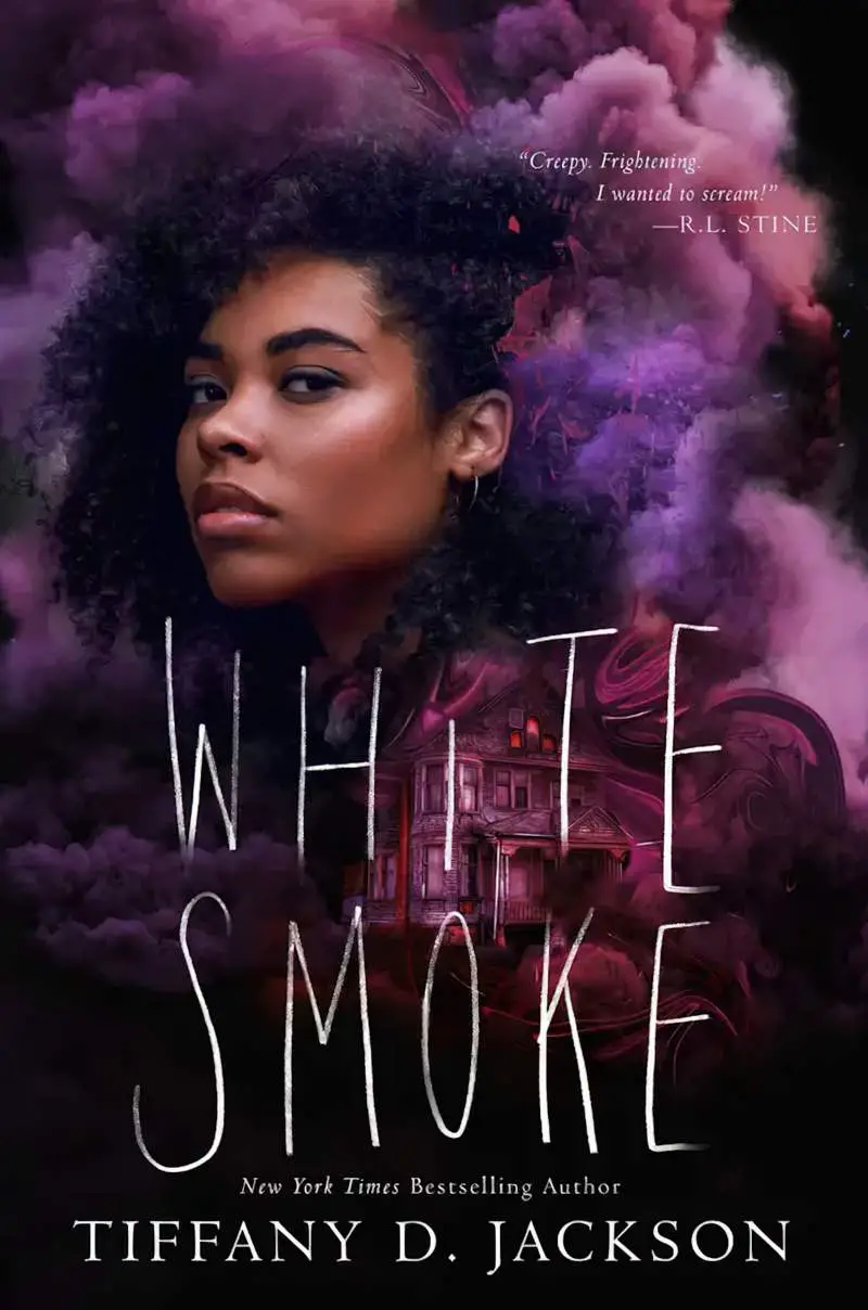
Bristly, tapered brushes equal horror/thriller:
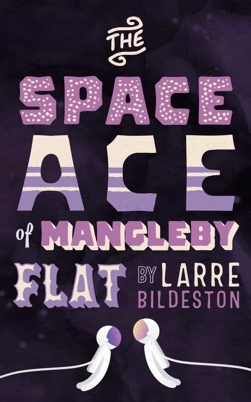
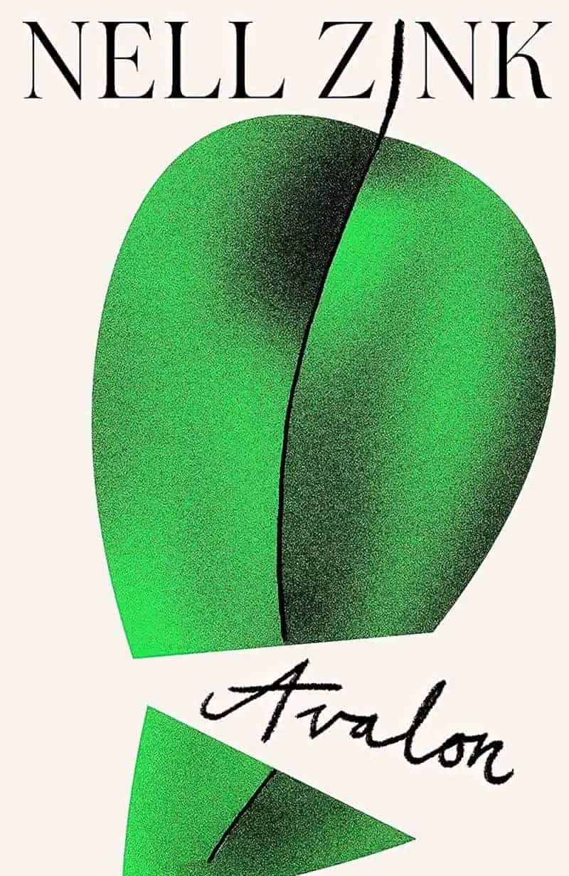
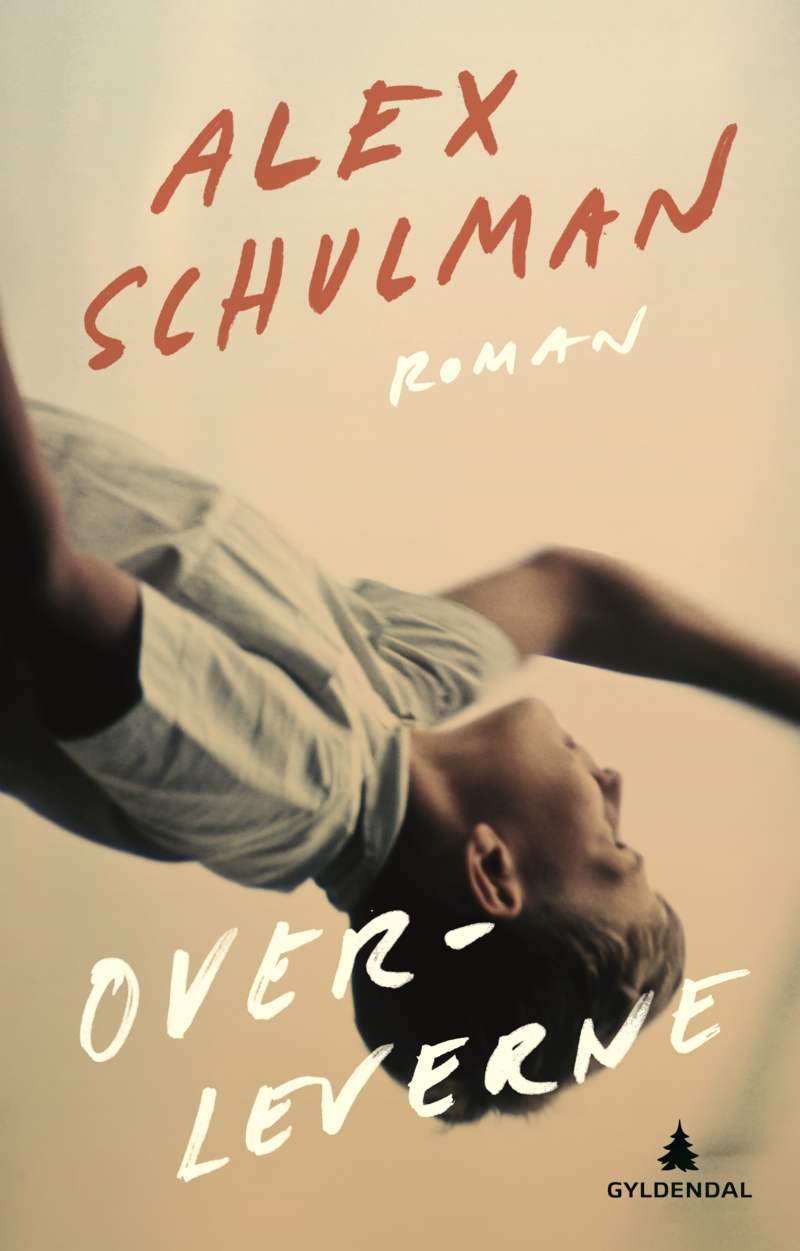
ATTEMPTING CURSIVE WITH AN INAPPROPRIATE BRUSH
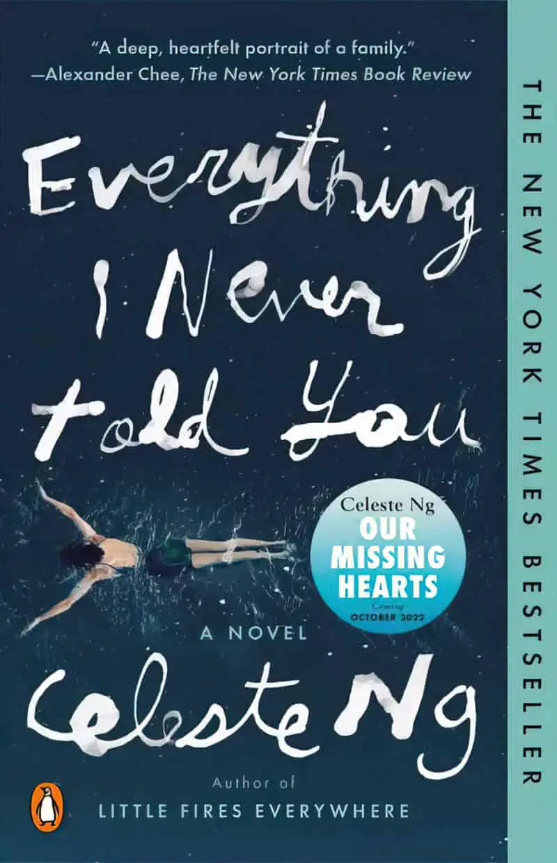
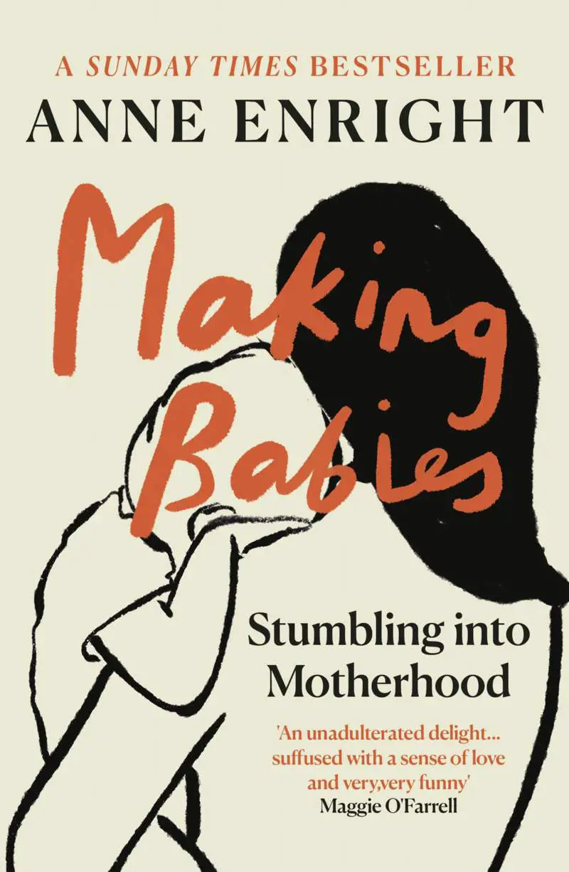
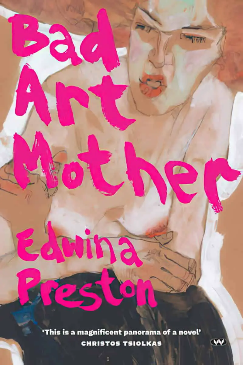
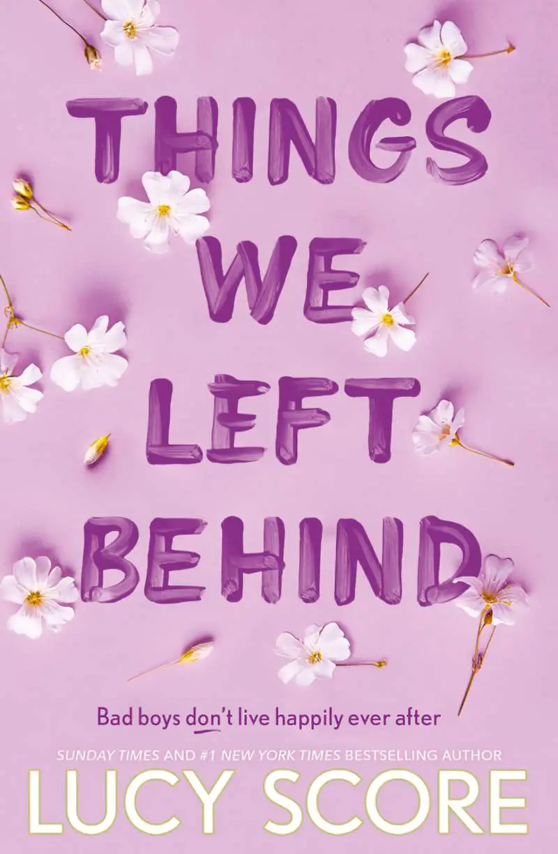
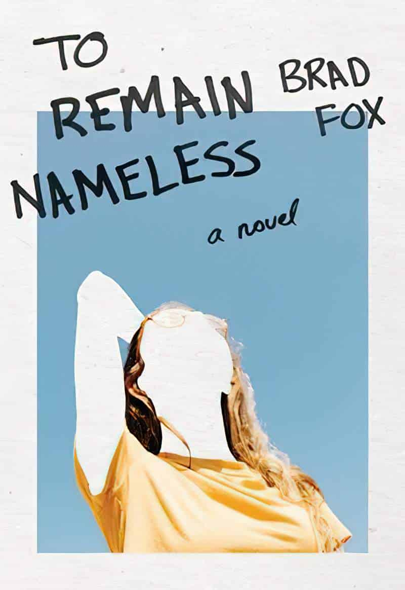
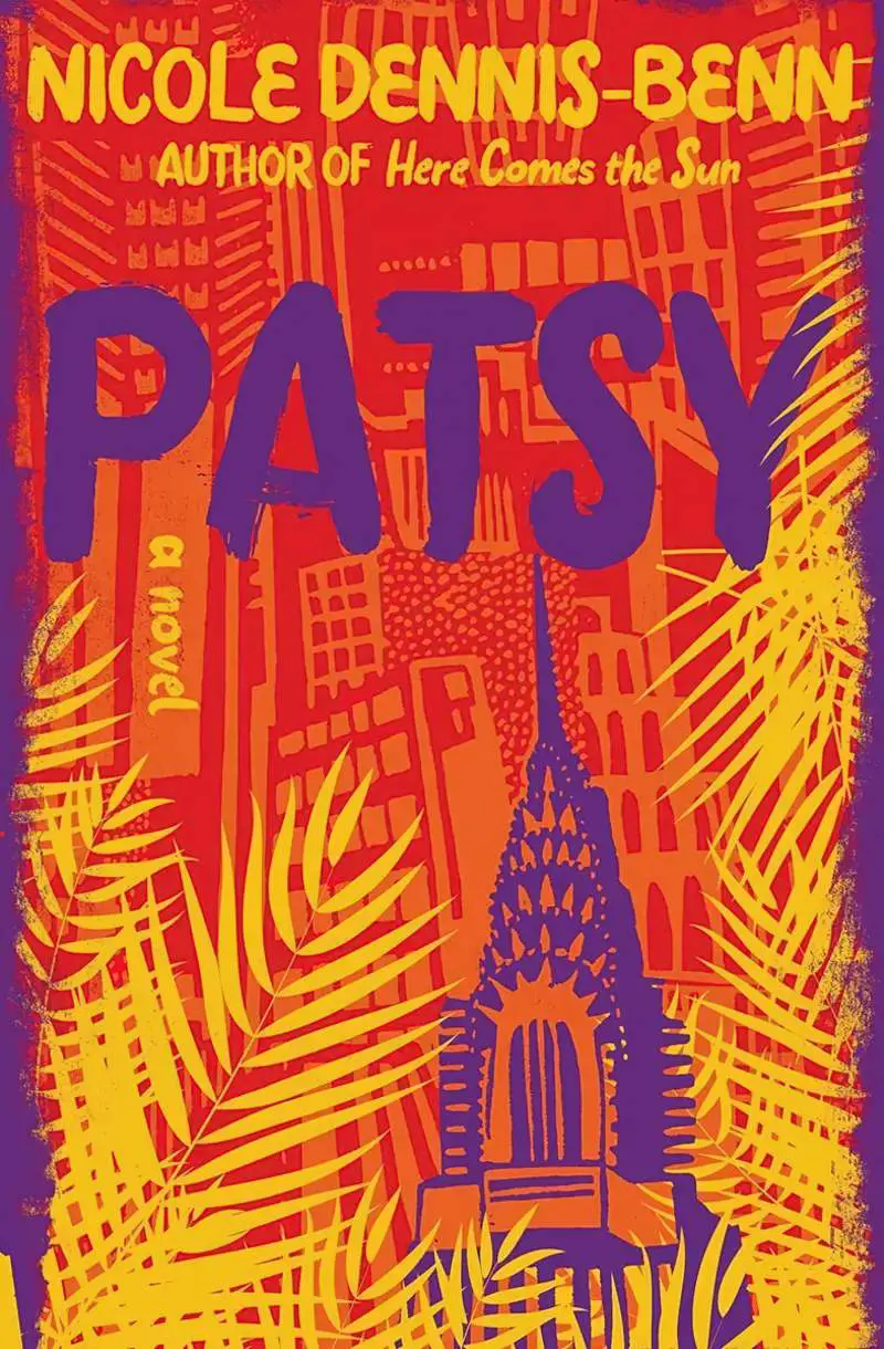
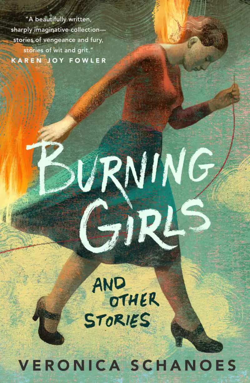
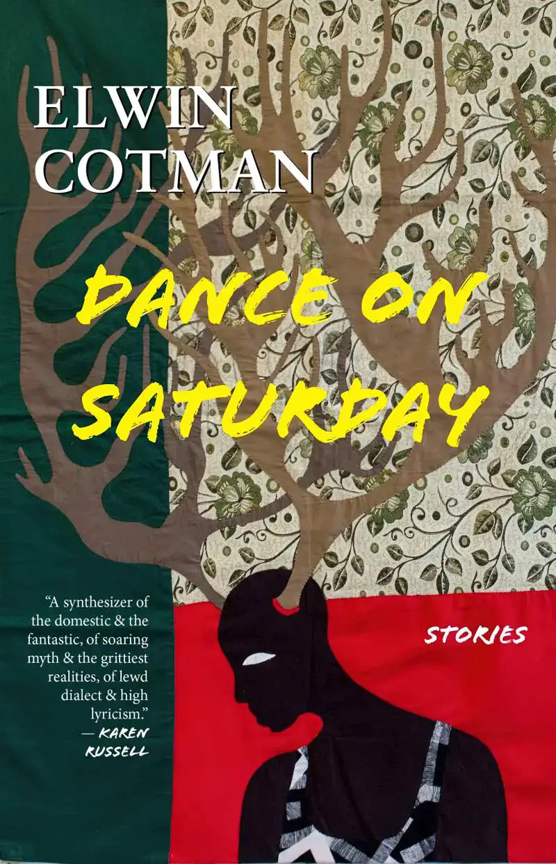
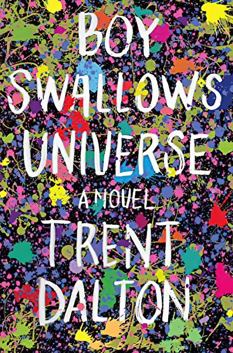
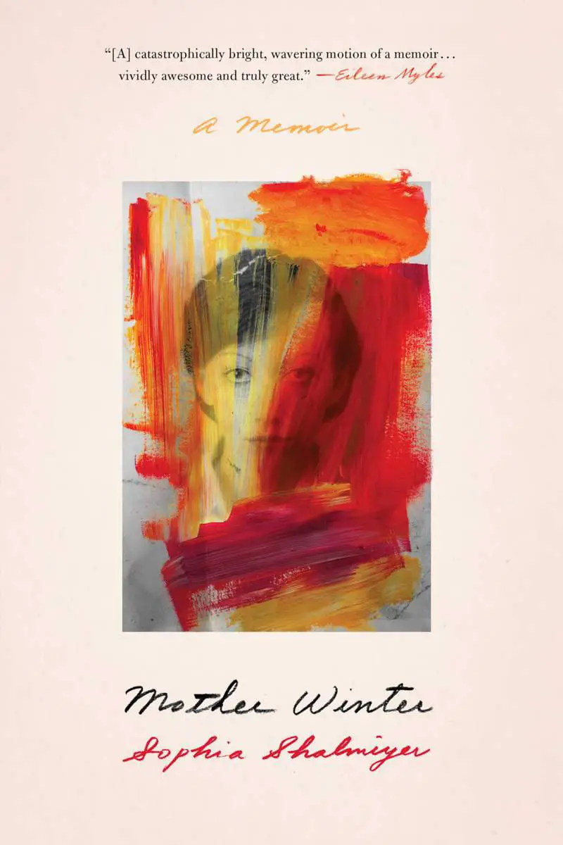
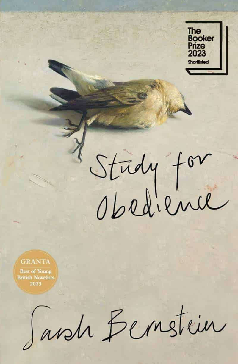
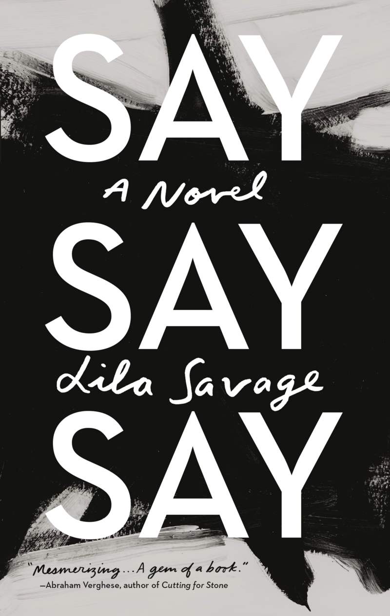
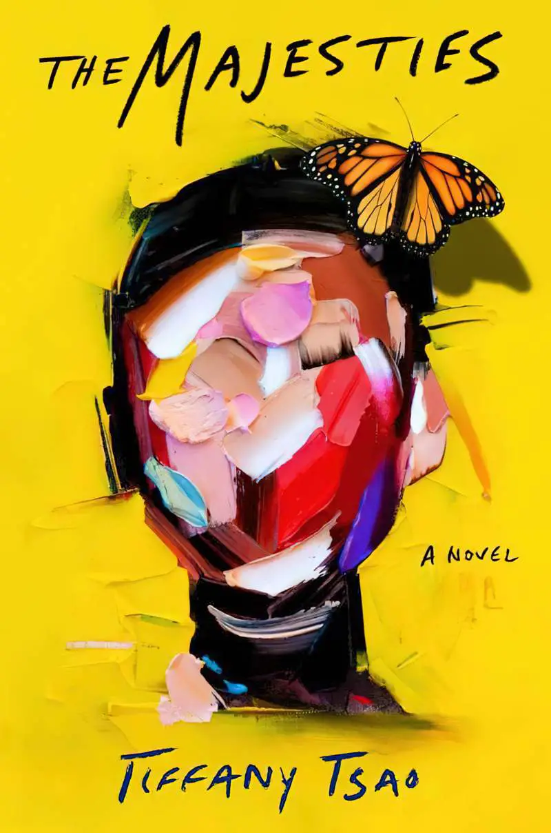
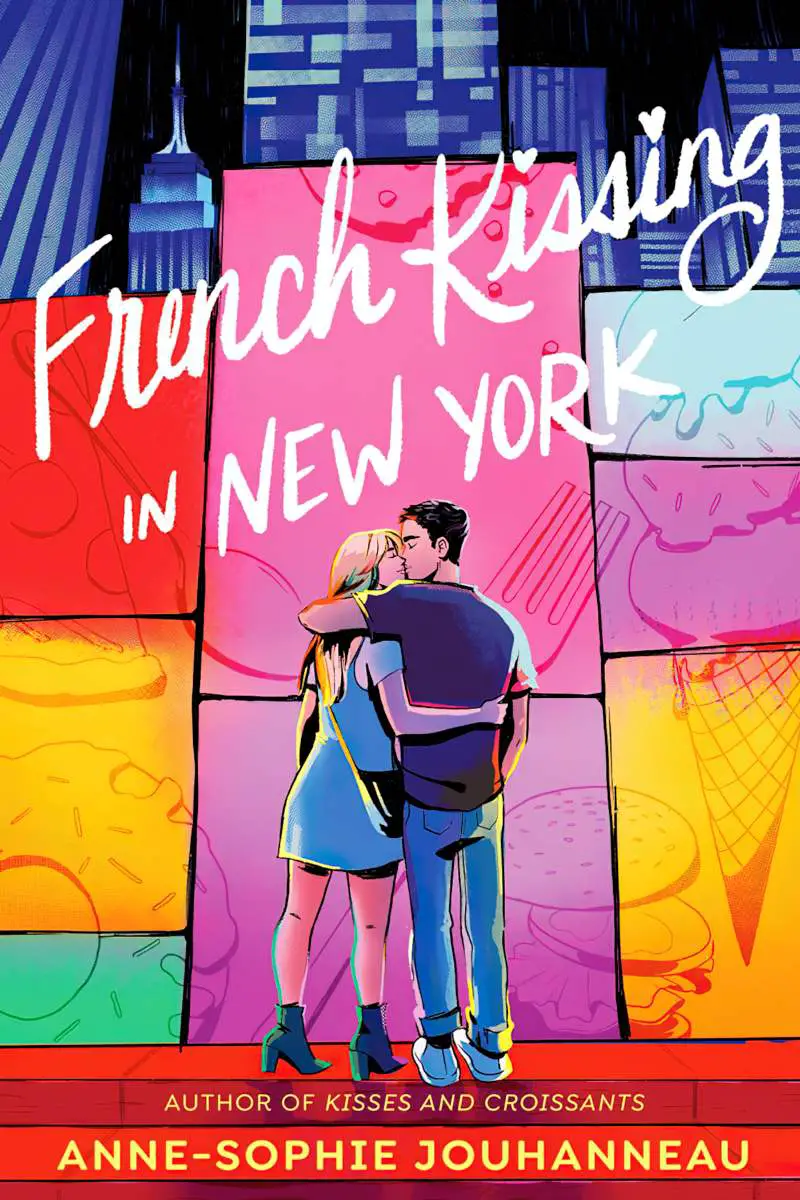
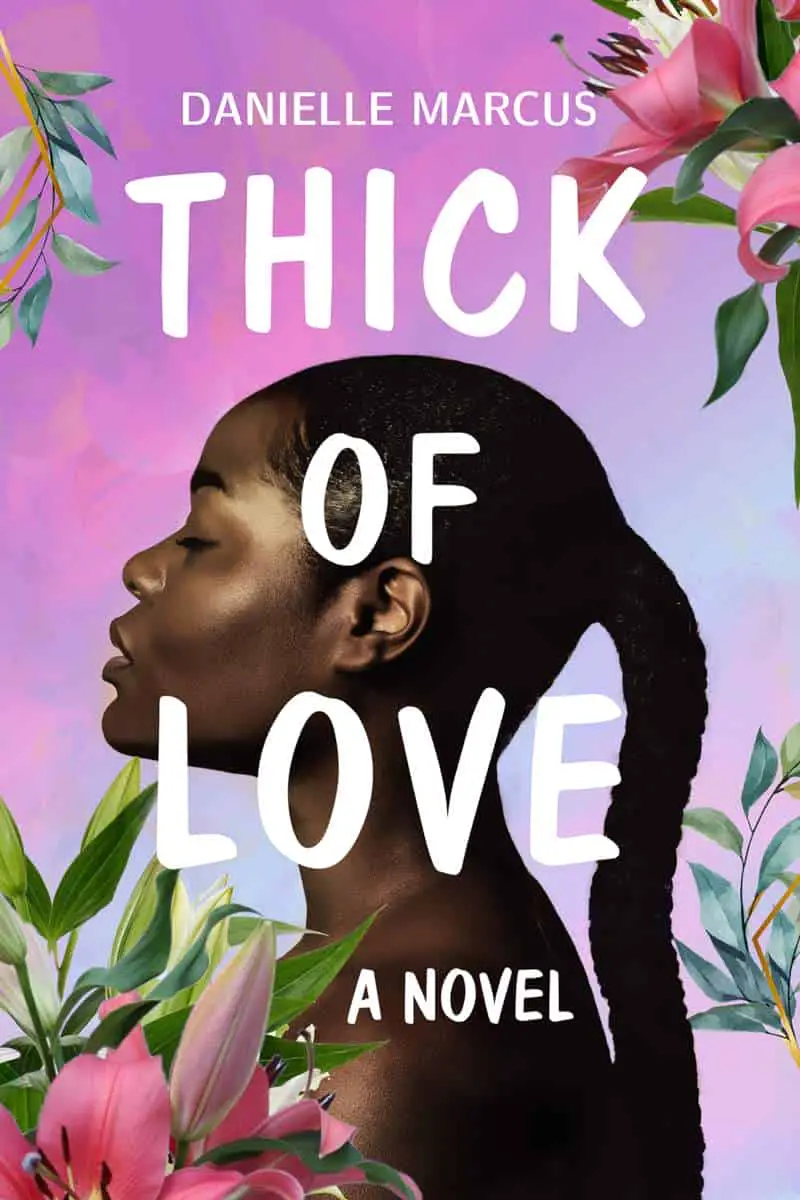
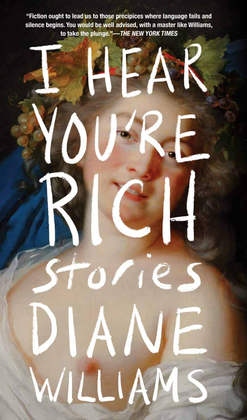
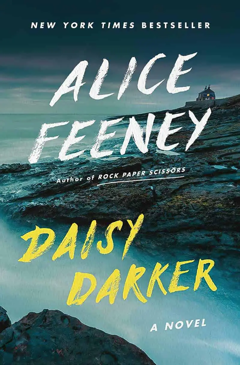
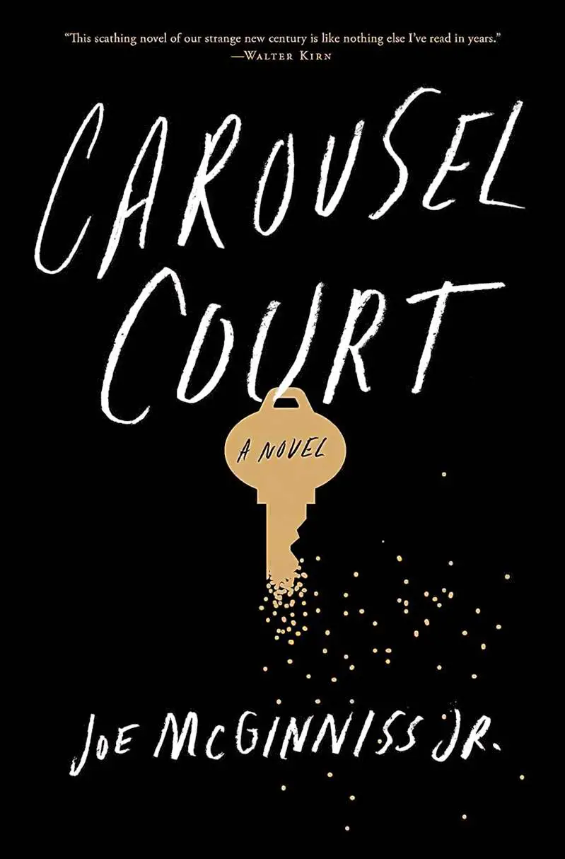
The book covers below each use a similar semi-opaque (SVG) brush font with a non-professional feel to it. (Sobbers typeface is one example of these brushscript fonts. Mattera is another, though I suspect some of these titles were hand-drawn by the designer.)

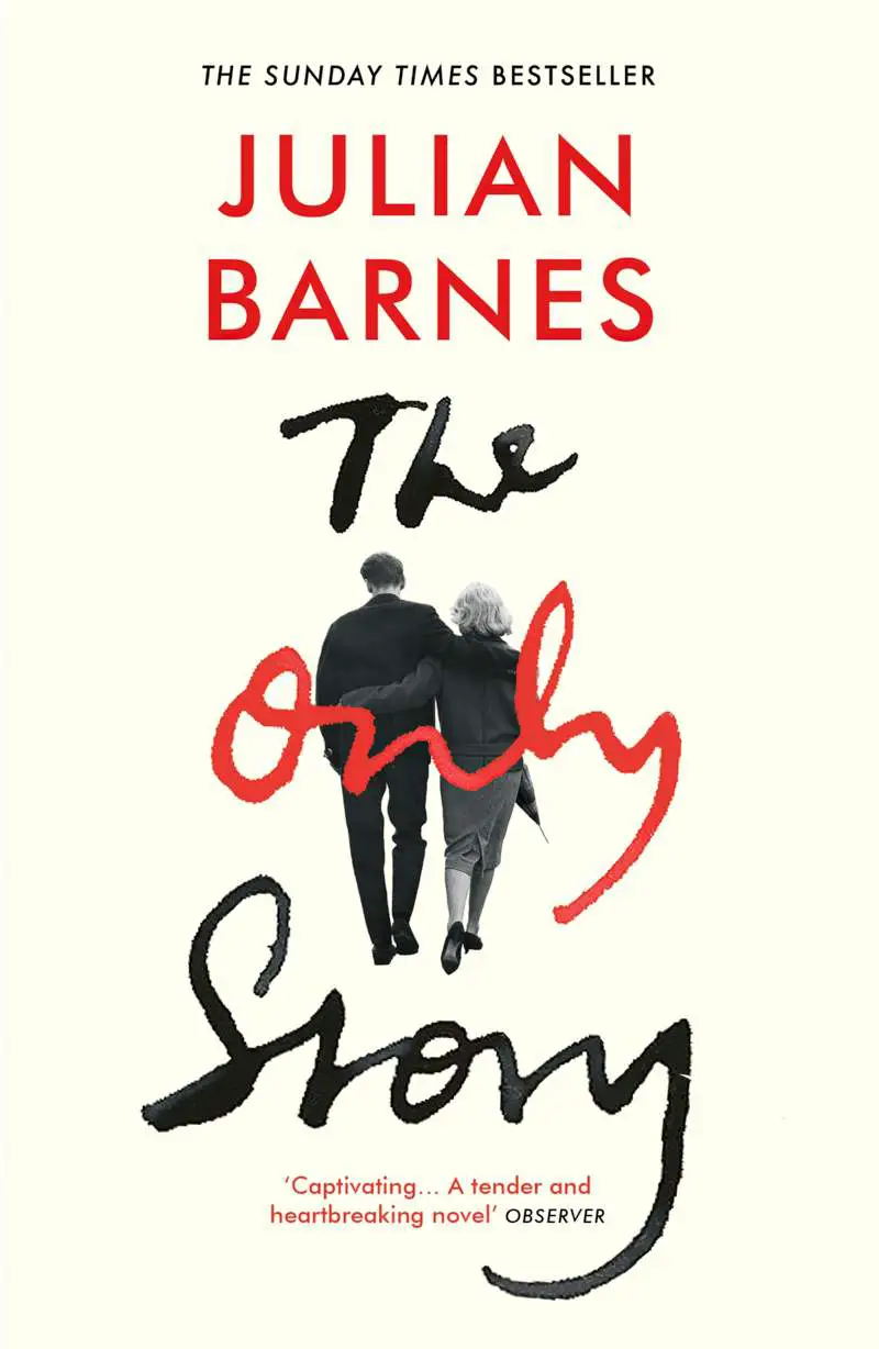


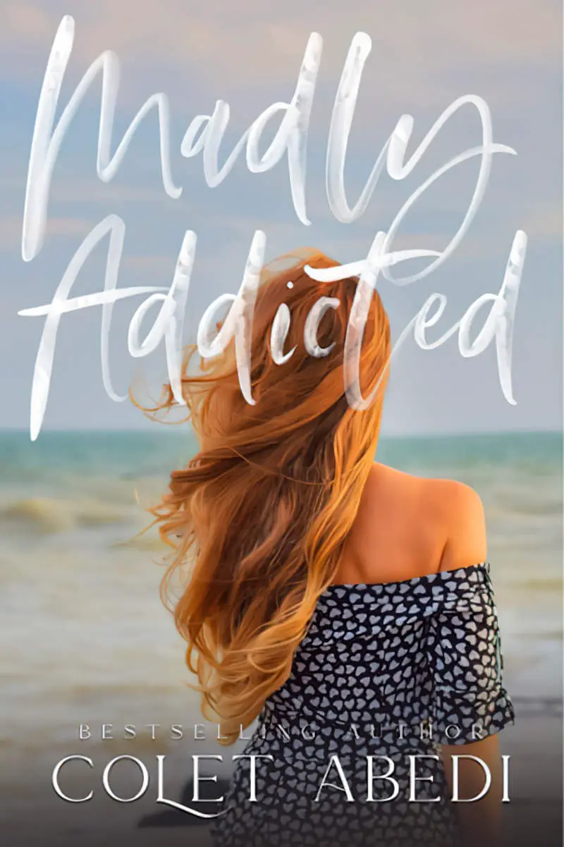
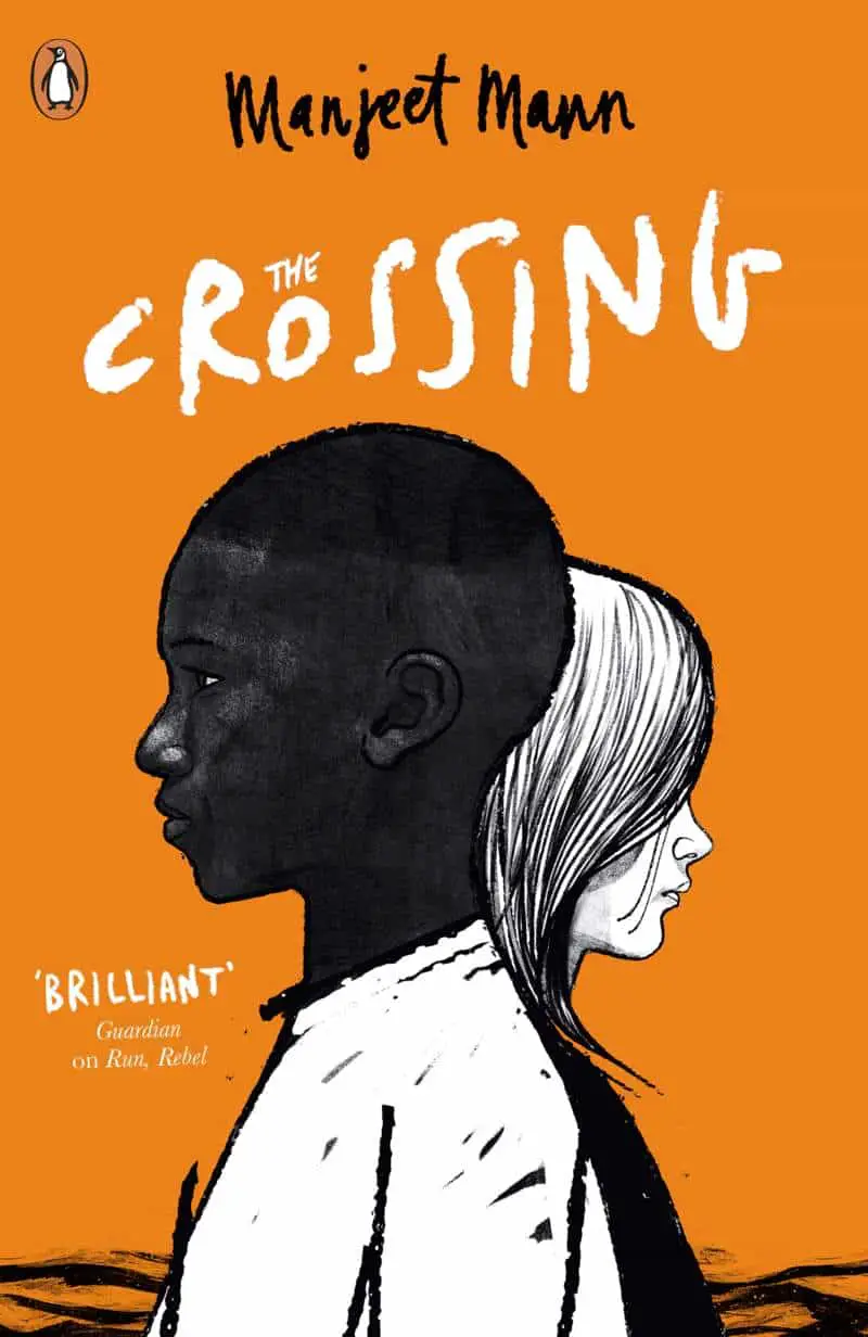
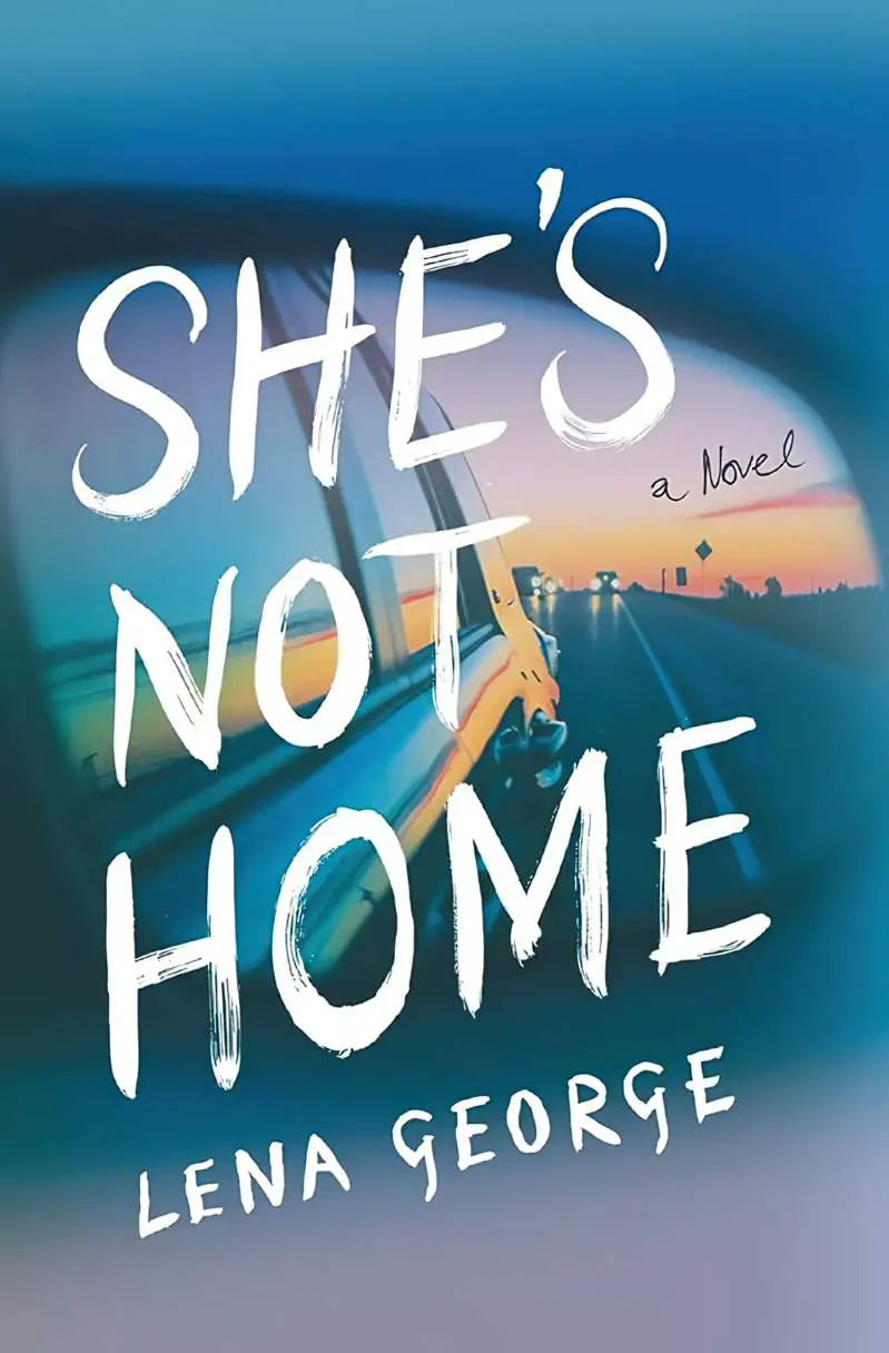
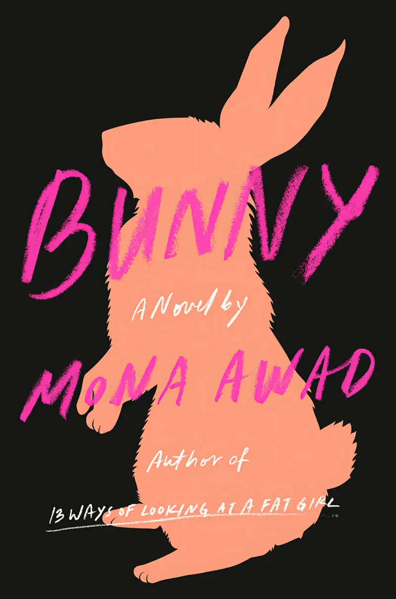
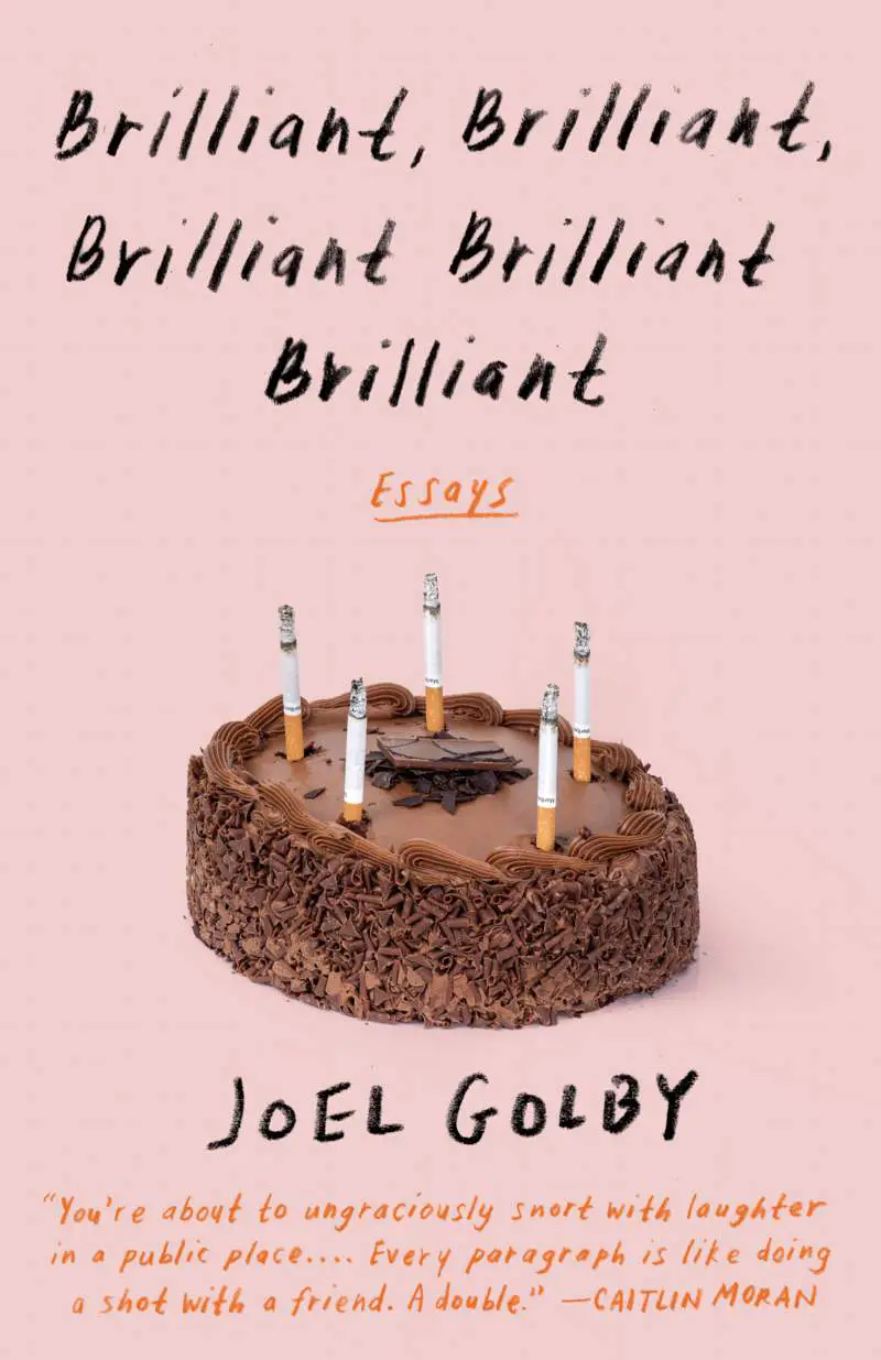
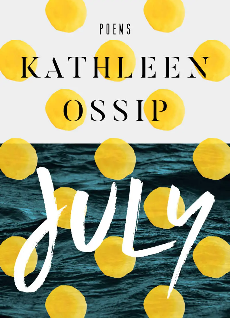
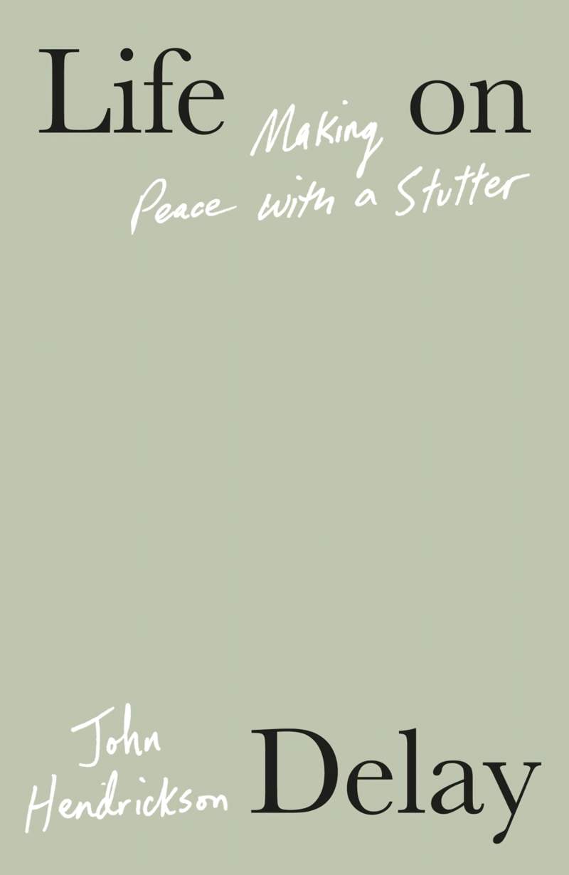
Here’s a non-running, opaque example of similar:
THE WARP GROUP TOOL IN AFFINITY DESIGNER 2
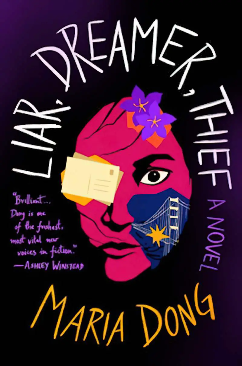
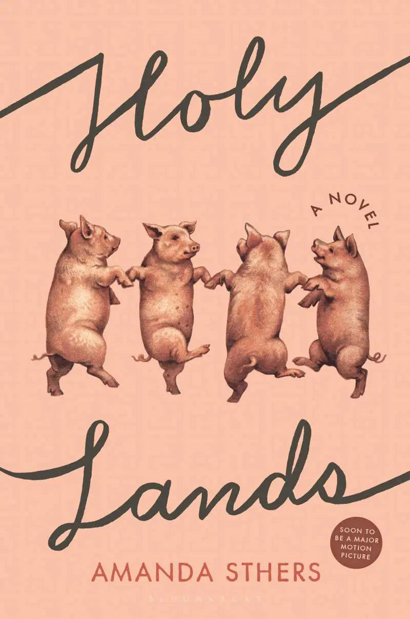
Sometimes designers fit text to a shape.
A designer’s eye will always be necessary, but from a technical point of view, creating word art like this is relatively easy since the addition of the Warp Group tool, which is what Affinity calls it.
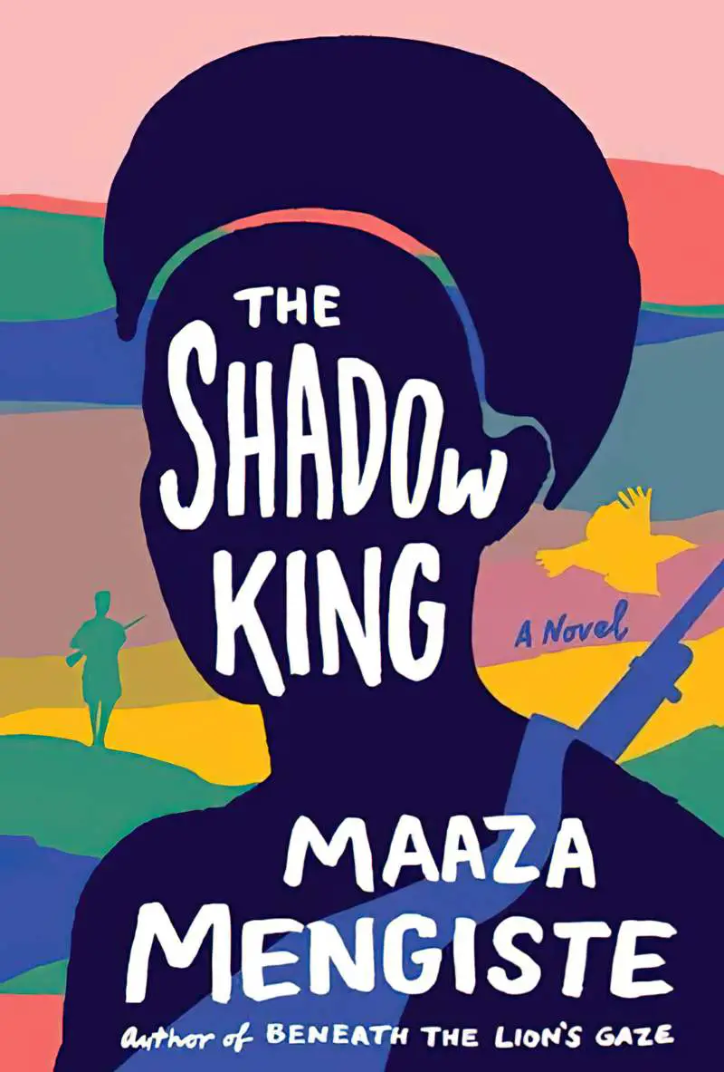
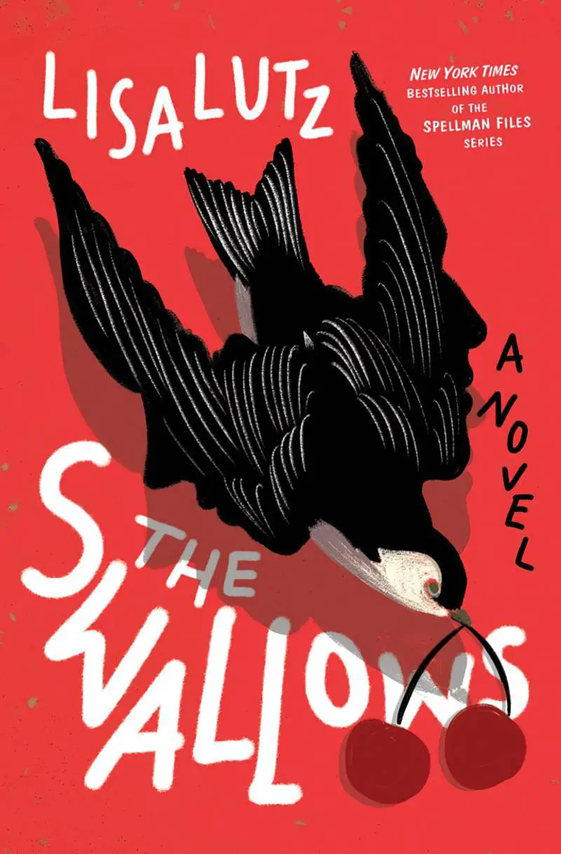
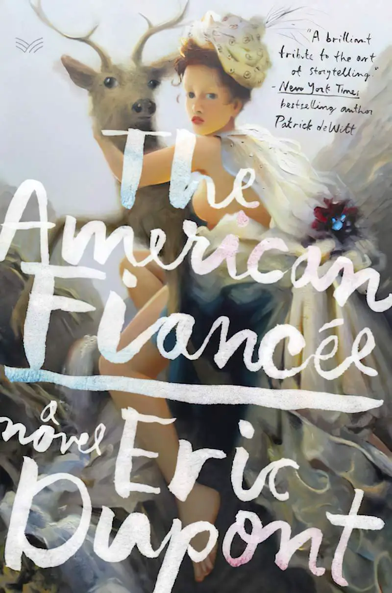
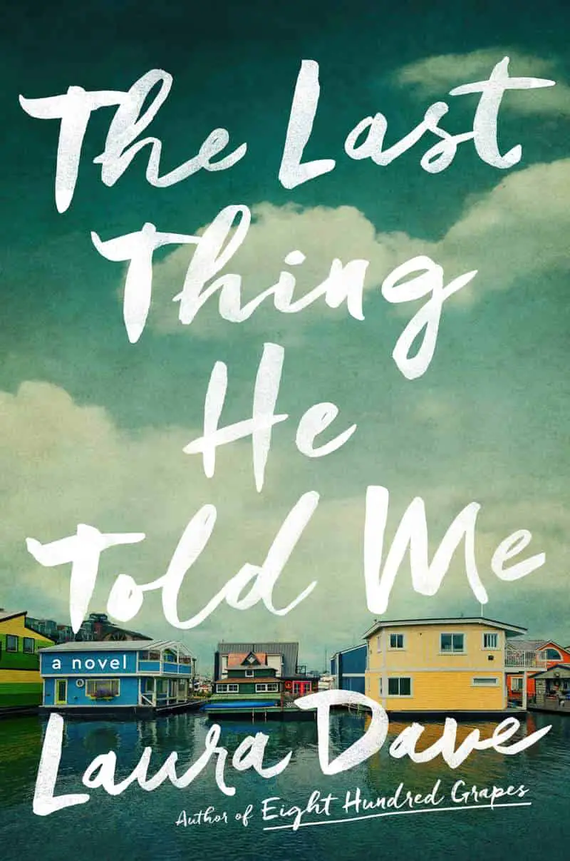
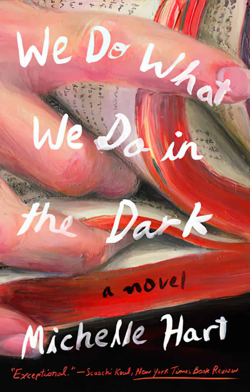
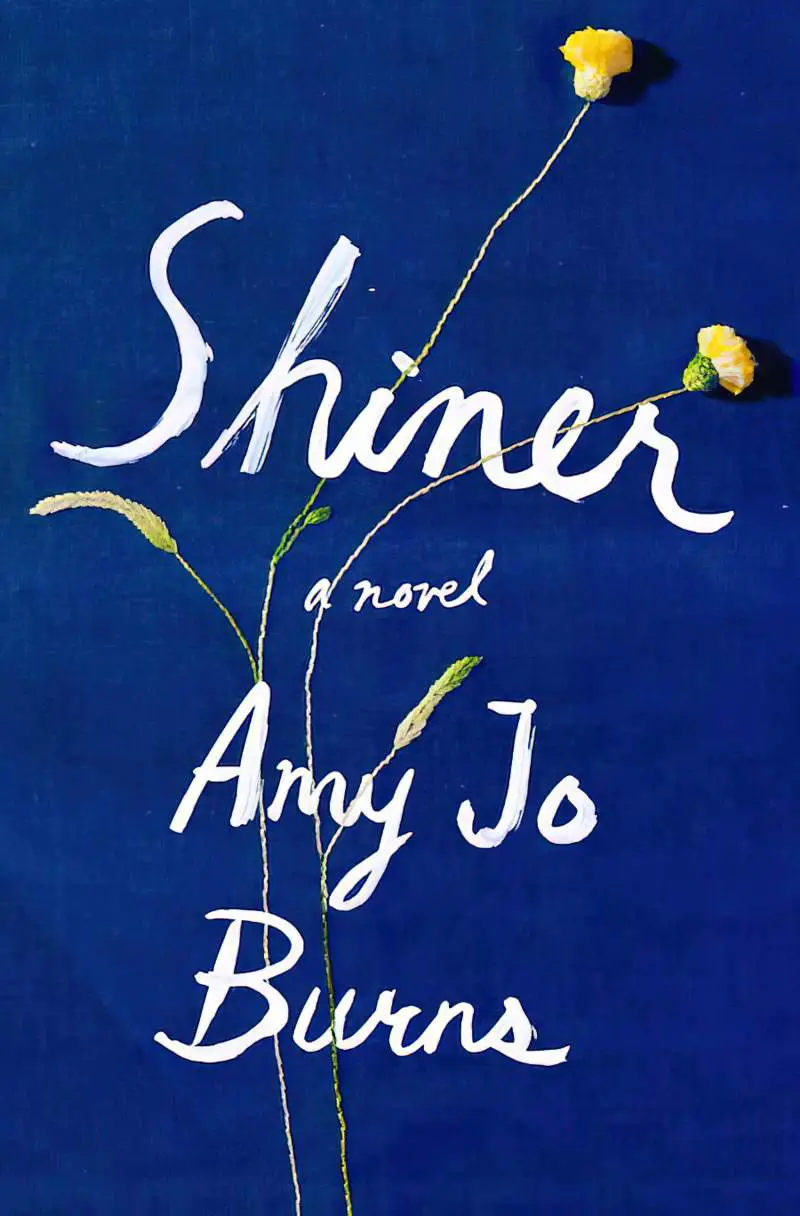
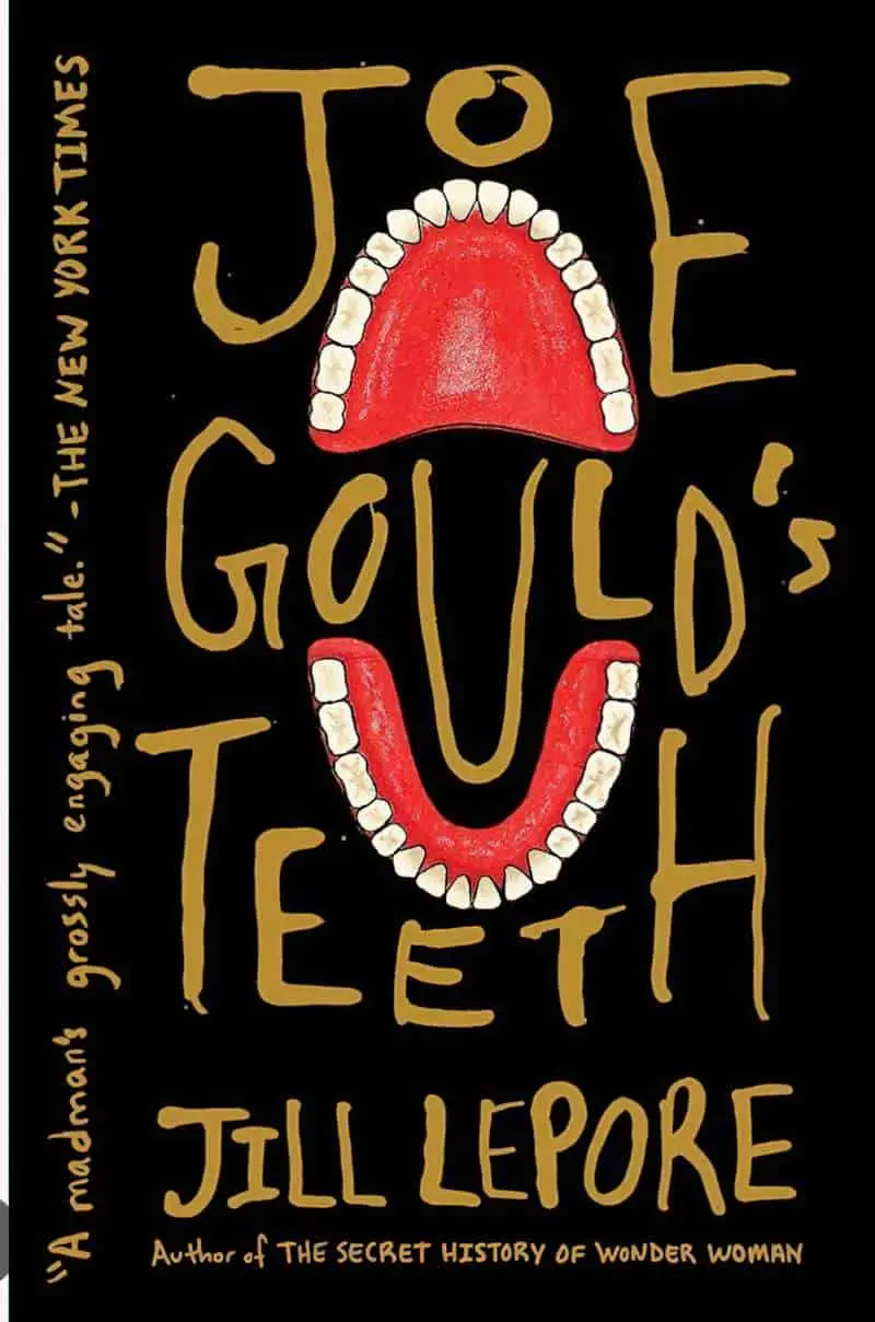
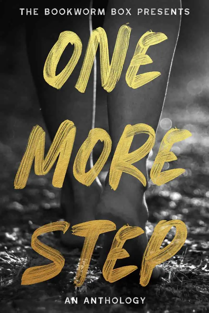
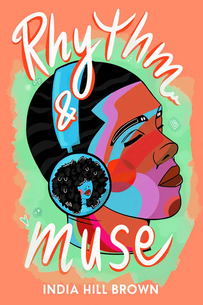
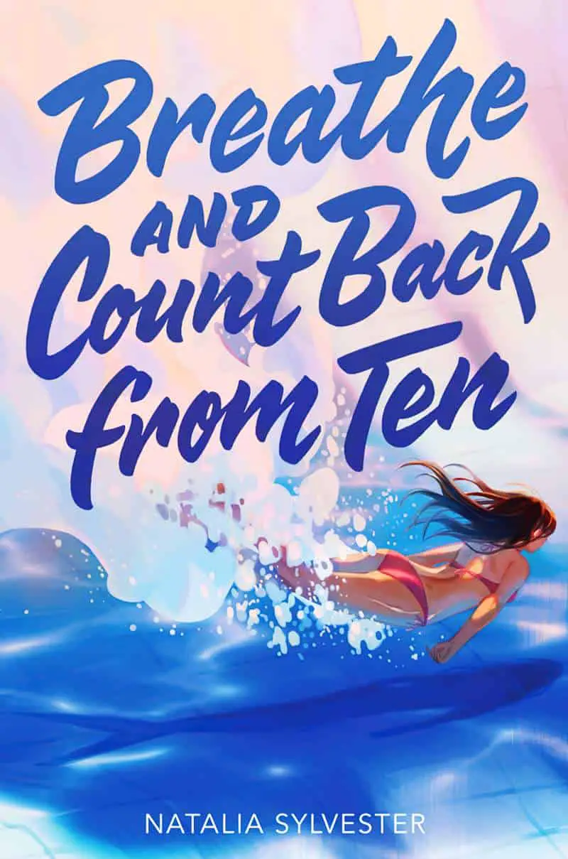
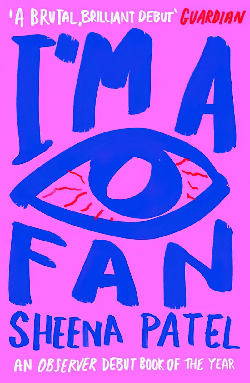
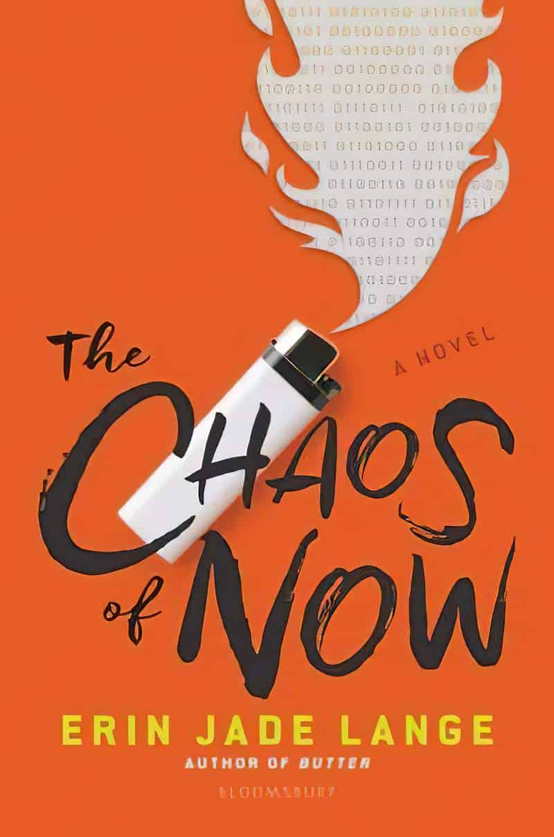
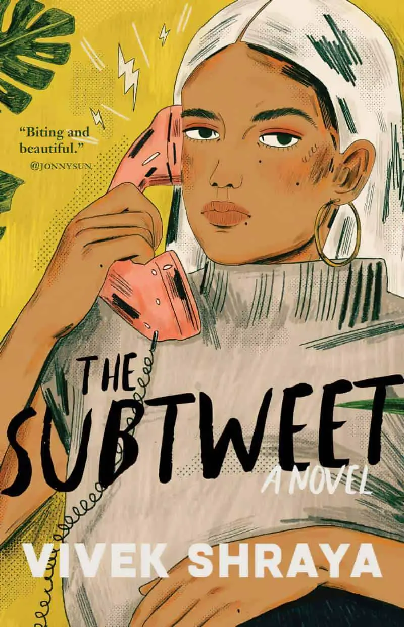
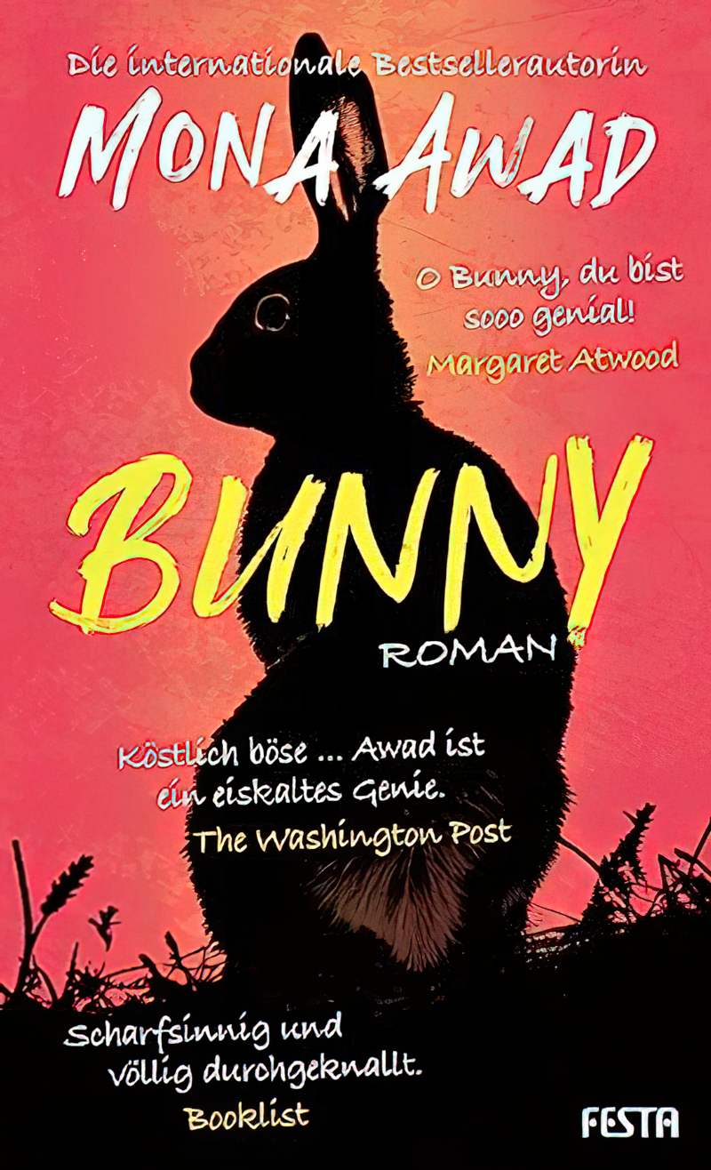
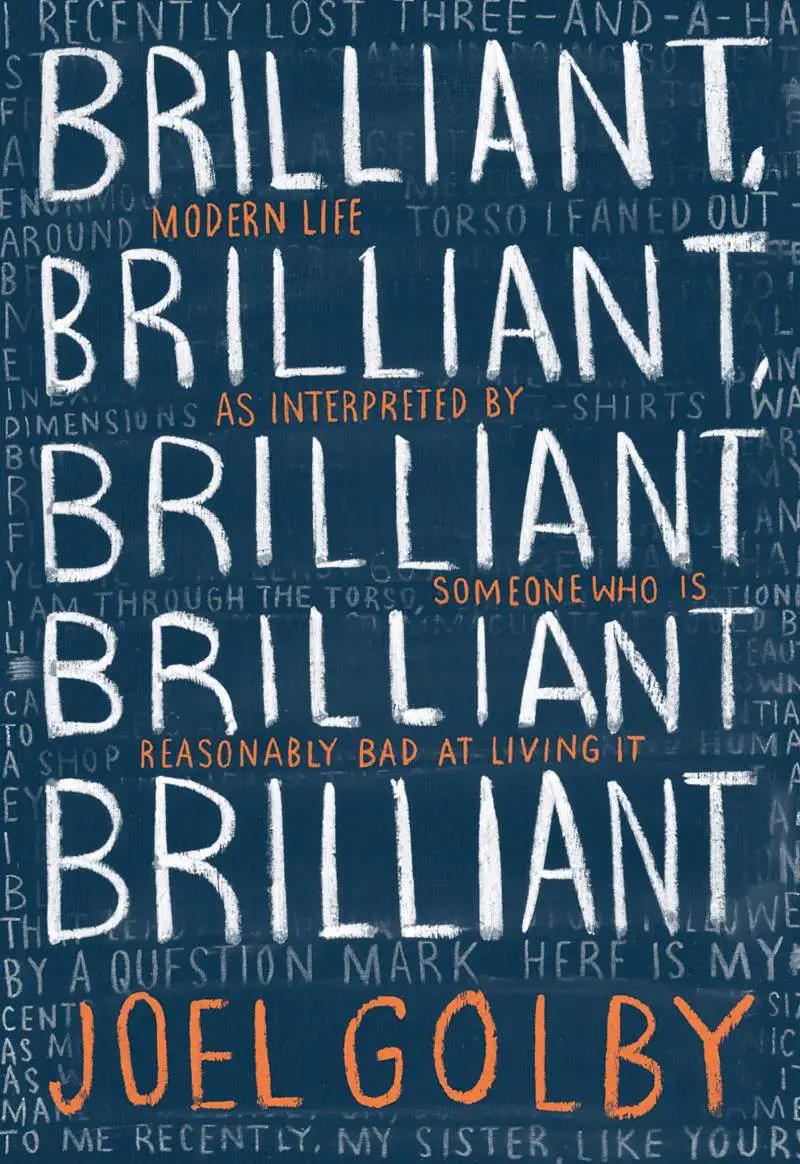
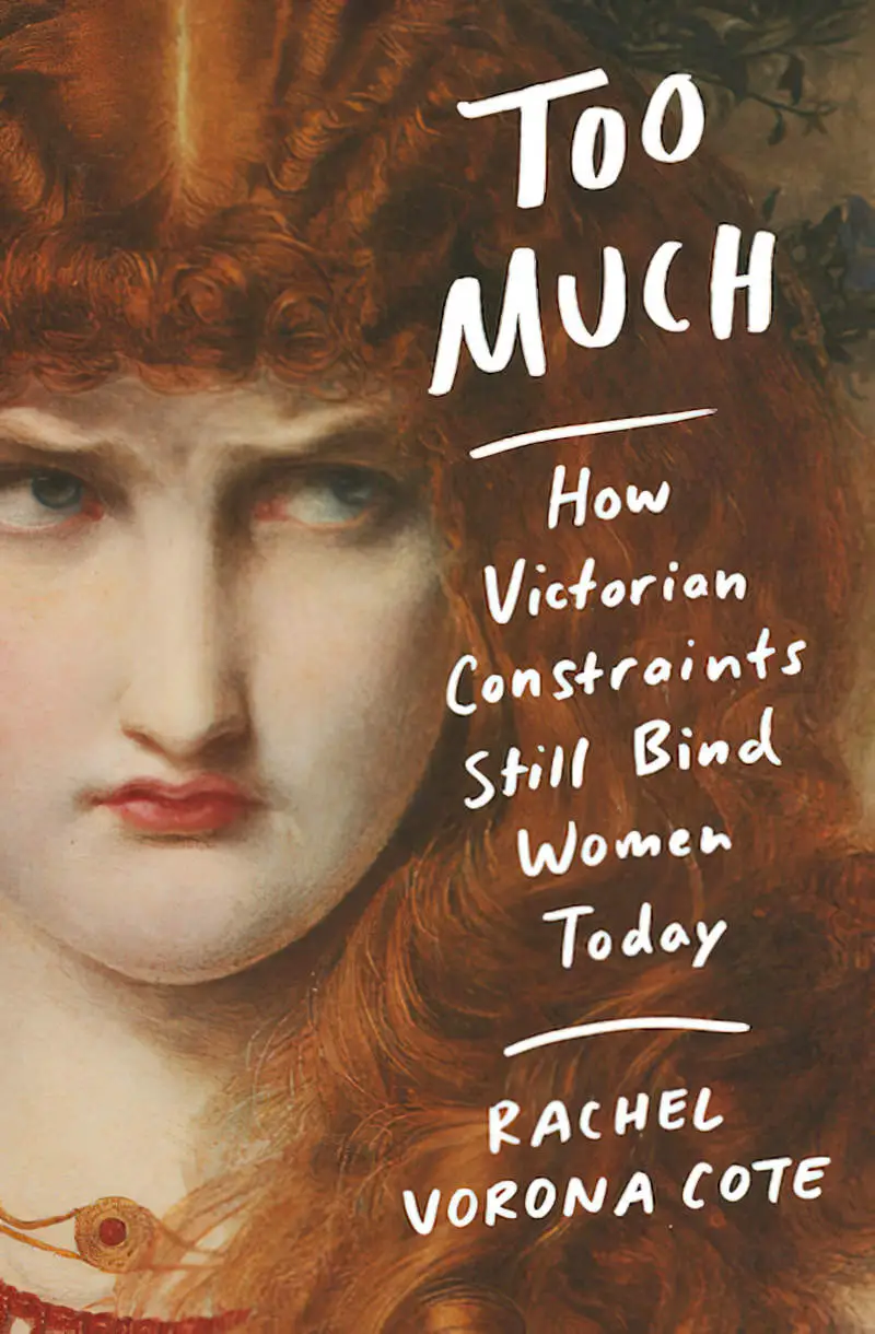
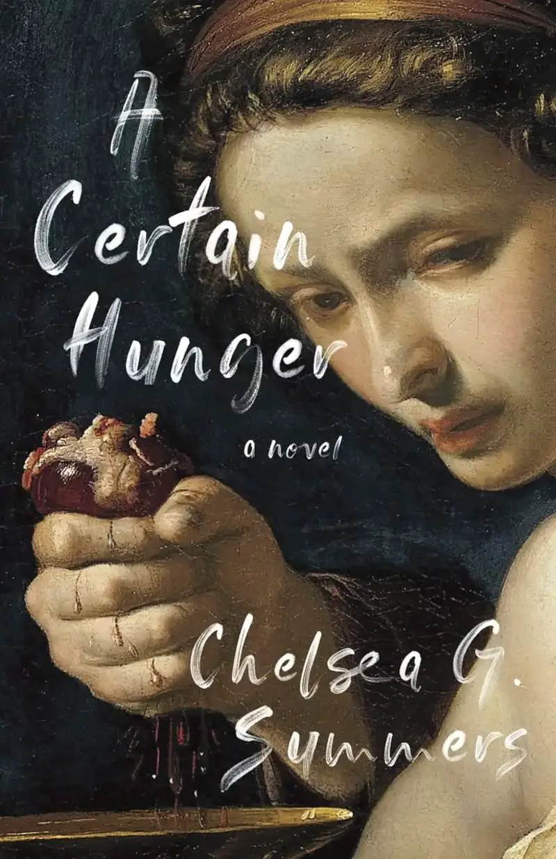
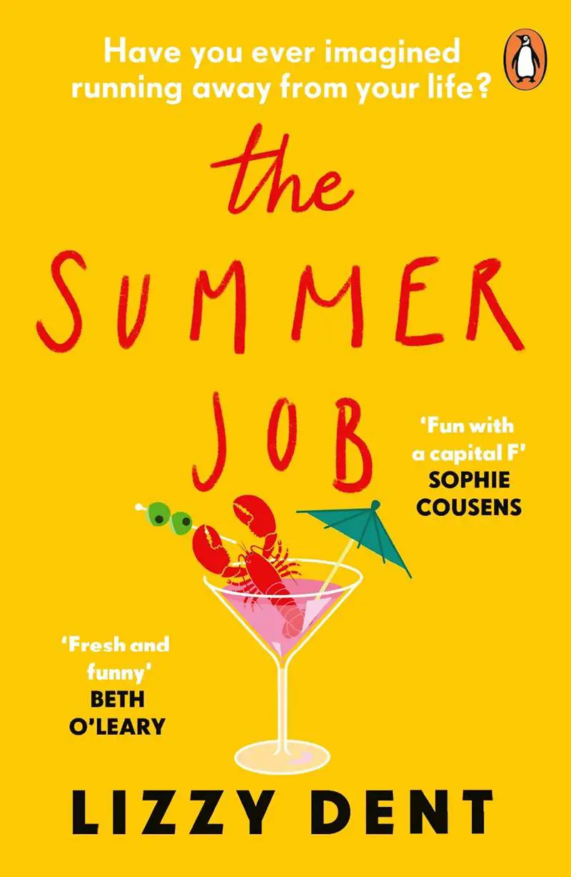
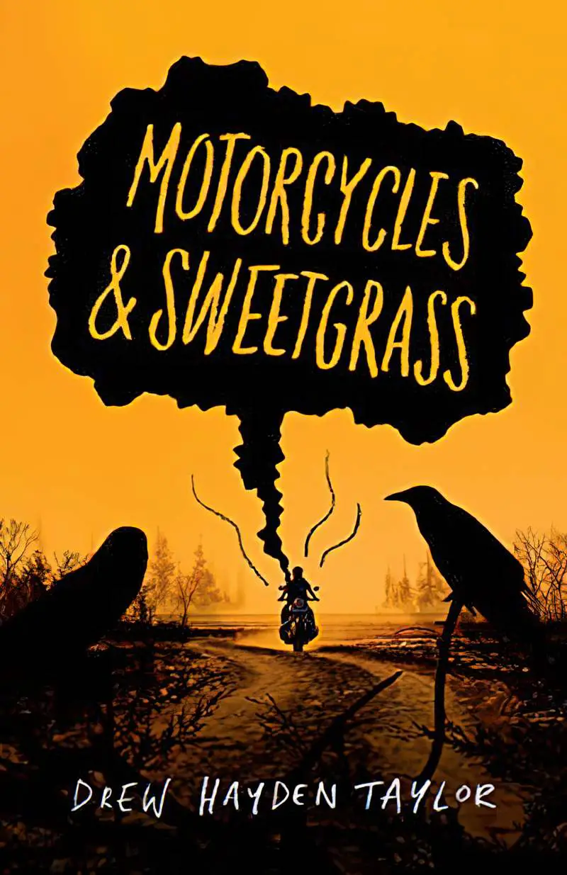
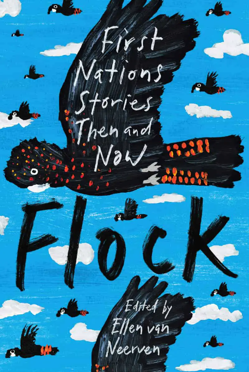
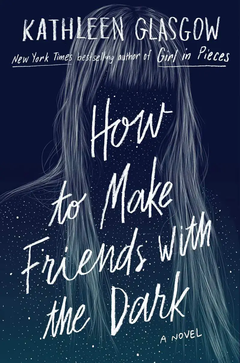
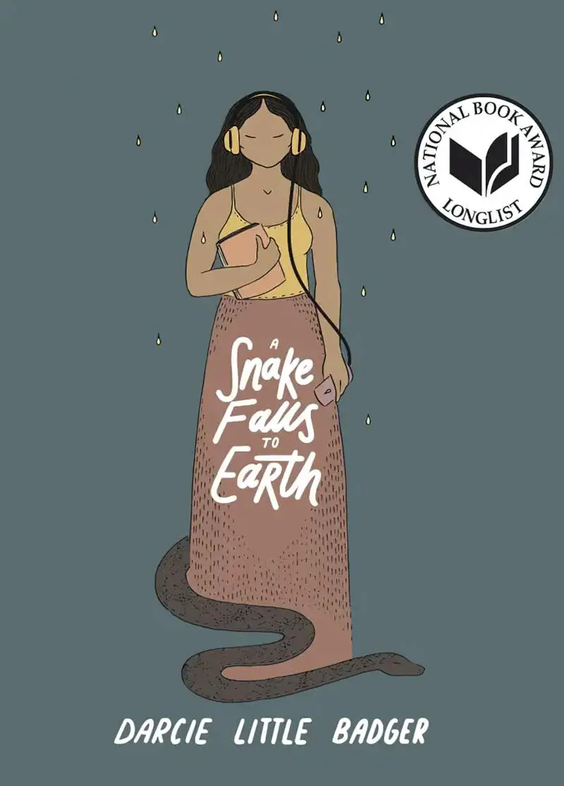
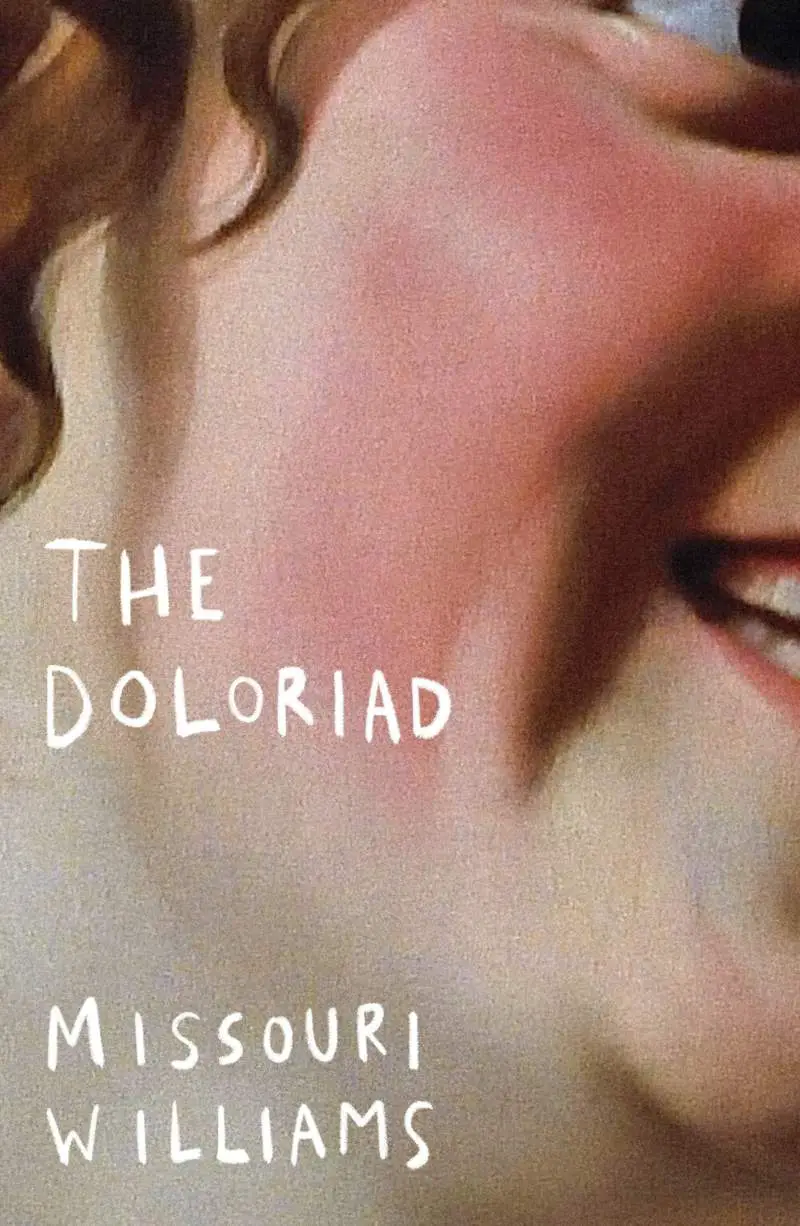
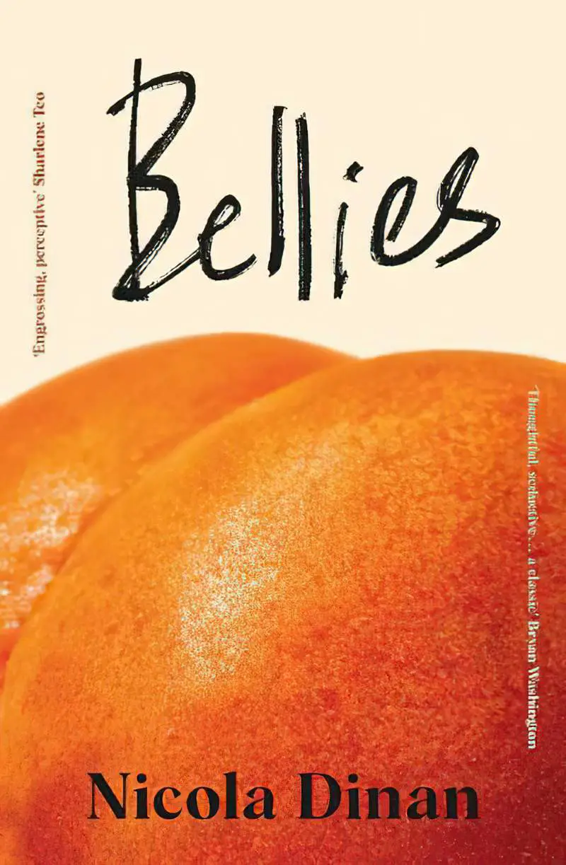
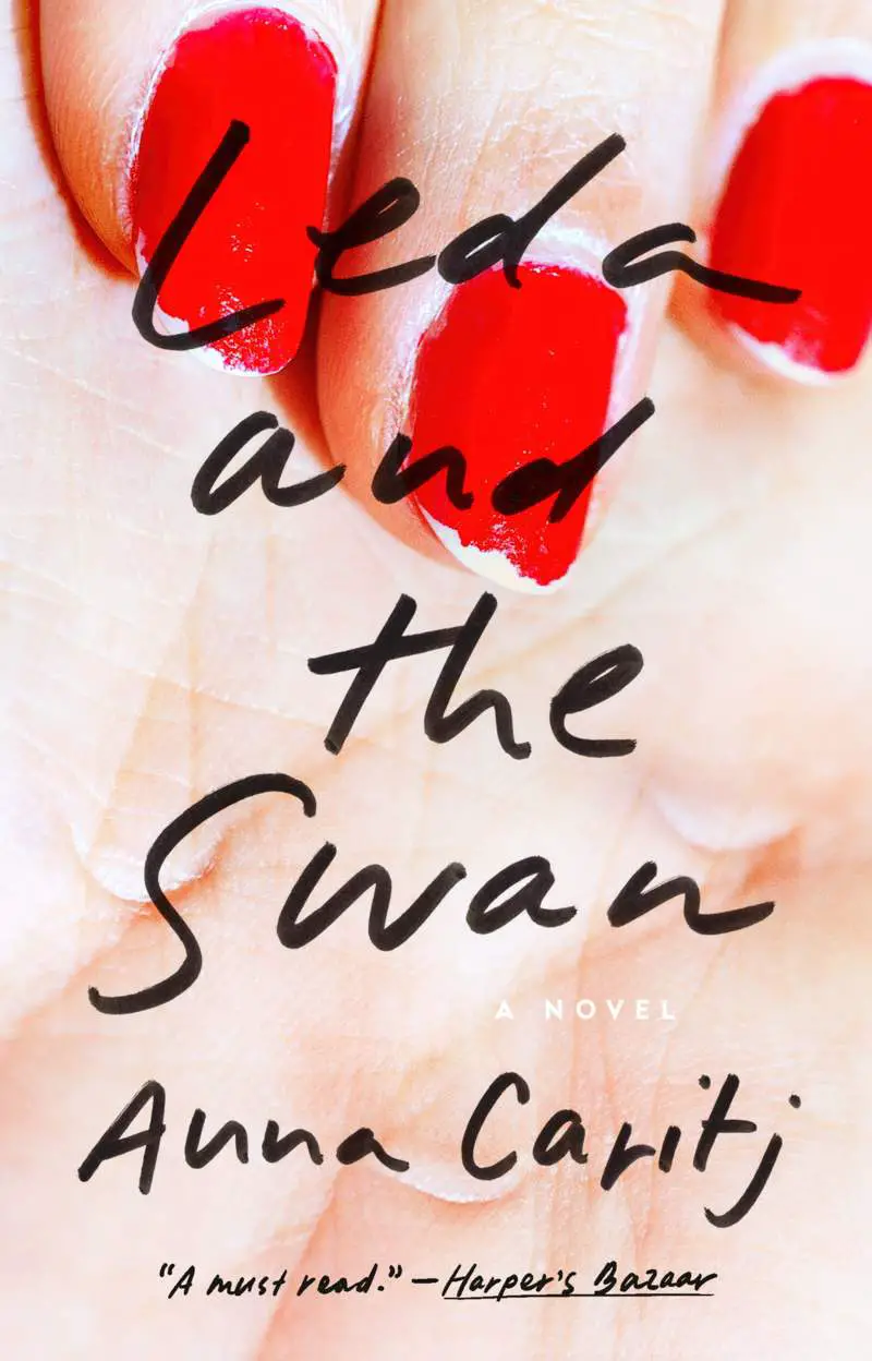
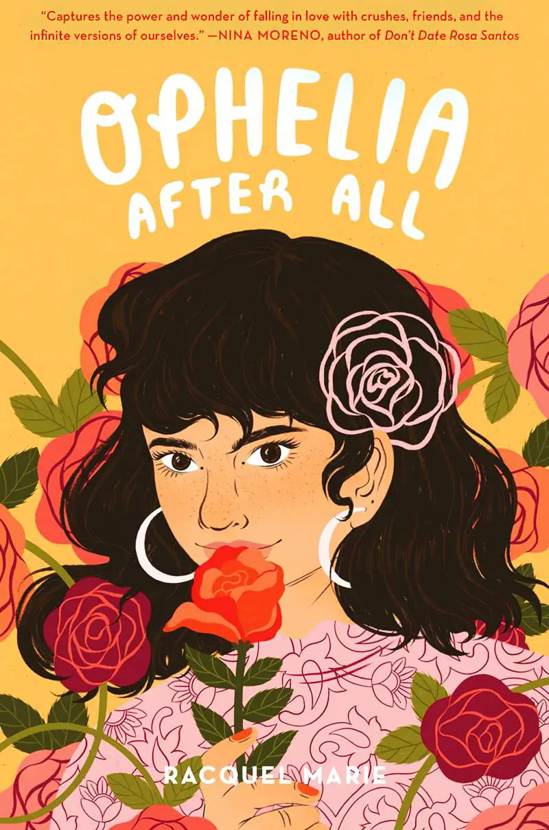
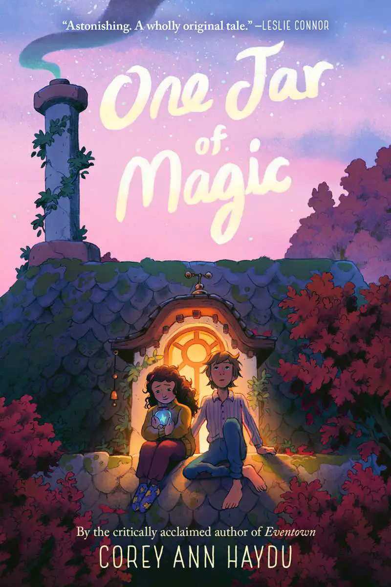
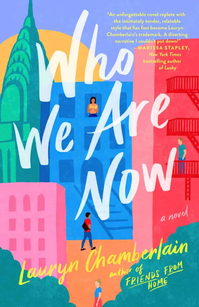
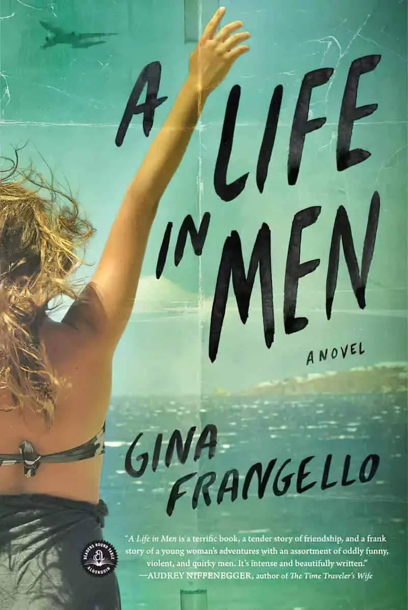
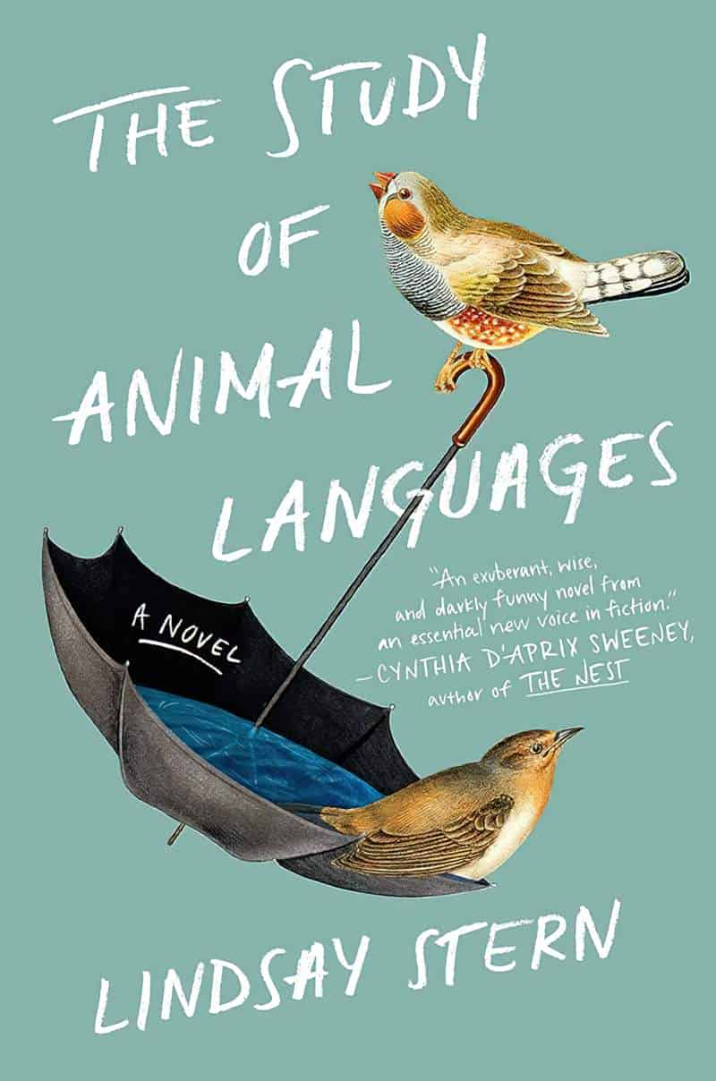
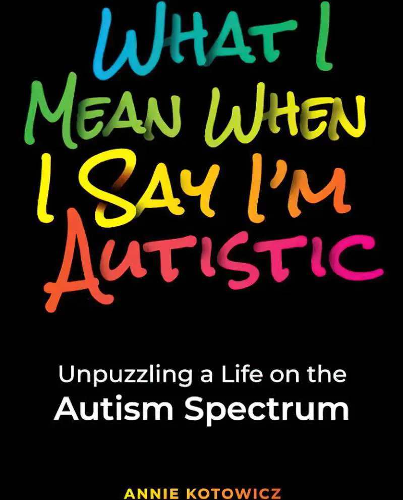
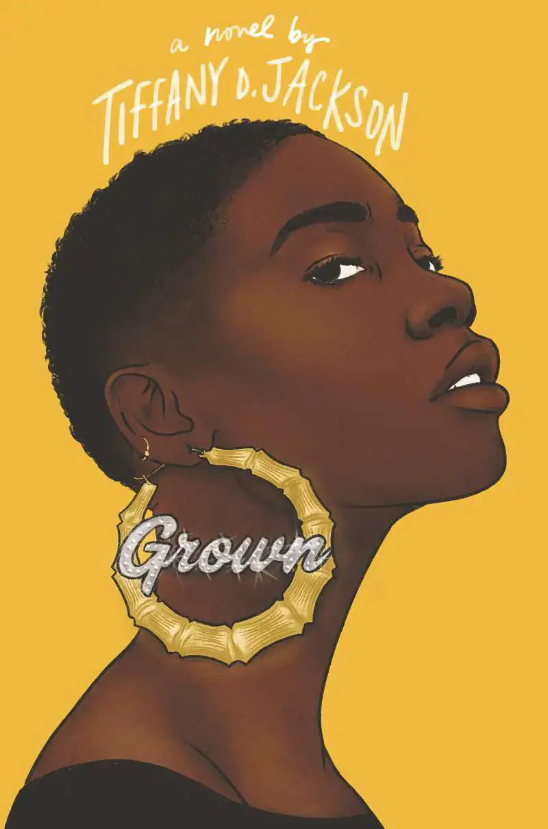
MORE EXAMPLES OF BRUSH SCRIPT ON BOOK COVERS
I have a lot of brush and felt-tip typefaces in my library. They are appealing, but don’t tend to look good unless I play with the tilt, sizing and get the typeface combo exactly right.
Let’s take a close look at how designers work with brush fonts.
One thing that stands out (with few exceptions) is the absence of layer effects on the text (drop shadows, outlines and so on). These fonts are designed to stand on their own.
Brush typefaces are especially well-suited to transparency. Typefaces with transparency are SVG files, but they do require Adobe subscriptions to work. SVG fonts typically bundle with TTF or OTF versions, which will obviously work in cheaper software, but then you won’t get the transparent effects.


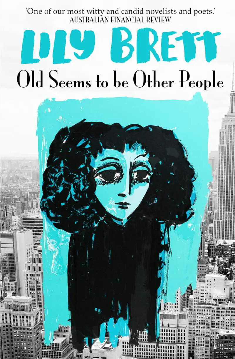
Old Seems to be Other People: Paganini font family.
Font at the top may be Parishish


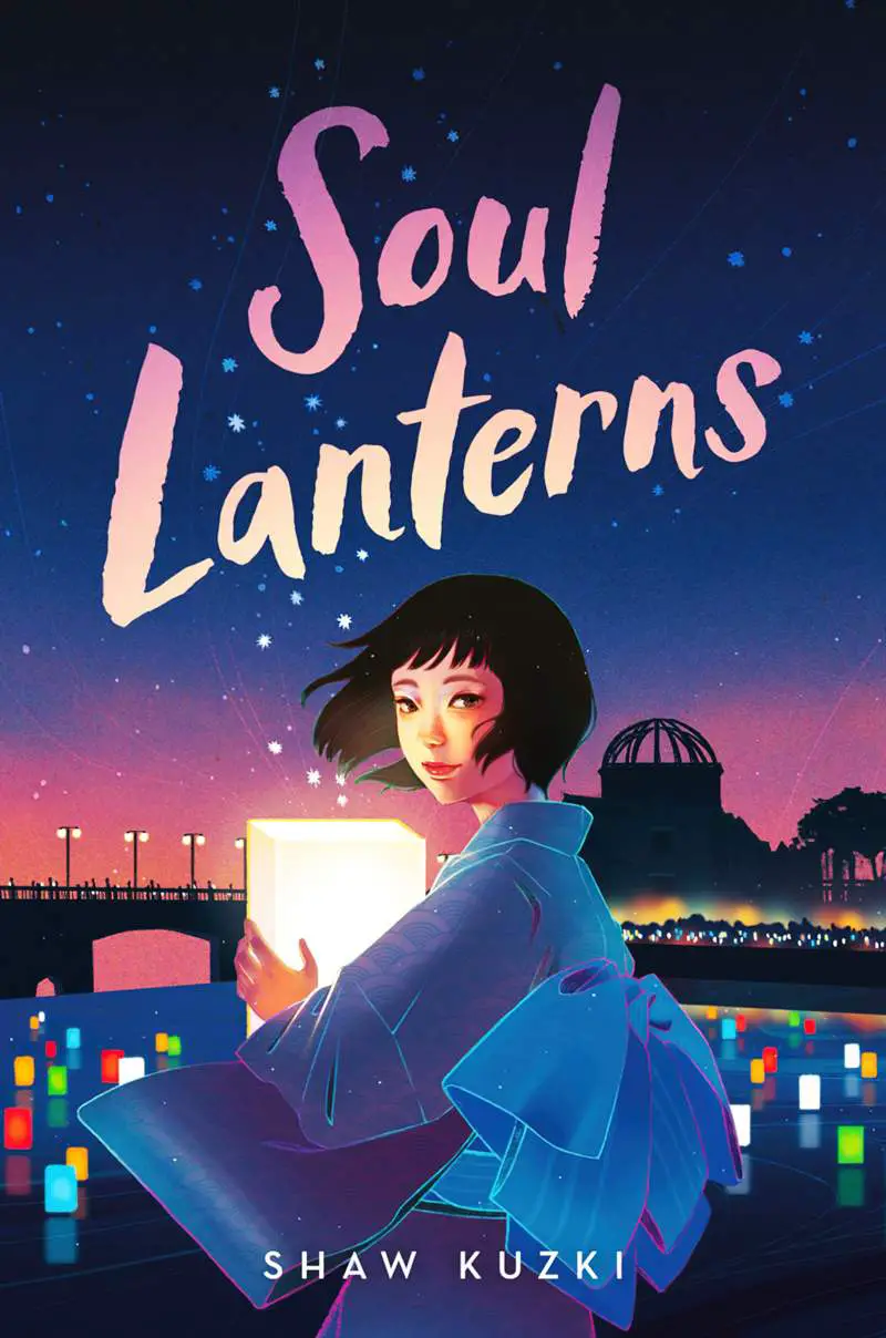
But what is it about this particular brush font that looks East Asian?