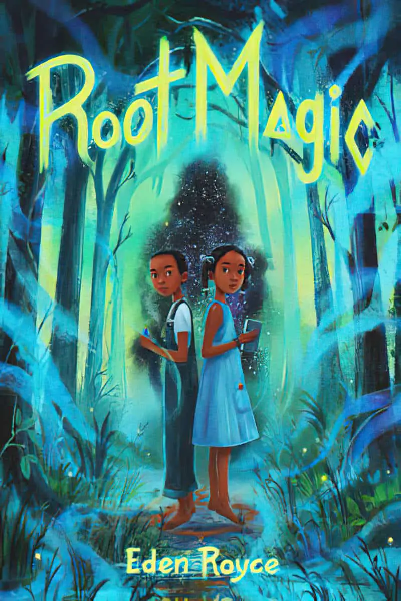
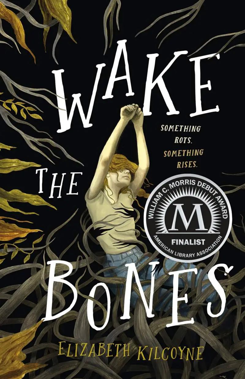
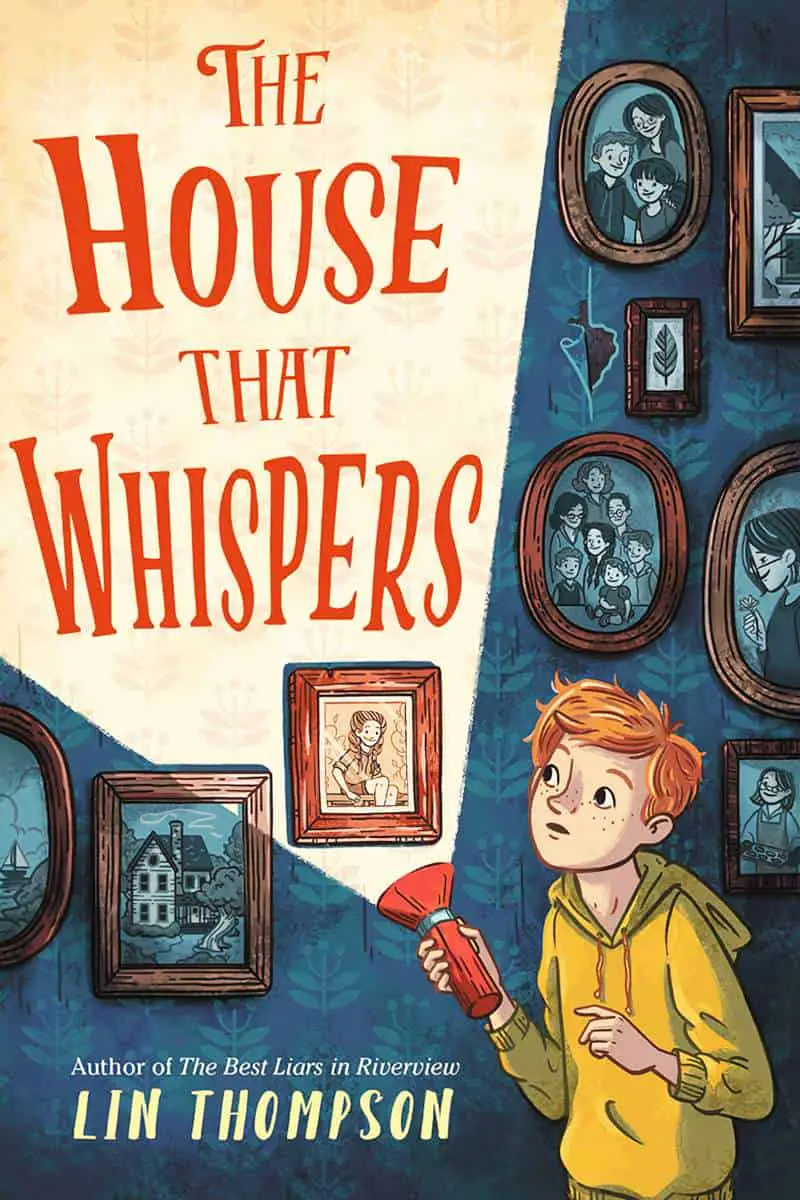
Let’s take a close look at how book cover designers alter the baselines of text to create a variety of interesting effects.
TILTING UP AND DOWN


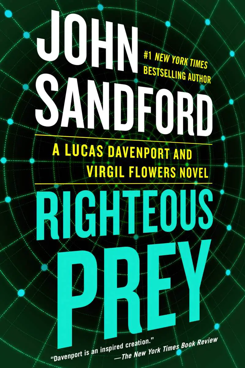
TILTING UP
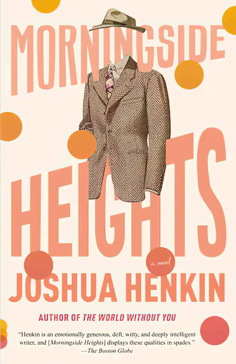
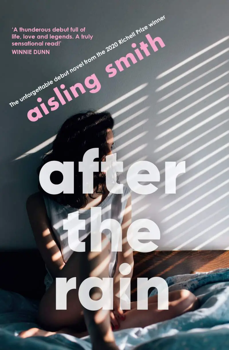
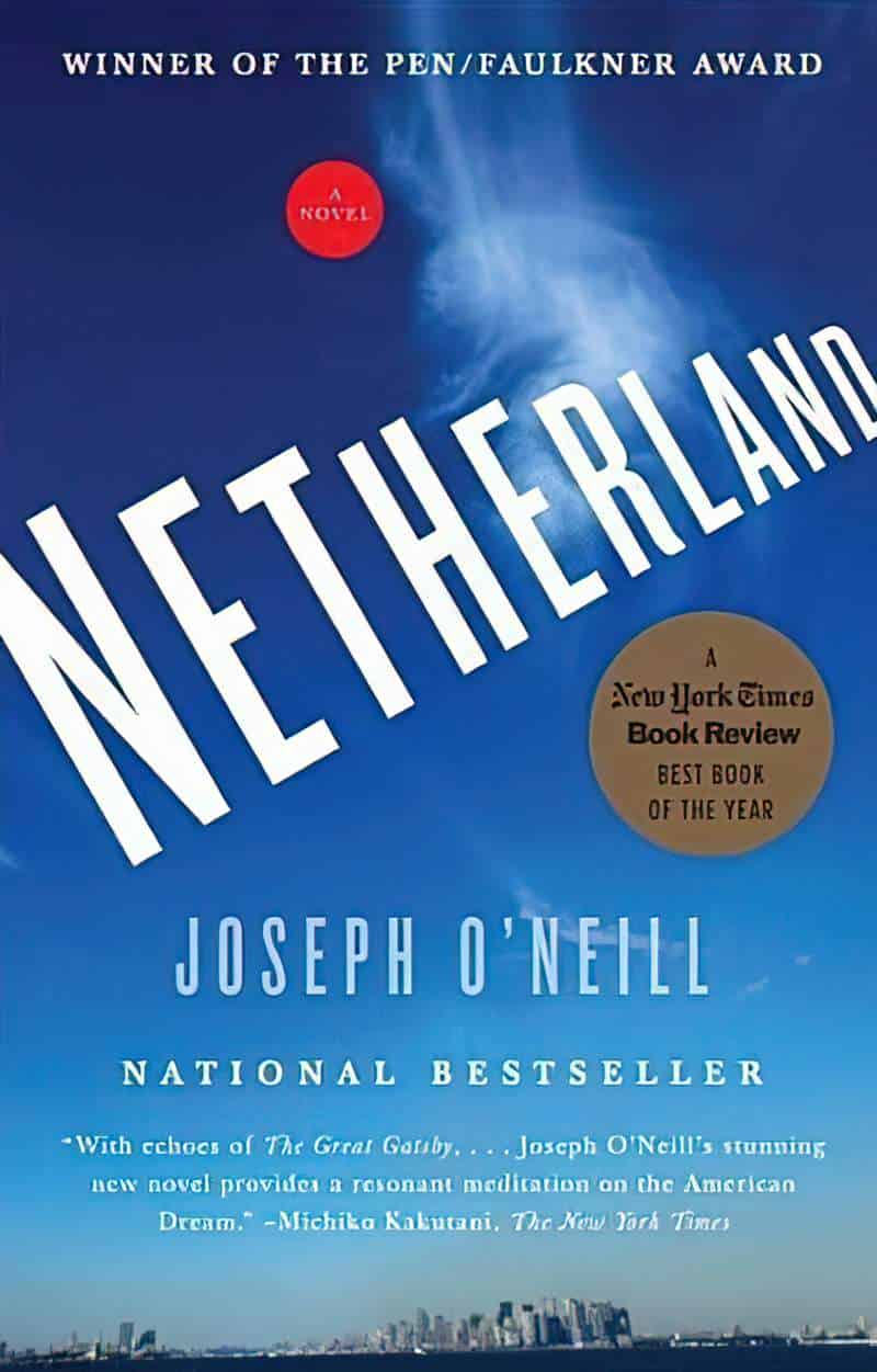
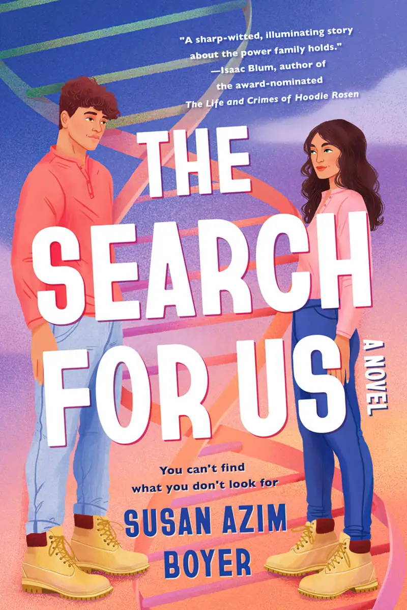
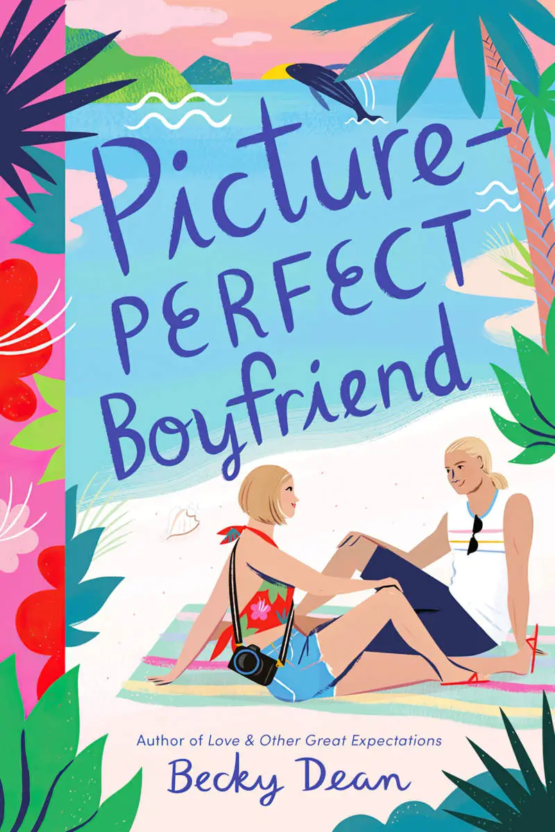
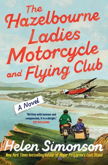
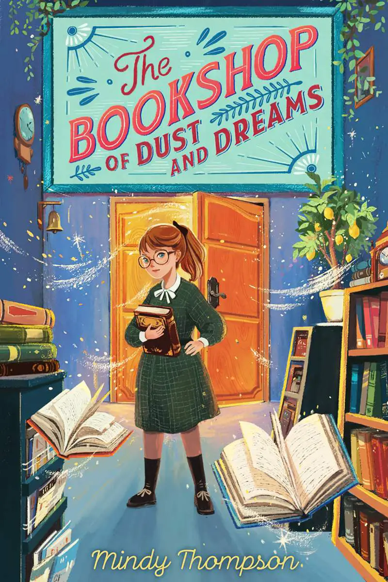
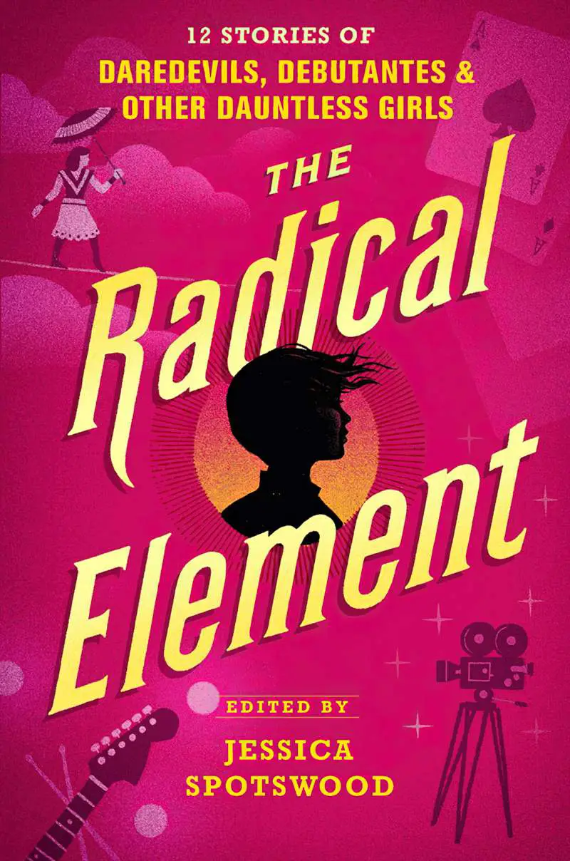
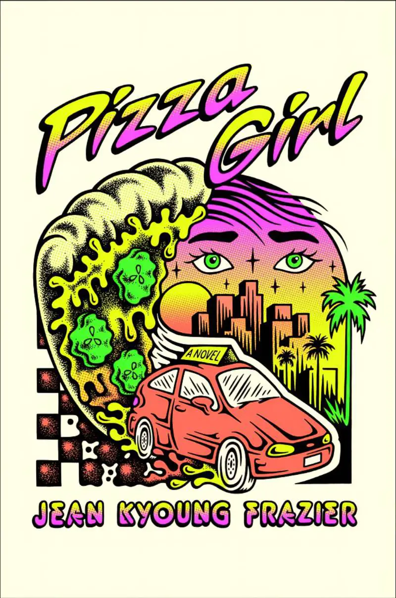
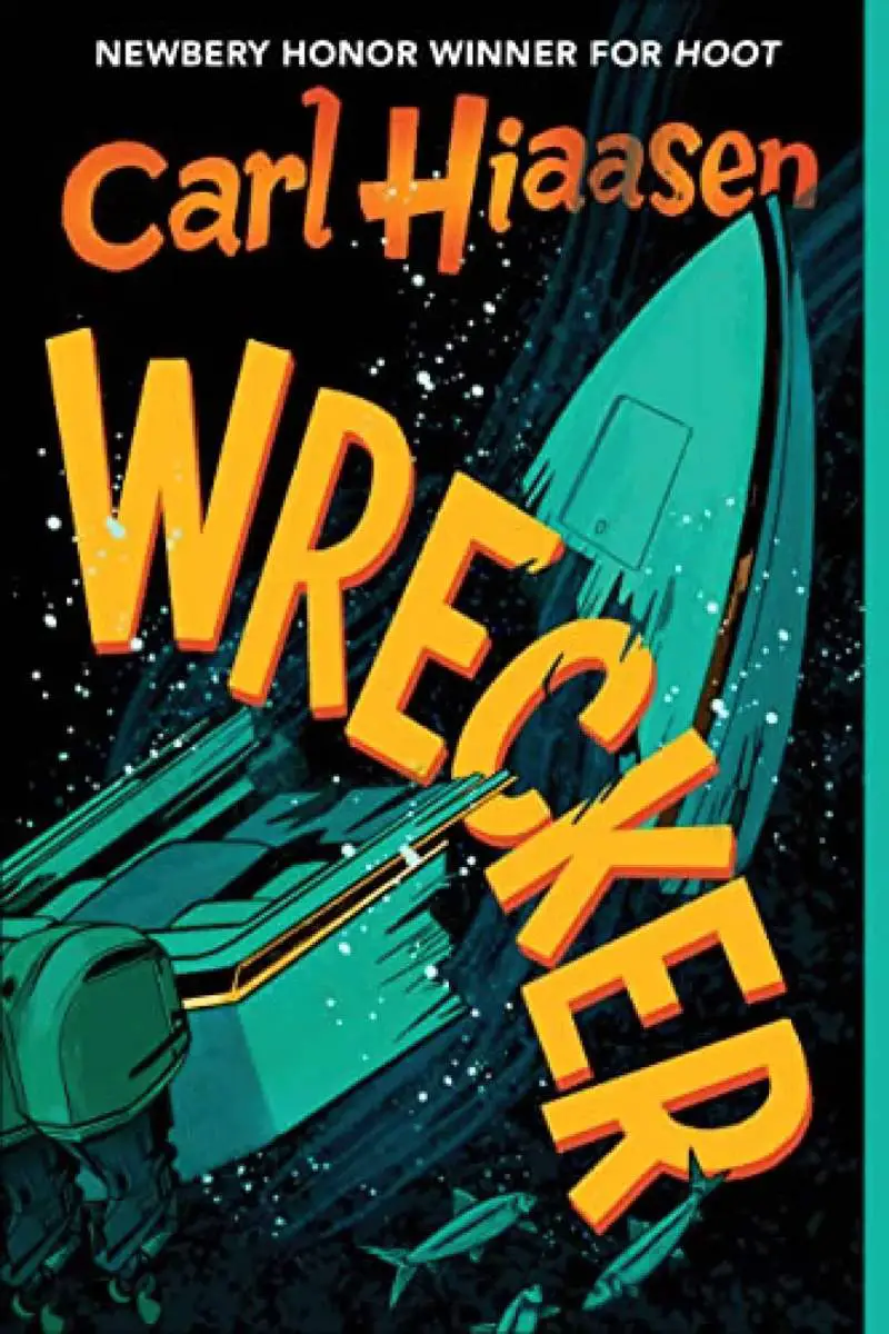
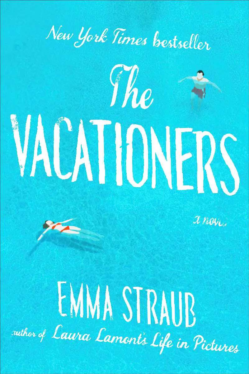
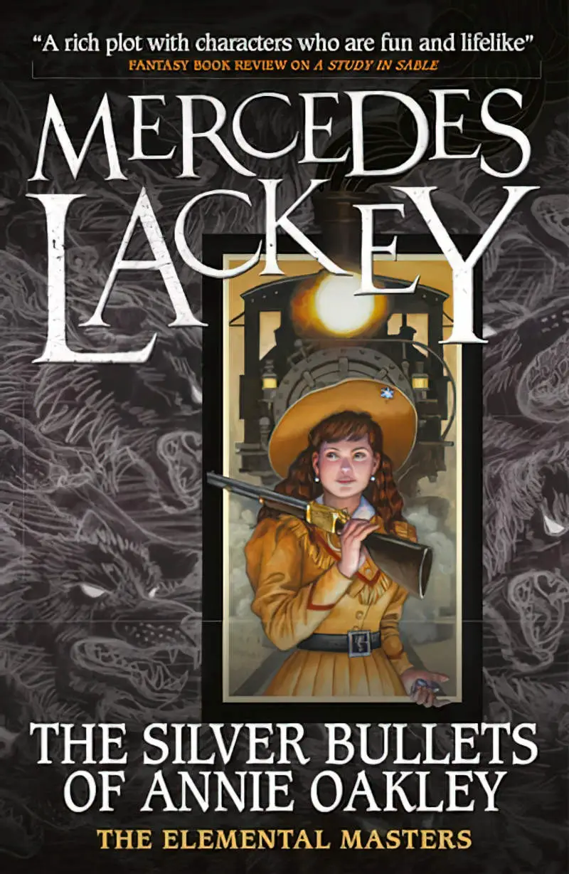
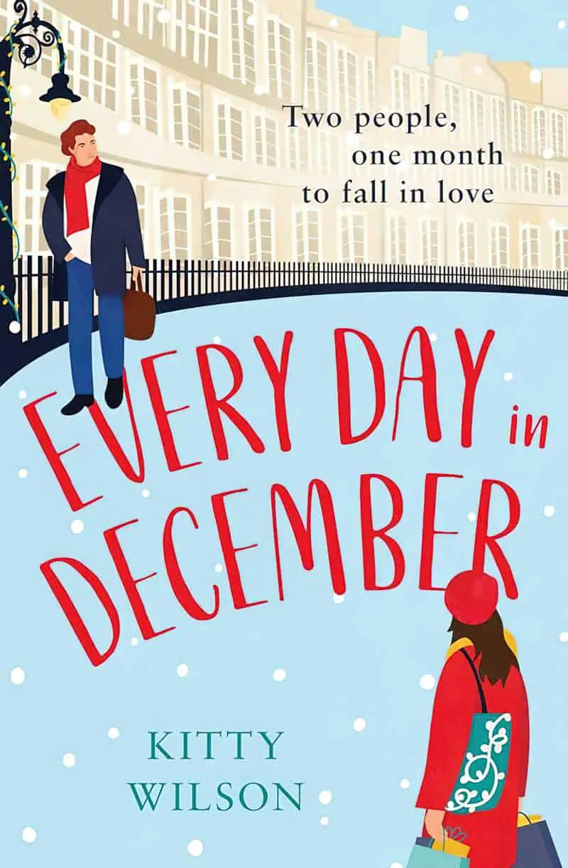
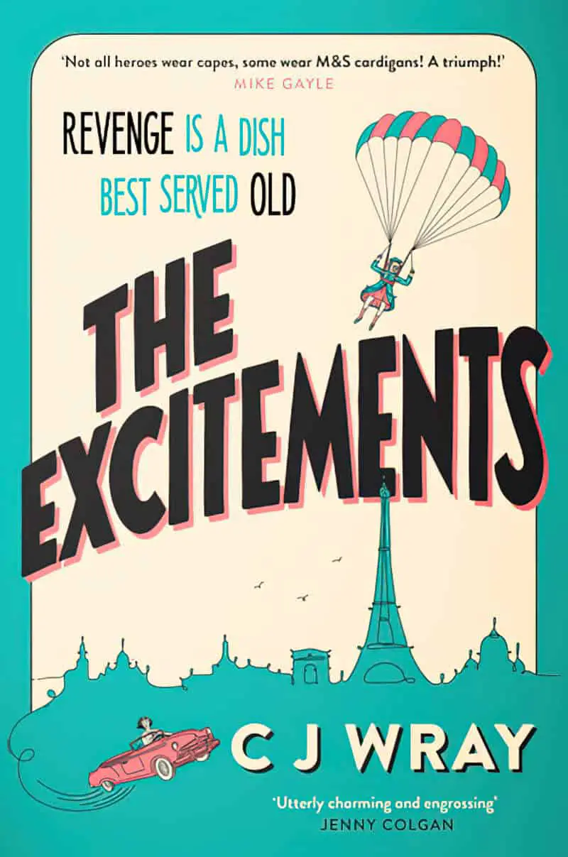
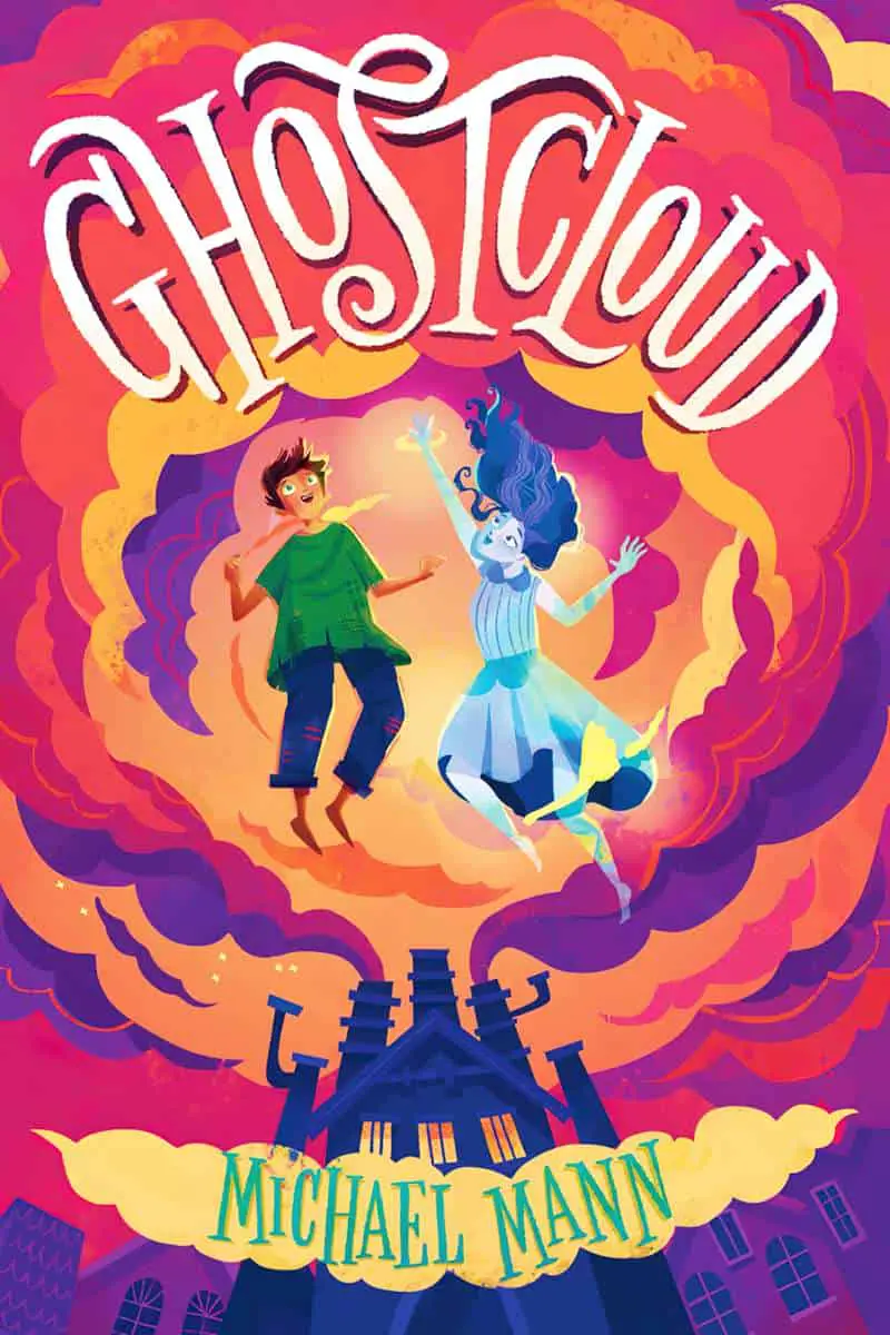
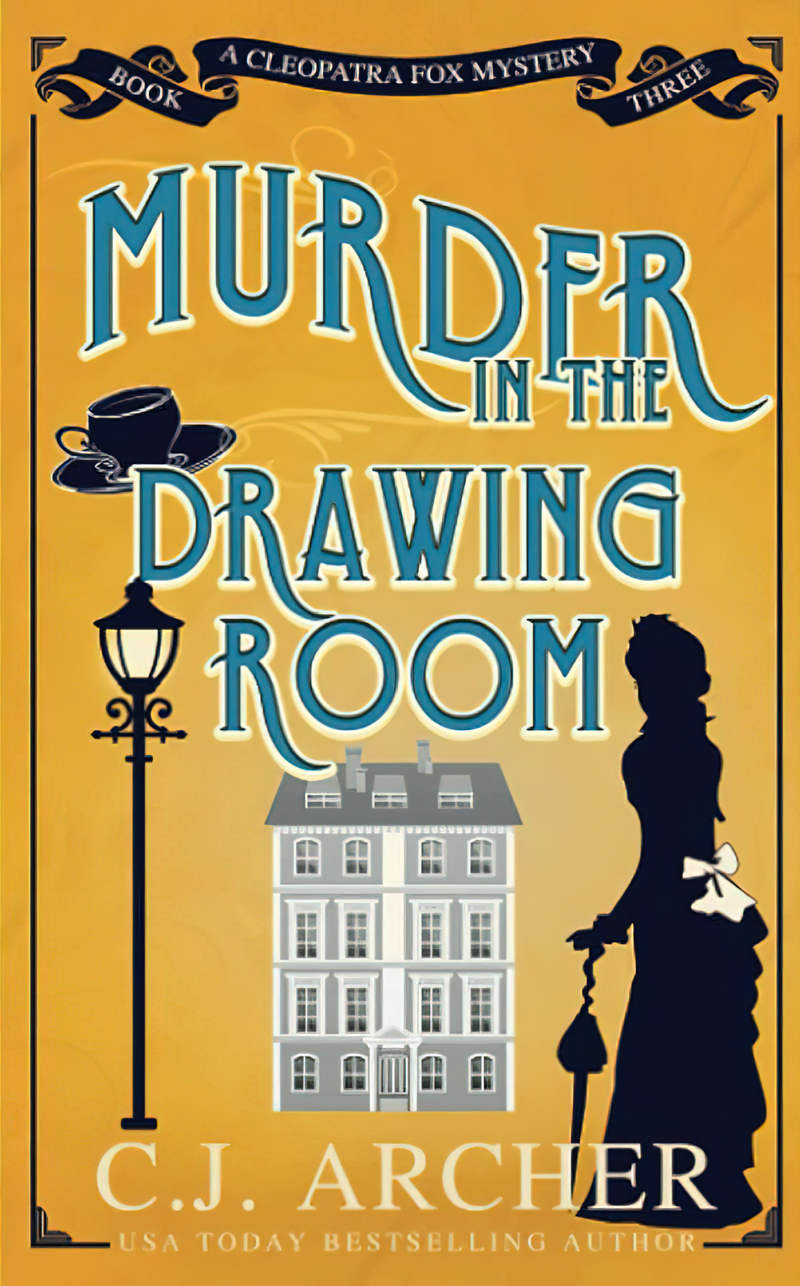
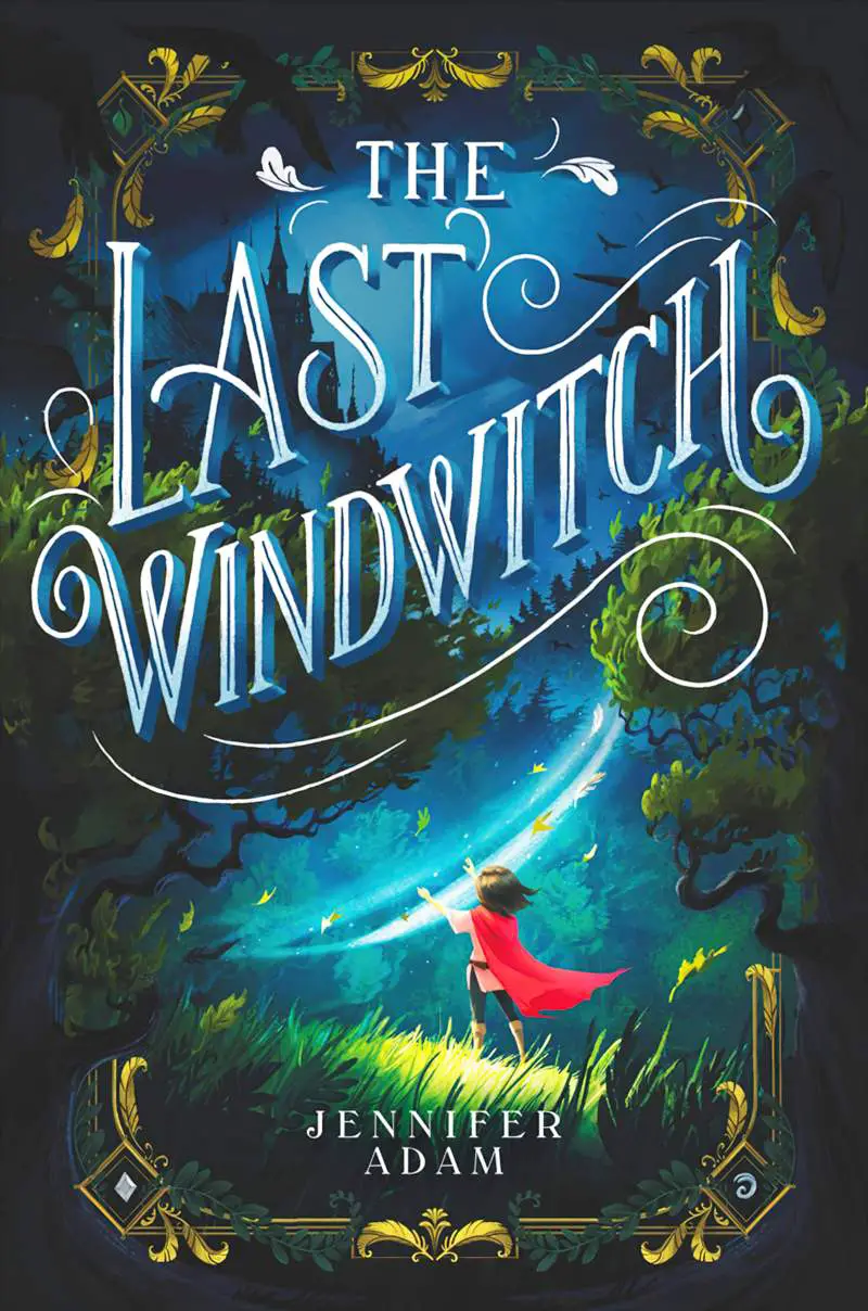
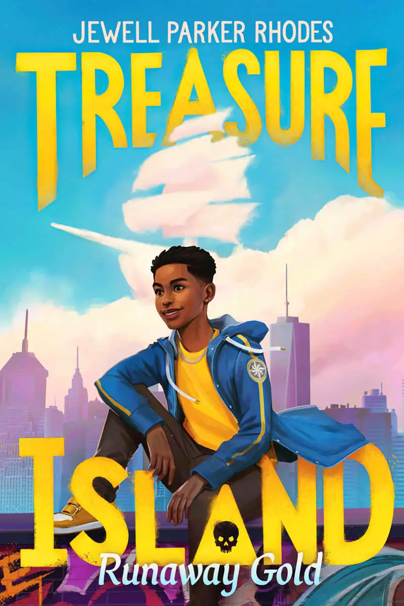
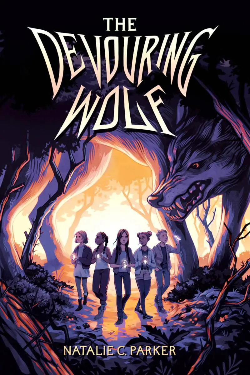
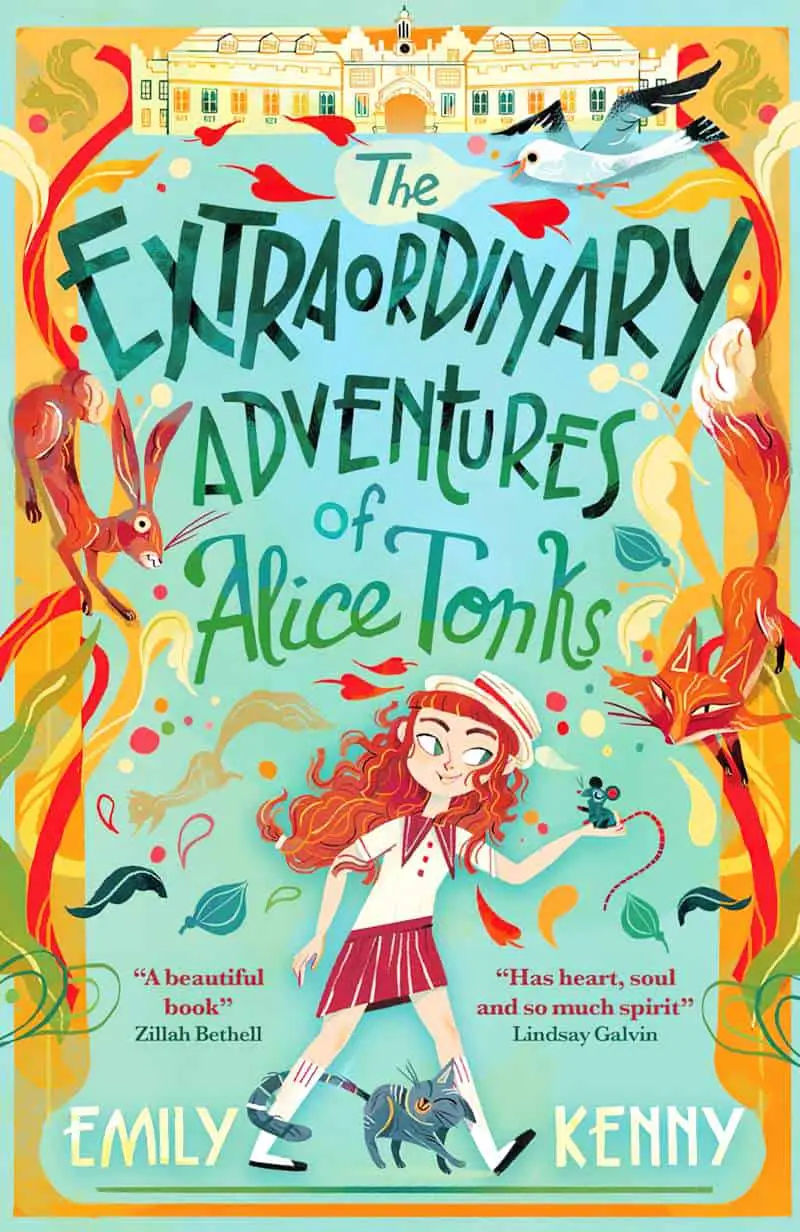
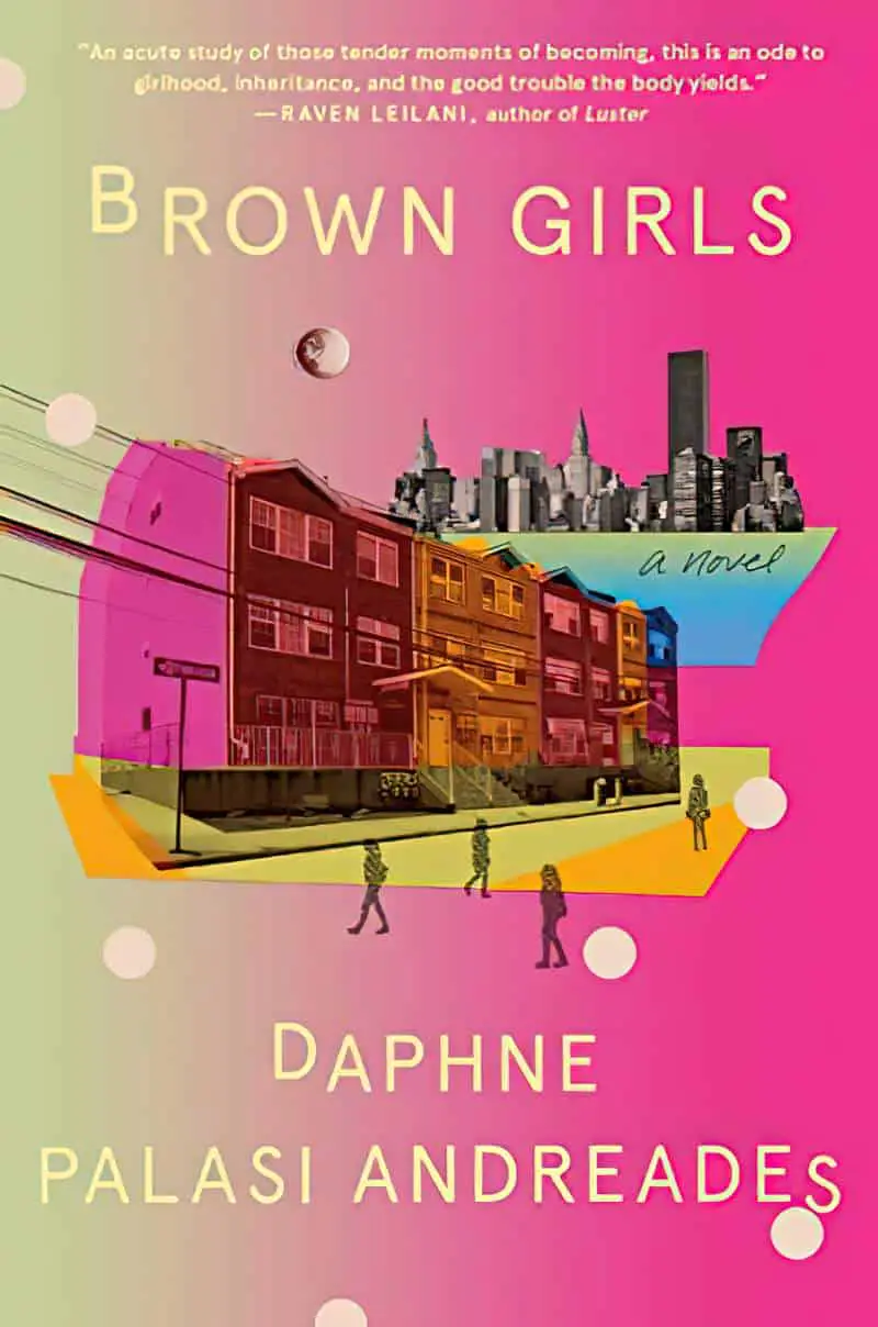
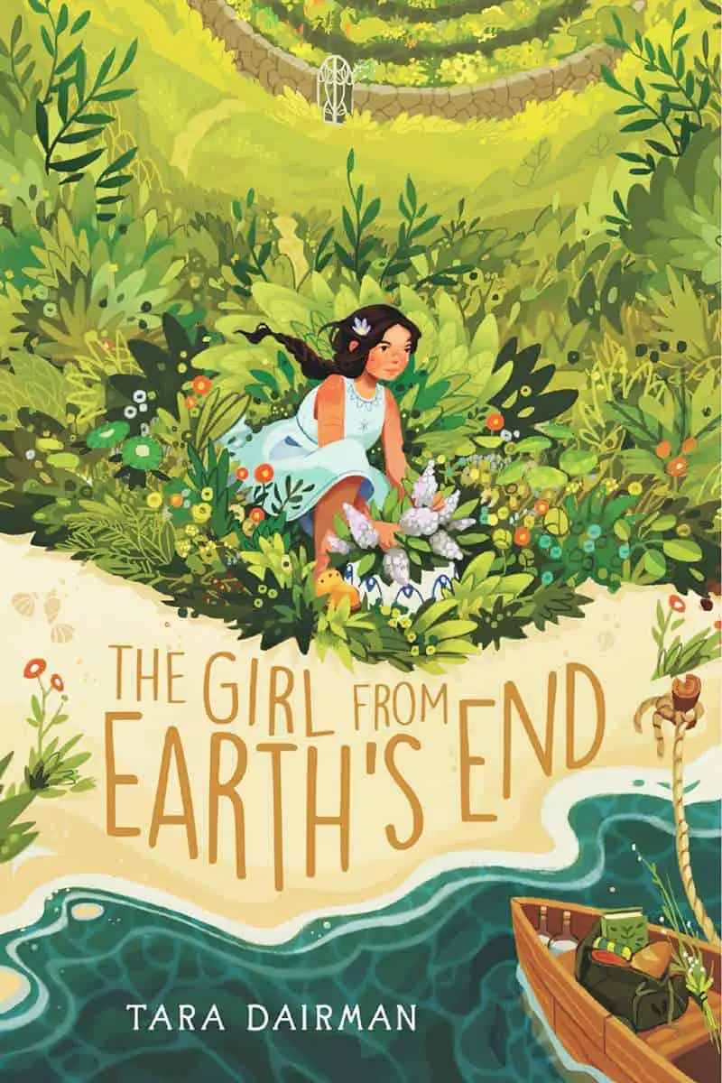
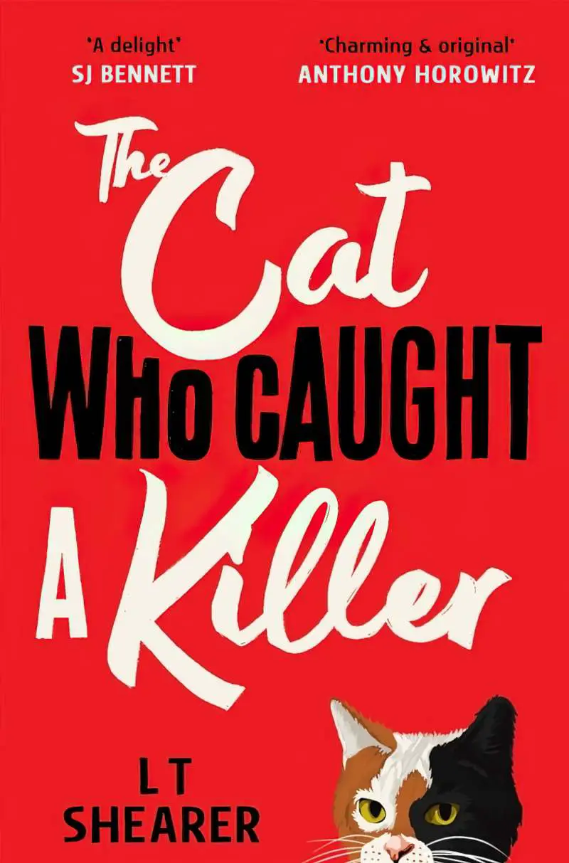
Tilting text upwards at about 20 degrees is very common and is therefore an unmarked design choice, though if you tilt upwards a lot, now you’ve got something different. If the font doesn’t look that great for some reason, try tilting it up a bit. This frequently improves the look. Or try tilting some of it (especially the lower lines, leaving the upper line horizontal).


TILTING DOWN
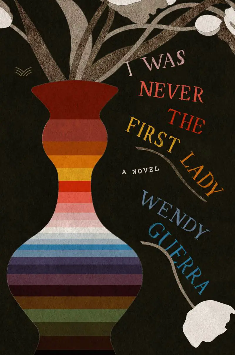
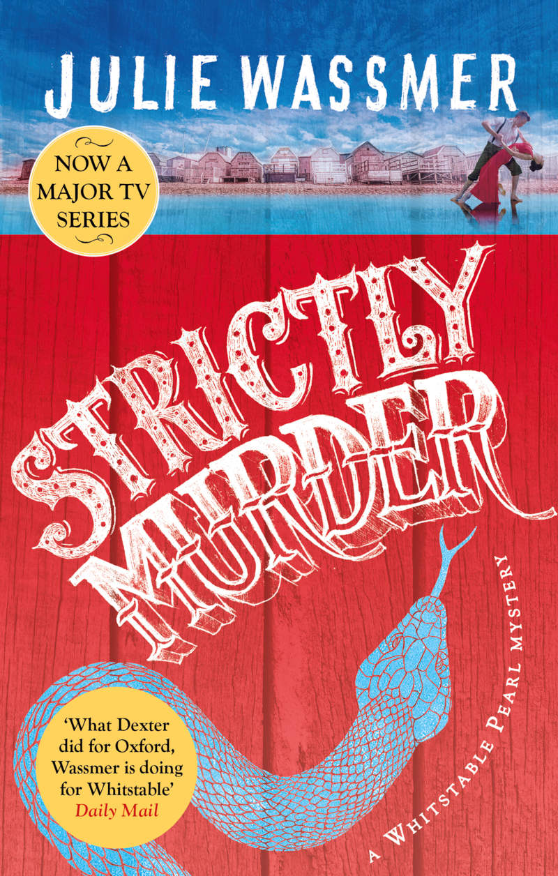
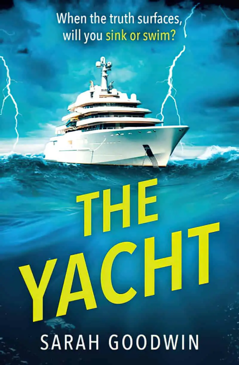
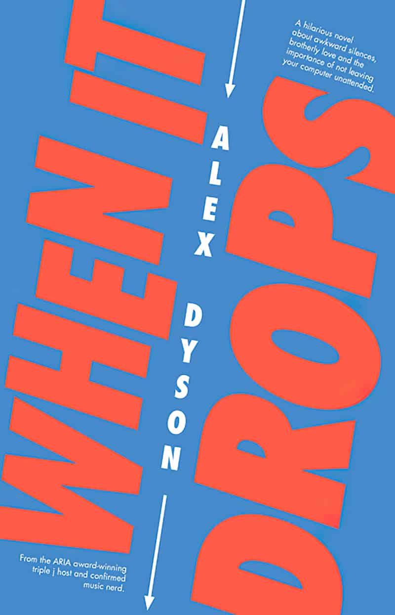
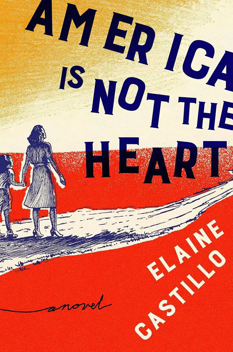
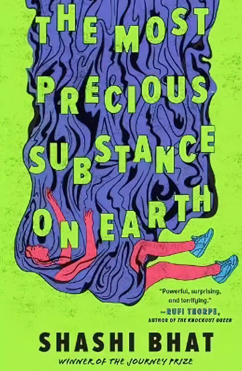
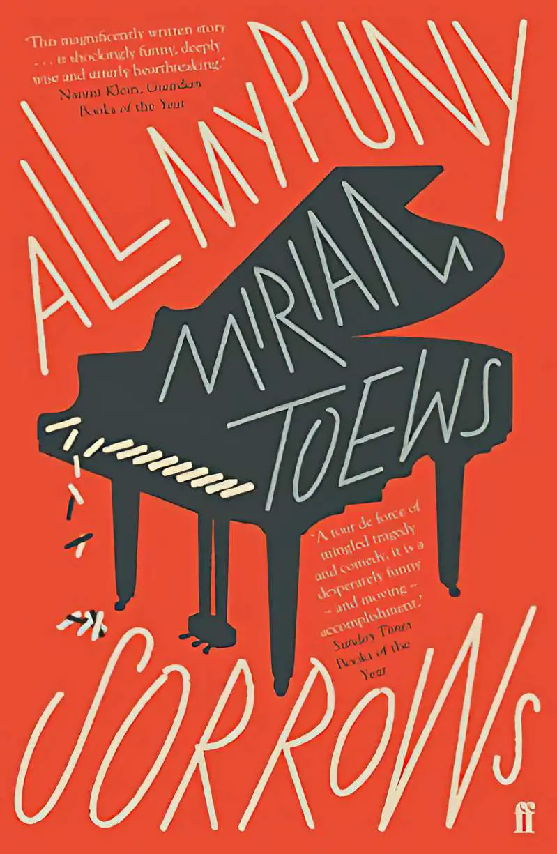
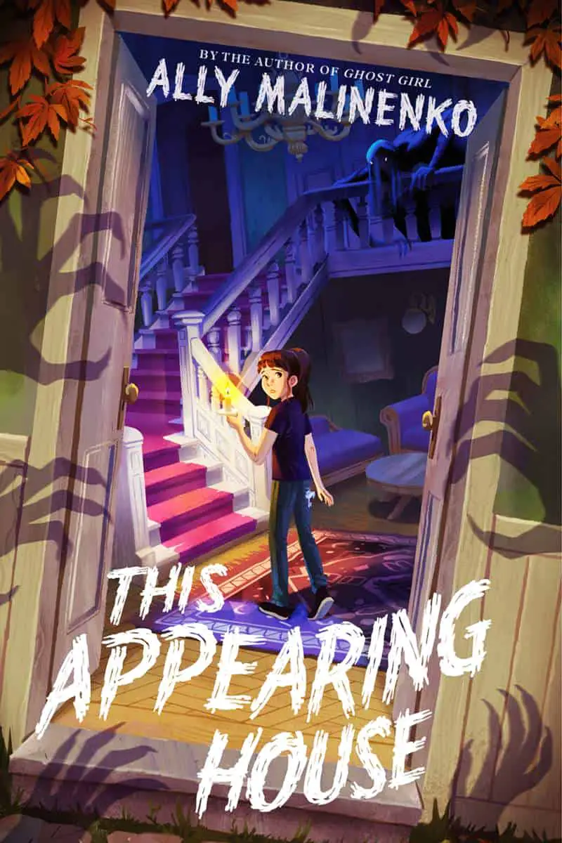
This is far less common and therefore marked. Whereas tilting up lends a playful, cheerful vibe (depending on the rest of the design), font which tilts down spells some kind of doom, or irony.


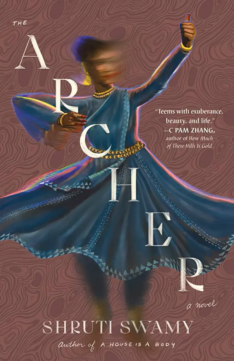

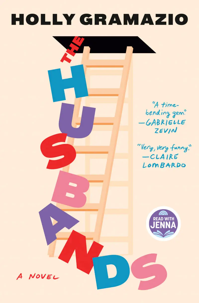
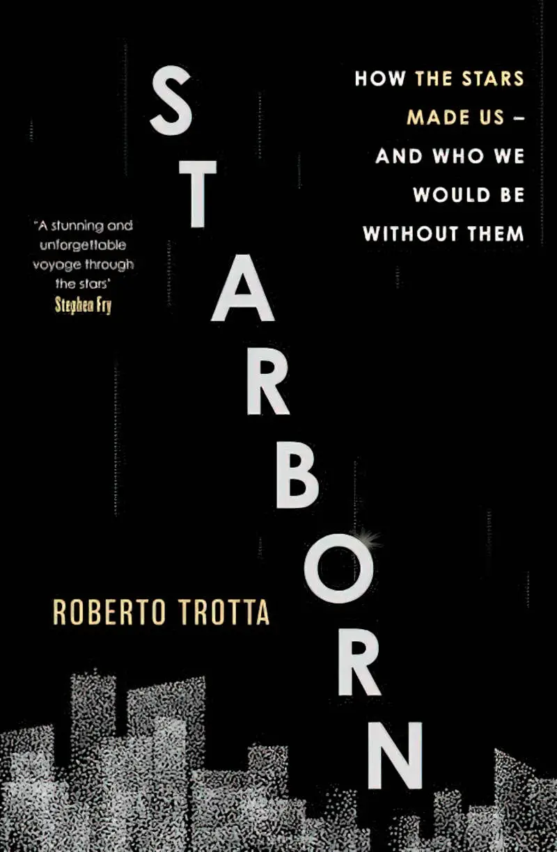
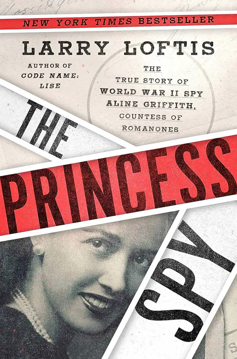
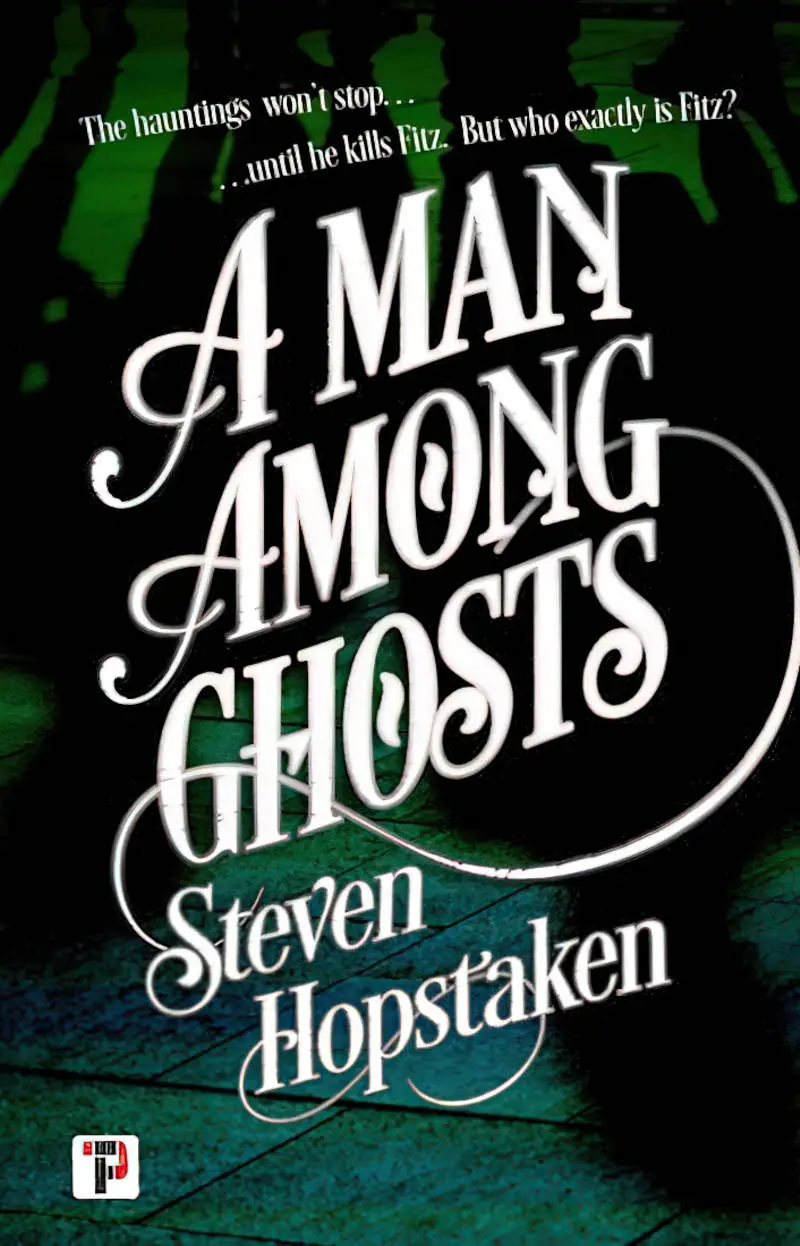
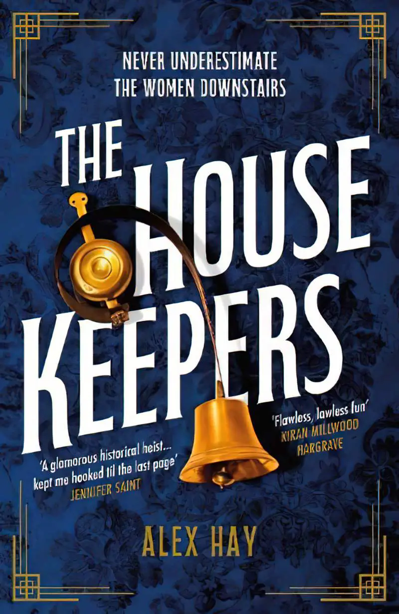
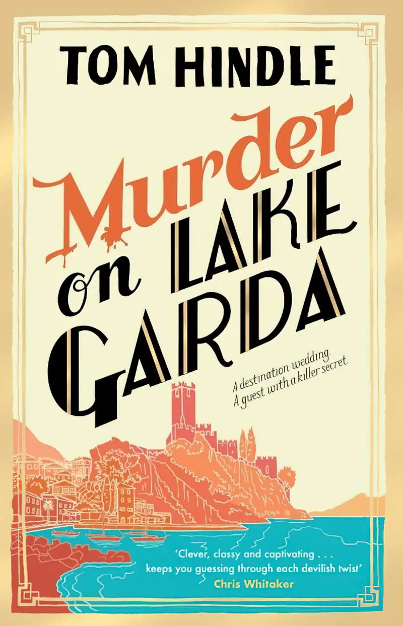
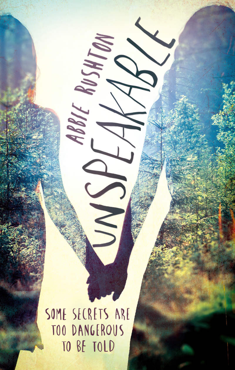
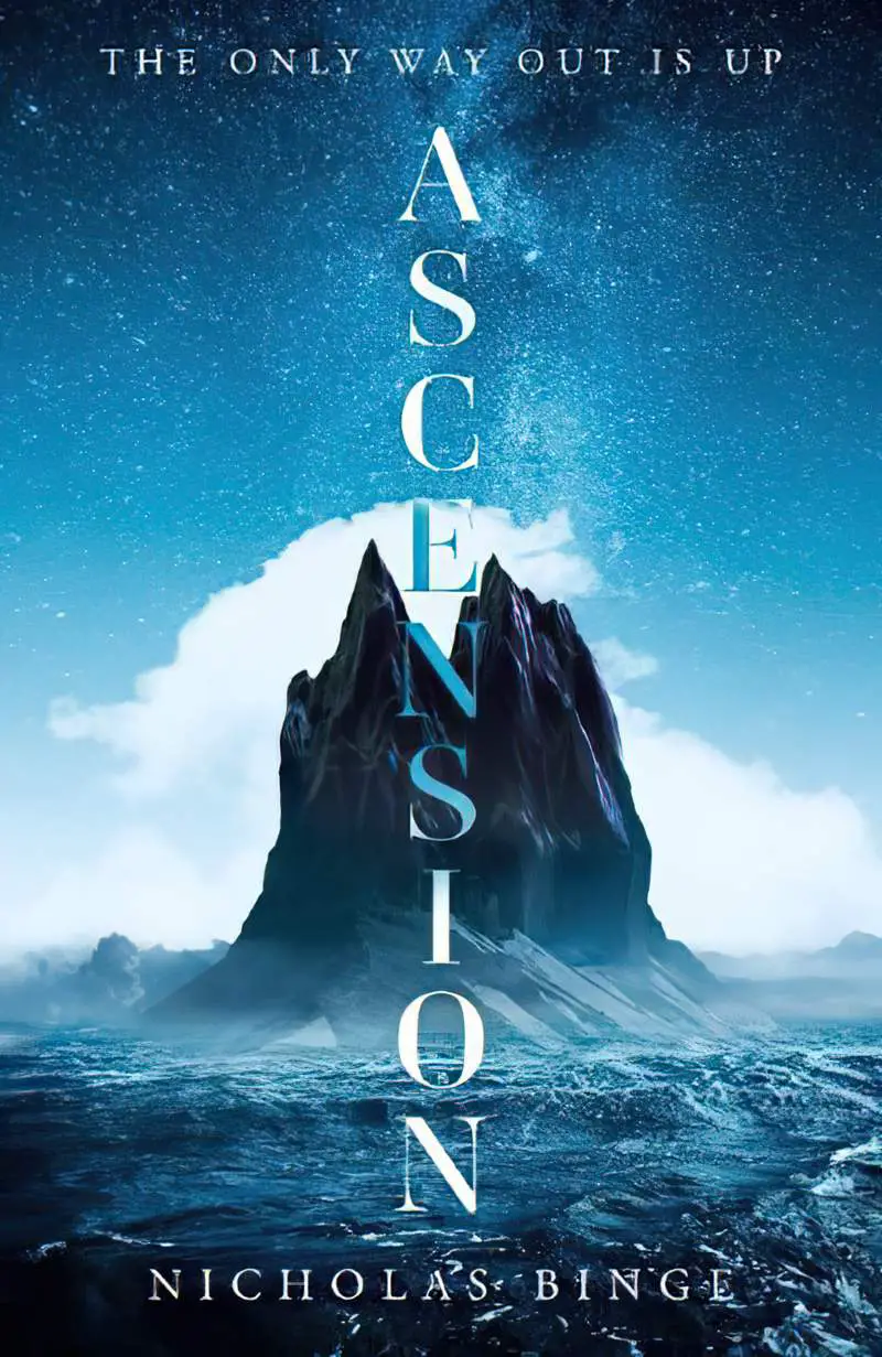
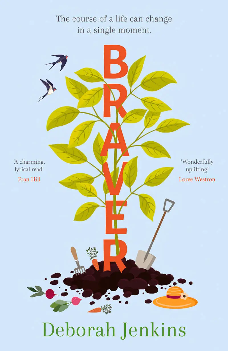
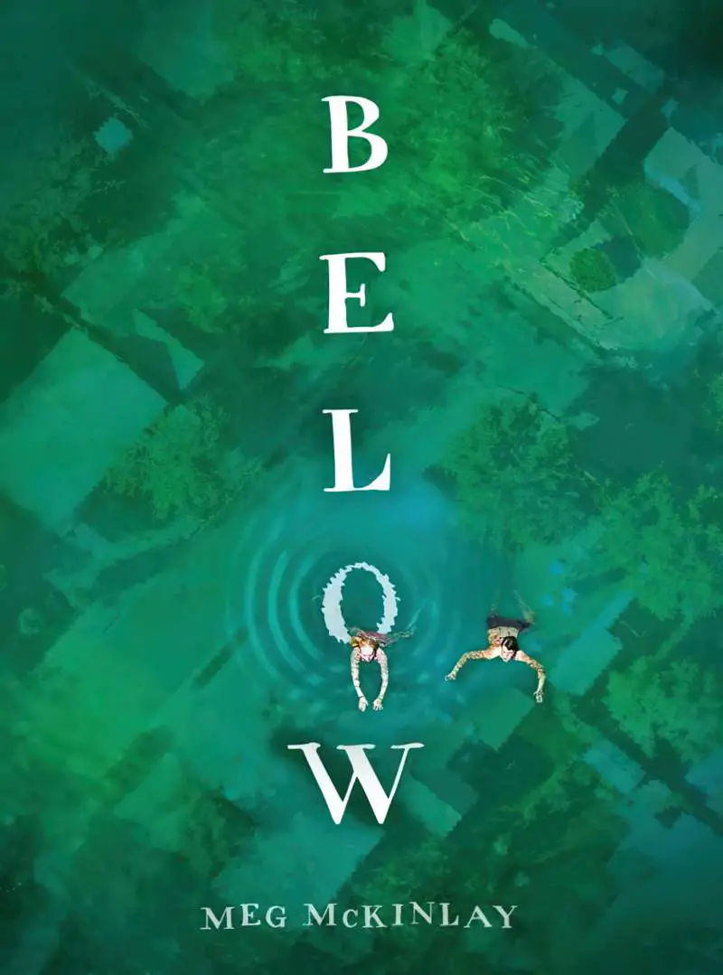
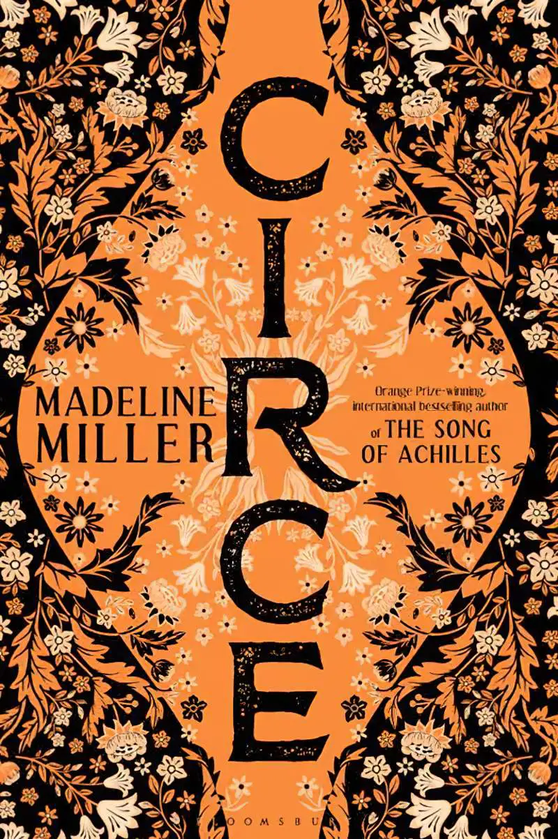
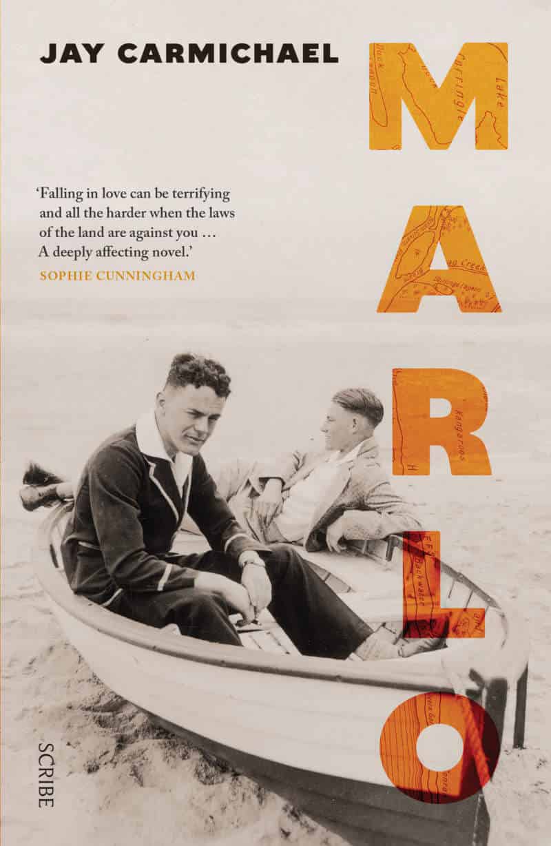
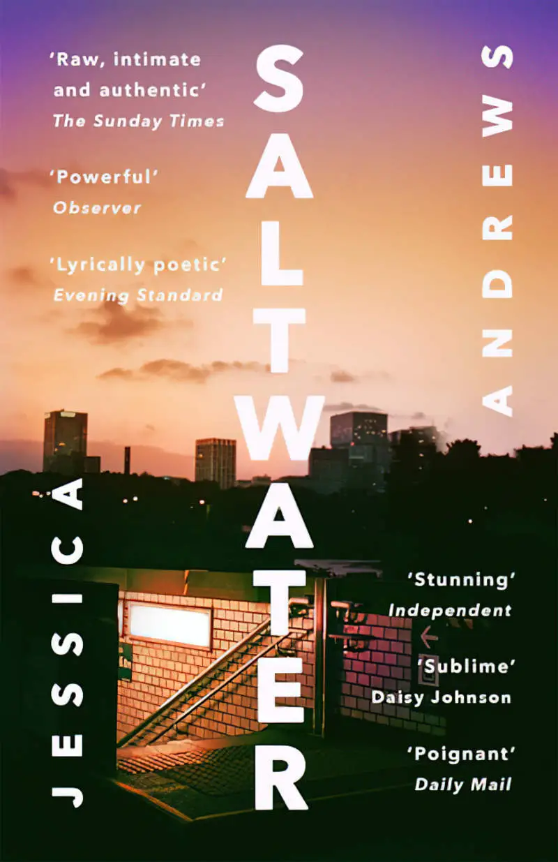
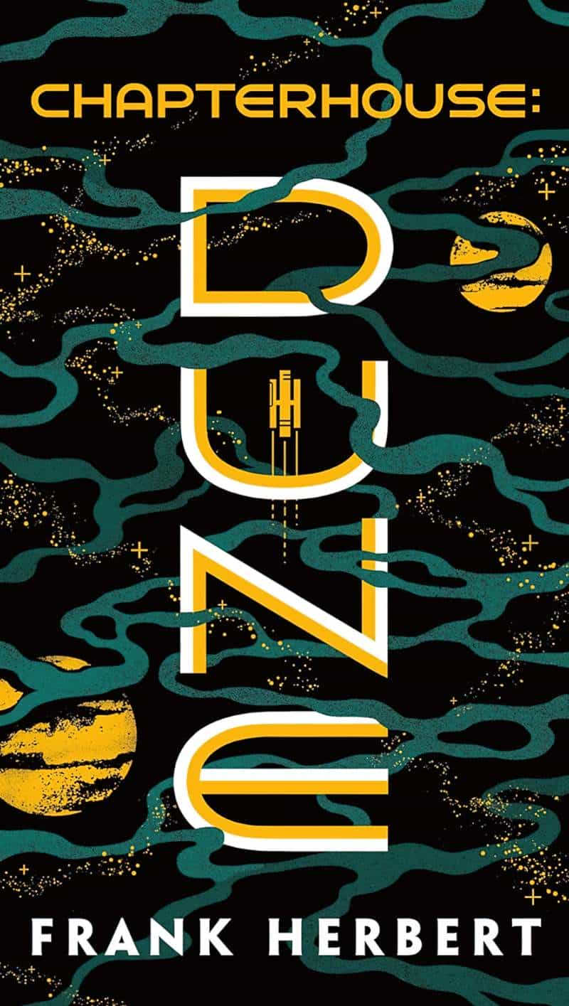
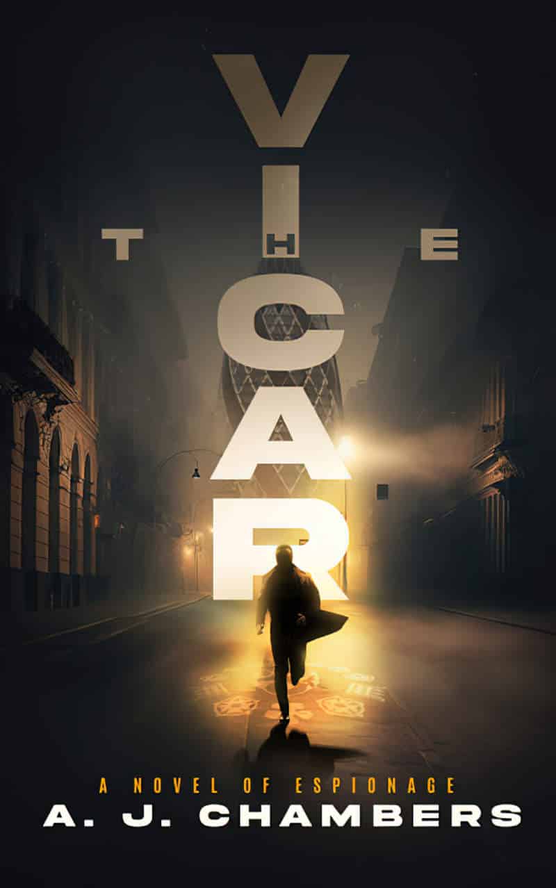
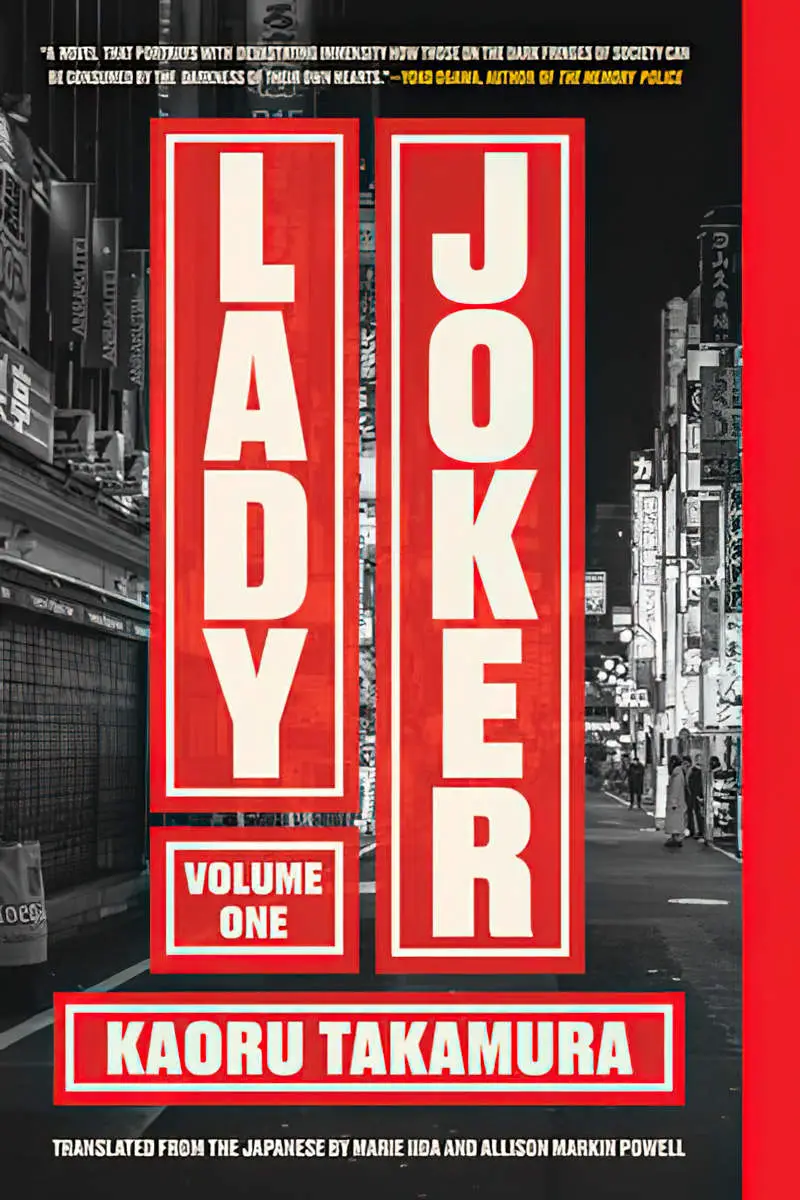
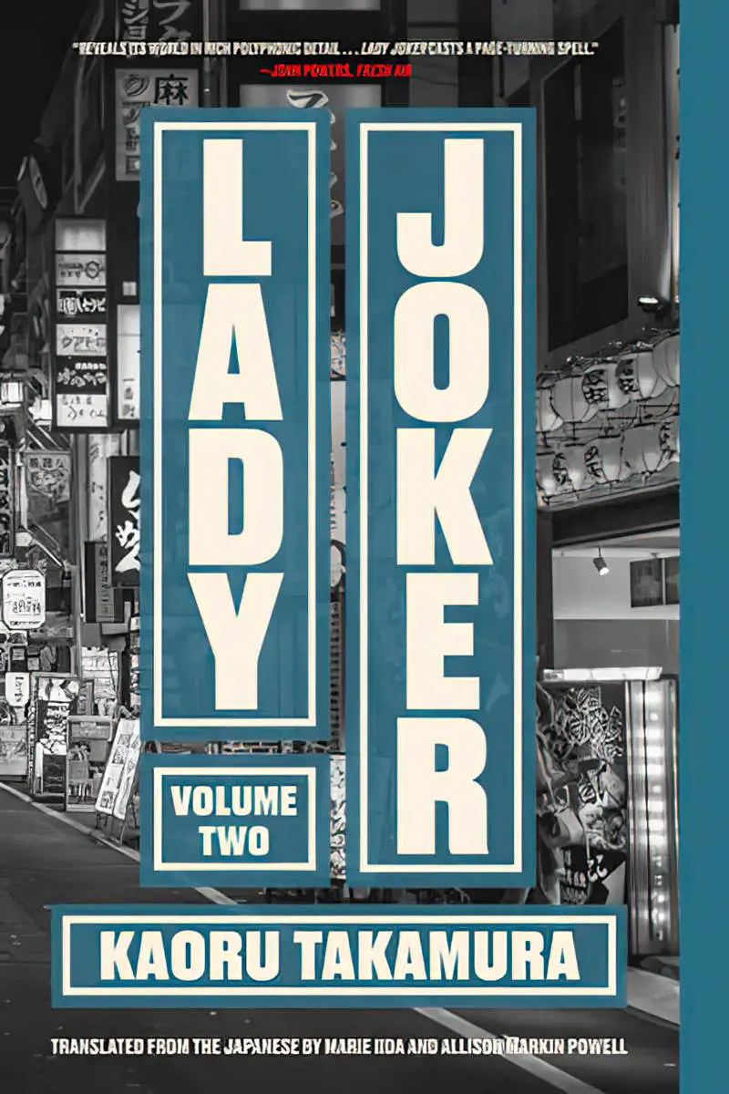
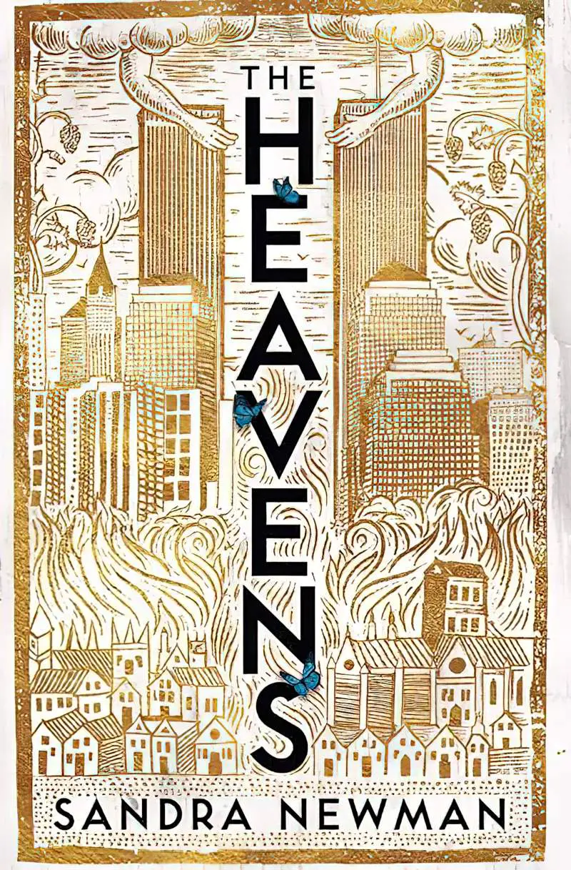
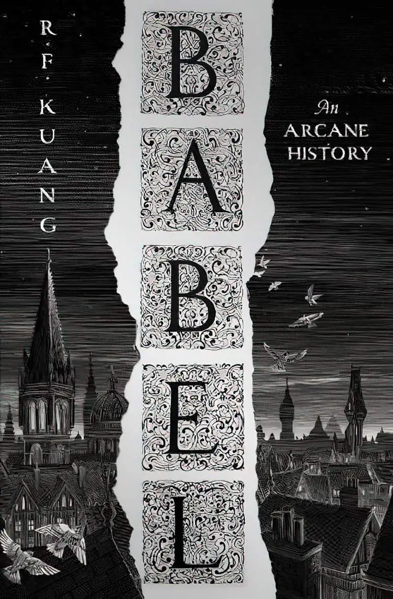
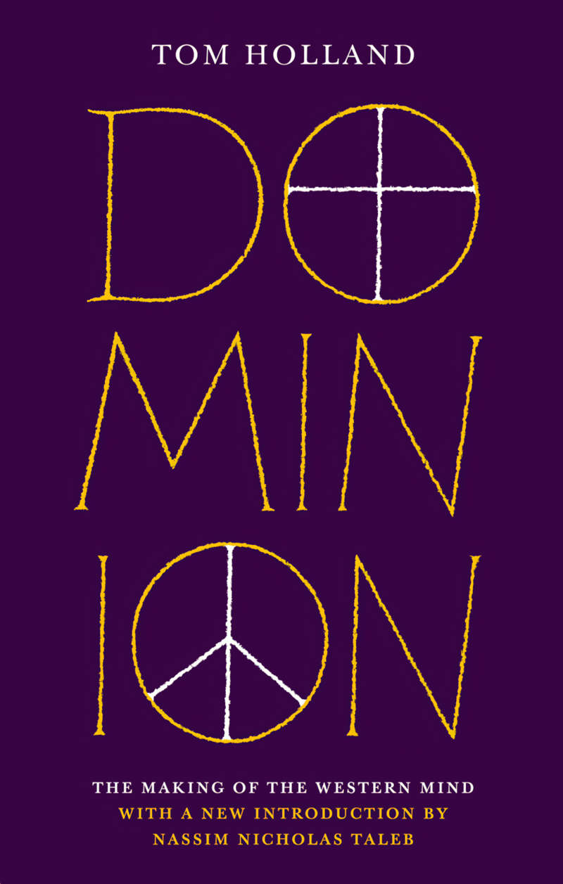
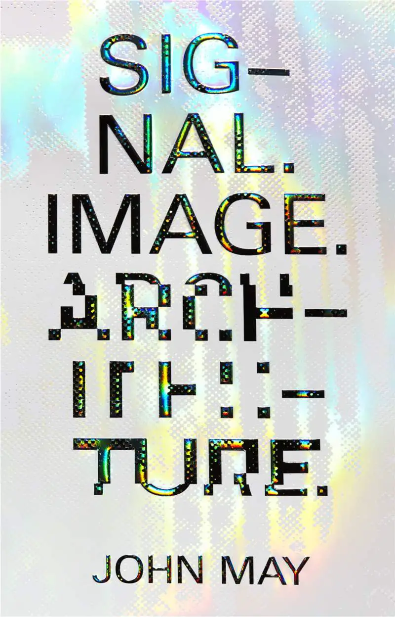
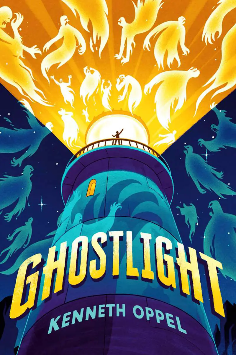
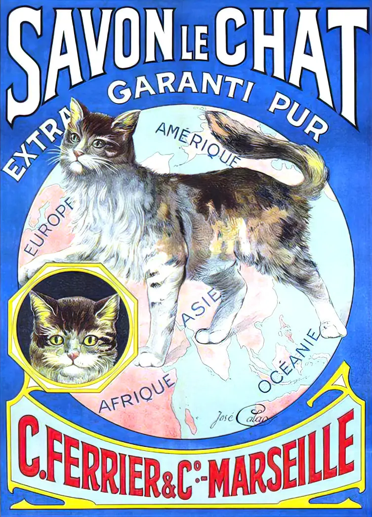
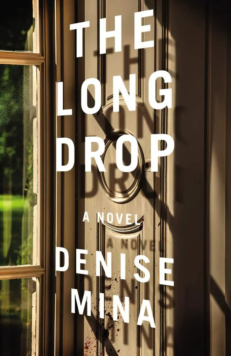
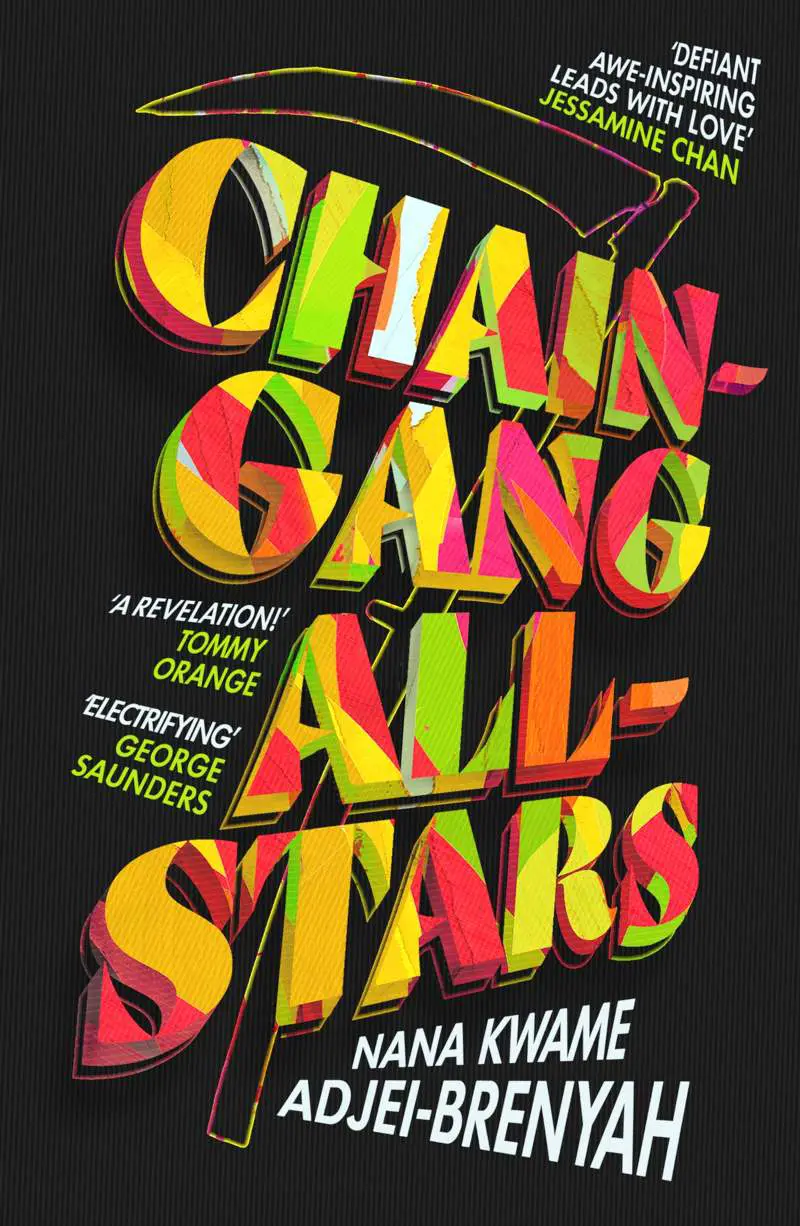
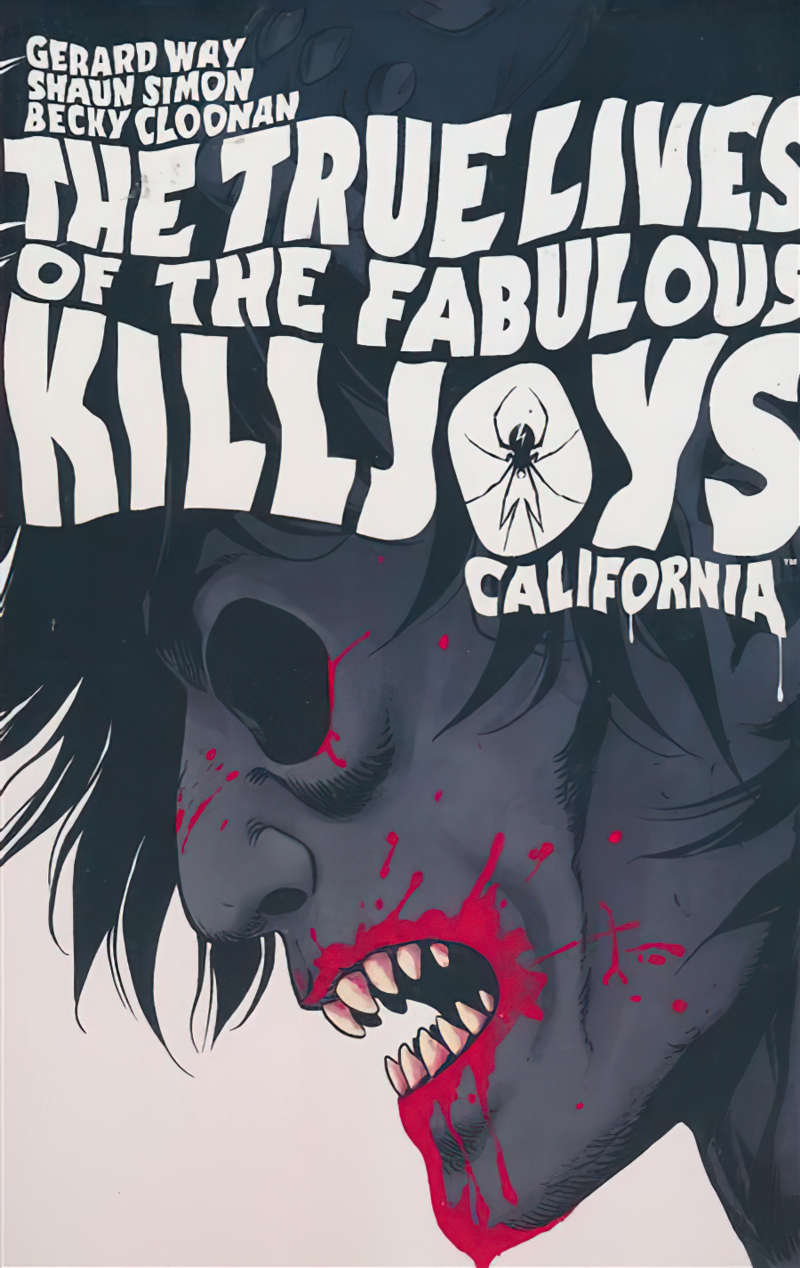
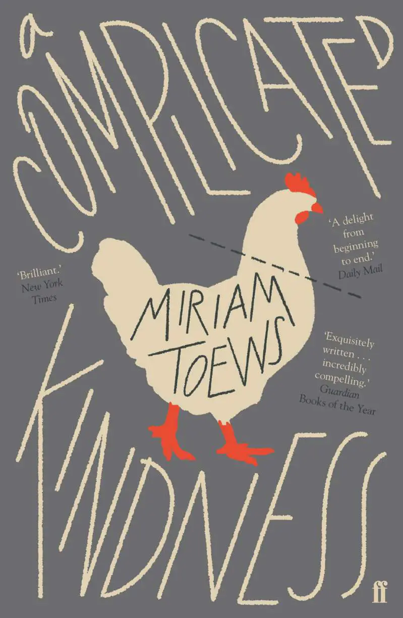
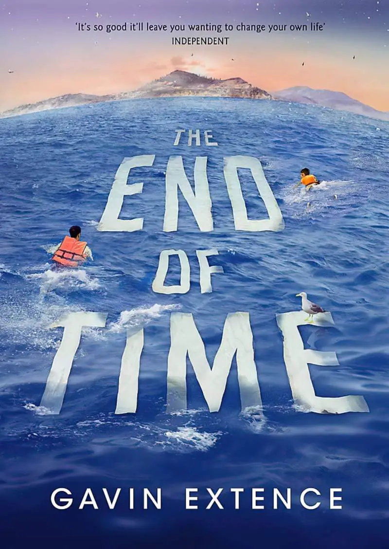
VERTICAL
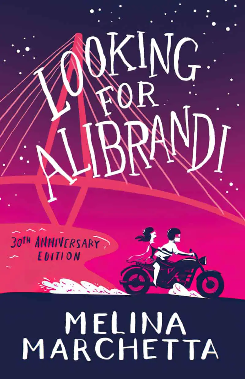
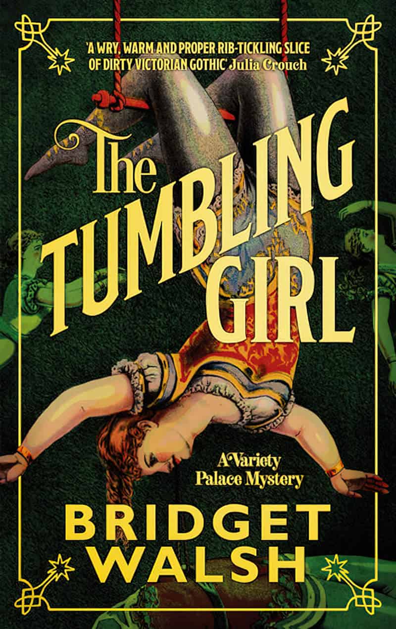
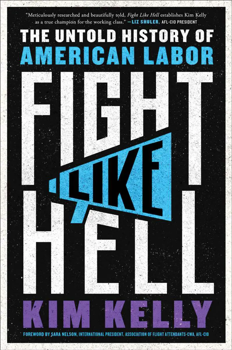
These designs have a majestic, movie poster feel to them. (Technically, rather than playing with the baseline, designers have limited each line to one letter, or sometimes a few letters.)


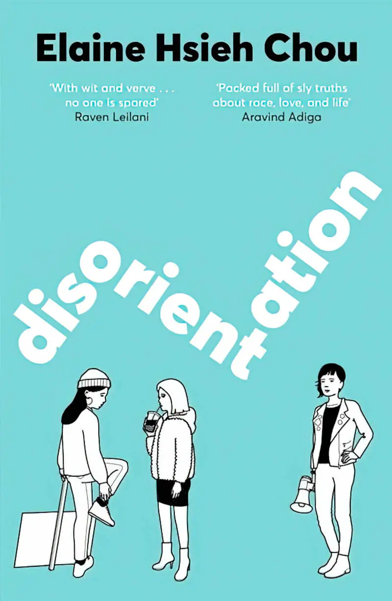
ARCING UP
In Affinity Designer:
- Type the text
- Layer > Convert to curves (Ctrl + Return)
- Layer > Ungroup all
- Unify the letters together in the one layer: Boolean operations in the toolbar: Add (the first icon reading from the left)
- Make sure you’re using the node tool (the little white arrow) and you’ll see all the nodes around the text
- Layer > Warp Group > Arc Horizontal
- Change the degree of warp using the slider in the top menu bar
- Finalize by clicking the button: Convert to Curves also in the top menu bar


ARCING DOWN


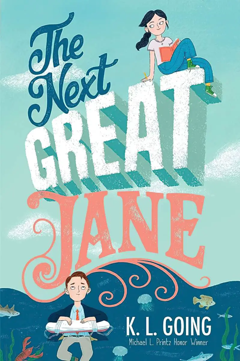
HORIZONTAL, TILTING UP COMBOS
Much of the time, this can lend a Victorian hand-crafted look:


ARCING UP AND DOWN

PINCHED
WARPED PERSPECTIVE
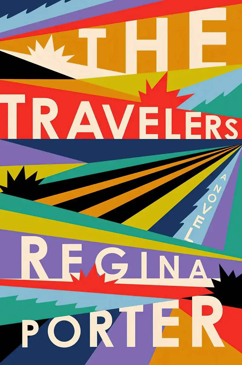
RAYS
- Layer > Warp Group > False perspective
- Finalise by clicking convert to curves
- Layer > Ungroup All to turn it back into a single curve (not a layer group)

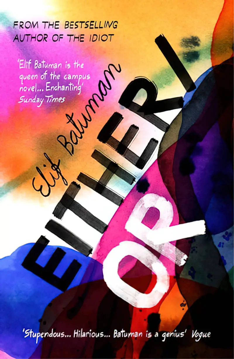
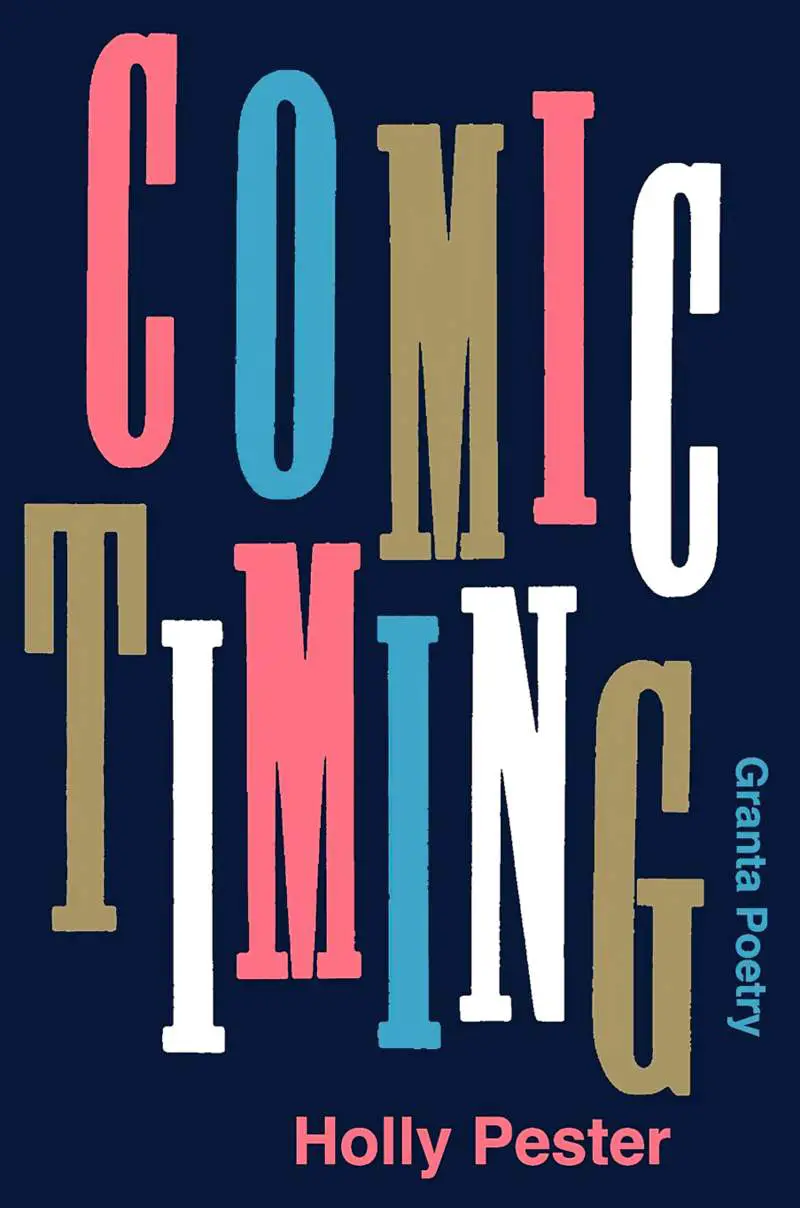
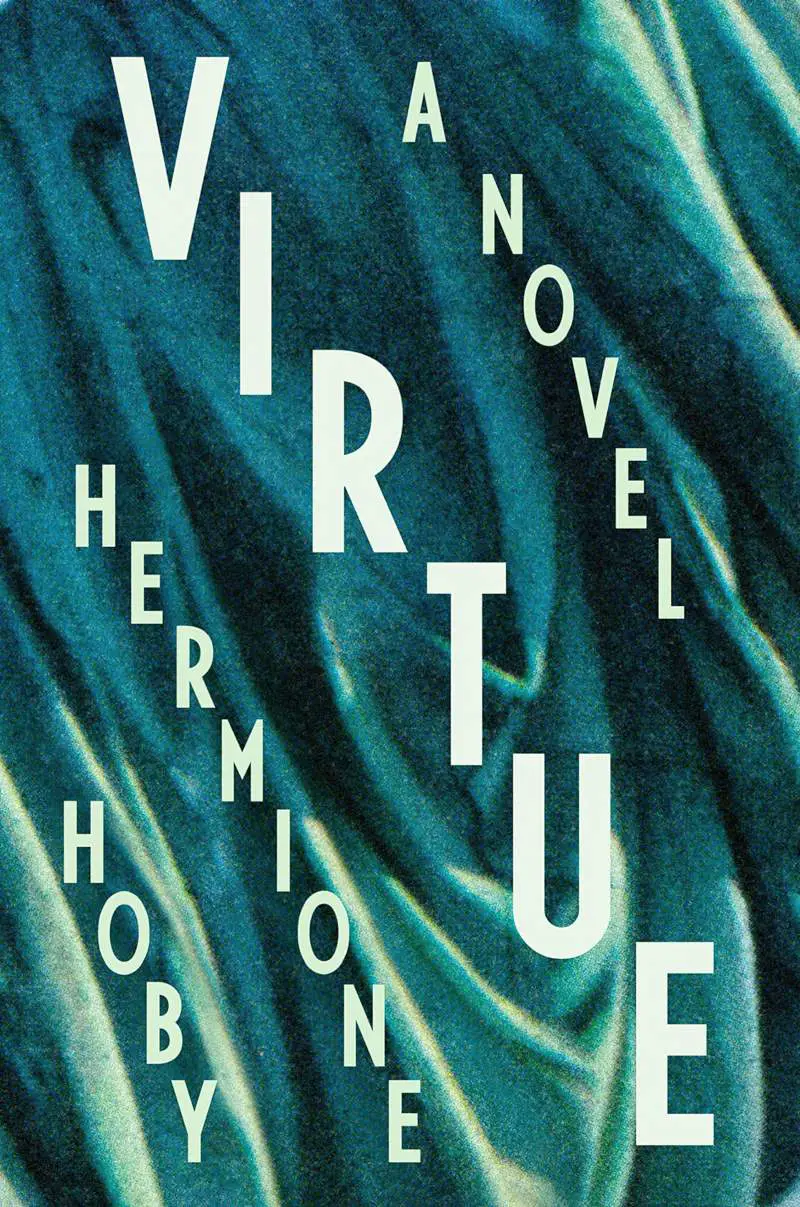
JIGGLED AND RESIZED LETTERS
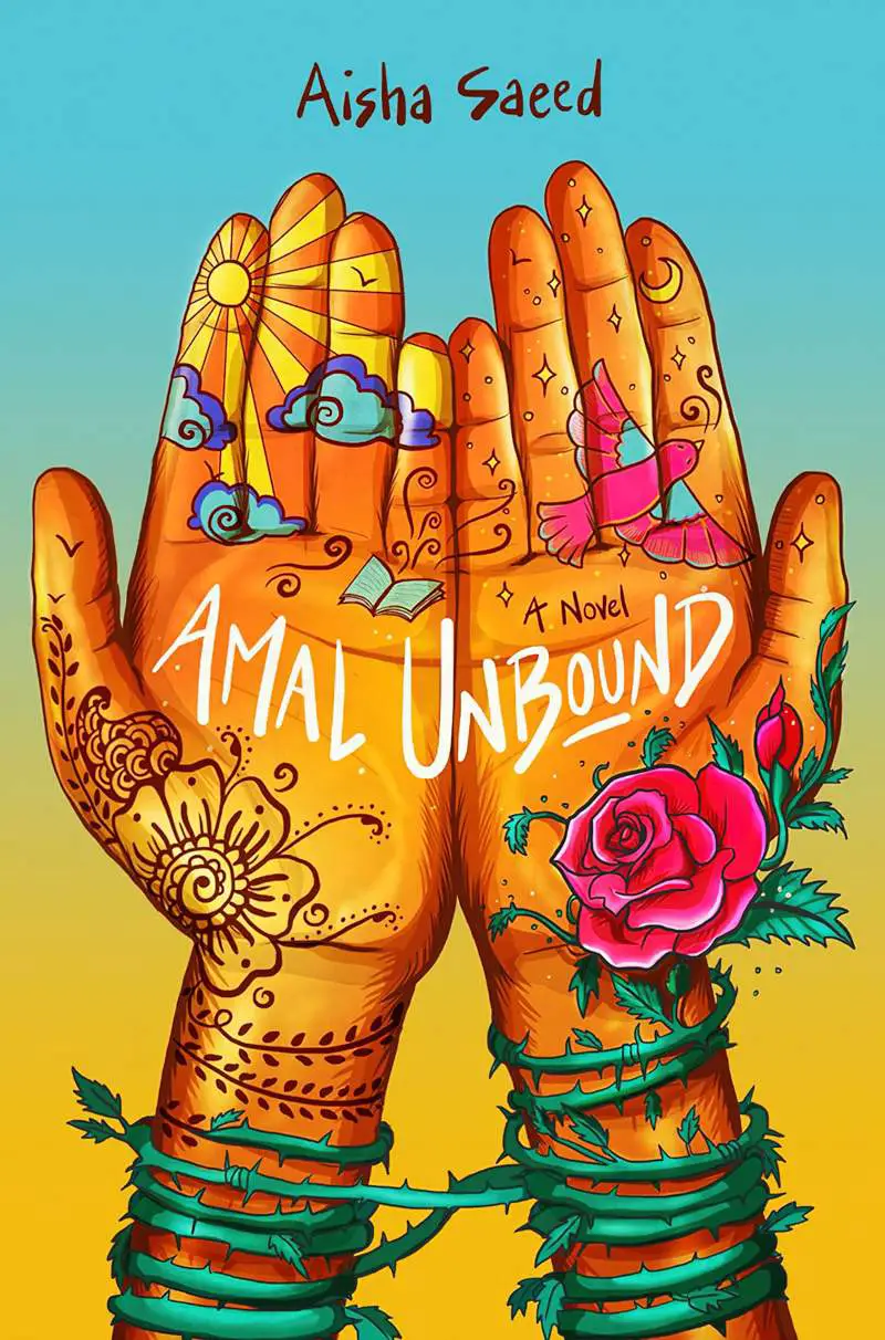
If tilting up lends a playful look, jiggling the letters within words does that more:

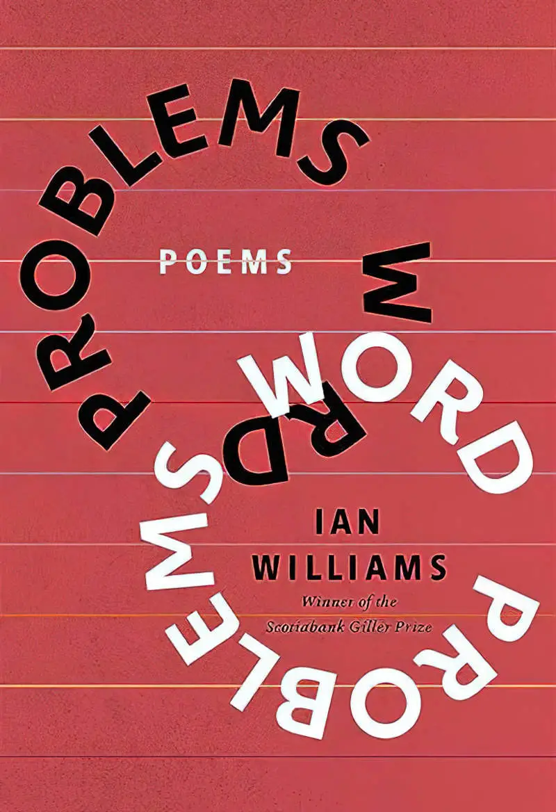
SHAPED WORDS
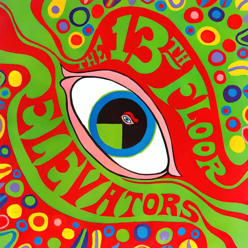
This style can have a 1960s psychedelic feel about it:
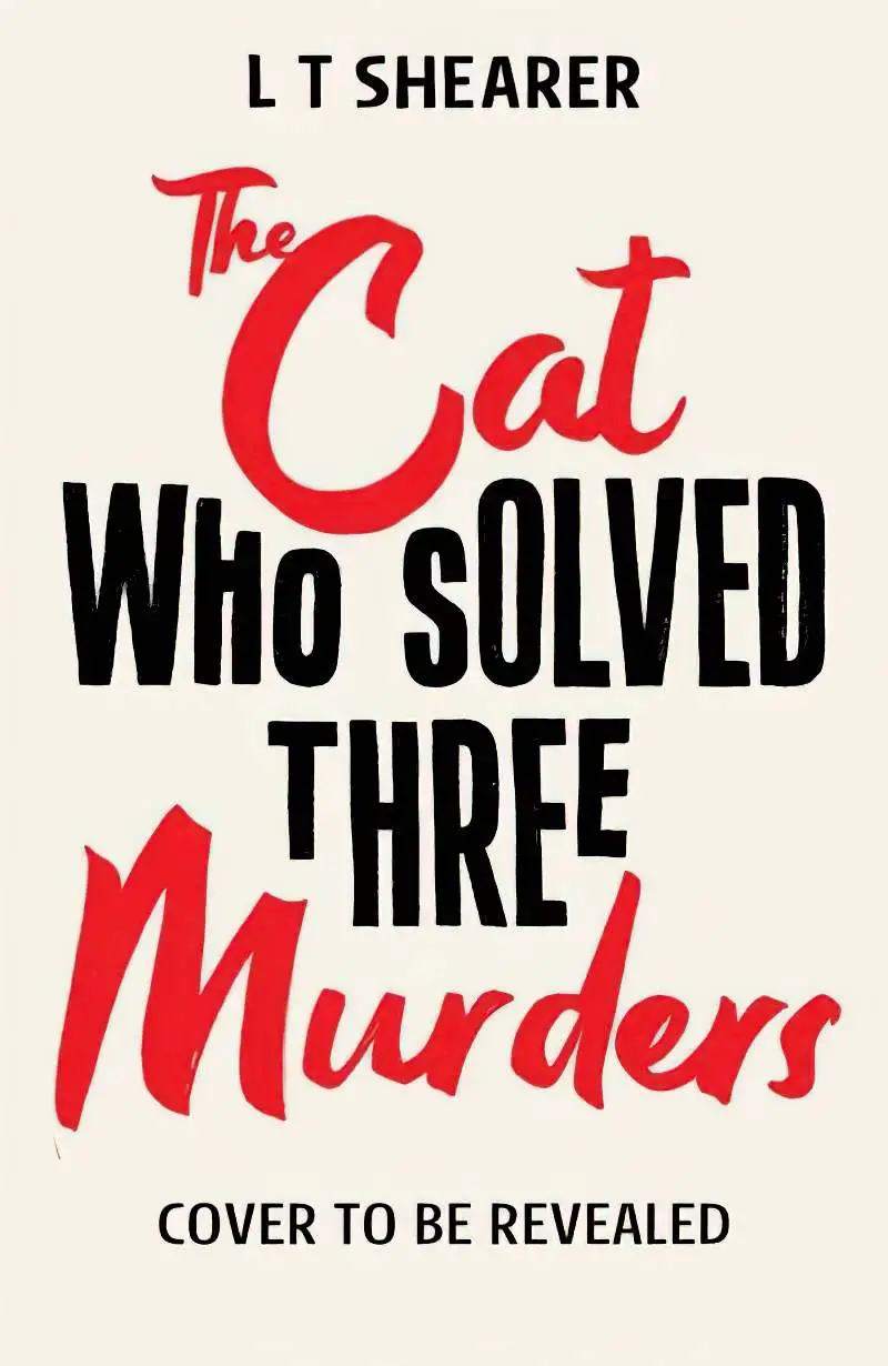
An Affinity Designer tutorial on how to create a text design like the image below.


Below: Compare the final cover with the ‘cover to be revealed’:

WORD ART
WARPED PERSPECTIVE

WARPED PERSPECTIVE WITH A DISPLACEMENT MAP
For more examples of blurred, glitched, displaced and warped imagery and text on book covers, see this post.
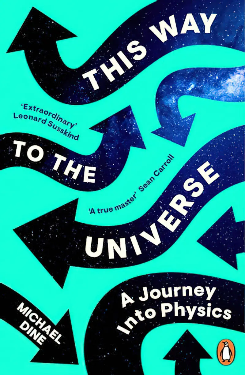
A WAVING BANNER
GENERAL TIPS WHEN WORKING WITH TEXT IN AFFINITY SOFTWARE
GUIDES/RULERS
To create text effects in Affinity software, you’re going to need some guides. Hit Ctrl + R to bring up the rulers, then you can pull down guides by clicking and dragging from the ruler. Drag the guide back up into the ruler to get rid of the ruler when you’re done using it.
QUICKLY CHANGE THE SIZE OF FONT
If you happen to be using a mouse, hover over the font size in the top menu bar and scroll your mouse wheel up and down to quickly change its size in real time.
THE GLYPH BROWSER
For access to every character a font has, you’ll find it in the Glyph Browser. Find this under View > Studio.
If you’ve purchased a premium font, you’ll get the best looking design by making use of all available options.
COMBINE STROKE WITH INNER OUTLINE
A good combo to try (especially for vintage, Victorian fonts):
Apply a white stroke, about 1px. (The Stroke panel is probably open next to the Colour tab, top right.)
Second, apply an inner outline effect the same colour as the text (Outline, outside, radius about 4px, solid colour).

DROP SHADOW
Drop shadows can be created easily in Layer FX, but you can achieve more interesting effects sometimes by duplicating your text, positioning below, then changing the colour and using the arrow keys on your keyboard to change it 1px at a time until it’s positioned where you want it.
For an ornate look, try a couple of different colours for your drop shadow.
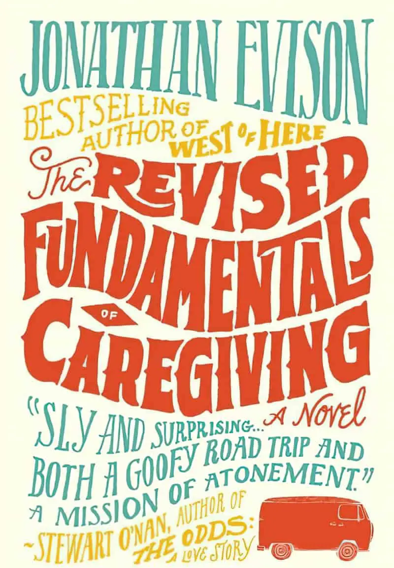
FIT TEXT TO A SHAPE IN AFFINITY DESIGNER 2
To create something like the Jonathan Evison book cover below, one way to do it is to create shapes first, then fill the shapes with text. This works best if you’ve sketched your basic design first and know basically what you want.
- In Affinity Designer 2, make sure snapping is turned on
- Create a vector shape that will serve as the outer frame e.g. a rectangle.
- Note that shapes have two different scaling handles. One type changes the size of the shape without changing the size of the text. But the handle on the outside of the bottom right corner of the shape will scale both shape and text as a single unit. (Holding down shift allows for distortion, though this rarely looks good.)
- Use the pen tool to create your curved lines inside the outer frame. Remember to press ESC between creating separate lines otherwise the software will assume you’re making a new shape.
- With the shape selected, you’ll be flowing text into it.
- Adjust your curves with the node tool (the white arrow). Holding shift while you do this keeps your node at the correct longitude along the side of the rectangle.
- Use the Artistic Text tool to type your first word.
- Position the text as best you can where you want it.
- With text selected, select Warp > Quad from bottom right.
- Making use of snapping guidelines, add extra nodes where you need them. That may well be in the centre of the text. It may be elsewhere. While holding shift down, adjust the text so that it snaps into the curves you already created with the frame shape and the curved line.
- Use handles on the nodes to refine and adjust.
- When you’re done creating and adjusting the text, delete the guides.
- Adjust spacing between words as needed. In Layers panel, be sure to have the Layer selected, not the [Warp] Group. Warping created a group. If you work with the Warp Group, adding any Layer FX won’t work as you want them to.
- Finalise by converting to curves (a button on the top tool bar). This changes the text into a vector path.