Sometimes graphic designers are so subtle about varying the size of text it’s barely noticeable to the audience. The third word in the title Ghost Girl, Banana is marginally smaller than the first two words:

In fact you may not even believe me. Not sure I even believe myself, so I measured the height. The orange rectangles were added by myself, then duplicated and repositioned:

What I hadn’t picked up by eye is how the designer made the GIRL of the title smaller as well, in a very subtle cascade of size. The colour, too, from white to, well, banana colour, is equally subtle.
Below is a more obvious example of a title which cascades in size, this time from small to large:


FAIRY TALE AND FANTASY LETTER SIZING
Once you start mixing up the sizing of font within a single word, now you’ve got a fairy tale look, illustrated perfectly by Stephen King’s novel titled Fairy Tale.

Of course, the fantasy genres utilise this graphic design association. Many modern fonts (when used in sophisticated design software such as Adobe and Affinity products) allow designers to make use of glyphs which come bundled with high quality fonts.


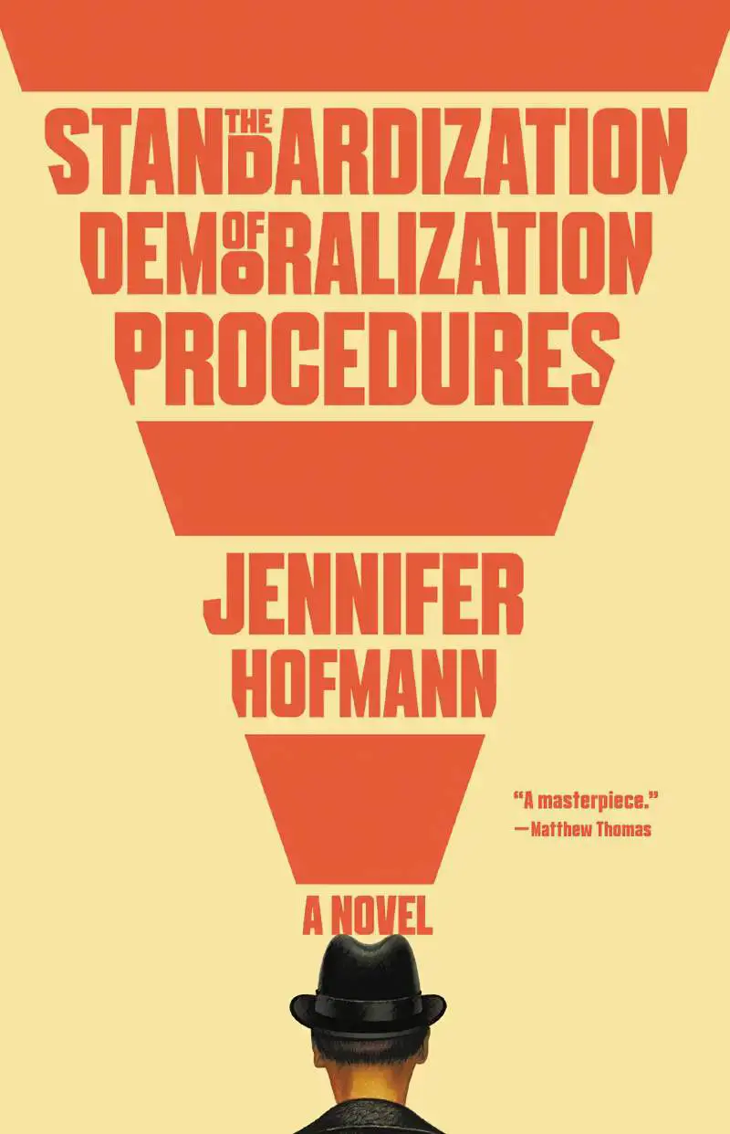
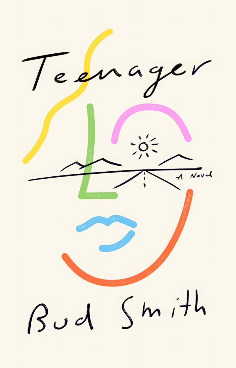
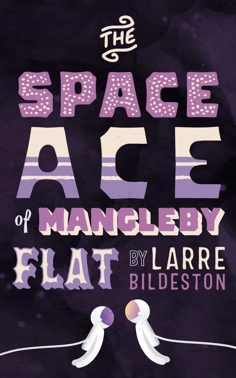
Above examples feature varied letter size within a single word. The examples below show how graphic designers have varied font sizes to emphasise the content words and diminish the grammatical words of book titles:


NOTABLE EXAMPLES

TWO SIZE COMBOS
- LARGE: title and author name
- SMALL: anything else, commonly “a novel”


THREE SIZE COMBOS
- Large: for the title
- Medium: for the author name
- Small: for the marketing copy
OR
- Large: for author name and title
- Medium: for e.g. ‘The Global Bestseller’
- Small: for the marketing copy
The marketing copy can seem like two different sizes with a combination of title case and uppercase with emboldening.


FOUR SIZE COMBOS
Once you get four or more font sizes, you’re avoiding any kind of minimalist look.


FIVE OR MORE


