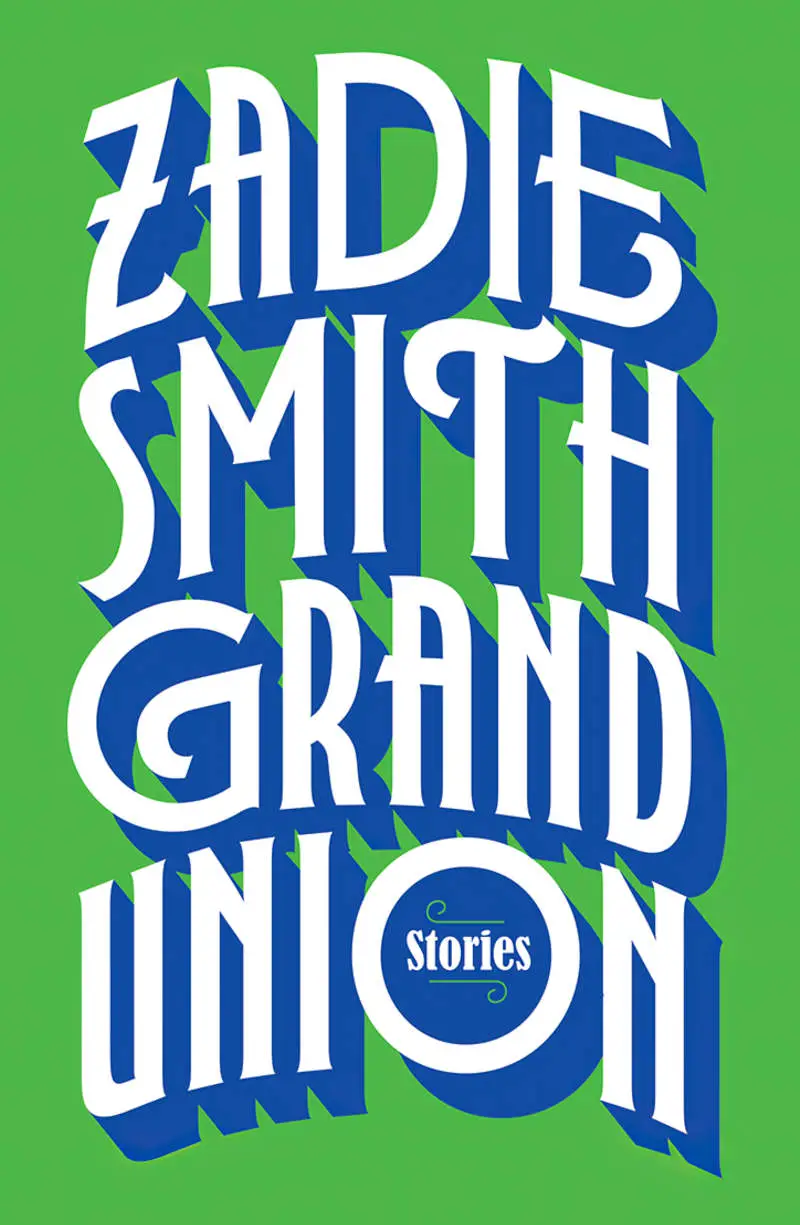
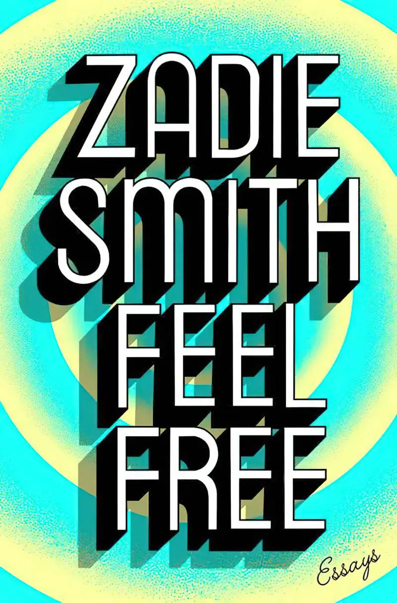
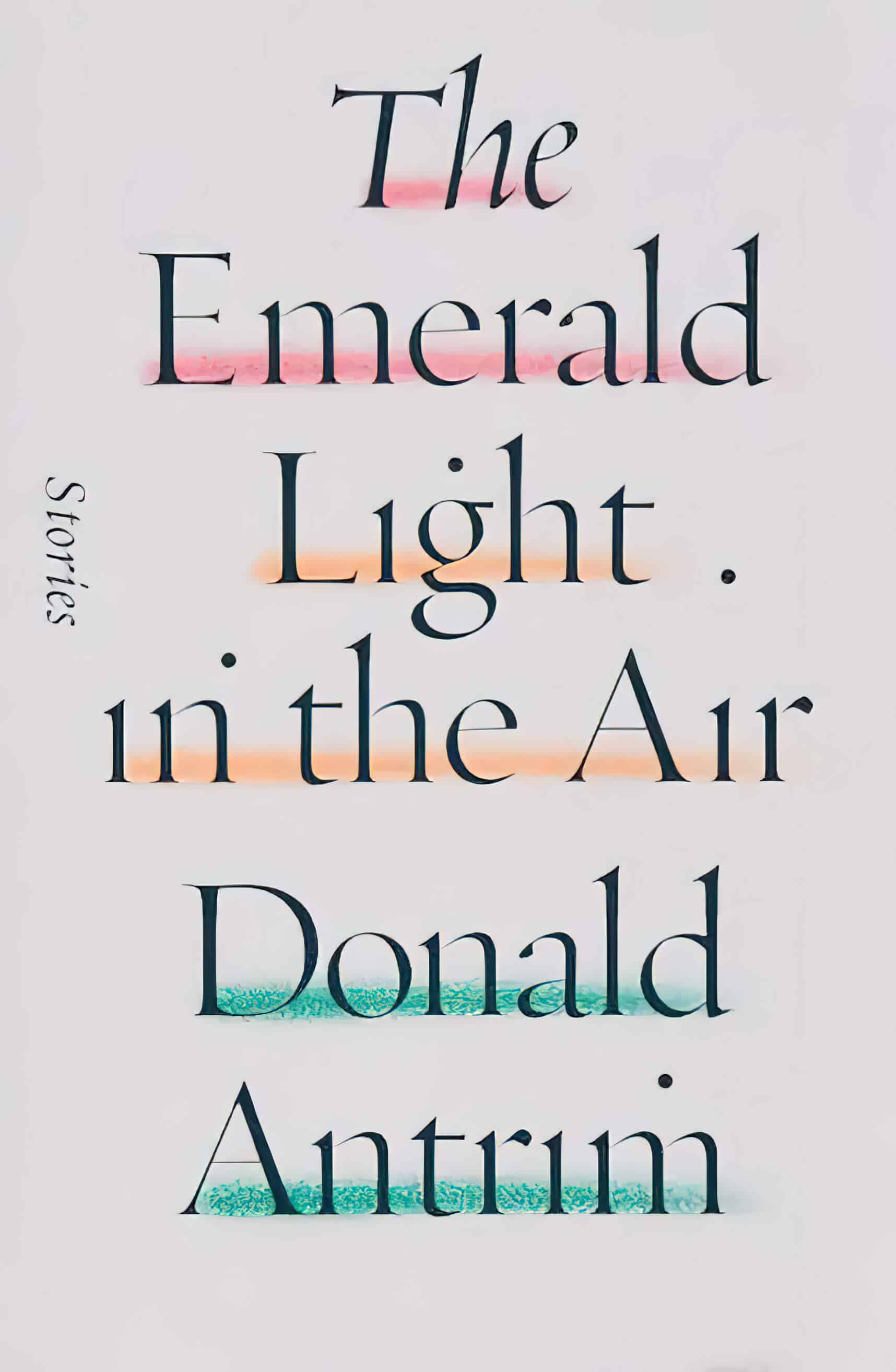
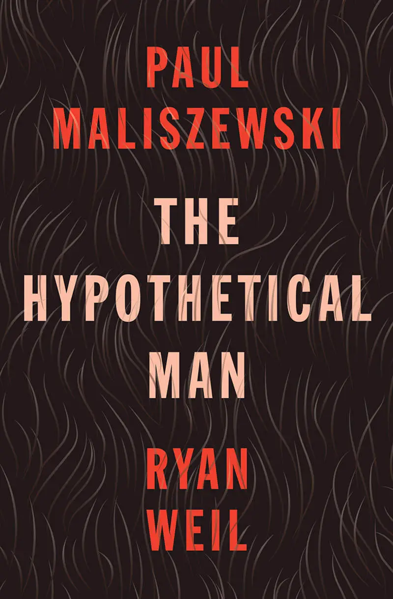
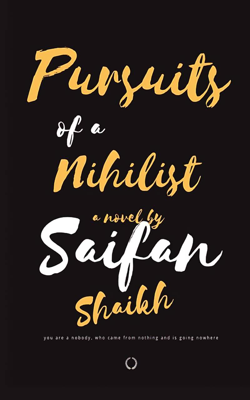
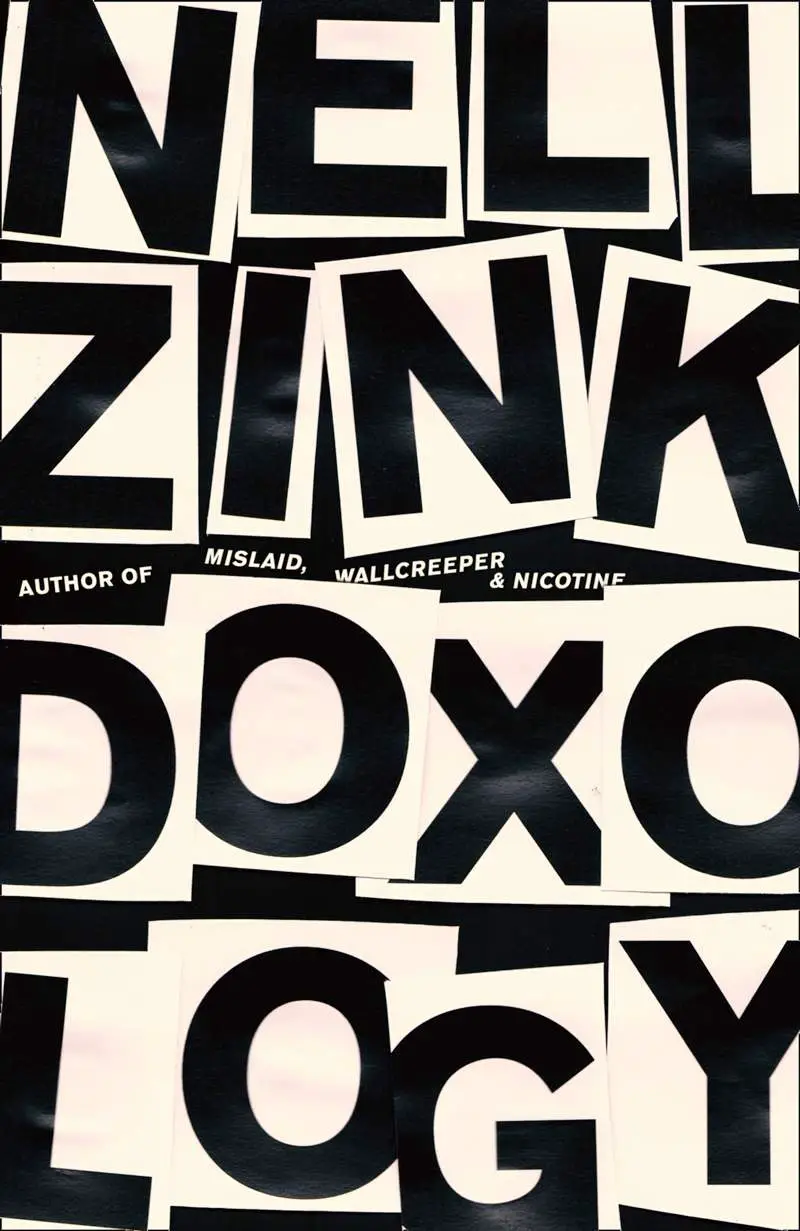
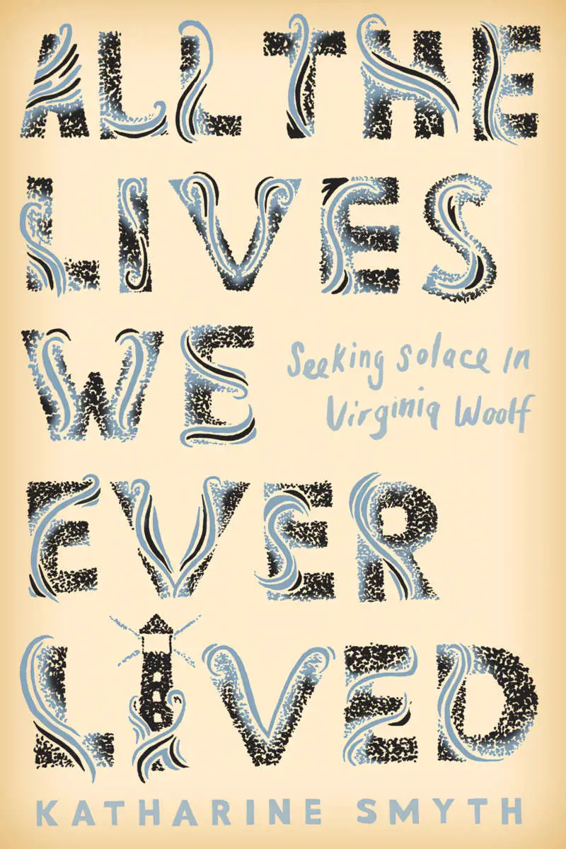
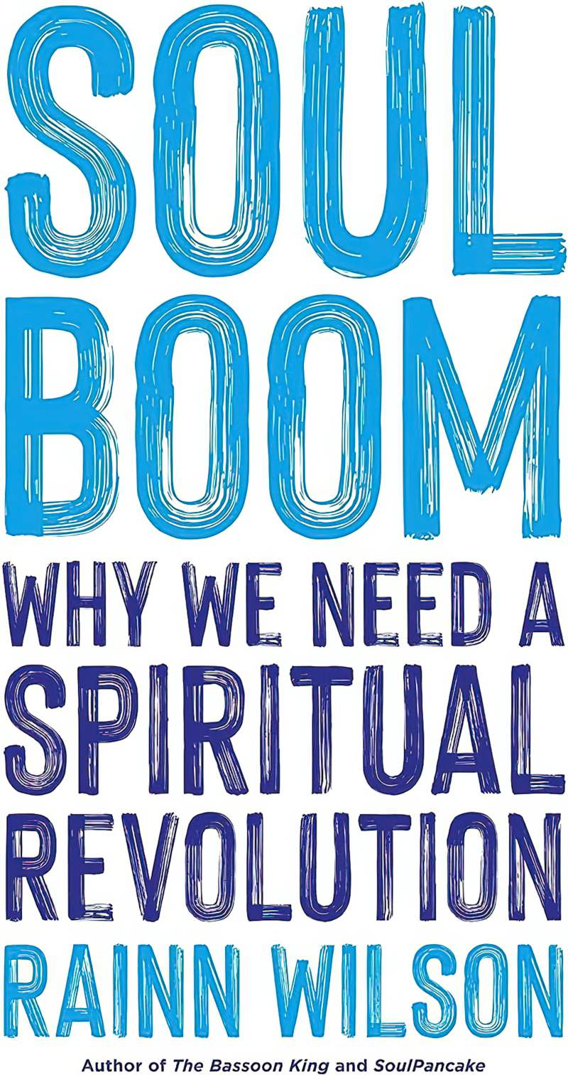
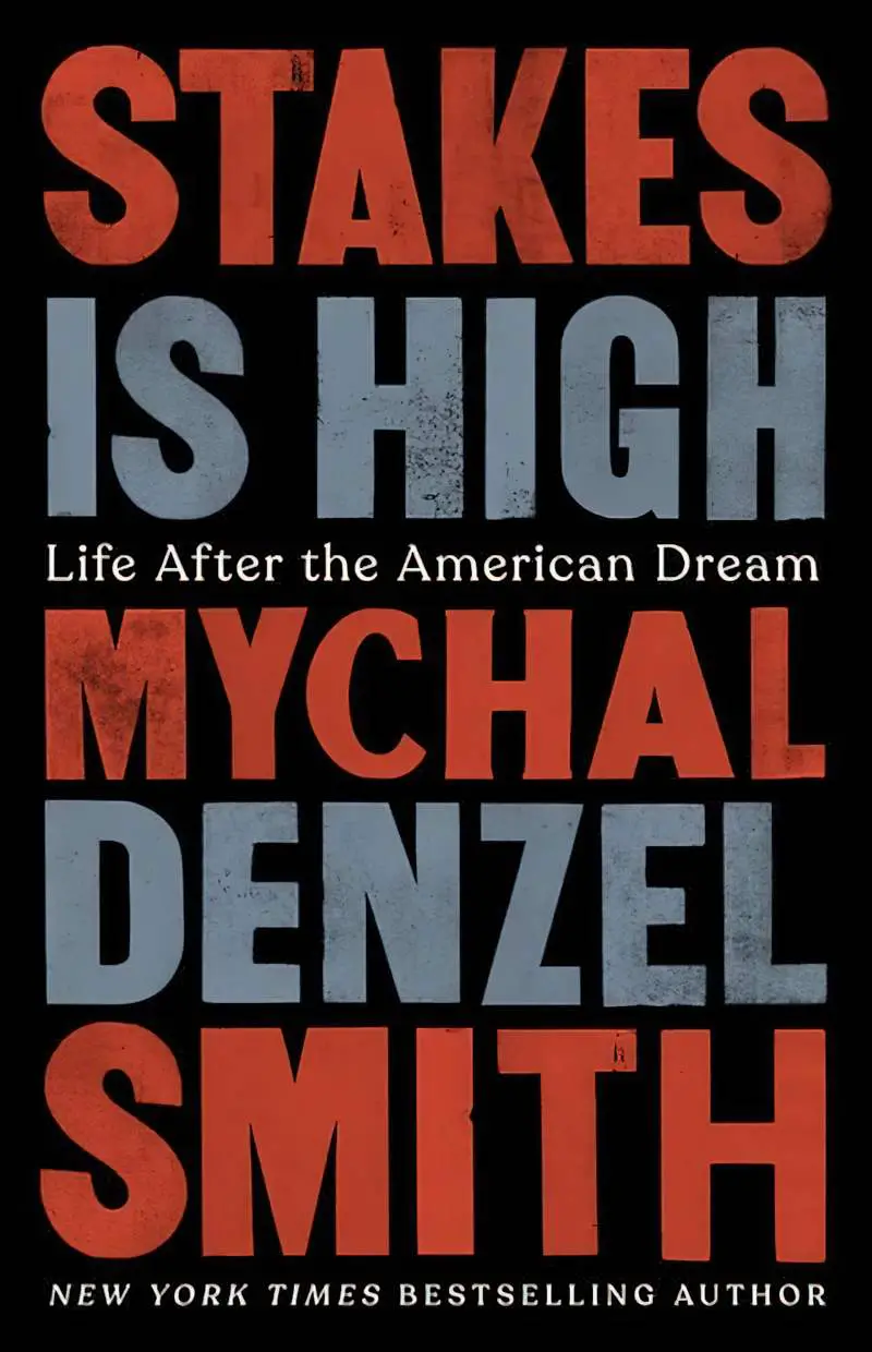
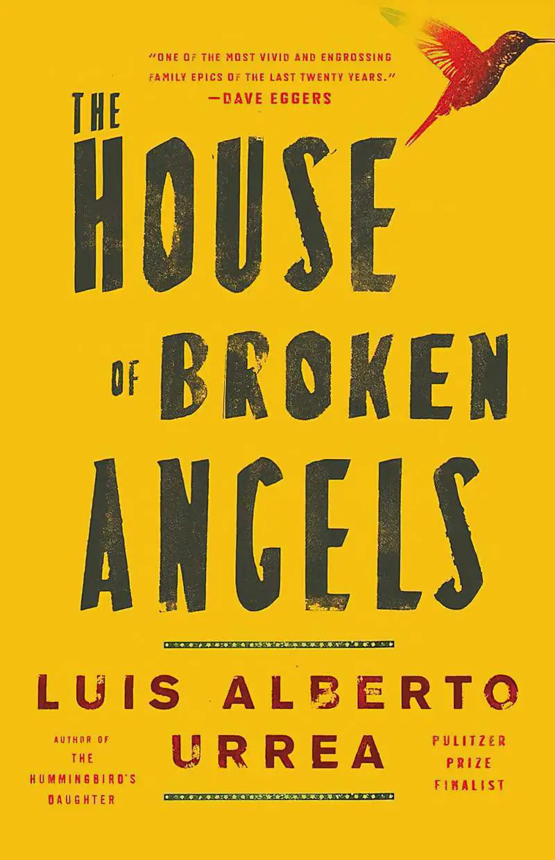
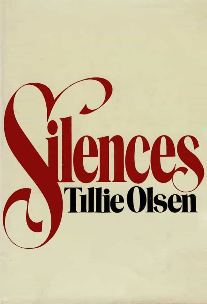
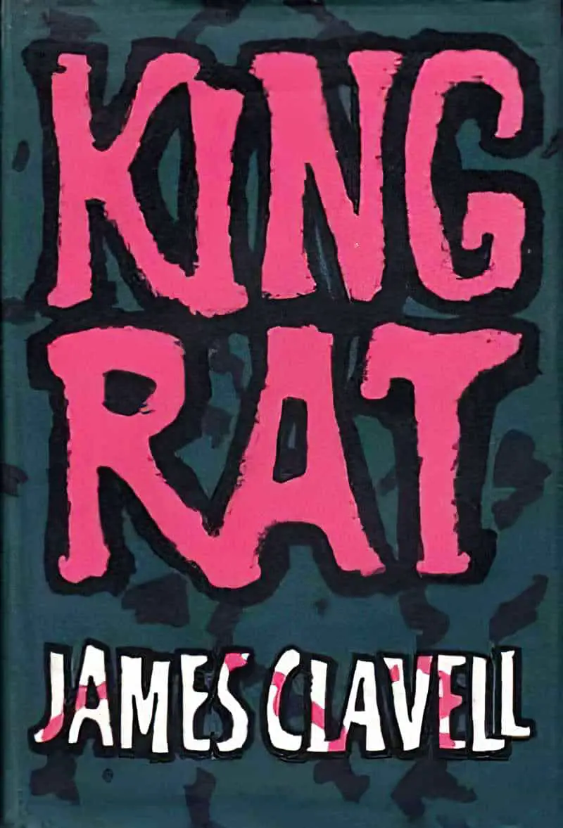
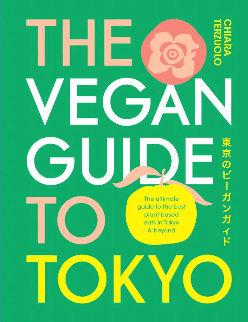
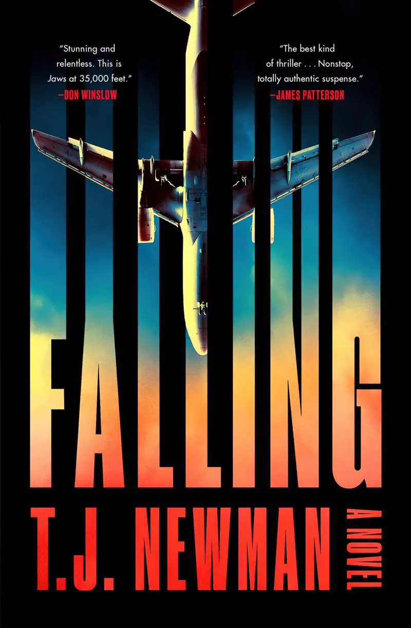
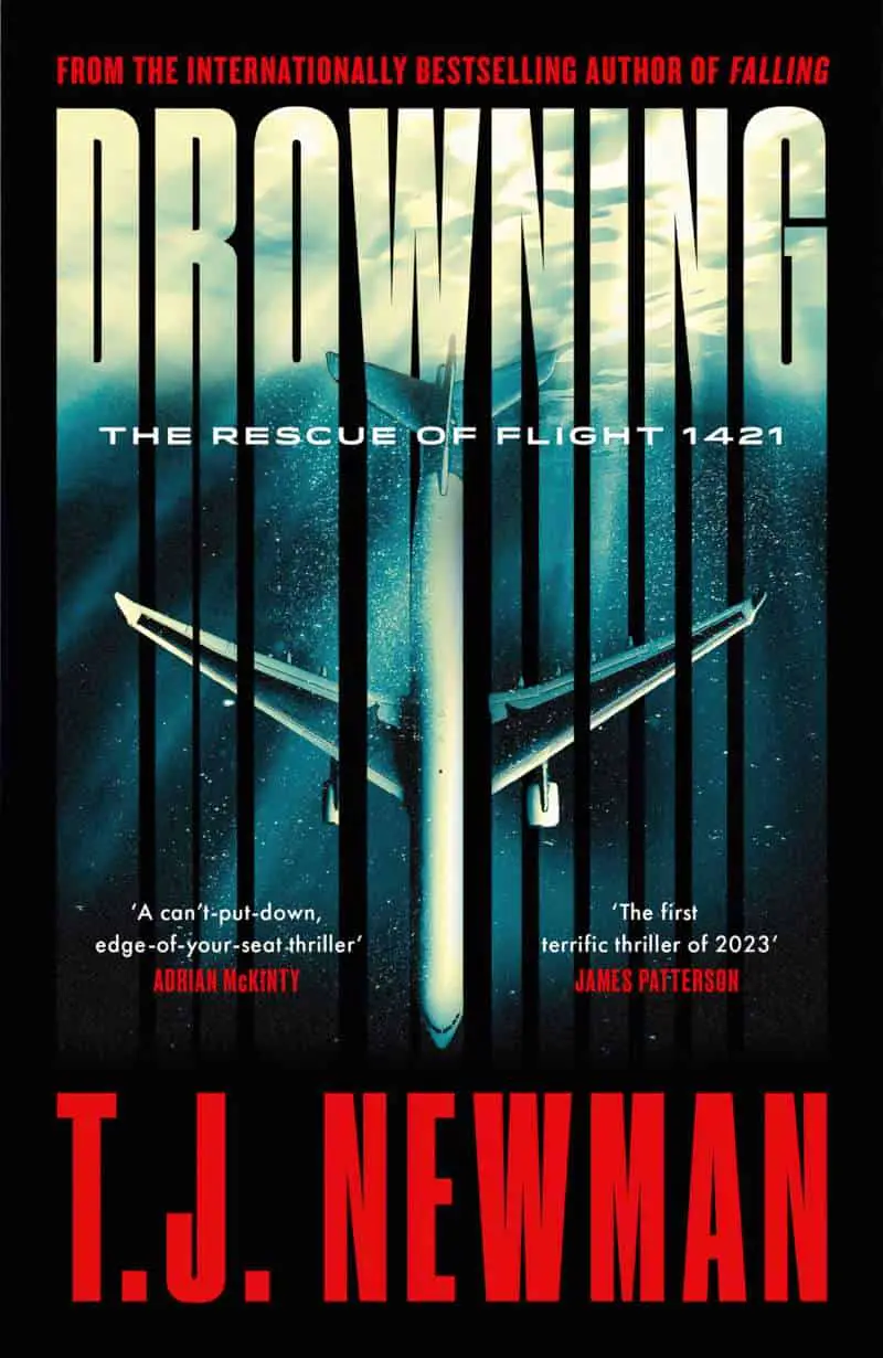
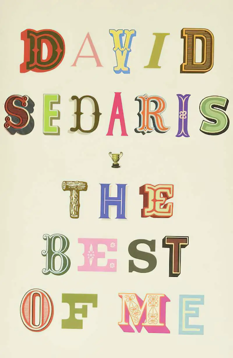
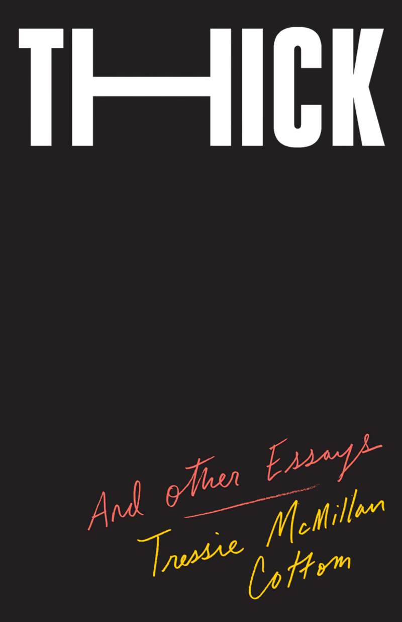
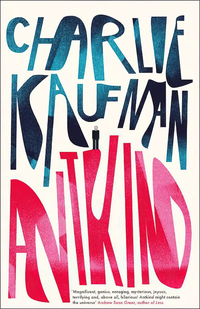
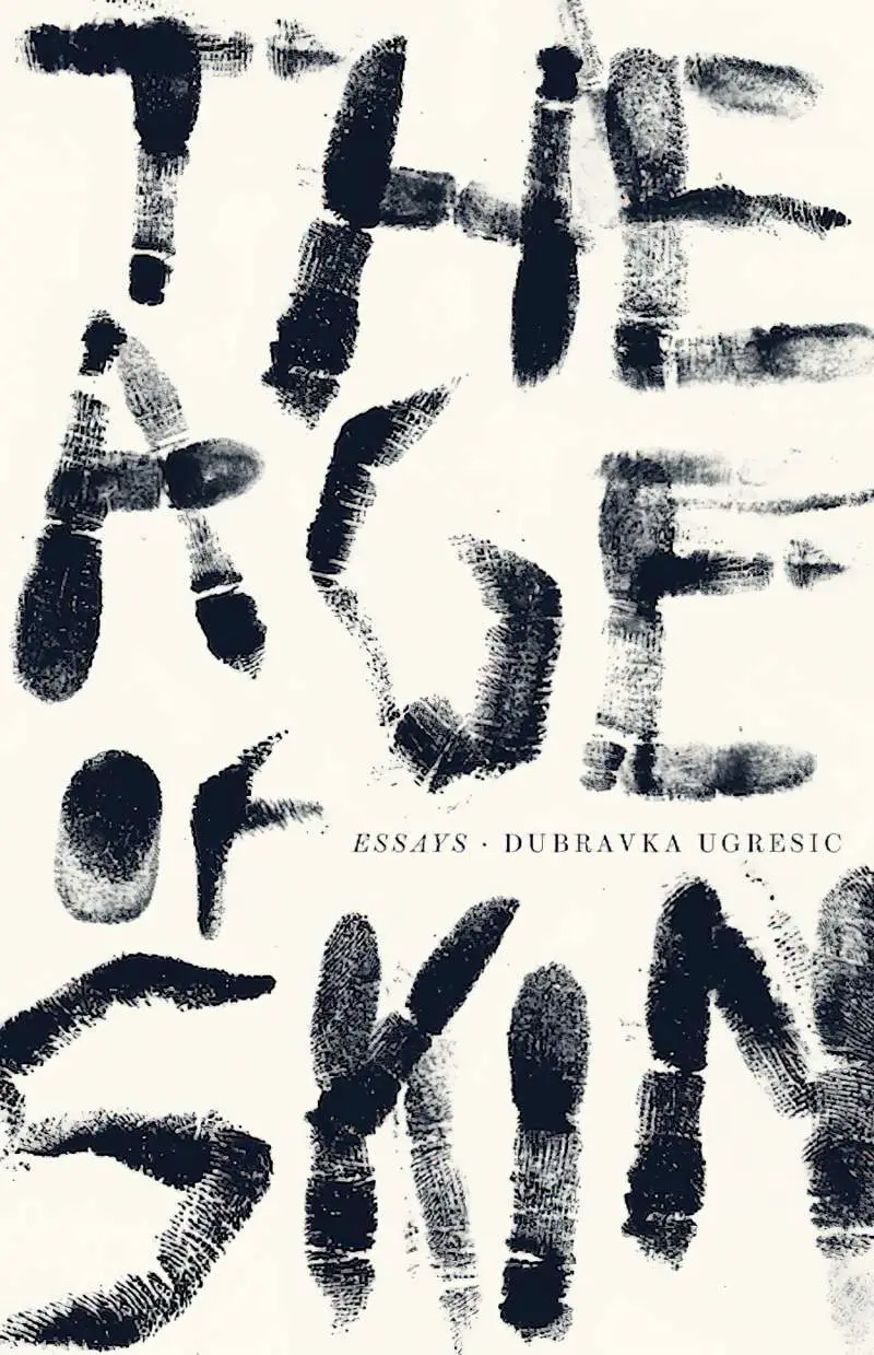
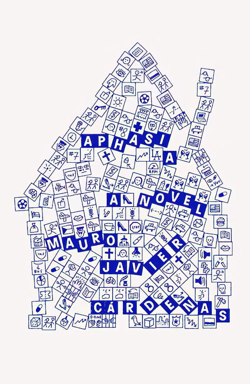
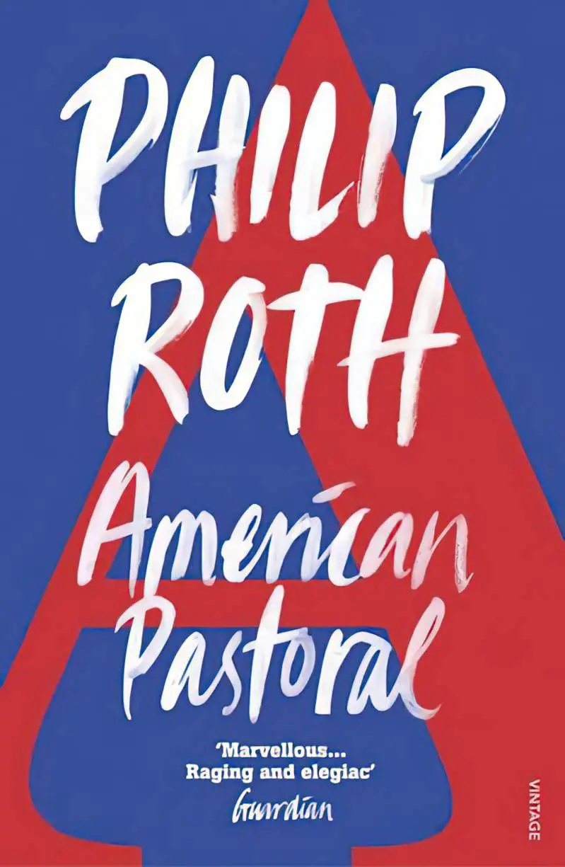
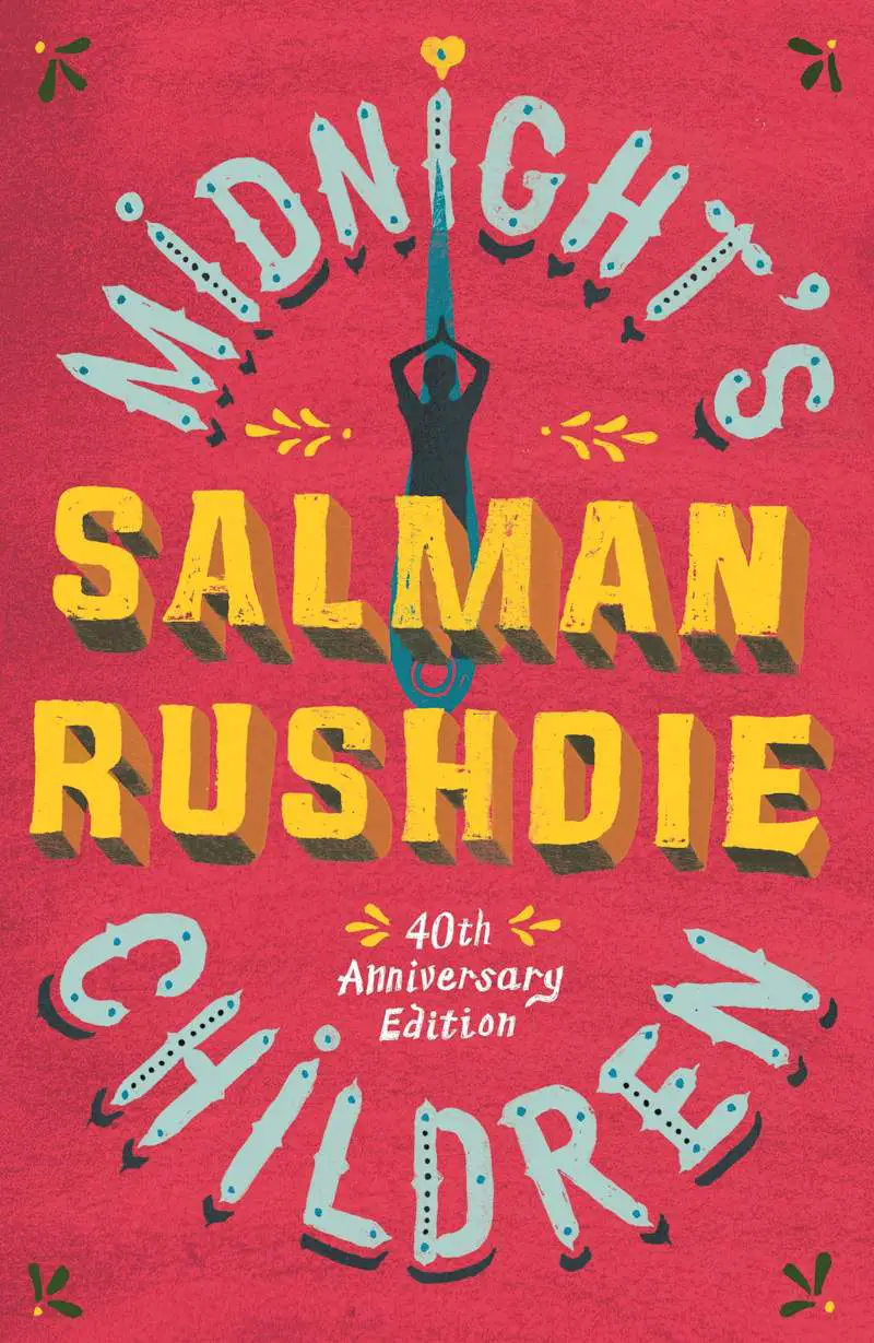
Let’s talk about typography as standalone artwork: word art. Below are a collection of favourite typographical book covers.
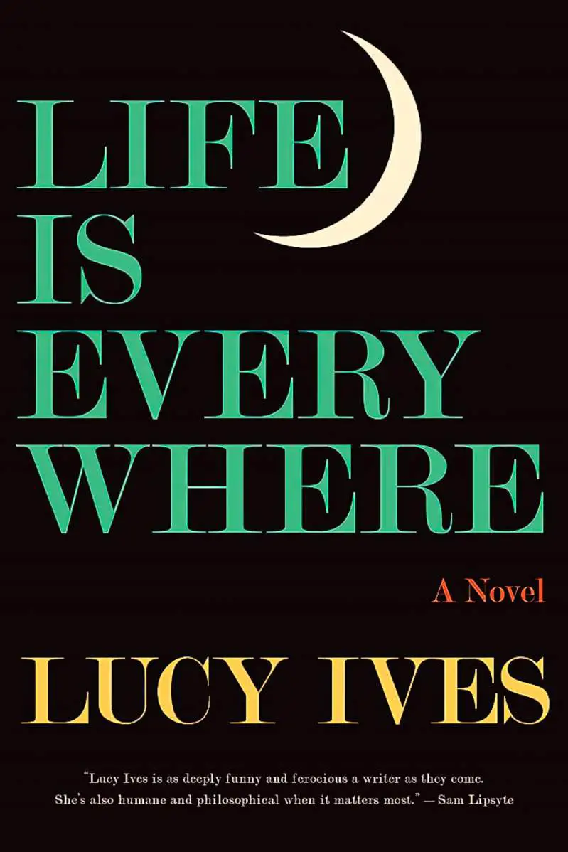
THE ALL TYPOGRAPHY COVER
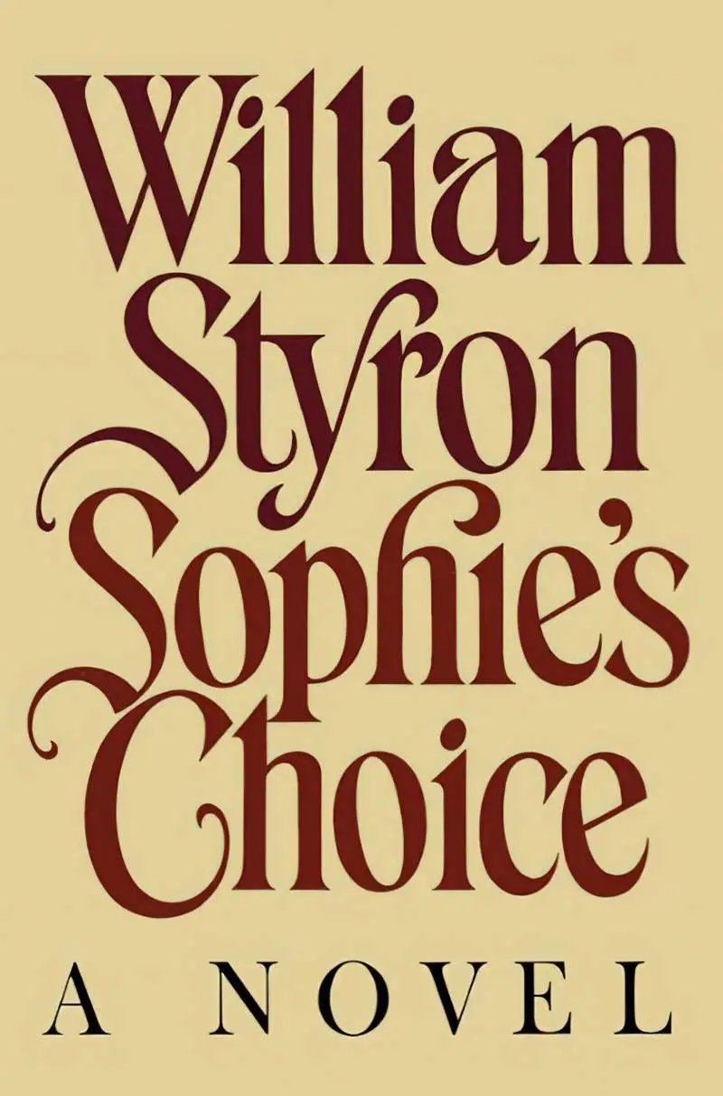
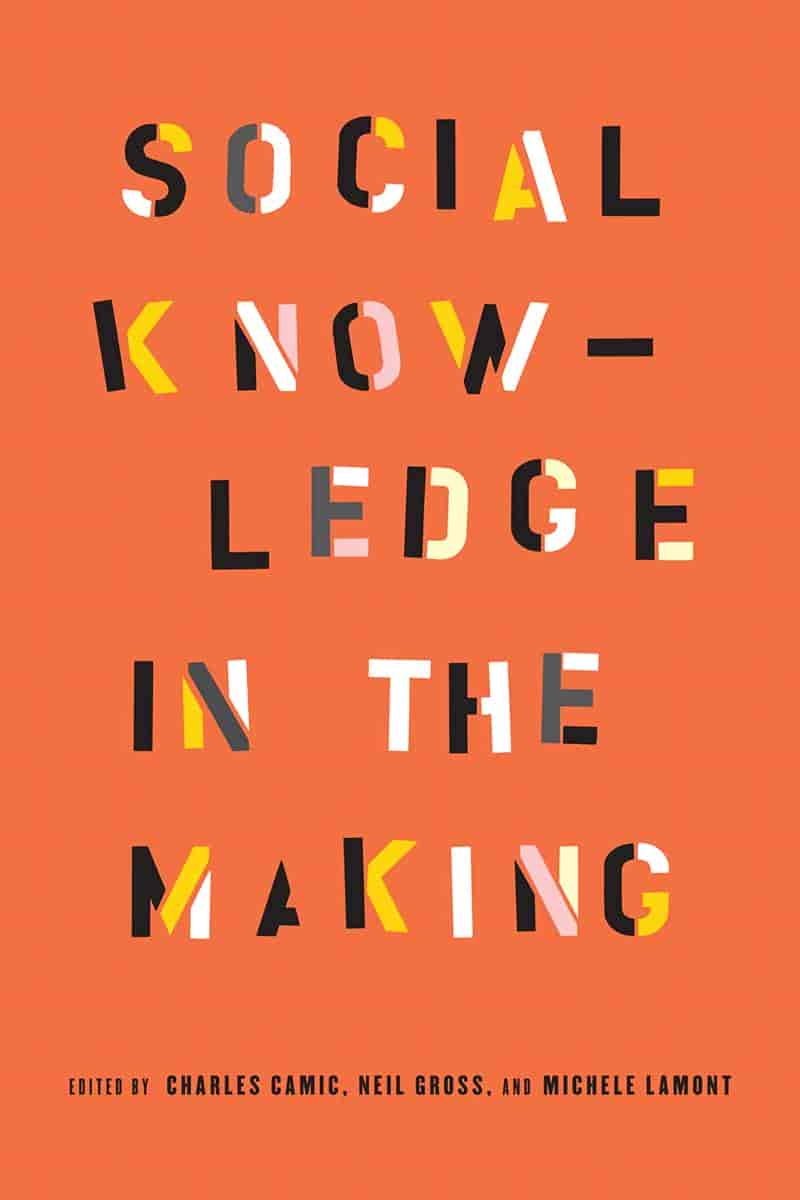
Paul Bacon invented the all-typography cover that has come back into style.
According to his obituary in the New York Times, Bacon was responsible for what became known as the “big book look,” a widely imitated style that stressed big typography and blocky colors with understated drawings. Bacon saw his job as “finding something that would be a synthesis graphically of what the story was about,” he told Print magazine in 2002. He was one of the best at it, and his work inspired generations of designers like Chip Kidd and Peter Mendelsund.
WNYC


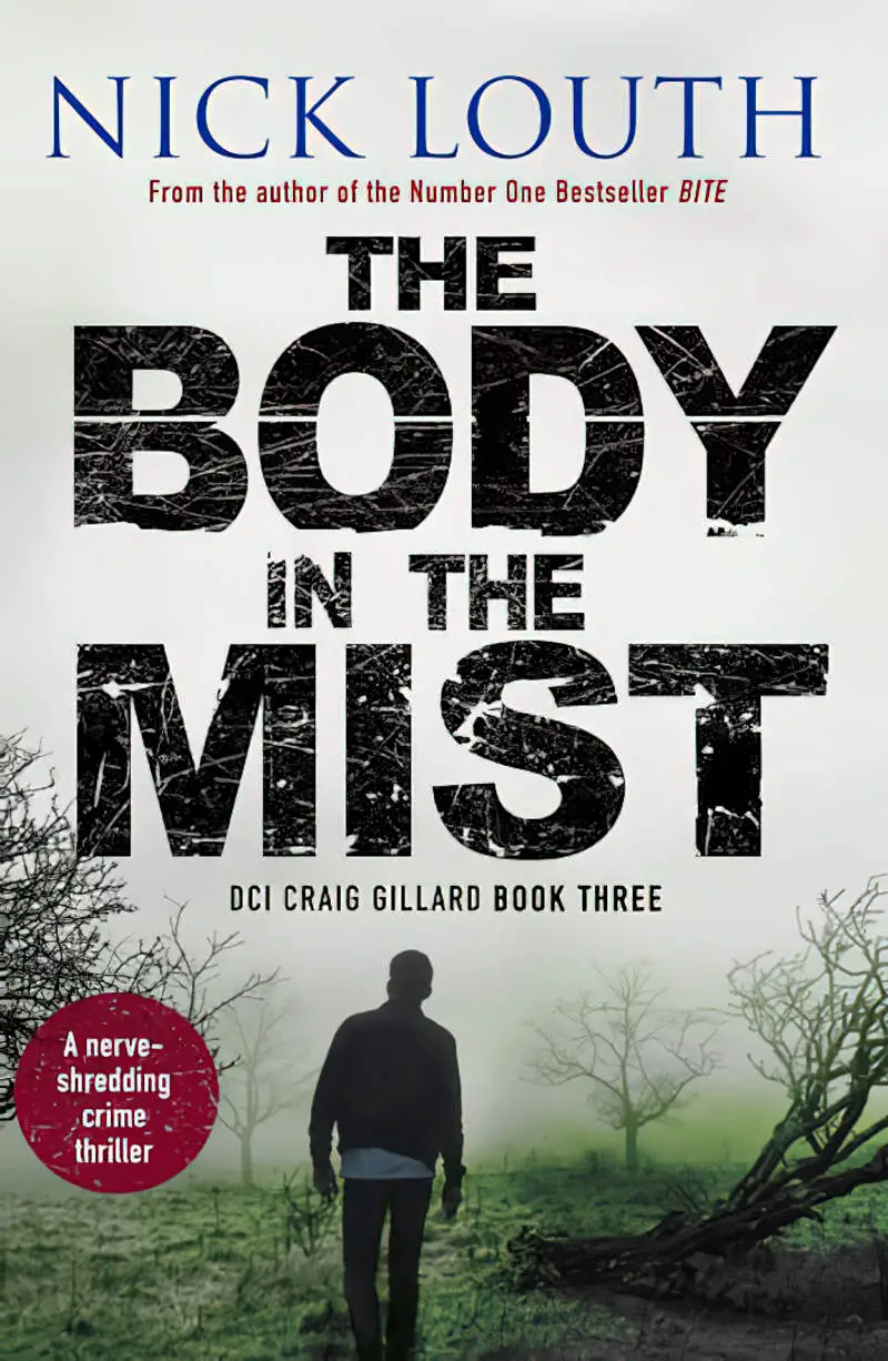
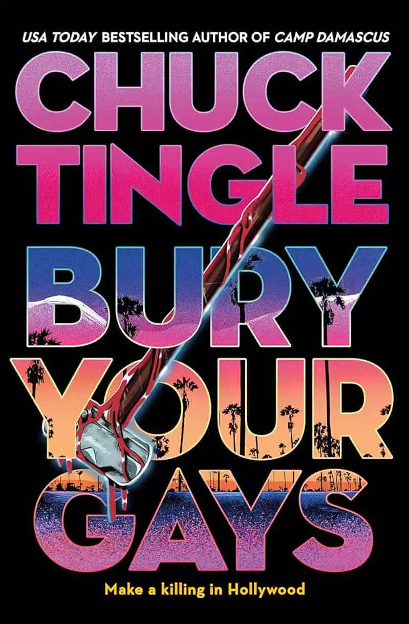
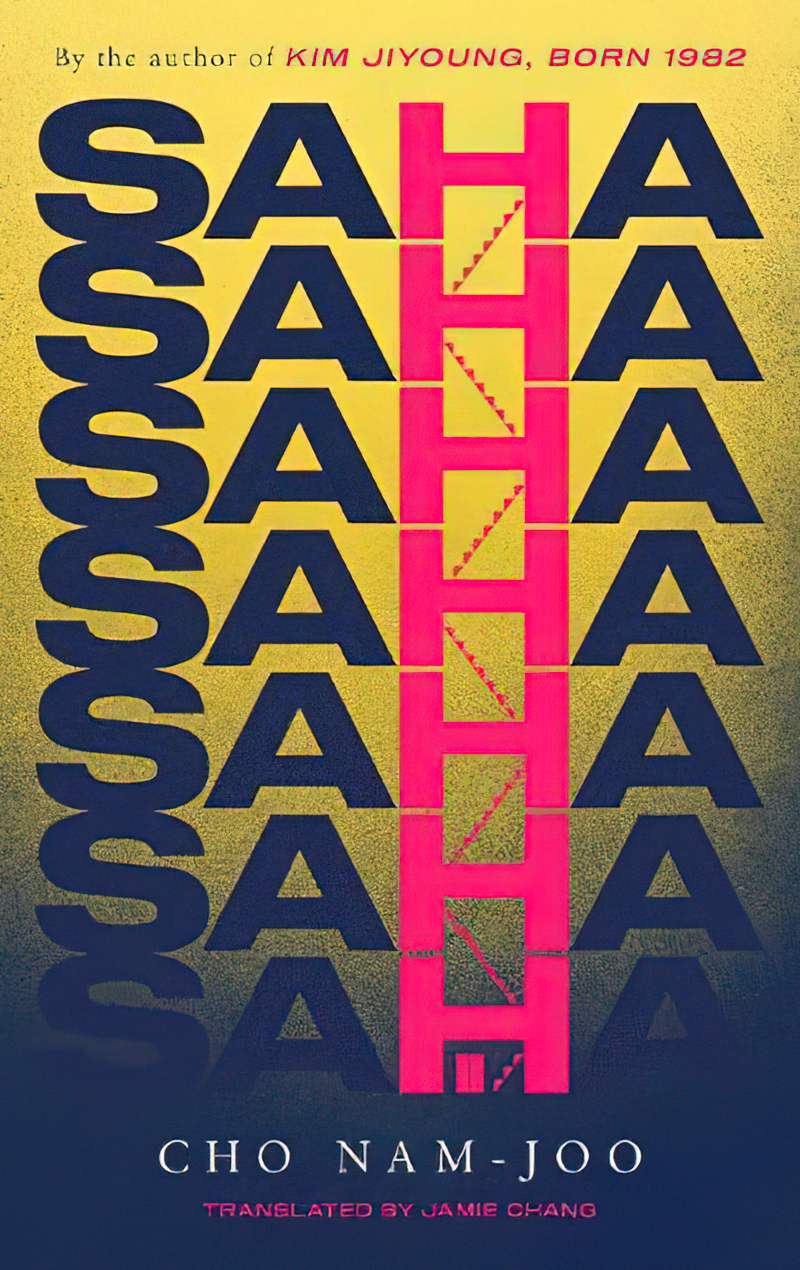
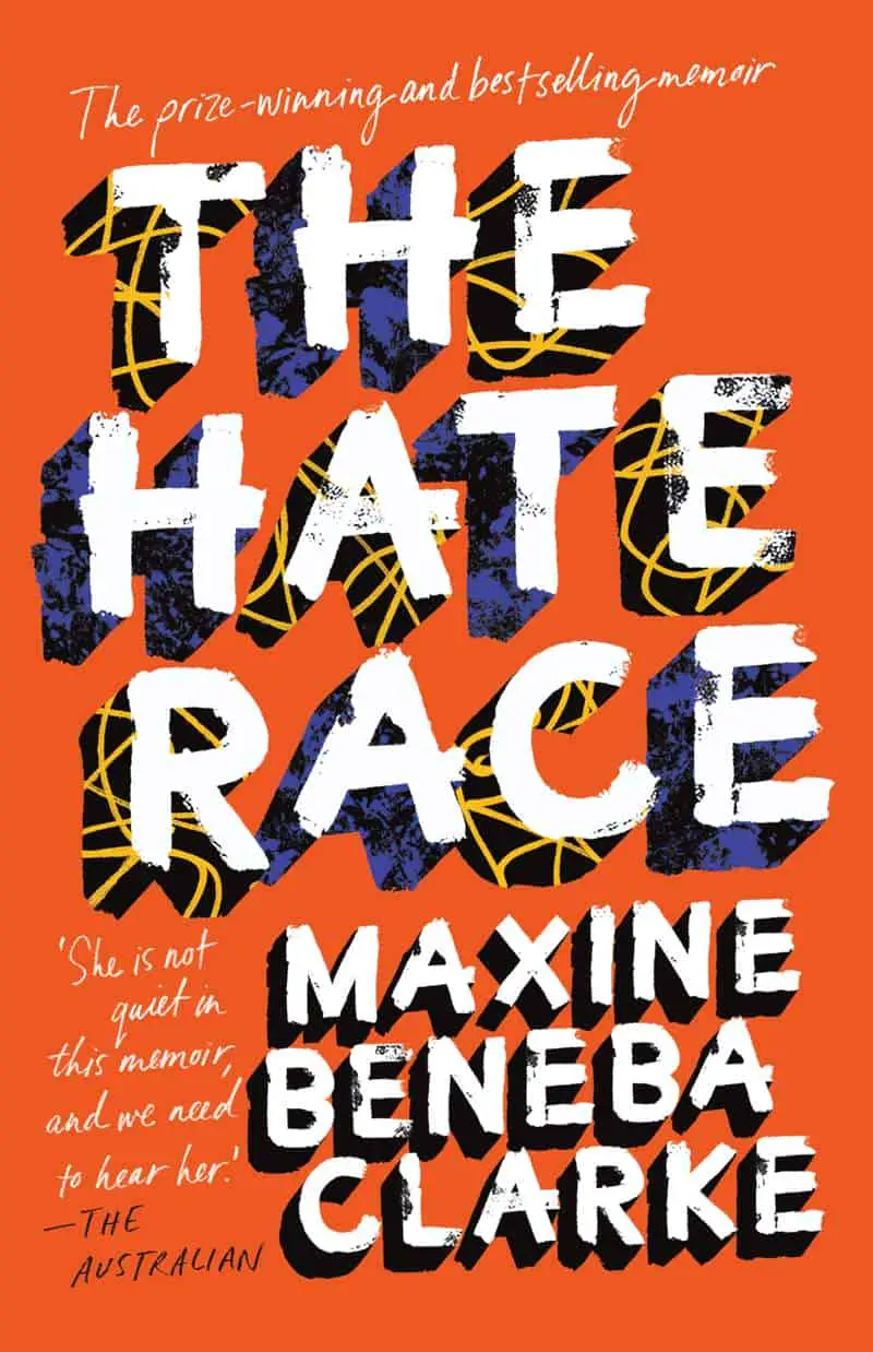
MASSIVE LETTERS USED AS A CLIPPING MASK
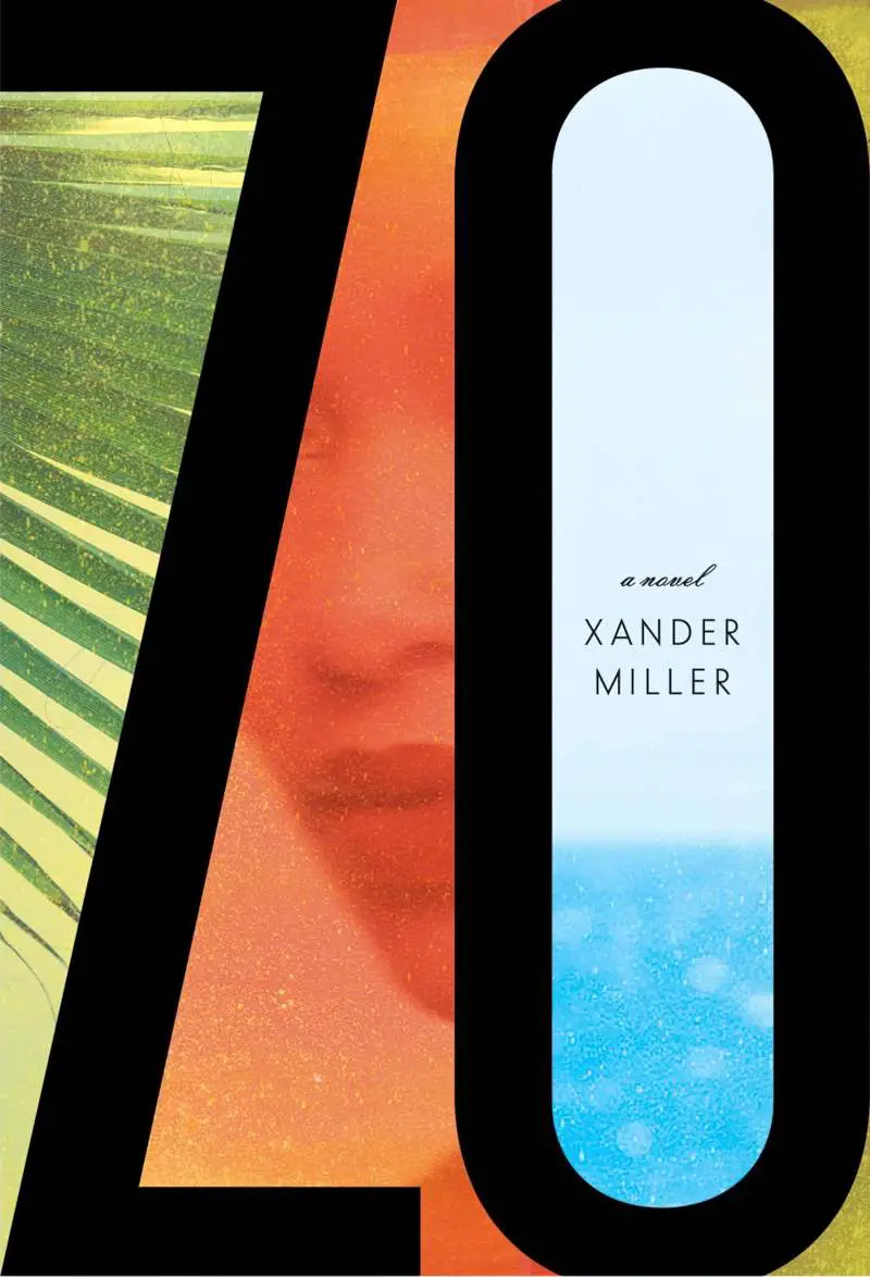

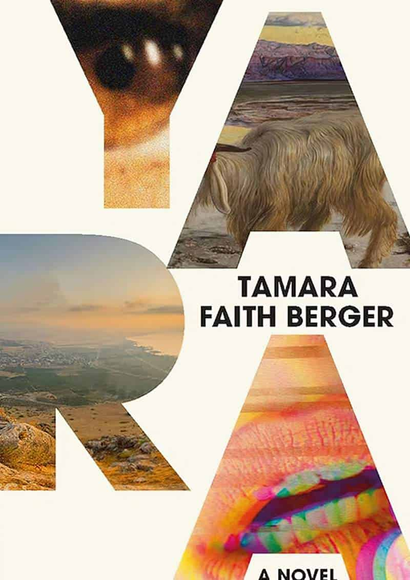

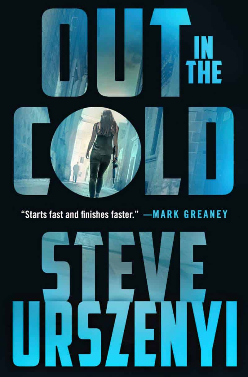


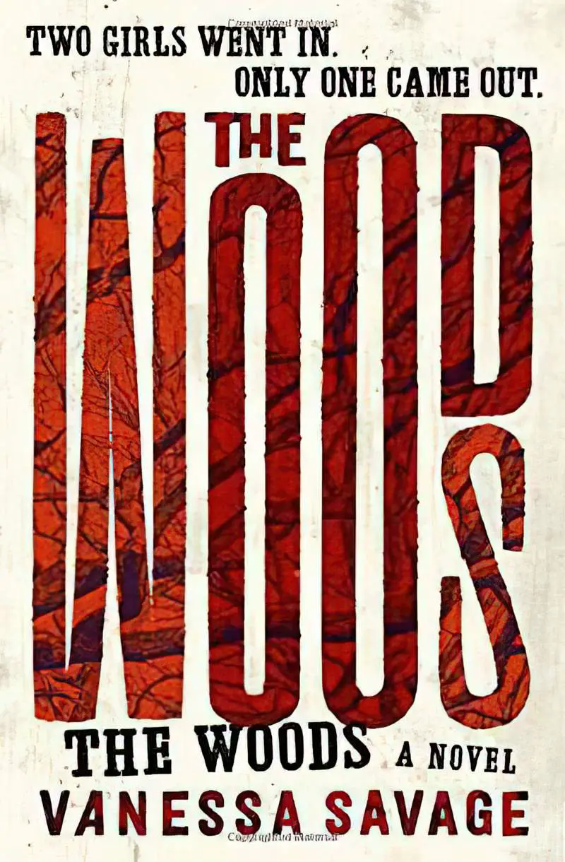
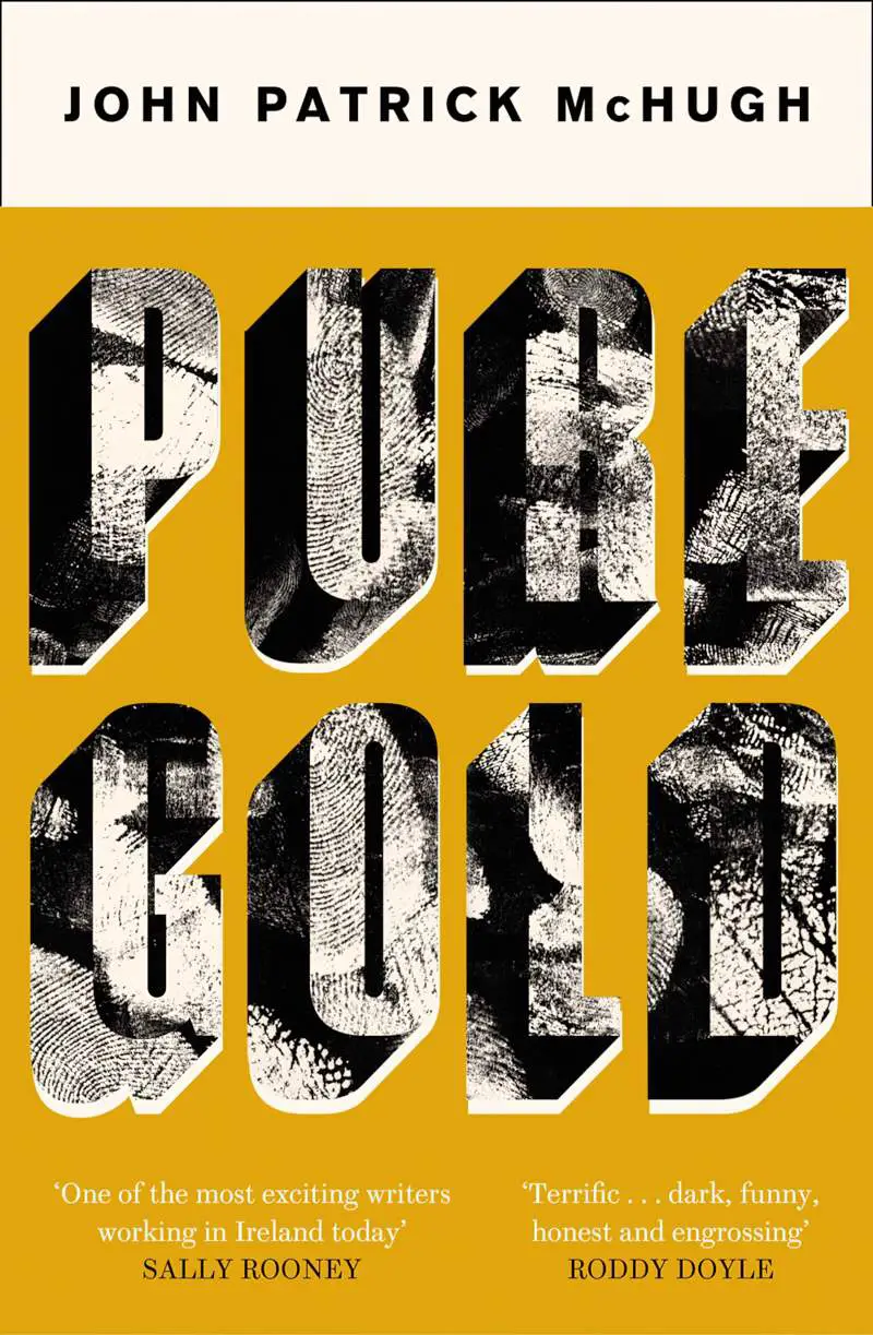
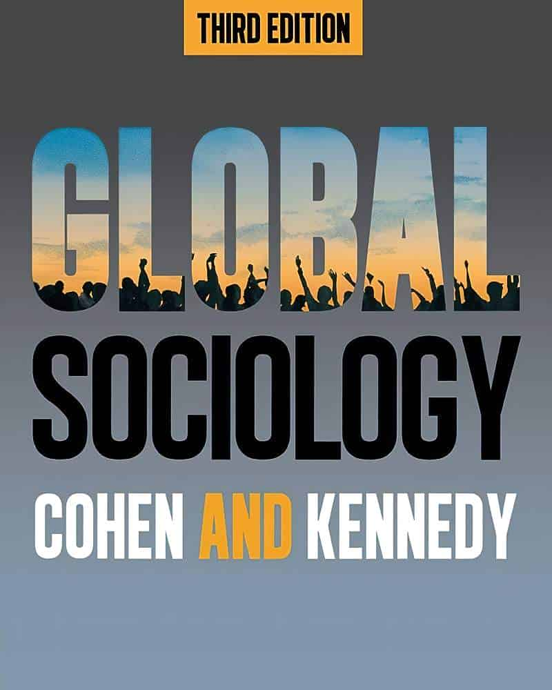
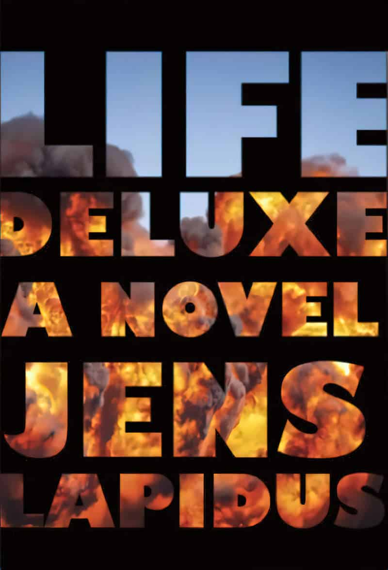
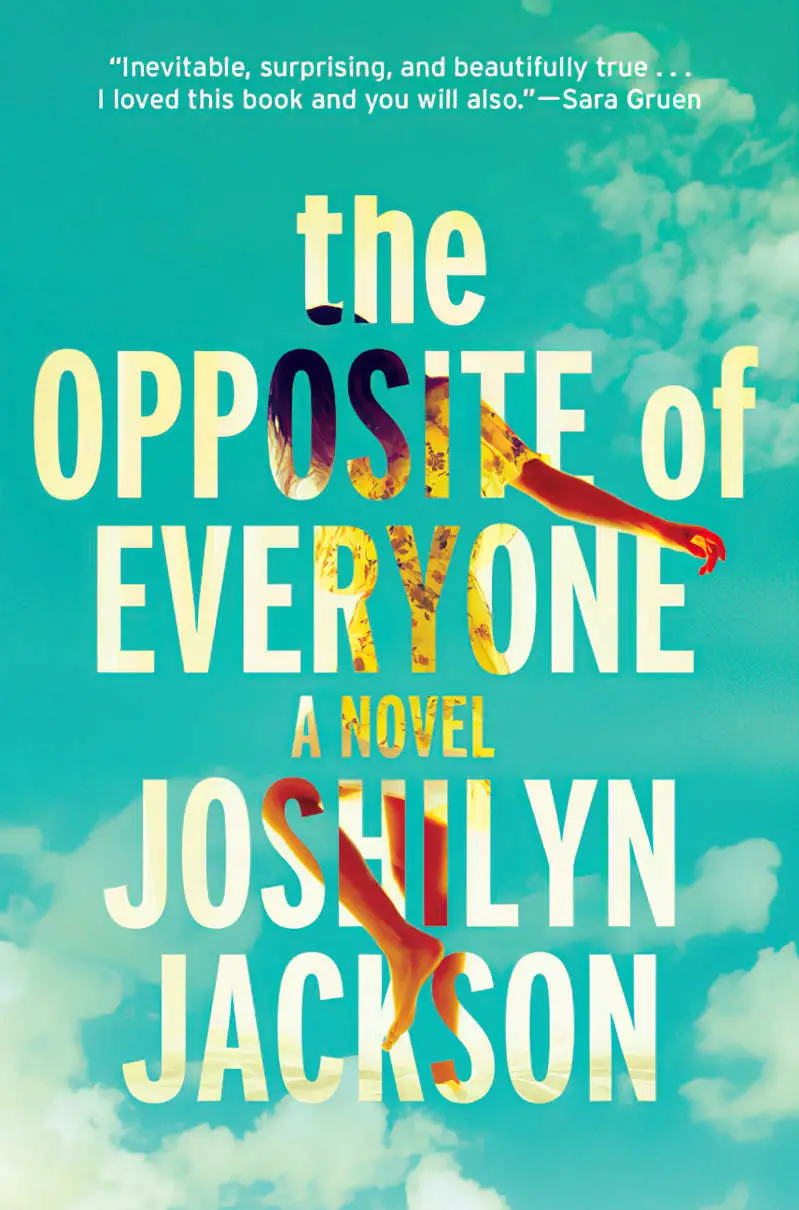

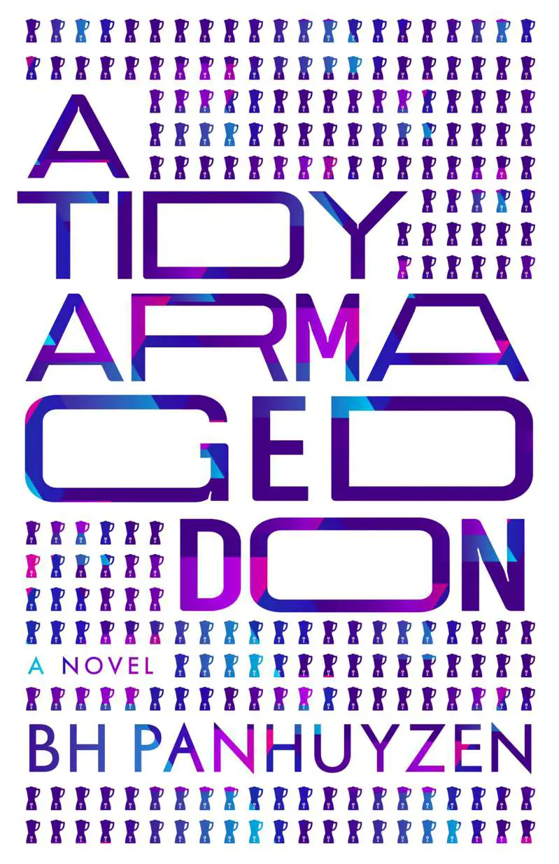
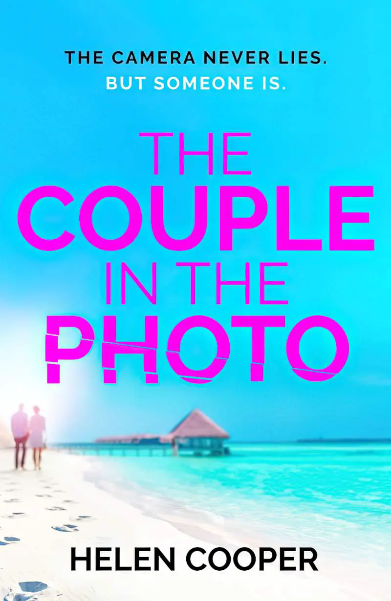
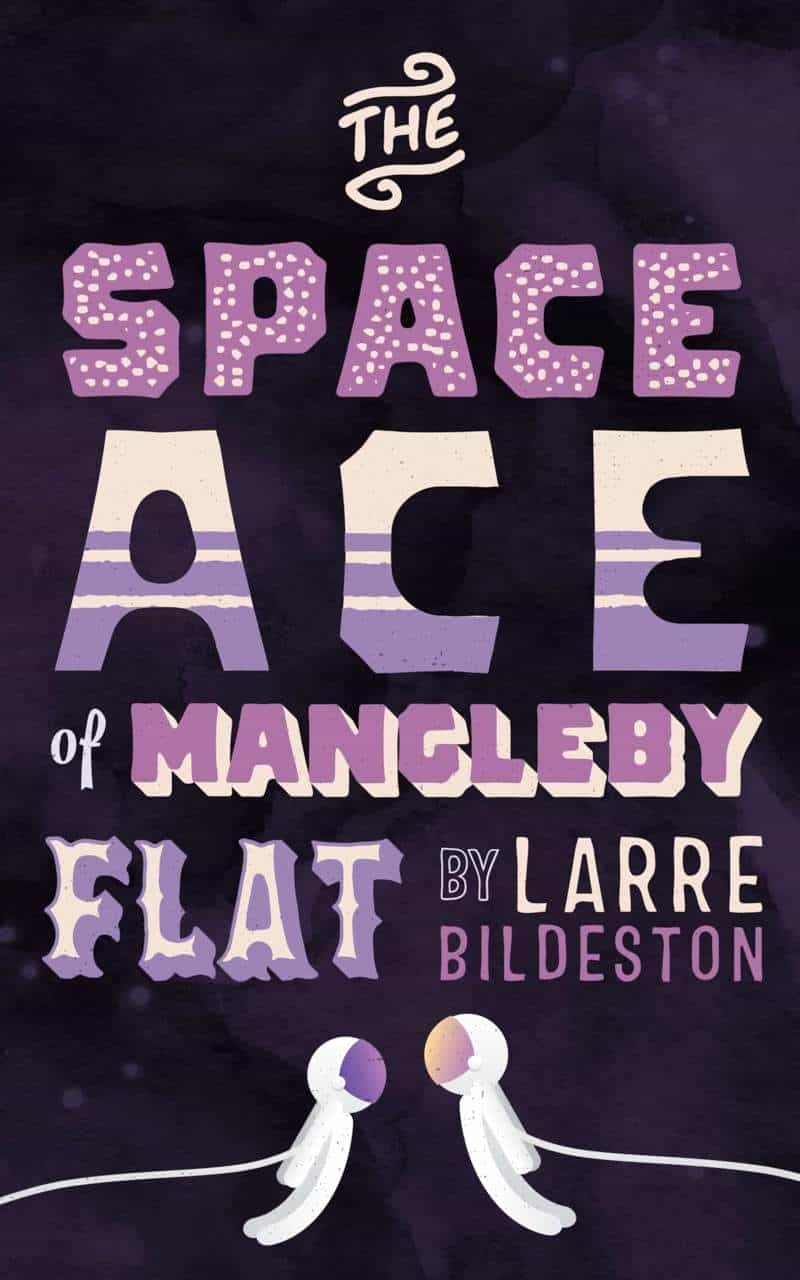
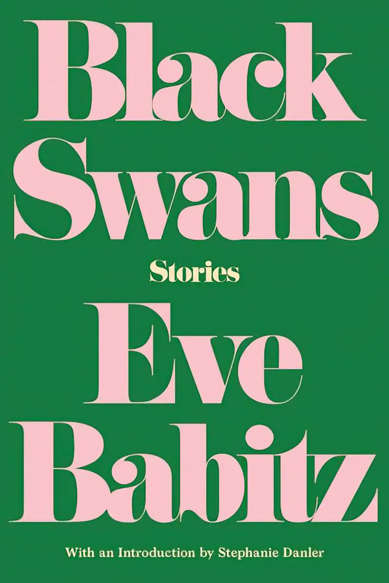
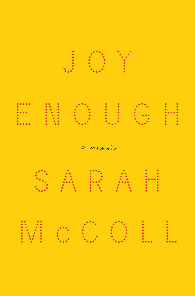
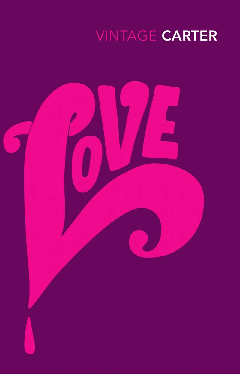
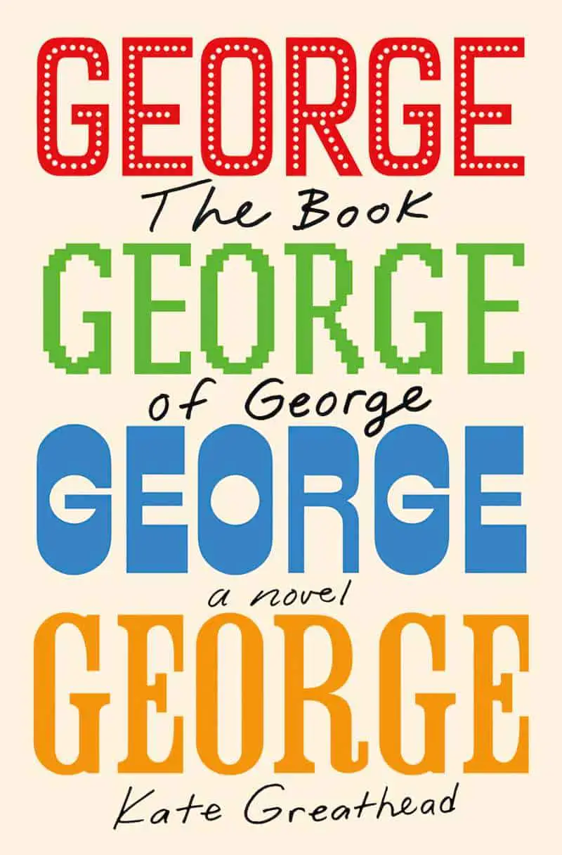
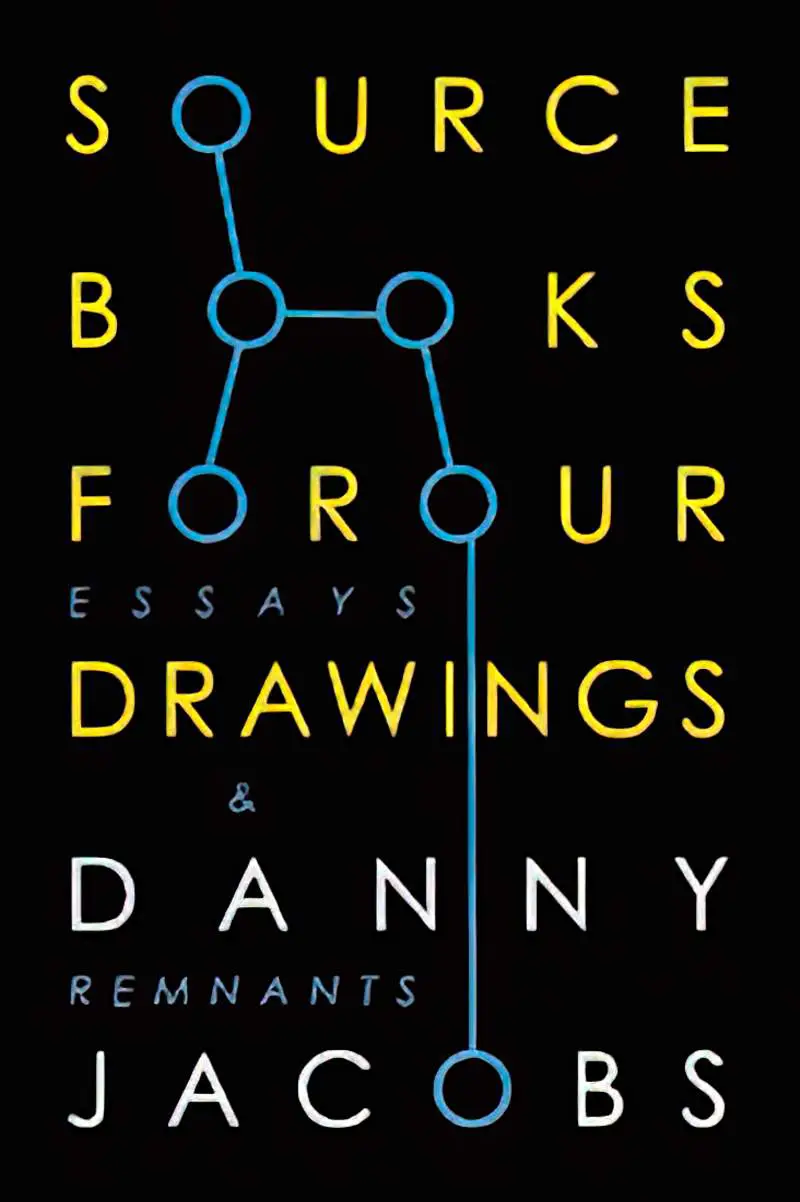
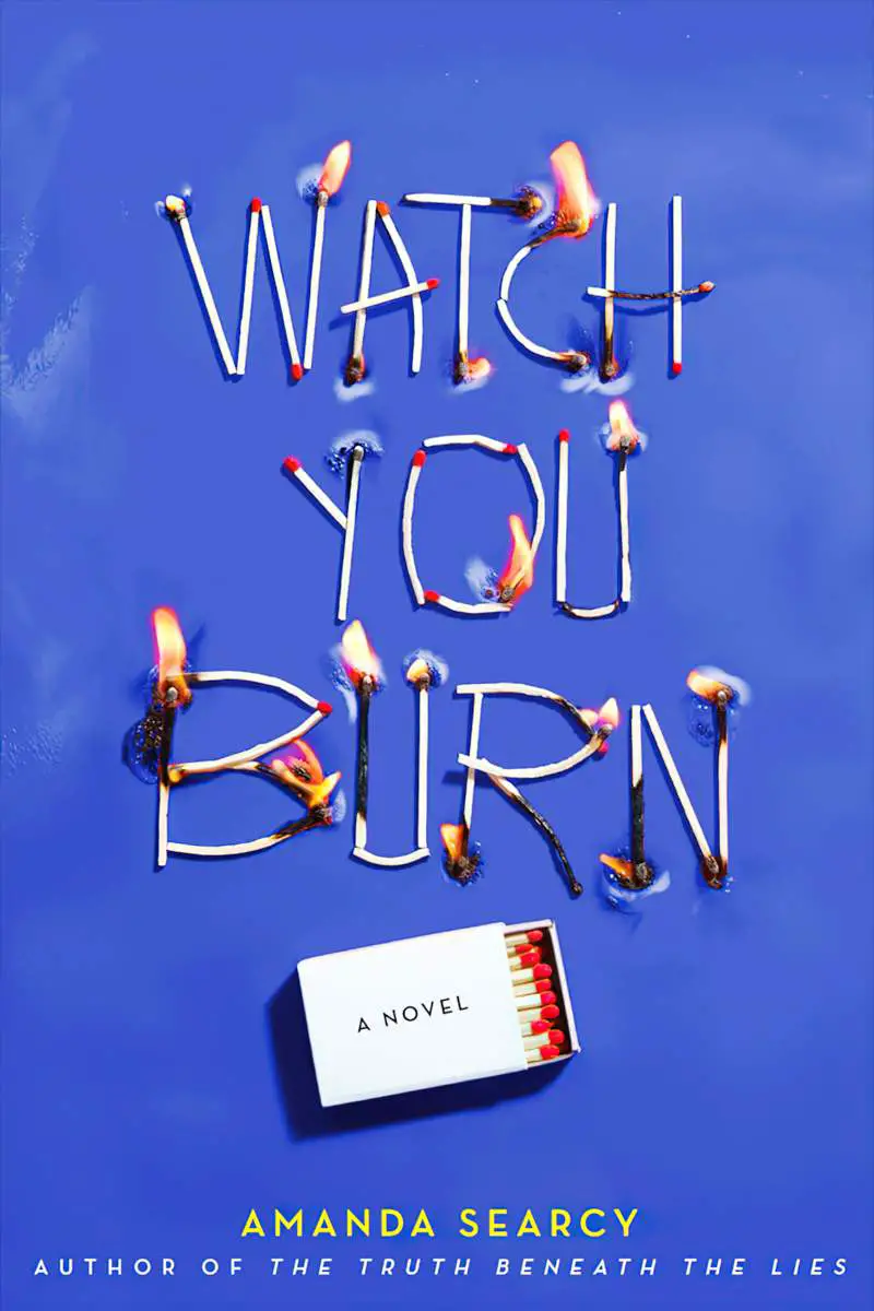
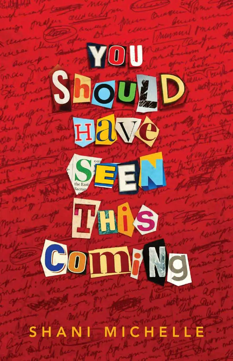
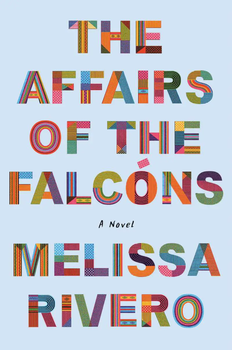
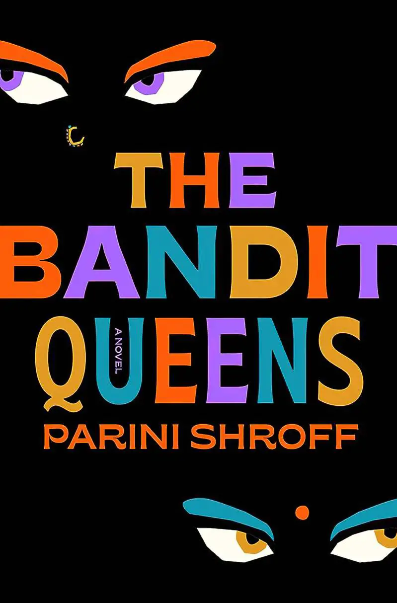
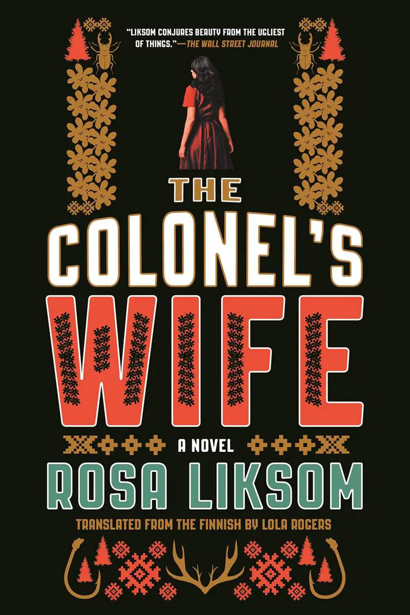
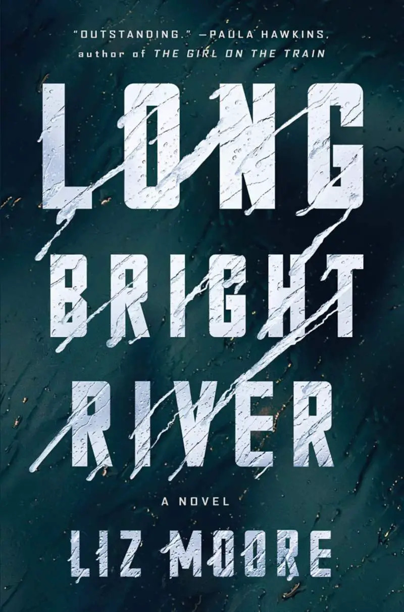
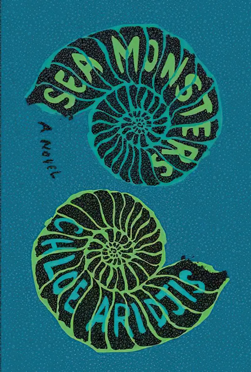
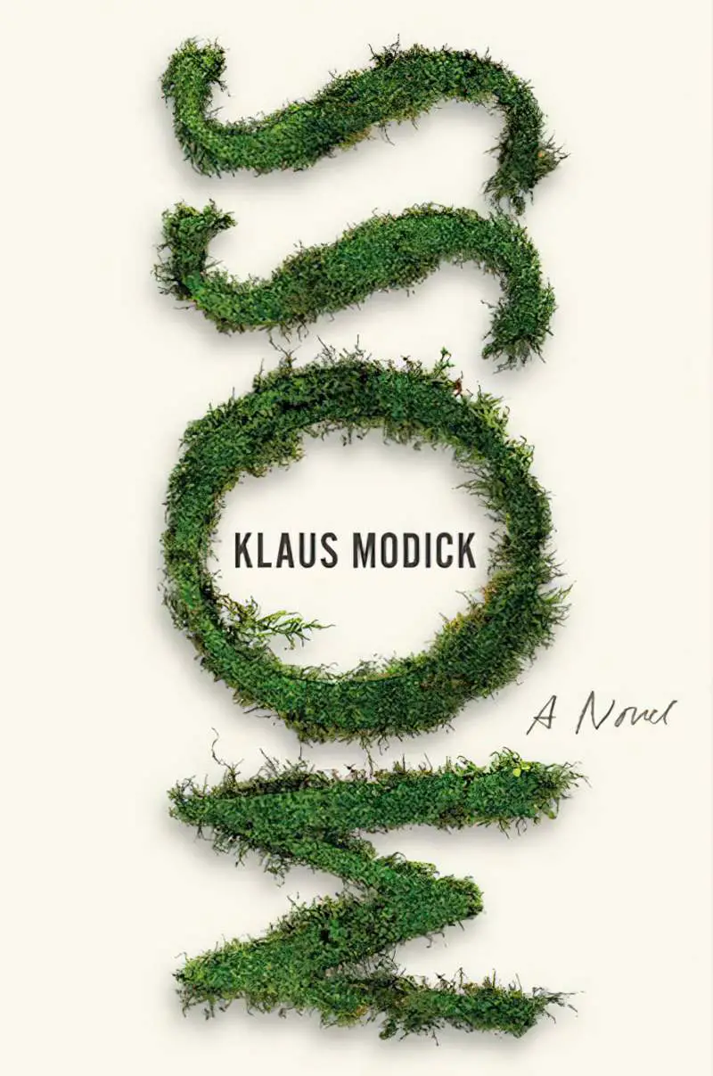
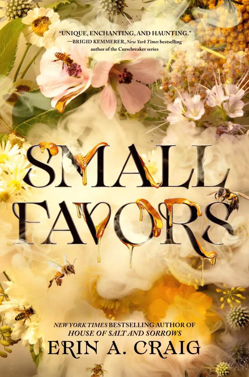
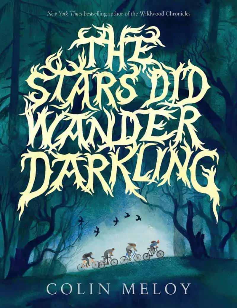
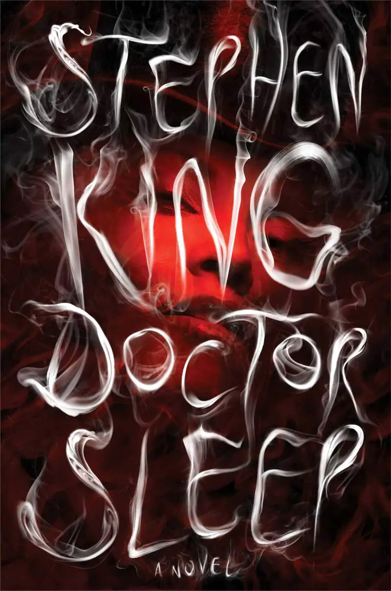
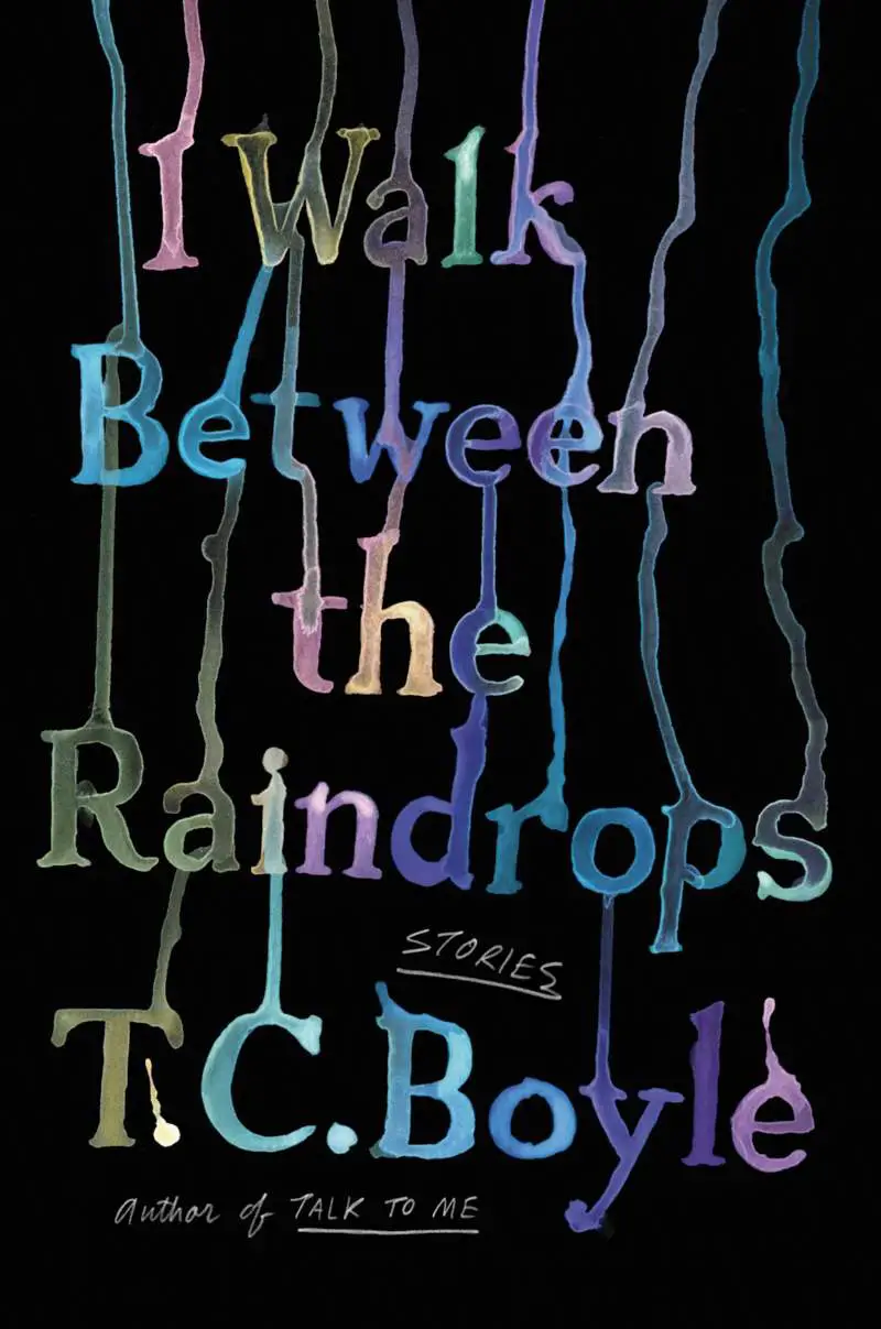
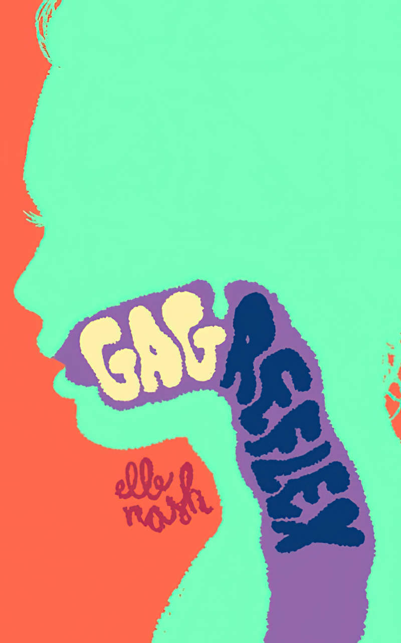
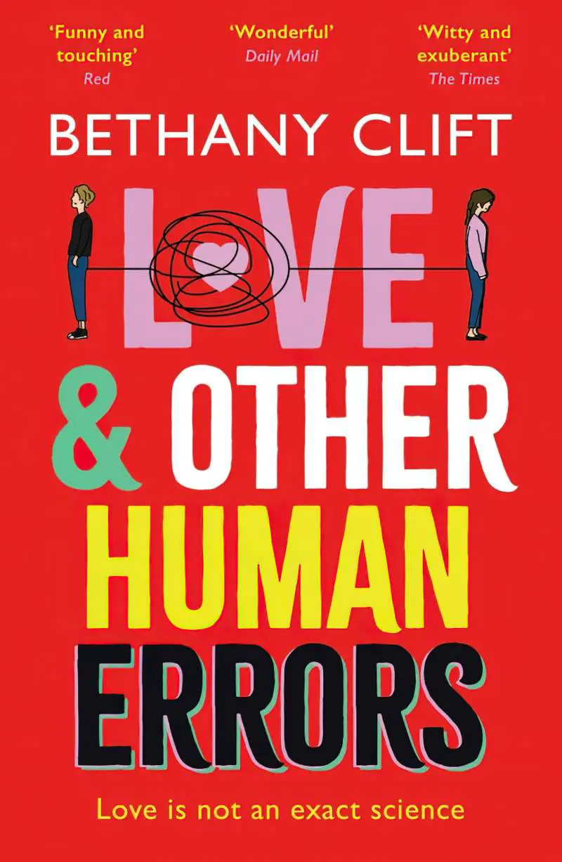
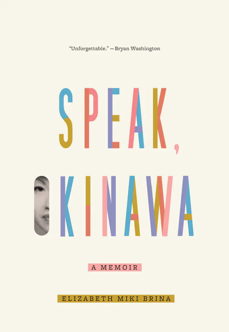
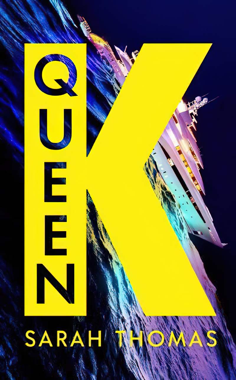
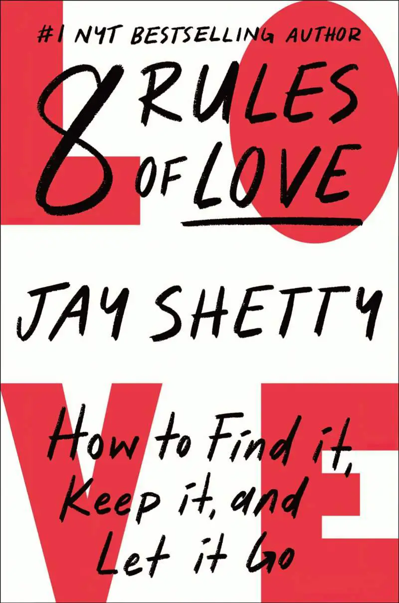
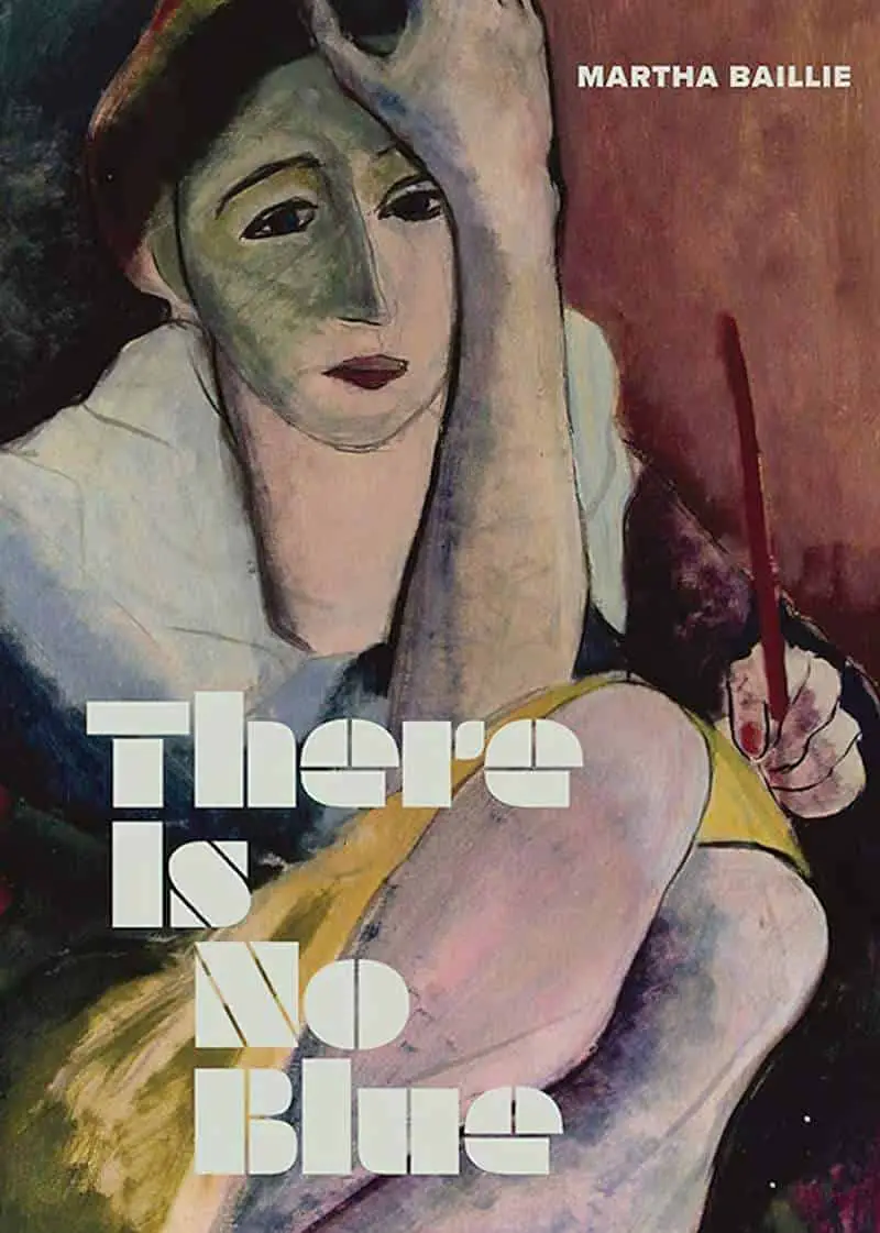
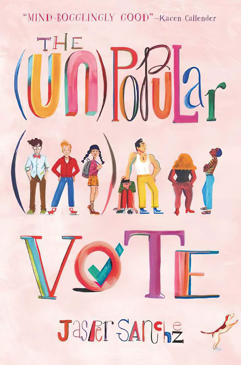
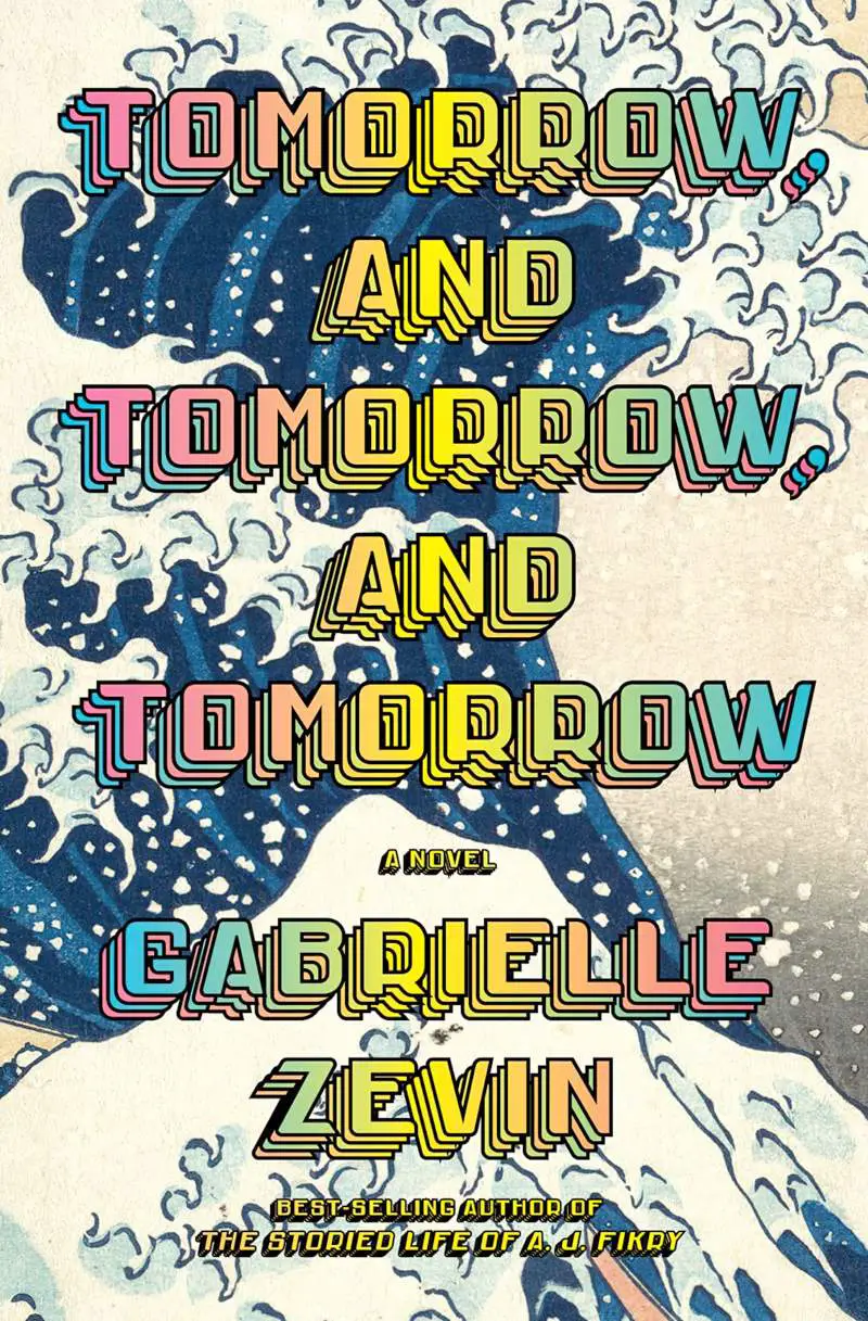
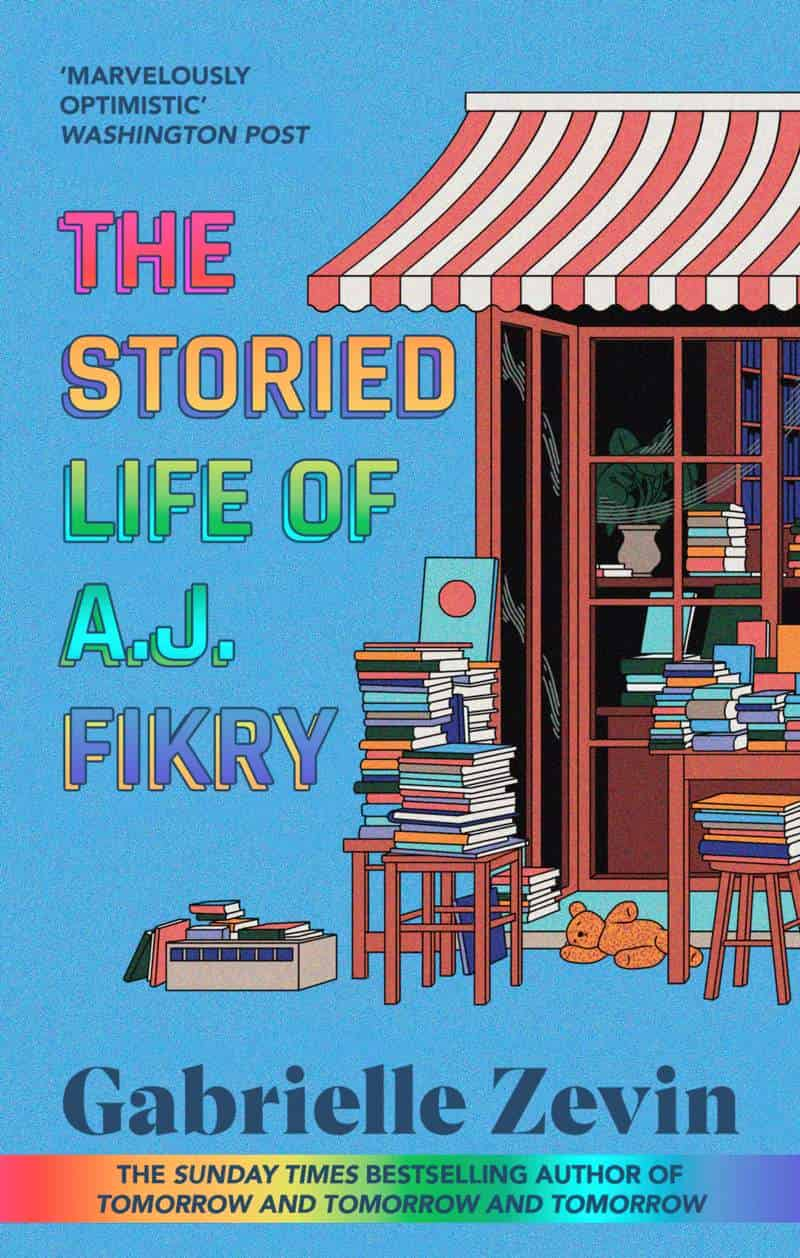
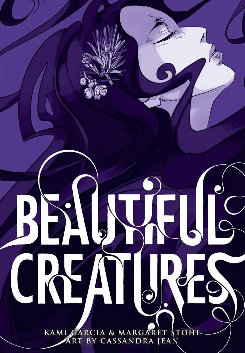
WORD ART
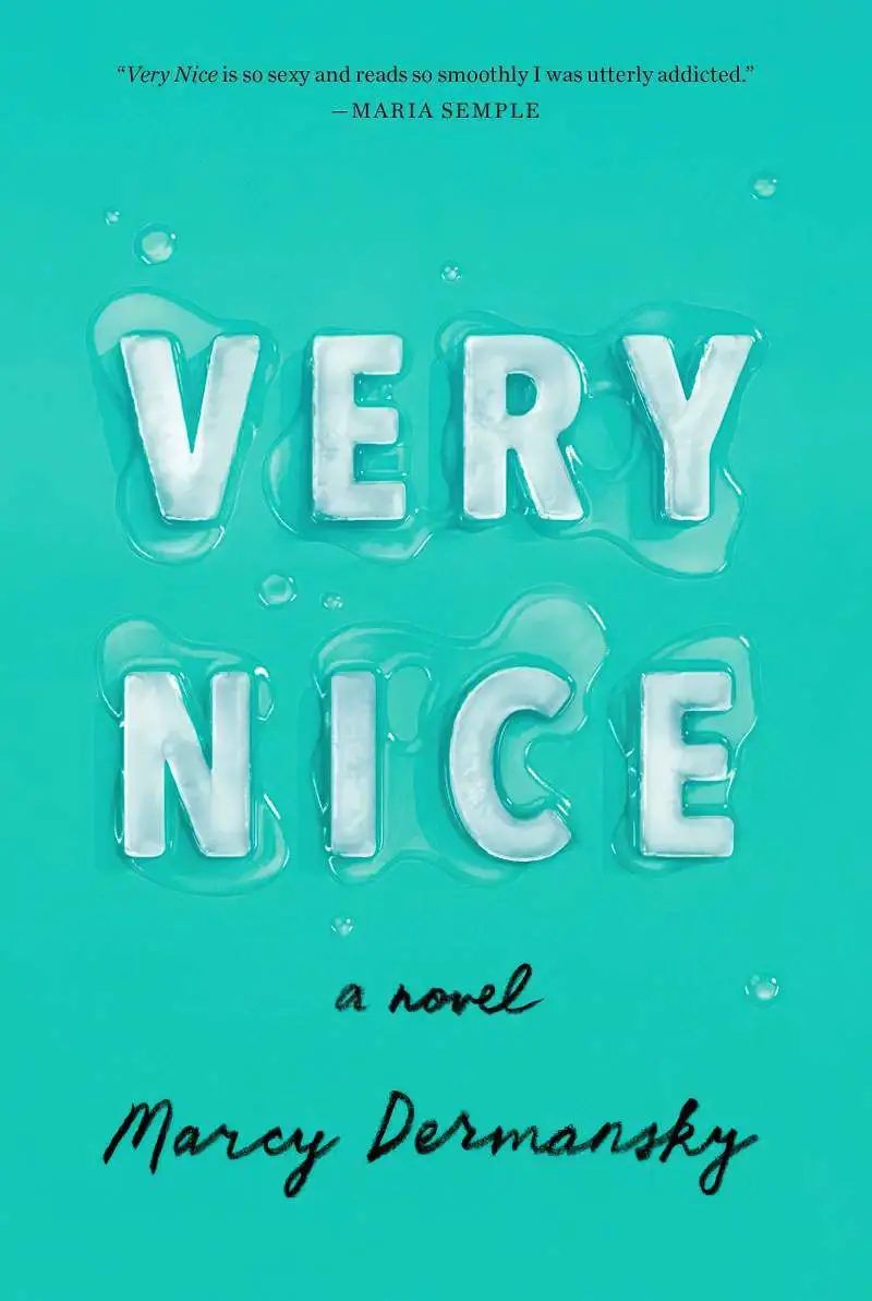
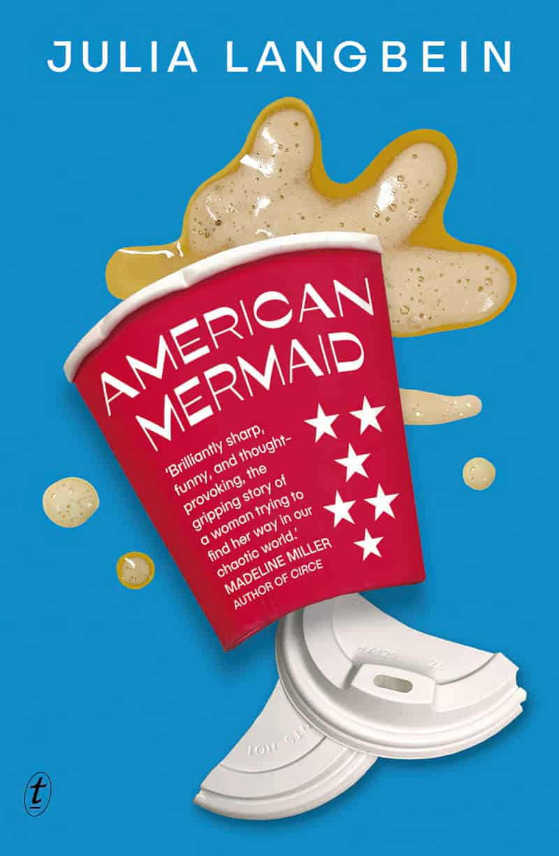
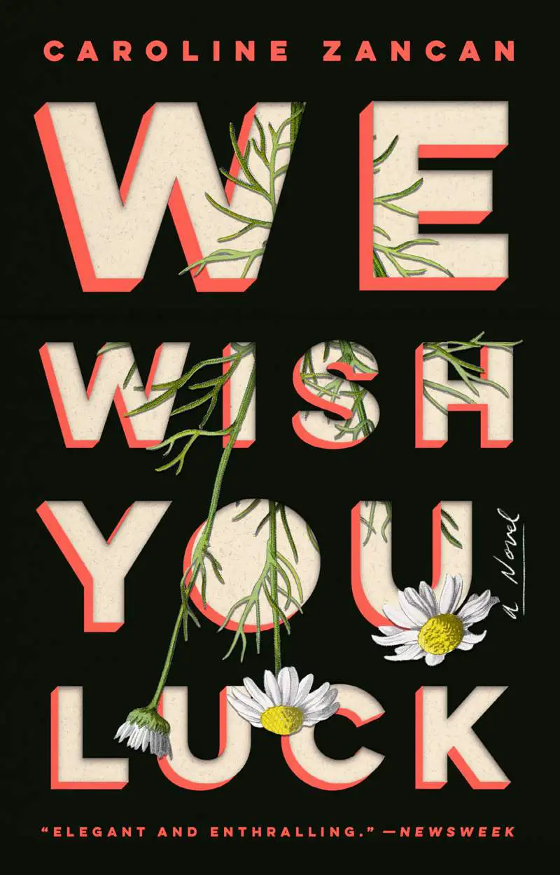
From letters dripping with honey to grass growing from cut paper, these book covers attracted my attention because of their word art.

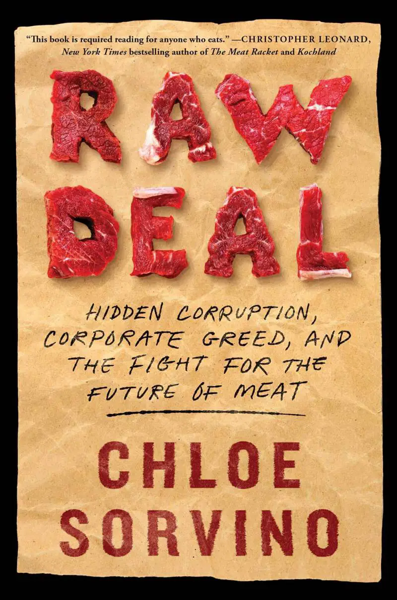
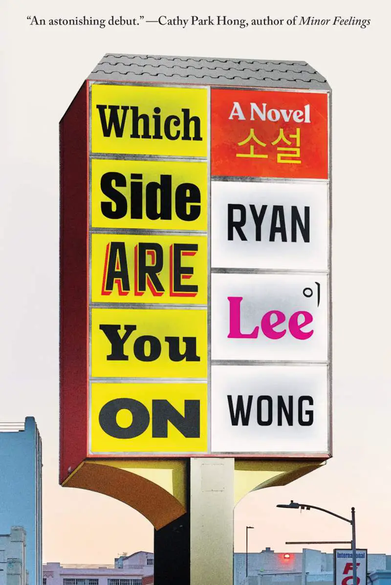
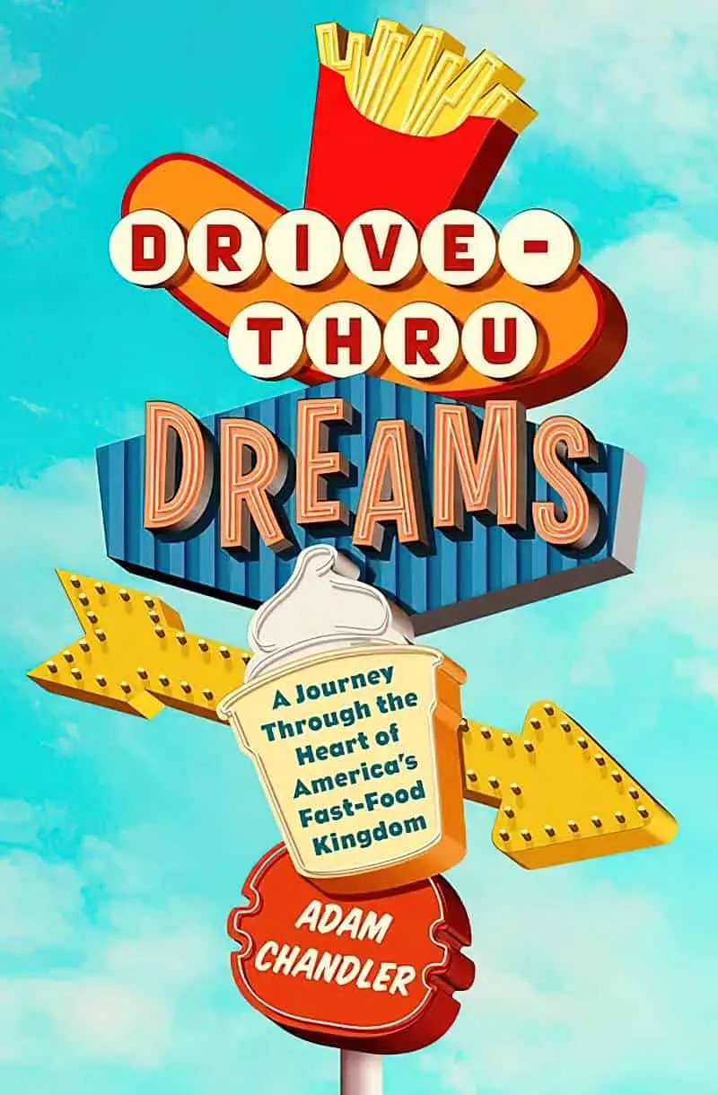
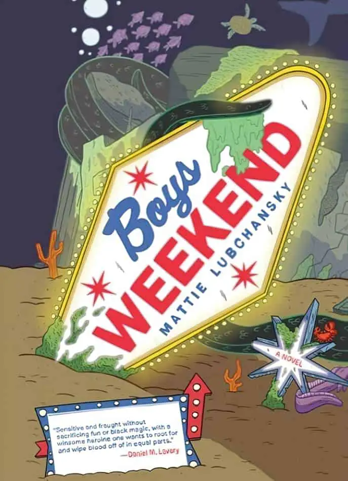
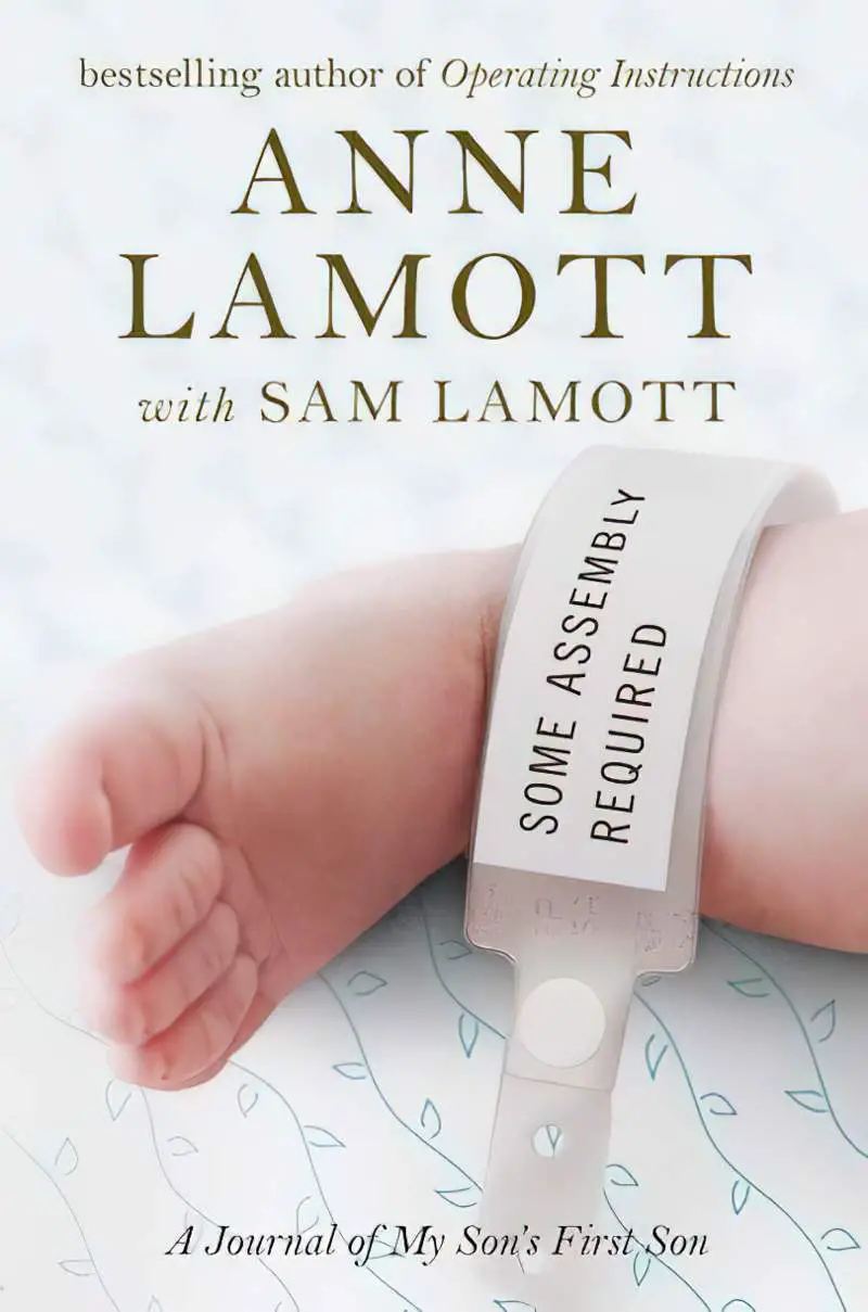
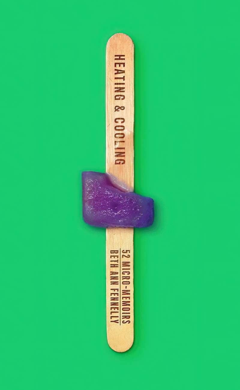
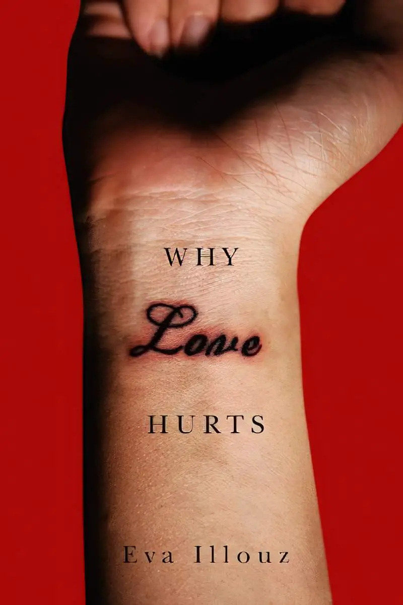
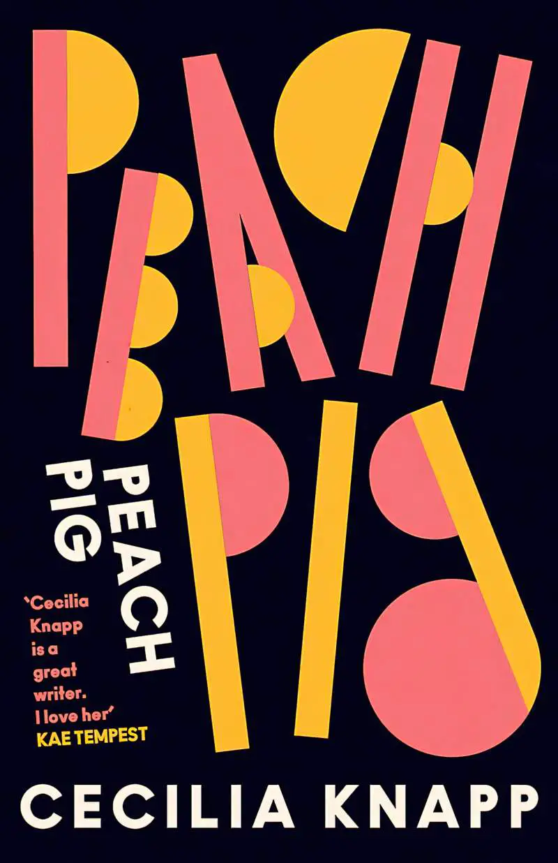
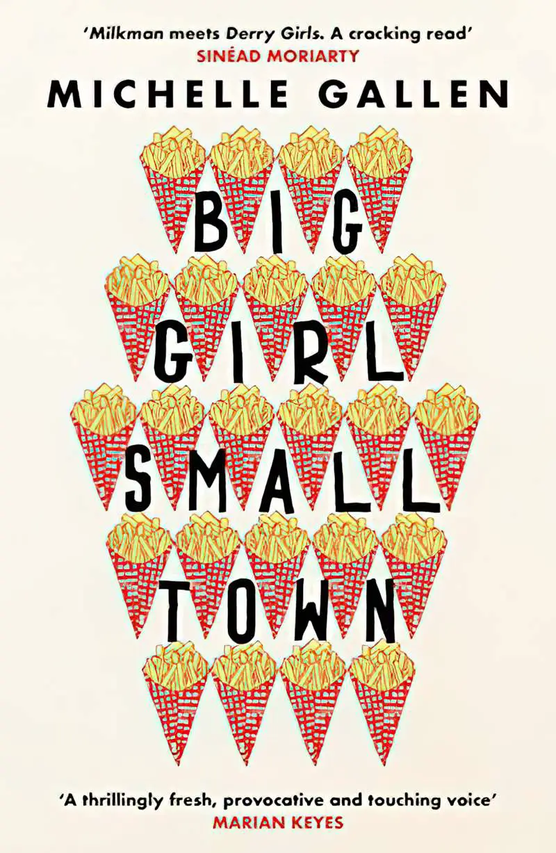
LETTERS THAT LOOK LIKE REAL WORLD OBJECTS
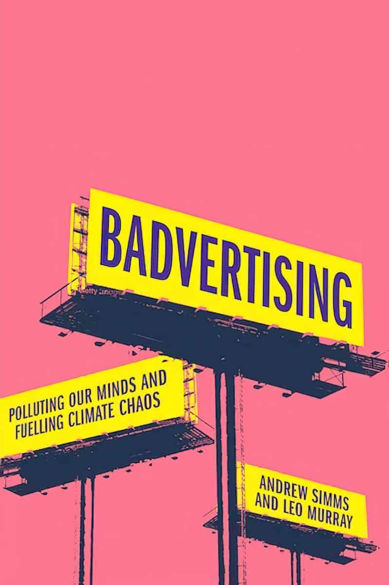
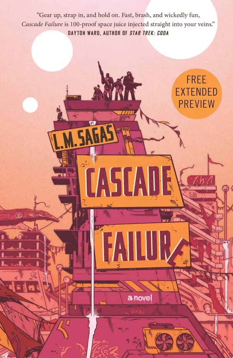
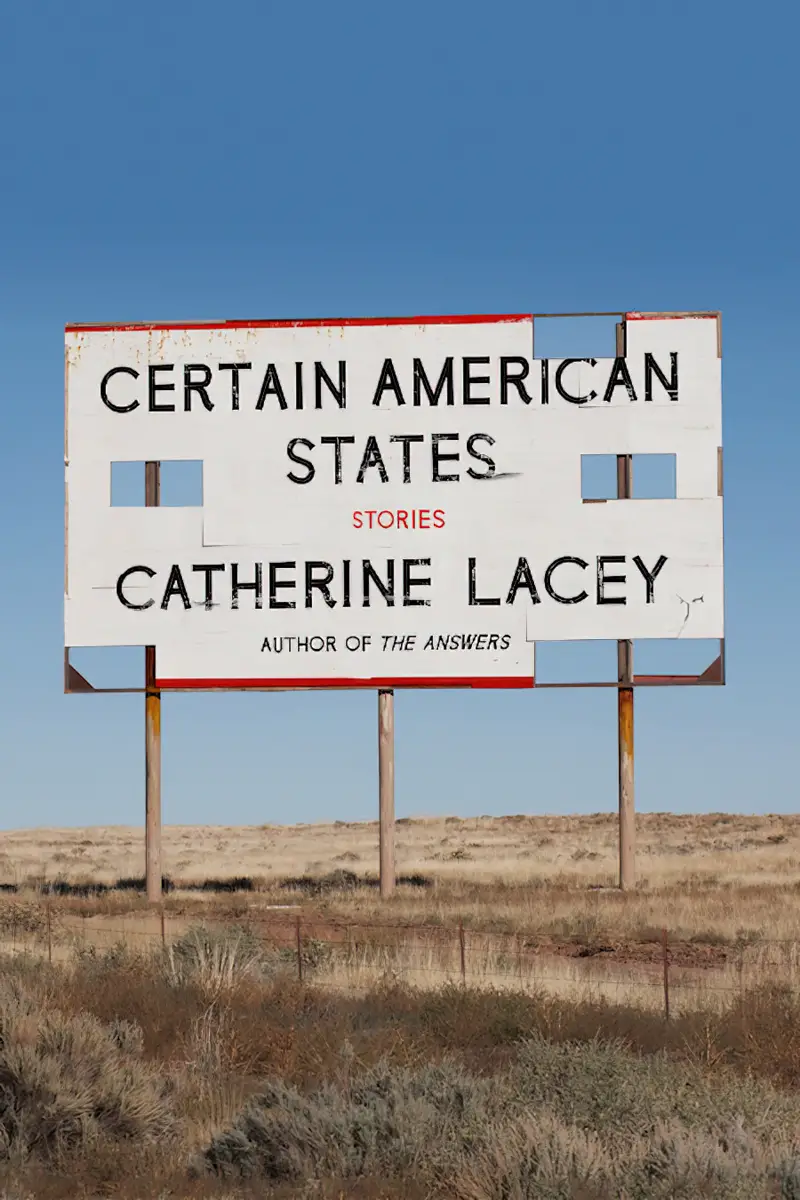
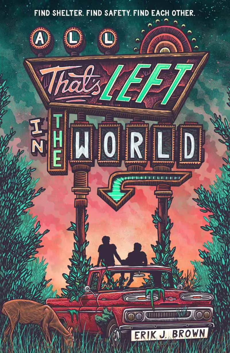
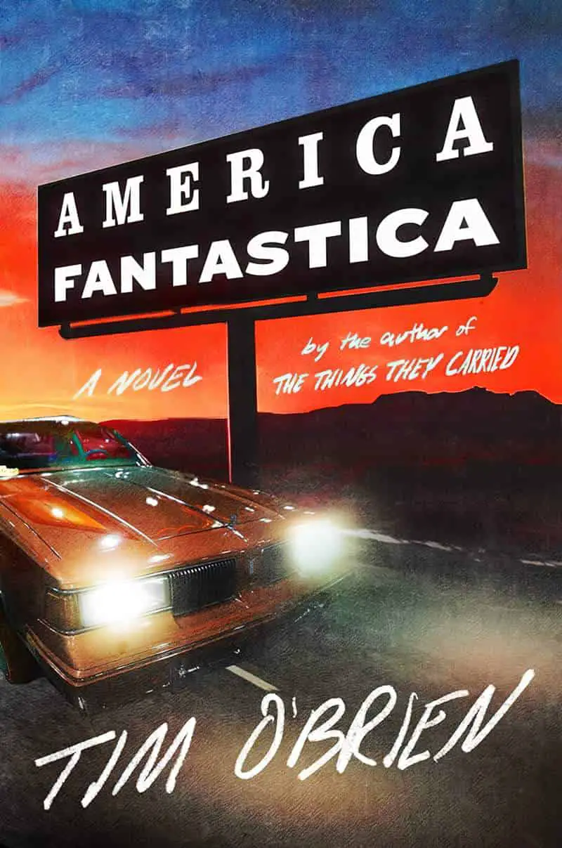
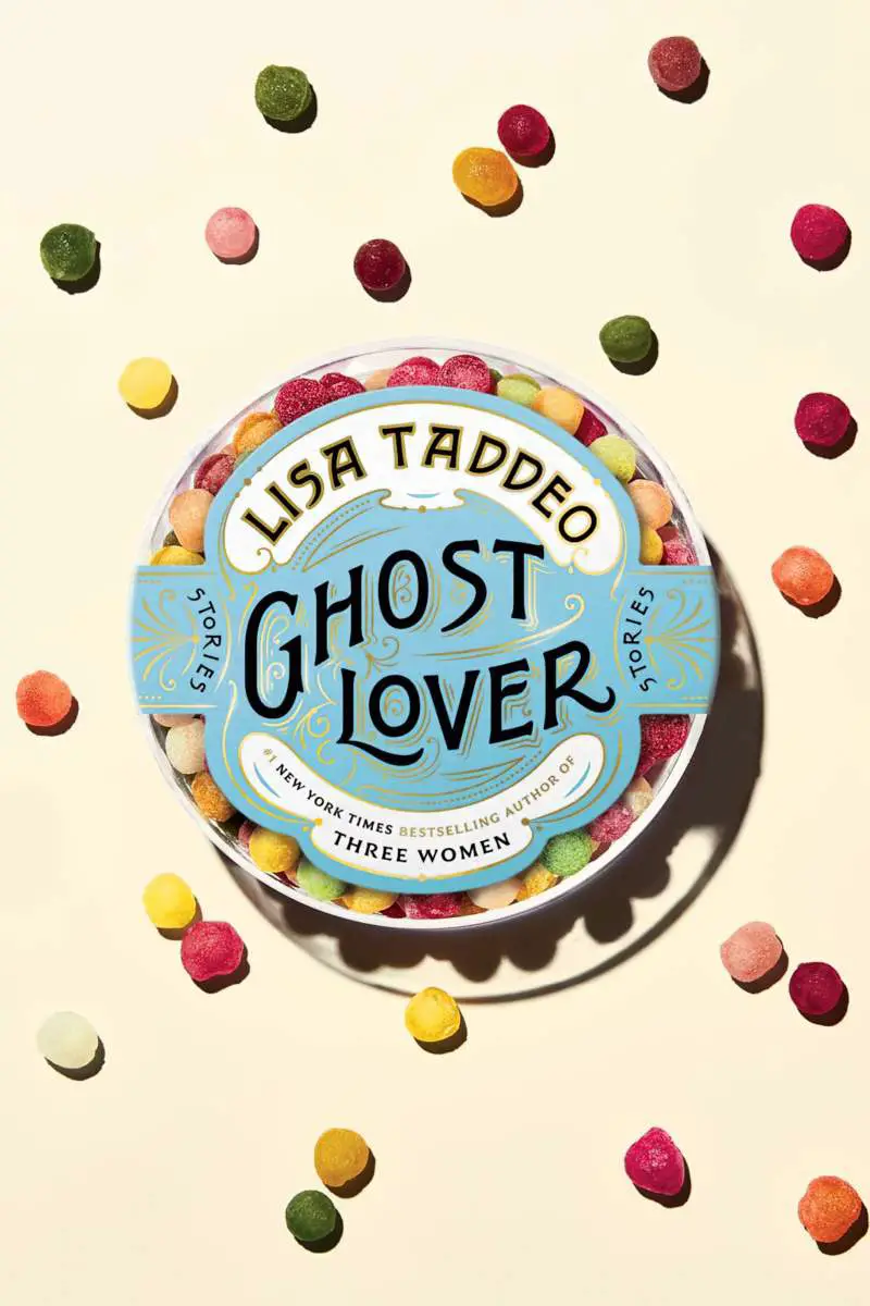
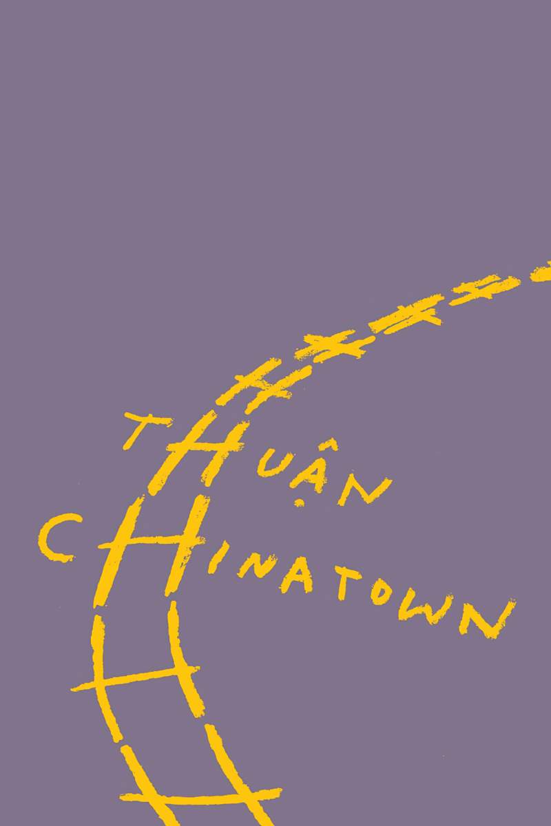
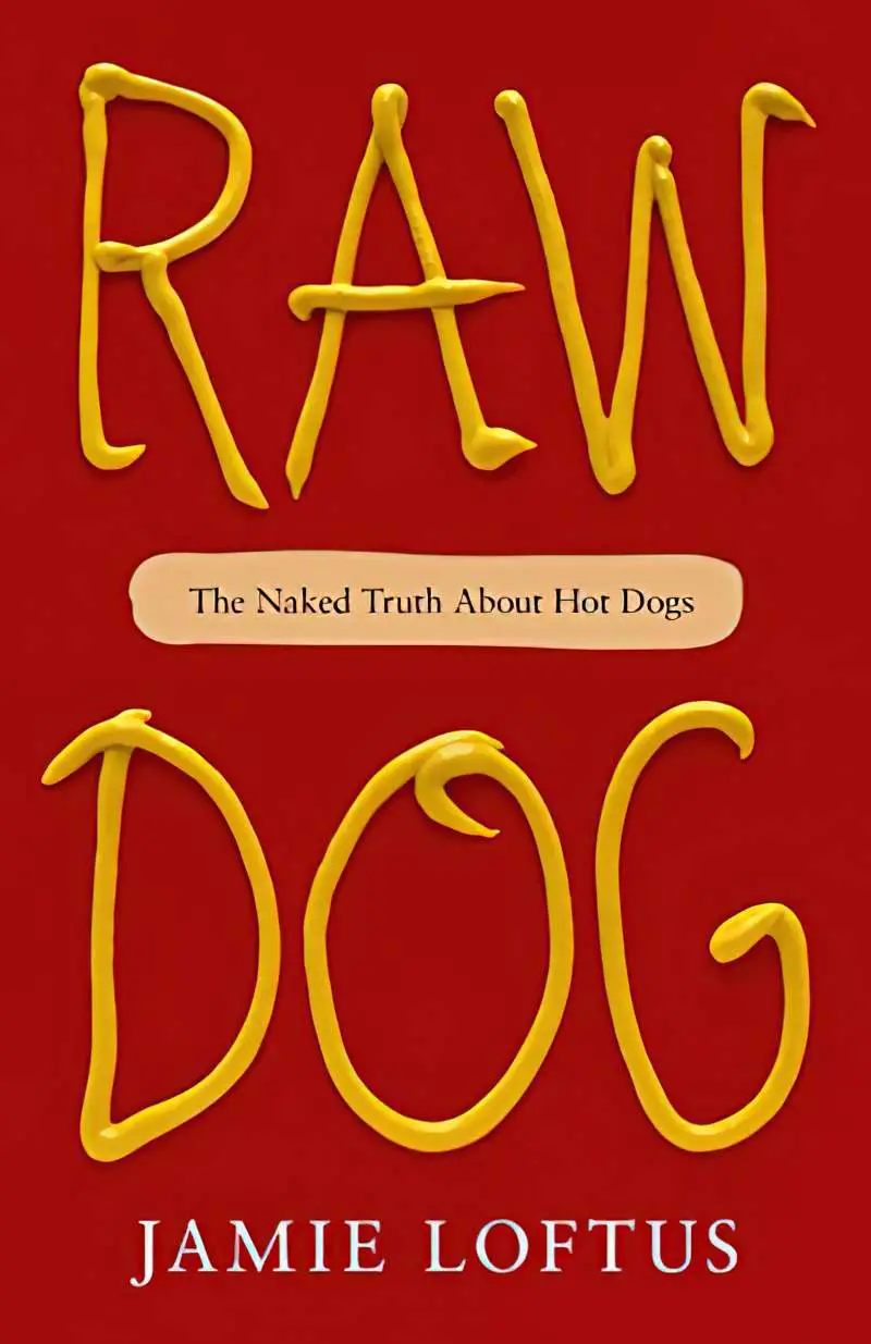
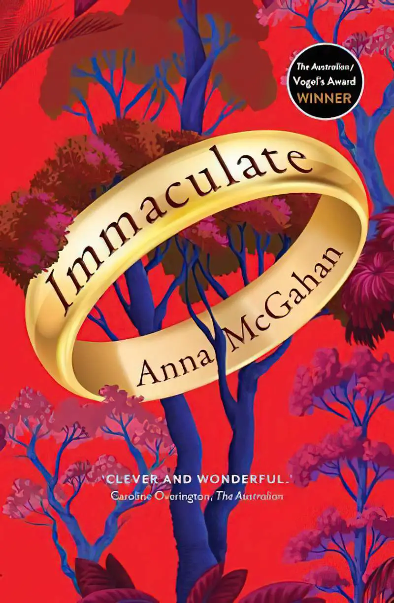
Balloons, signage, train tracks, popsicle sticks, an engraved ring, a tattoo…
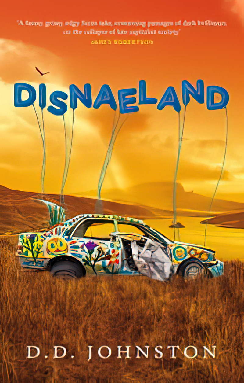


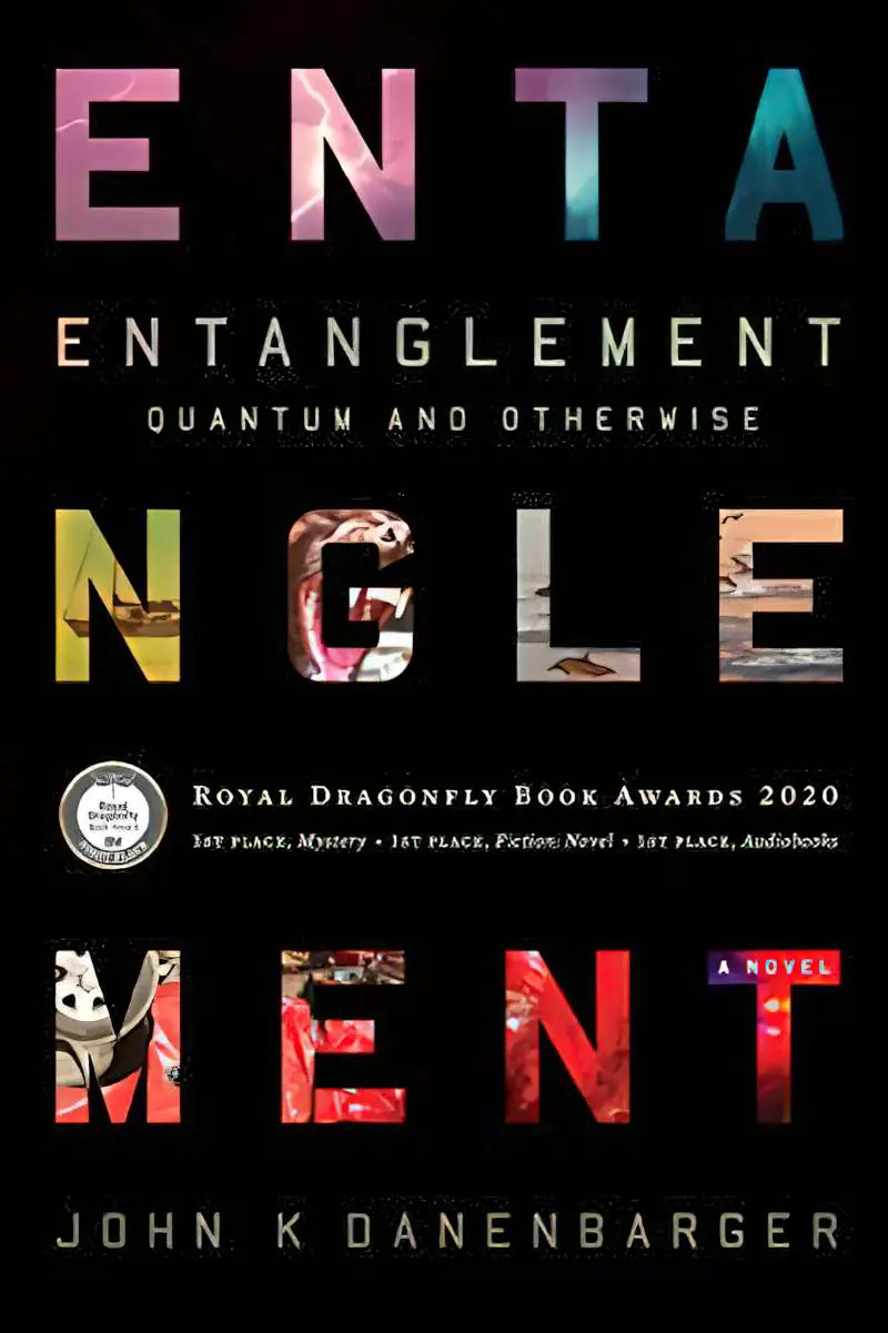
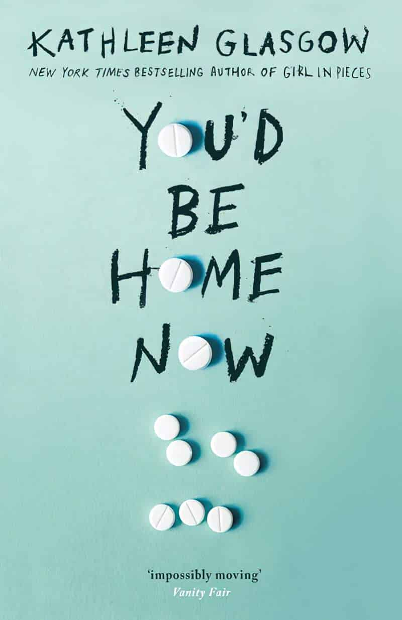
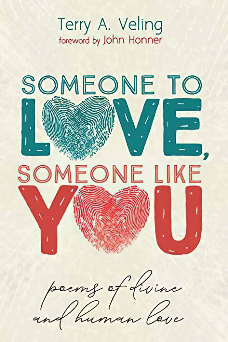
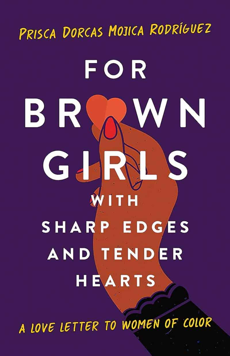
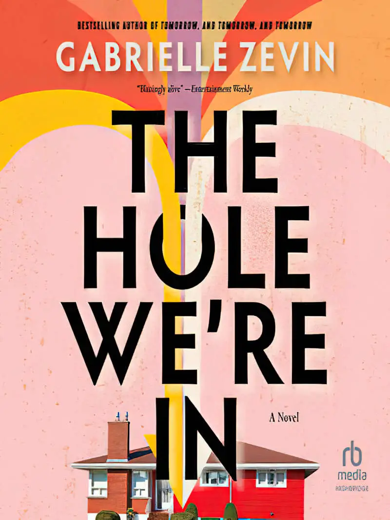
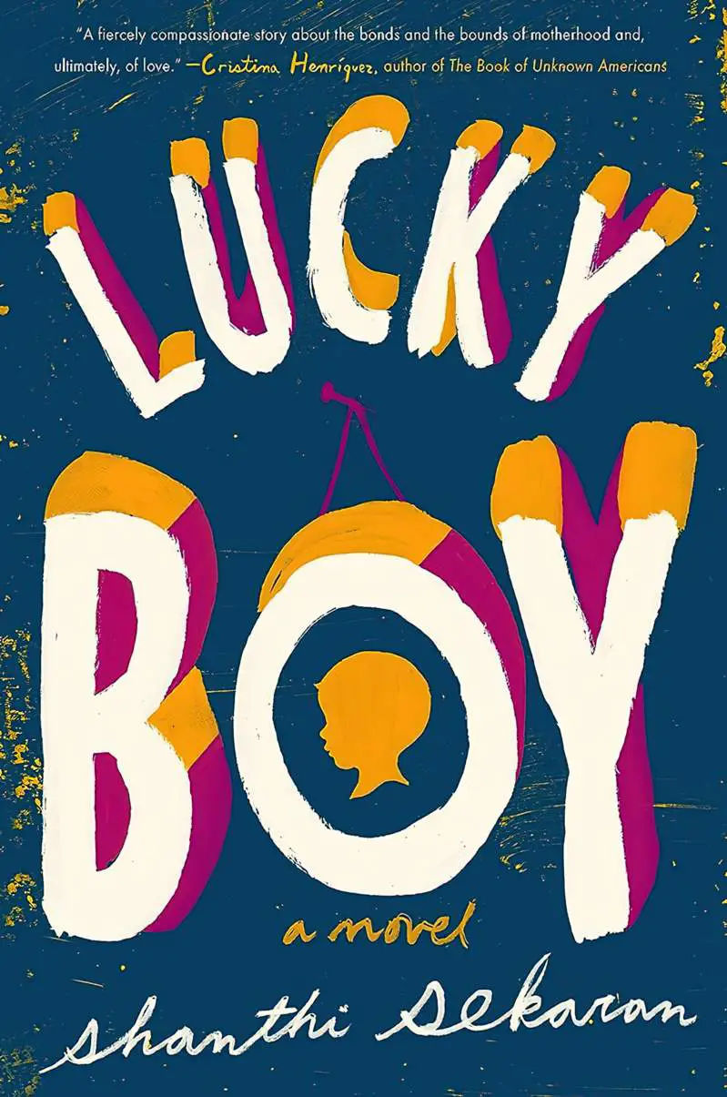
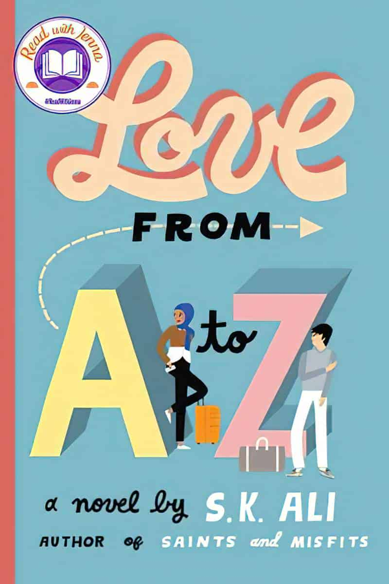
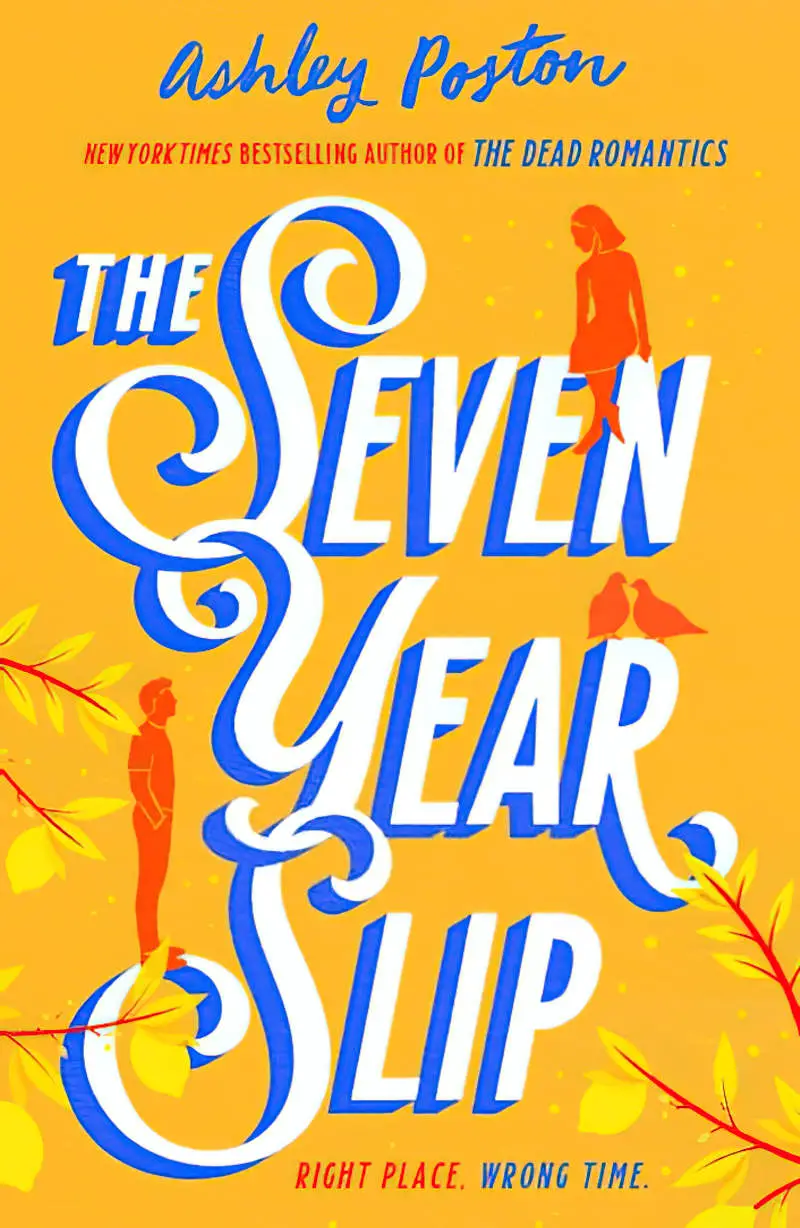
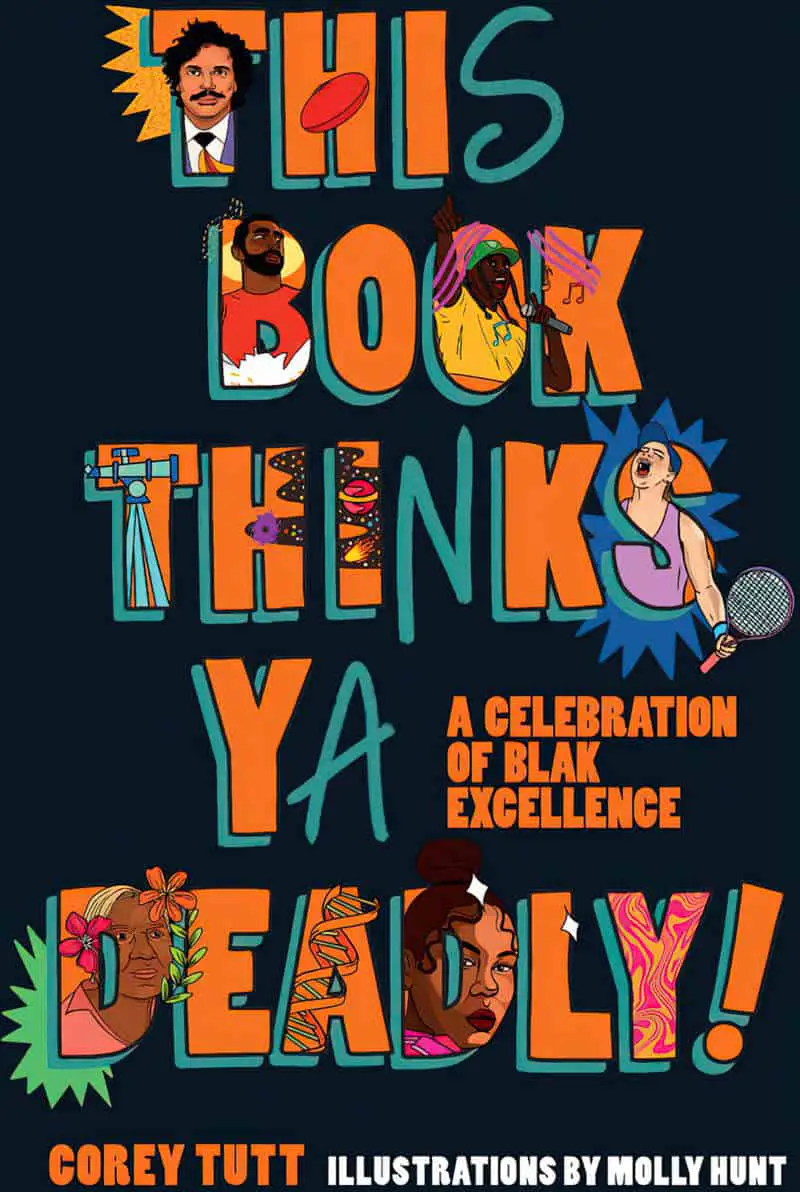
SINGLE LETTERS REPLACED WITH OBJECTS
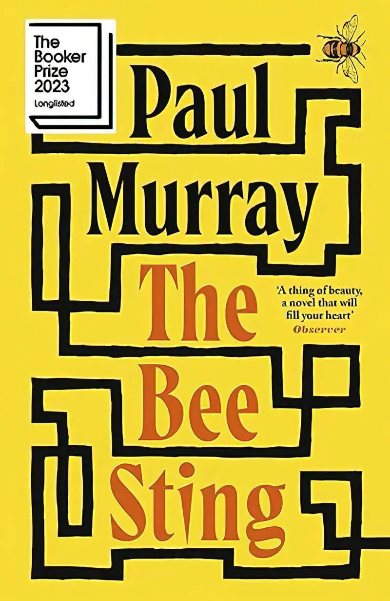
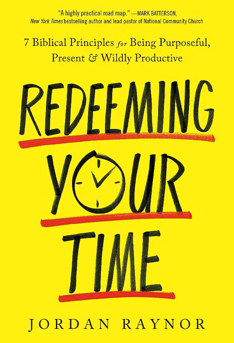
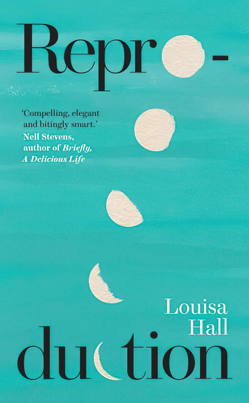
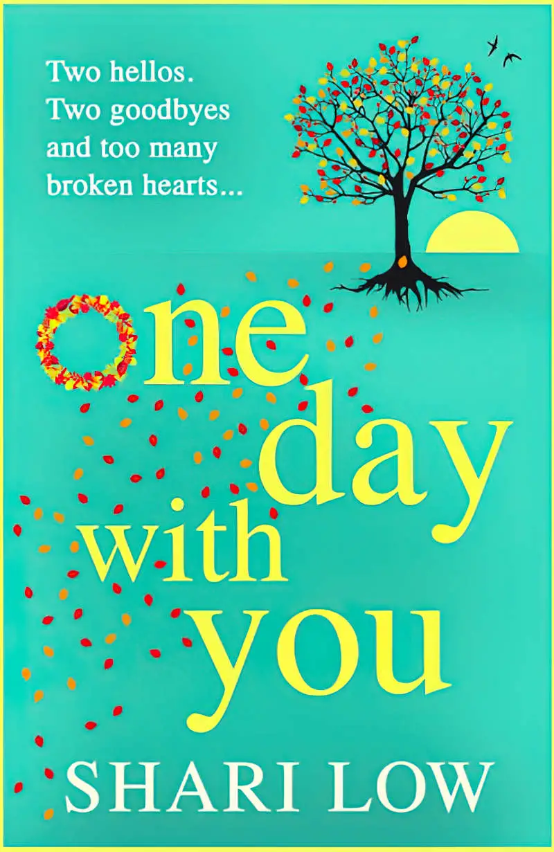
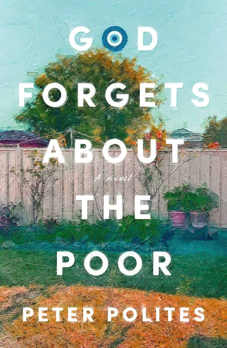
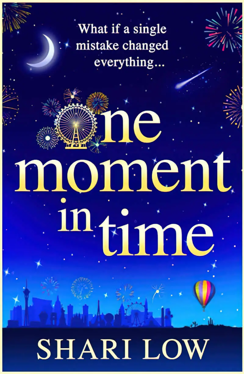
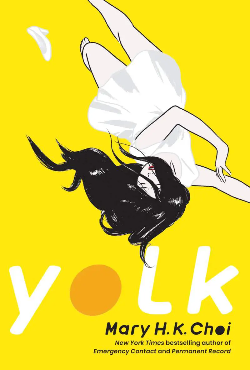
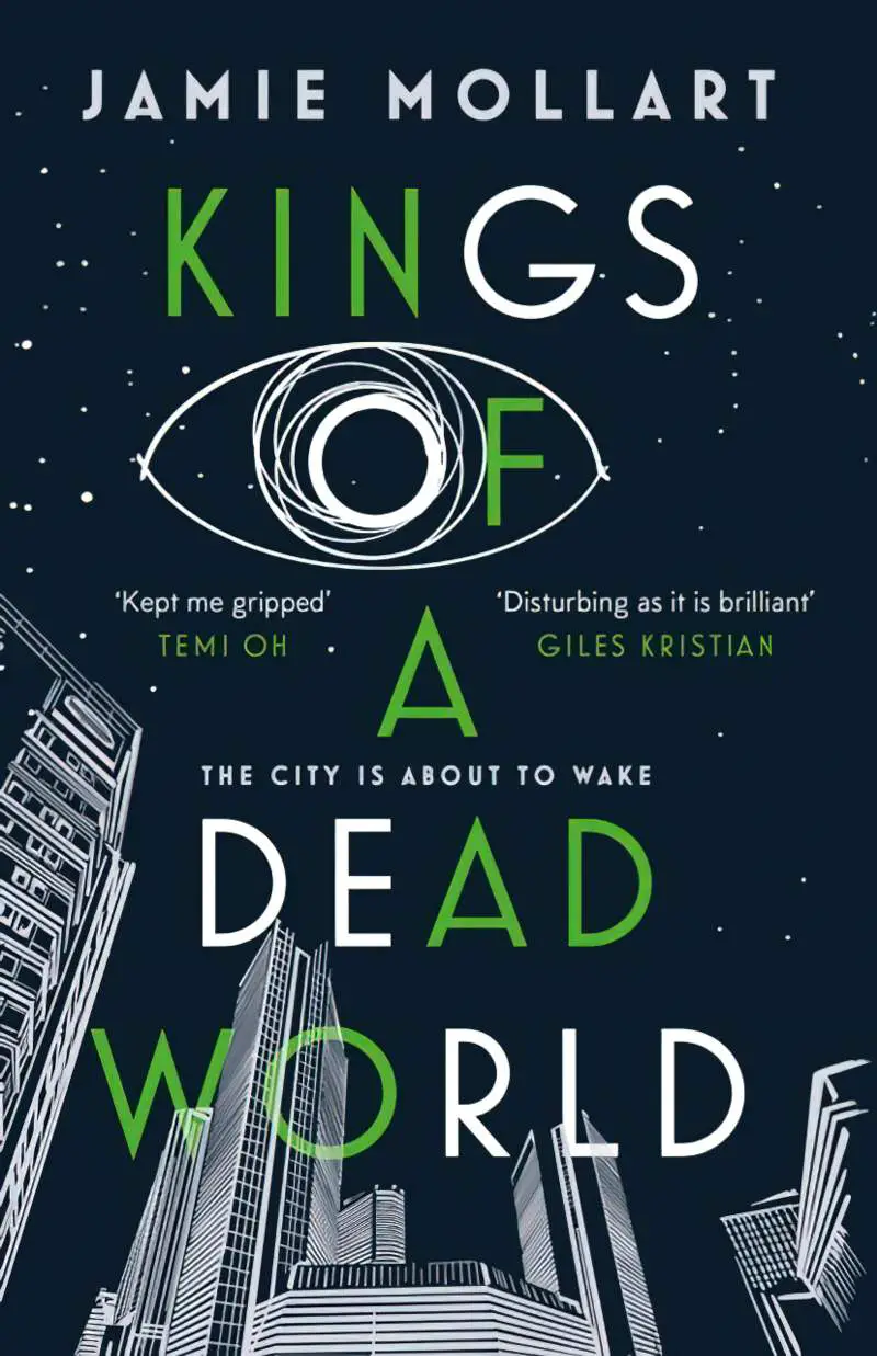
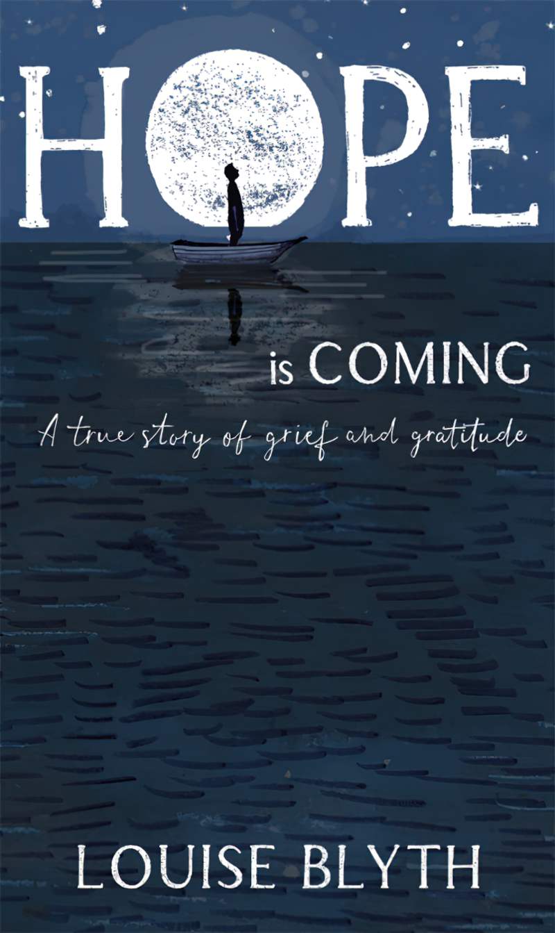
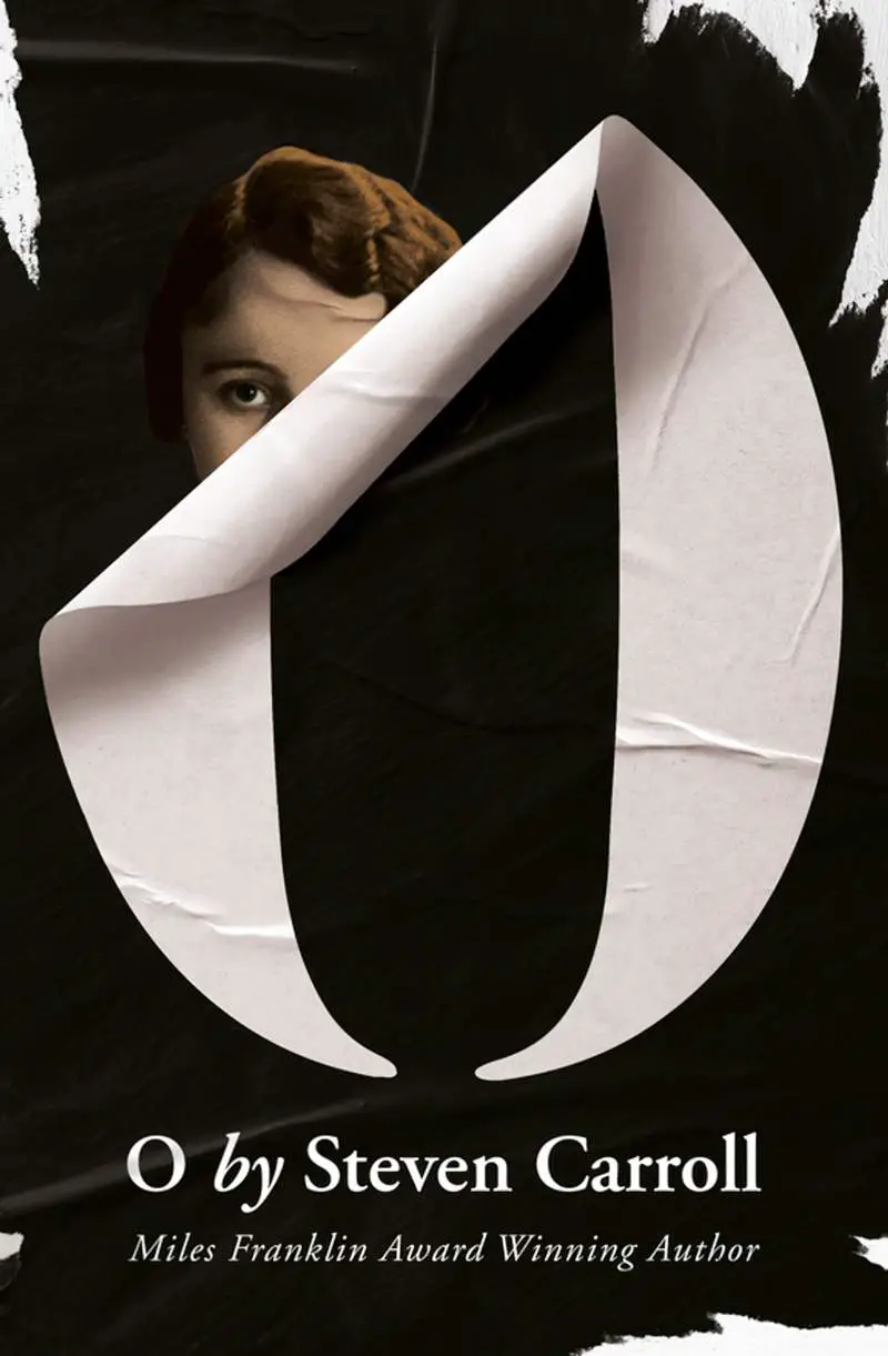
THE LETTER O
An O in the title offers many opportunities for playing around with word art:
I’m not sure how to classify these:
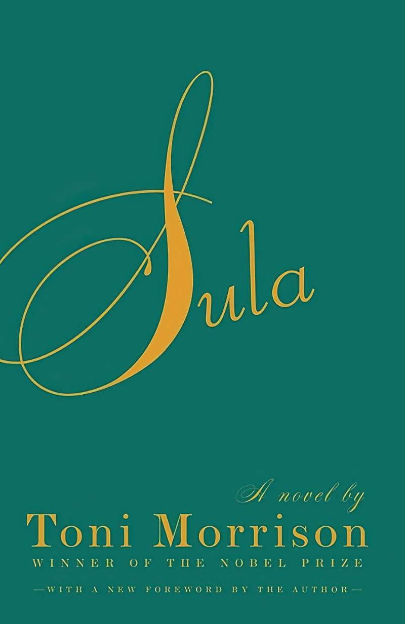
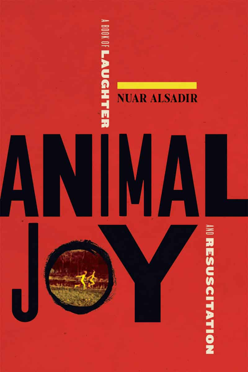
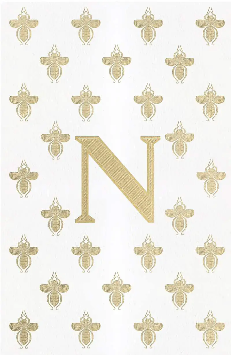
SINGLE LETTERS AS CENTRAL ARTWORK


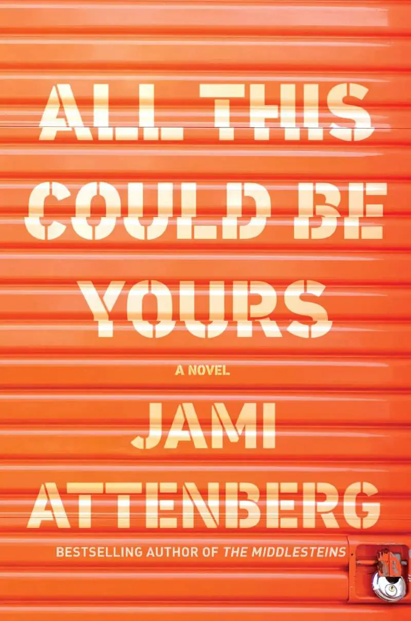
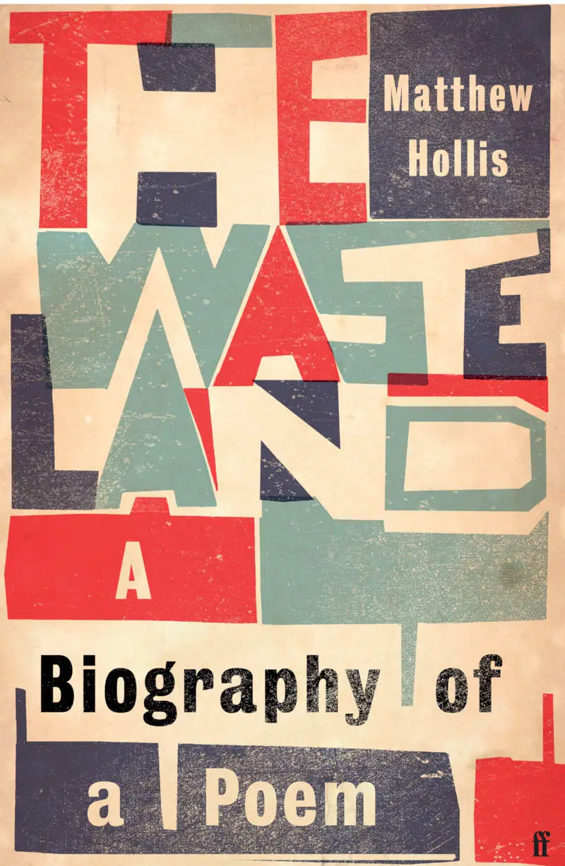
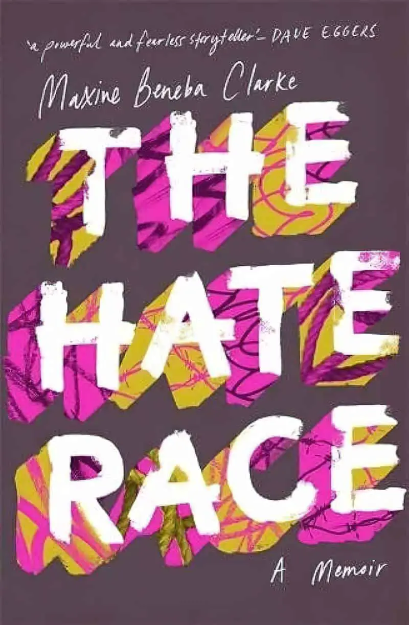
THE ART OF STENCILLING


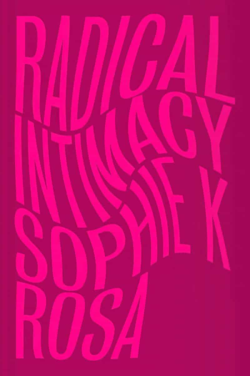
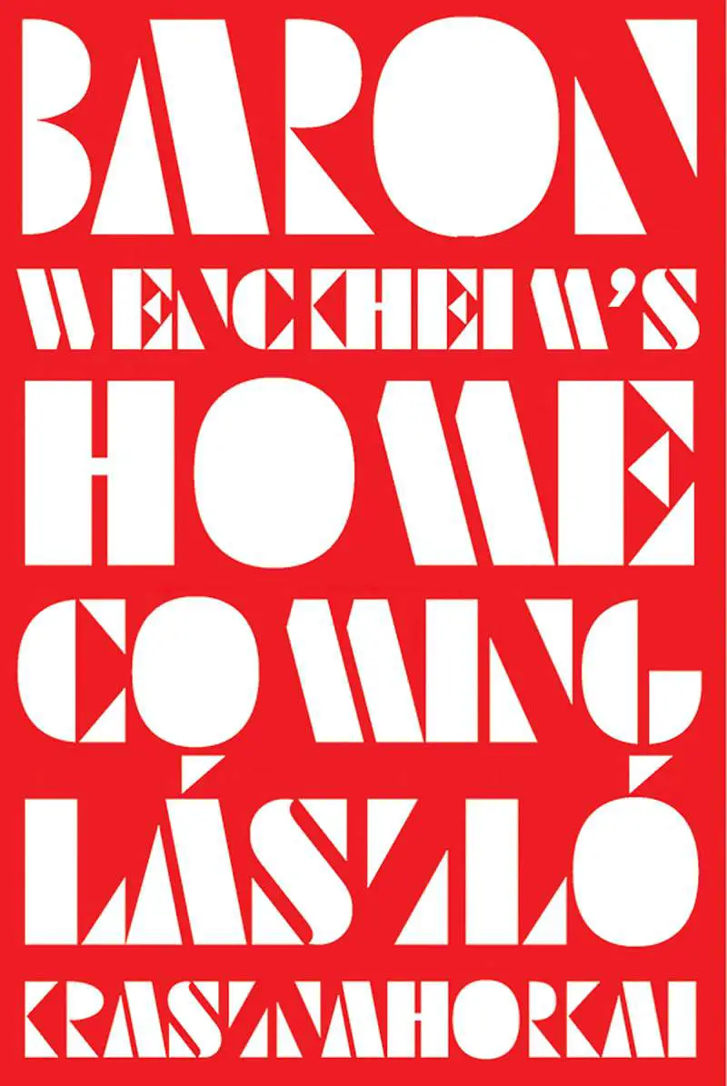
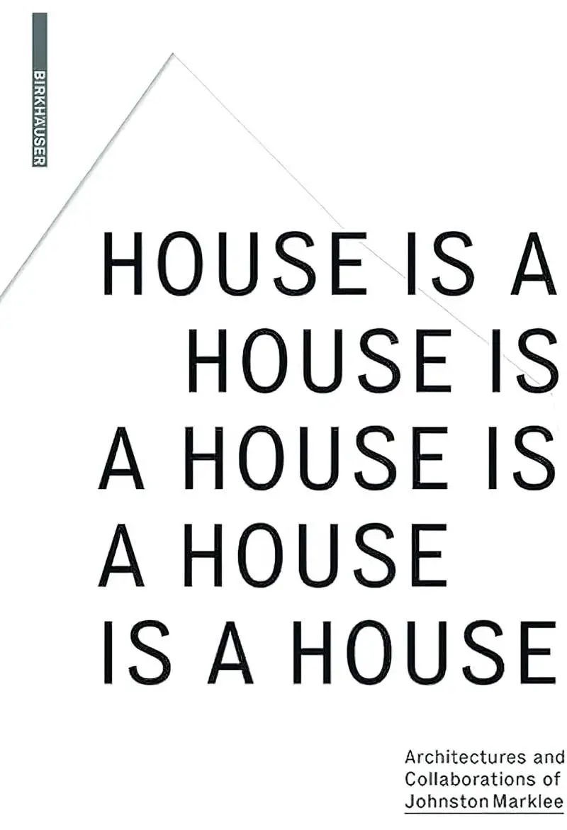
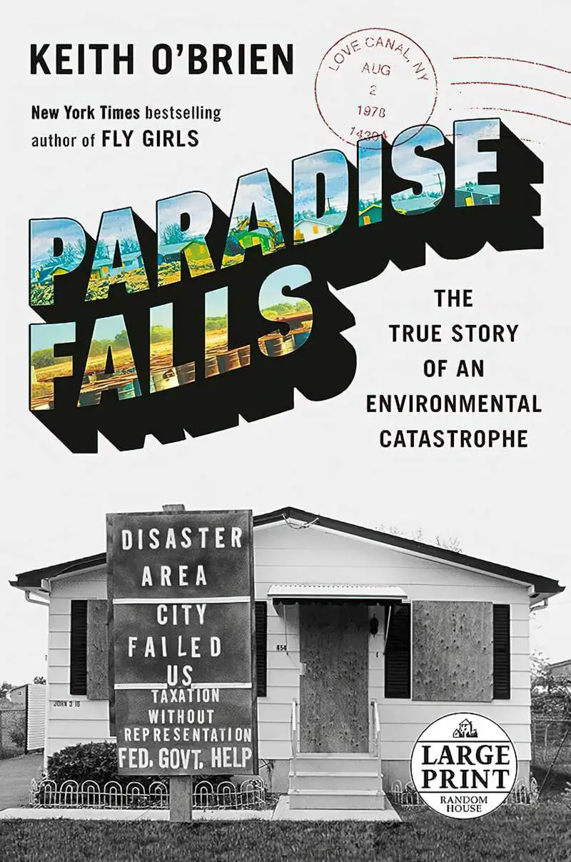
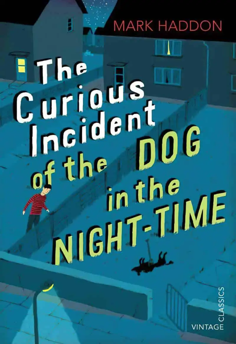
UNUSUAL LAYOUTS
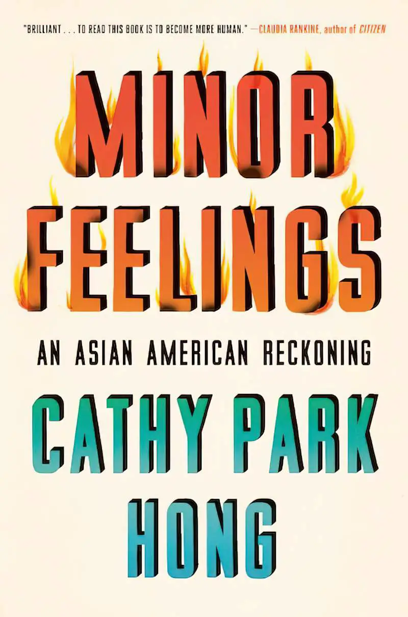
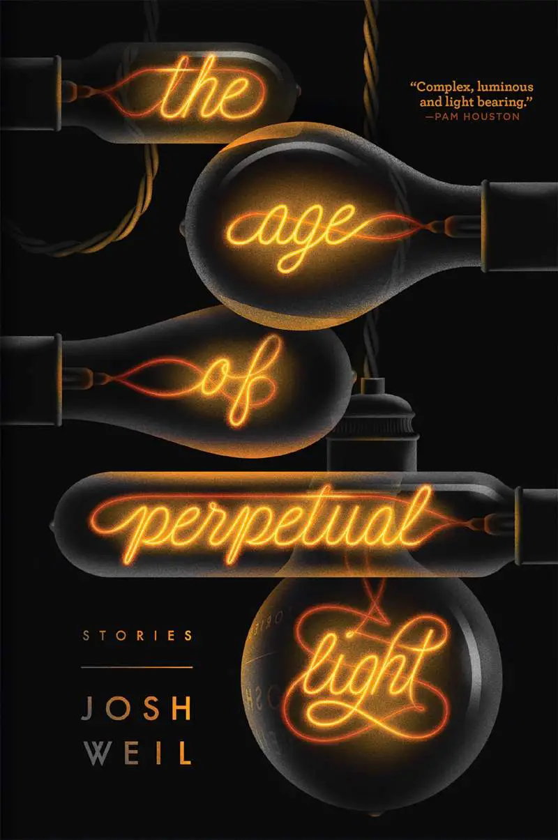
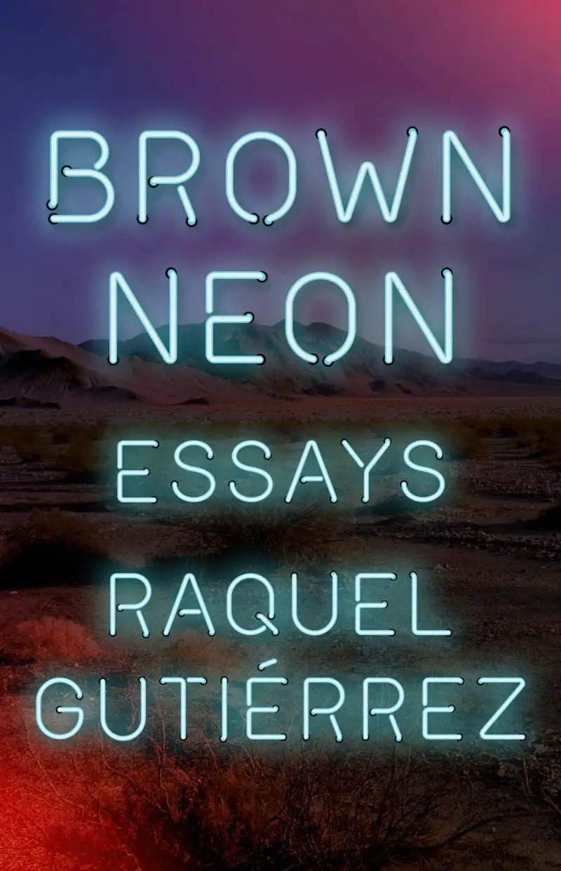
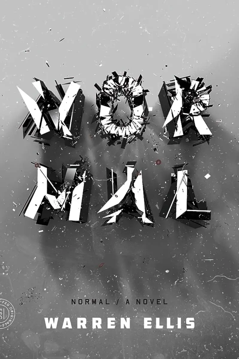
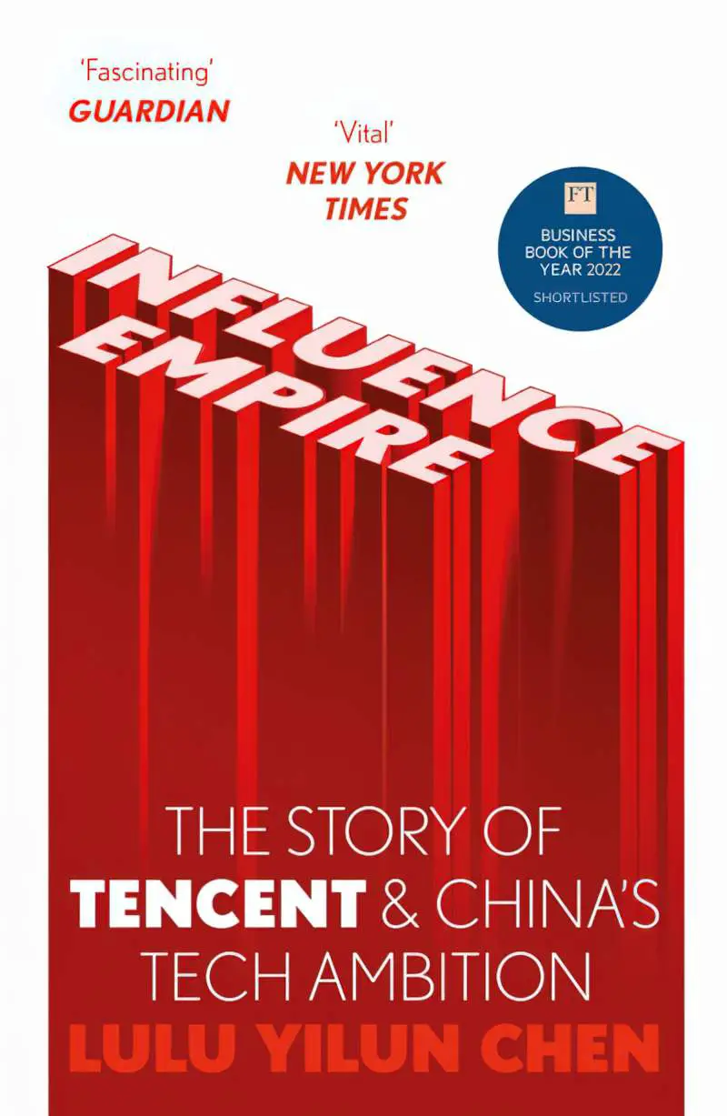
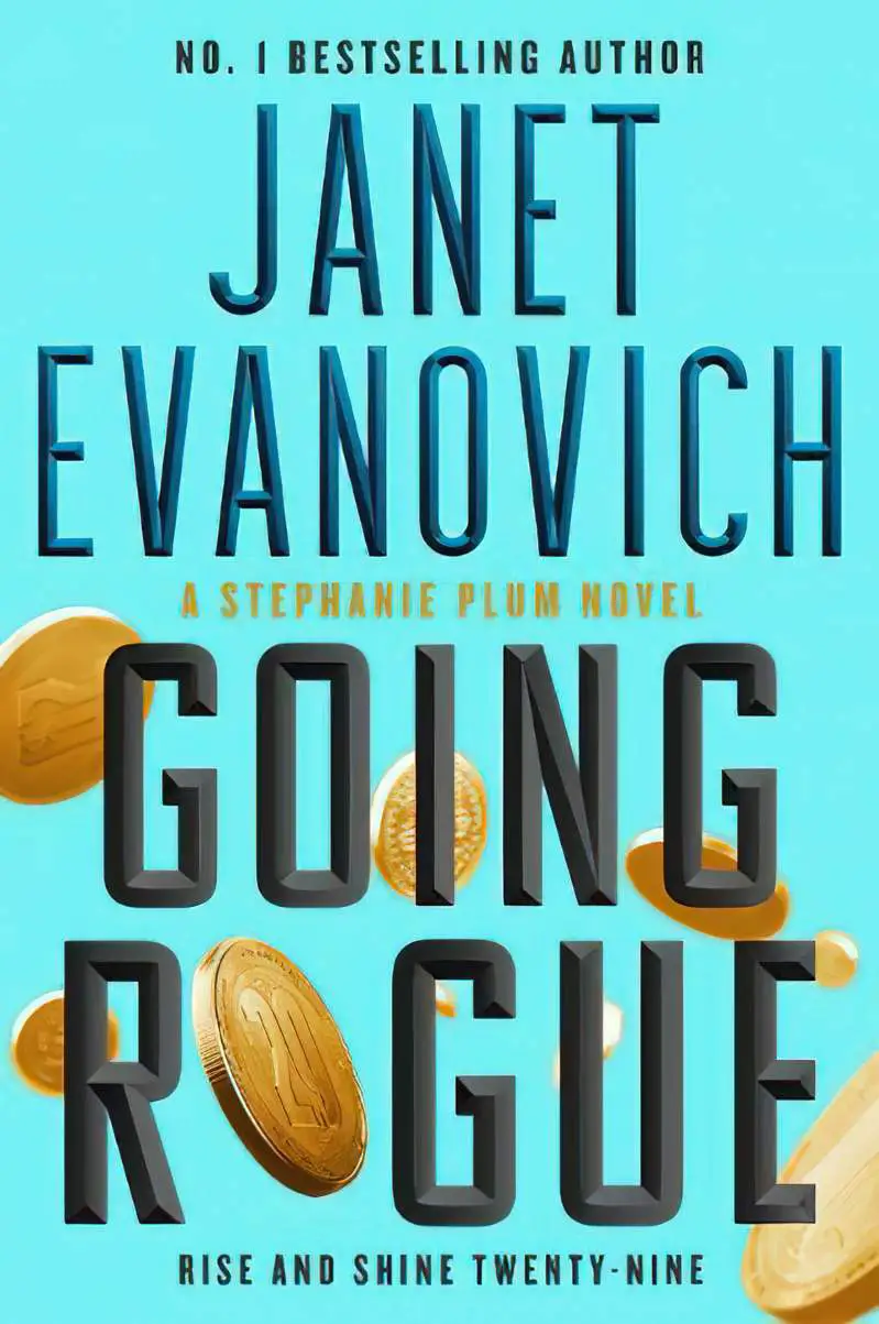
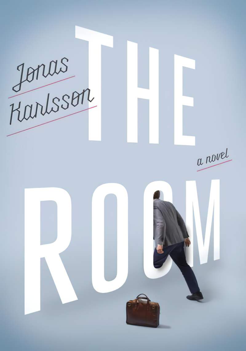
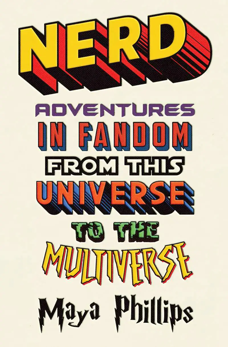
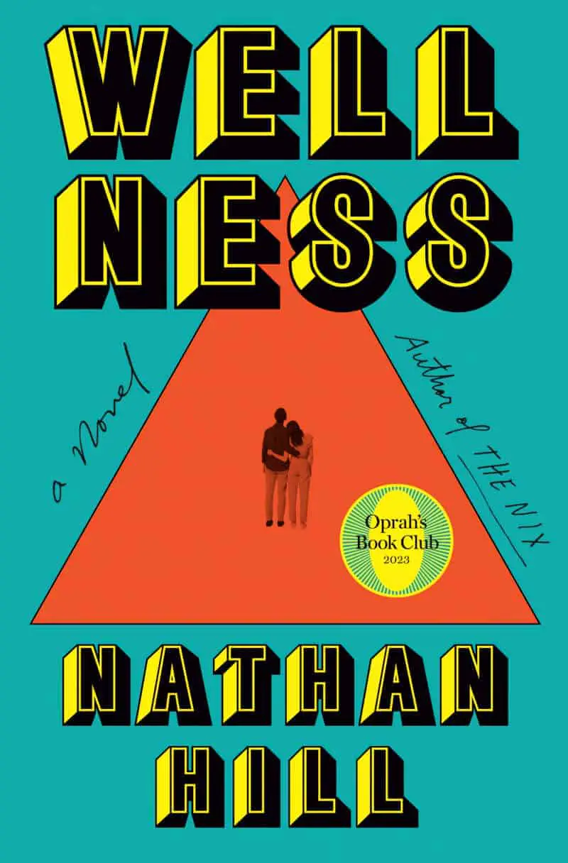
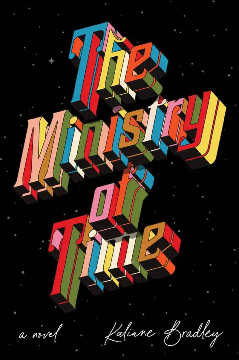
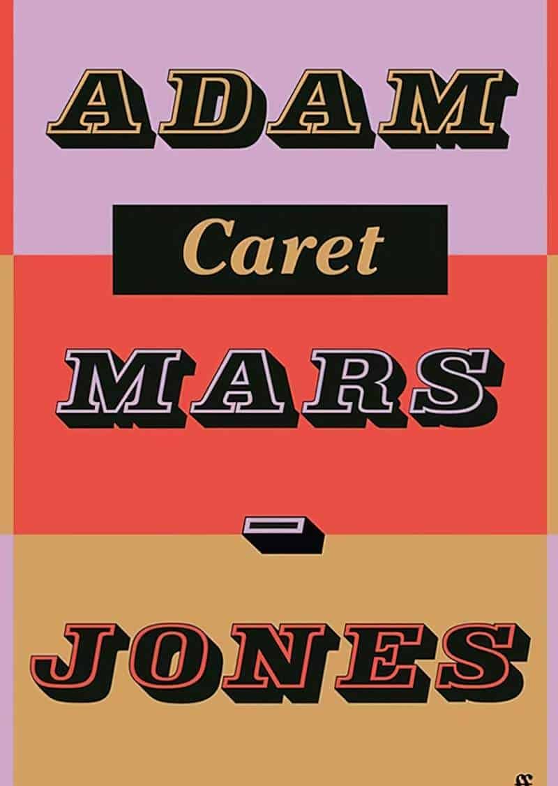
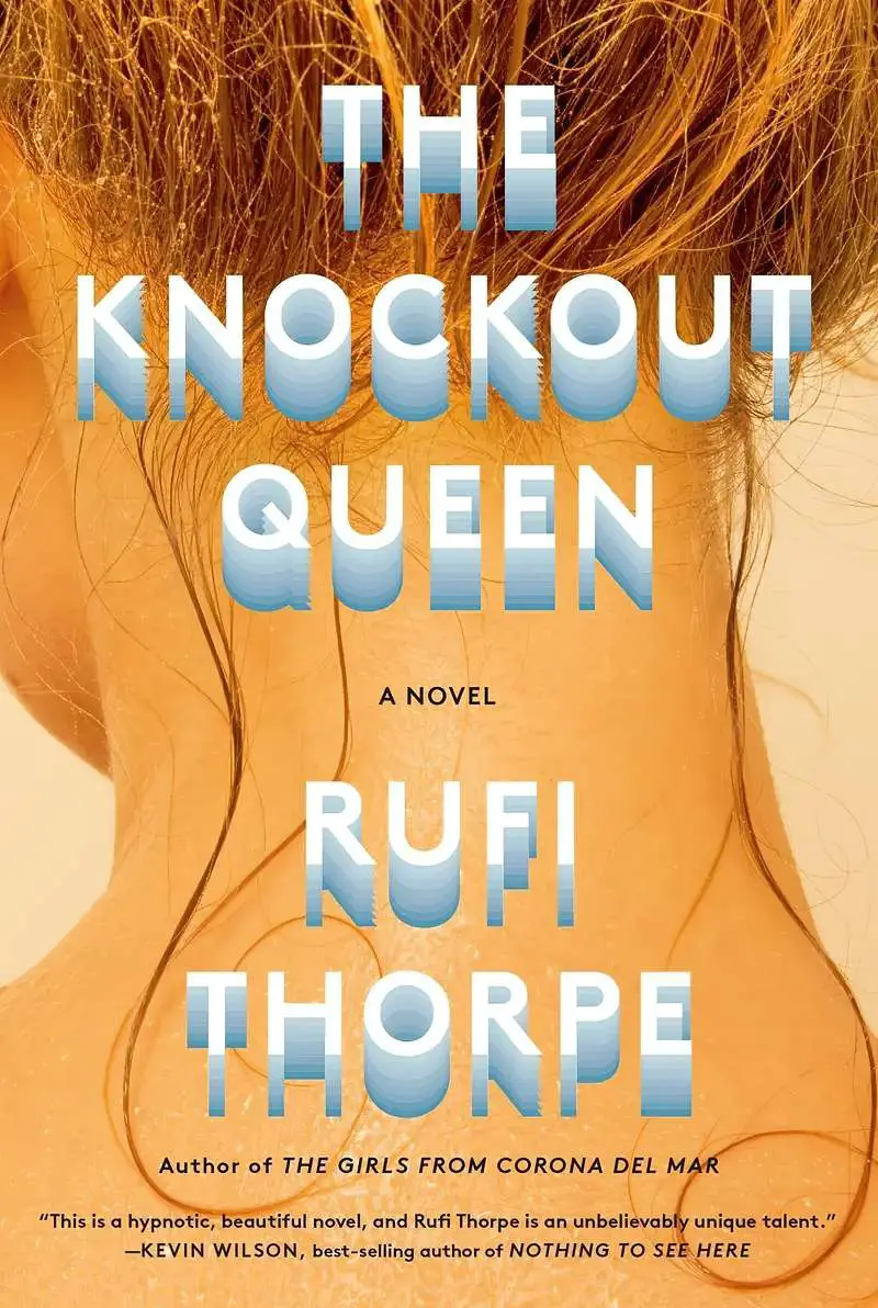
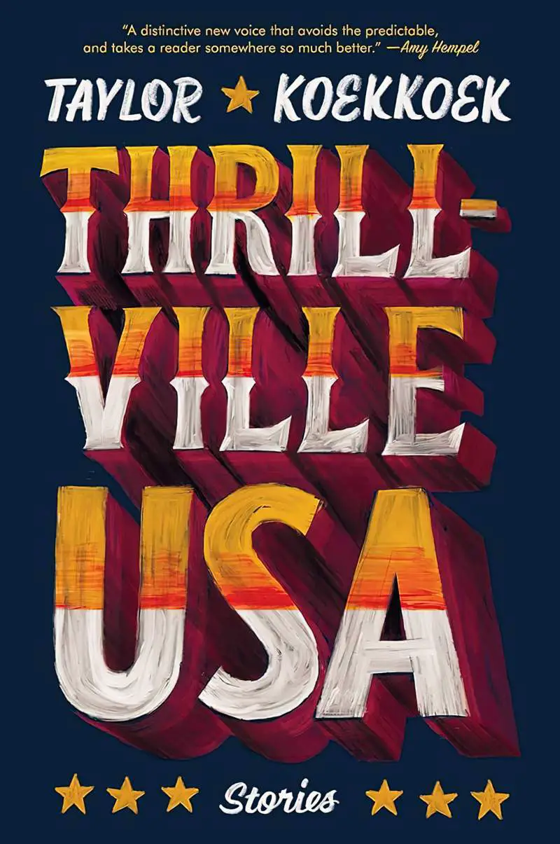
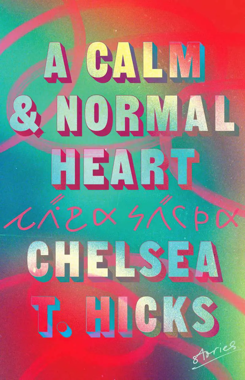
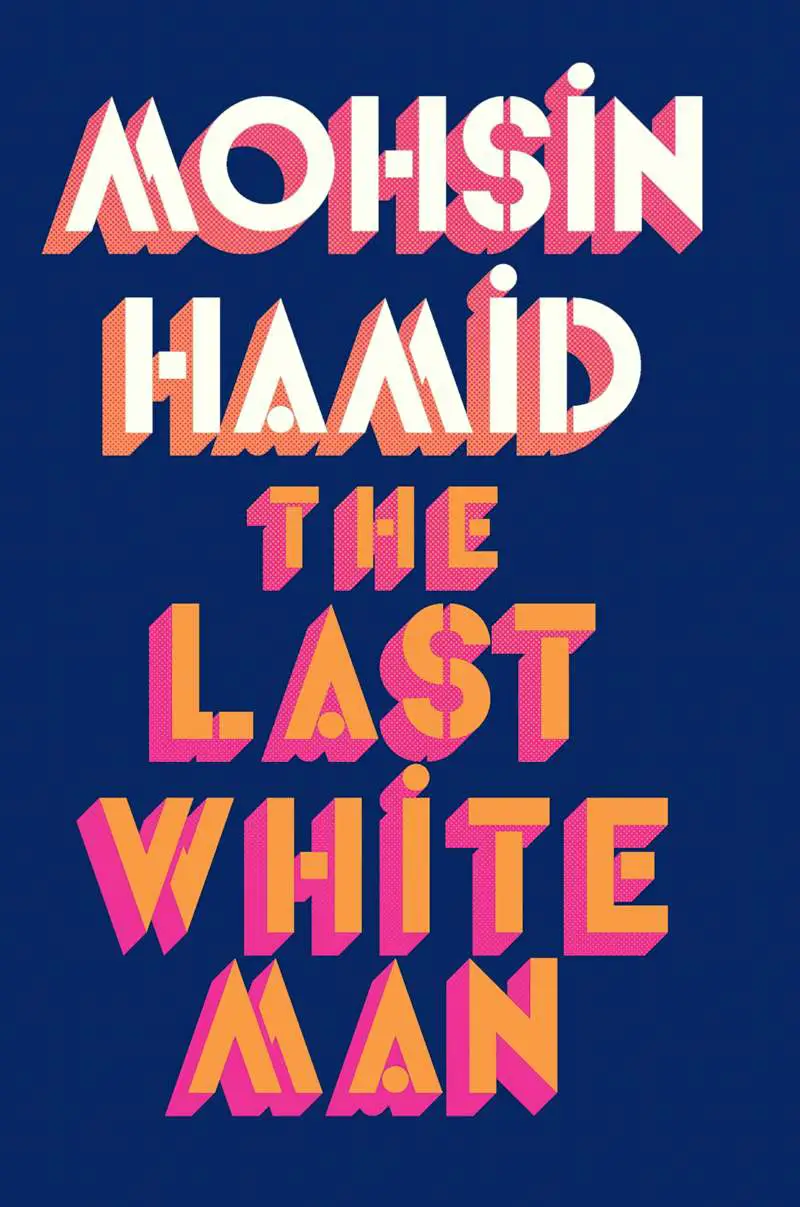
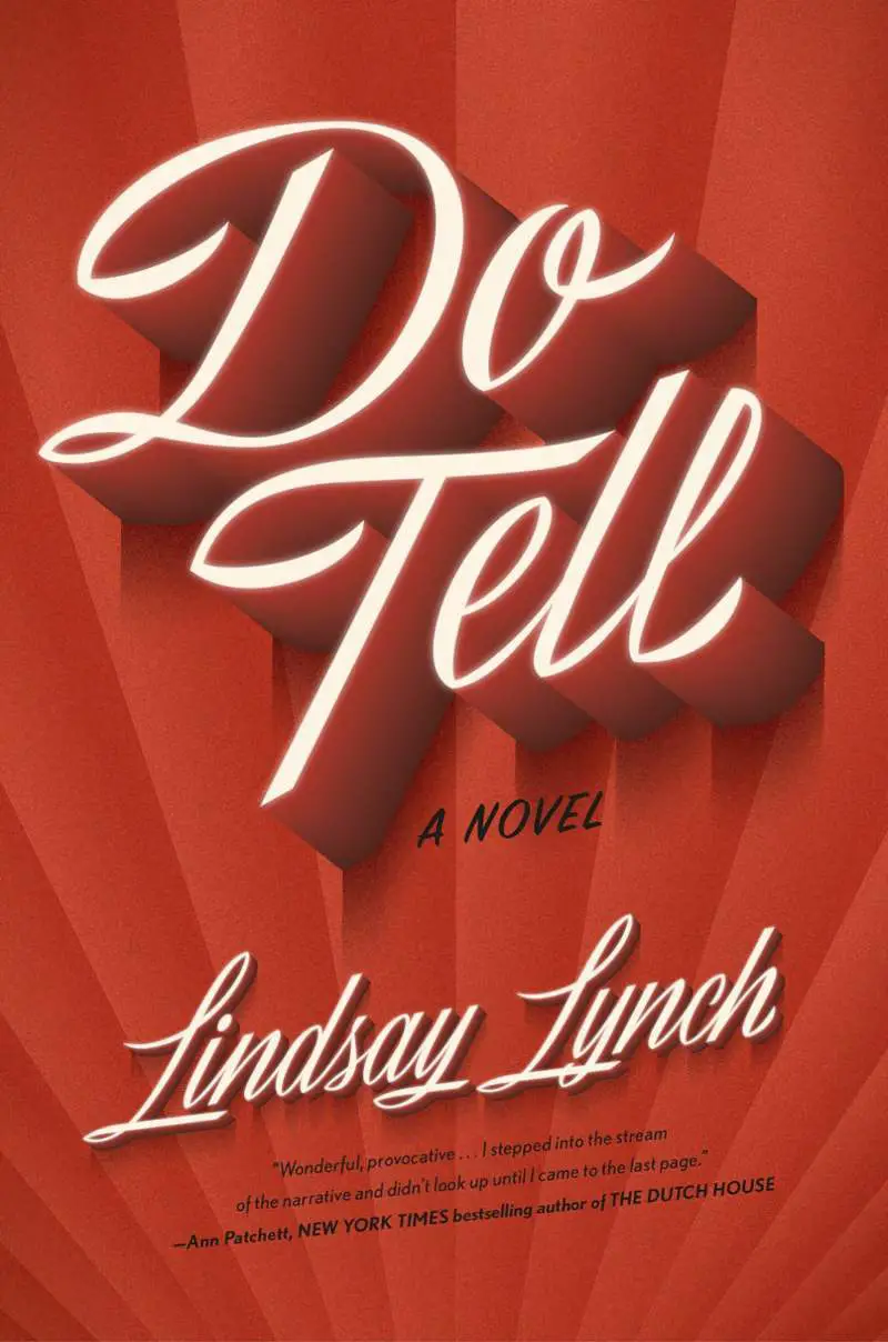
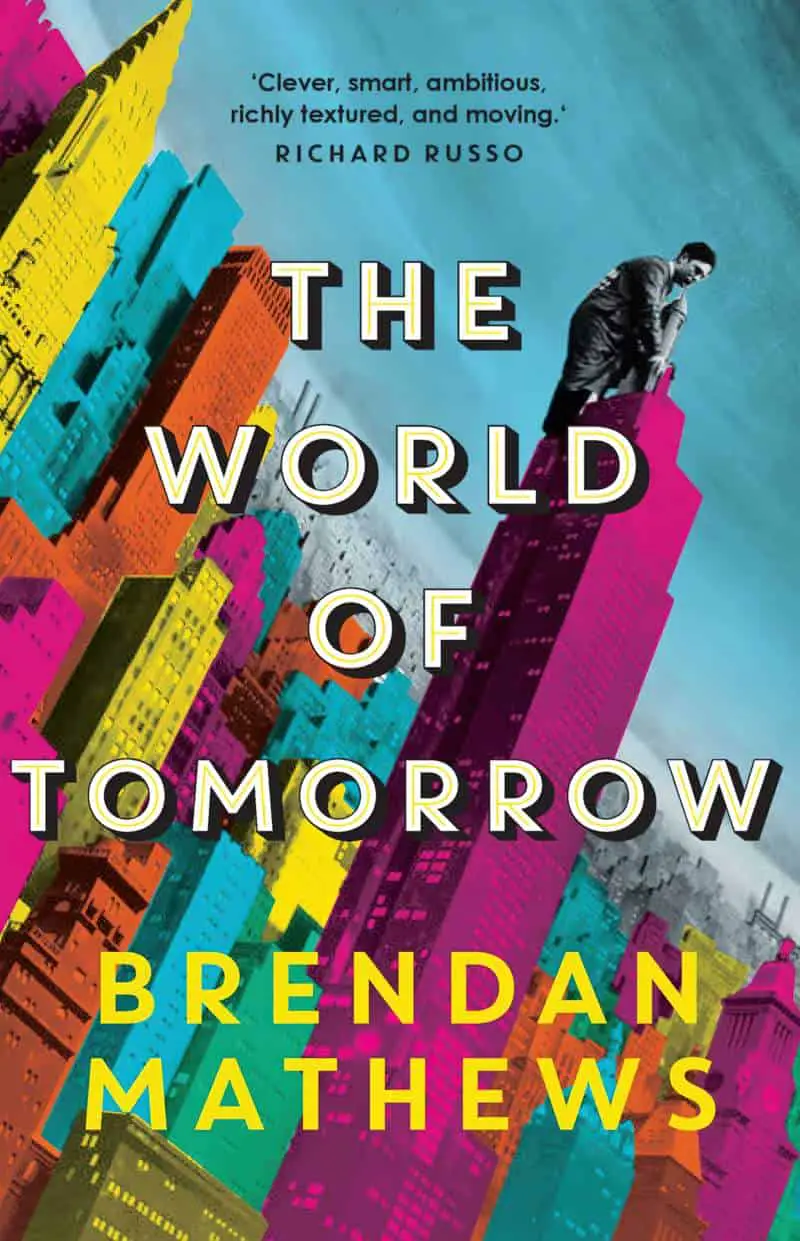
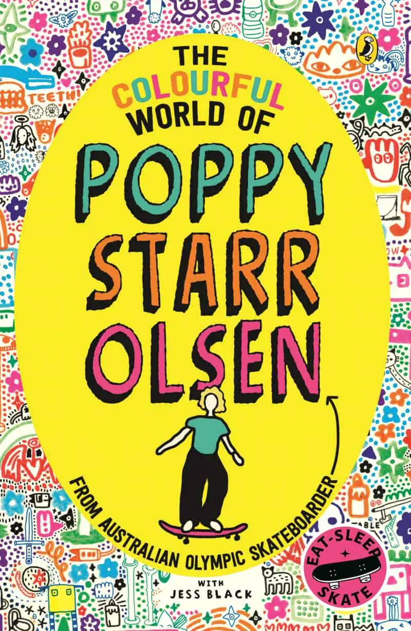
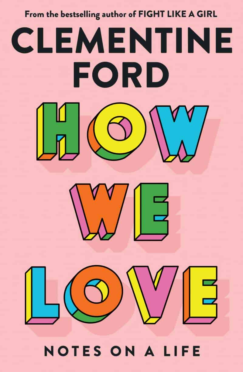
EXTRUDED FONTS
An extruded font looks as if it is popping out from the canvas as a 3D object. That said, you don’t need 3D software to create this look.
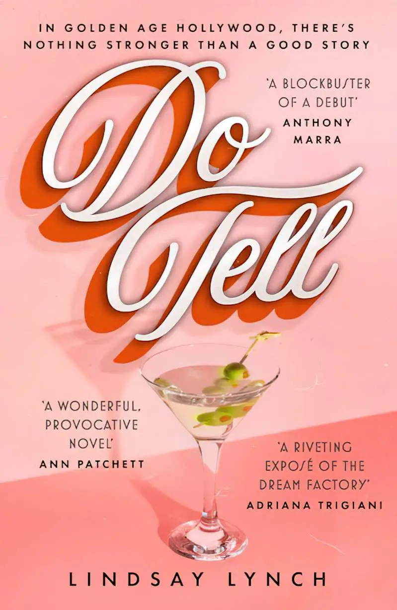
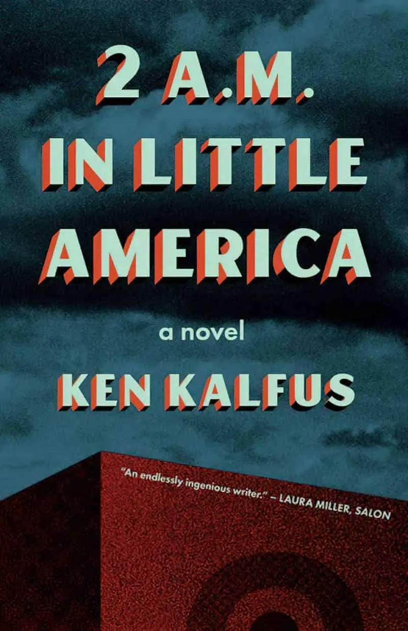
Drop shadows can look pretty similar to extruded typography, but not exactly the same. Here is an example of a drop shadow next to an example of extruded typography:


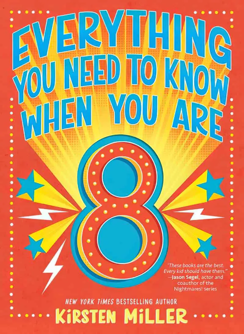
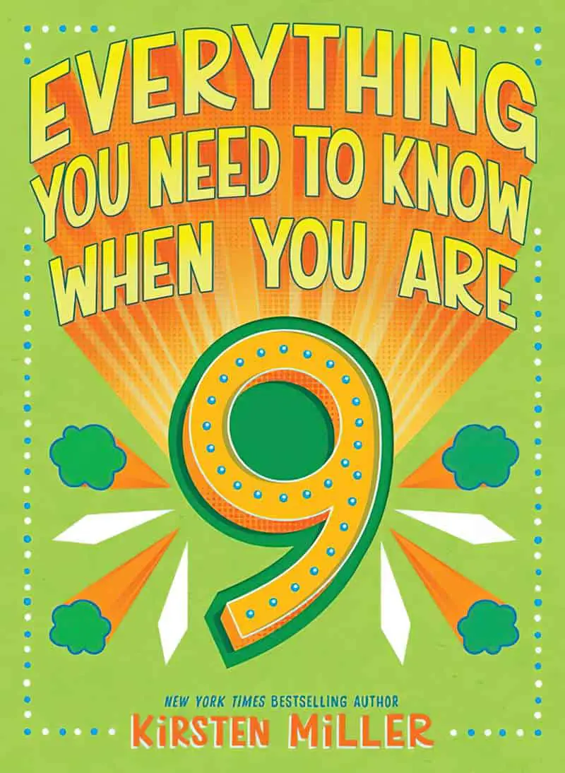
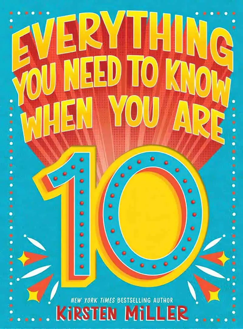

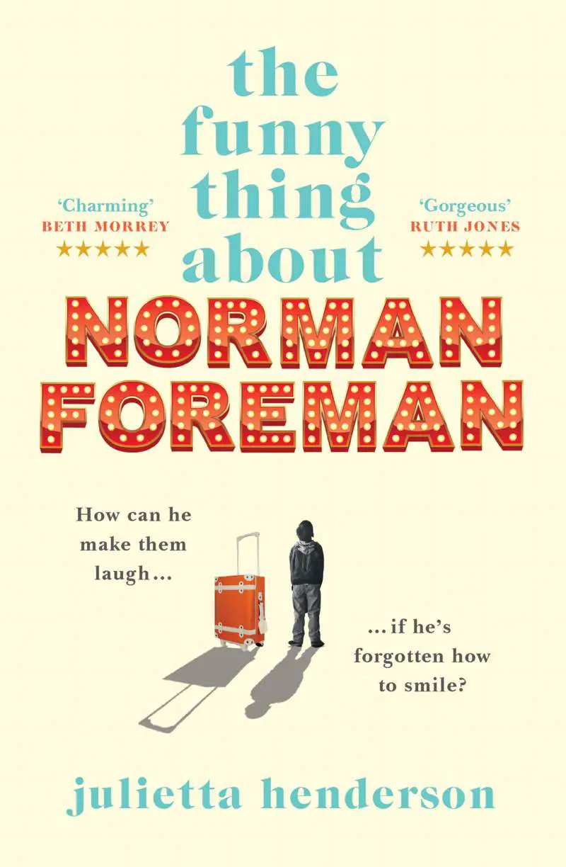
CIRCUS & SHOWTIME LIGHTS
ORNAMENTS
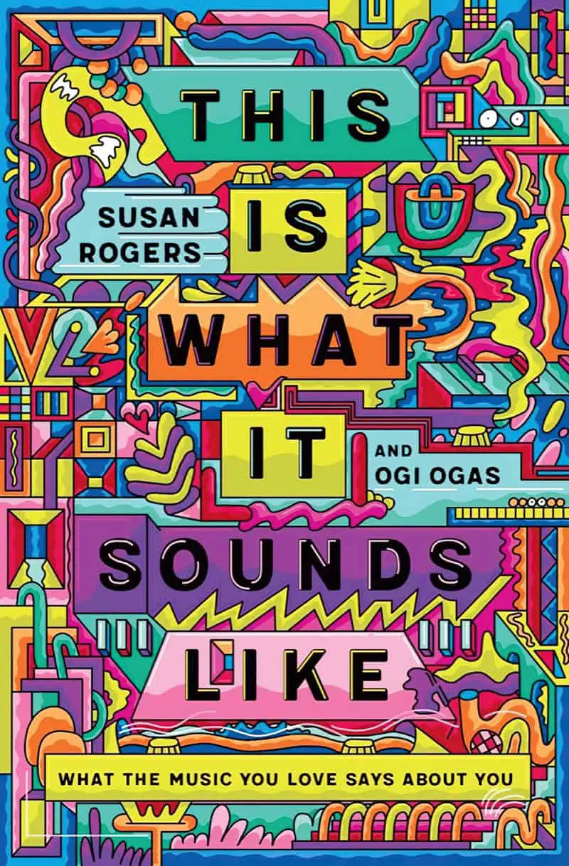
VECTOR MASTERS
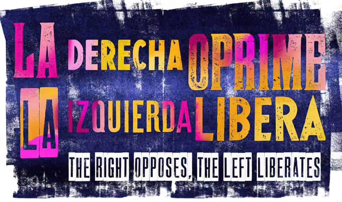
GLITCHING AND GRUNGE