-
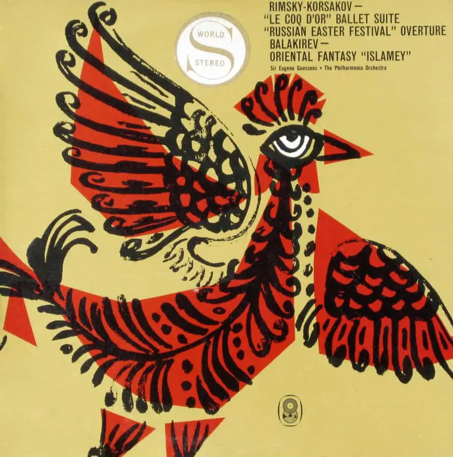
Volcano, Lava, Magma
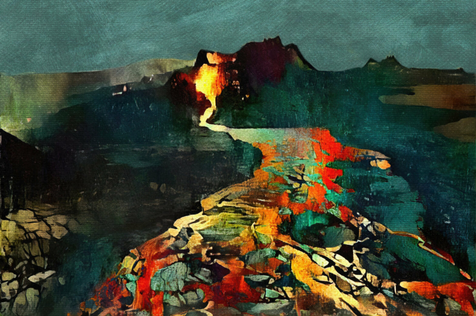
Volcanos in art and storytelling
-
Treasure In Art And Illustration
Treasure: It’s never about the treasure. It’s about the adventure of finding it. Treasure in adventure stories is a stand-in for ‘winning’.
-
White Streets, Blue Skies, Blue Seas
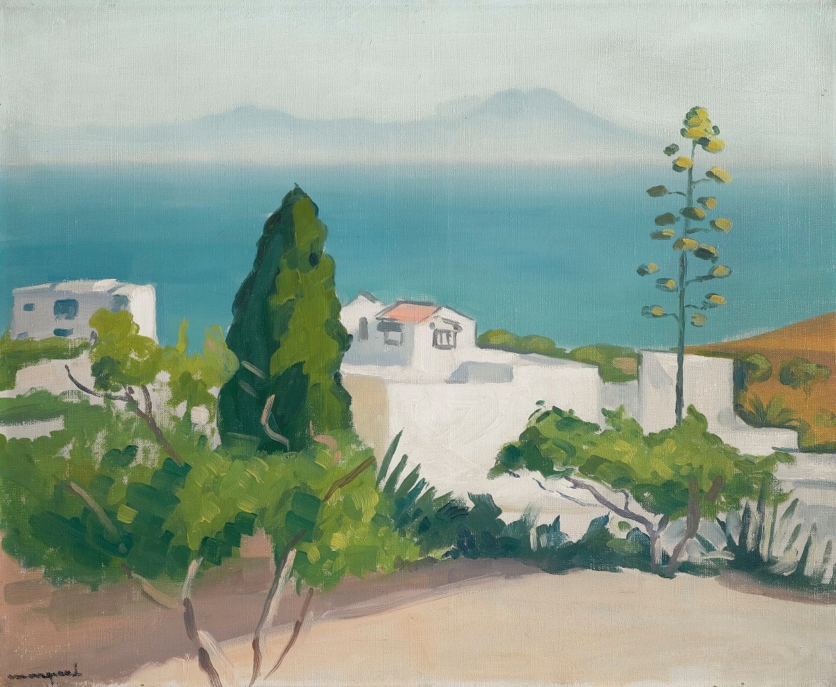
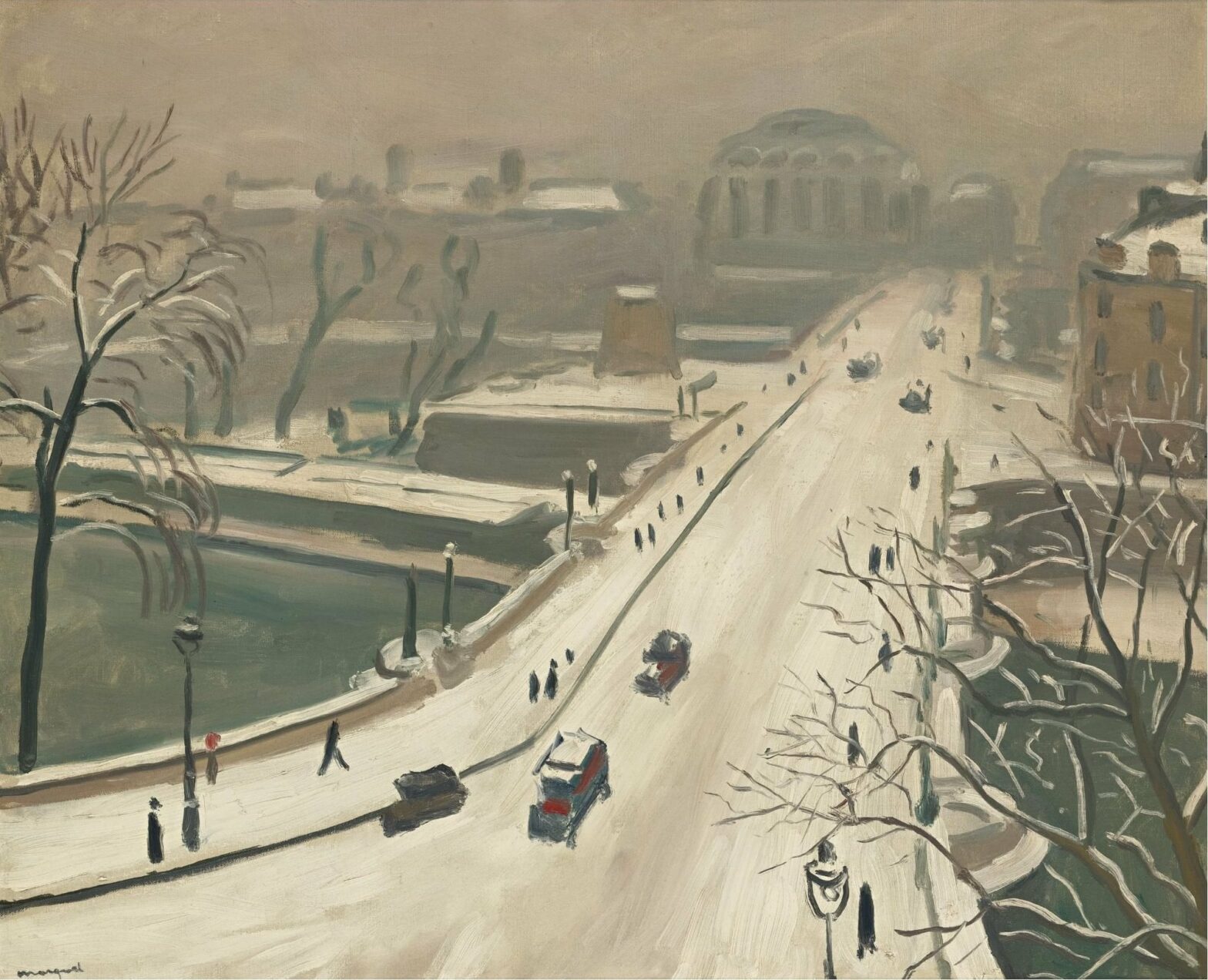
Two artists who remind me of each other: Wayne Theibaud and Richard Diebenkorn. Header image: Albert Marquet (1875-1947) Bordeaux, France Landscape of Sidi-Bou-Said, 1923
-
Kissing In Art And Illustration
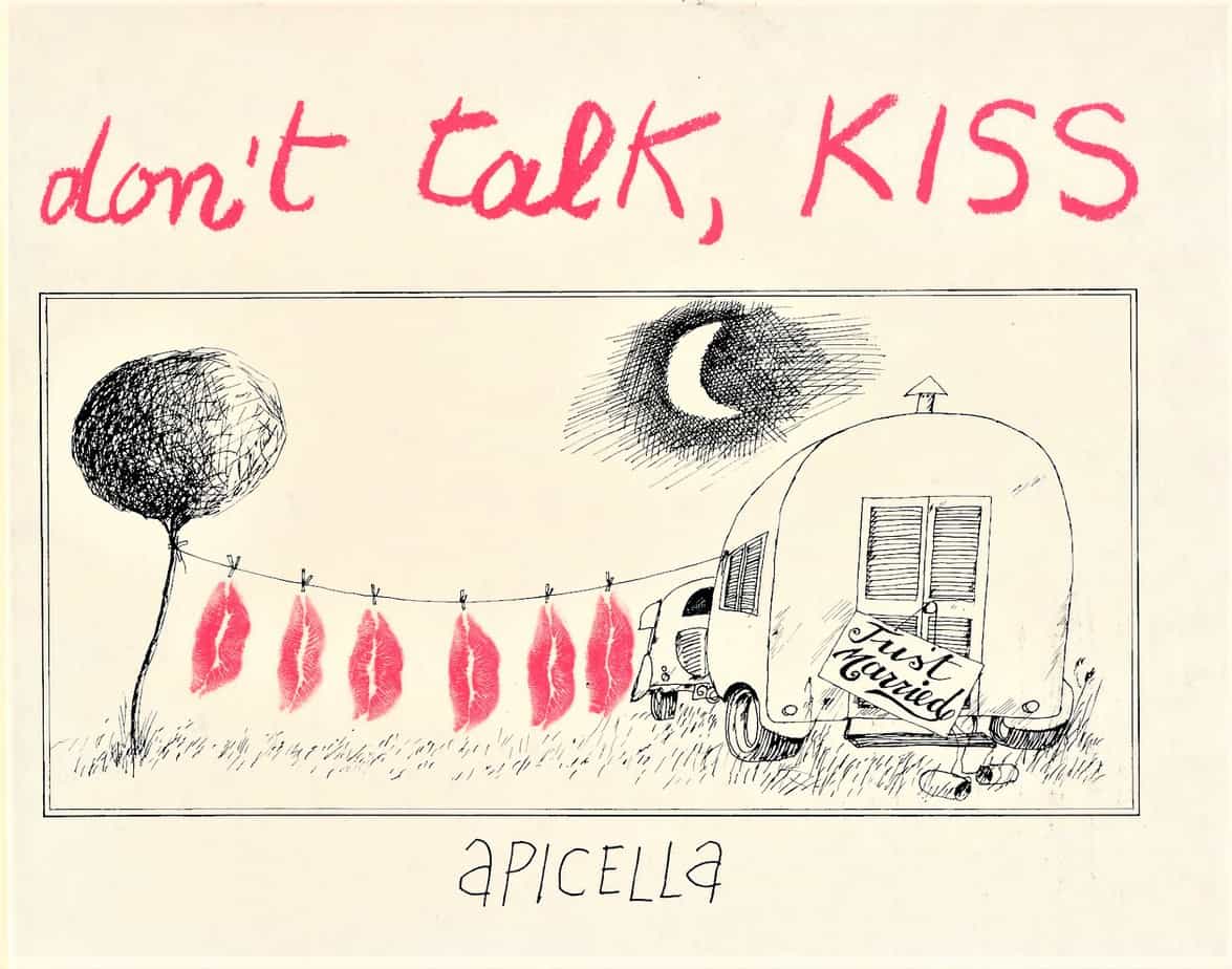
And it seemed to her that kisses, voices, tinkling spoons, laughter, the smell of crushed grass were somehow inside her. Katherine Mansfield A kiss on the forehead-erases misery.I kiss your forehead. A kiss on the eyes-lifts sleeplessness. I kiss your eyes. A kiss on the lips-is a drink of water. I kiss your lips. A kiss on the forehead-erases memory.…
-
Distorted Houses In Illustration
There’s a style of house, popular in Hallowe’en illustration and in children’s books about witches, which looks distorted and crooked. You know it when you see it. This house is a creepy inversion of The Dream House, so it is always two-storeyed with an attic, and you just know it has a basement as well. Why is it crooked and…
-
Compositions With Strong Vertical Divisions
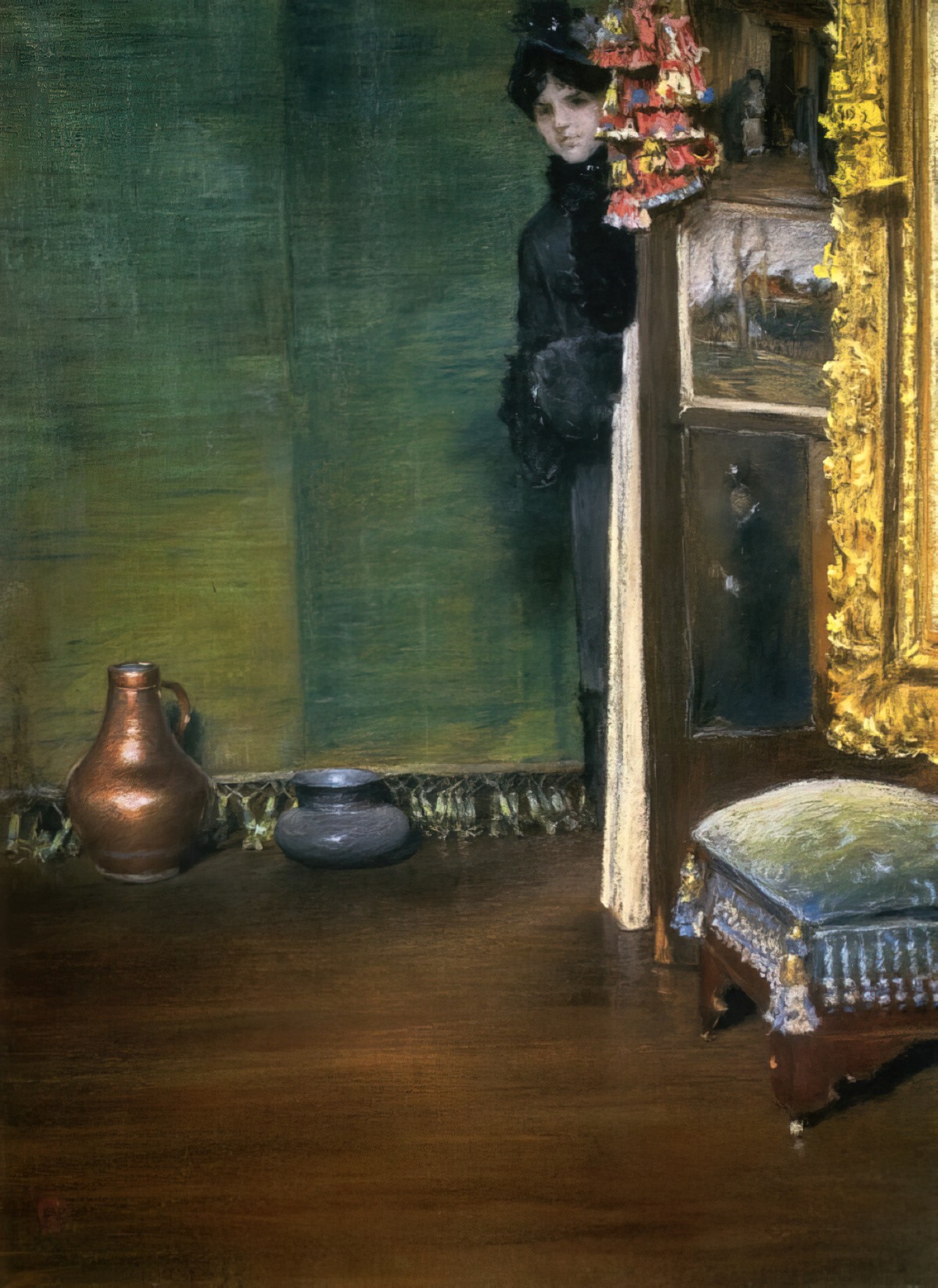
Header painting: William Merritt Chase. May I Come In, 1883, pastel
-
Swimming Pools in Illustration and on Book Covers
Swimming without water: Buckets, bins and bathtubs by Charlotte Bates and Kate Moles, 9th August 2022 Swimming stories by Adele Prince, 9th August 2022 In deep: At one with the water, with all that entails, Rebecca Olive, 9th August 2022 She is peeling off her wet swimsuit when the yummy mummies arrive. Glossy and stick thin, they swiftly surround her,…
-
Sunlight Streaming Into Rooms
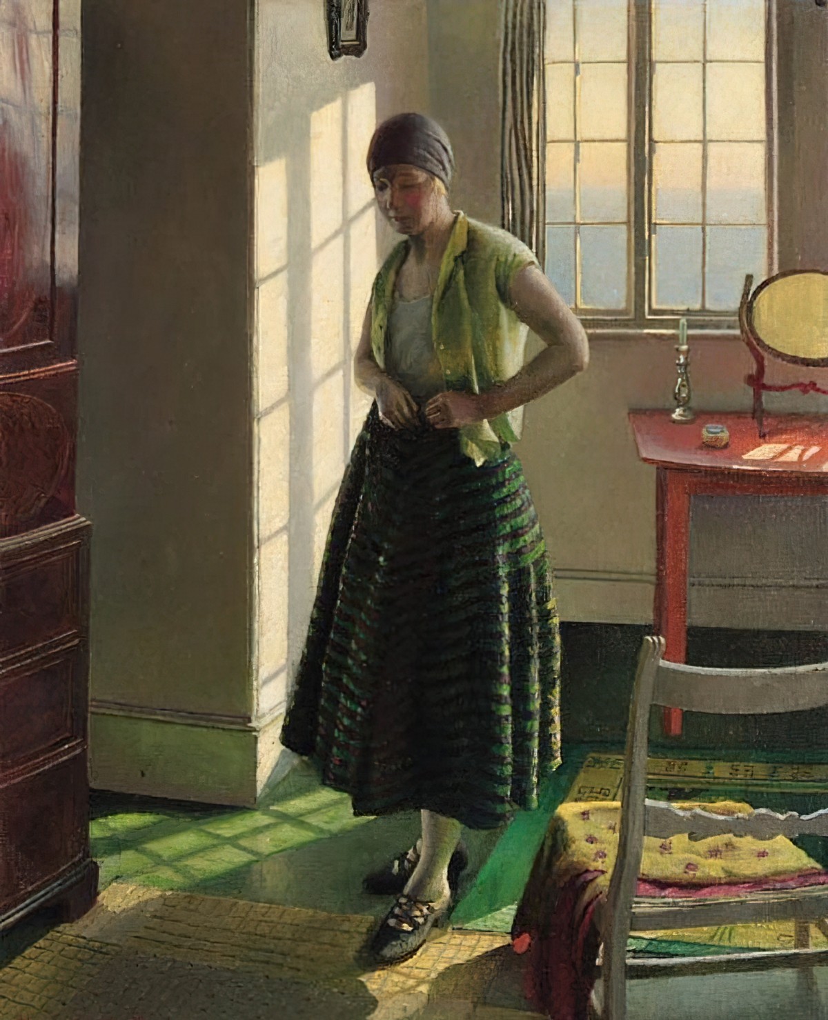
-
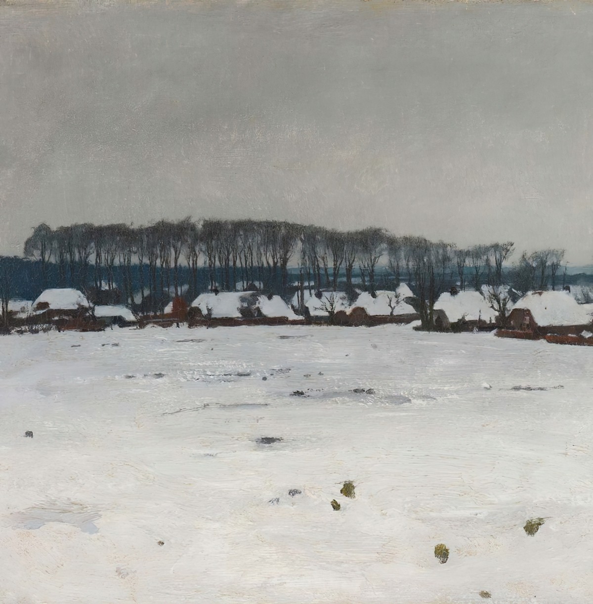
Cities Under Snow In Art And Illustration
-
Balconies in Art and Illustration
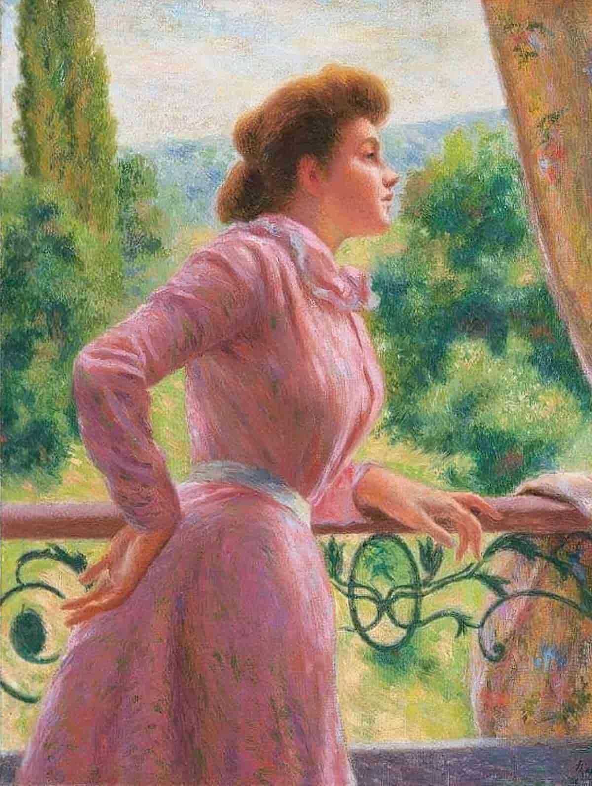
A collection of paintings and illustrations featuring balconies and view from balconies.
-
Glow Worms And Fireflies In Art And Illustration
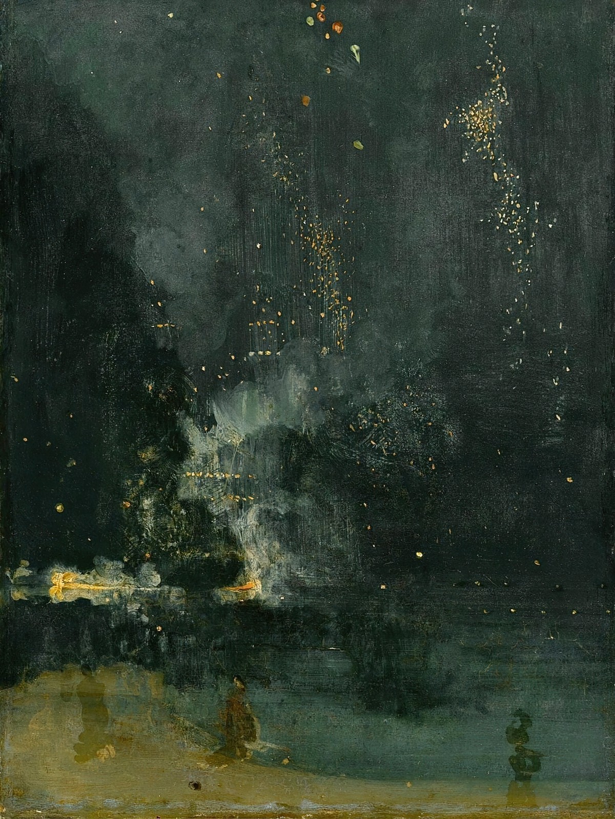
Fireflies are especially popular in East Asian art. All sorts of bright flecks can add interest to a painting.
-
Thick Dark Outlines In Art And Illustration
Thick, dark outlines in art and illustration is associated with several completely different types of art. First, let’s takes a look at thick, dark outlines in fine art, which is a distinctive feature of certain art movements.
-
Houses In The Snow
A collection of hygge houses surrounded by snow.
-
Fairies in Art and Illustration
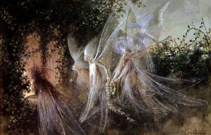
Much can be said about fairies but a few nuggets of info have stuck with me as I read about them. Also: Some of my favourite fairy art.
-
Snowy Landscapes In Art And Illustration
Like the various underwater scenes, snow can be many colours other than white. The colour of snow depends on the colour of the sky, the ambient light. As you’ll see below, snow can also be quite brightly coloured.