Let’s take a close look at how graphic designers alter margins, kerning and leading when creating contemporary book covers.
- Kerning: The space between letters
- Leading: The space between lines
First, by way of contrast, a small selection of book covers which are centre justified. Note than in all of these examples, the symmetry is broken by another stand-out page element, be it a marketing blurb, a sticker or similar. When a design is too symmetrical it can look off or unsettling, or else evokes a specific design school or art type (Art Deco, Art Nouveau, the Symbolist movement, children’s “squish paintings” of butterflies etc. which, admittedly, is sometimes what you want, but not accidentally.)


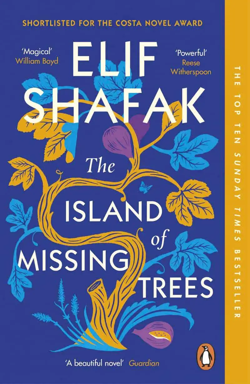
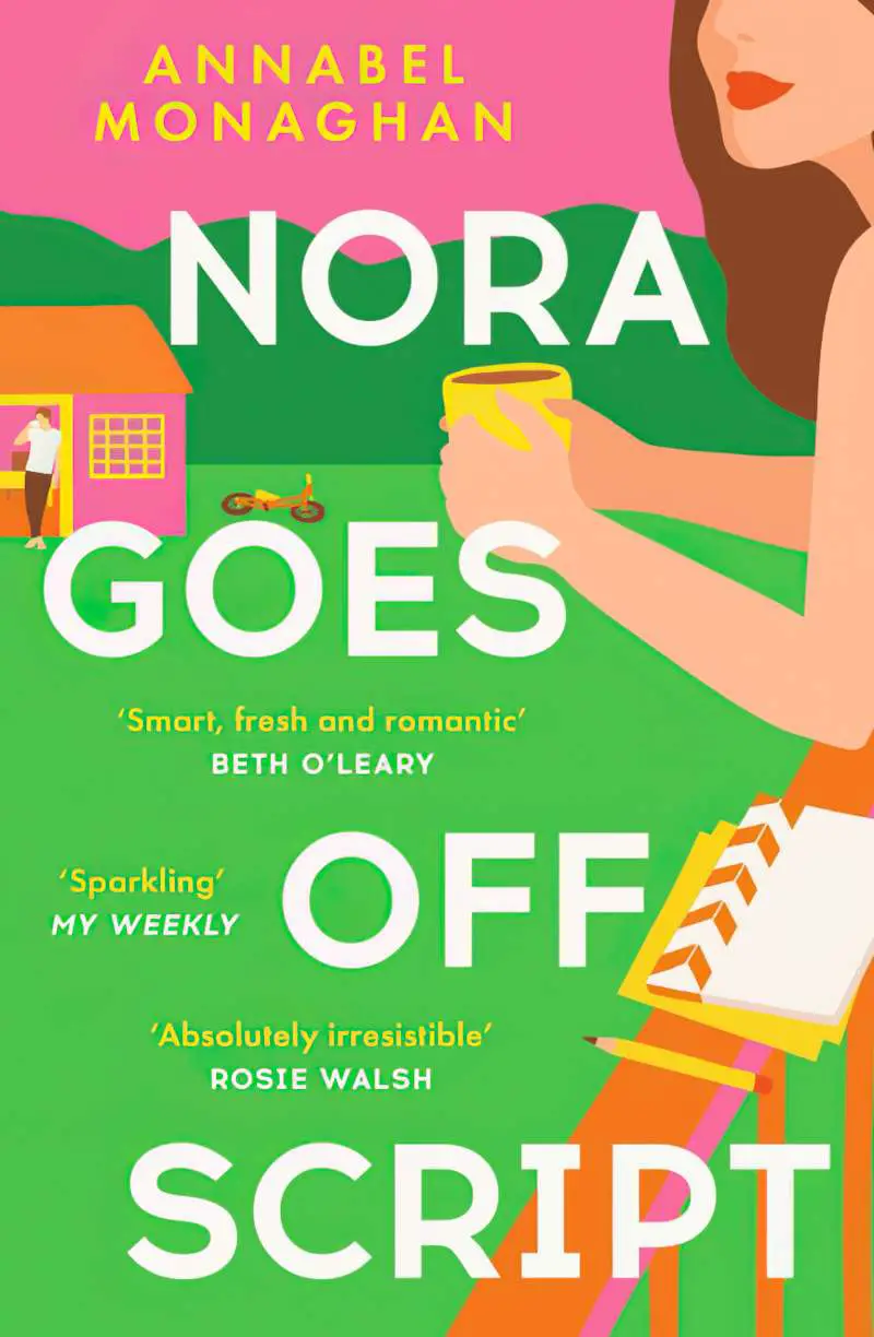
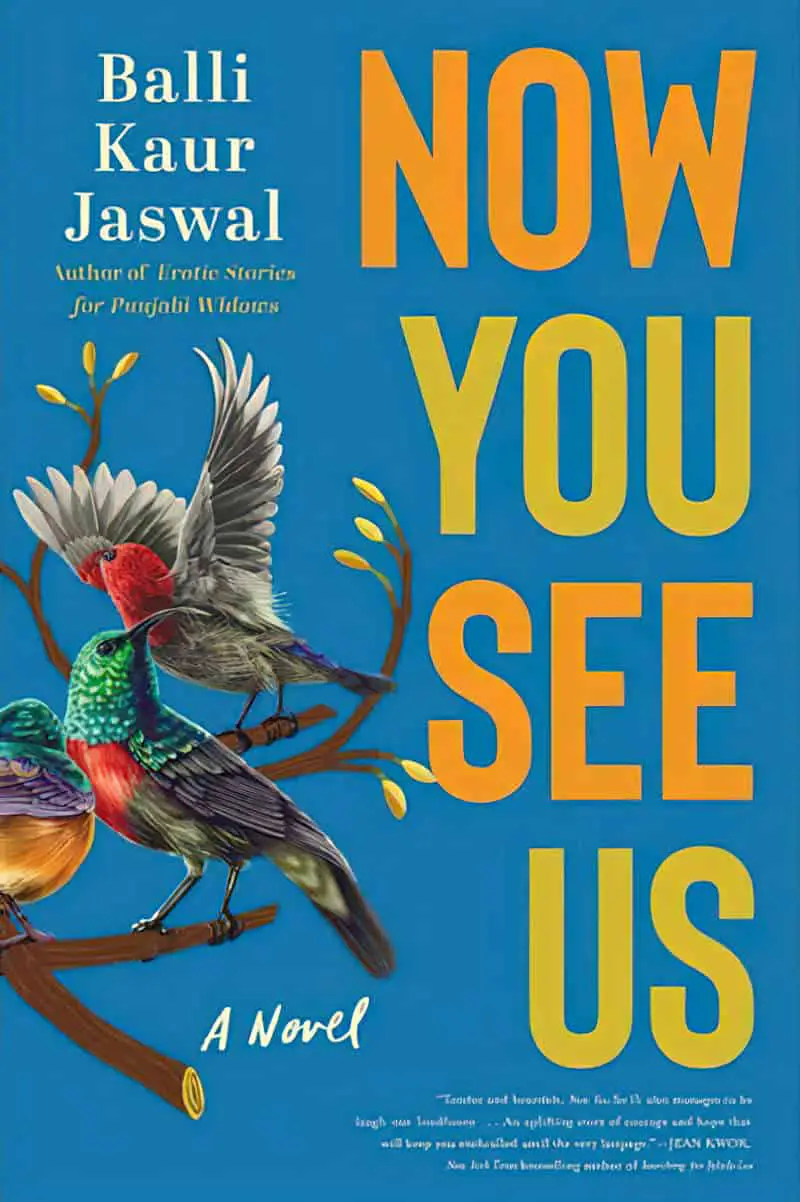
Now let’s take a look at book cover text with manual placement. In all of these cases, the placement works. Crime and thriller novels frequently make use of this ‘zig-zagged’ alignment of text, perhaps because it creates a vague sense of unease in the viewer. Notice how manually-placed, zig-zagged text often combines with centre justified text, e.g. the title will be zig-zagged, the author name will be centred.
The really convenient part of zig-zagged justification: Space is created to insert marketing text in smaller font.


In the example below, THOSE EMPTY is zig-zagged, but EYES is centred below the EMPTY.
Naturally, the arrangement of text can depend on the image.


But it’s not just the suspense genres which make use of this justification of text. It’s very easy to find examples from other less harrowing genres:


WIDE SPACED TEXT FITS AROUND A CENTRAL IMAGE
The examples above are very common and unmarked. Below, examples of another type of widely spaced text on book covers with strangely justified text to fit around a central image:


These covers tend to have a literary, serious feel.
But this kind of text placement can be seen on the book cover of any genre at all, and it’s not always a tallish, sans serif font:


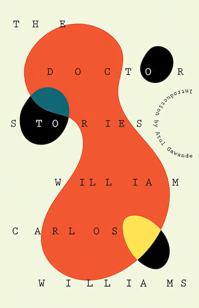
CONTENT WORDS VS GRAMAMTICAL WORDS
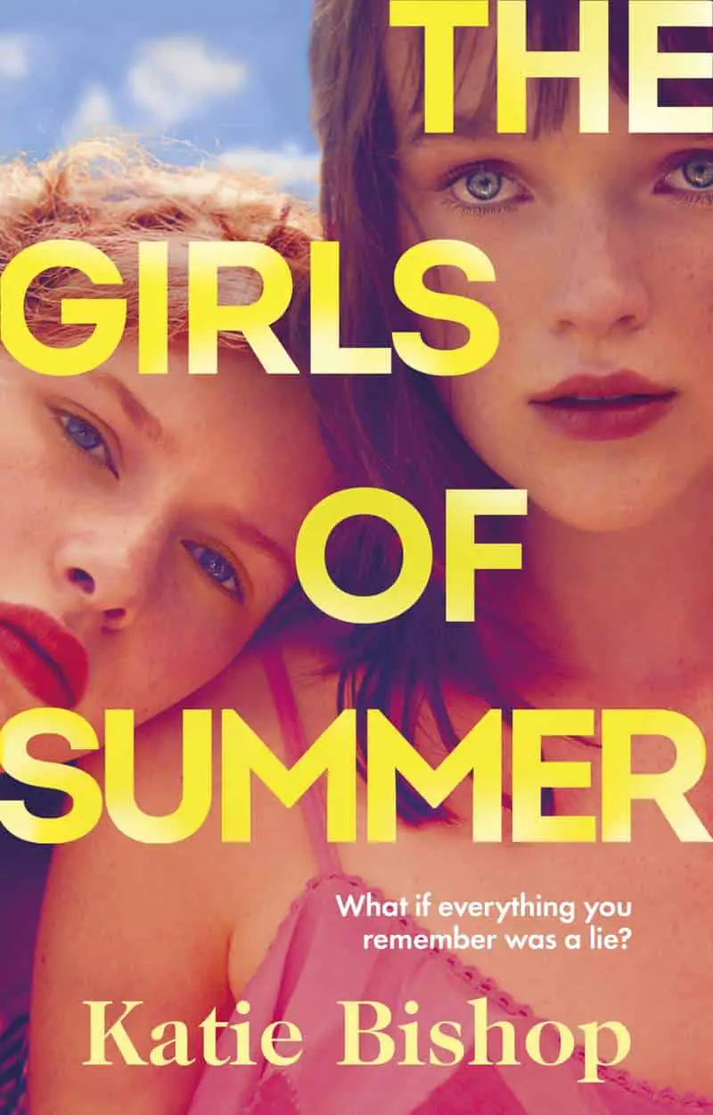
Now let’s take a look at the size of words within a book title. Frequently, not all words of a title are the same size.
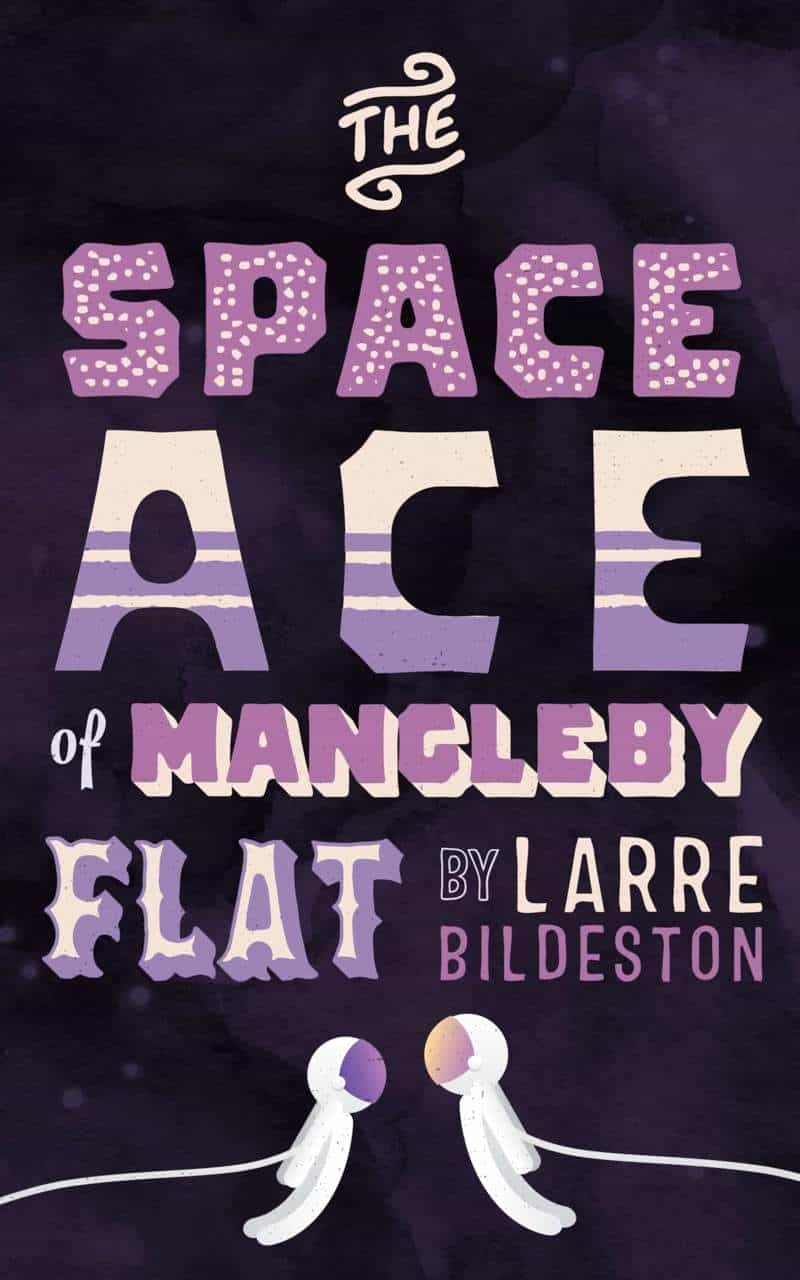
In examples below, designers have made the most of the varying heights of individual letters, even going so far as to extend and shorten manually. Small words (THE, IN, THE, ON etc.) nestle between the other words of the title.
Utilising the varying heights of letters, designers can utilise title case (rather than uppercase). Take note of where the titles are lowercase versus uppercase. Also take a look at where designers have increased the horizontal spacing of letters (kerning).
To adjust font spacing in Affinity software:
- Select the text using the Artistic text tool
- Hit alt + an arrow key (left = less space between letters, right = more)
If you want to increase or decrease the spacing between just two letters (not words), place the text cursor between the two letters and do as above. (You’ll find this becomes necessary when messing around with baselines and curves.)


Below, designers have reduced the vertical spacing (leading) to the point where the letters are sitting (or almost sitting) on top of each other. Unmarked leading is is between 120% and 145% of the point size.


In the book cover below, the designer has converted font to curves and cut a chunk out of the AR of MARSONS, which allows the lines to sit snugly together. This also elevates the design by creating something unique. (The author name in this font and font design is utilised across all books in the series.)

When you make use of a font duo, and one of those fonts is a brush script, the brush script text may look good overlapping with the other font:

NARROW MARGINS
(Or non-existent)


LEFT JUSTIFIED TEXT ON BOOK COVER GRAPHIC DESIGN


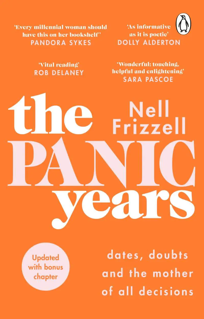
Left justified text is fairly common on the book covers of non-fiction and memoir:


And for this very reason, the graphic designer chose left justification for this humorous work, alongside a graphic which looks like it might have come out of an anthropology textbook:


Left justified text isn’t necessarily positioned to the left of the page:


RIGHT JUSTIFIED TEEXT ON BOOK COVER GRAPHIC DESIGN
Here’s another very common format: The author’s name centred at the top; further down, a right justified title in exactly the same font.


Another popular format: Marketing copy at the top, a right-justified title below, and the author’s name below that (also right-justified).


DELIBERATELY MESSED UP KERNING
Remember, kerning refers to the spacing between individual letters.
Where kerning is deliberately uneven, the design takes on a hand-crafted look.
Typewriter fonts look even more retro when the spacing isn’t perfect, since even spacing is much easier on a computer, and is therefore a post-digital phenomenon.

The book cover in the header is created for practice purposes only and does not exist. Image: AI generated. Author name: Randomly generated. Fonts: Barlow and Simply Breathtaking.