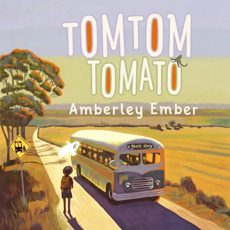
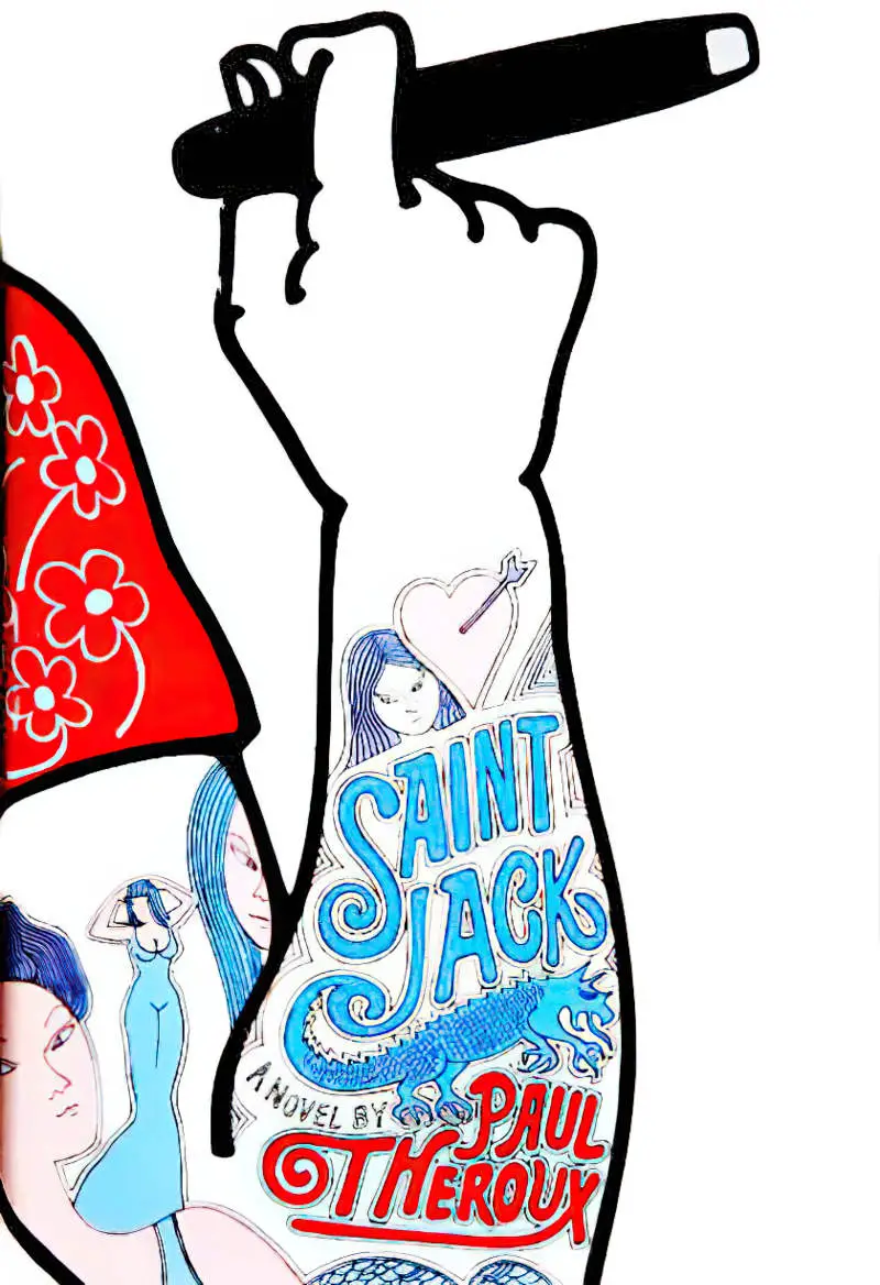
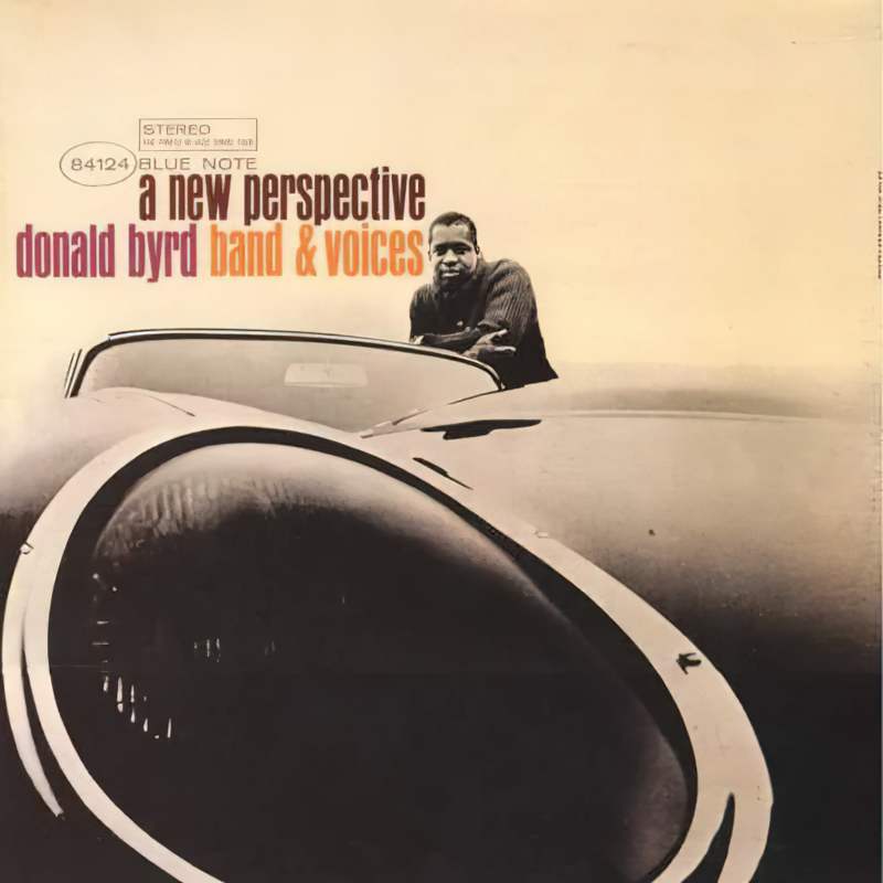
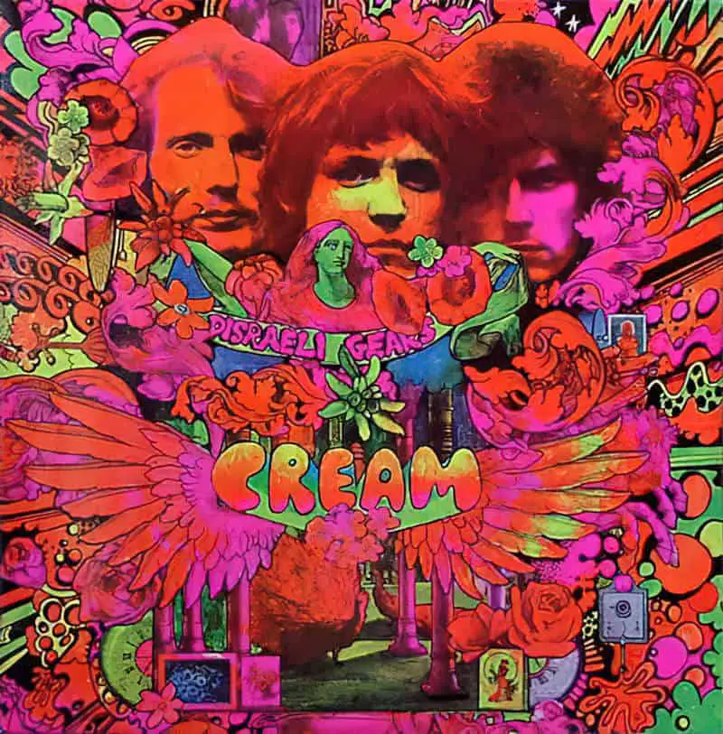
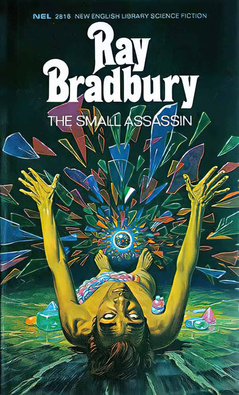
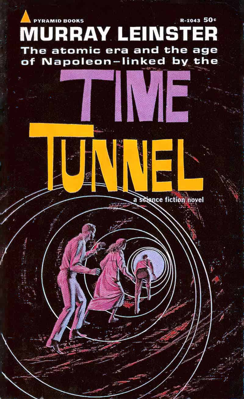
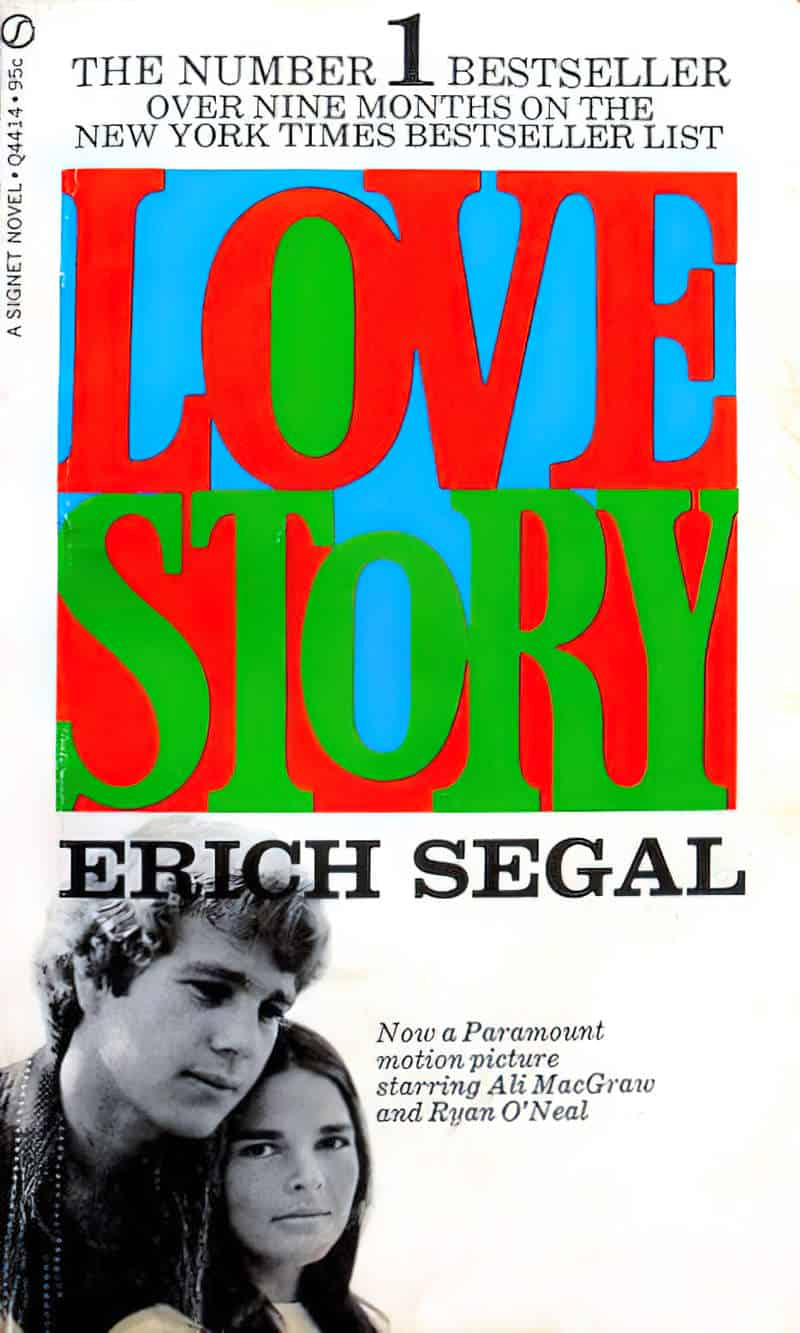
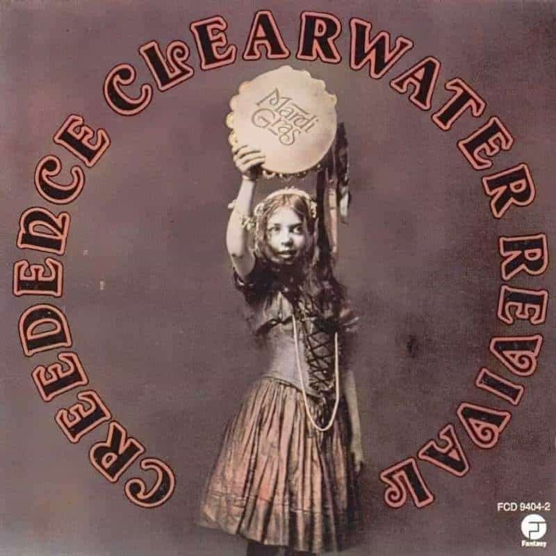
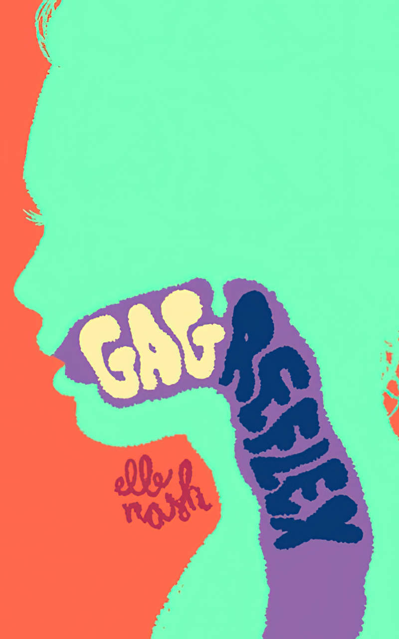
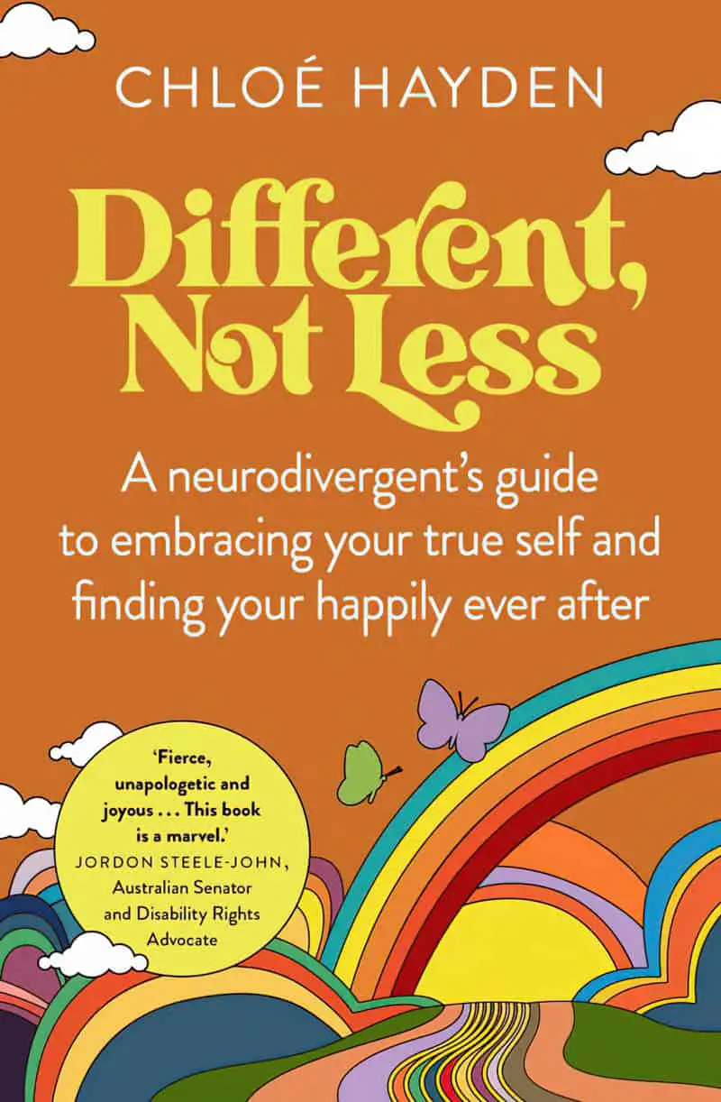
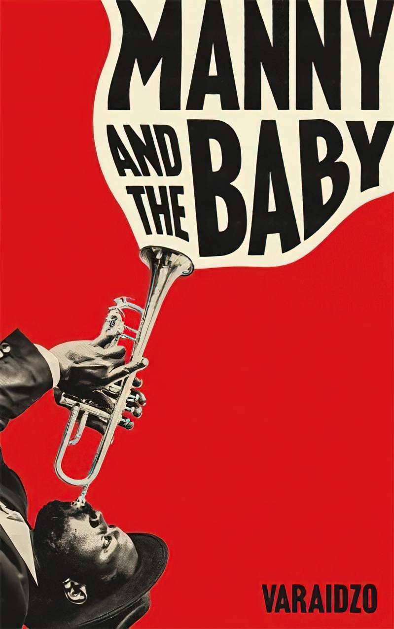
The style of lettering I’m talking about today actually began in the 1950s. A designer called Paul Bacon was influential in creating a look which is back in fashion. He famously hand-lettered his fonts in original ways:
Various examples of font from mid-century:
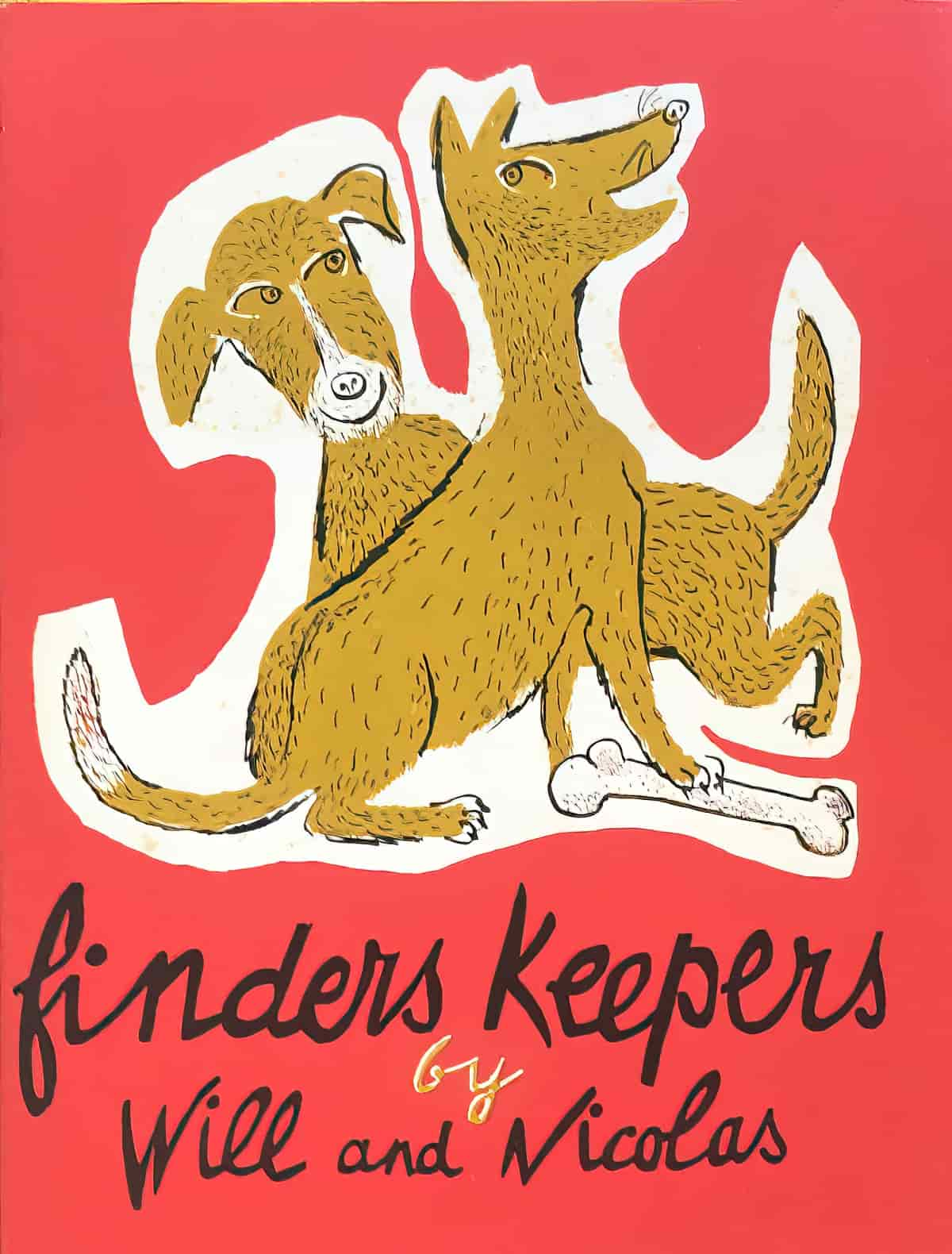
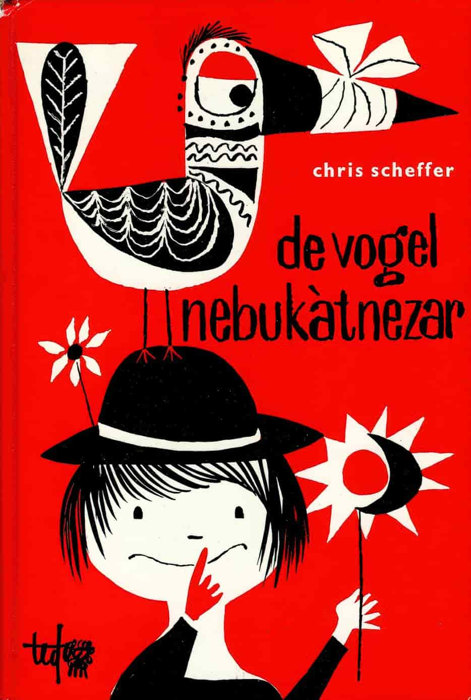
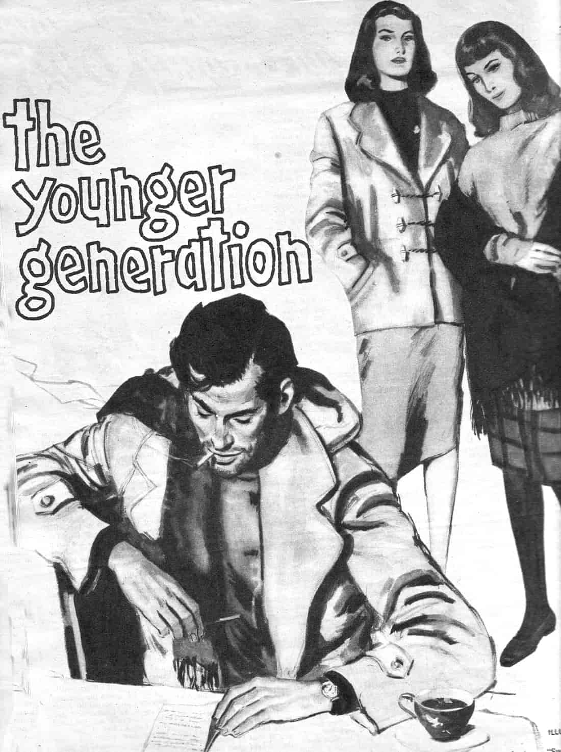
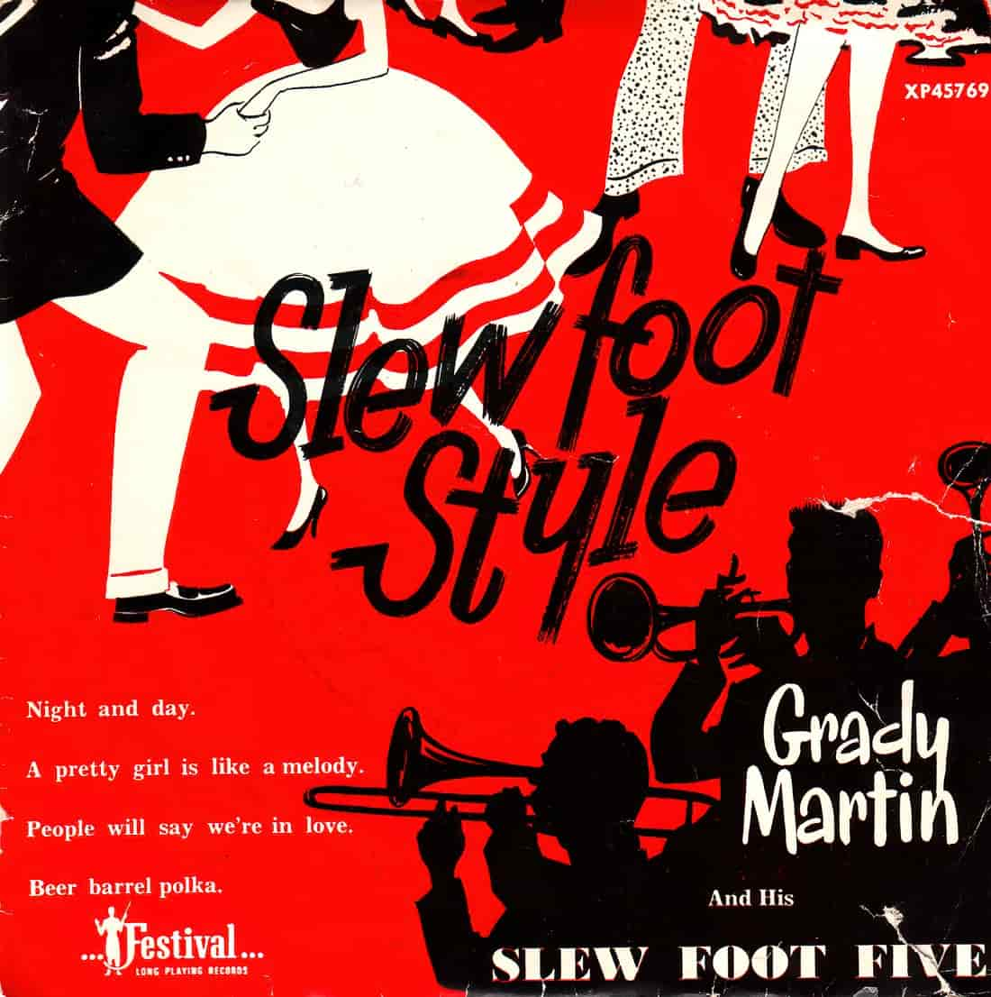
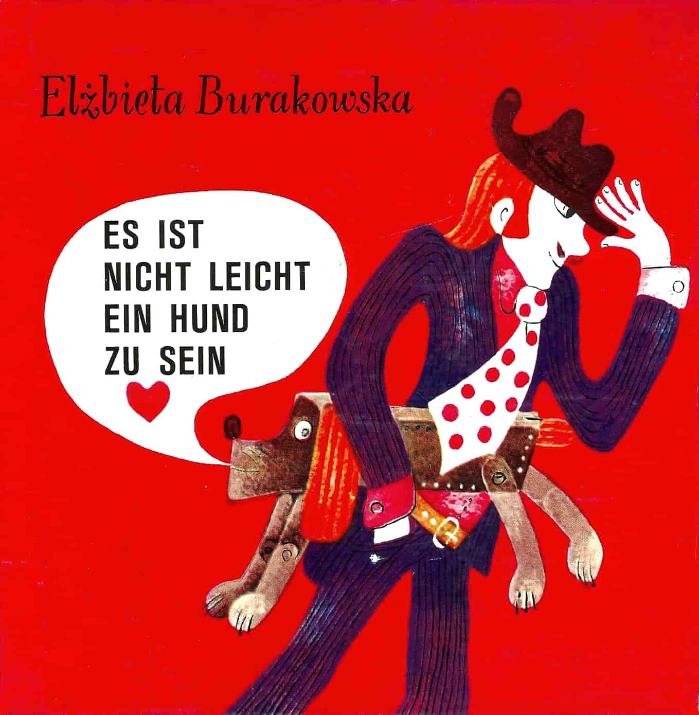
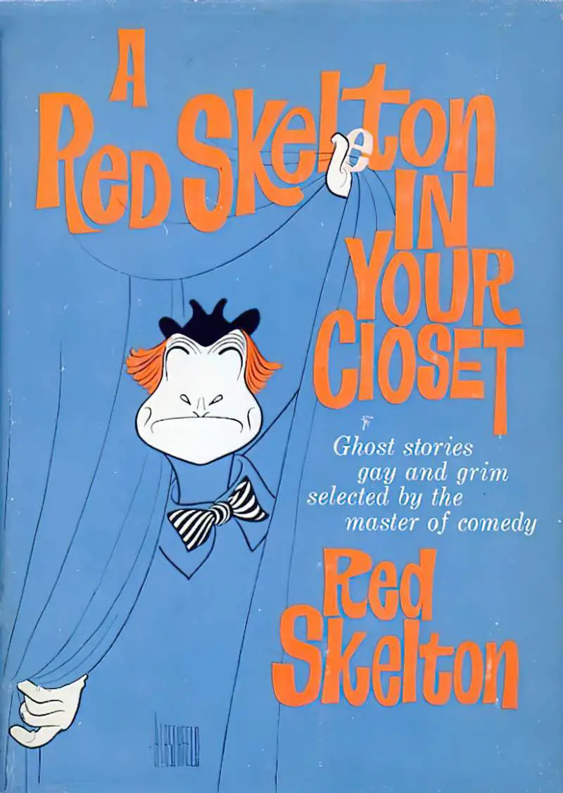
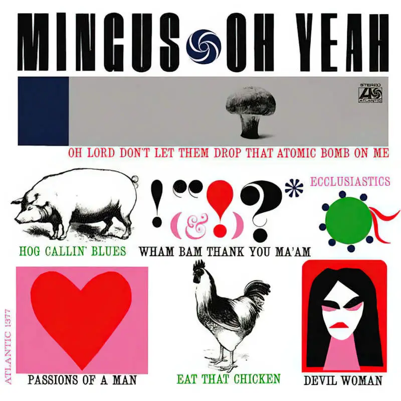
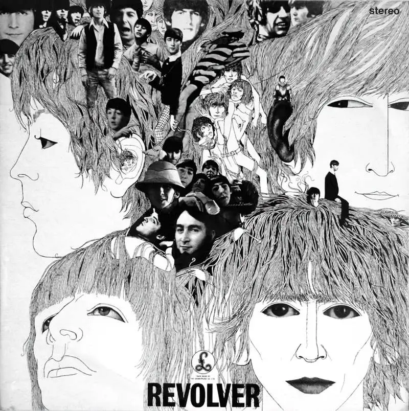
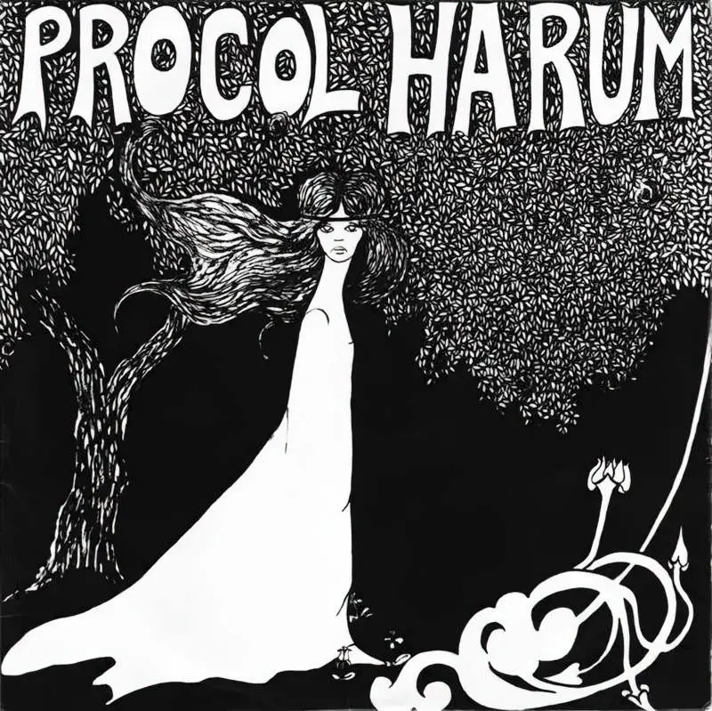
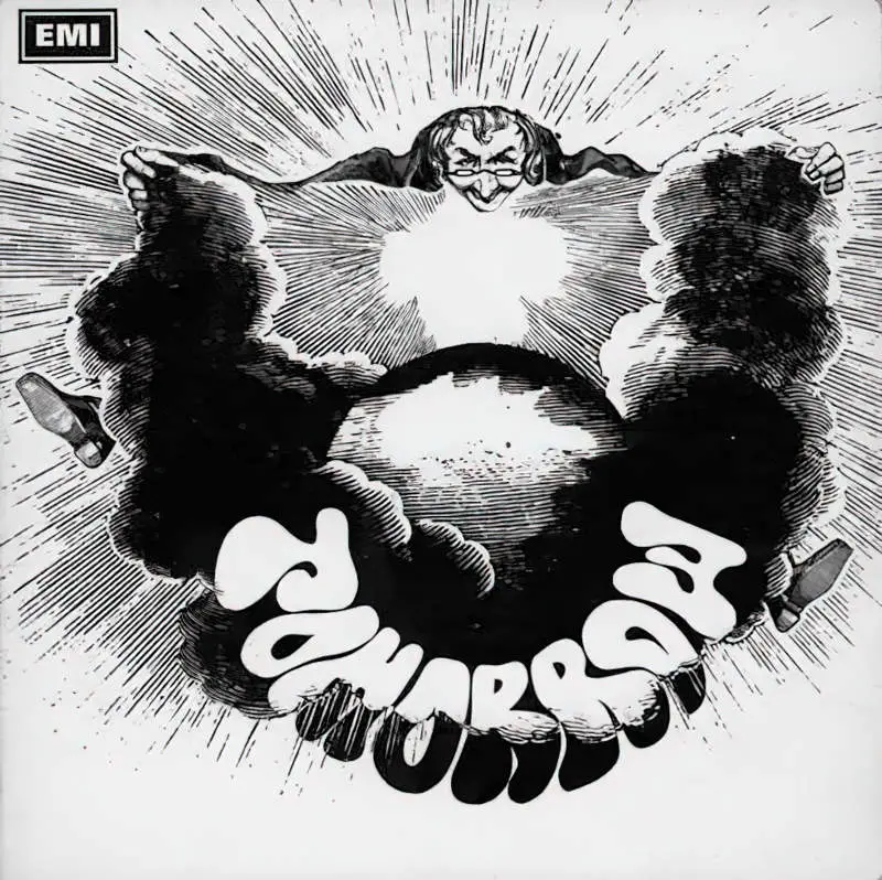
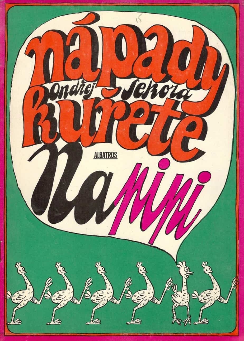
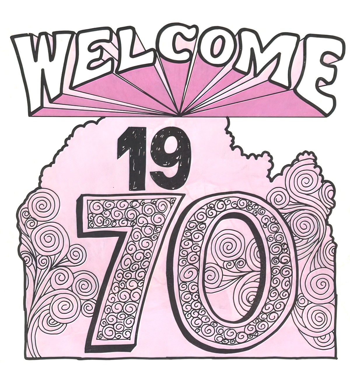
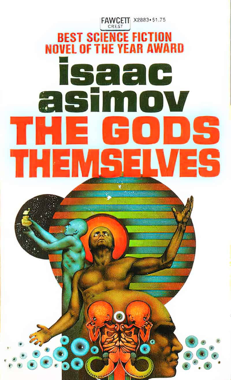
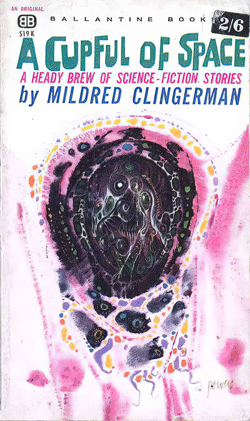
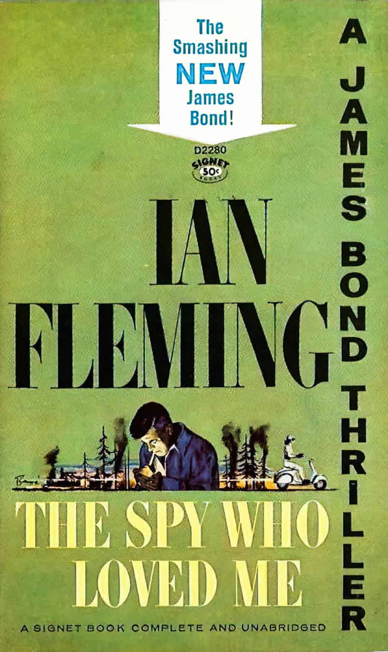
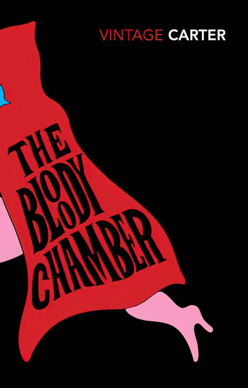
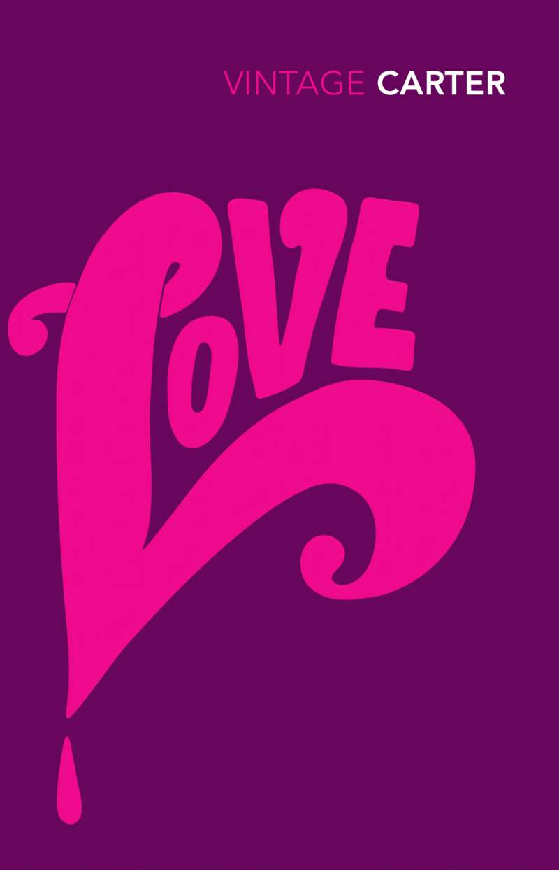
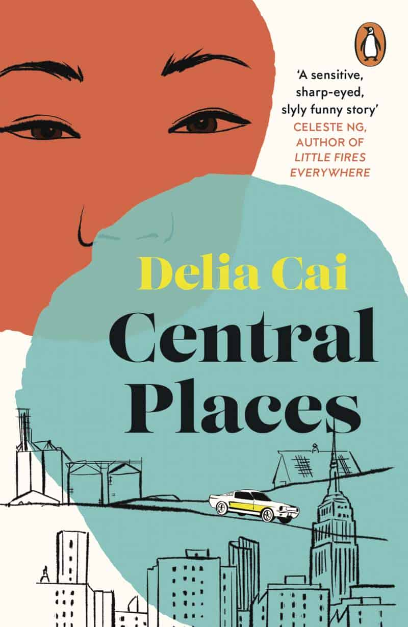
It wasn’t all swirly and psychedelic. Here are other examples by various designers from the golden age of hand-lettering. As you can see, typography fell into two main categories: Distinctively lettered, not lettered in any interesting way at all:
THE CONTEMPORARY PAUL BACON LOOK
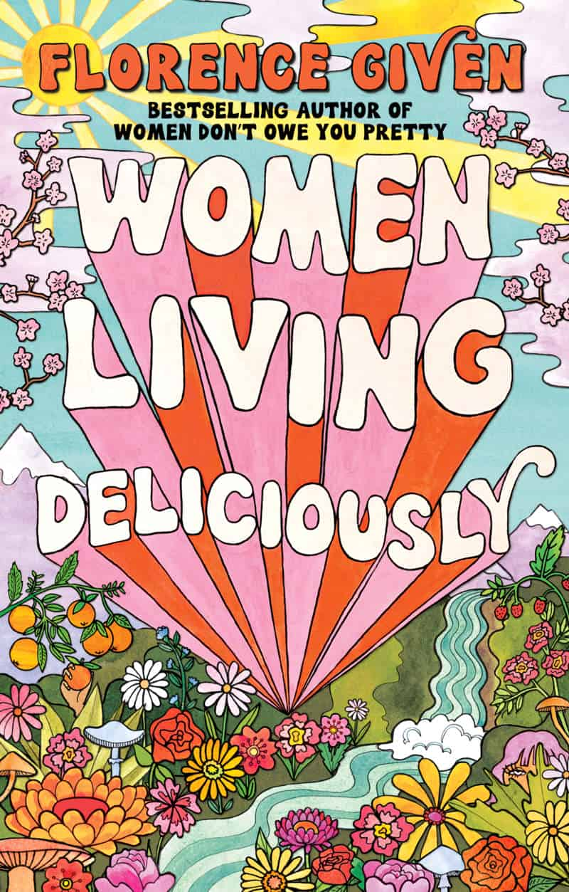
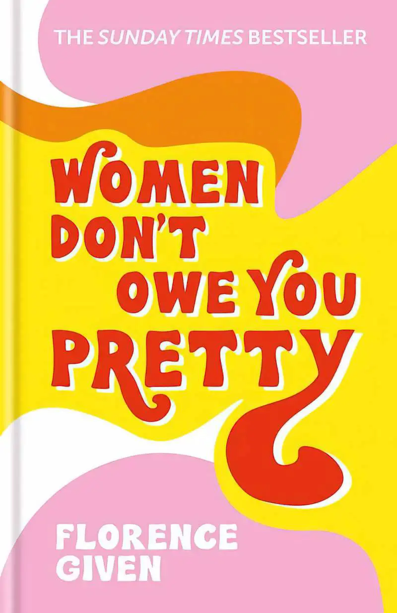
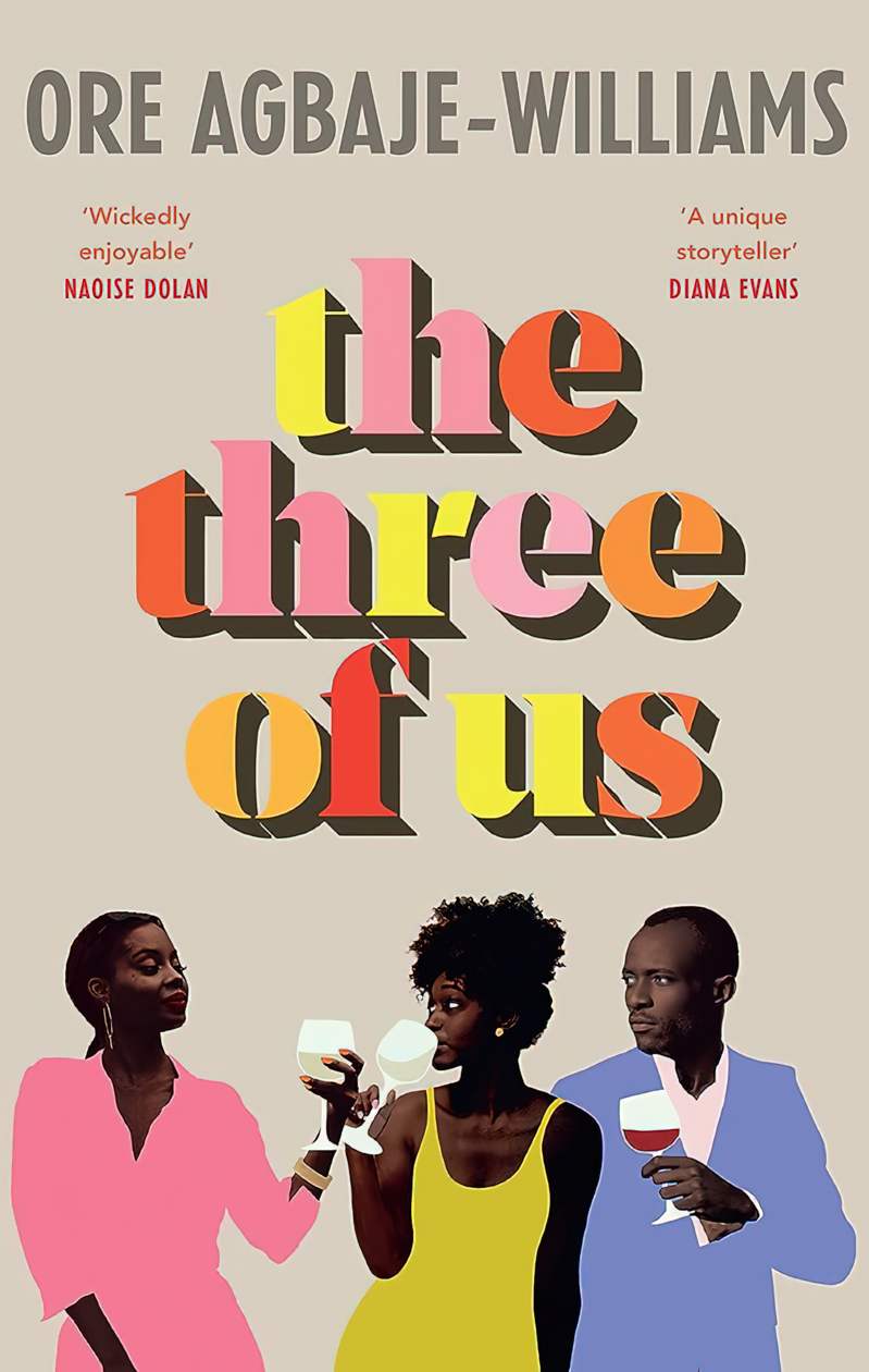
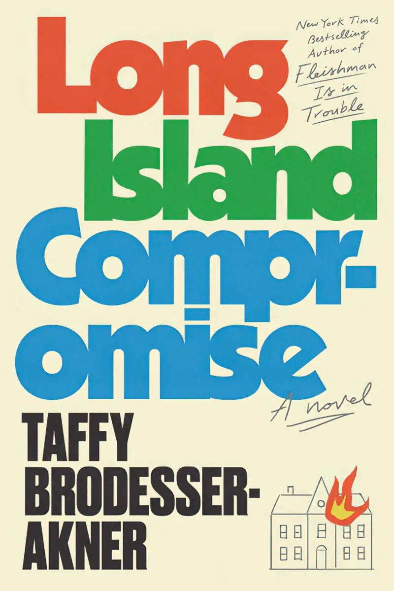
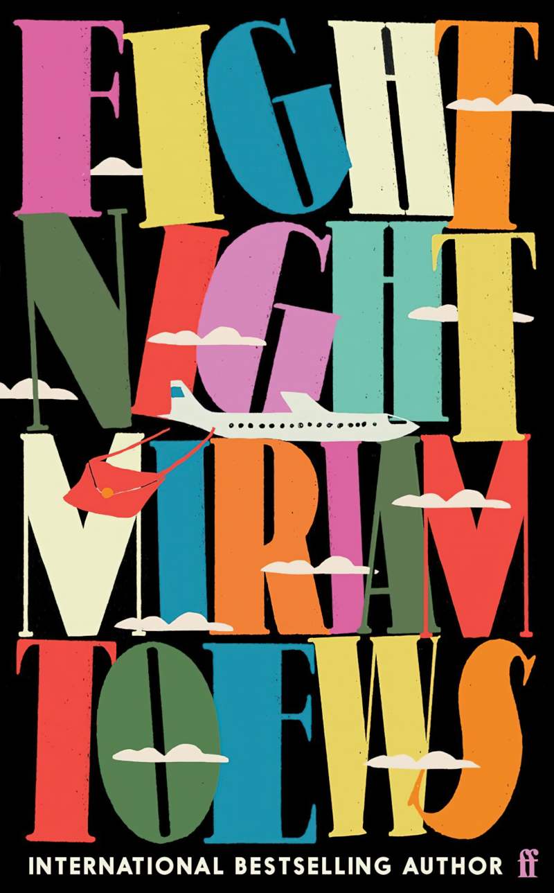
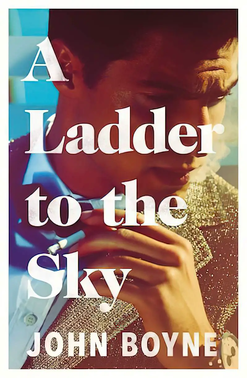
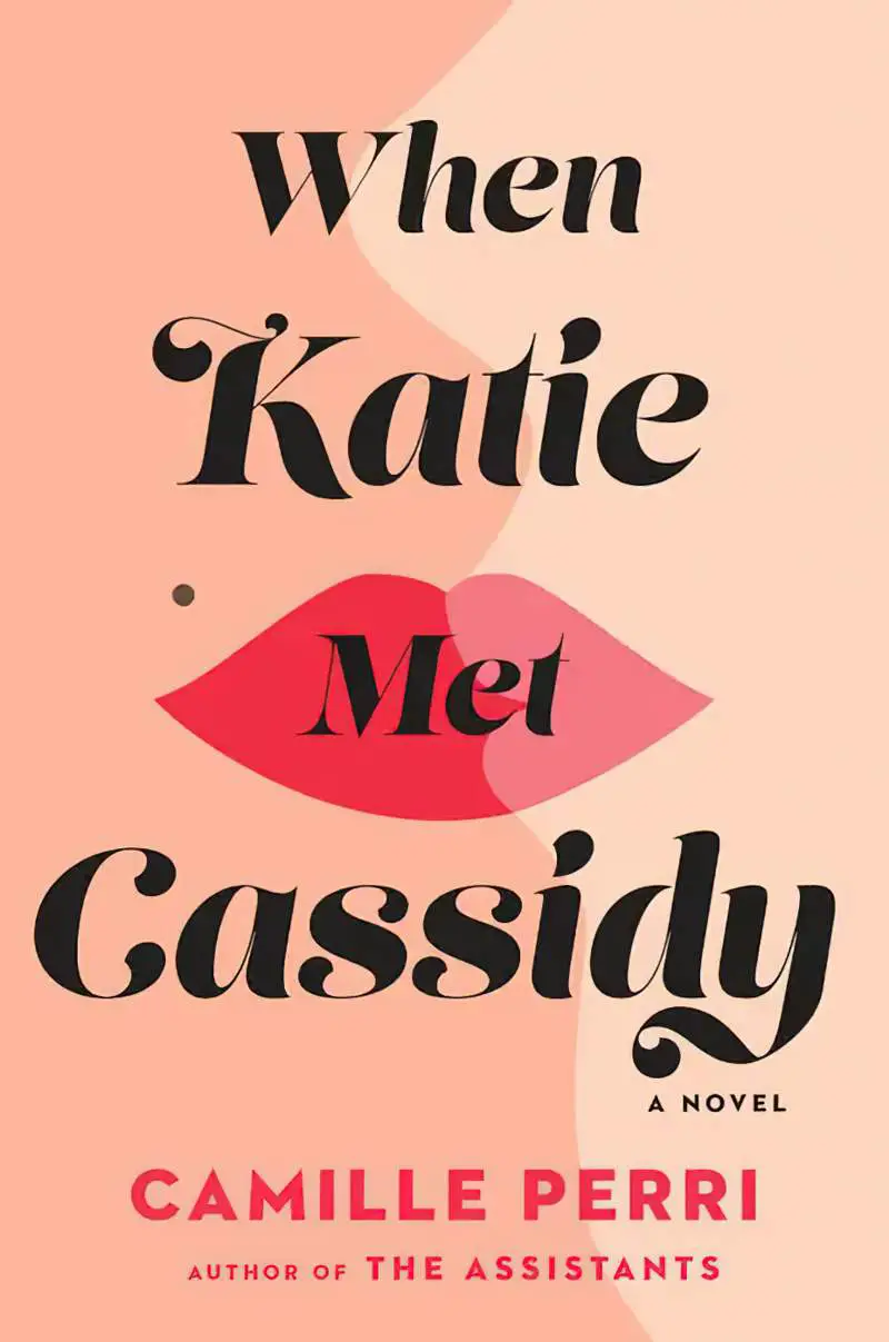
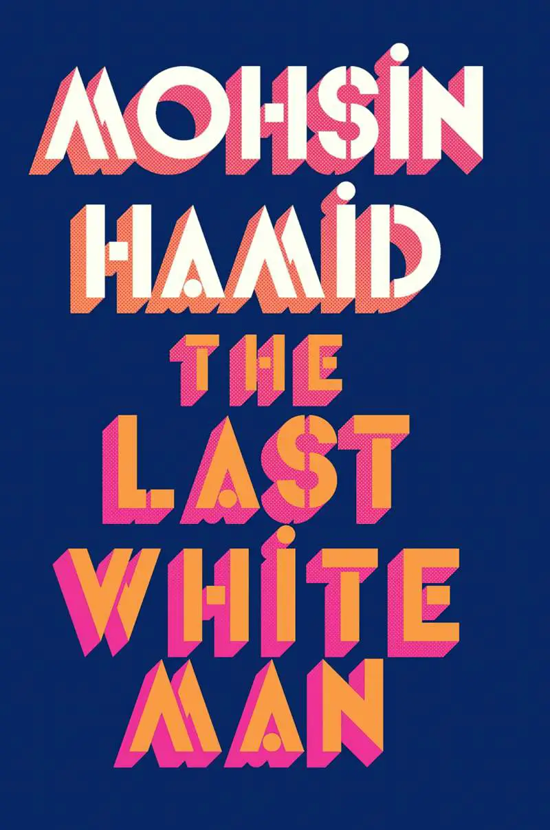
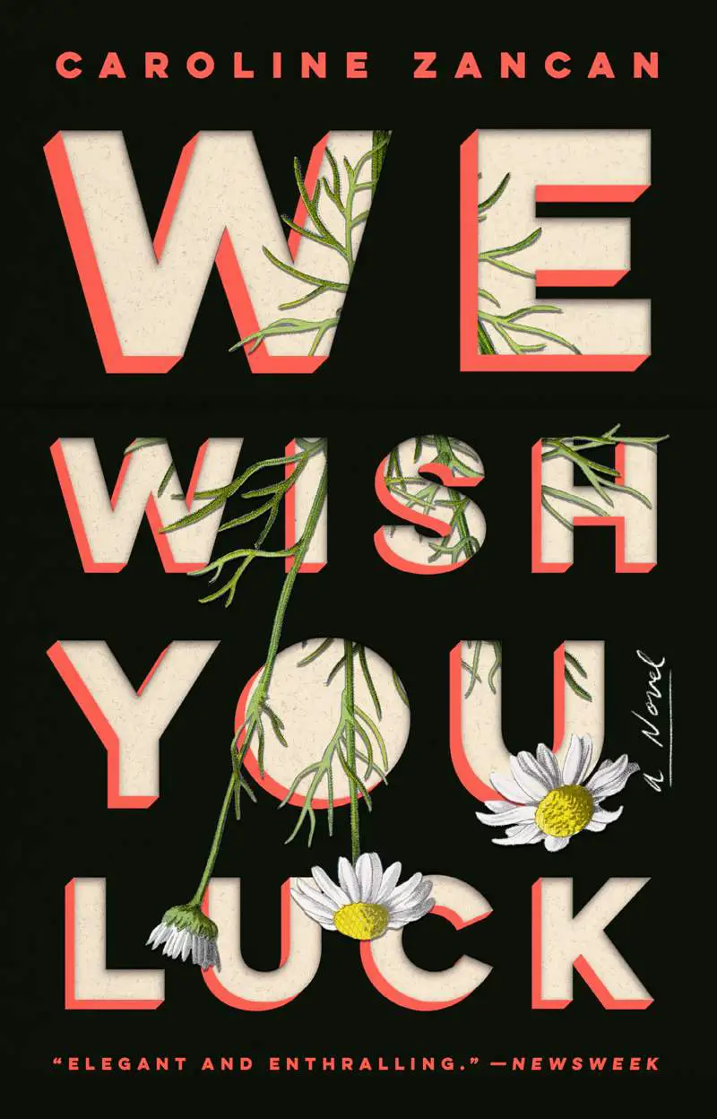
I’ll just call this the ‘Paul Bacon’ look. These days, book covers are sometimes hand-lettered but are also frequently purchased as a font which looks hand-lettered in that mid-century style. Purchased fonts may also come with Extrude versions.
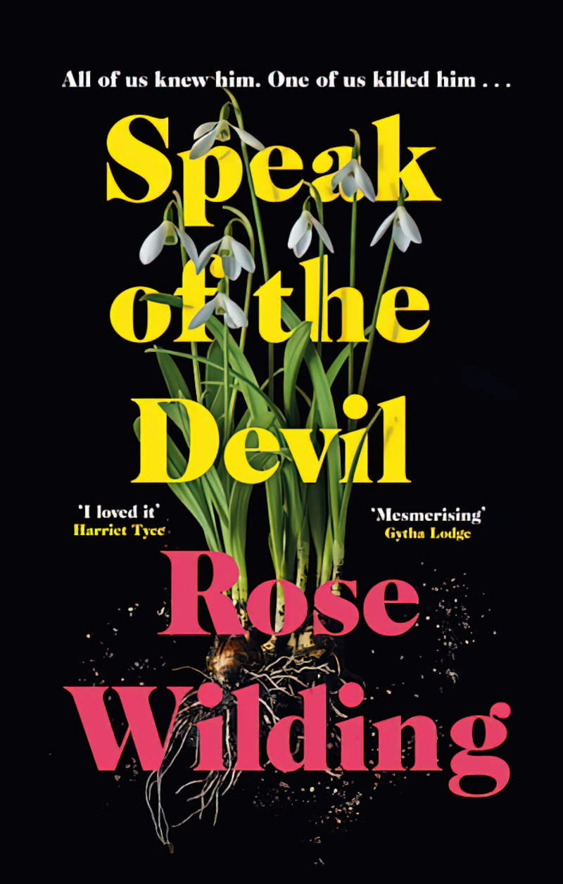
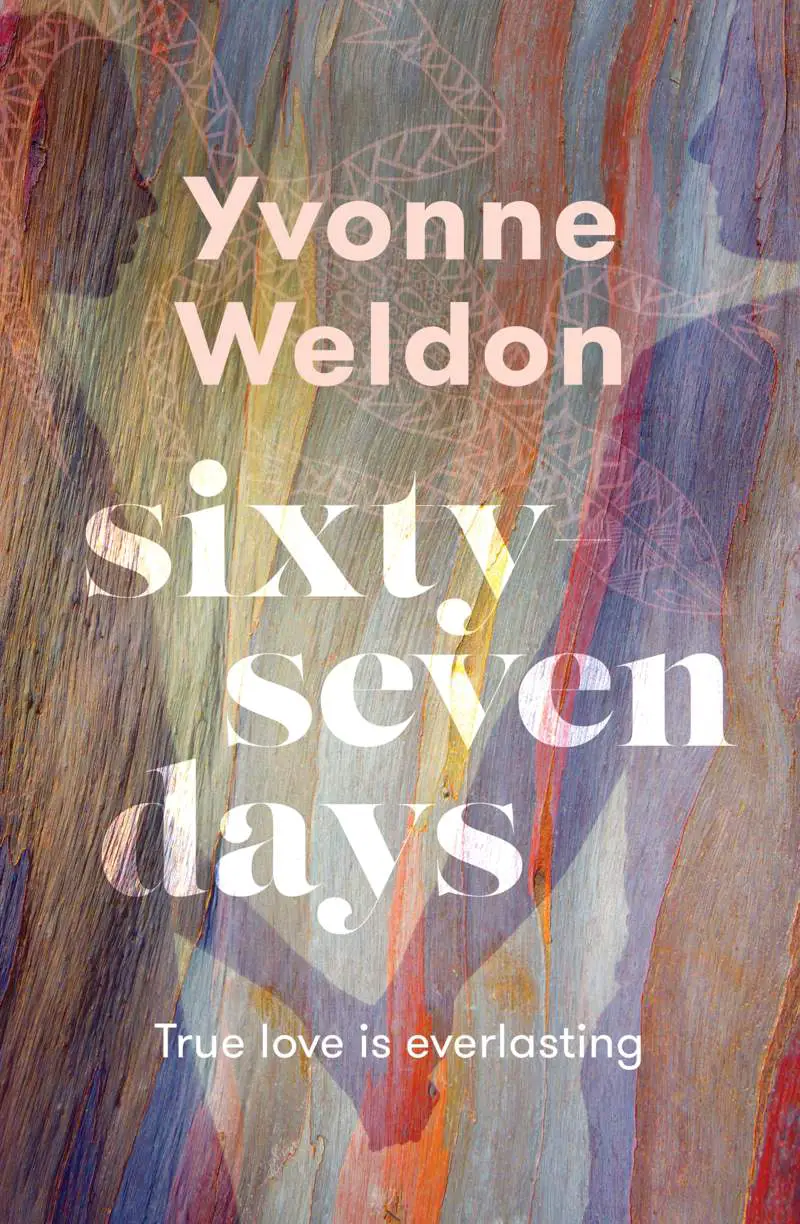
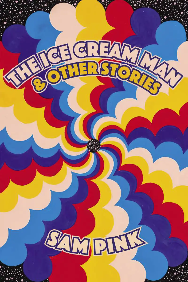
How MIGHT we describe this style?
- The baseline often follows the image, or fits inside it somehow. Two lines of text might fill curved shapes which fit together in a Yin Yan sort of way.
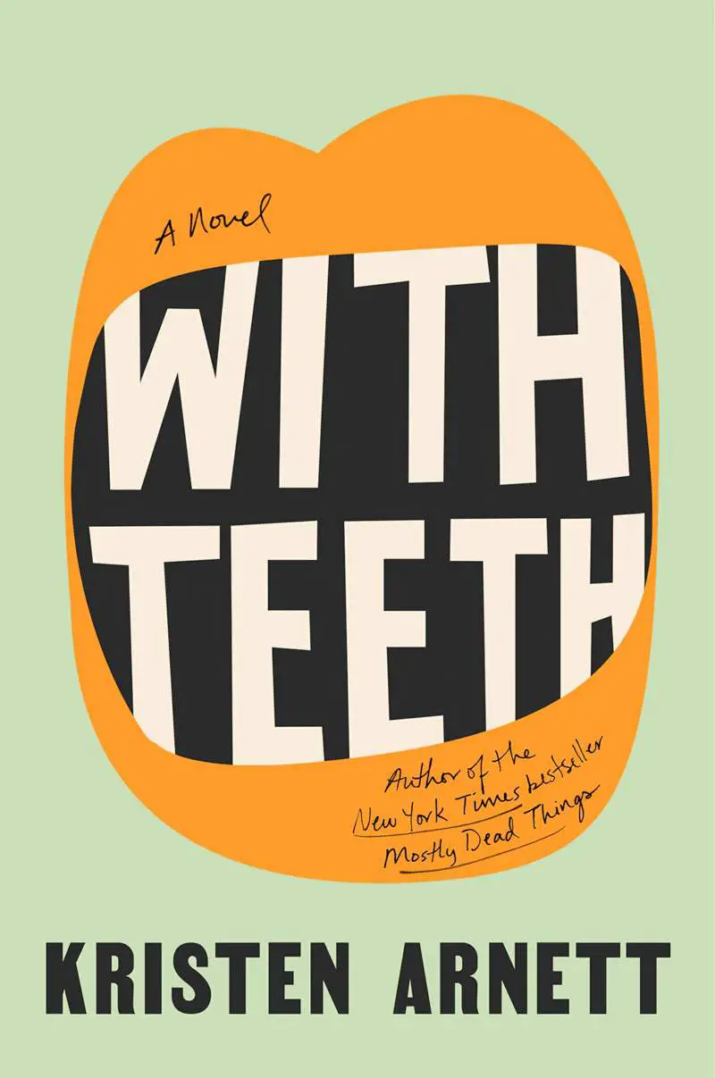
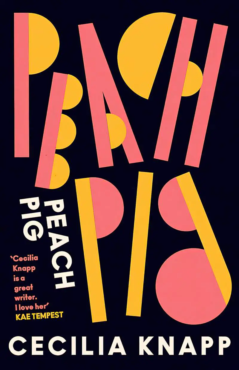
- As well as entire words, individual letters are frequently morphed in some way: curved, wavy outer lines, elongation, uneven sizing. The size of individual letters can expand to create a shape which resembles or completes an image.
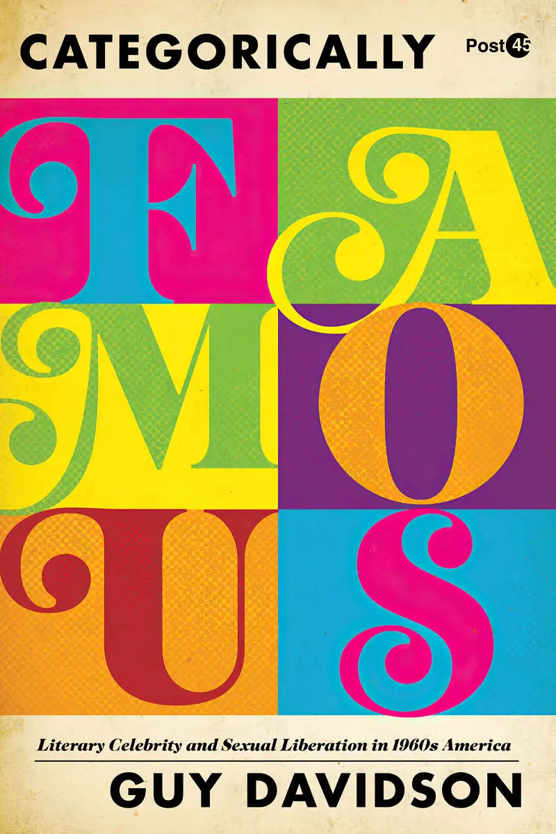
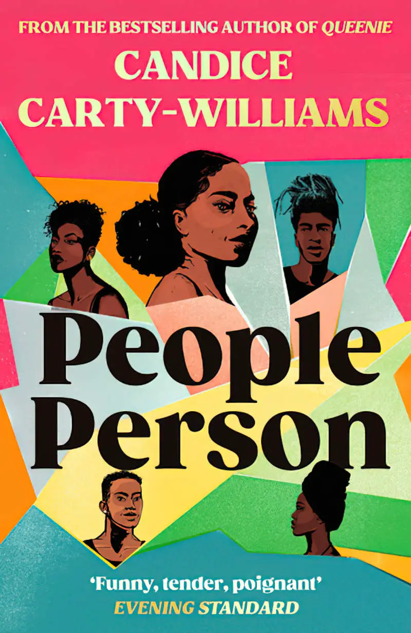
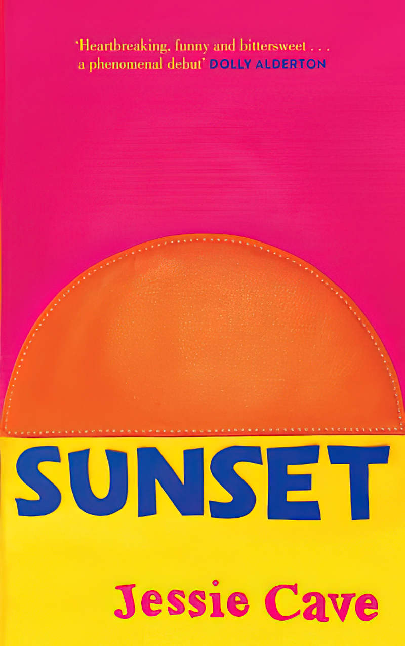
- We’ve got the curved style of font with exaggerated curves and flourishes, as well as a squarer style. Stencil fonts also look as if they come from this era. A single stencilled letter may comprise two or more colours.
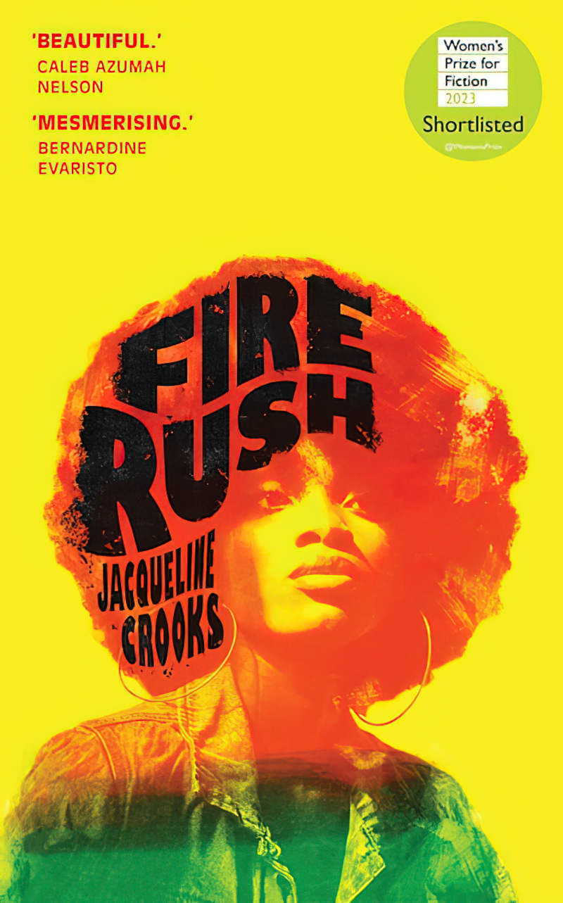
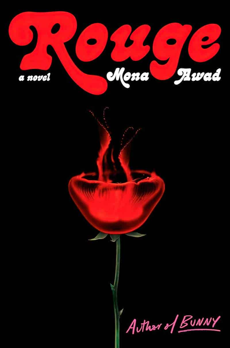
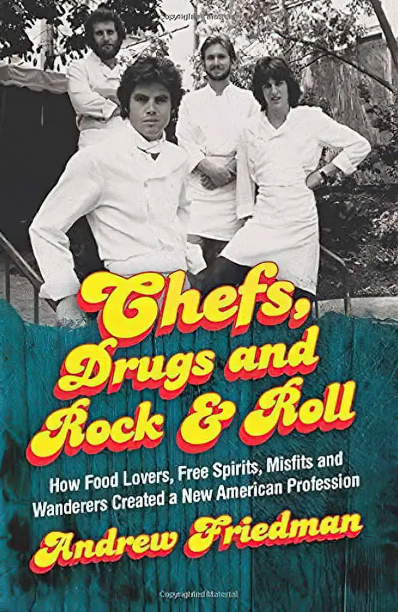
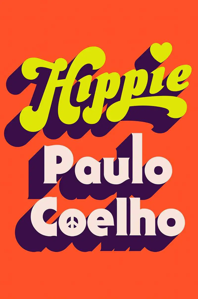
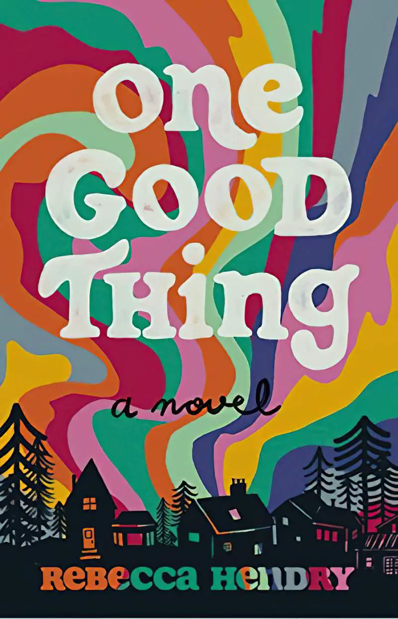
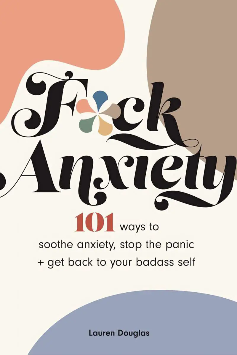
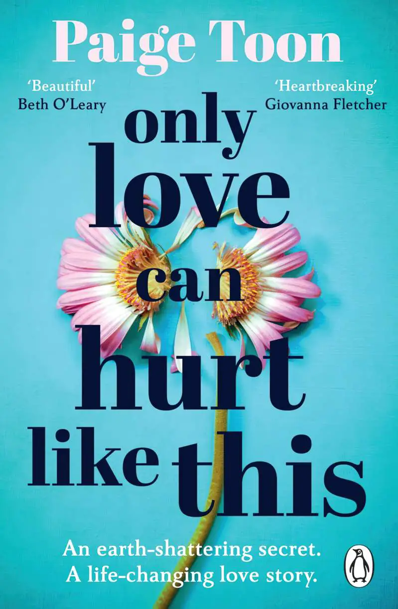
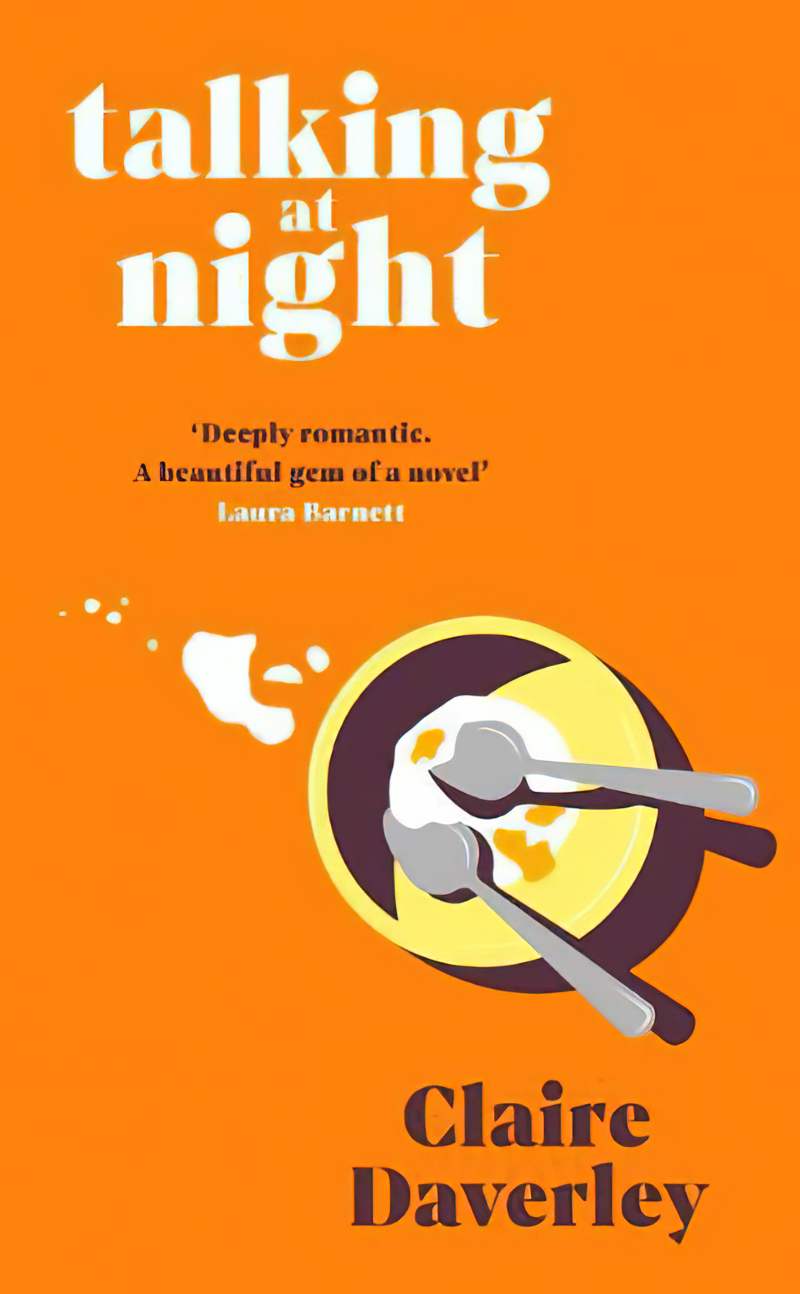
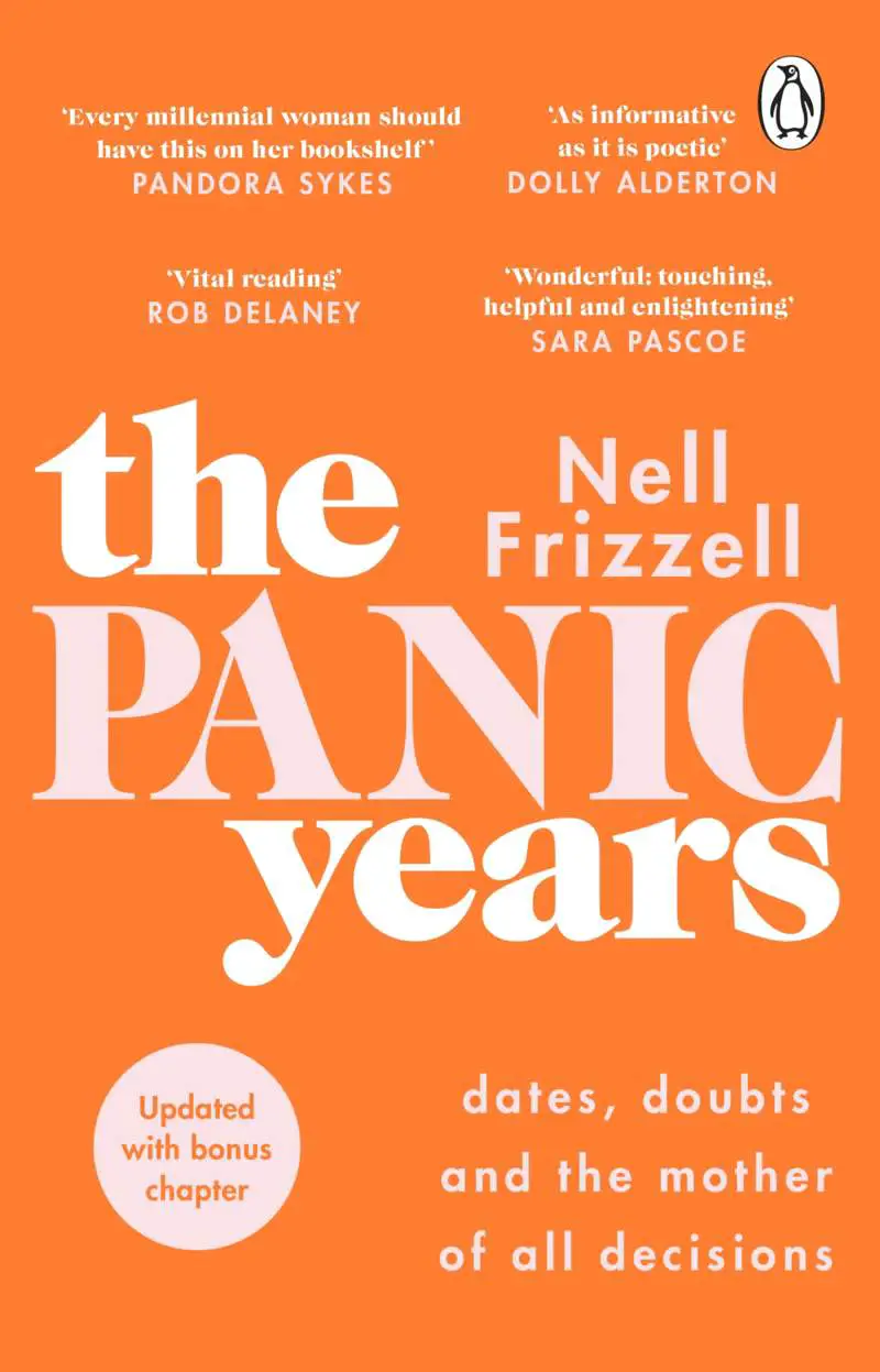
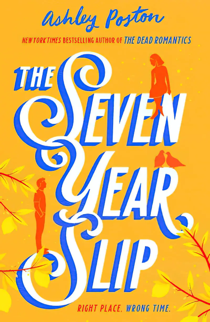
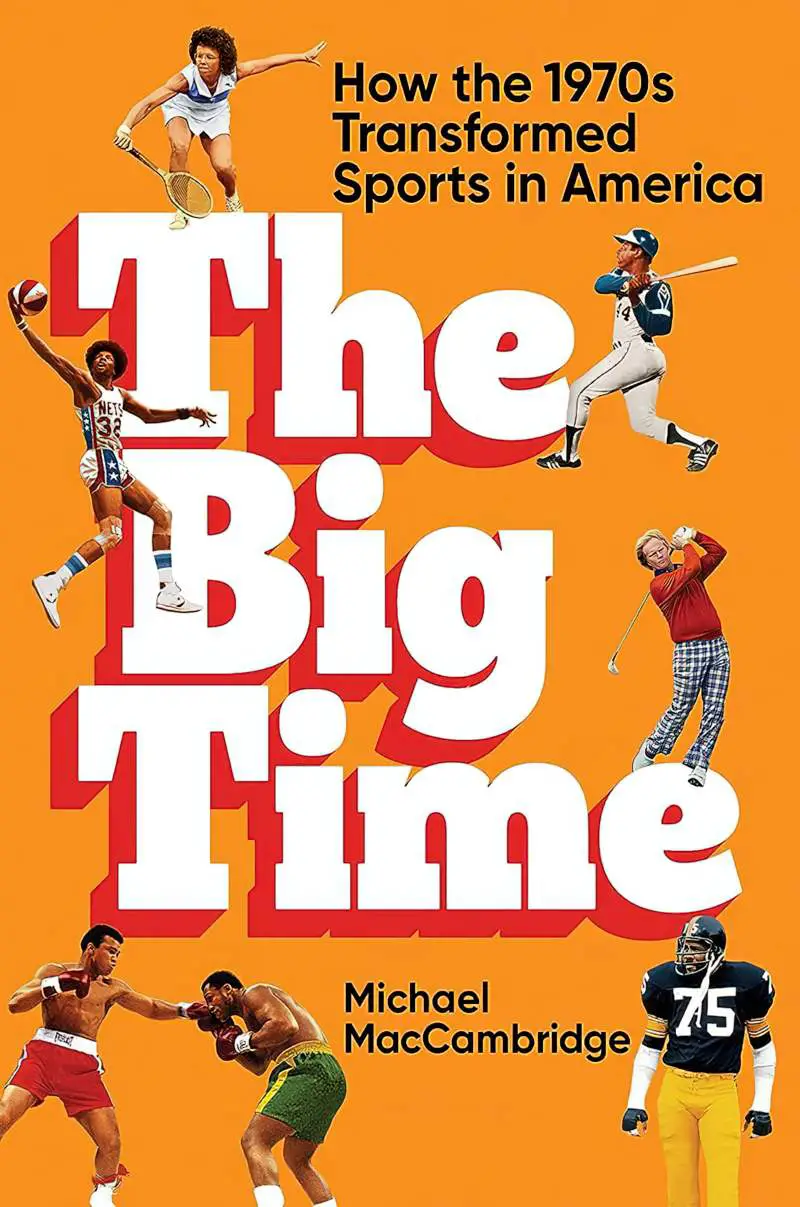
- When seen in contemporary design, colour palettes are frequently in the orange part of the spectrum, evoking the 1970s. The designer of Fire Rush has recoloured a photo to look psychedelic.
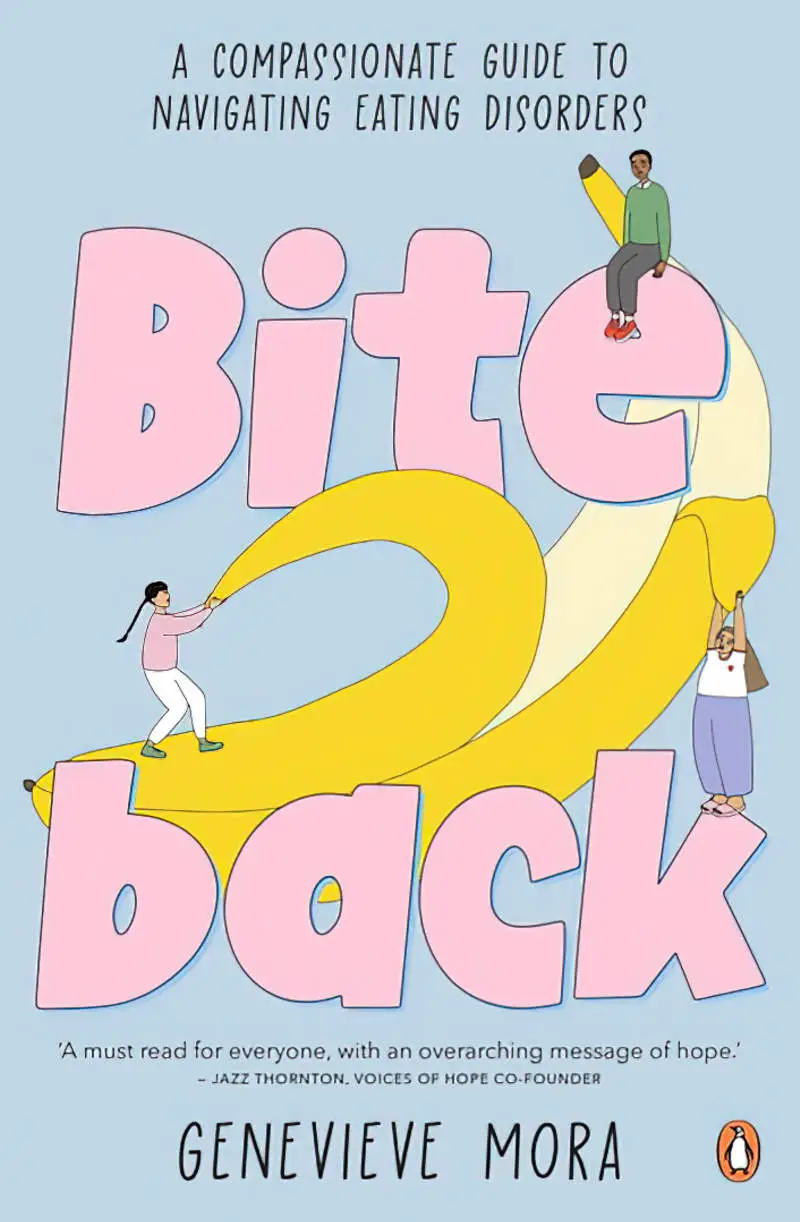
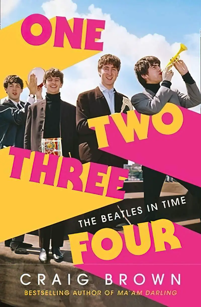
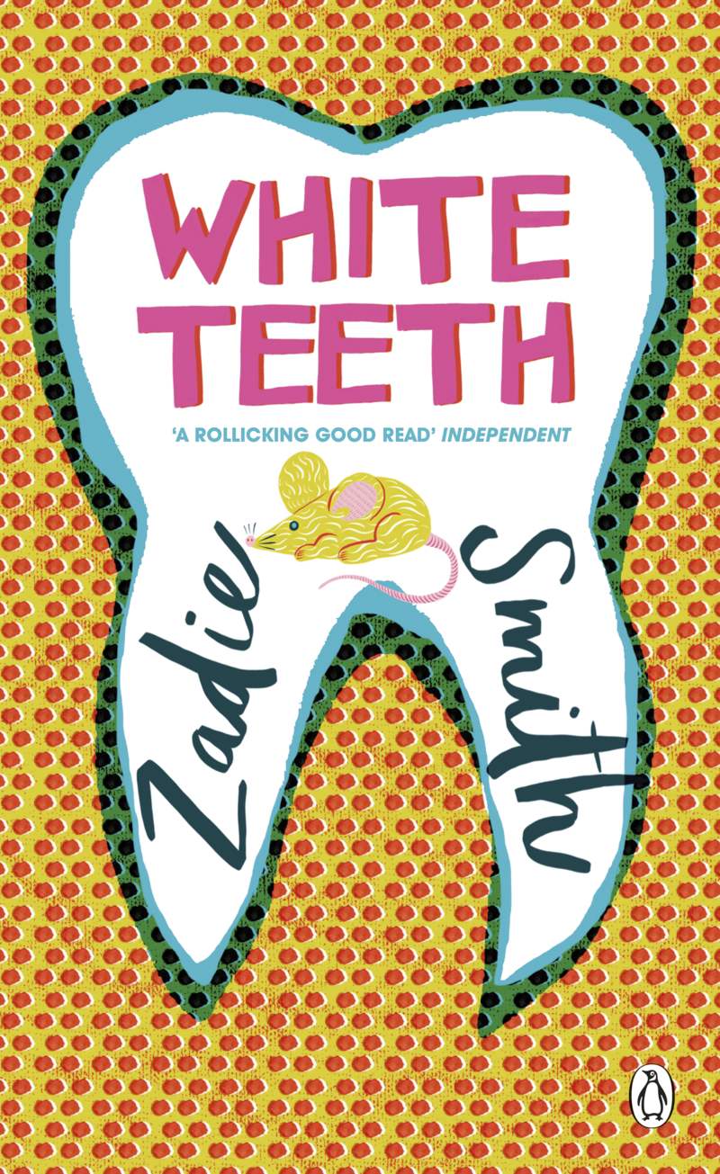
- On the cover of Bite Back we see this style but with the atomic style of illustration, which gives the book both a retro and modern feel.
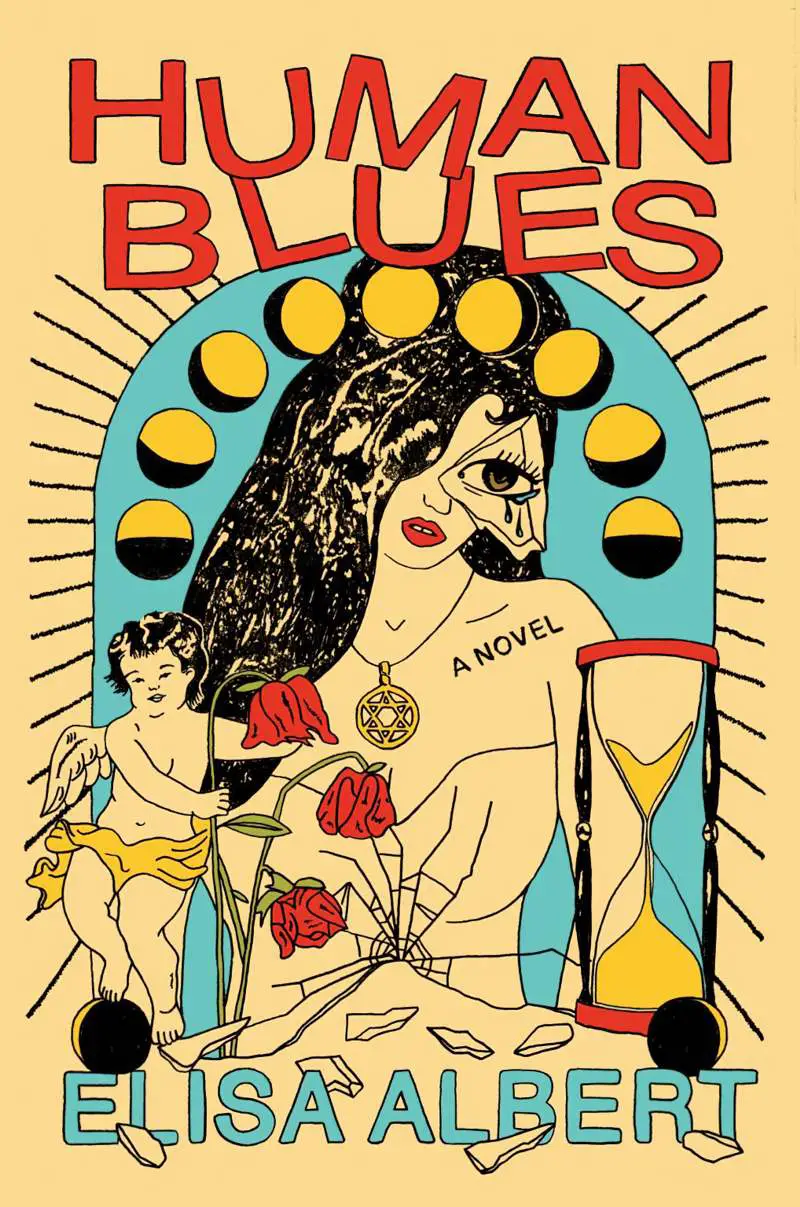
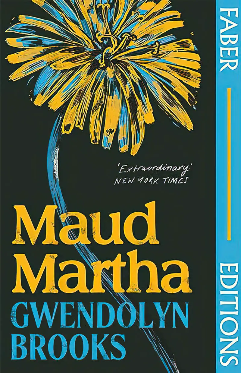
- The designer of Human Blues has made use of an off-white background colour to lend a retro feel, and also utilises stylistic elements reminiscent of a 1970s inspired by Bauhaus.
- Opaque extrusions rather than drop shadows are common, and look as if they could have been hand-drawn.


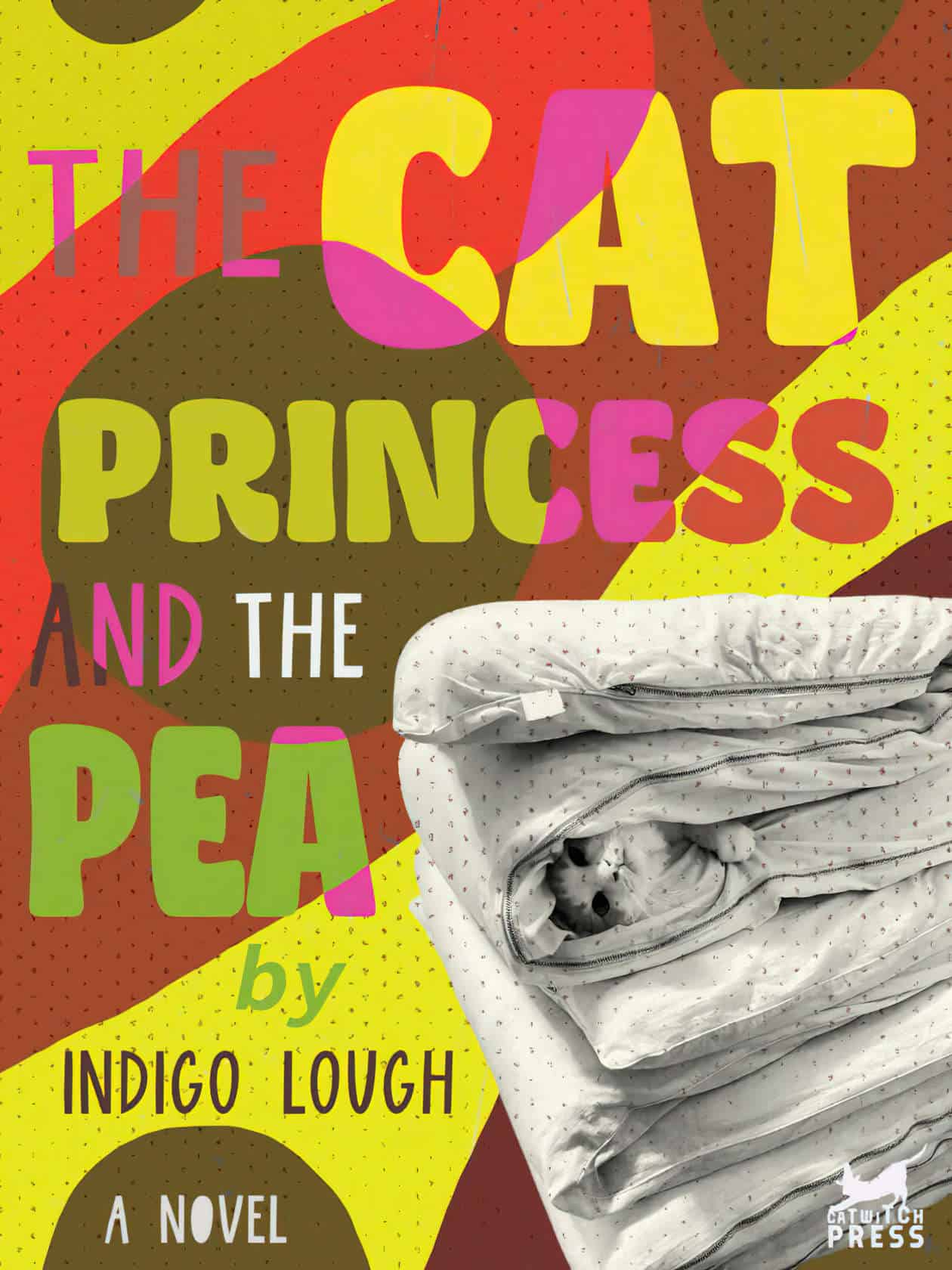
THE CAT PRINCESS AND THE PEA: A NOVEL
(This book doesn’t exist — I made it purely as design practice.)
THE PHOTO
I found the image of the cat between mattresses on Tumblr but it doesn’t have a credit. First I removed the background using ClipDrop’s remove background functionality because it actually works better than Photo software at the moment.
Next I desaturated the photo of the cat between the mattresses and pulled down the curves to blacken the darks.
COLOURS
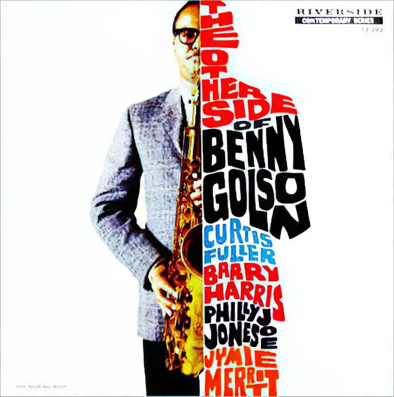
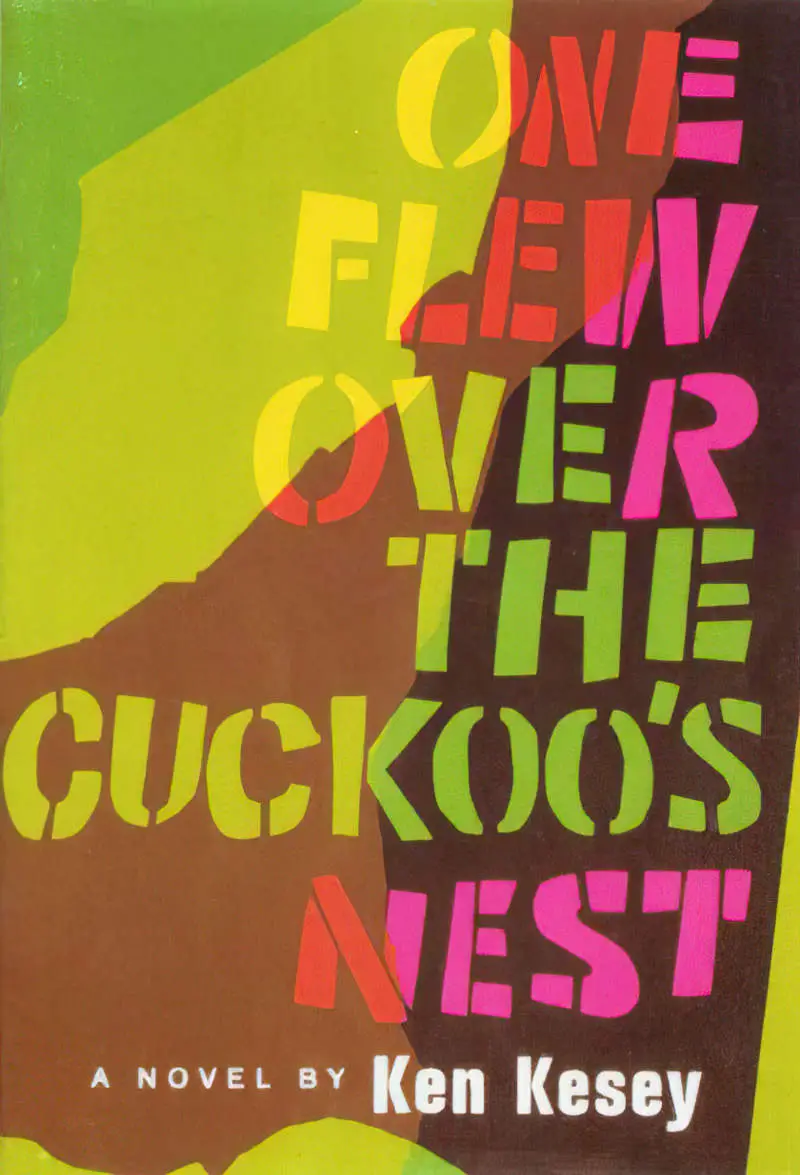
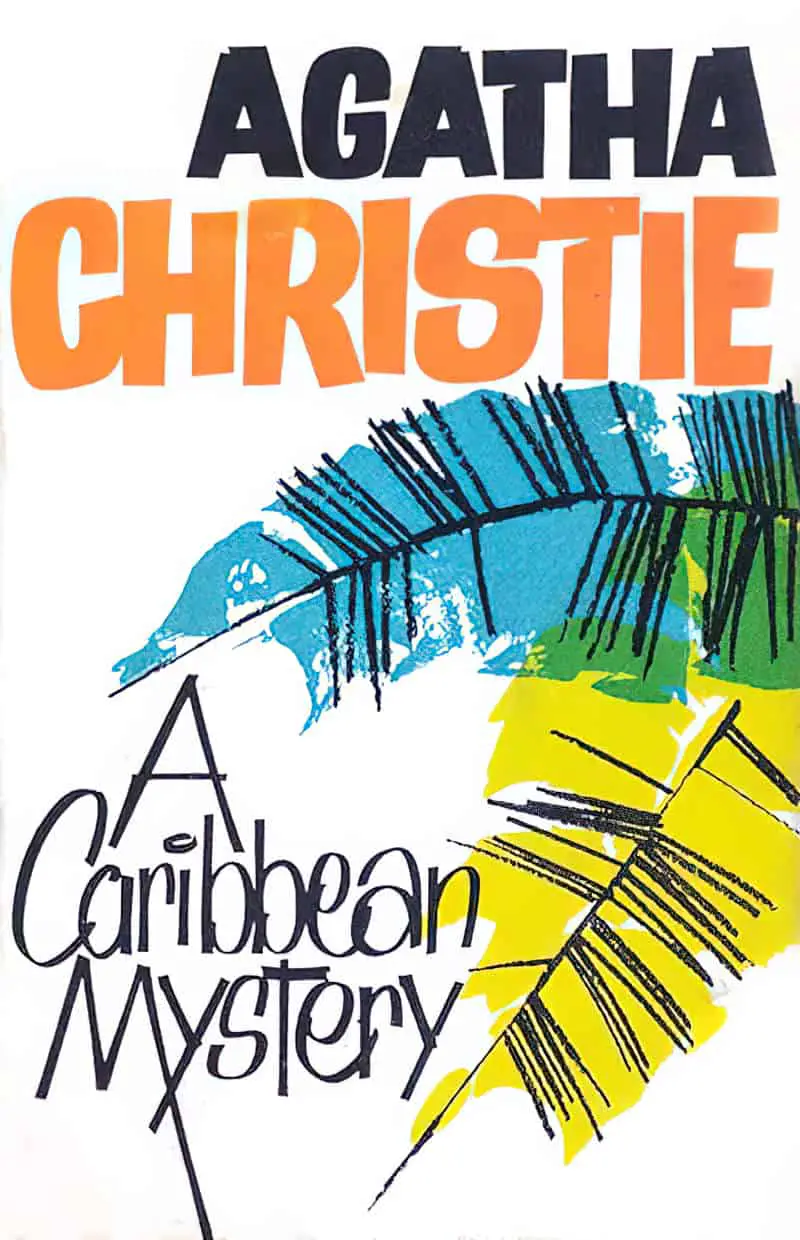
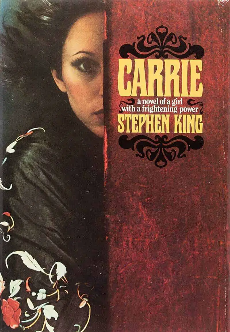
For the colour palette I imported into Affinity Photo Paul Bacon’s retro cover for One Flew Over The Cuckoo’s Nest. From the dropdown menu on the Swatches I selected Create palette from document.
I inked the background manually with a large comic brush.
The fonts
Ocean Secret, Smooth Soul and Source Code Pro Bold Italic for the ‘by’. I rasterised the text layer and painted over the letters manually, using the same brush I used for the background.
TEXTURE
Finally I added a scratchy texture layer and set it to Hue blend mode (which turned the black scratches blueish.) And another texture layer for the dots, placed underneath the text and set to Multiply blend mode.