The All Typography Book Cover

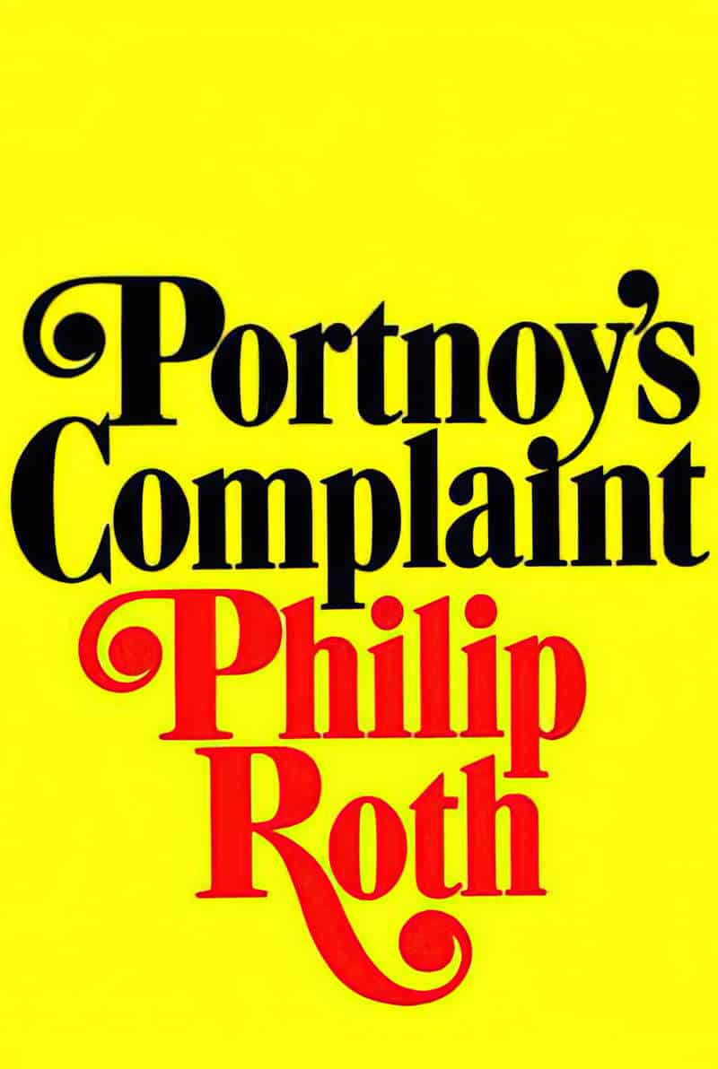
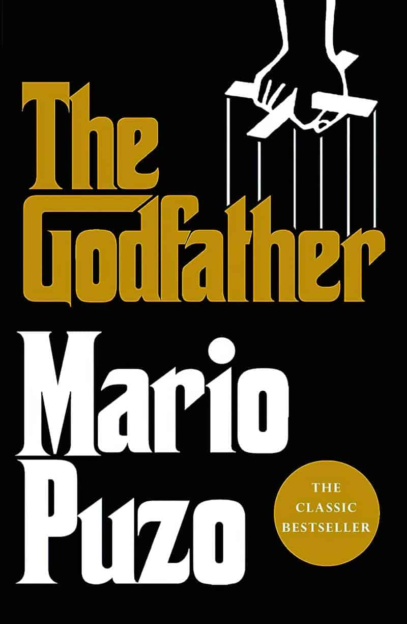
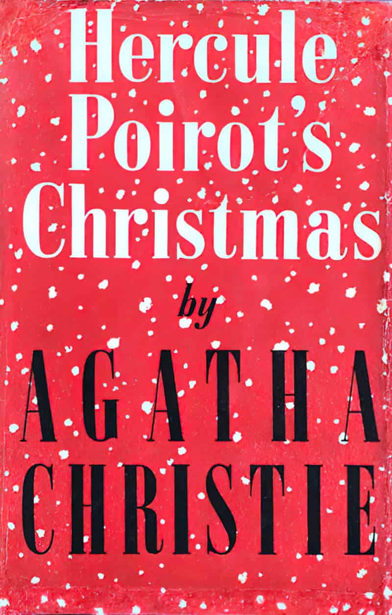
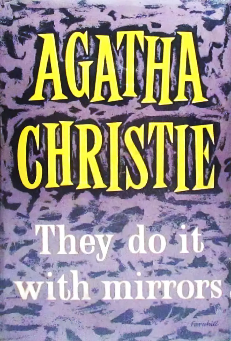
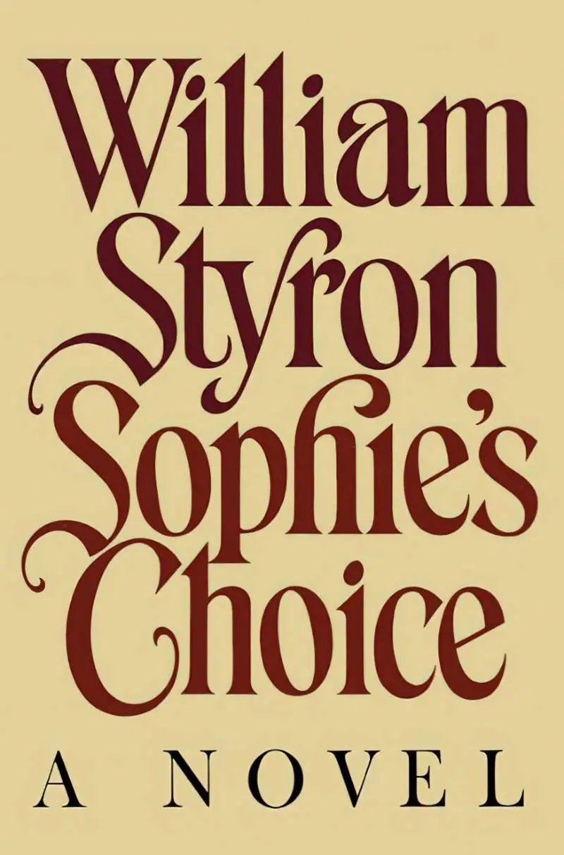
It was graphic designer Paul Bacon who popularised the all-typography cover last century. This category of cover will be familiar to you and look contemporary, because it has come back into style.

THE BIG BOOK LOOK

According to his obituary in the New York Times, Bacon was responsible for what became known as the “big book look,” a widely imitated style that stressed big typography and blocky colours with understated drawings. Bacon saw his job as “finding something that would be a synthesis graphically of what the story was about,” he told Print magazine in 2002. He was one of the best at it, and his work inspired generations of designers like Chip Kidd and Peter Mendelsund

WNYC
Sophie’s Choice Paul Bacon cover

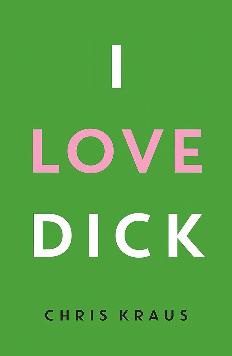
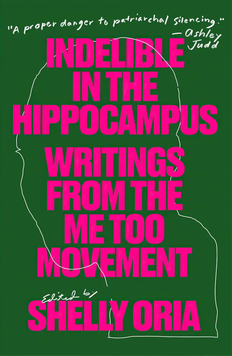
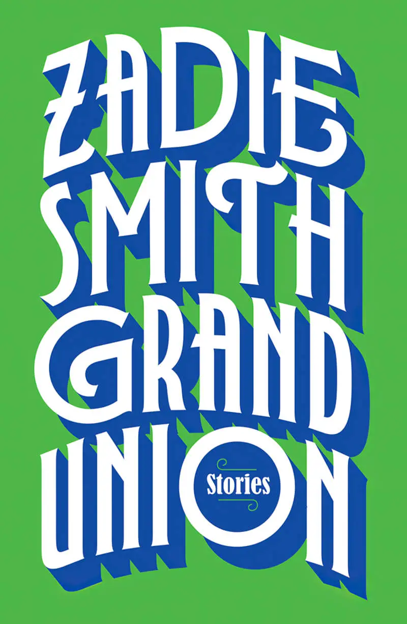
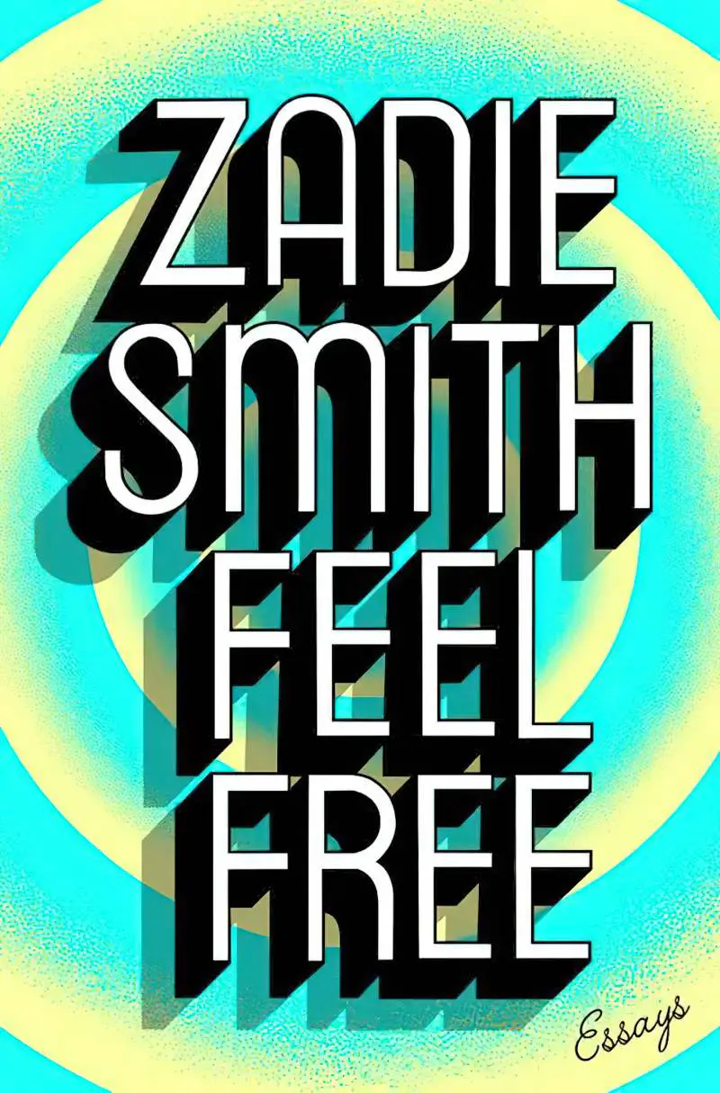
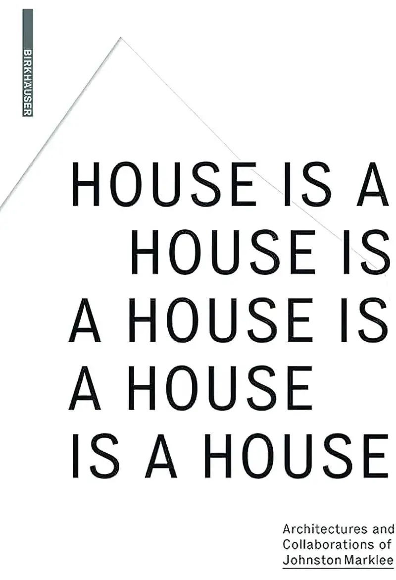
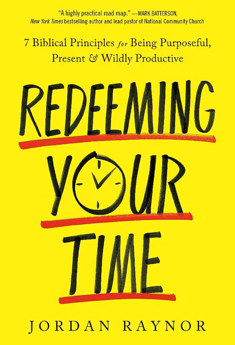
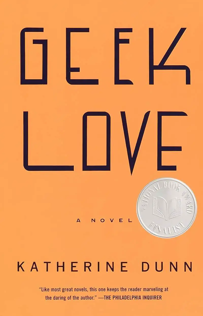
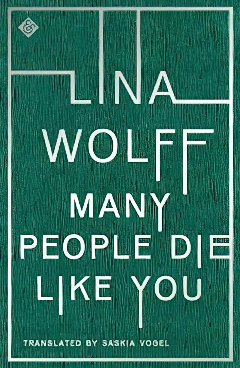
Below I have collected a mixture of contemporary examples of The Big Book Look on covers, with typography as the main — or only — element:

CONTEMPORARY FICTION SET IN AUSTRALIA AND NEW ZEALAND (2023)

On paper, things look fine. Sam Dennon recently inherited significant wealth from his uncle. As a respected architect, Sam spends his days thinking about the family needs and rich lives of his clients. But privately? Even his enduring love of amateur astronomy is on the wane. Sam has built a sustainable-architecture display home for himself but hasn’t yet moved into it, preferring to sleep in his cocoon of a campervan. Although they never announced it publicly, Sam’s wife and business partner ended their marriage years ago due to lack of intimacy, leaving Sam with the sense he is irreparably broken.

Now his beloved uncle has died. An intensifying fear manifests as health anxiety, with night terrors from a half-remembered early childhood event. To assuage the loneliness, Sam embarks on a Personal Happiness Project:

1. Get a pet dog

2. Find a friend. Just one. Not too intense.

PAPERBACK

KINDLE EBOOK

MORE INFO

error: Content is protected