Graphic designers and digital artists will frequently go to Layer > Add Fill Layer then set it to multiply blend mode and lighten the opacity to tie a work together (functioning much like a glaze). Here’s an example of that:

There’s always more than one way of doing something in Photo software. (I use Affinity products.) Rather than a Fill layer, you might alternatively add a Recolour adjustment layer from the layers panel, adjust the sliders and change the blend mode from within that window (most frequently to Multiply, or to Linear Burn if you want to emphasise the blacks).
For more precise control of how your blend mode layers interact with each other, don’t forget to click on the little cog icon to the right of the dropdown menu. I was using blend modes for years before I realised I could make use of this option to make whites whiter and darks darker. (Here is the Blend Ranges instruction page in Affinity Photo.)
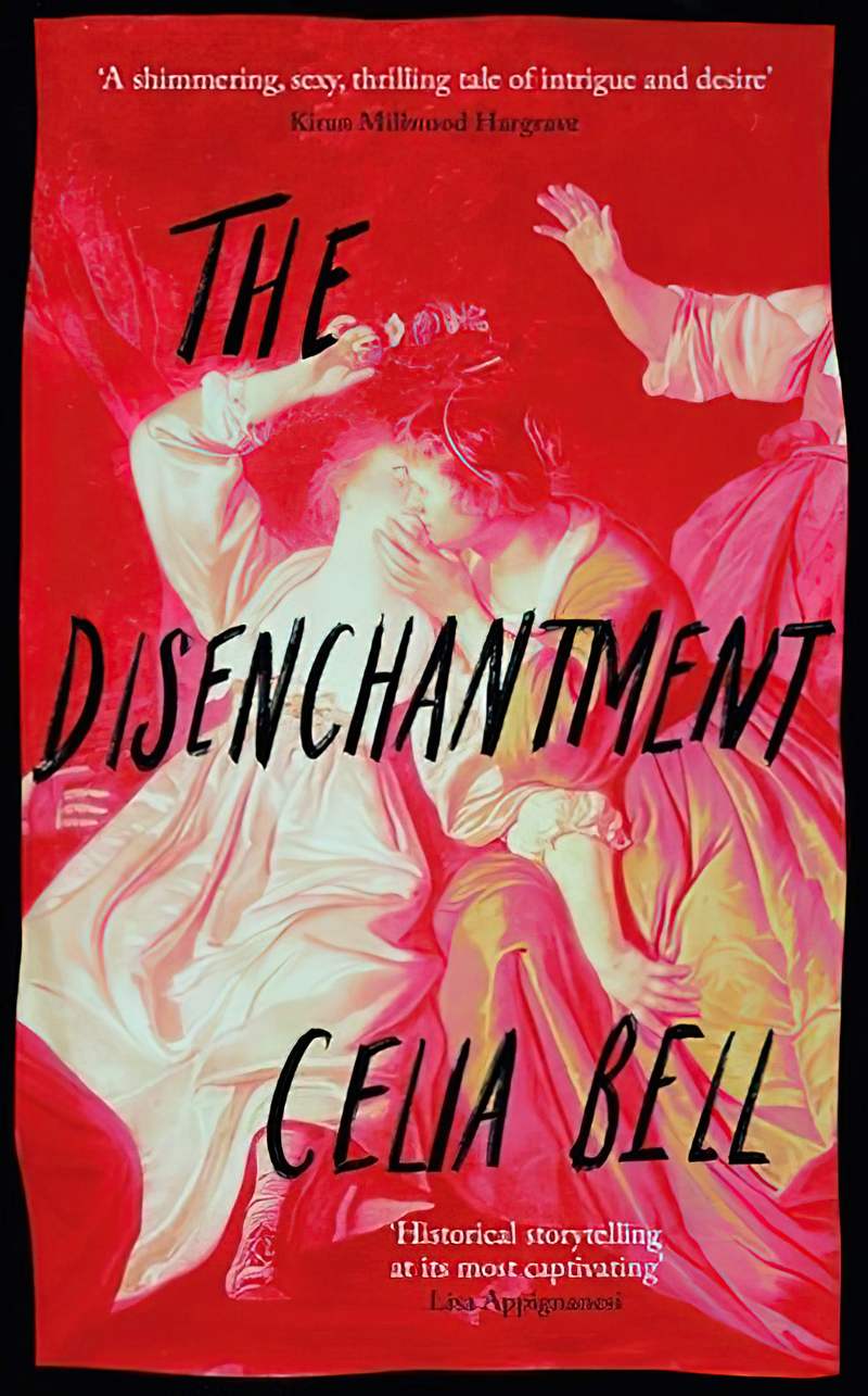
So, lowering the opacity of a blend layer ties a colour scheme together. But today I’m interested in when designers leave multiplied blend mode colours at high or full opacity.
The image has now shifted from the ‘representational’ end of the realist spectrum towards ‘non-representational.’ Non-representational images defamiliarise the real world and encourage viewers to see their own familiar worlds afresh. In this way, a cover can make a promise to readers about what a story is likely to do.
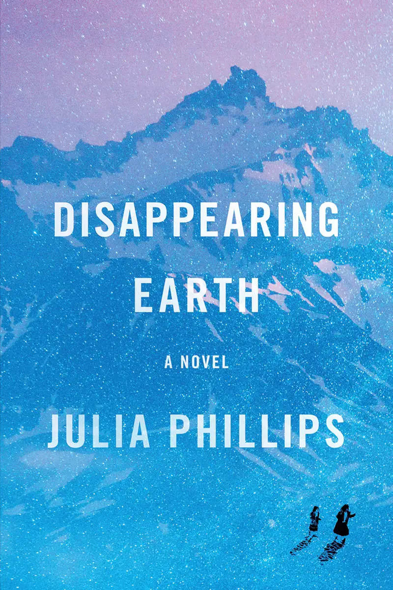
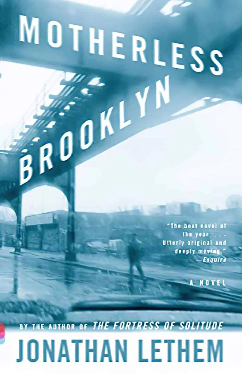
SUBTLE RECOLOURING
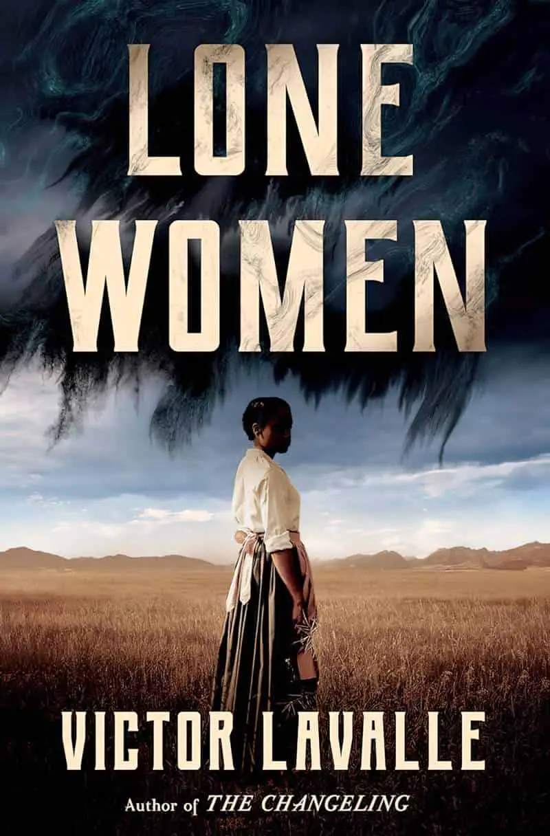
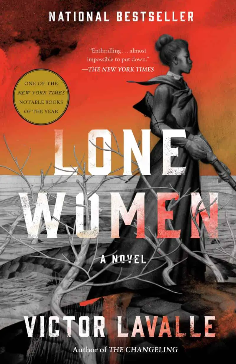
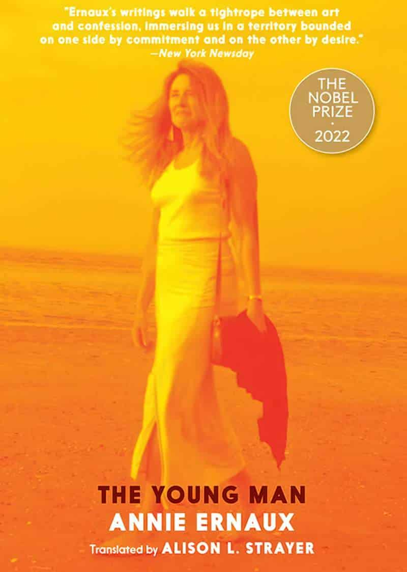
If you see a photograph on the front of a book, you can guarantee it’s had something done to it. Here are some fairly subtle examples:


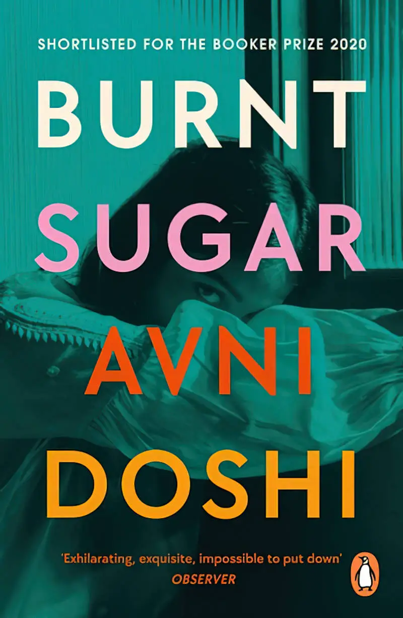
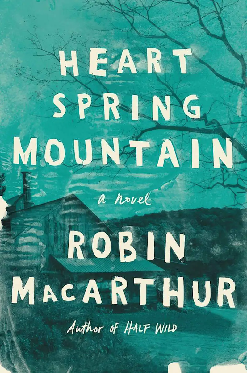
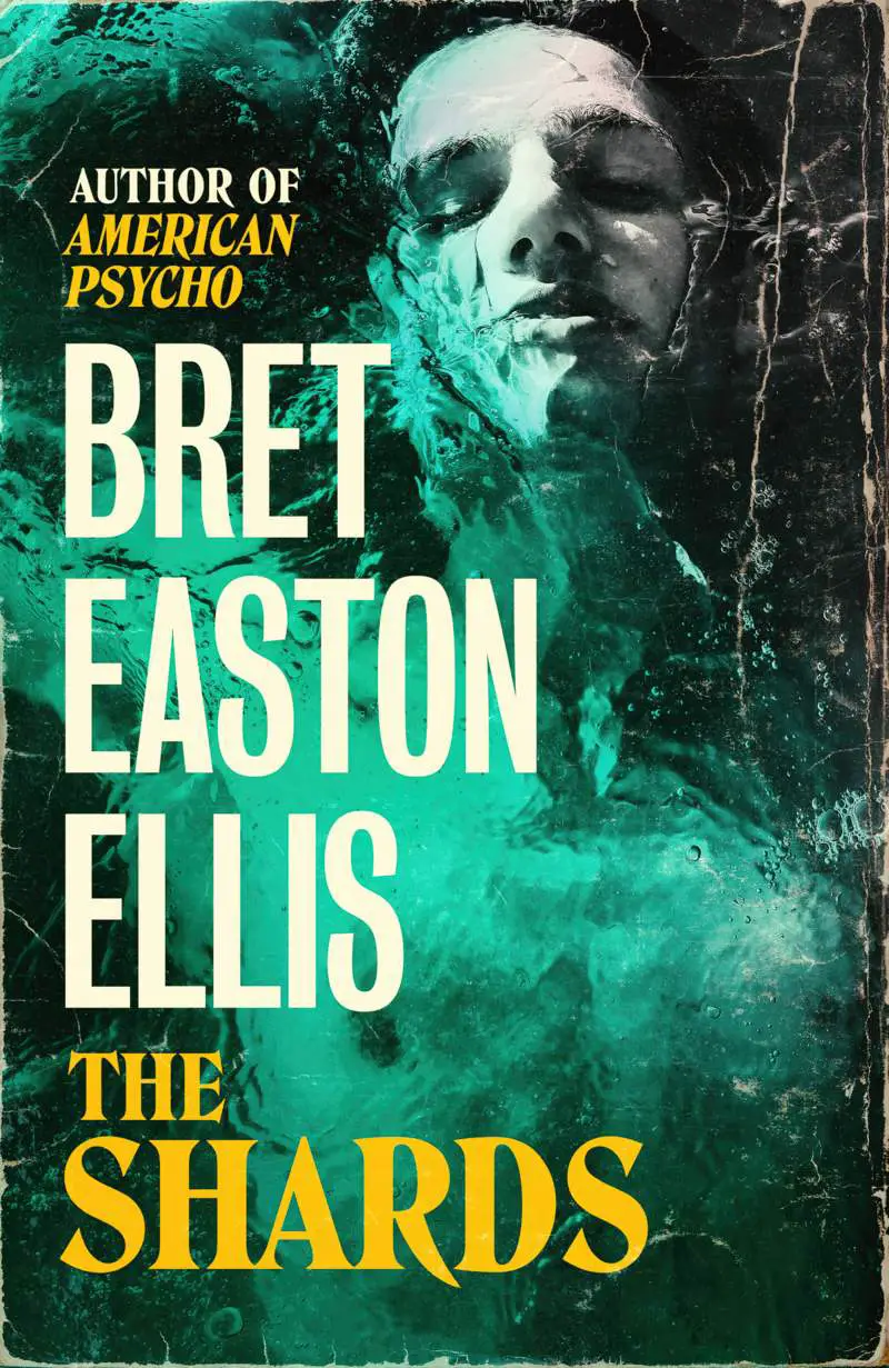
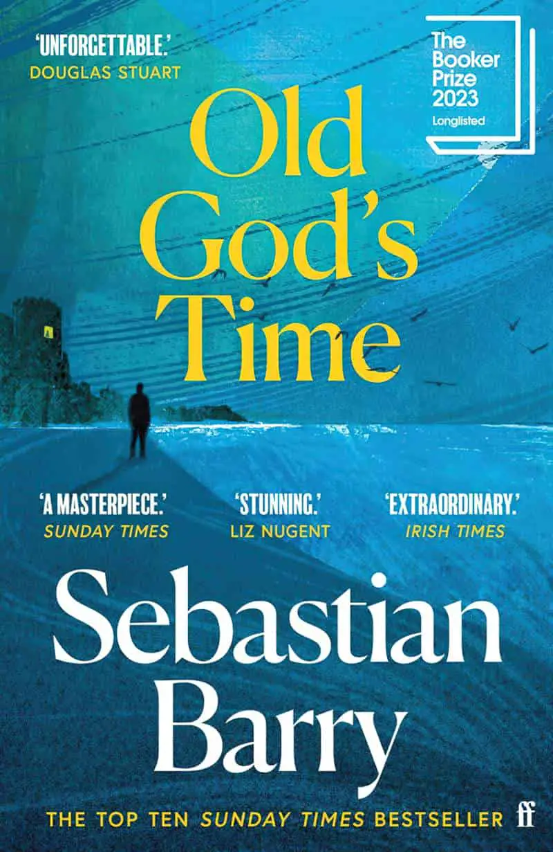
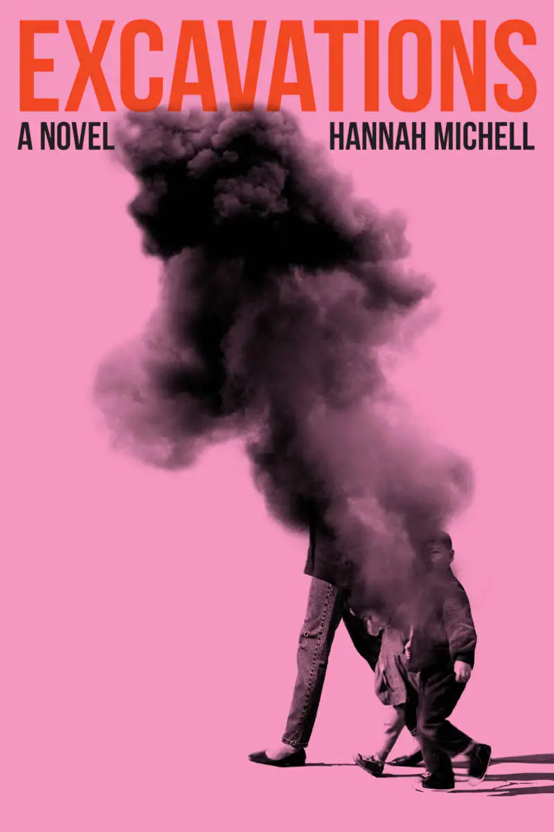
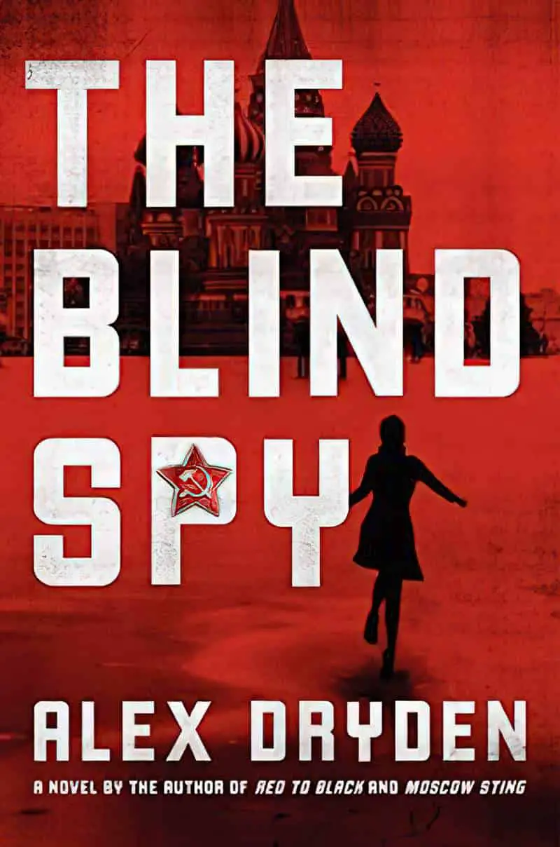
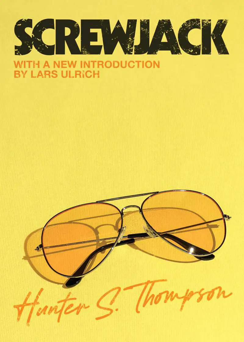
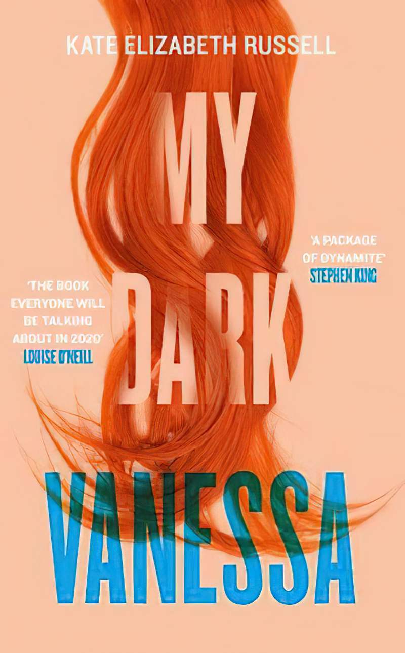
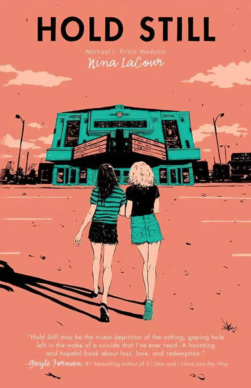
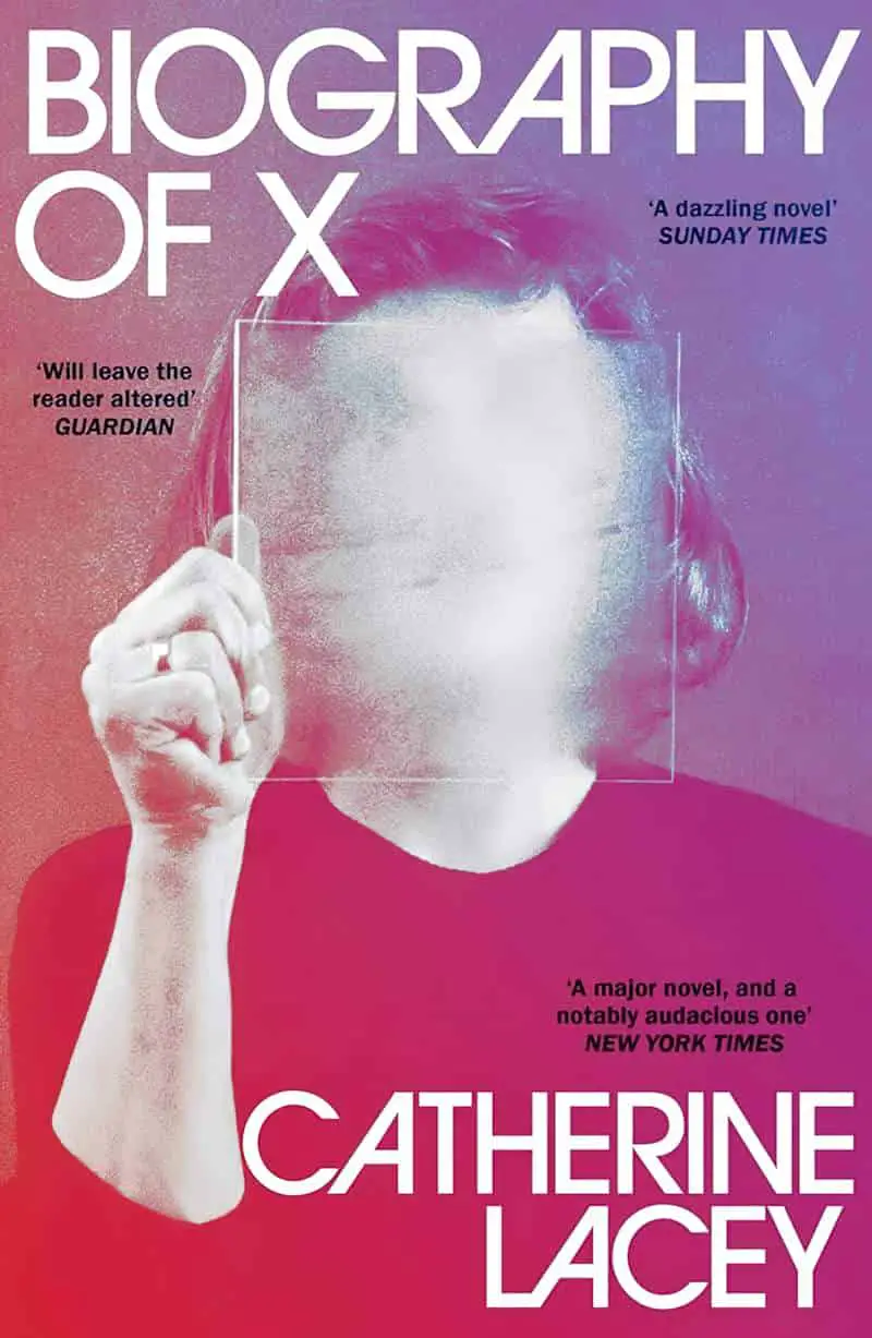
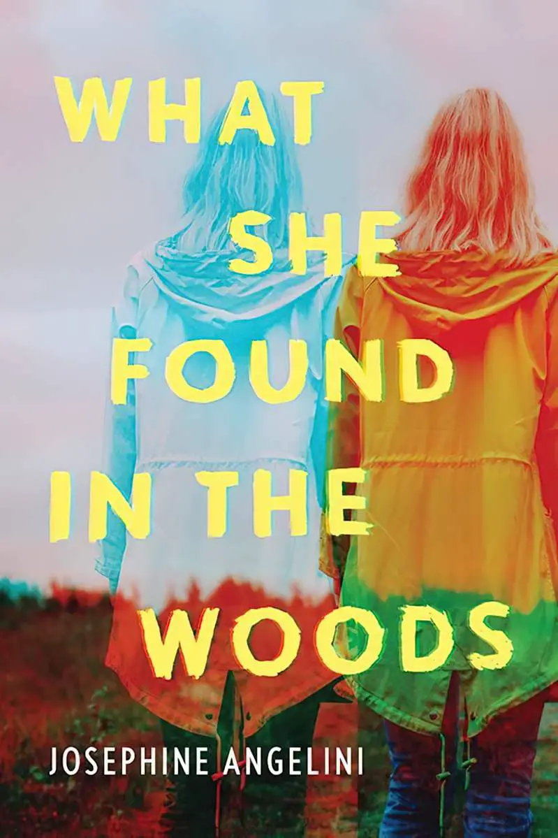
RECOLOURING WITH SINGLE FILL LAYERS


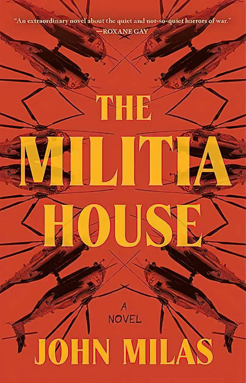


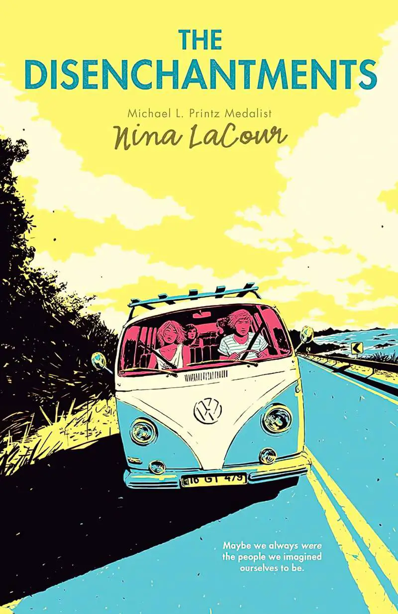
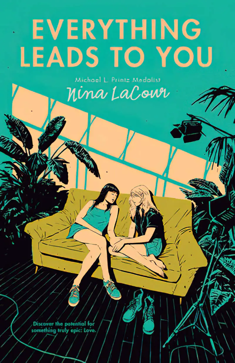
POSTERISED RECOLOURING
(I’m sure much of this is hand-drawn — I’m just trying to describe the look.)
Other examples of posterisation:

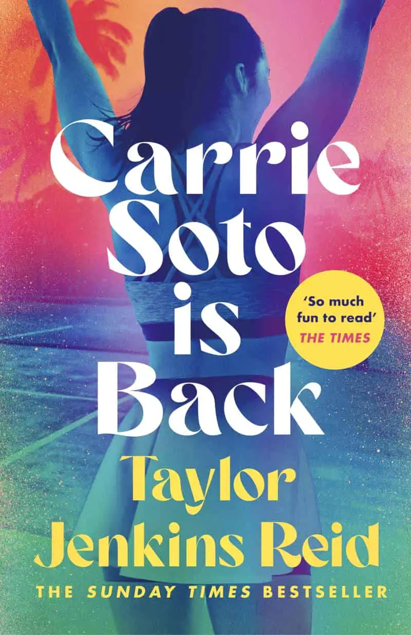
GRADIENT RECOLOURING


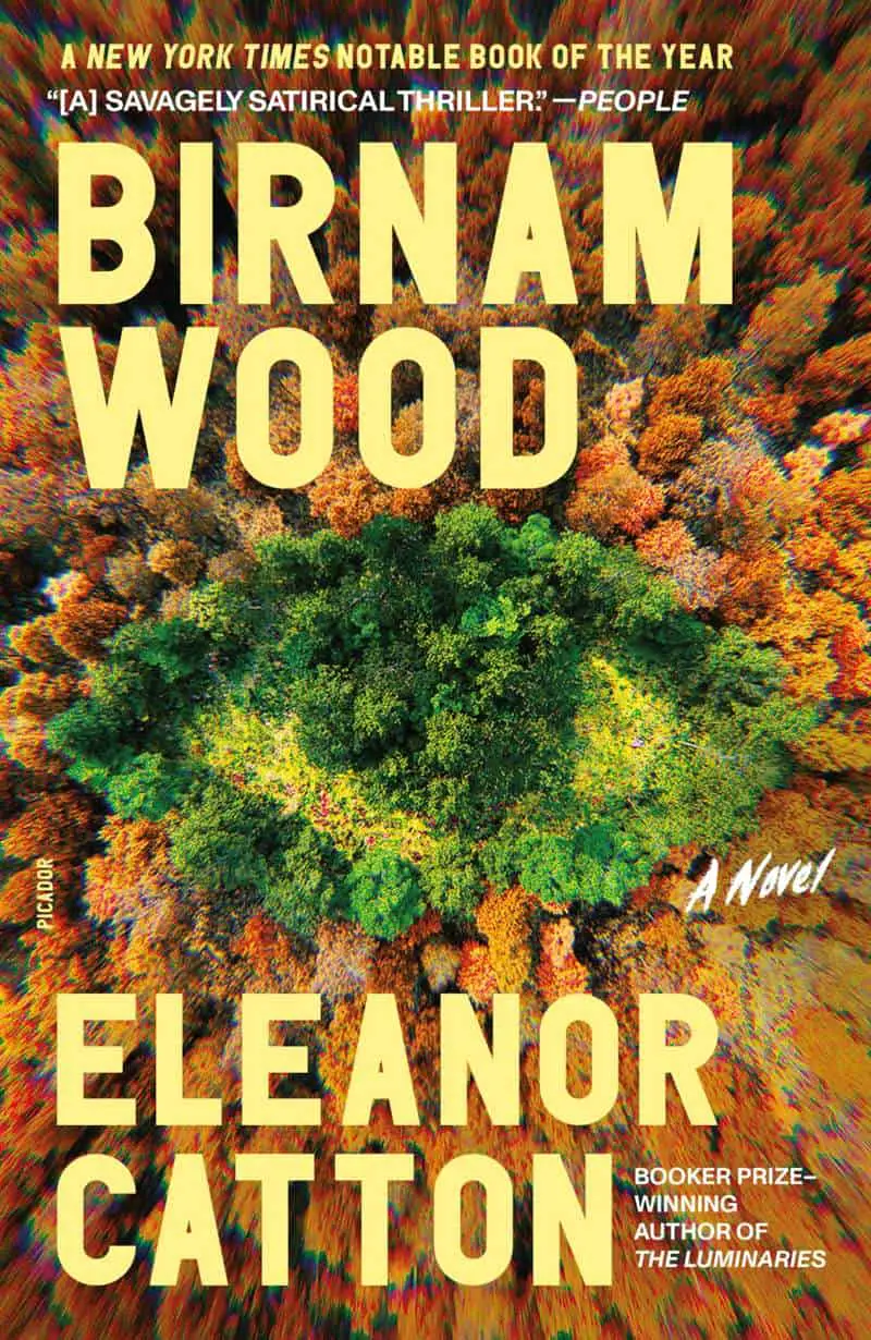
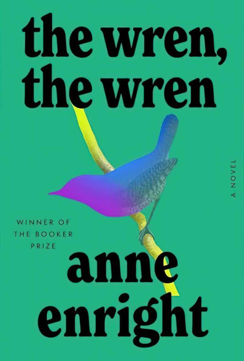
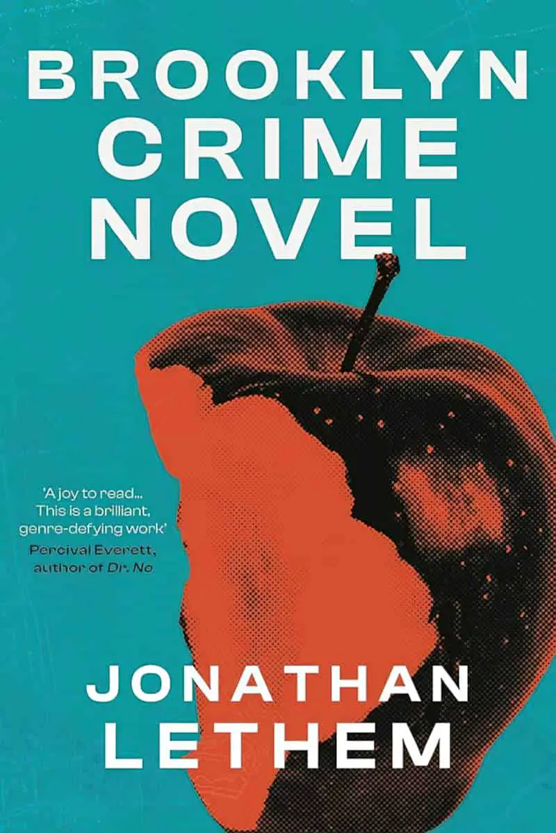
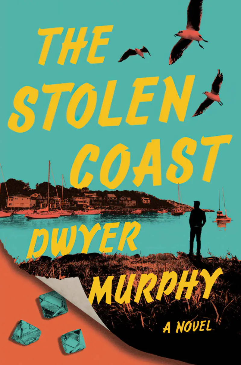
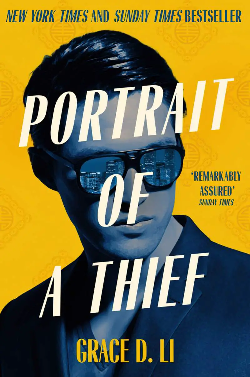
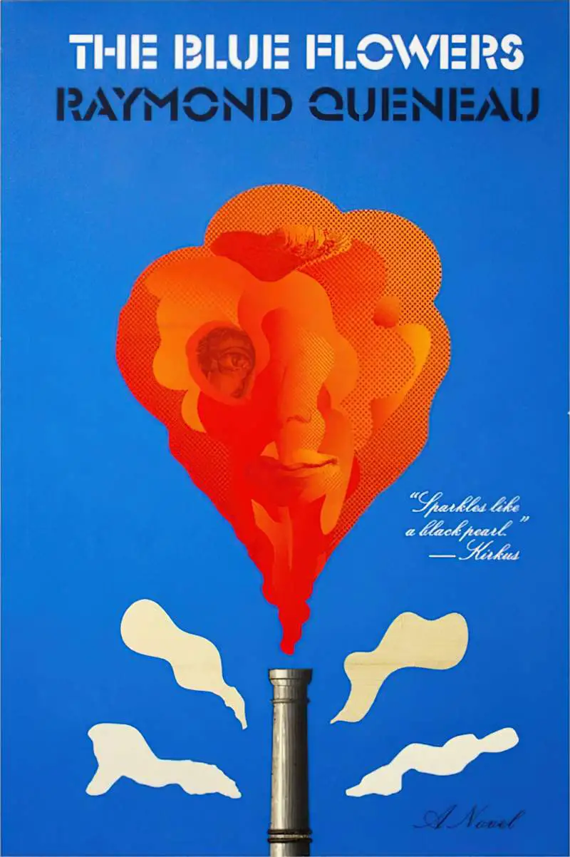
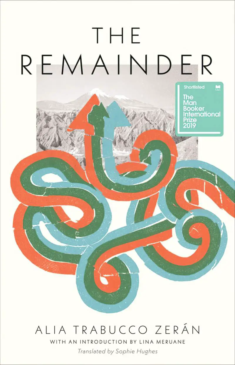
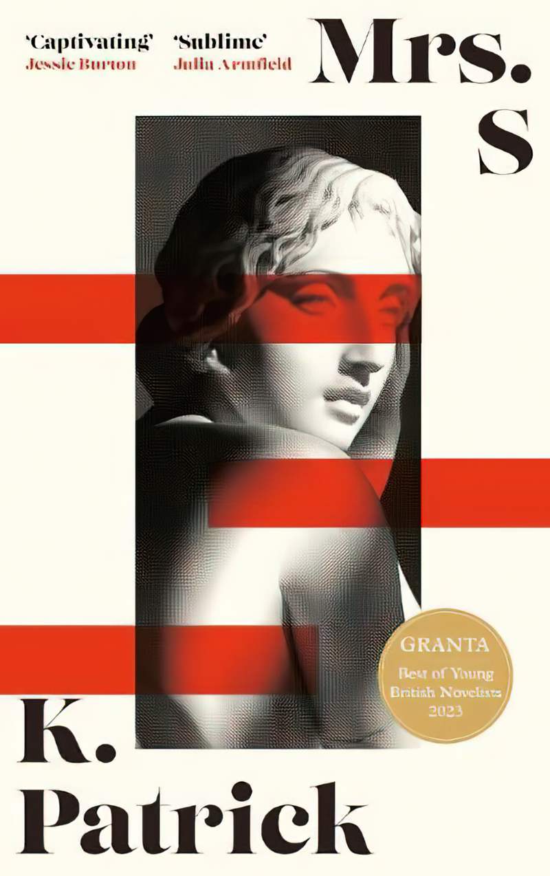
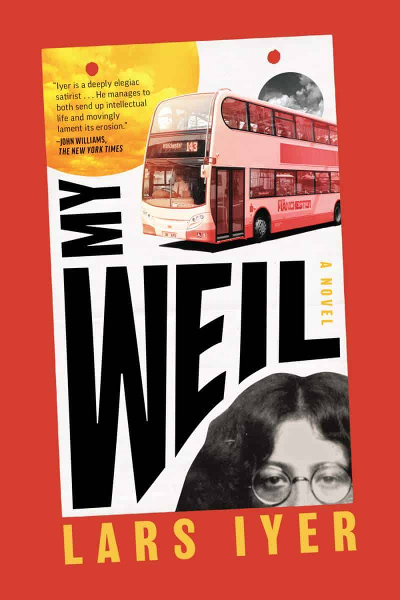
MORE COMPLEX RECOLOURING EXAMPLES
The book covers below use this technique for selected or for multiple parts of an image.
For example:
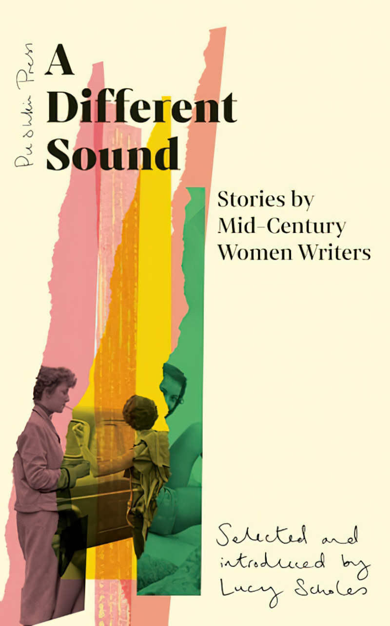
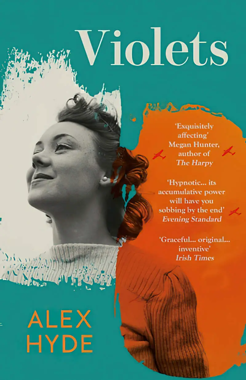
- Torn strips of paper or blob shaped masks laid over a black and white photo on the covers of Violets and A Different Sound.
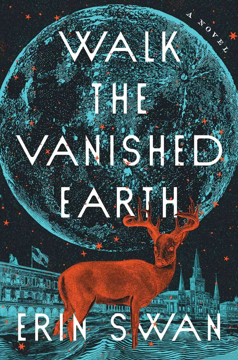
- A Contrast Negate blend mode layer inverts the lights and darks before colour tinting is applied in Walk the Vanished Earth. (To be honest, this could have been sketched/etched by hand.)
- Recolouring foiled layers of a geometric border of The Removed.
- The border colour applied as a colour layer to photographs within that border, unifying the colour scheme on the cover of My Weil.
- A Bauhaus touch on the cover of Mrs. S.
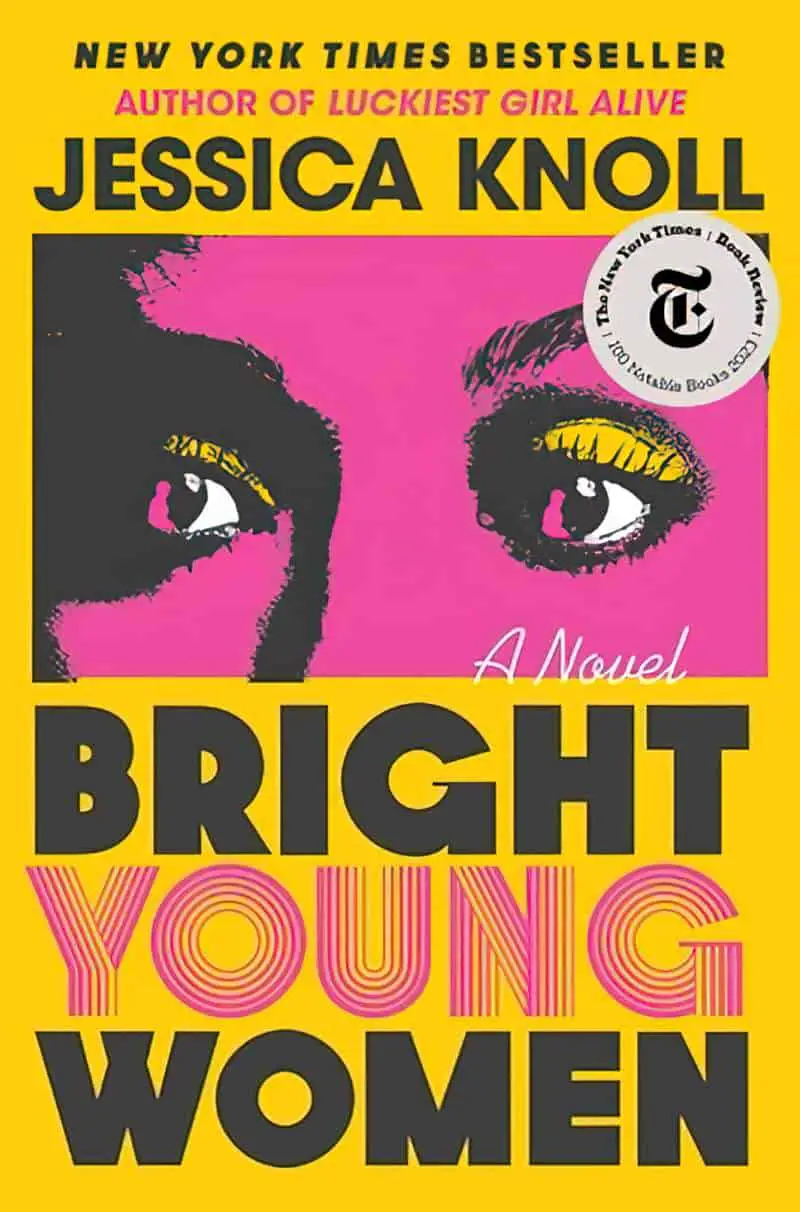
- Two dominating complementary colours on the cover of The PO.


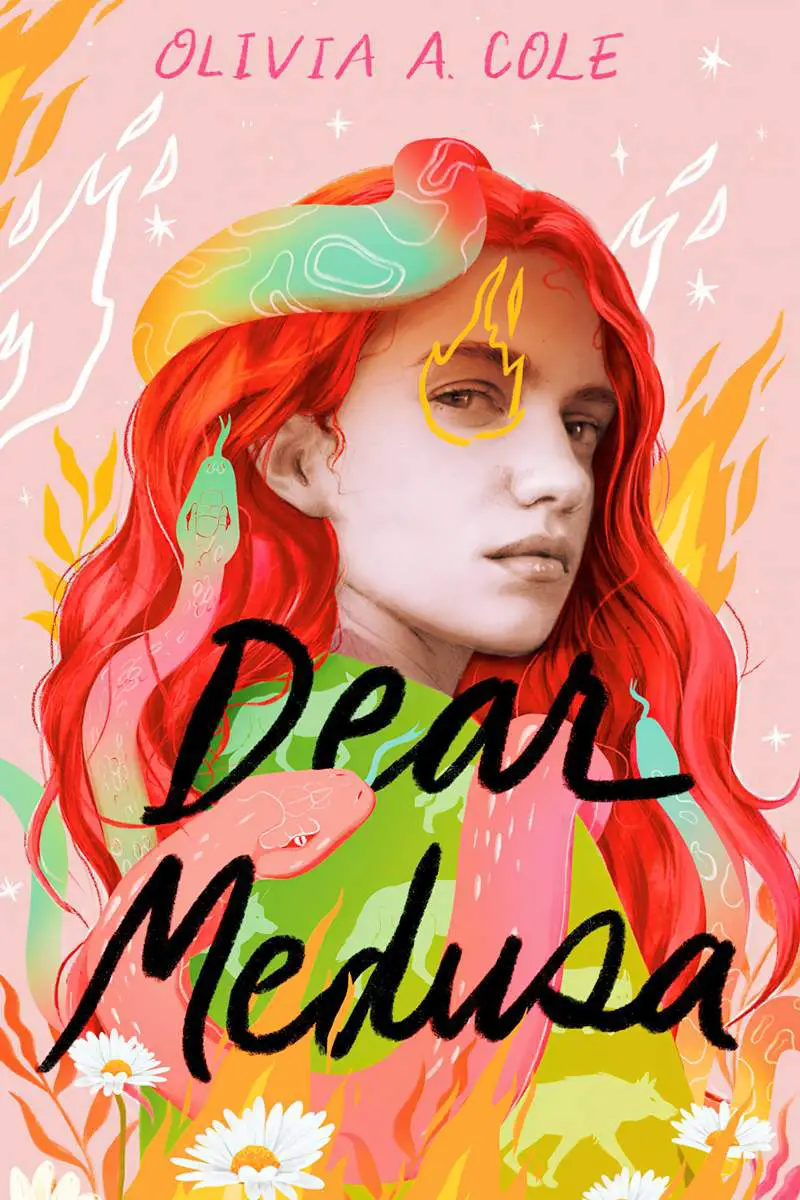


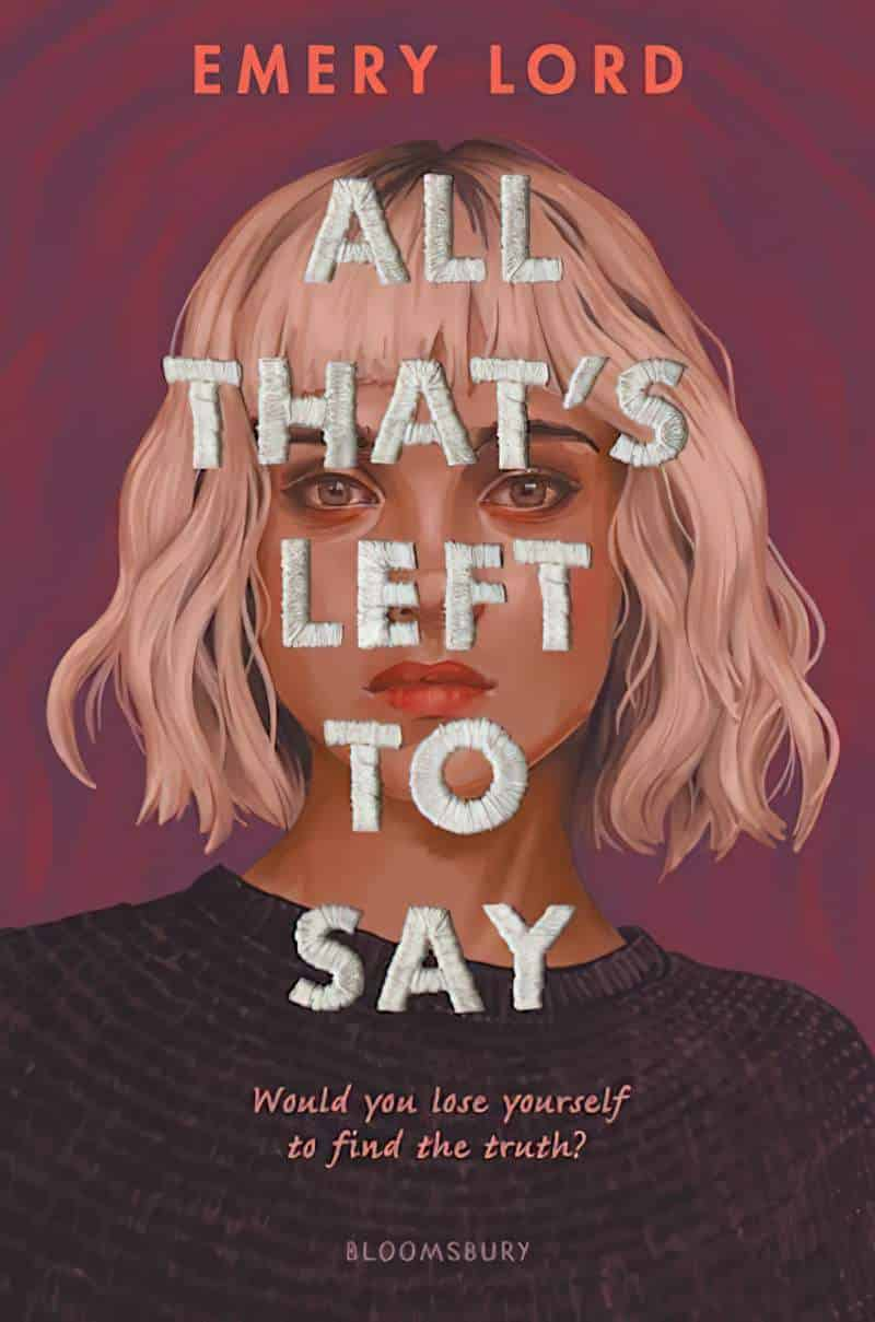
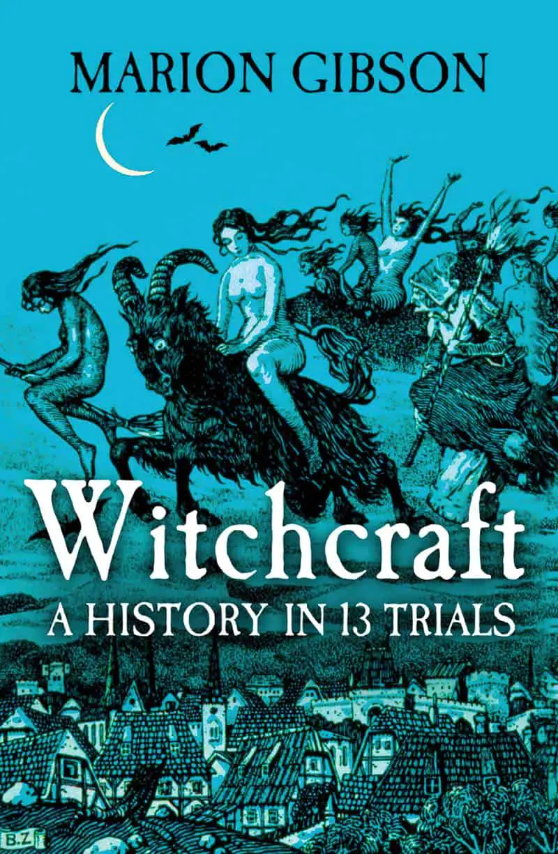
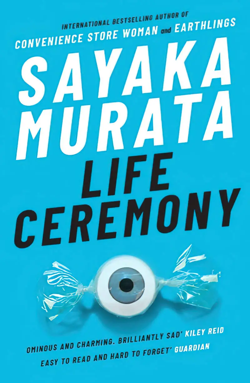
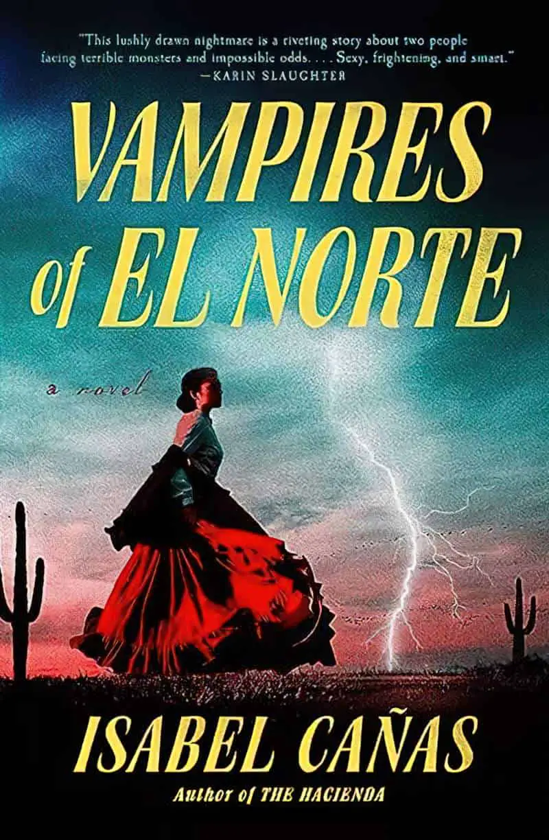
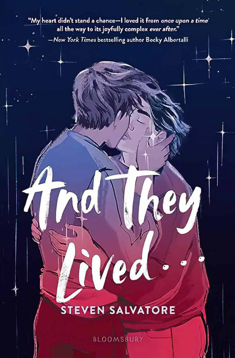
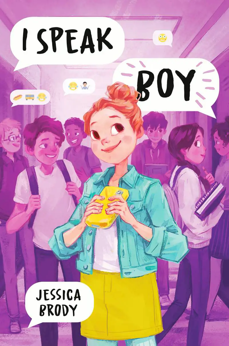
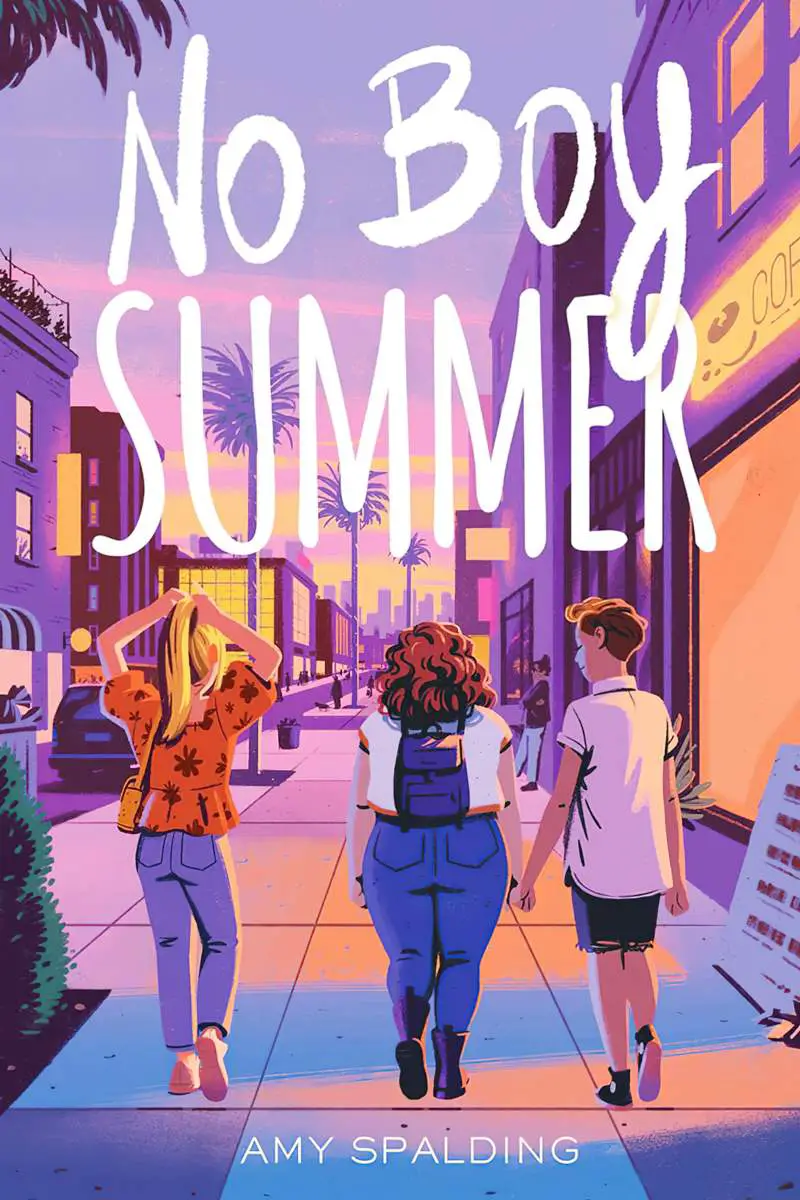
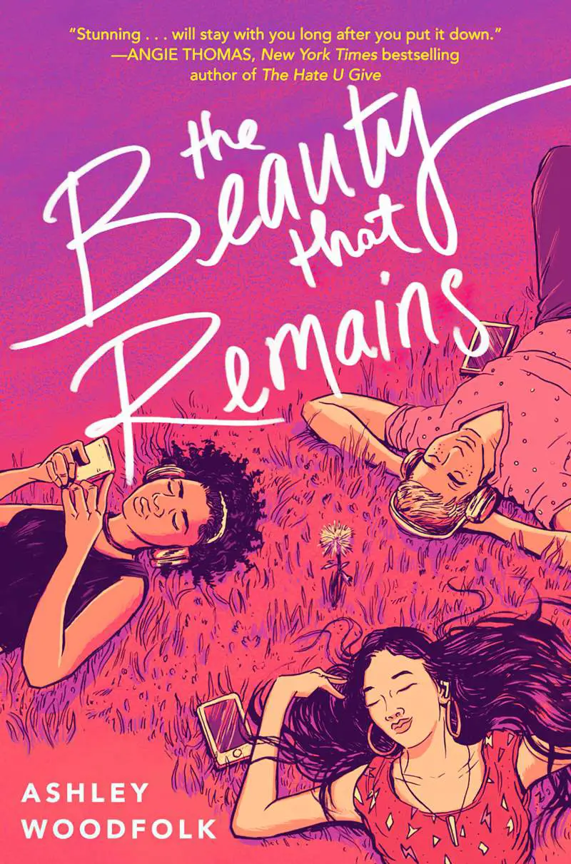
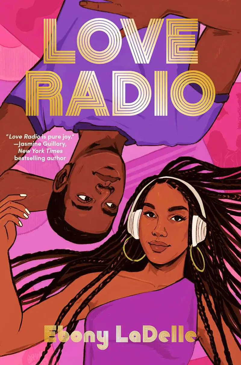
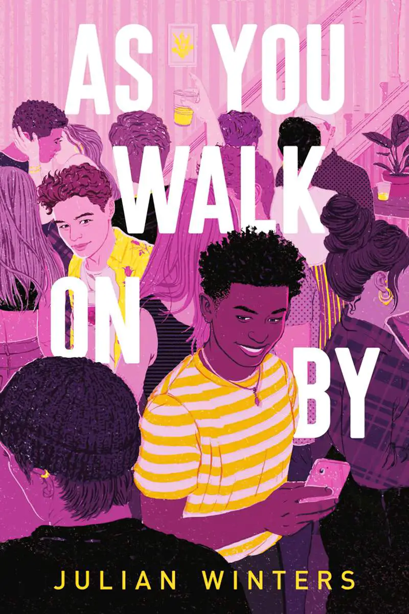
Strong ambient colour in illustrated book covers
Purple is popular on the covers of young adult novels:

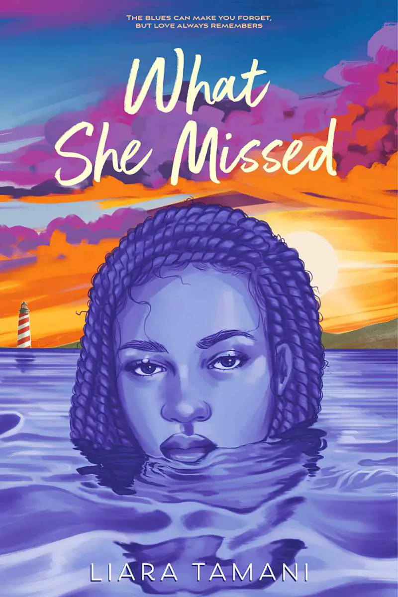
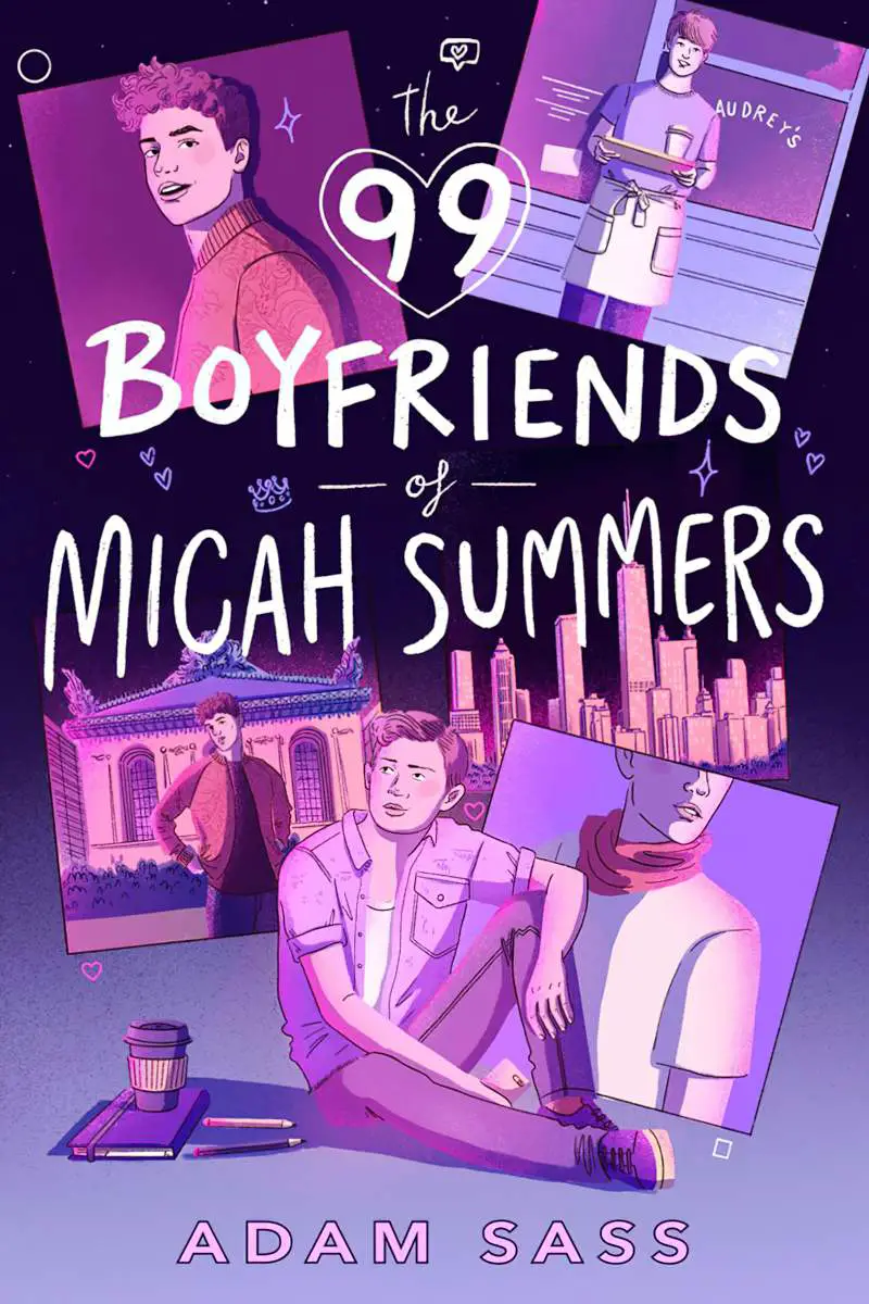
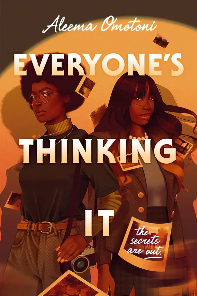
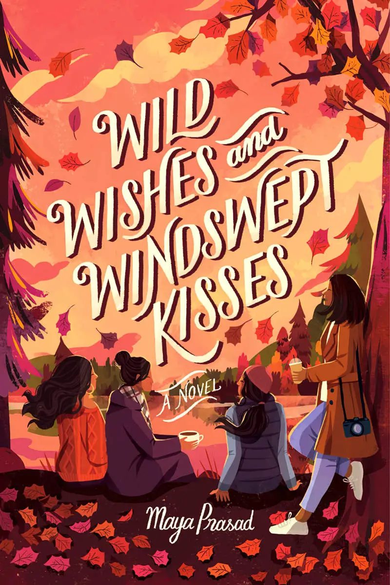
These browns and orange palettes are also beautiful:
The fake book cover in the header was made from the following meme: