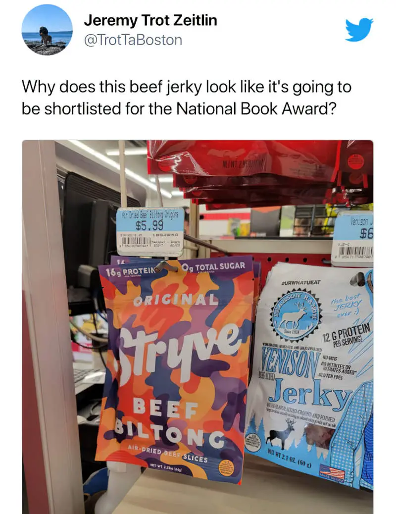
Today’s post is inspired by the following observation regarding the graphic design of award-winning literary novels which are so distinctive by now that, when re-purposed to sell beef jerky, can make readers feel as if they are eating a book:
The tweet reminds me of a favourite children’s picture book by Oliver Jeffers. The hardcover edition has a bite cut out of the cardboard on the back:
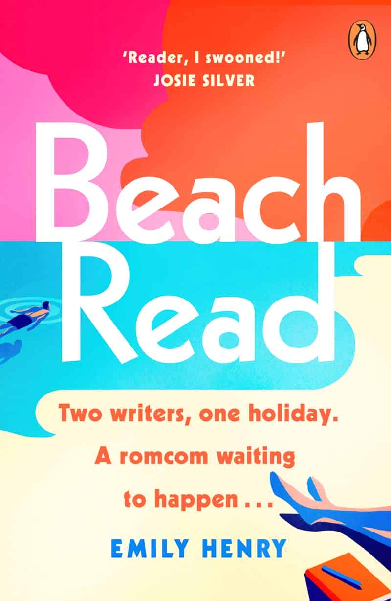
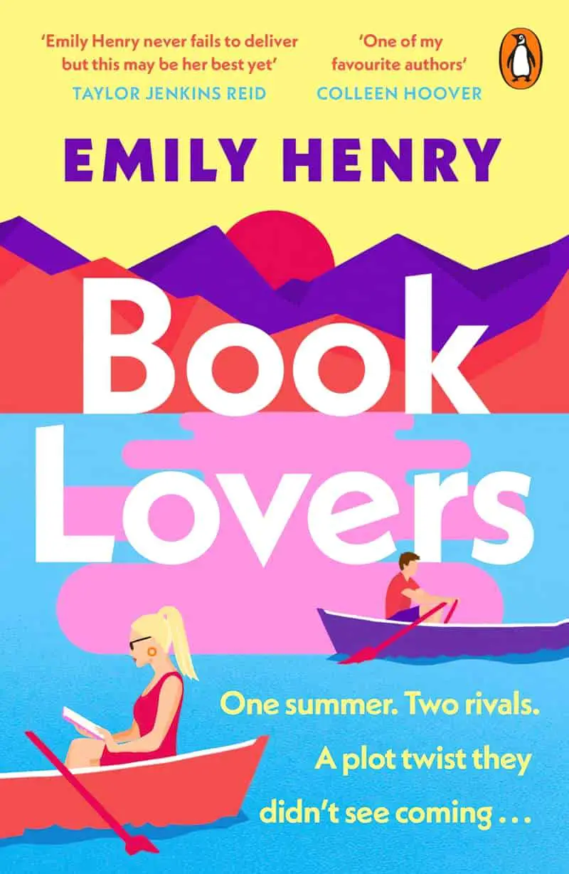
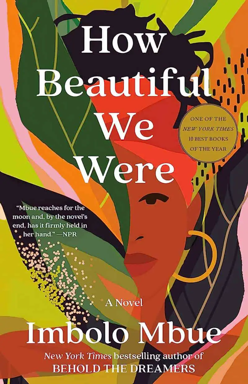
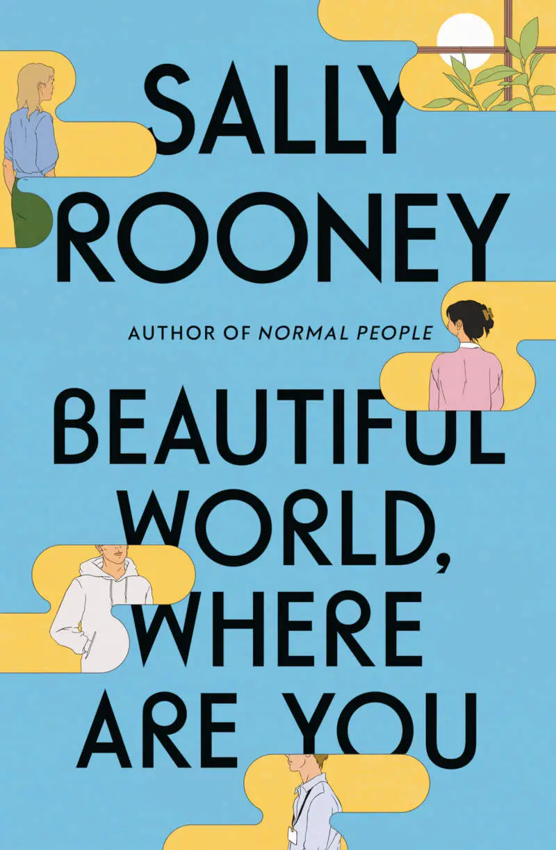
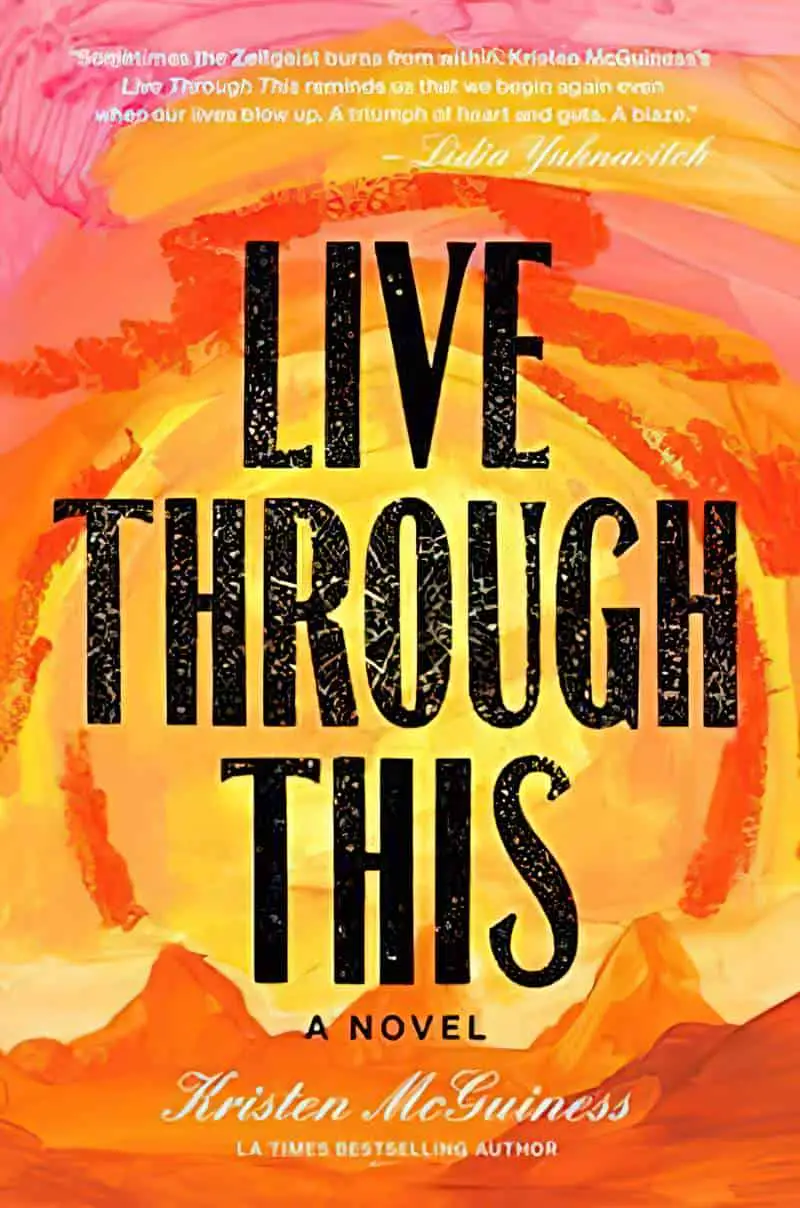
This design trend, well into its third or fourth year in the major publishing houses, has attracted plenty of nicknames and attendant discourse online — culture critic Jeva Lange calls it “blobs of suggestive colors,” while writer Alana Pockros calls it the “unicorn frappuccino cover,” and New Yorker writer Kyle Chayka once referred to it on Twitter as “the Zombie Formalism of book covers.”
Kottke, in 2021
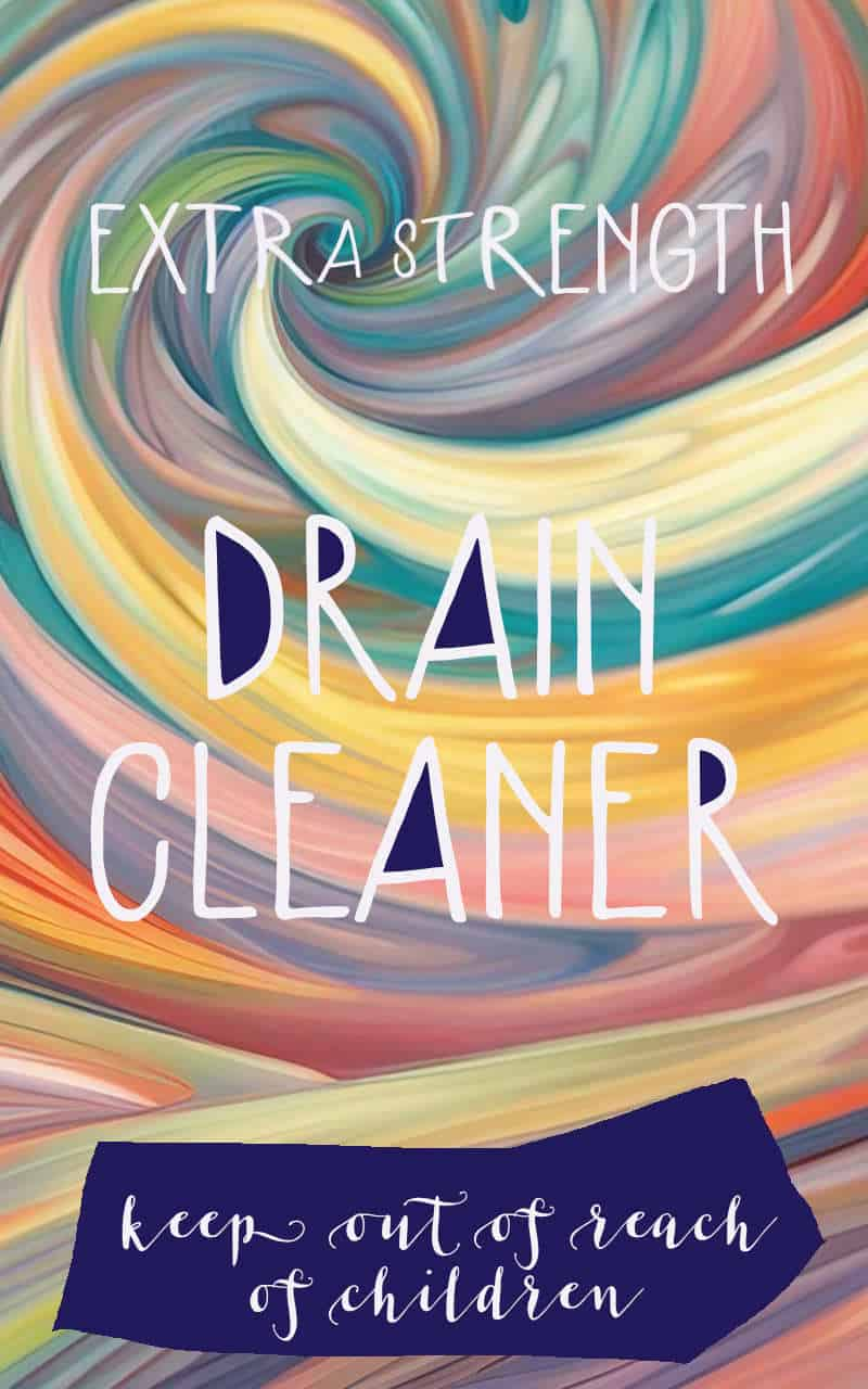
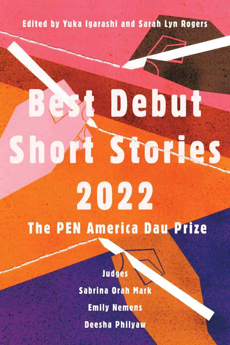
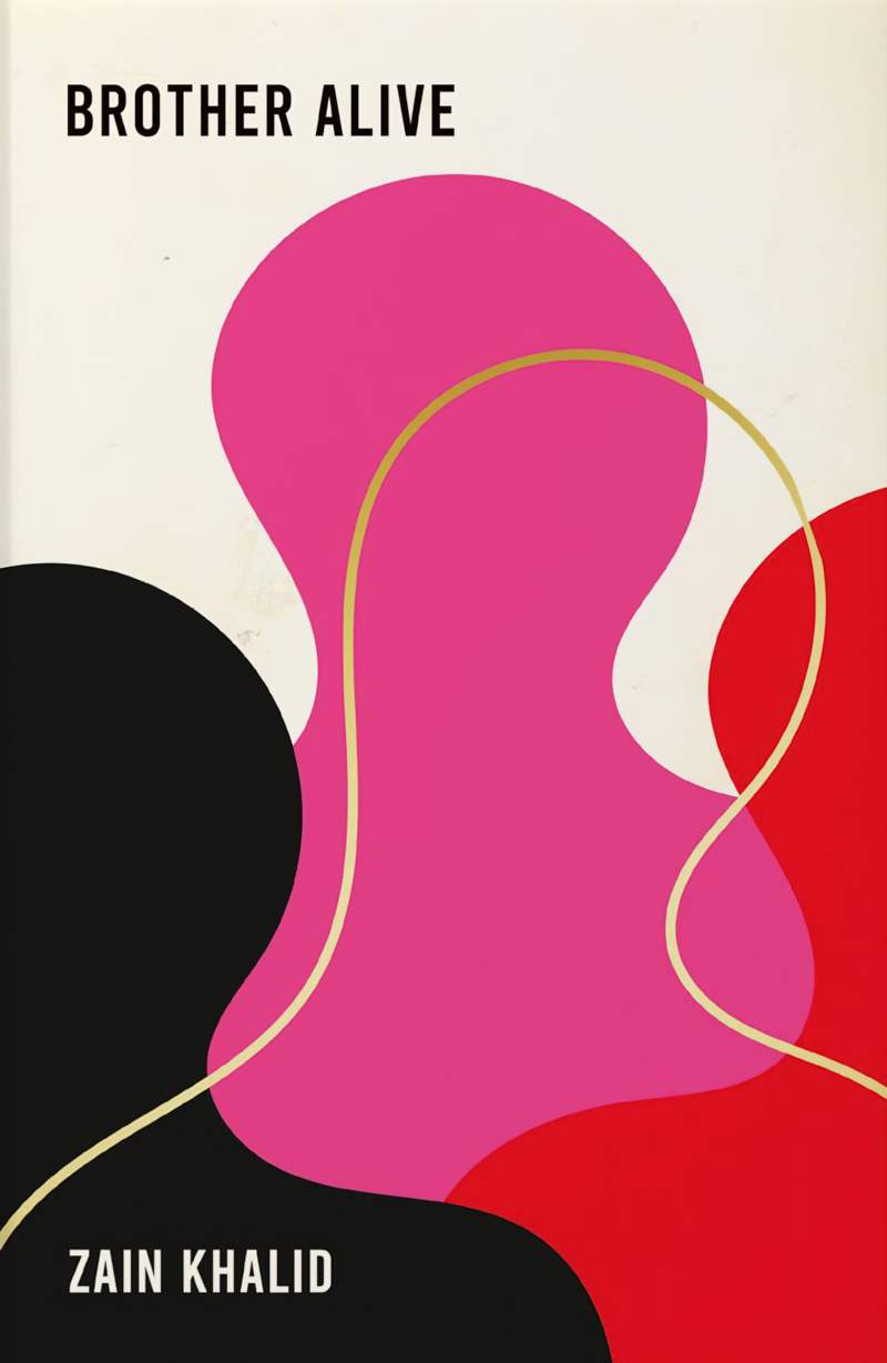
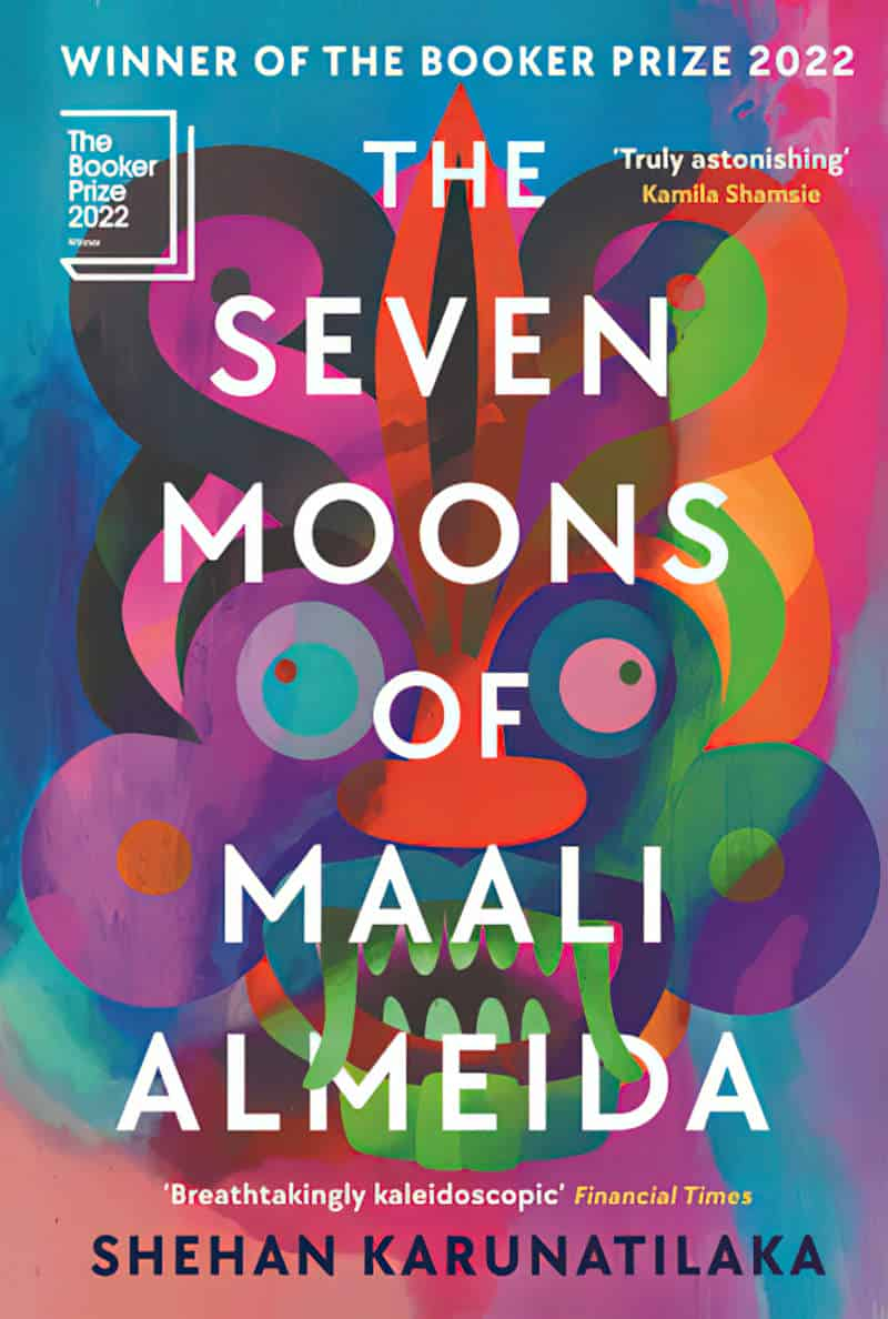
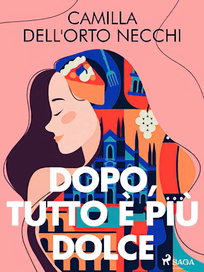
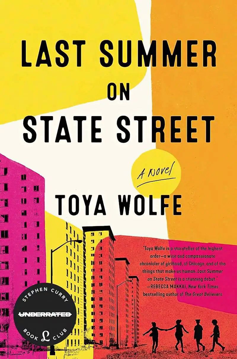
Now let’s collect some examples of the book covers evoked by the National Award Winning Novel by debut author Beef Biltong.
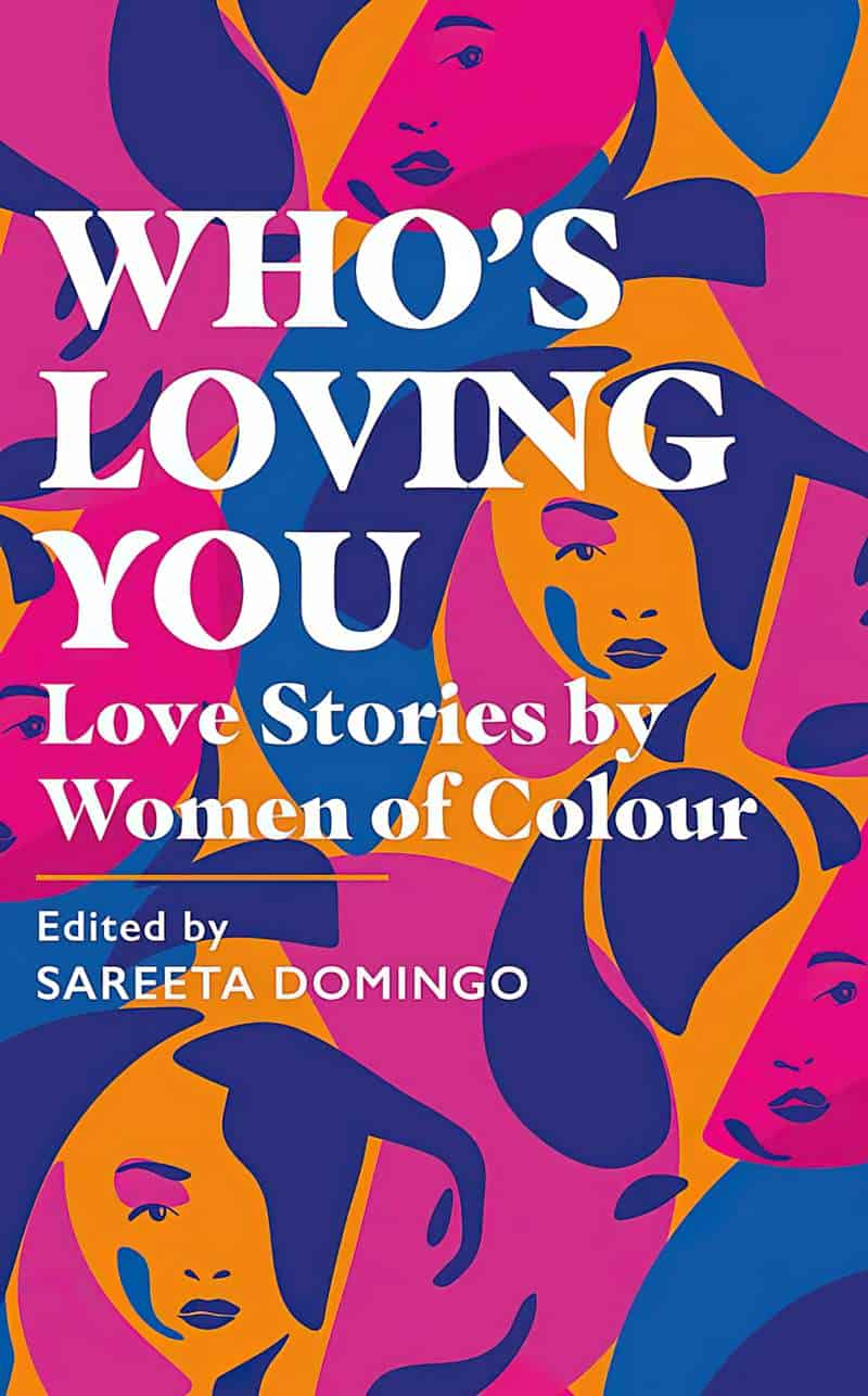
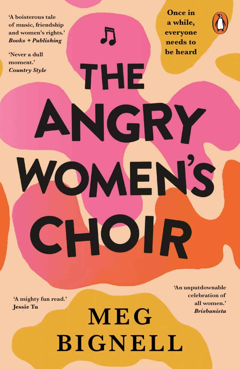
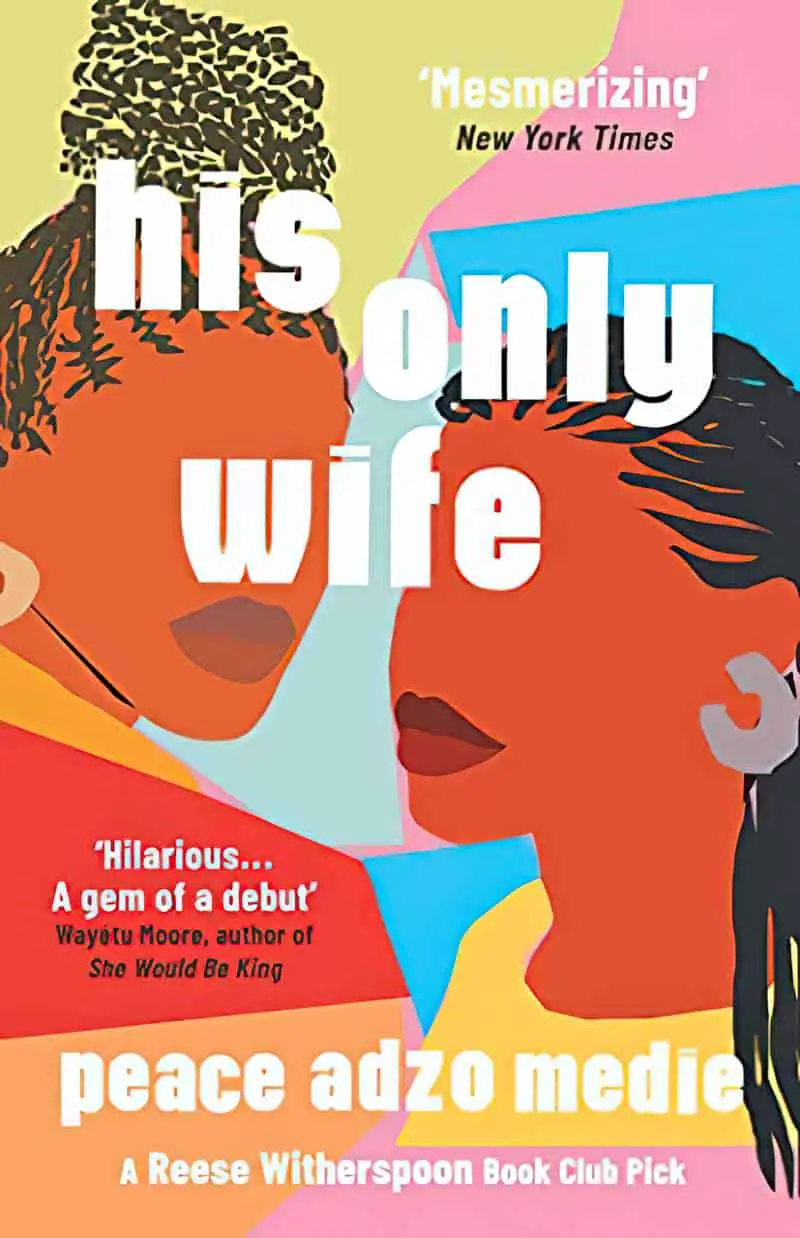
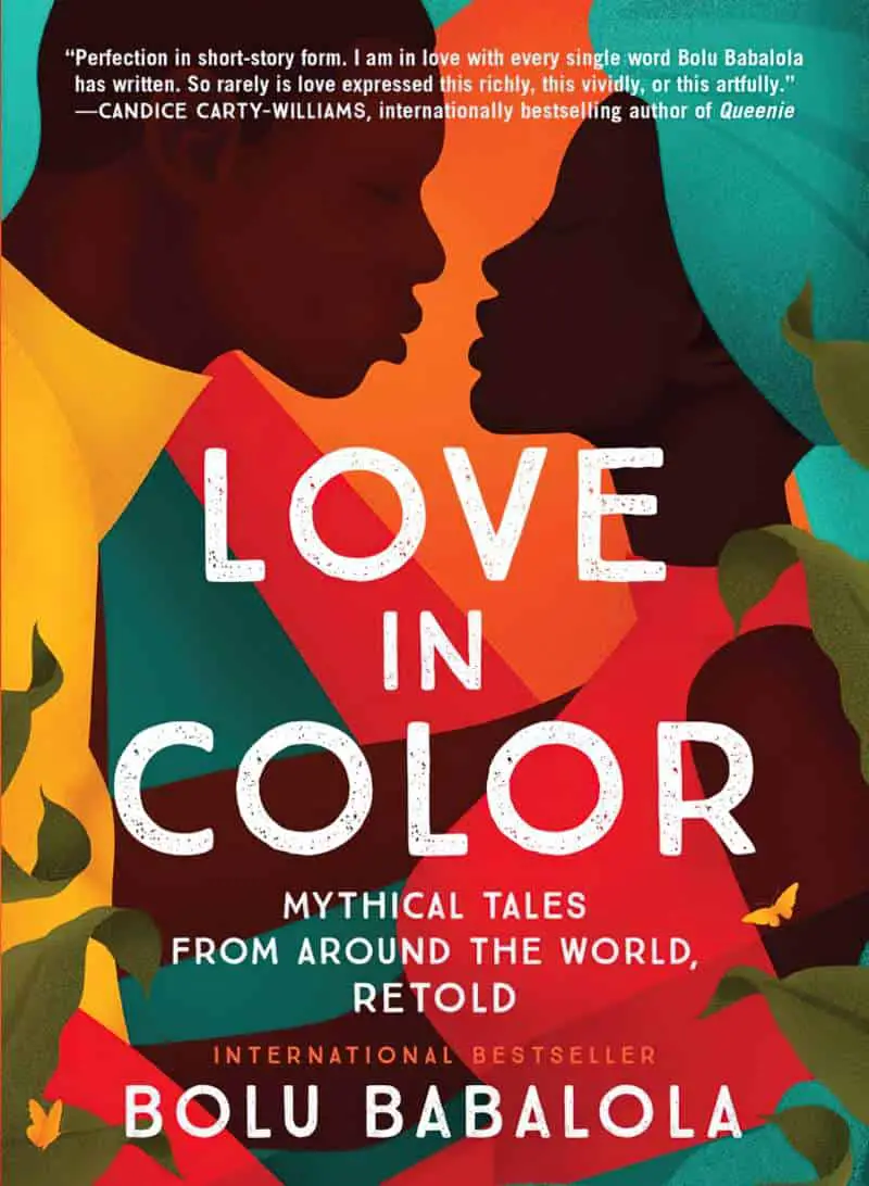
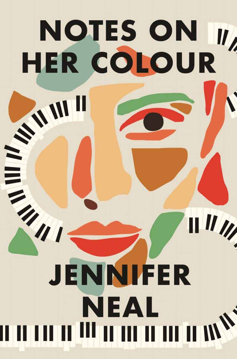
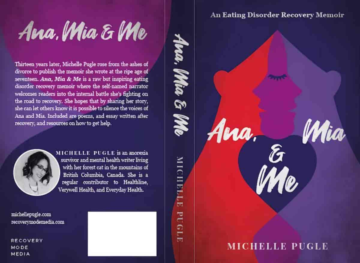
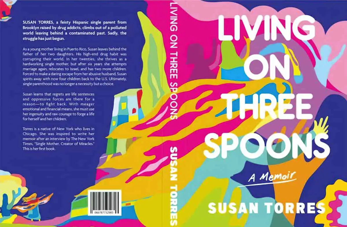
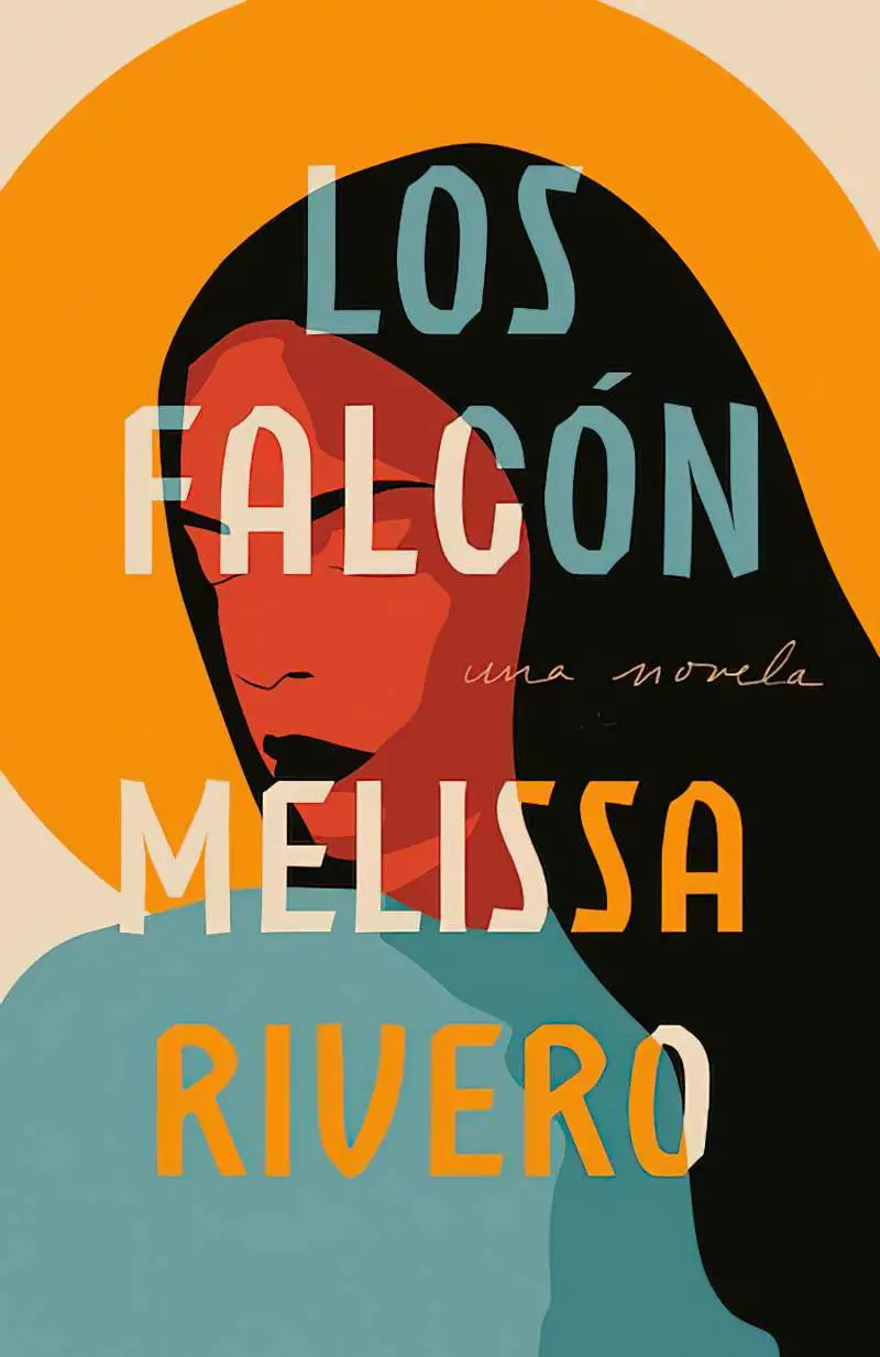
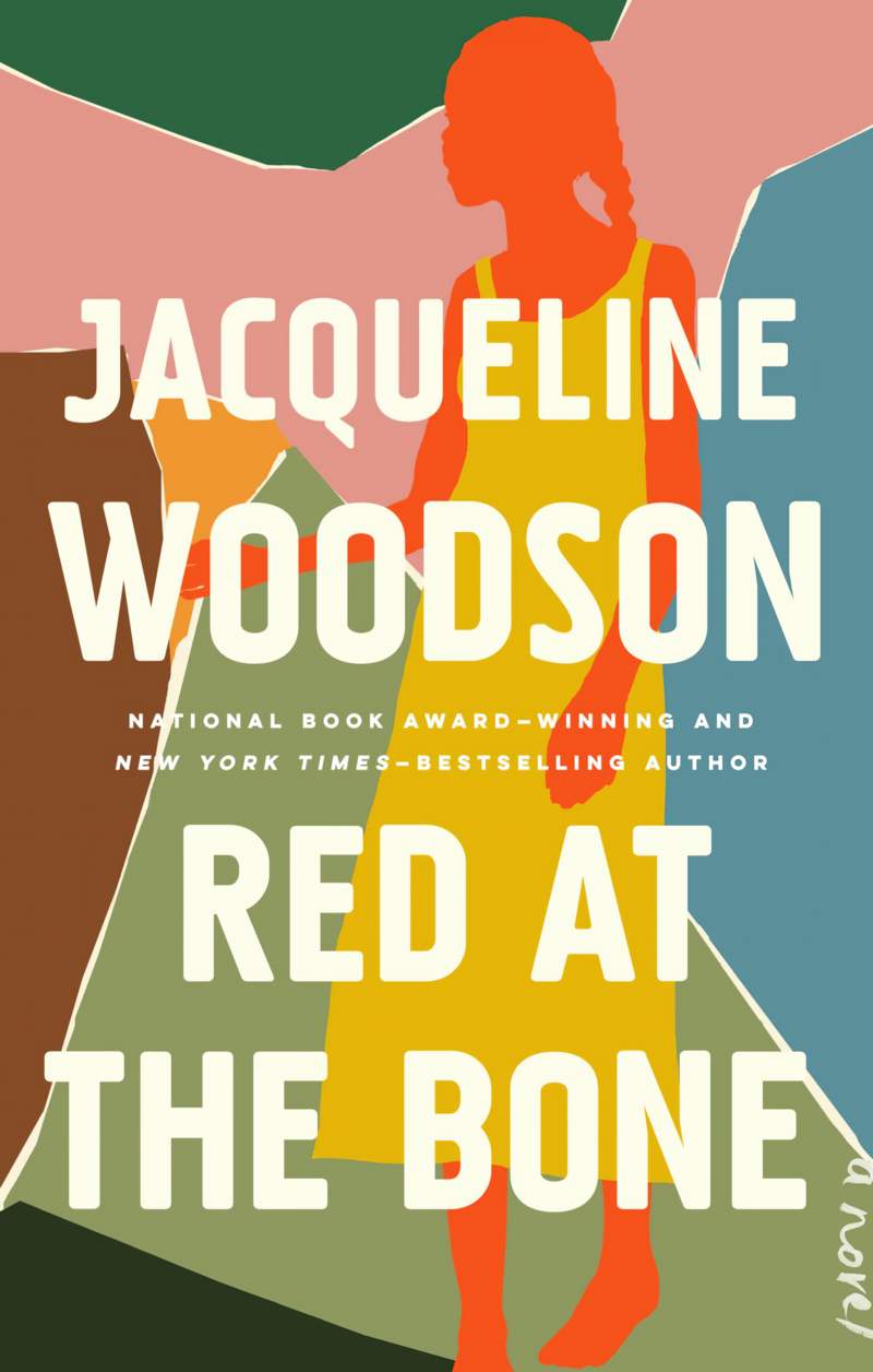
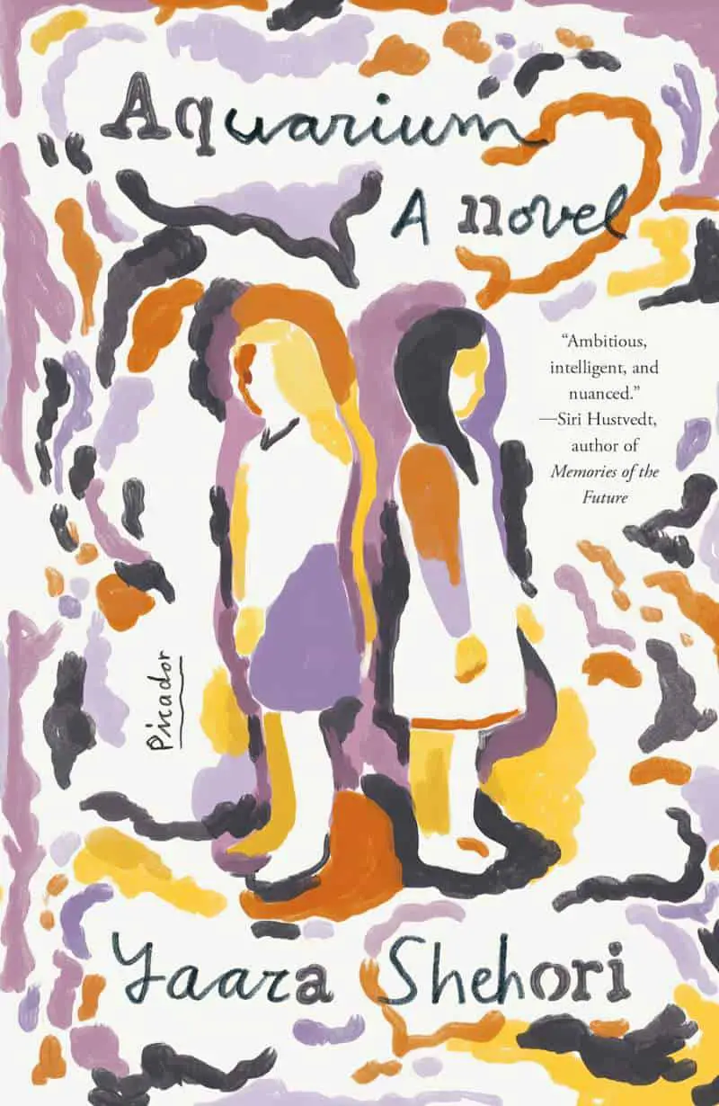
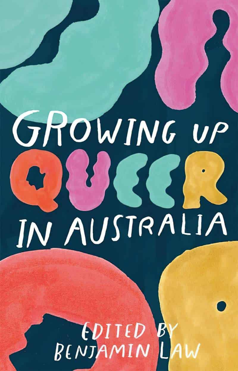
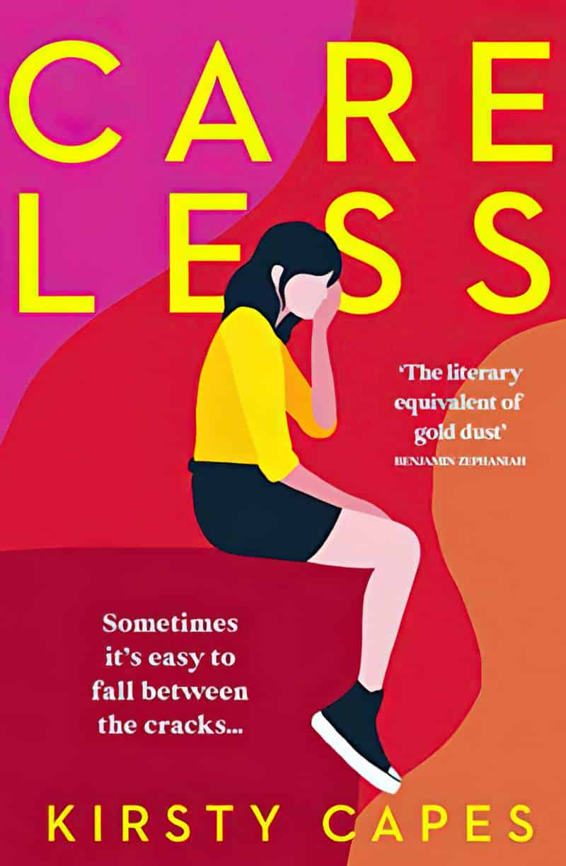
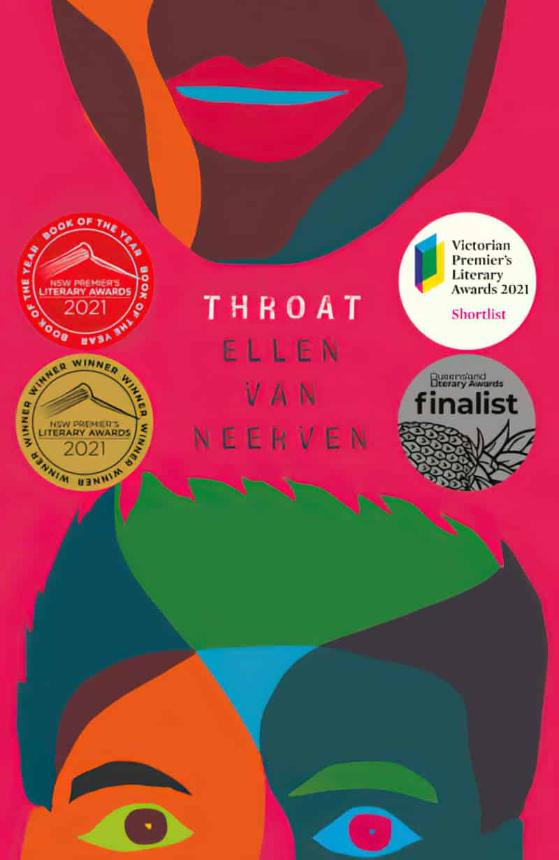
Short story collections, women and especially authors of colour seem likely to get one of these covers:

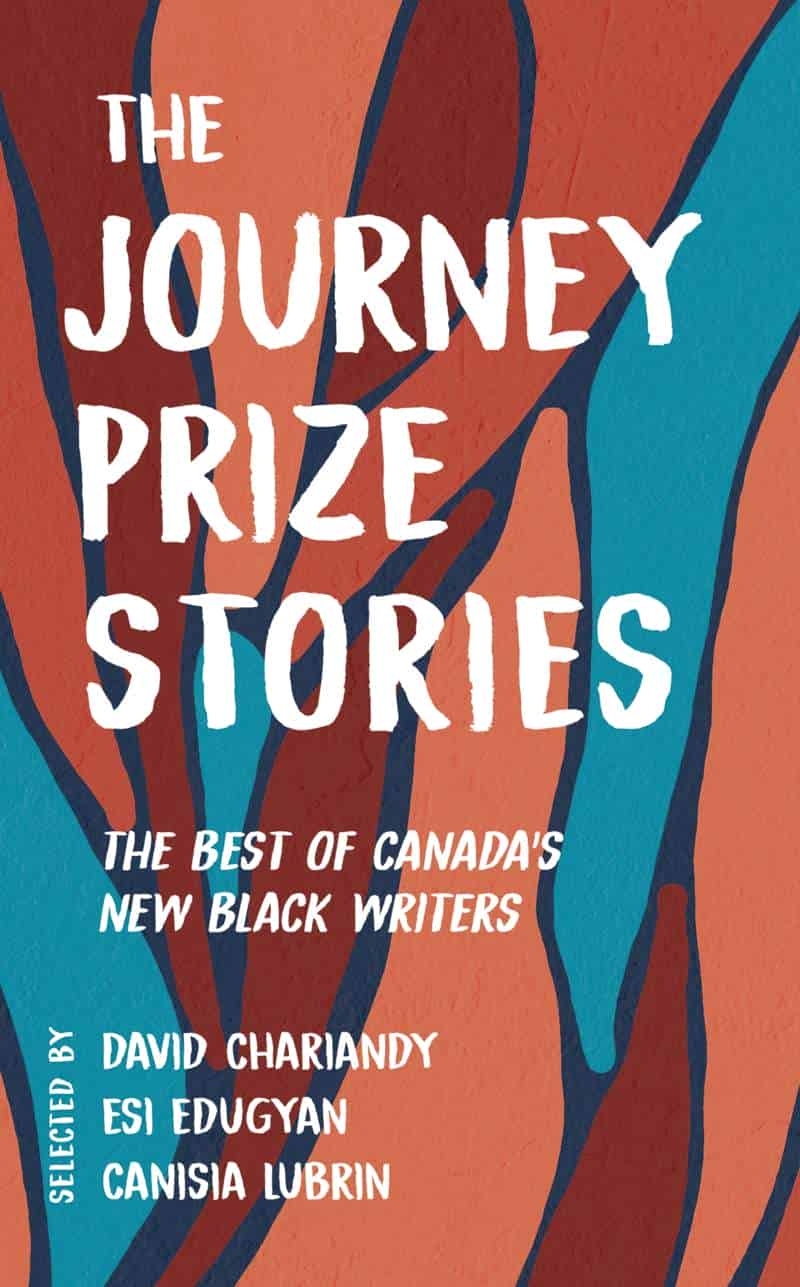


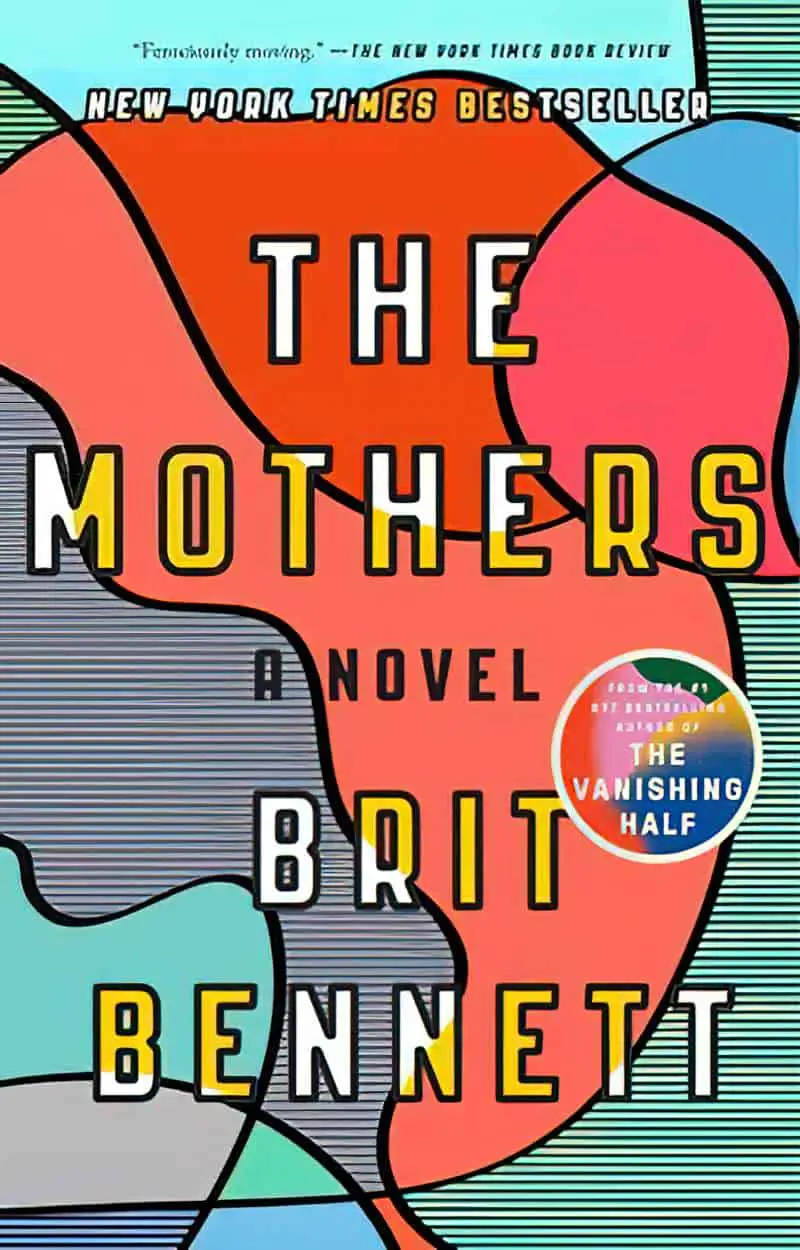

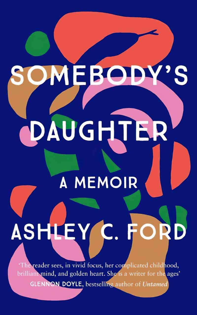


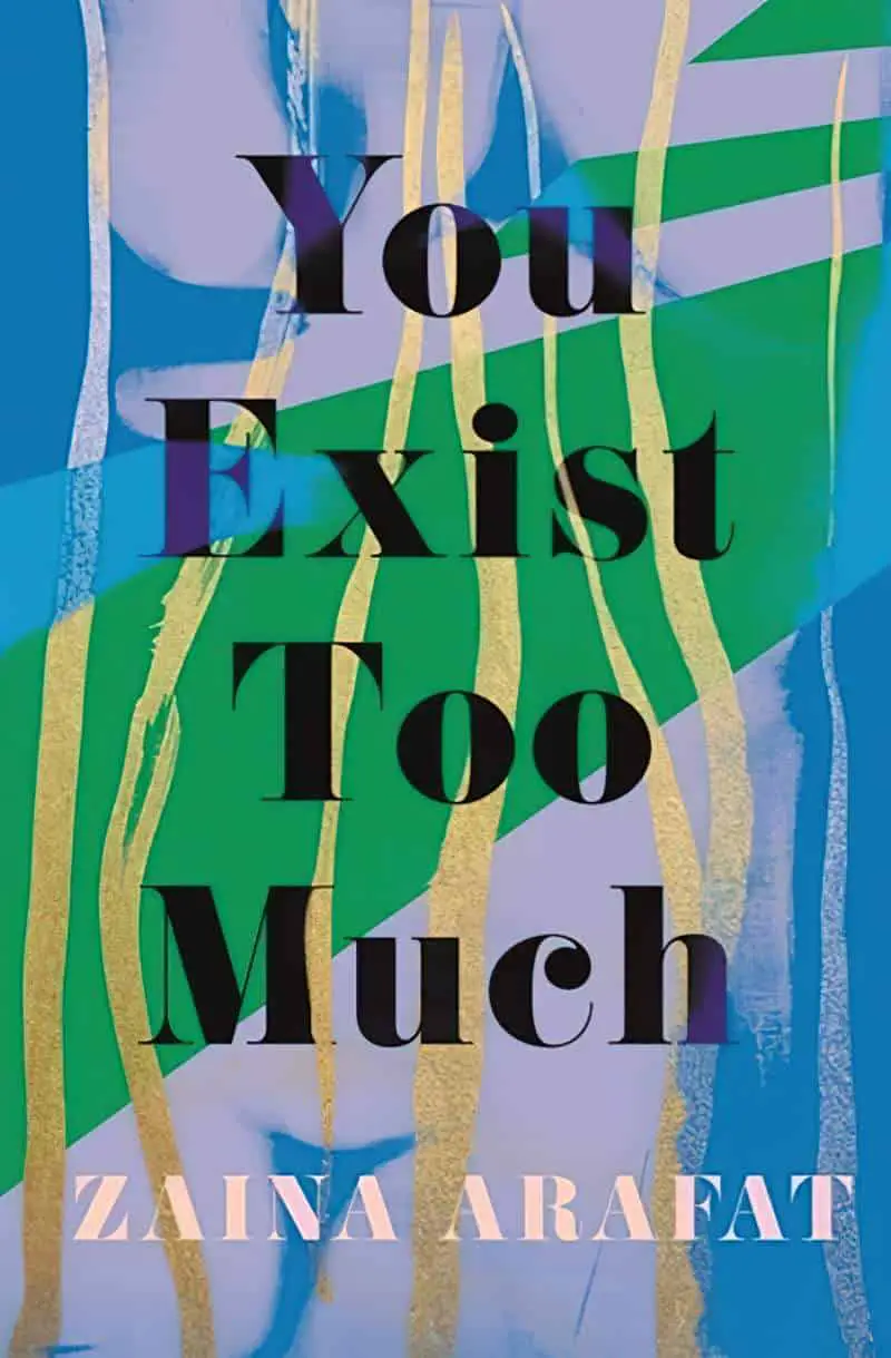

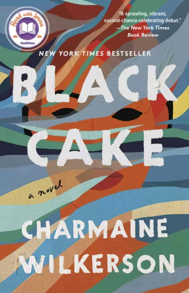
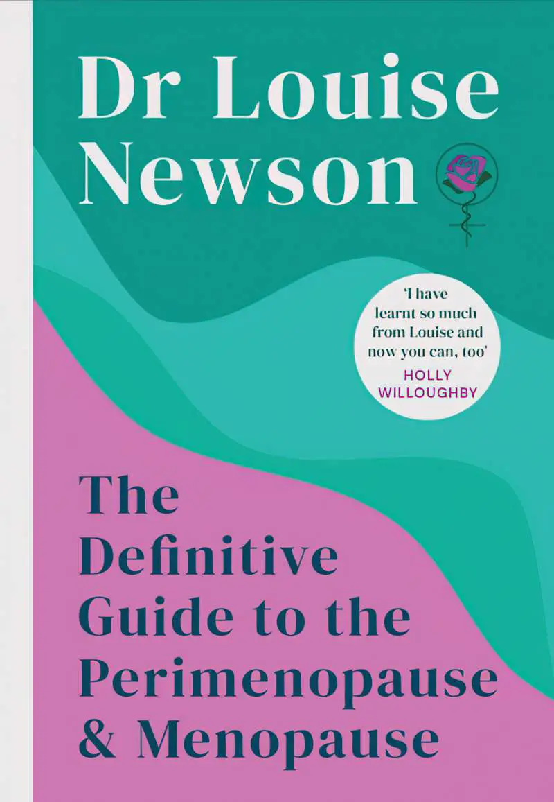
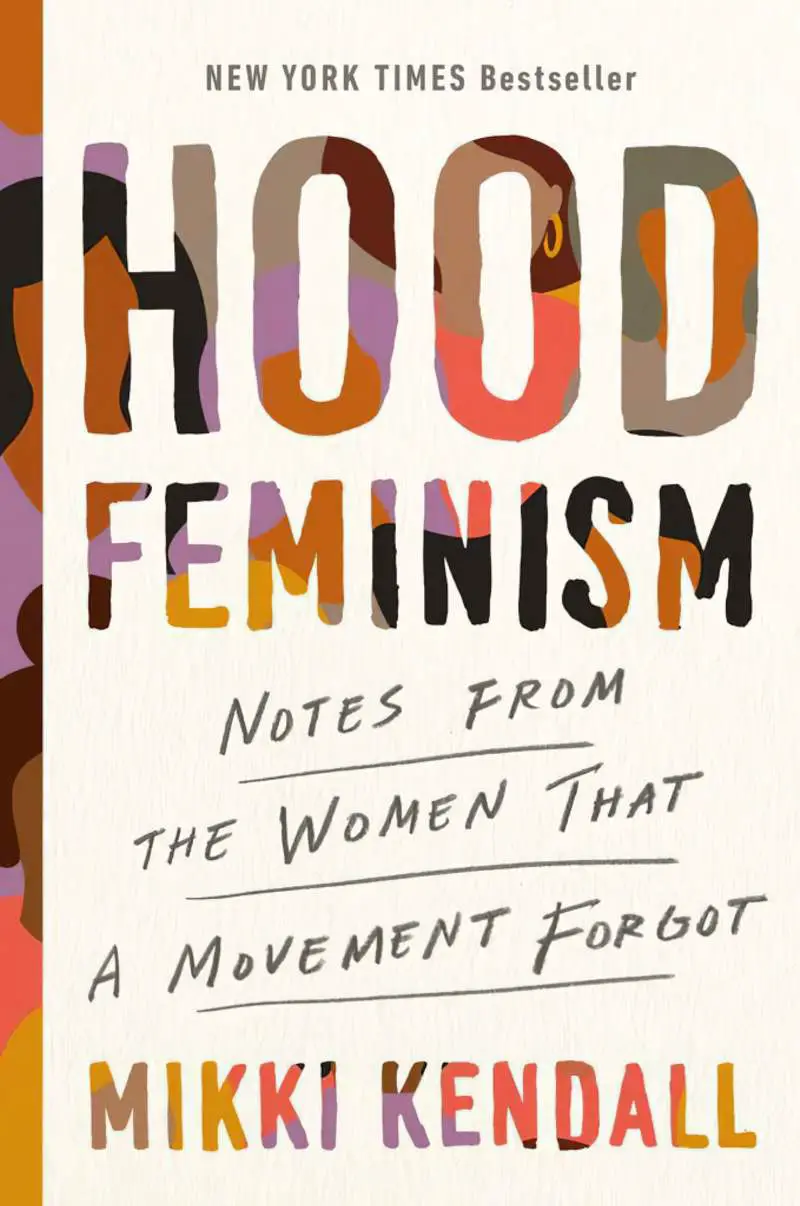
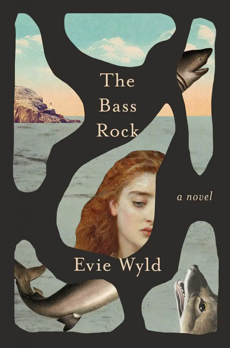
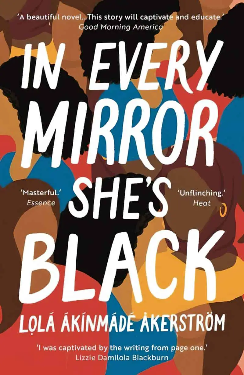
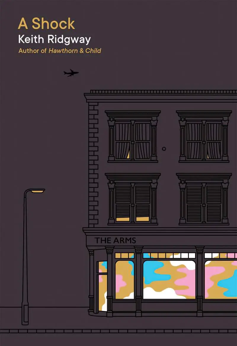
It’s not just fiction which utilises this graphic design. Here’s a non-fiction example:
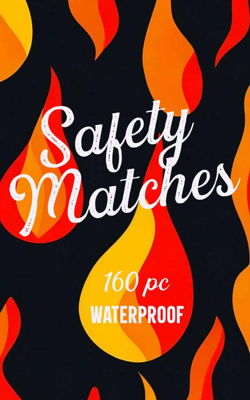
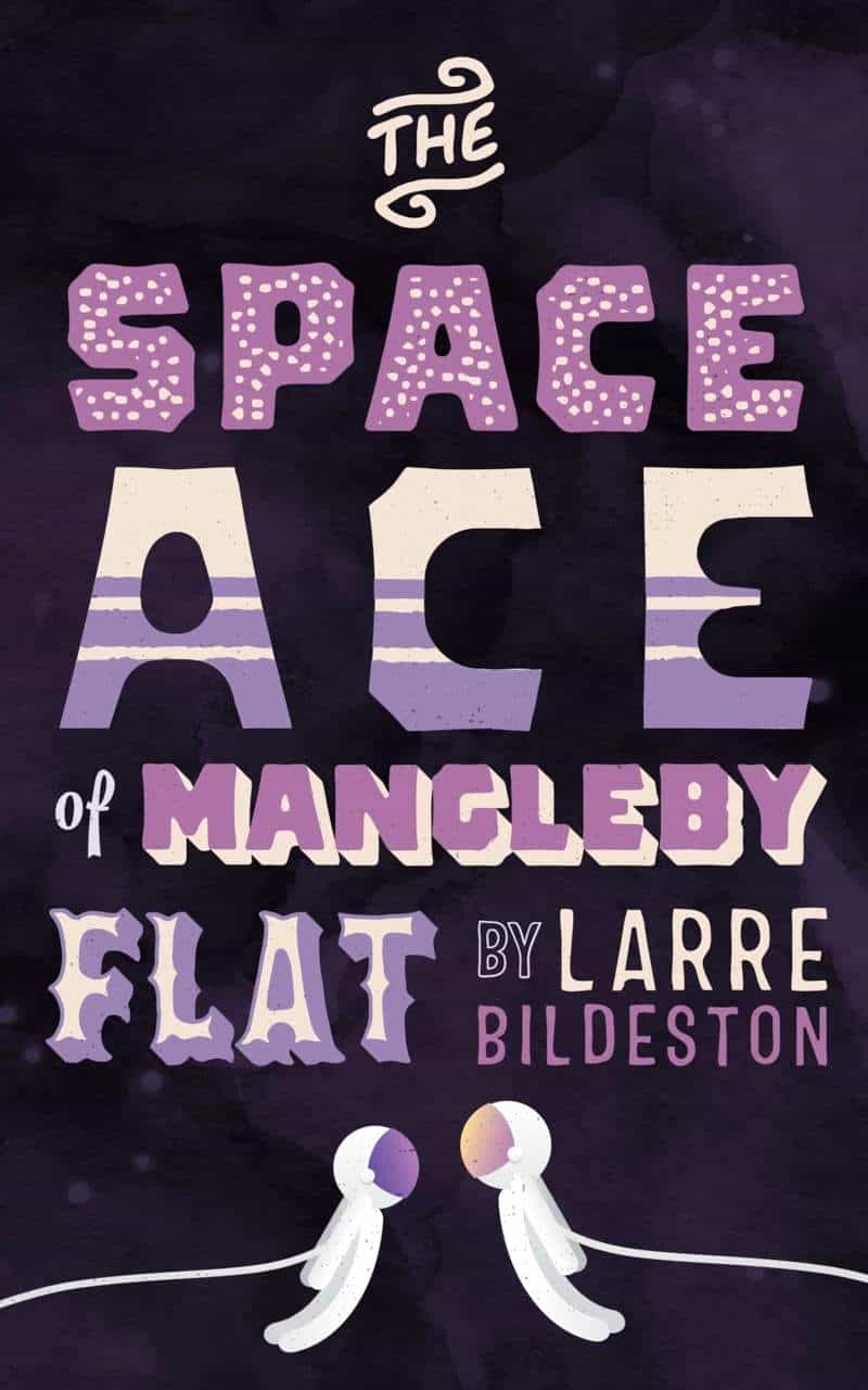
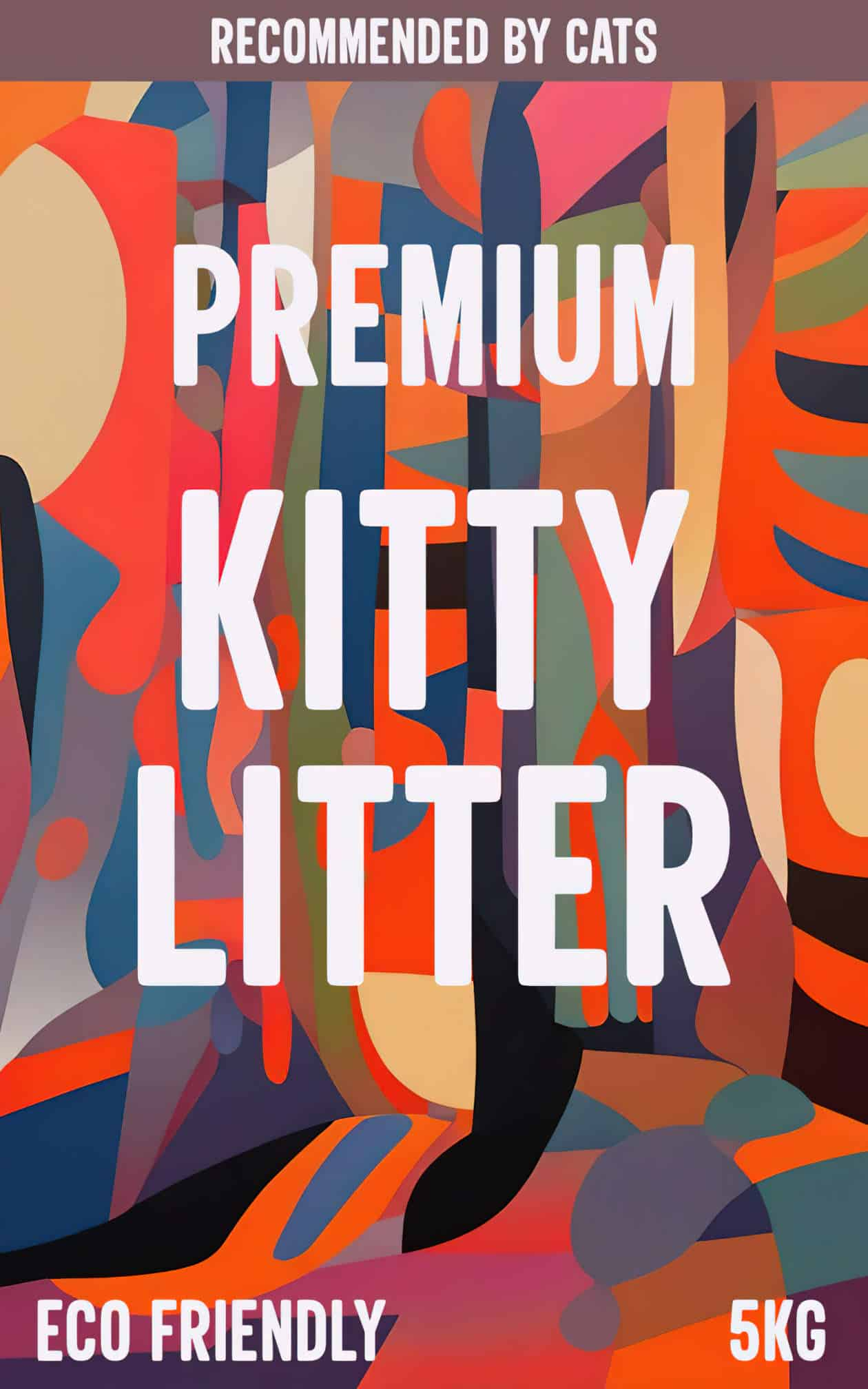
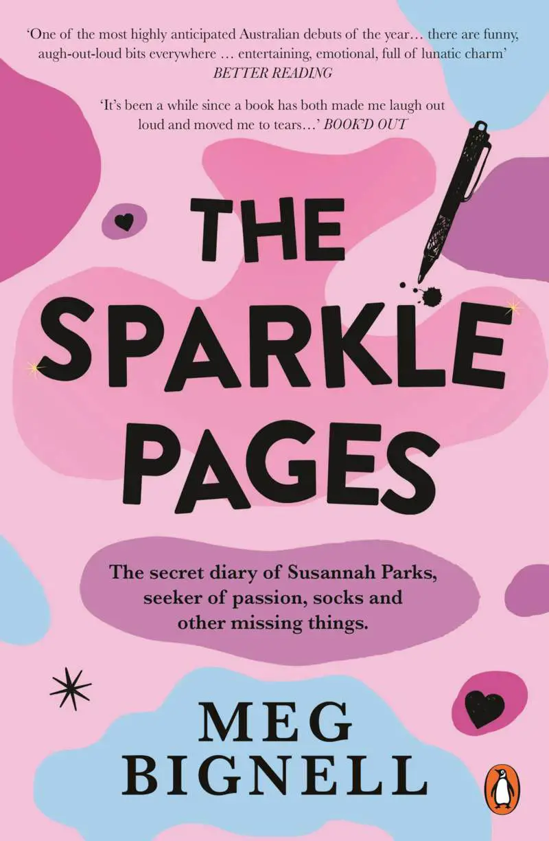
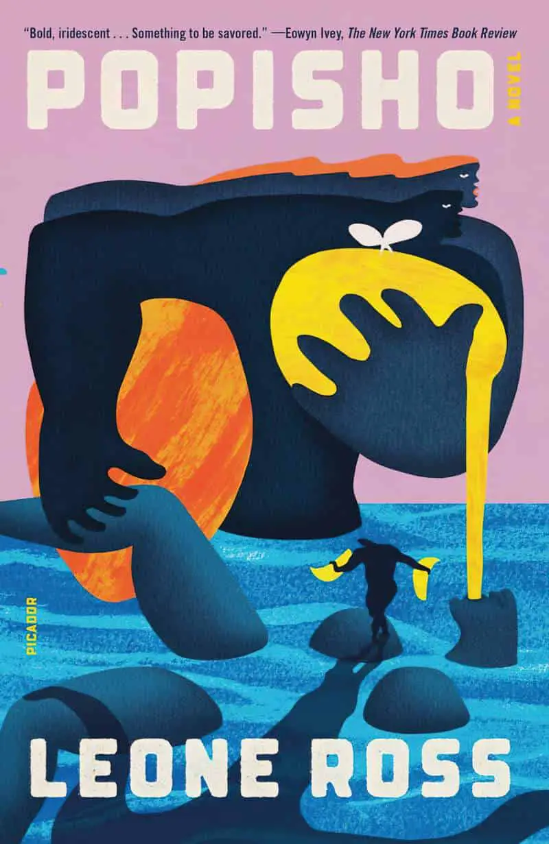
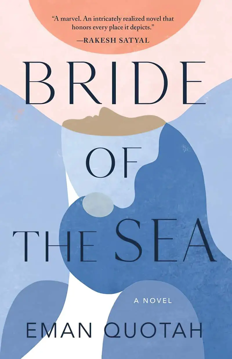
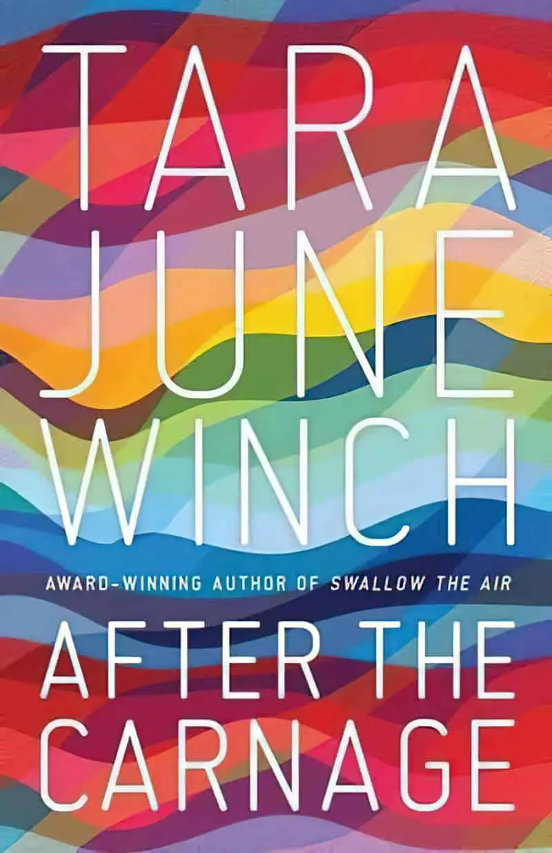
VARIATIONS ON THE BLOB THEME


Art for header image cover was created using ClipDrop AI Art Generator using the prompt “large shapes, flat design, abstract expressionism, matte painting, fauvism” and no style.
Fauvism was known for bold, vibrant, almost acidic colours used in unusual juxtaposition, and an intuitive, highly gestural application of paint.
Flat design uses simple, two-dimensional elements and bright colours, in contrast to a more realistic style that gives the illusion of three dimensions through copying real-life properties.
You can also guide ClipDrop by telling it which colours you want. (I doubt it will be too long before we can upload a colour palette and tell it to use that.)