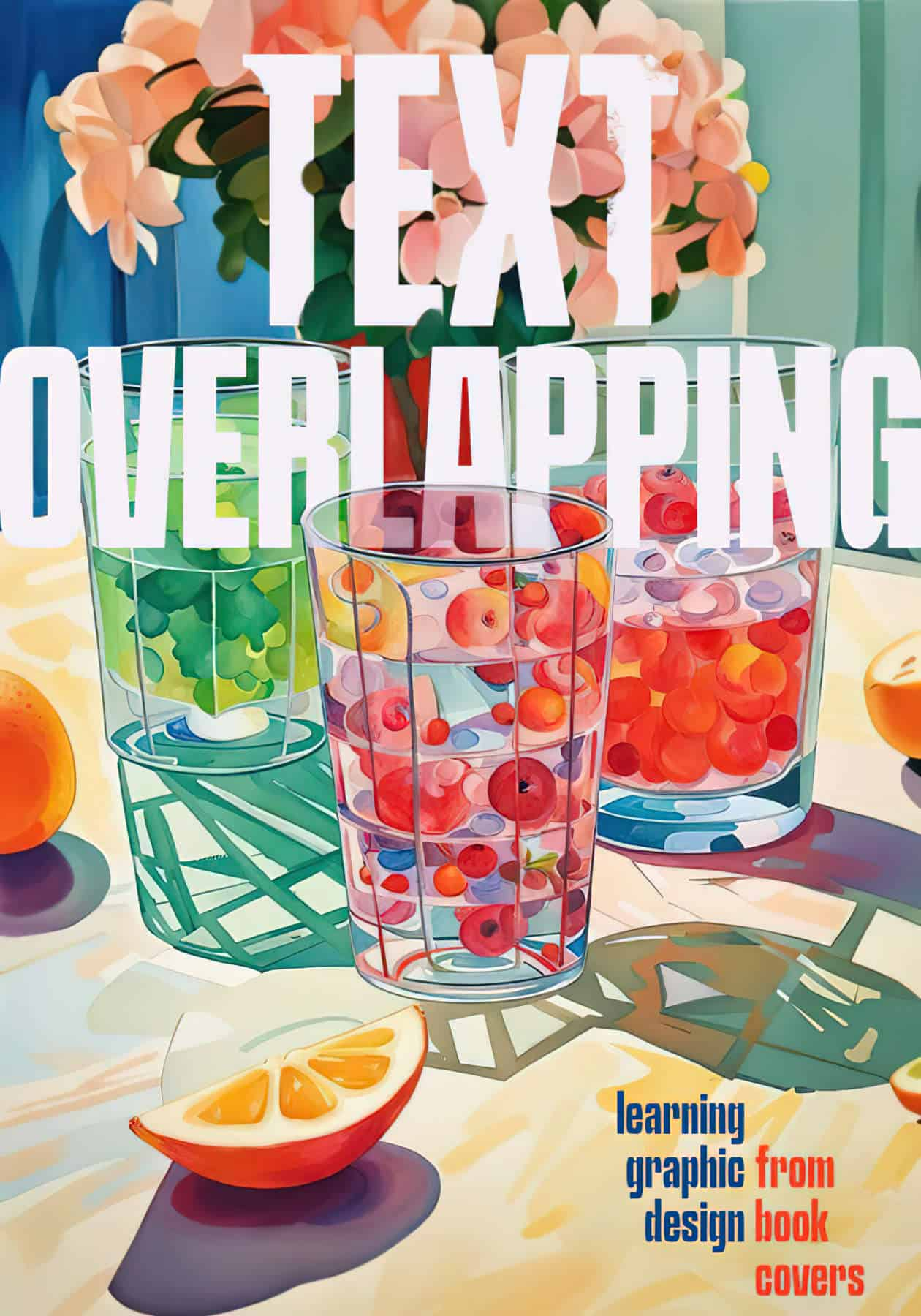
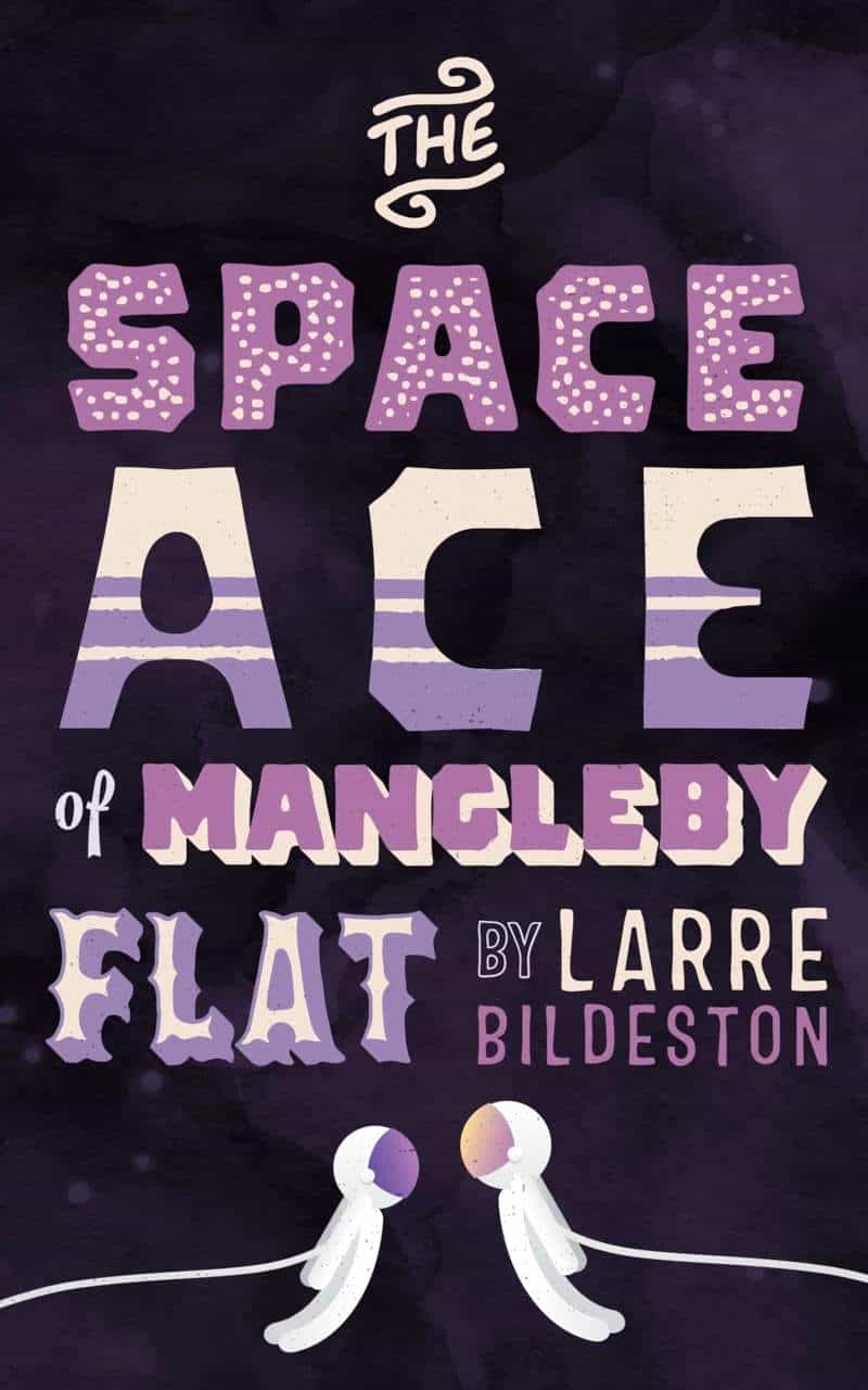
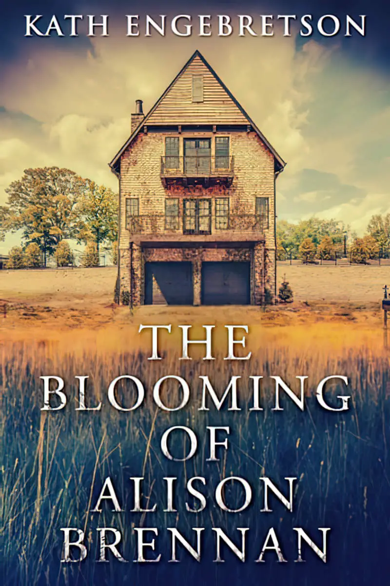
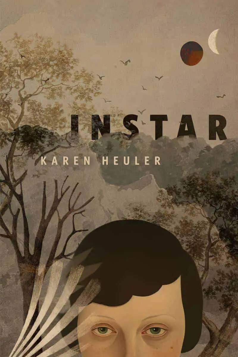
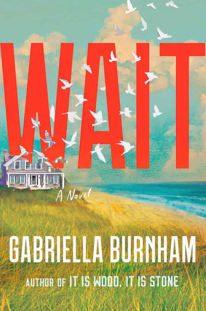
This is one of those low effort, big reward tricks which is so very common on professionally designed book covers but relatively rare on less attractive self-published books: The graphic designer integrates the text into the graphic in some way, often to create the illusion of depth.
Here’s a favourite (extreme) example from a recently published book. The cover illustration of Light Comes To Shadow Mountain is by Jade Le.
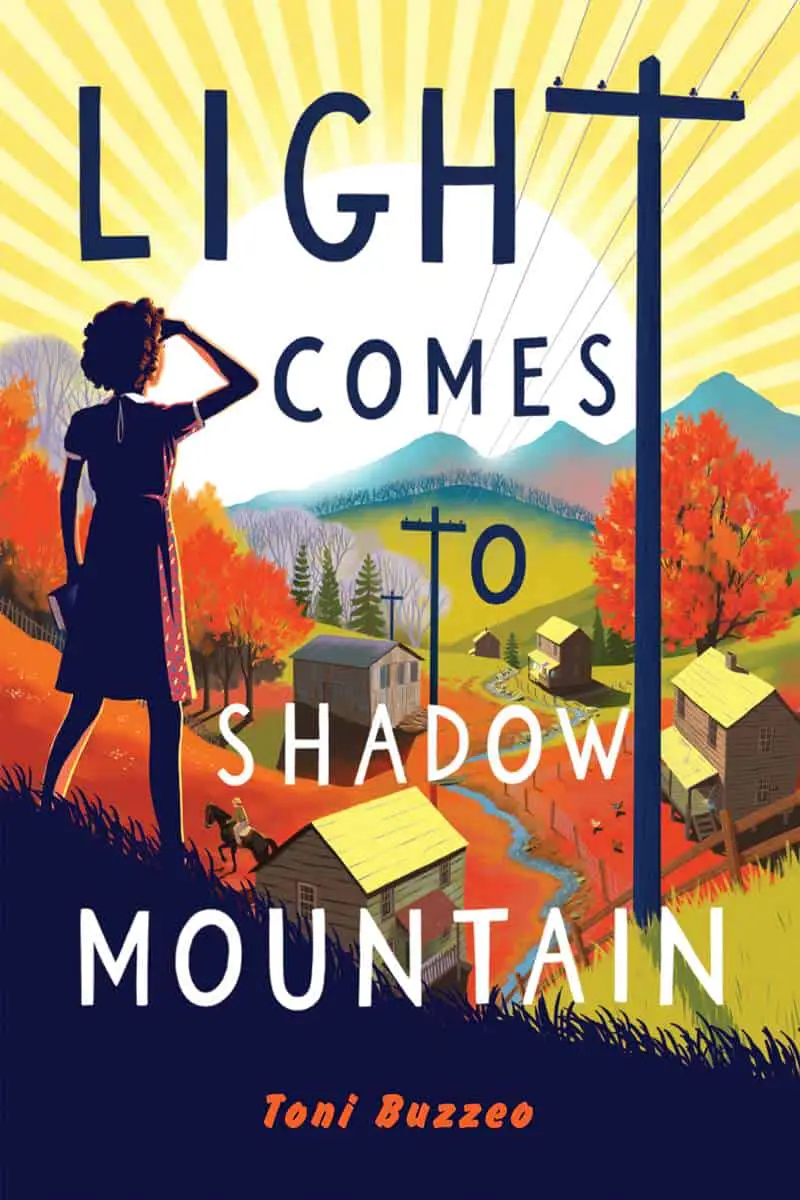
The cover of Light Comes To Shadow requires high-level artistic skills — I don’t want to underestimate this — but at the same time, there are other more subtle and easy ways to integrate text and image.

Here’s another beautiful example serving as the cover of Minor Disturbances At Grand Life Apartments:
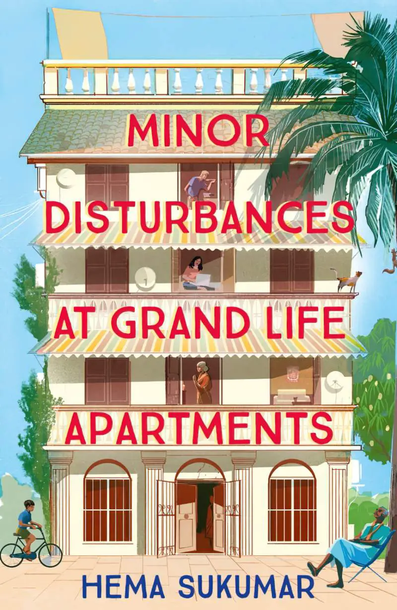
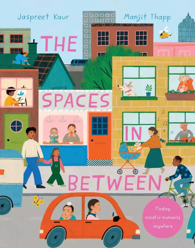
More examples of where the text is intradiegetic:

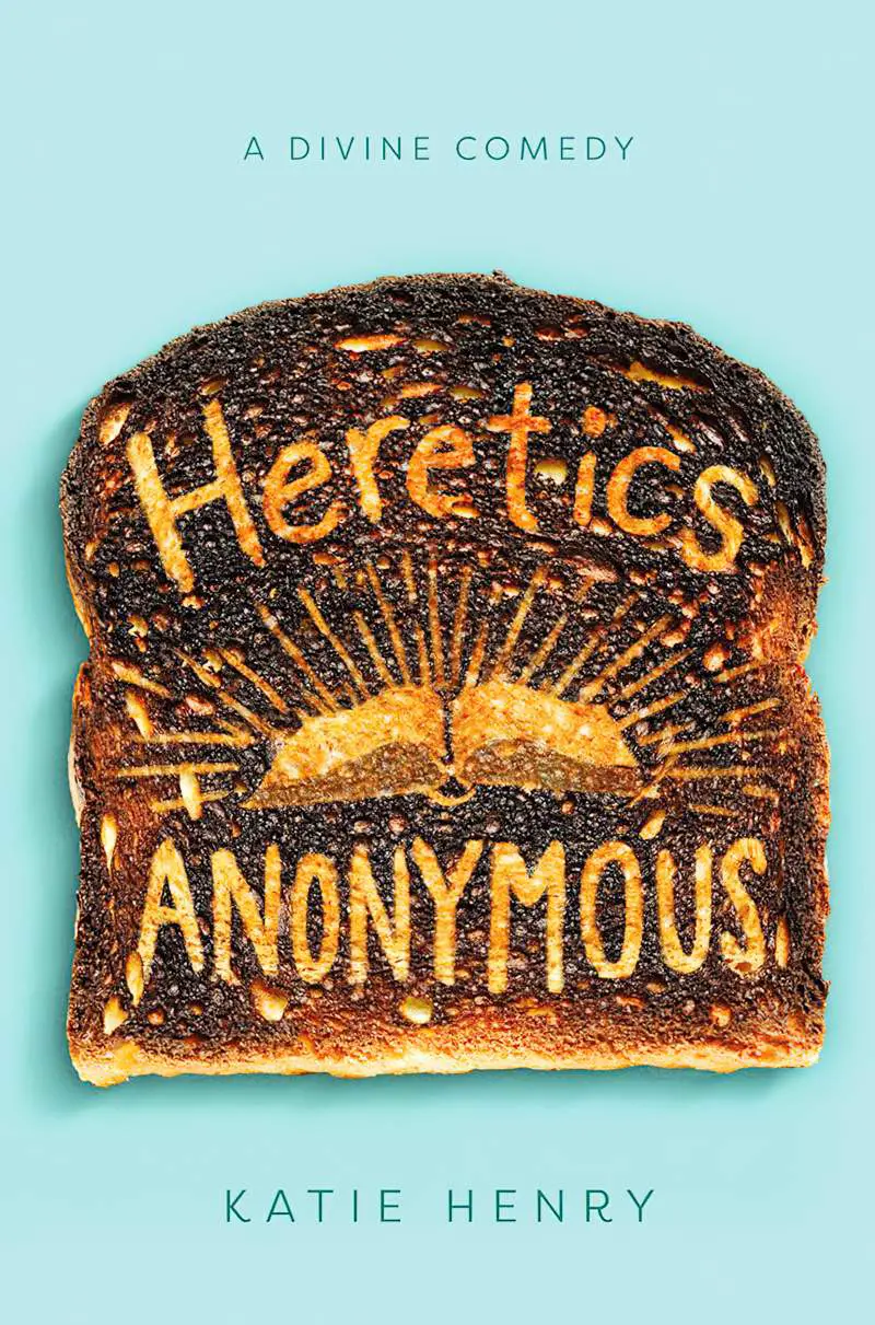
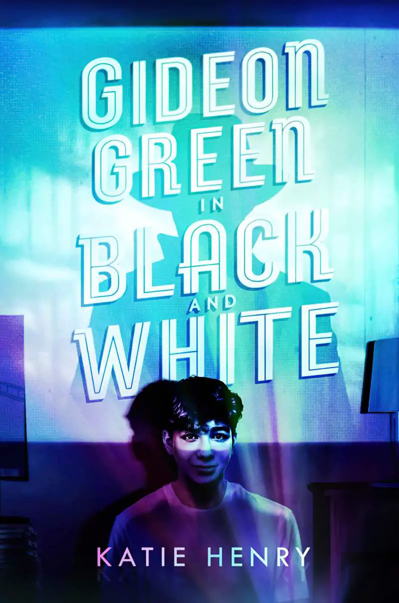
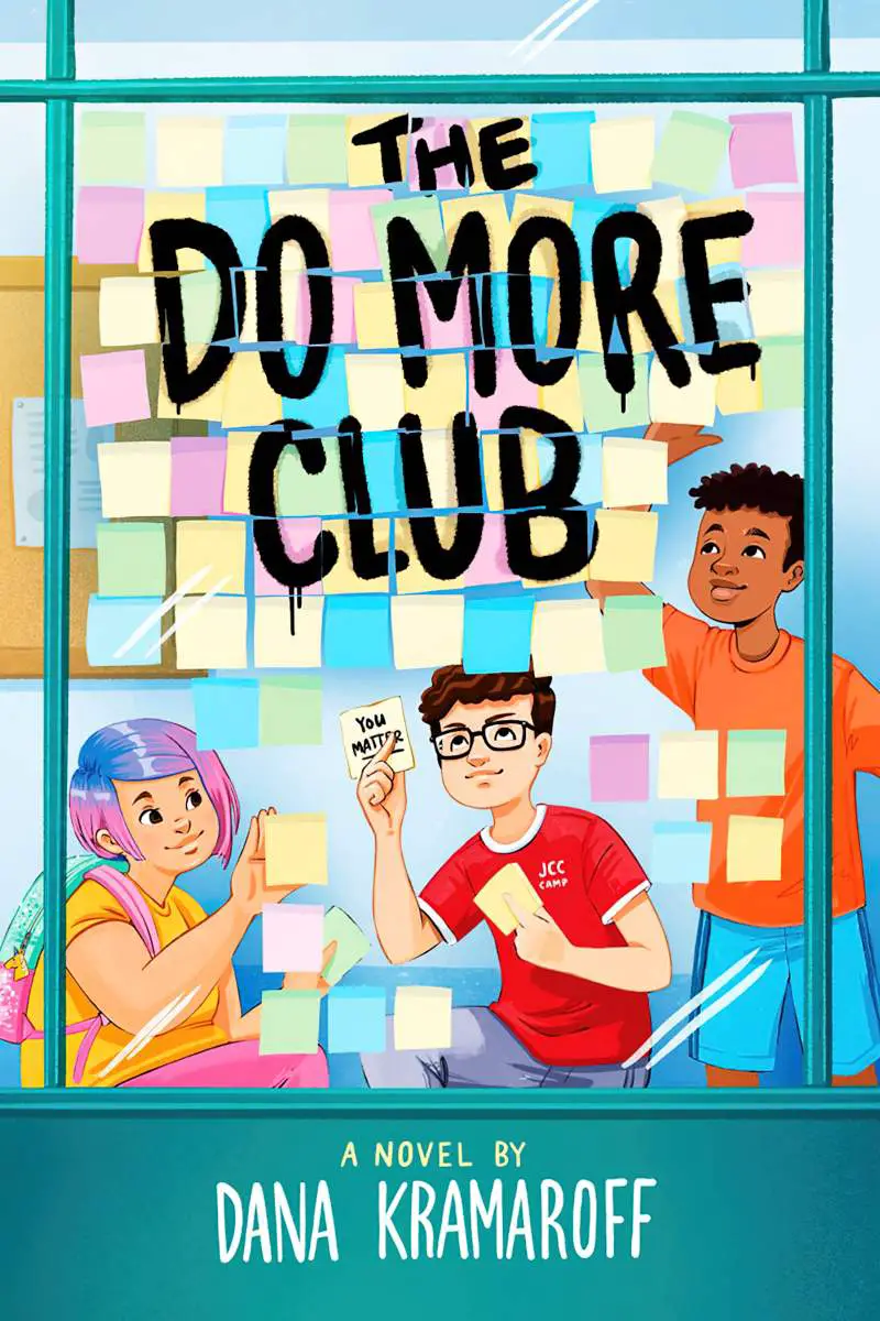

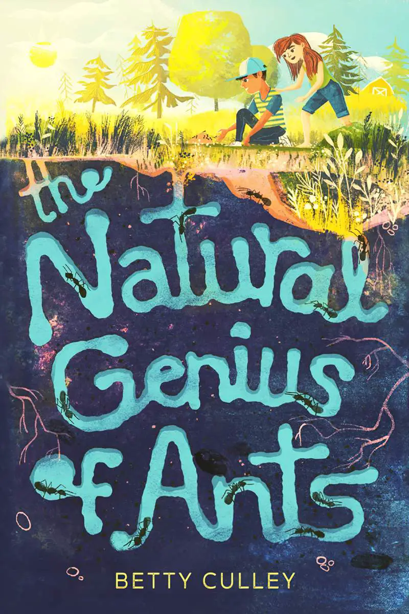
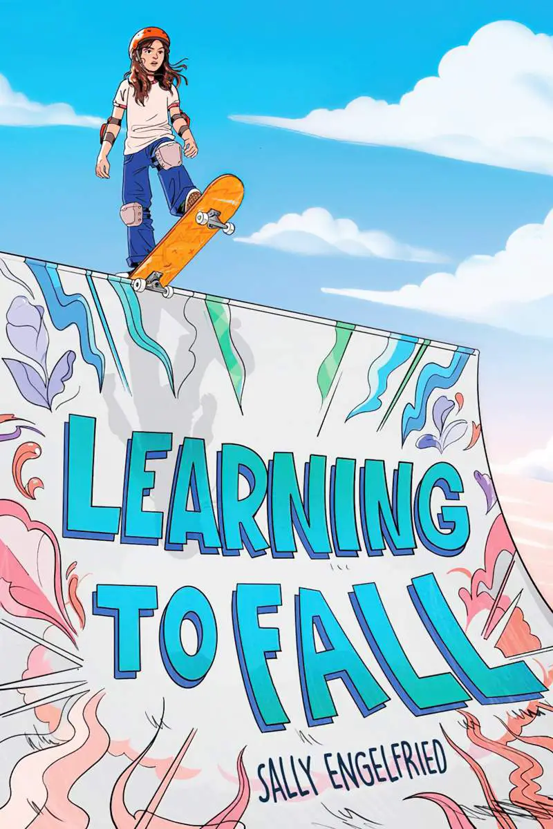
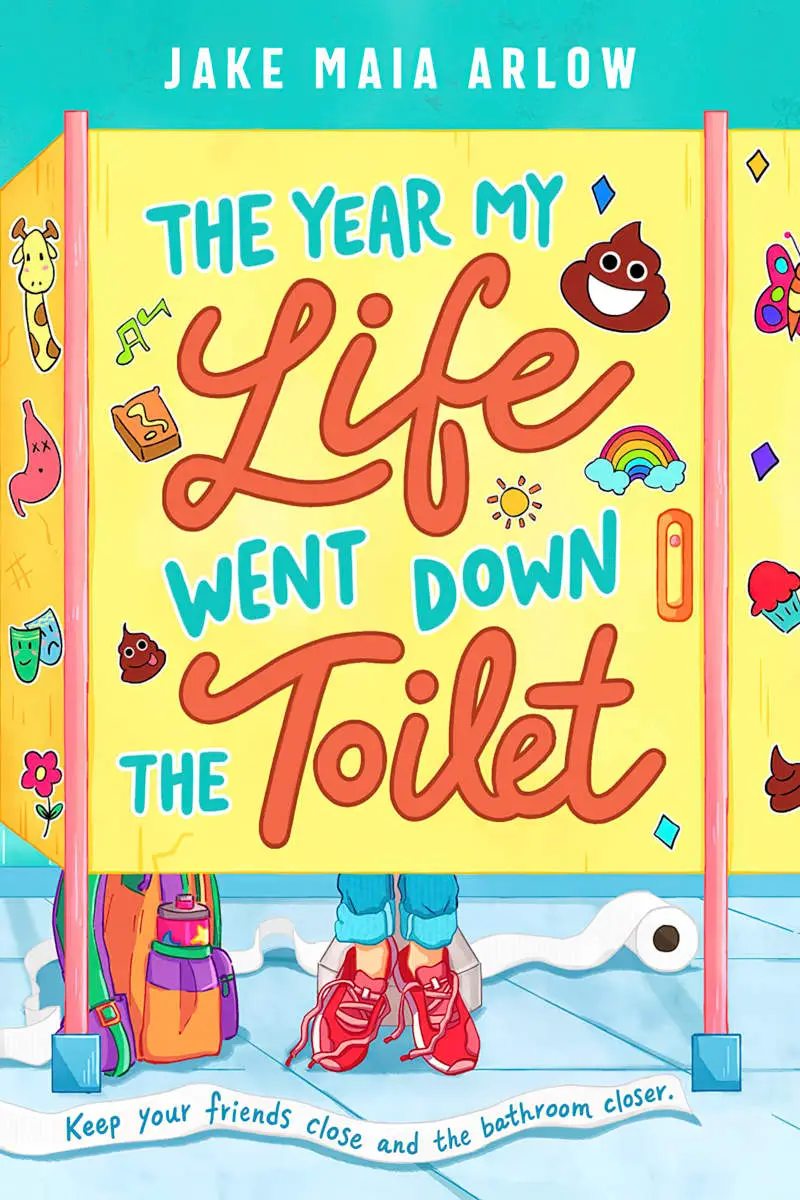
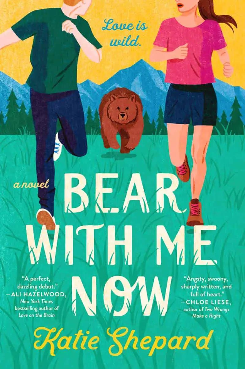
Below, the cover of Bear With Me Now is equally beautiful and well-designed yet the text/image integration technique is simple: Grass “grows over” the text and suddenly the entire image has depth. That bear really does like it’s running straight for us! I don’t know how the designer did this, but I can see two easy ways:
- Make a rasterised layer of the text, create a layer mask and simply erase grass sized shapes out of it (probably using an eraser set to a grass brush)
- Create an extra layer of grass on top of the text and add the grass (probably with a grass brush). In this case, the grass is two separate layers: one layer goes over the title, the other goes under.
Here’s another example utilising grass:
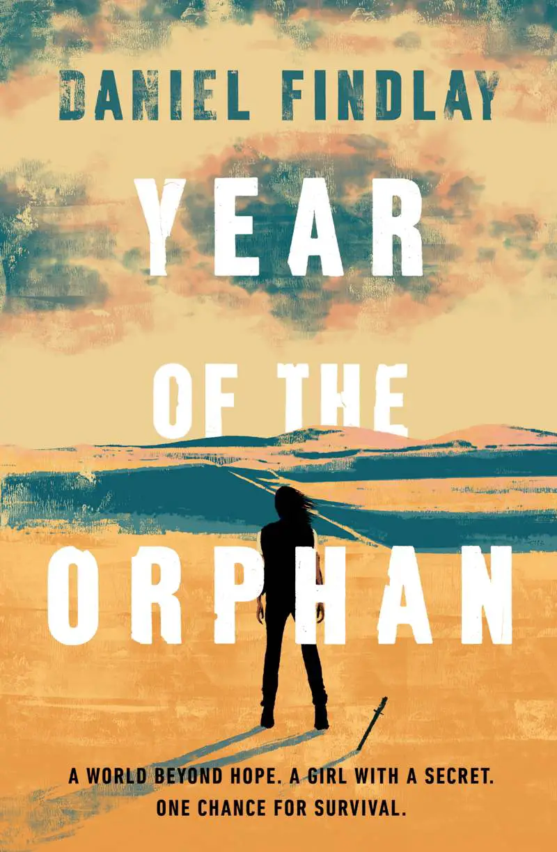
Below is another relatively easy-to-achieve example: Part of the title YEAR OF THE ORPHAN is behind the distant mountains, creating great depth. Part of the word YEAR is simply erased, as if sinking into the cloud. Note how careful the graphic designer was to ensure the woman’s right hand remained visible between the legs of the H of ORPHAN.
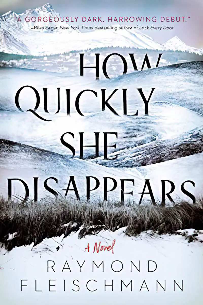
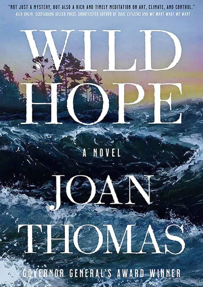
Other examples where some of the text sits behind the horizon, emphasising depth:








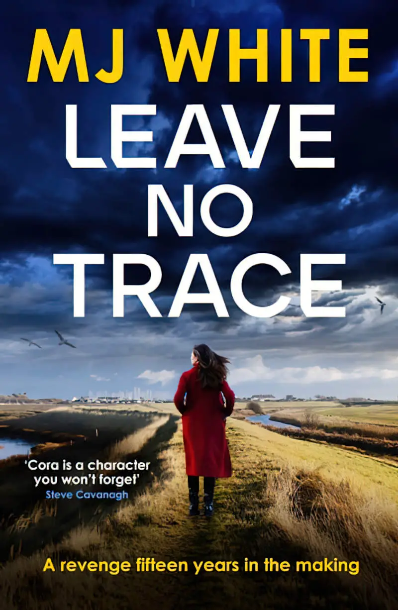
Here is another very subtle example which might in fact simply be the way the font of LEAVE NO TRACE is angled at the corners, though it looks like Montserrat SemiBold with the angles manually erased by the designer:
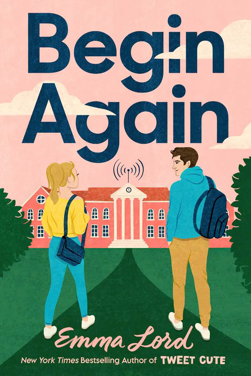
More clouds:
Now for some more complex interlocking and interweaving. Each of these covers will have multiple duplicates of both image and text, carefully ordered:

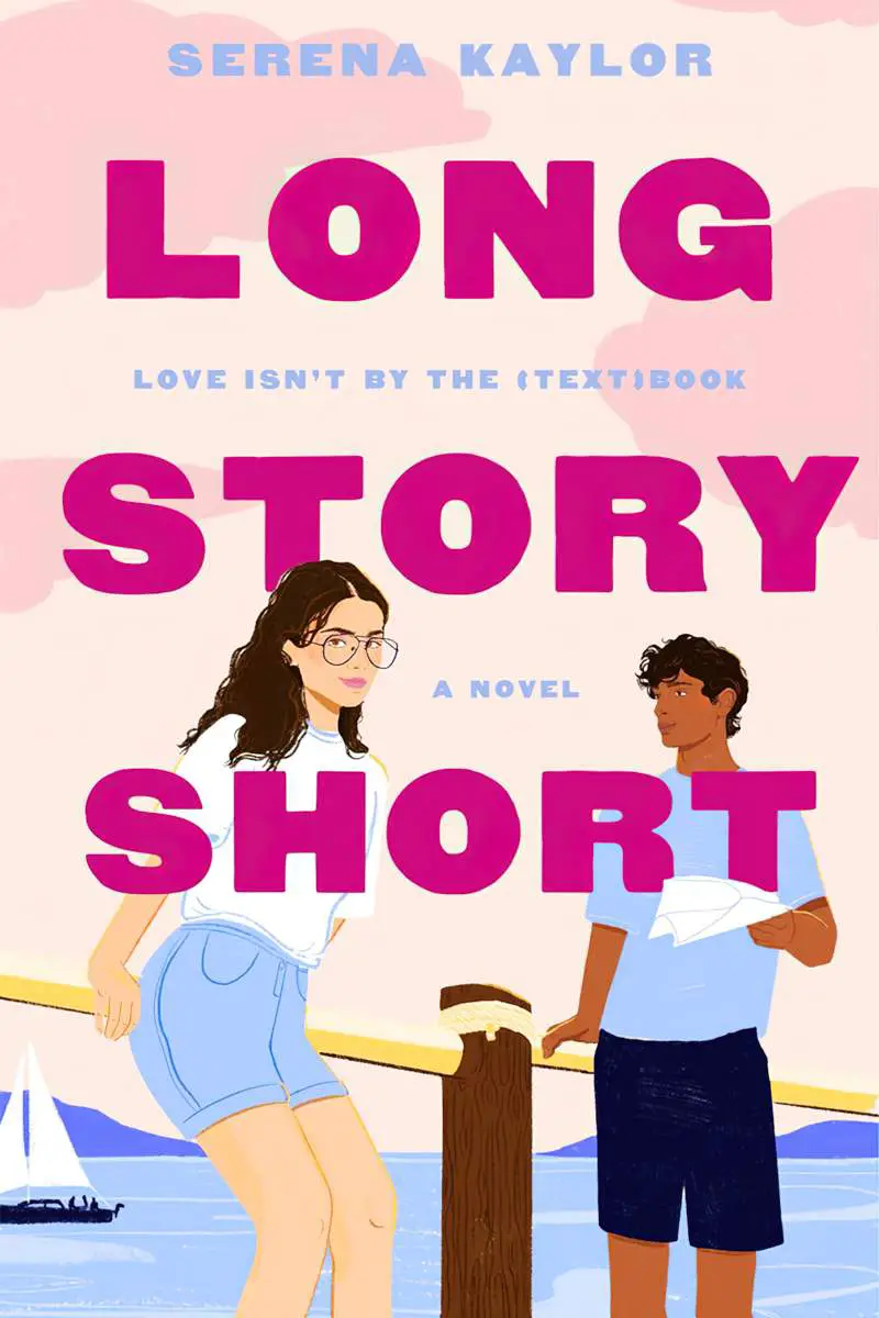
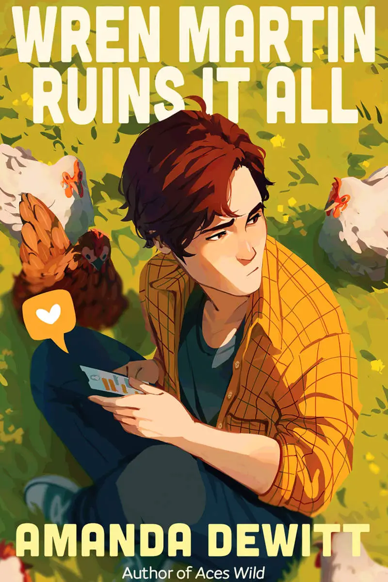

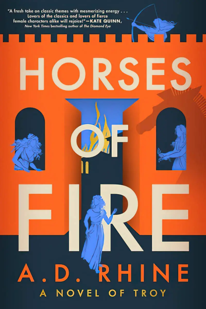
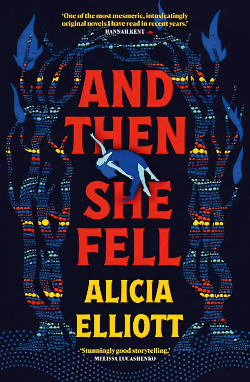
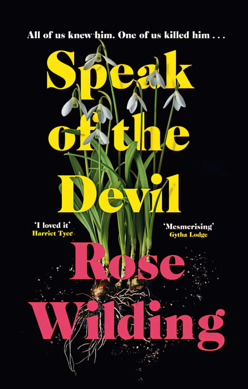


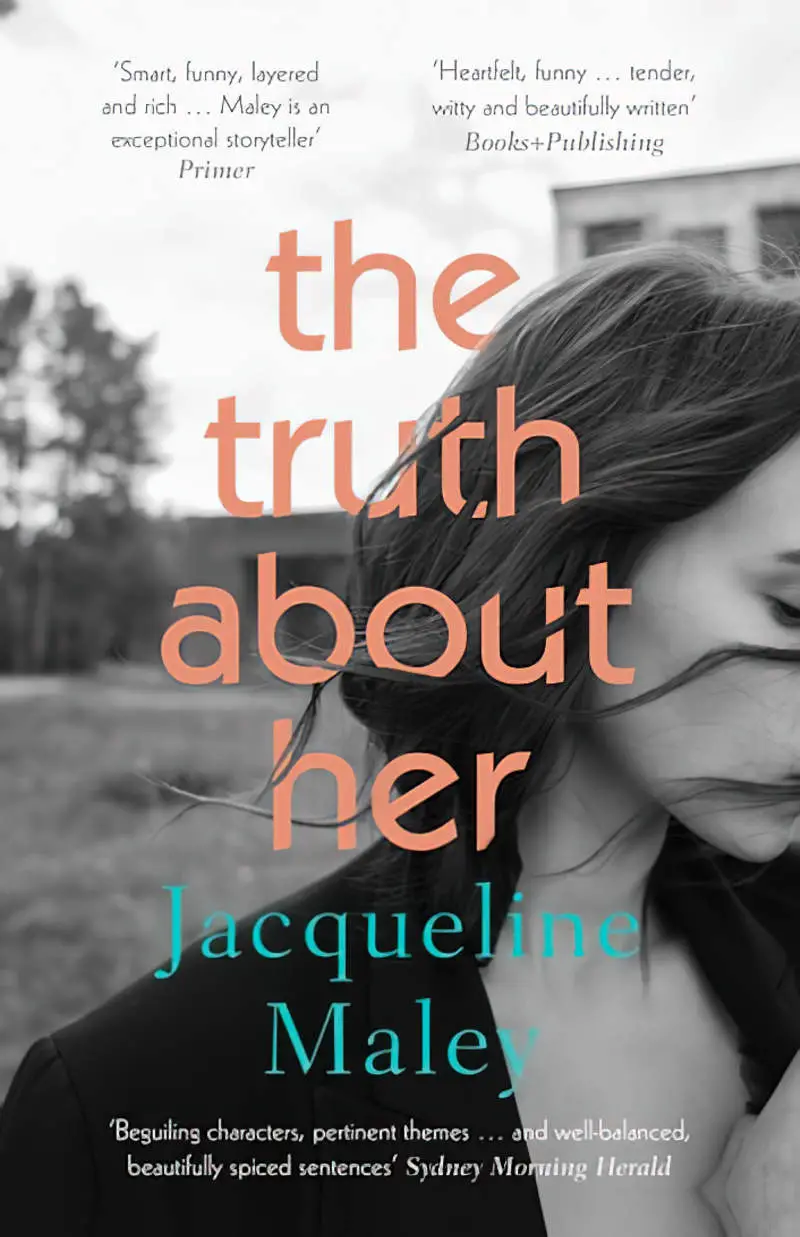


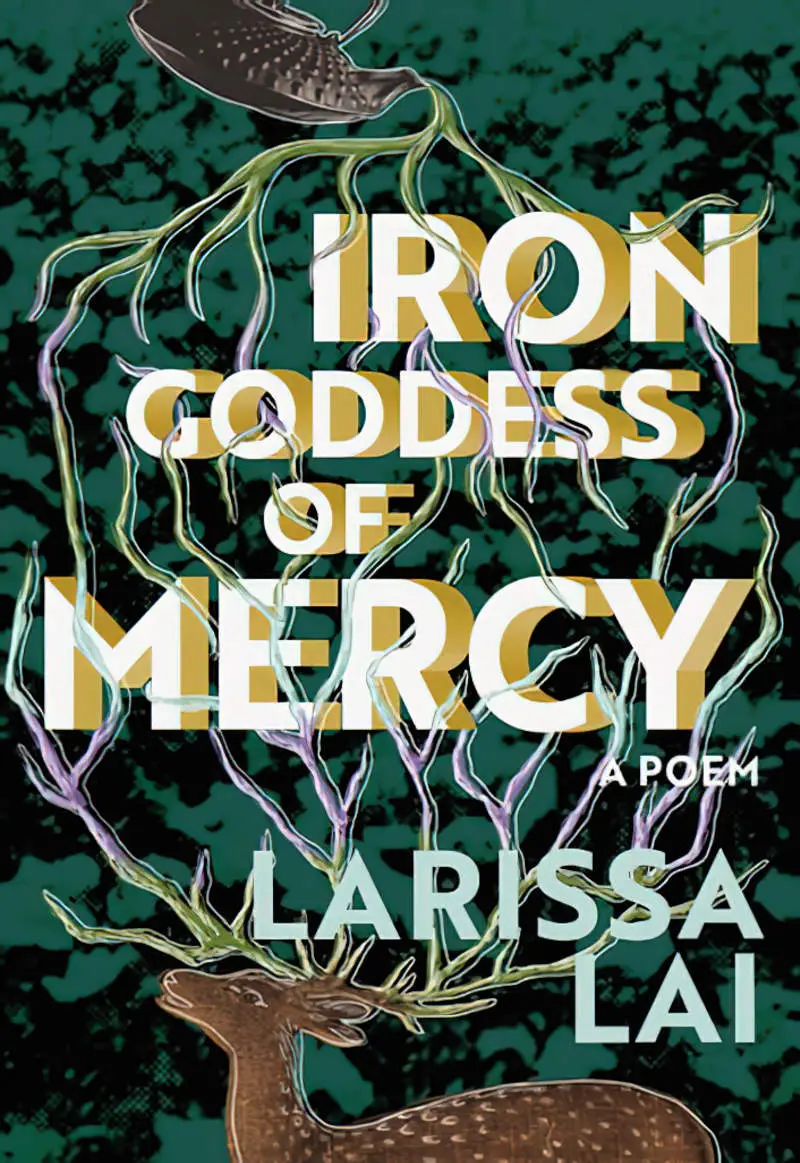
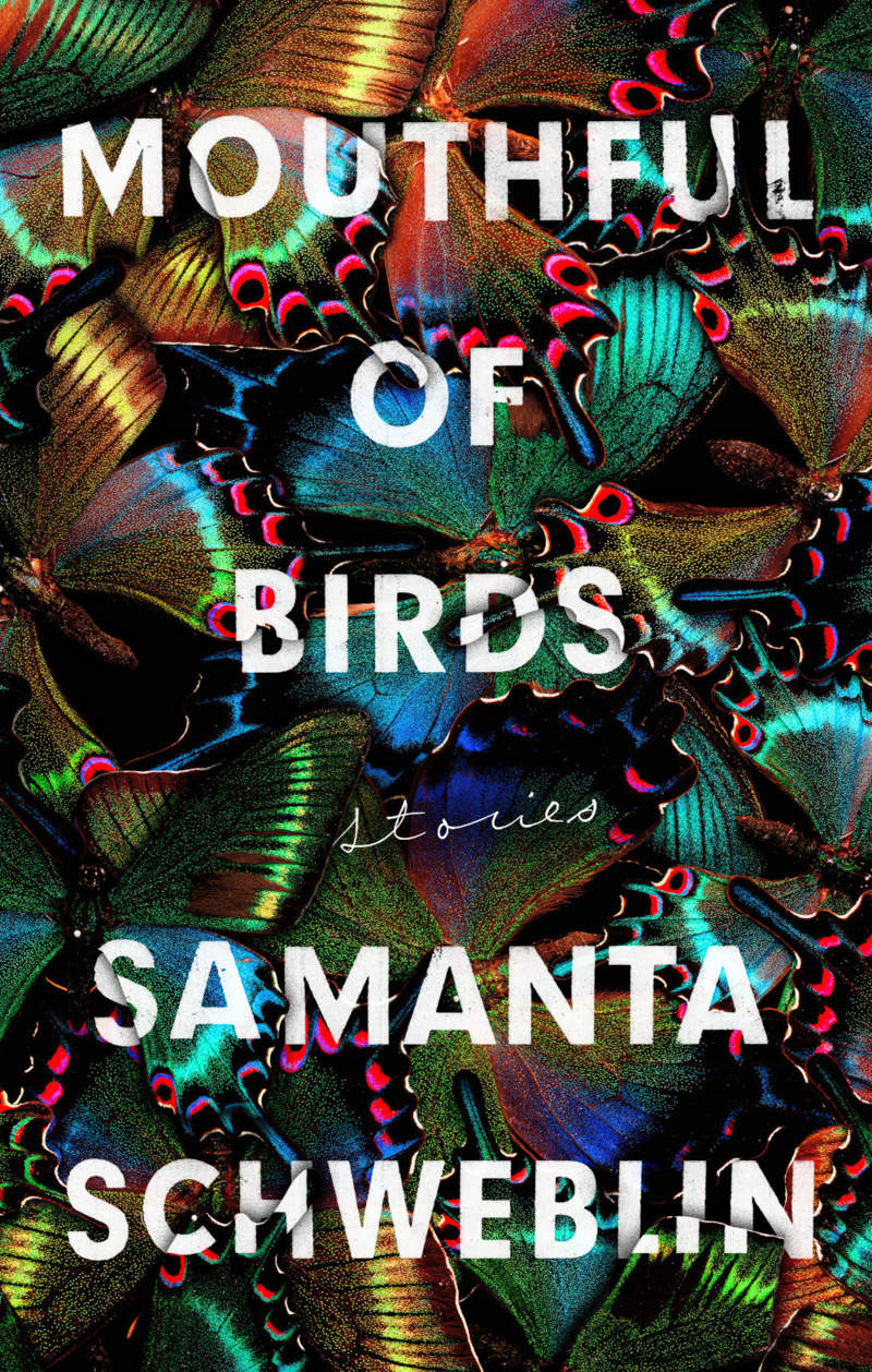
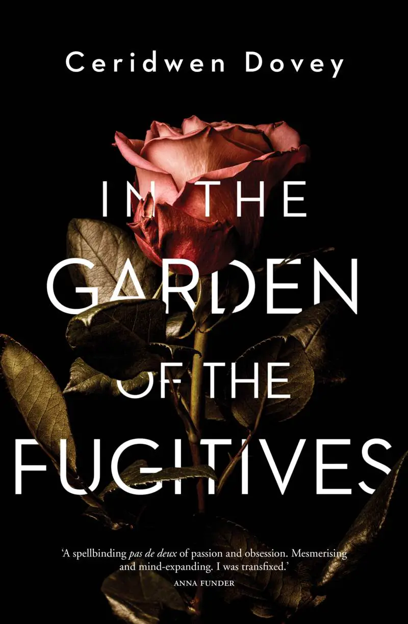

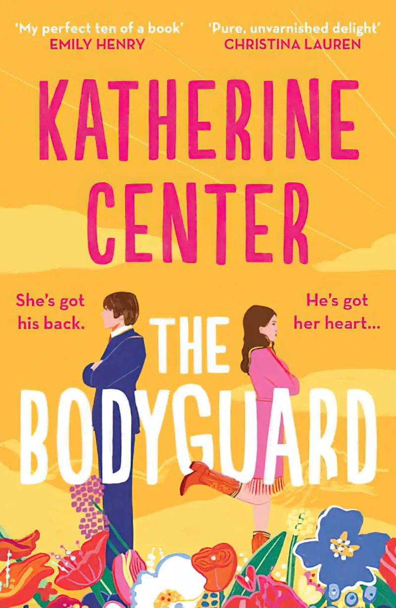
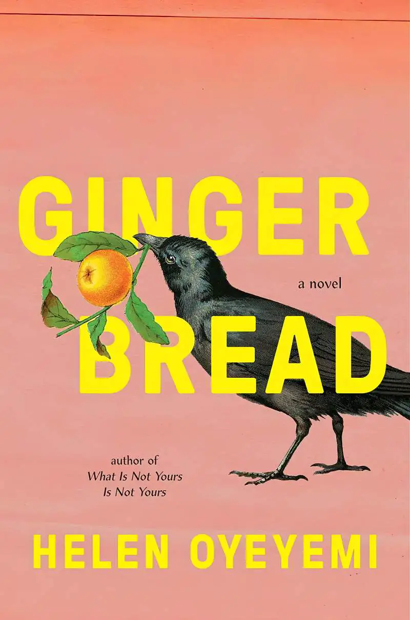
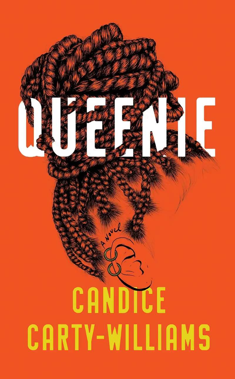
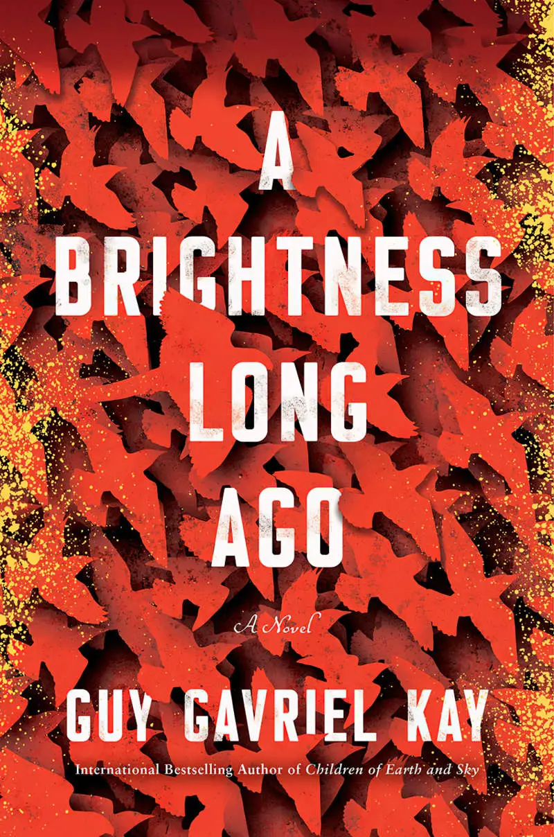
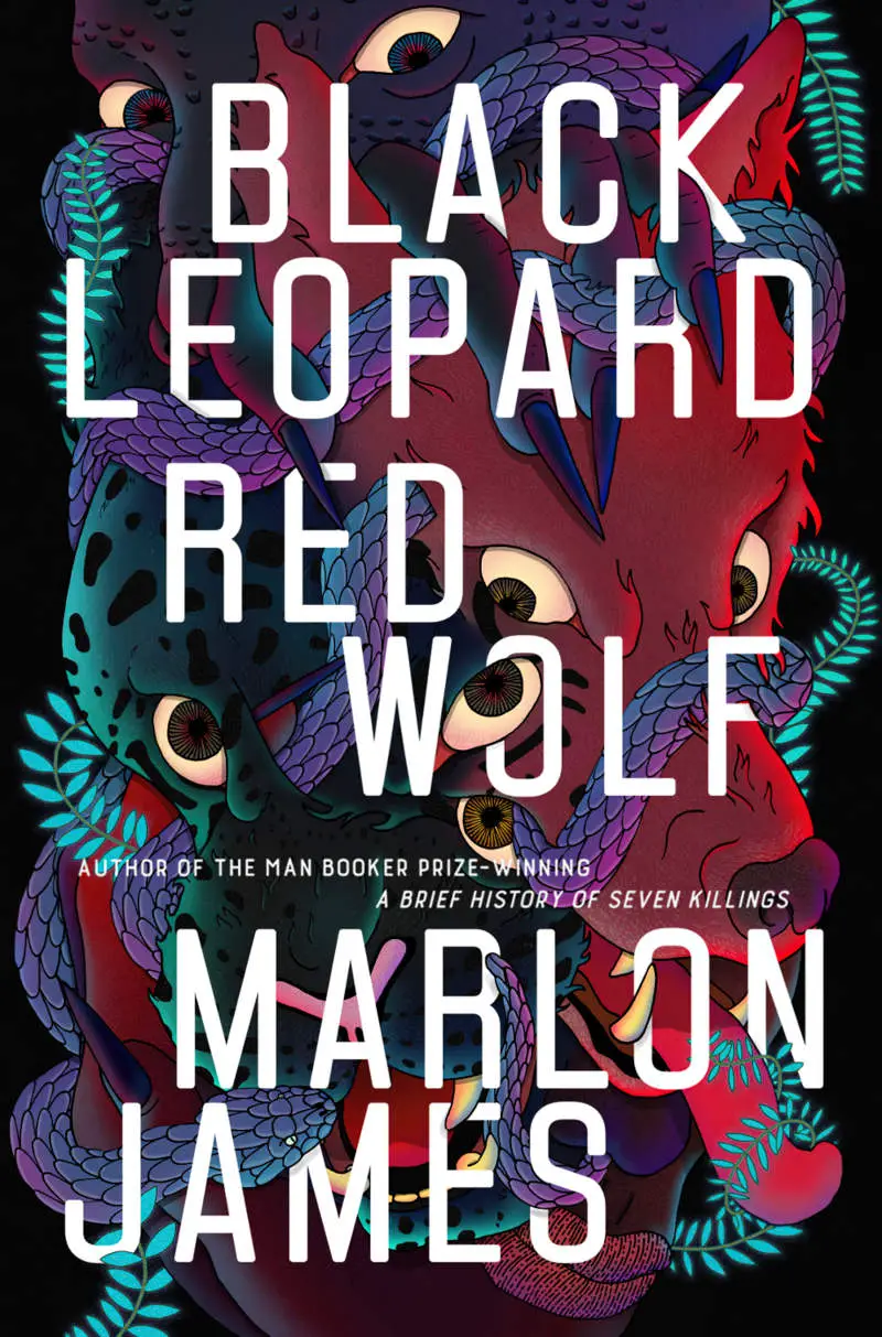

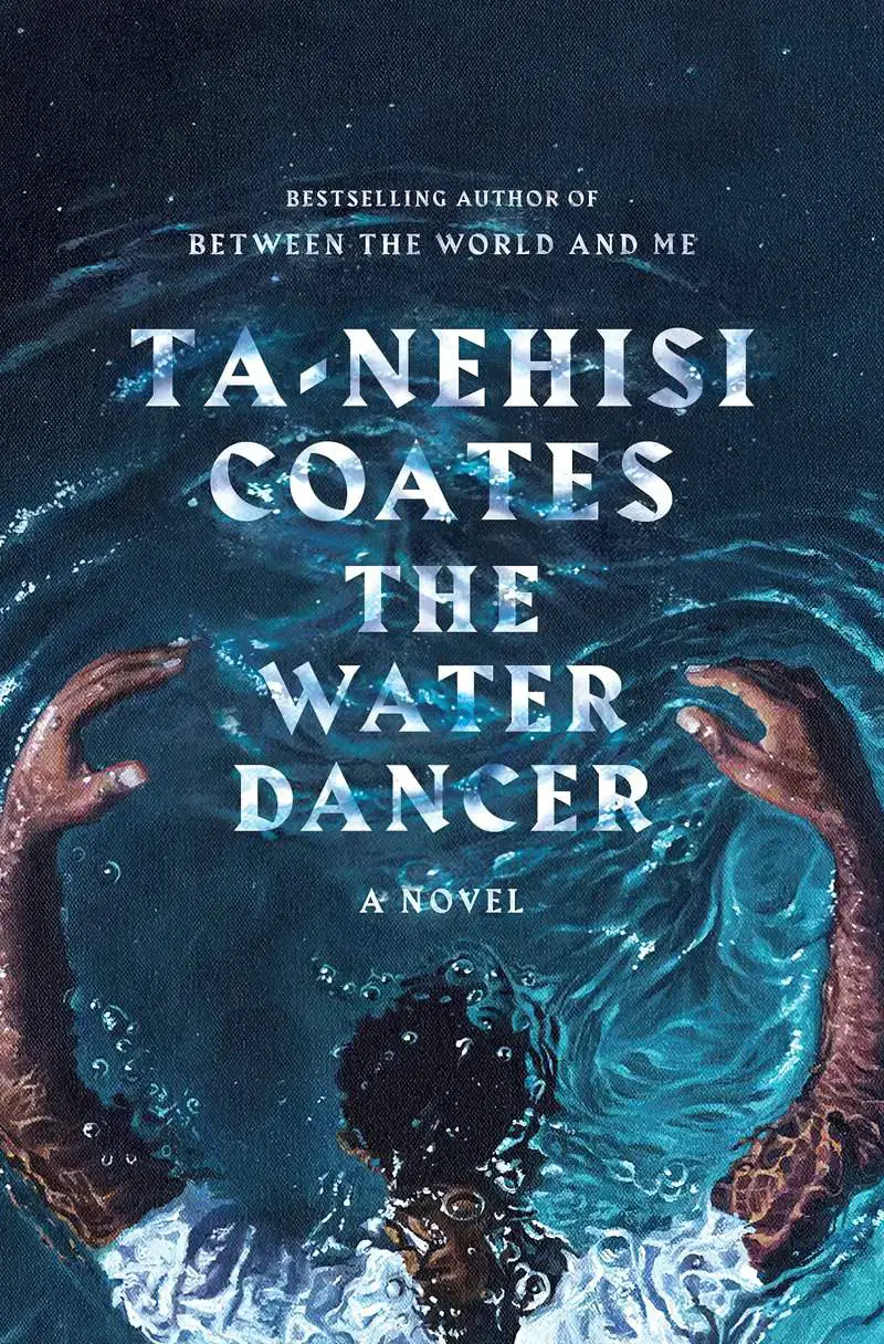
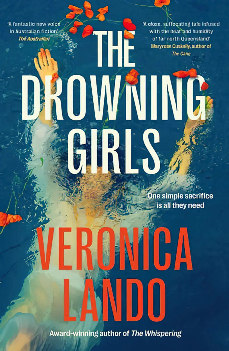
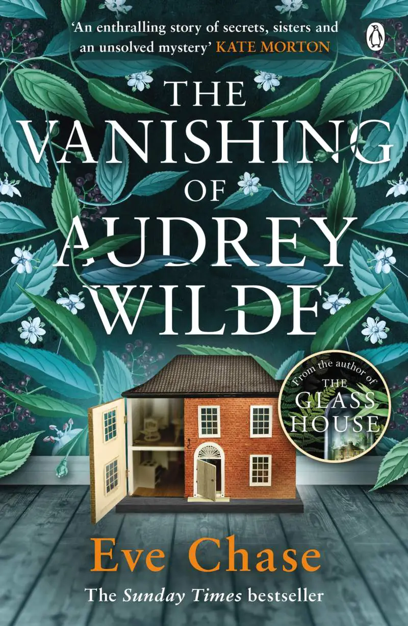
If you don’t have access to Adobe (or Affinity) products, this can be done with a Canva Pro subscription.
- Choose your template
- Upload your graphic and place it
- Duplicate the graphic layer
- Use the “Background Remover” effect on one of those layers (which works really well in Canva, even better than Photoshop, even with hair)
- Place the text between those two layers (Use the shortcut Ctrl + bracket to quickly move layers up and down)
There are more and more free Background Remover options online, especially since the increasing proliferation of AI art generators. For instance, ClipDrop by Stability.ai. They give you a certain number of free “Remove Backgrounds” per day.
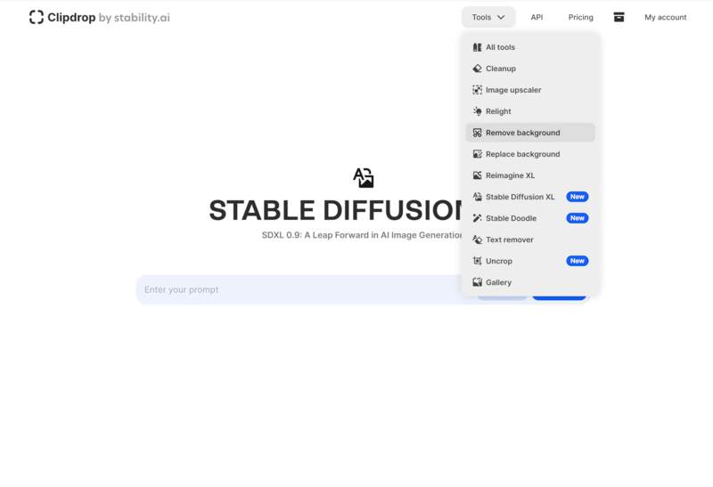
The cover art of this post was created in ClipDrop.
In Affinity Photo I made a duplicate of the graphic, cut out the front tumbler of water and placed it on top of the text. I set the tumbler to Linear Blend Mode, which retains darkness when I lower the opacity to create the transparency of the glass.
For the word TEXT I roughly used an eraser.
This whole thing took about five minutes. With more time and attention to detail we can create stunning effects with relatively little effort.
I used a very attractive and modern free font called Schabo Condensed.


