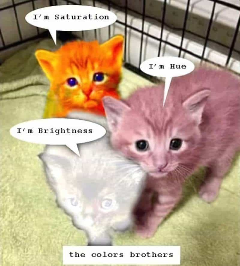
When talking about ‘colour’ artists are talking about several things rolled into one. Digital artists and photographers might think in terms of hue, saturation and value (HSV).
- Hue: Where the colour falls on the spectrum (red, blue, yellow etc. — what little kids learn when they learn their ‘colours’ of the rainbow.)
- Saturation: The strength of the hue. (Painters talk about how much grey is mixed in. They may also use the word ‘chroma’, a synonym for saturation. Low chroma colours are sometimes called ‘weak’, and high chroma colours ‘strong’.)
- Value/Brightness: The light/darkness from white to black. (Light = high value. Dark = low value. I have a problem remembering which way round this goes, but then I also get my lefts and rights back-to-front.)
WHAT IS KEY?
‘Key’ is a photography word but I apply it to digital illustration as well. (Many of us are using photo software to create our illustrations, after all.)
Photographers change the key of an image by adjusting their lighting. Low lighting equals low key. (See my problem?) With extremely low lighting you get that noir, chiaroscuro look.
WHAT IS HIGH KEY?
Of course, lots of lighting equals high key. Think overexposure, but on purpose. Objects seem to blend into each other because outlines disappear. High-key lighting gives us more fill light and softer shadows. High key photos look as if they’ve been taken at midday when the sun is overhead.
High key images comprise a (narrowed) range utilising only light (high!) value colours. More specifically, a high key colour palette describes the set of colours ranging from mid-tone hues to white.
KEY IN PAINTING
Painters train their eye to look for value as well as hue. As a training exercise, they might carry around a square of red cellophane and hold it up in front of a scene. This forces the eye to focus on values rather than hue. (Painters don’t tend to use photography terms but will frequently talk about value and tonal range.)
An artist can get by simply by understanding value. Some will say it’s more important to understand value than hue. (Especially these days, in which the science of hue selection can be automated — or highly assisted — within Photo editing software. There are also online palette generators such as Coolors.co.)
THE INVERSE: MAKING USE OF THE FULL TONAL RANGE
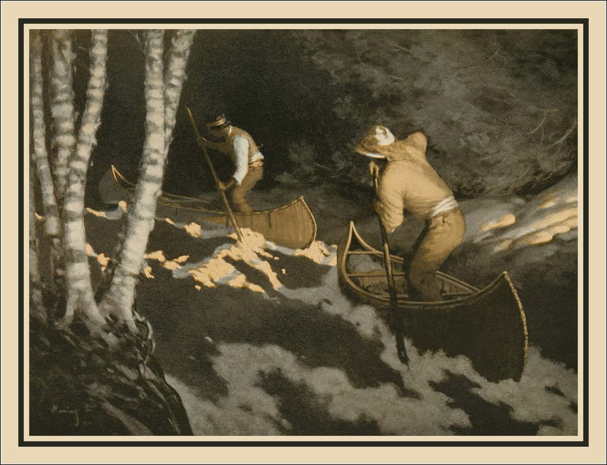
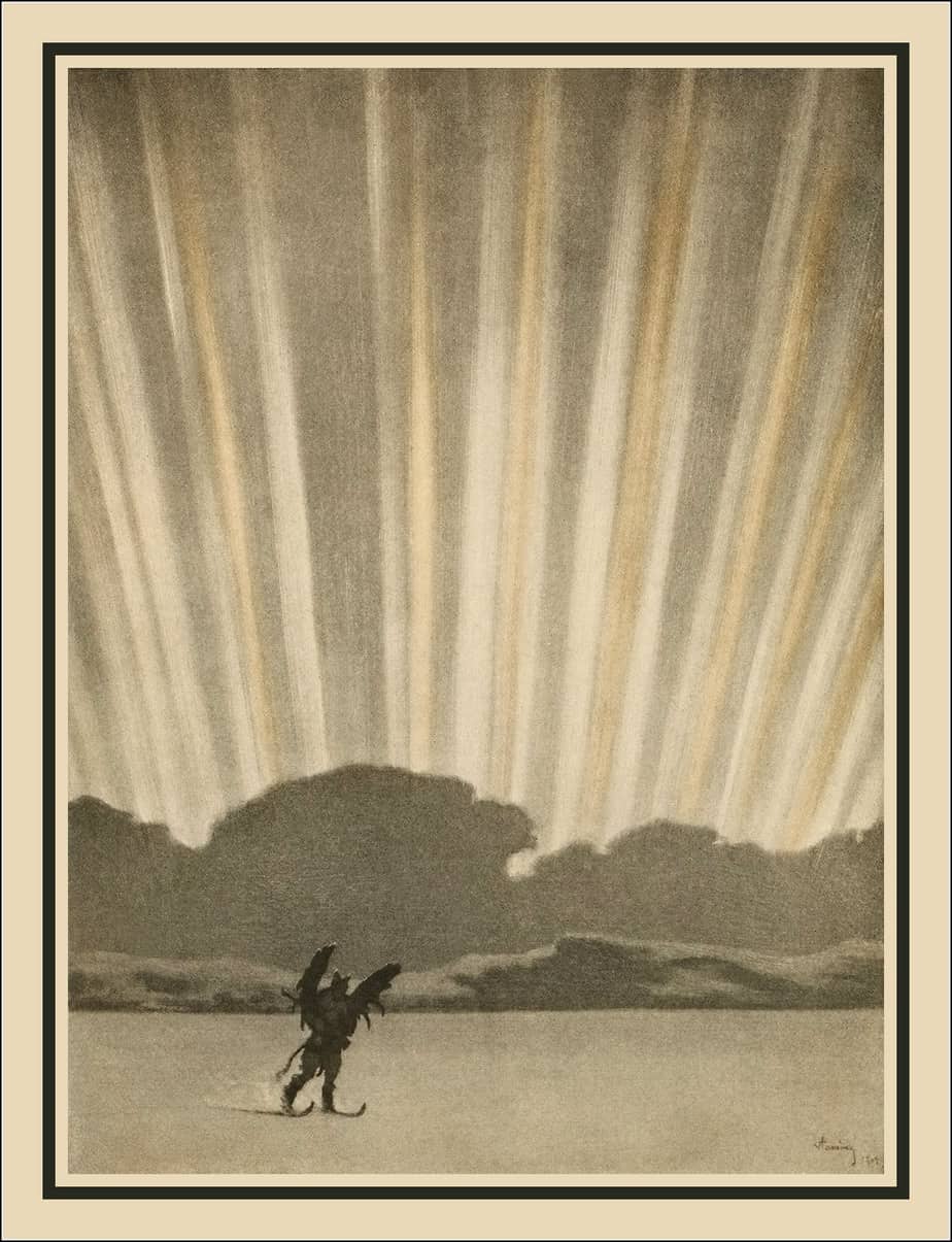
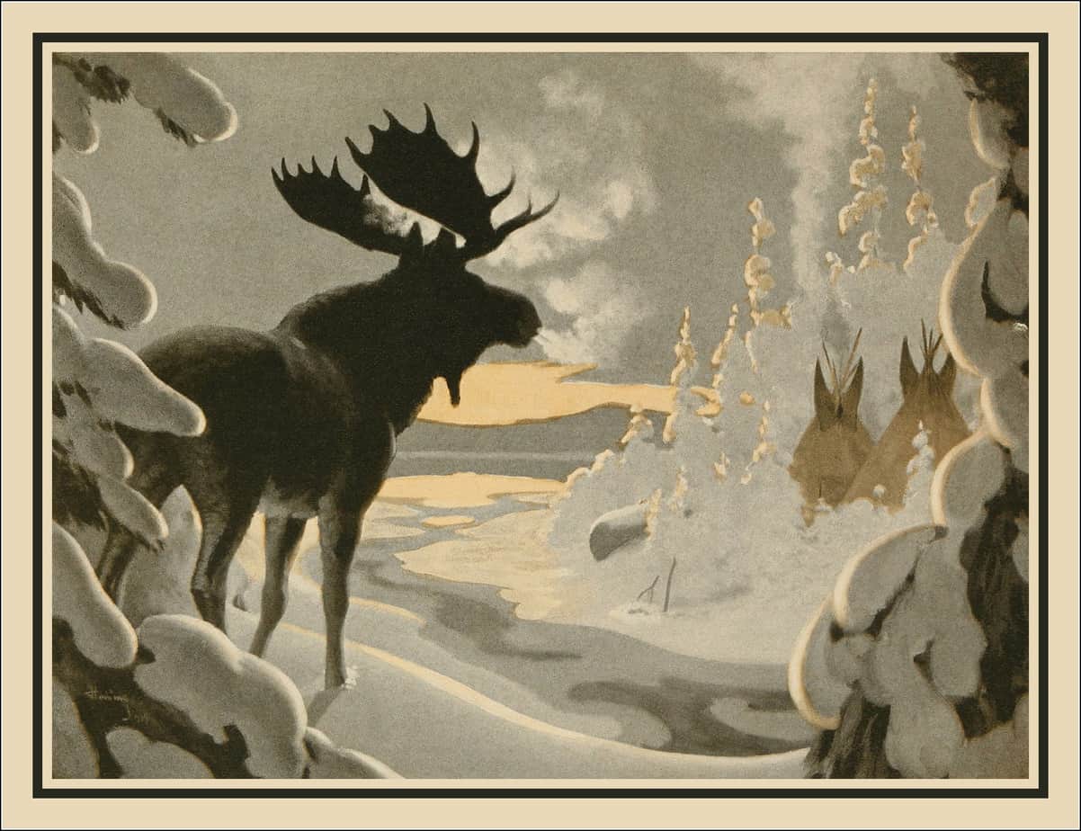
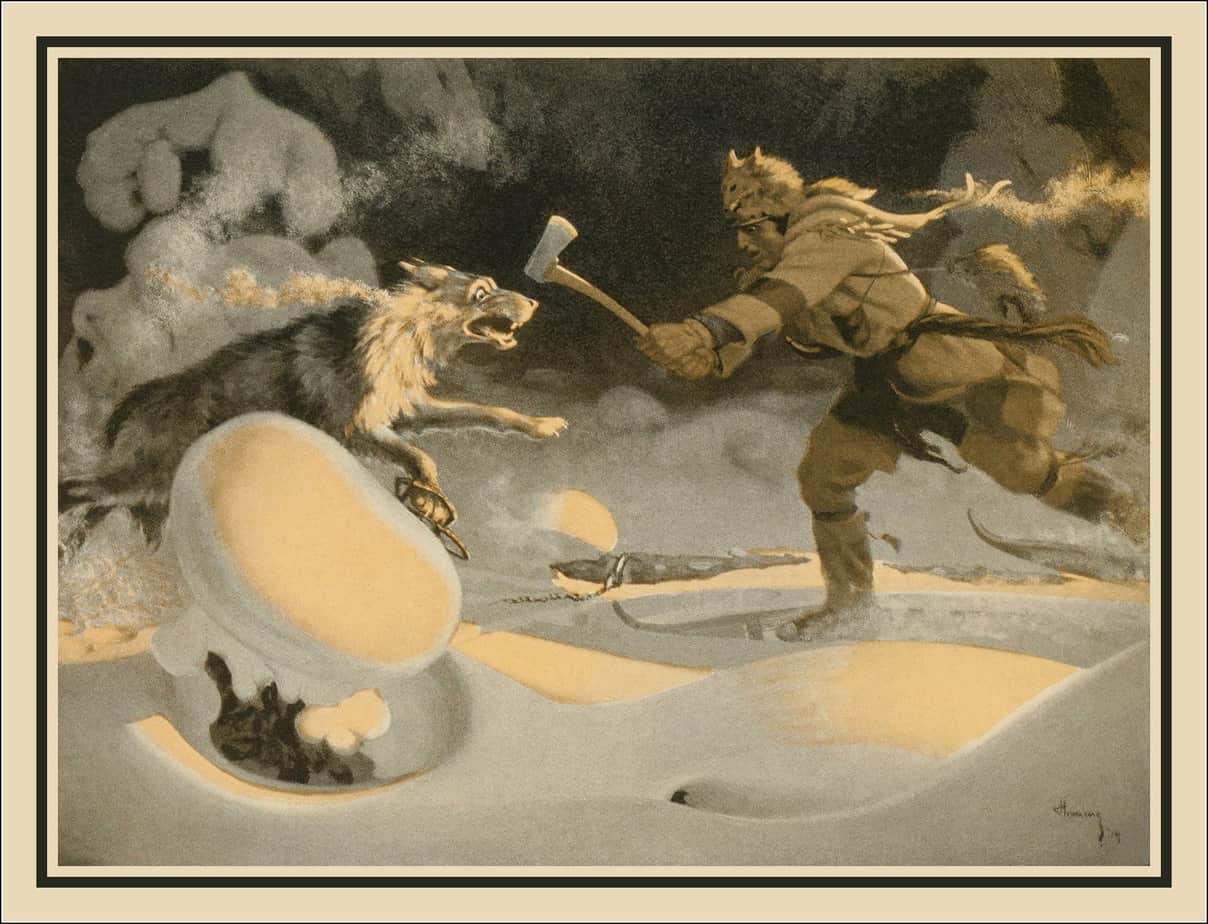
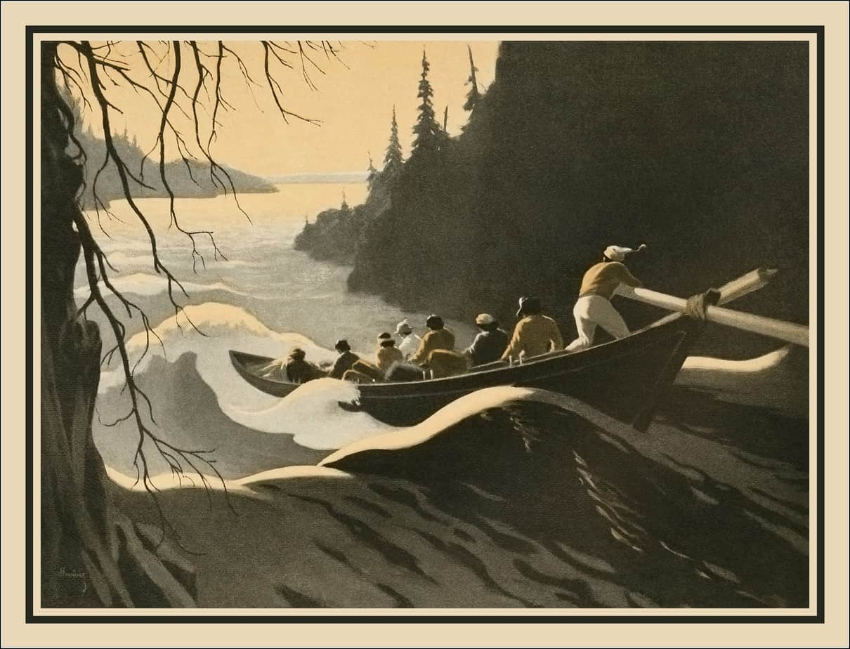
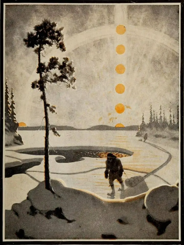
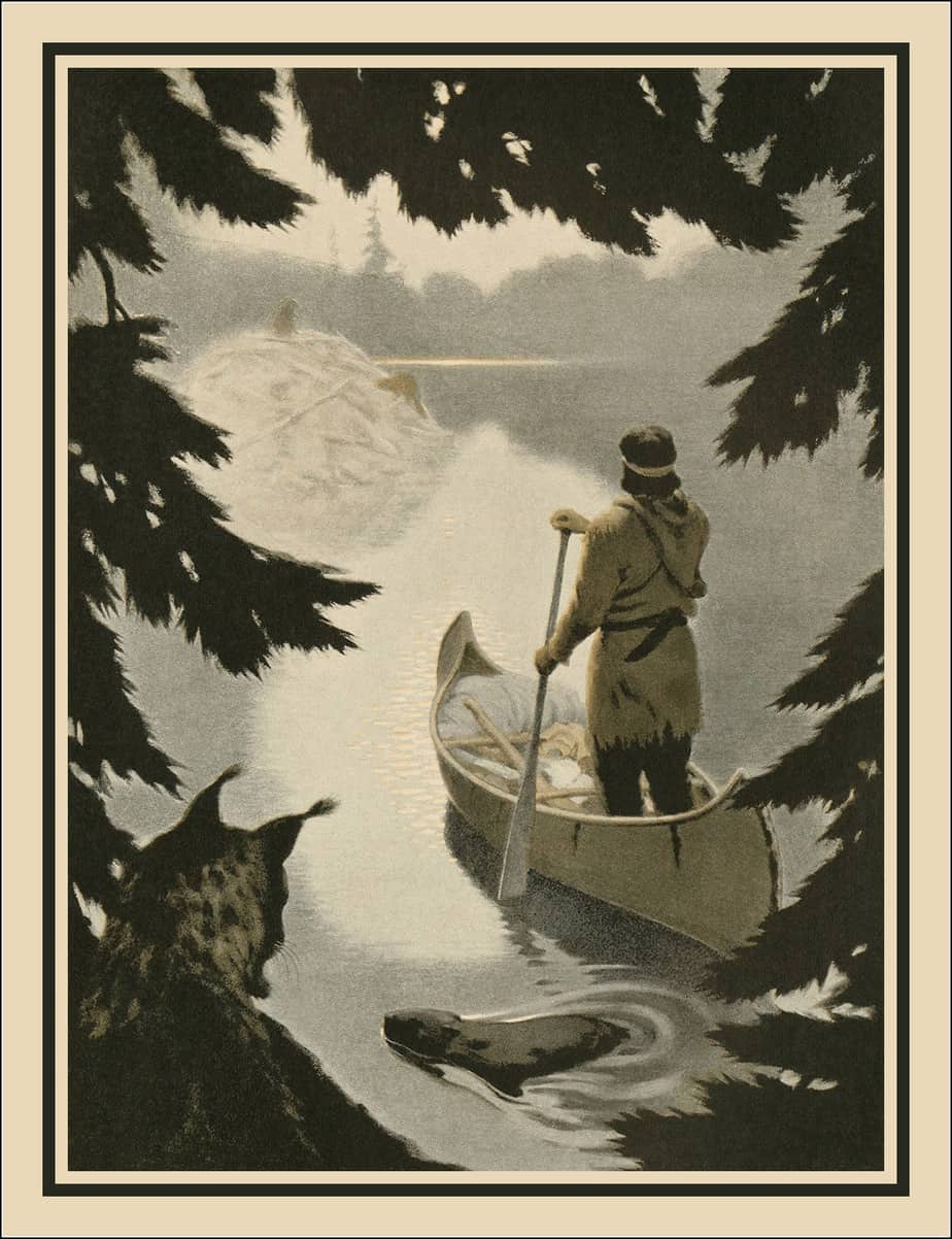
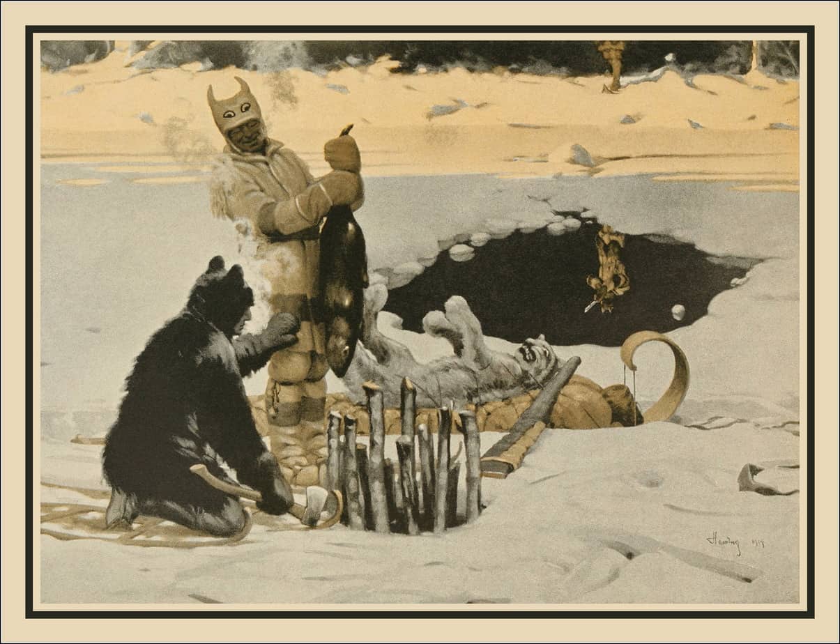
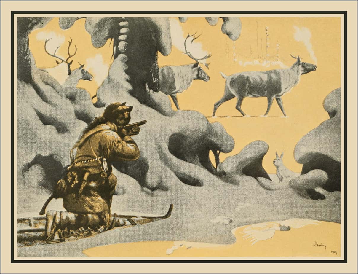
The Drama of the Forests is a 1921 Canadian adventure novel by Arthur Heming.
These days, some of Hemings’ illustrations are housed at the Canadians Gallery of the Royal Ontario Museum. Apparently the artist was colour blind. His eyes didn’t differentiate hue very well but this guy understood values. Heming’s paintings make full use of tones from lights to darks. This makes for dramatic landscapes.
Today I’m talking about the opposite of what Heming did: Designs which make limited use of tones, ranging only from lights to mid-tones (whites to light-grey). These designs might also be described as ‘pastel’, because of the whiteness and brightness.
In colour theory, pastels (also known as “tints”) are pale tones of colours made by mixing a significant amount of white into the original shade.
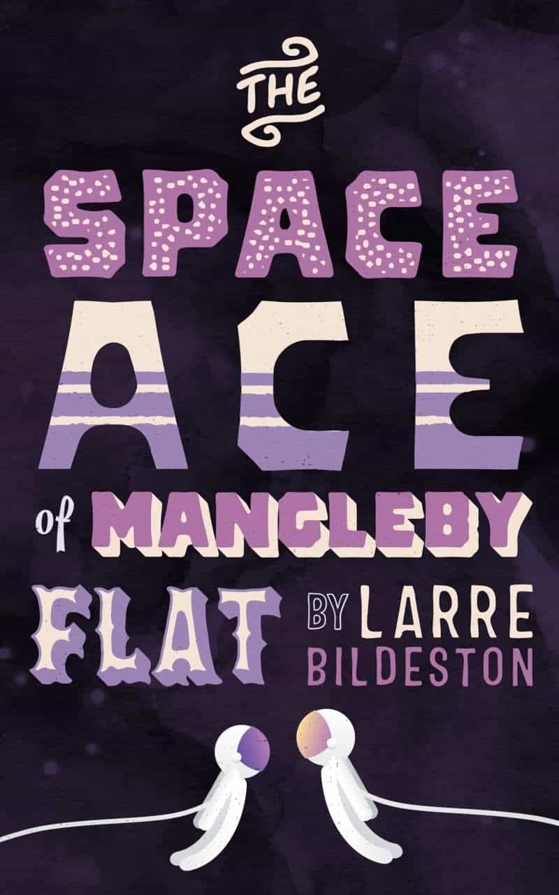
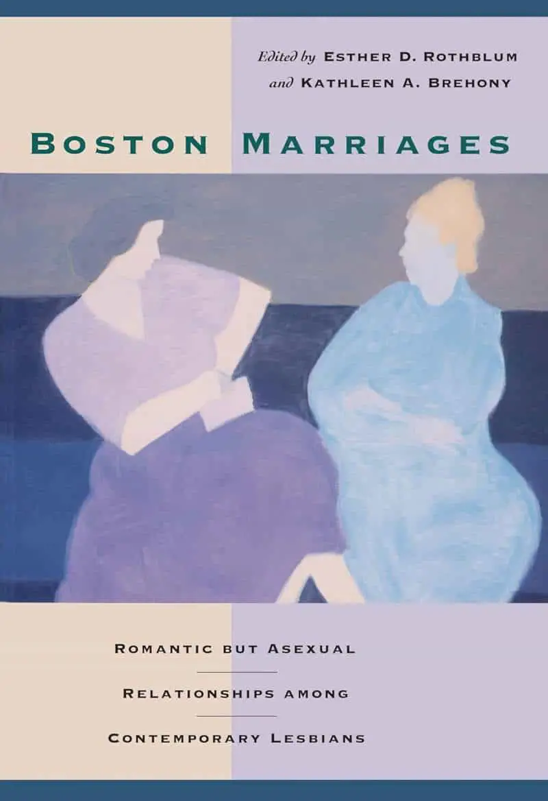
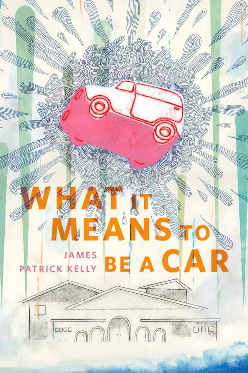
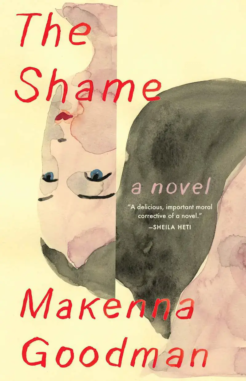
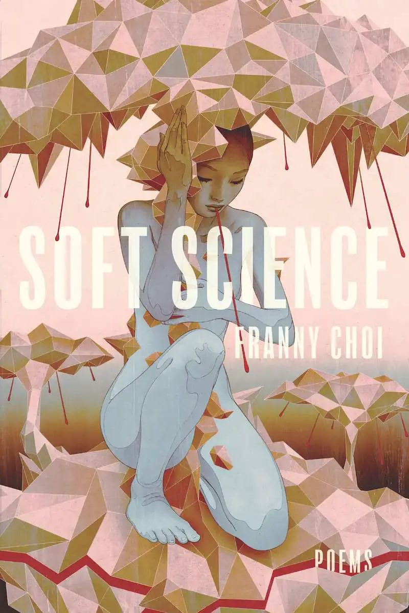
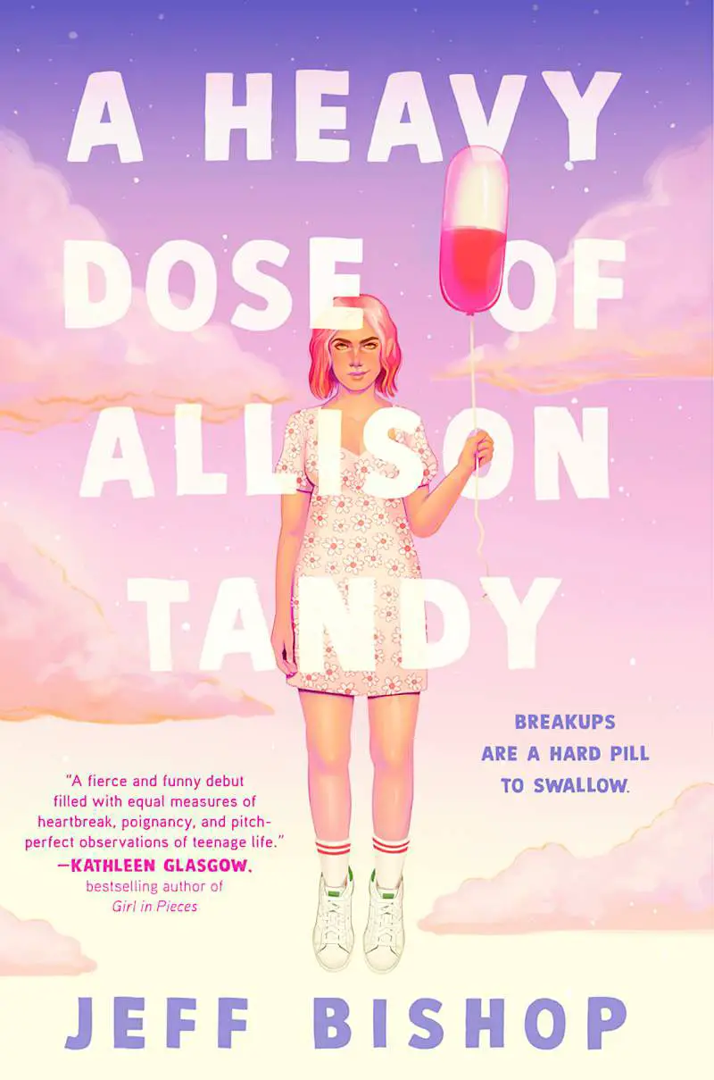
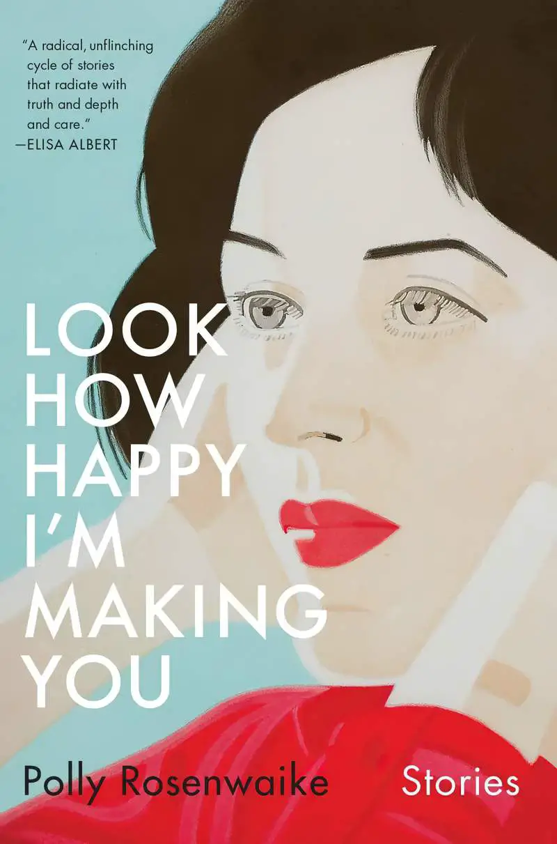
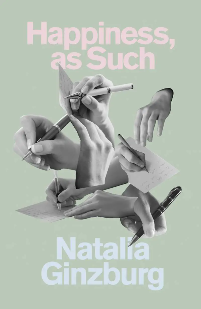
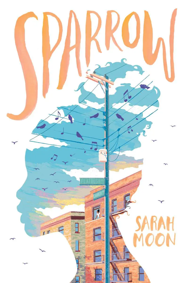
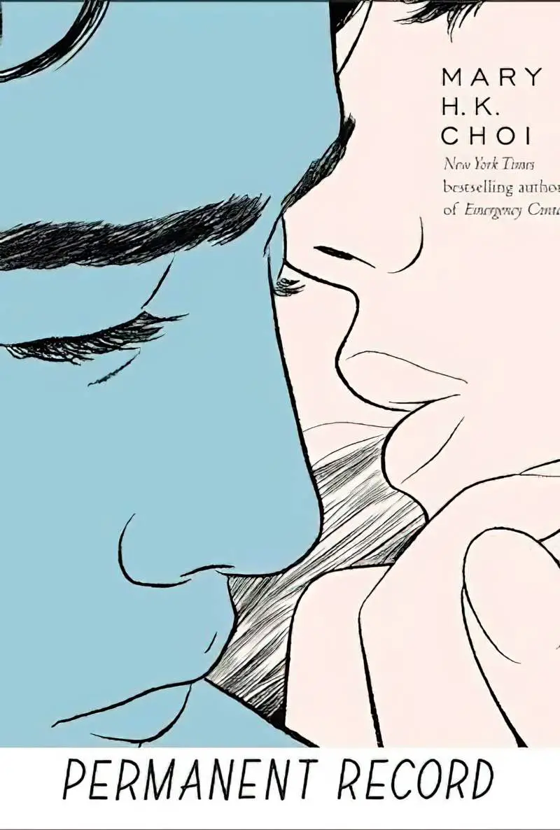
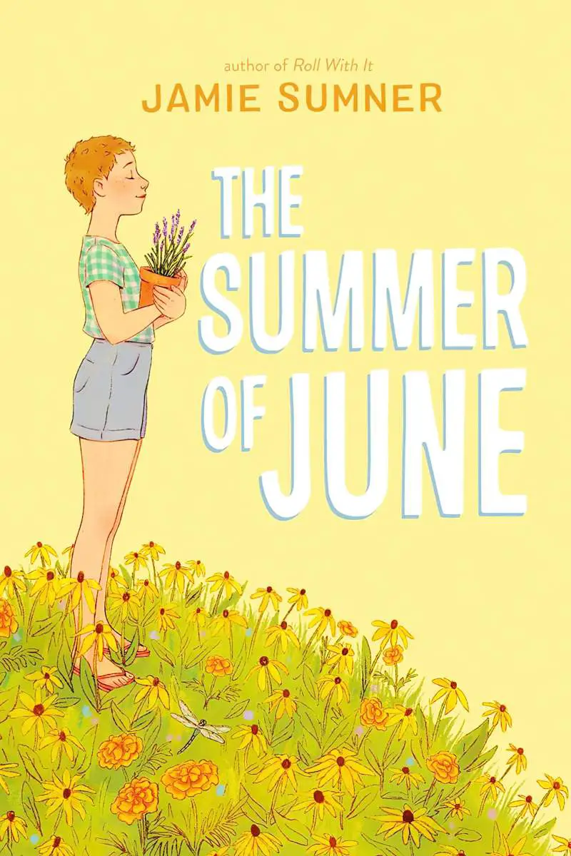
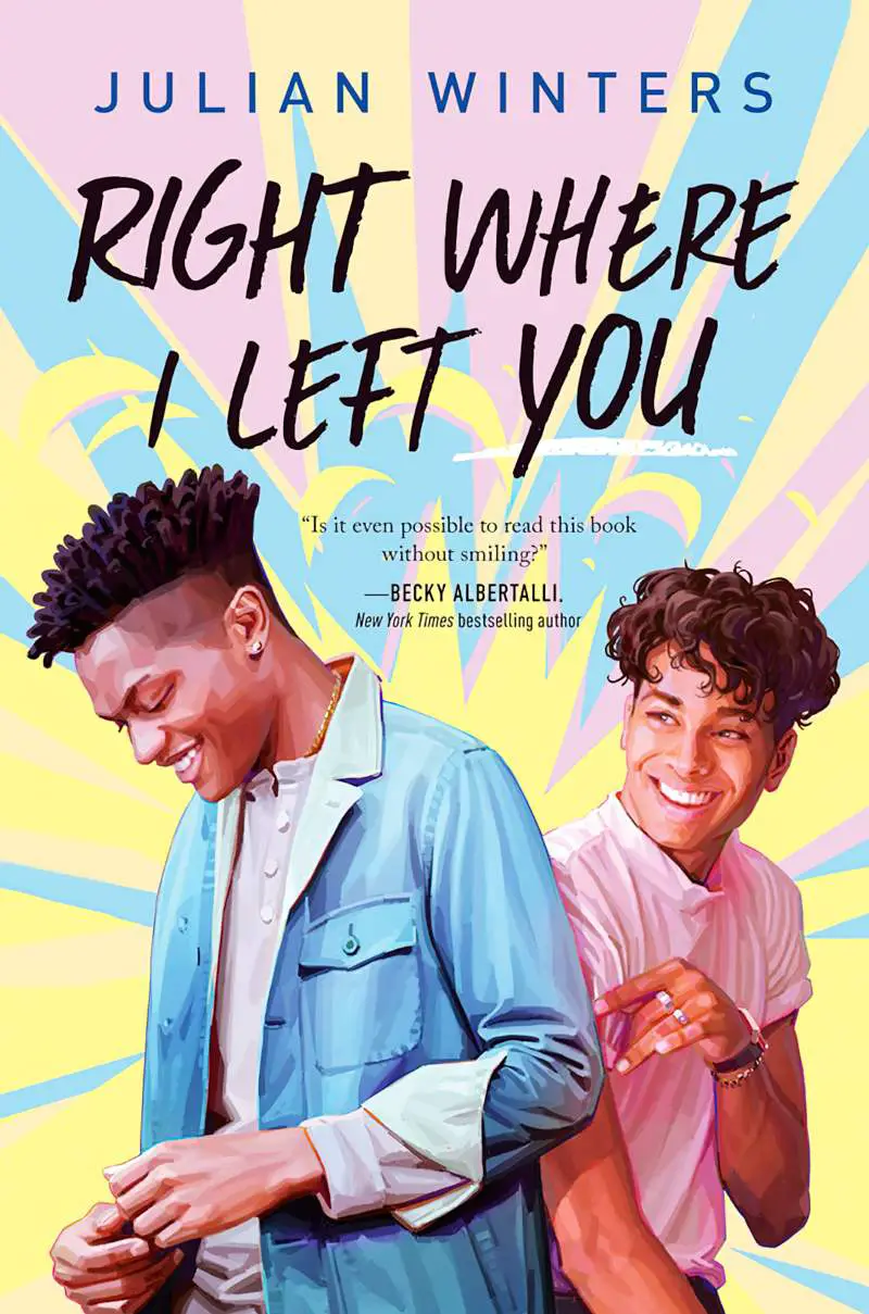
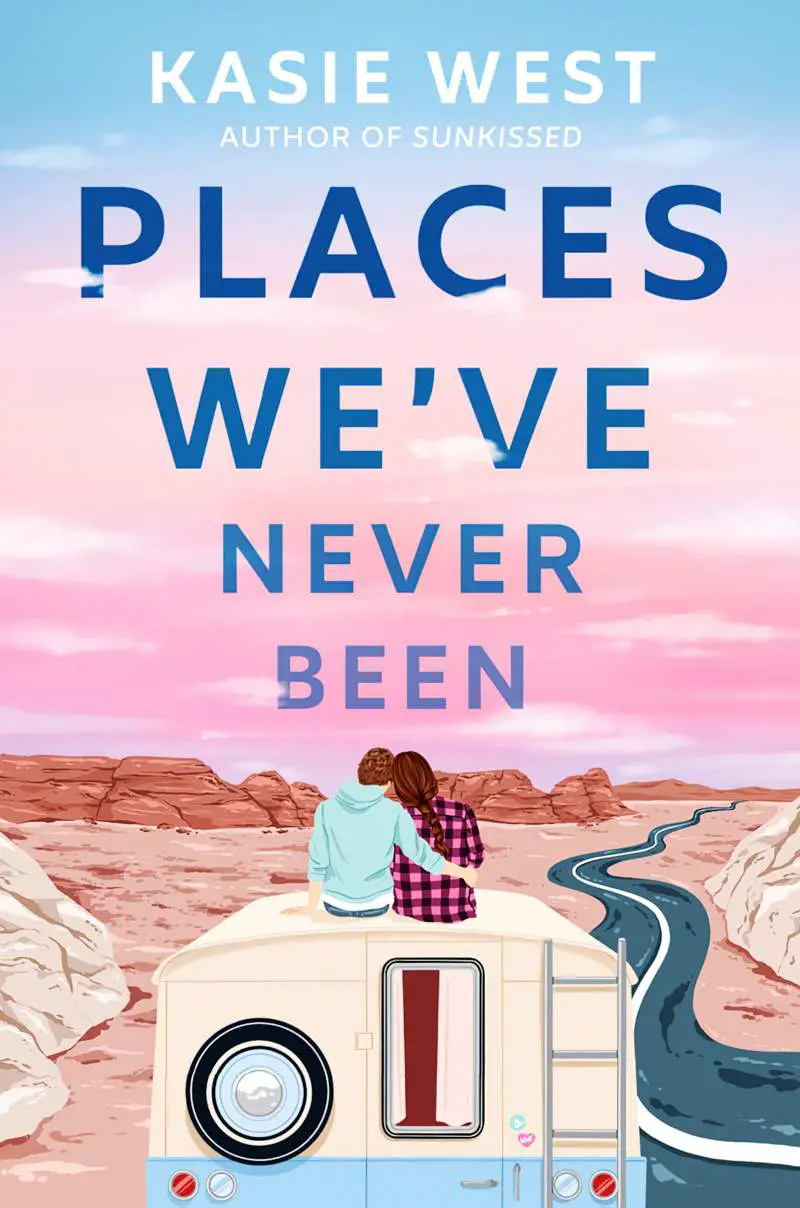
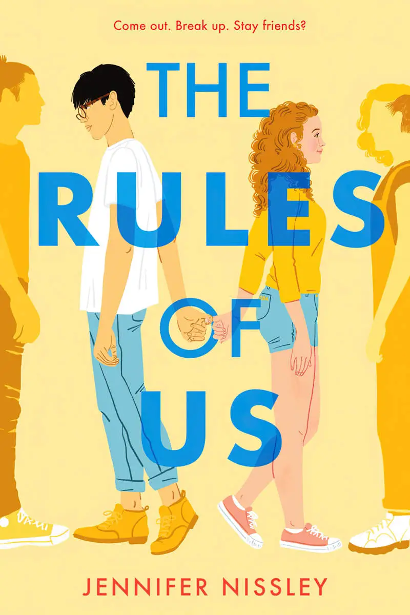
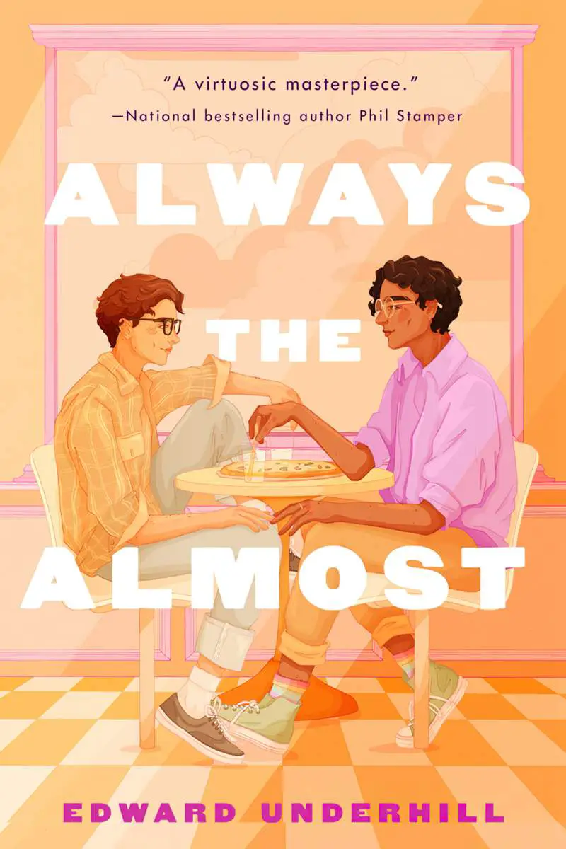
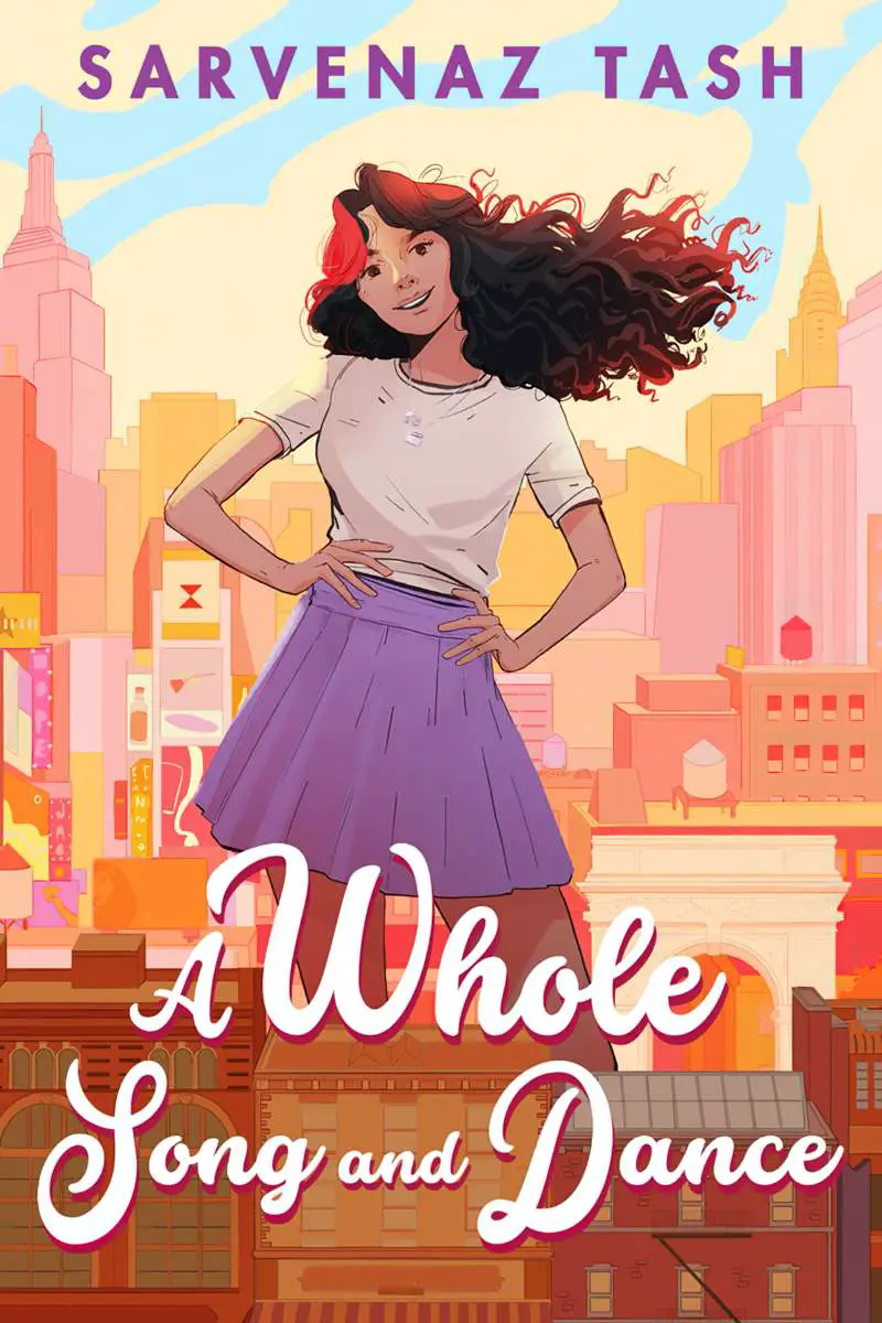
EXAMPLES OF HIGH KEY BOOK COVERS
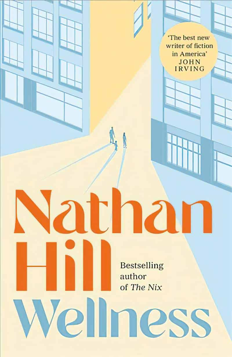
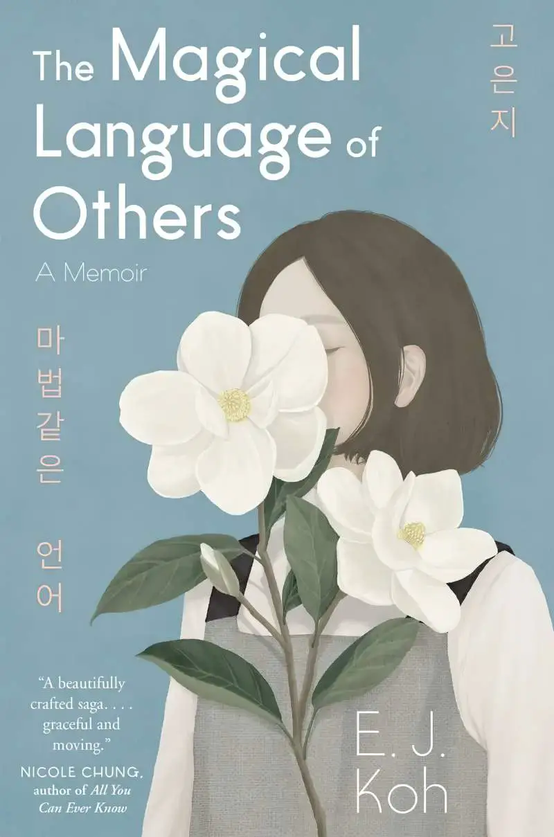
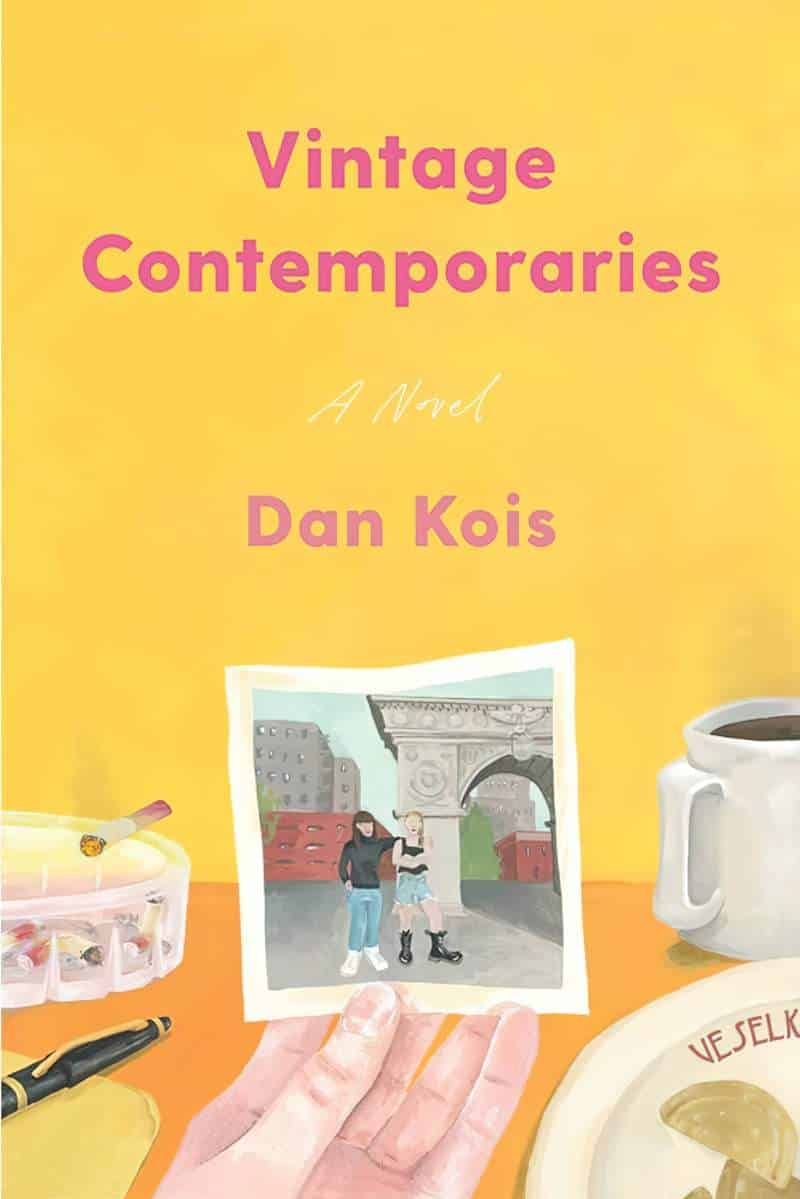
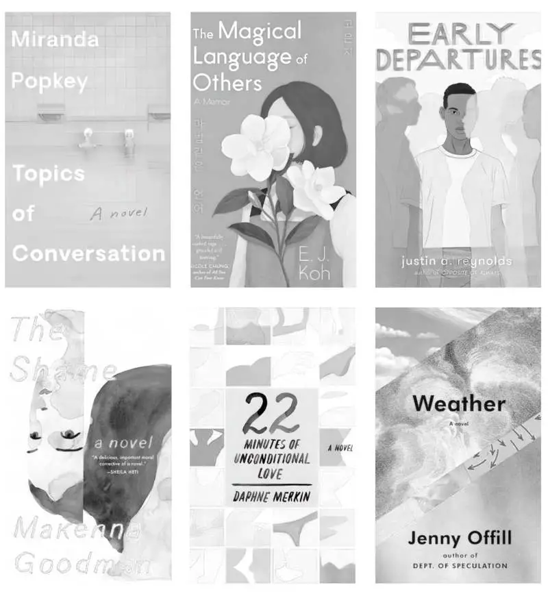
If you take any one of the book covers below, import it into Photo software and convert to grayscale, you’ll find nothing in particular stands out. High key/low chroma covers can get a bit lost on a black and white digital bookstore.
I really love these covers and I wonder if we’d see more of them if the eReader black and white limitation weren’t an issue. However, if the overlaid text is either black or white the text does stand out from the illustration, which is useful.
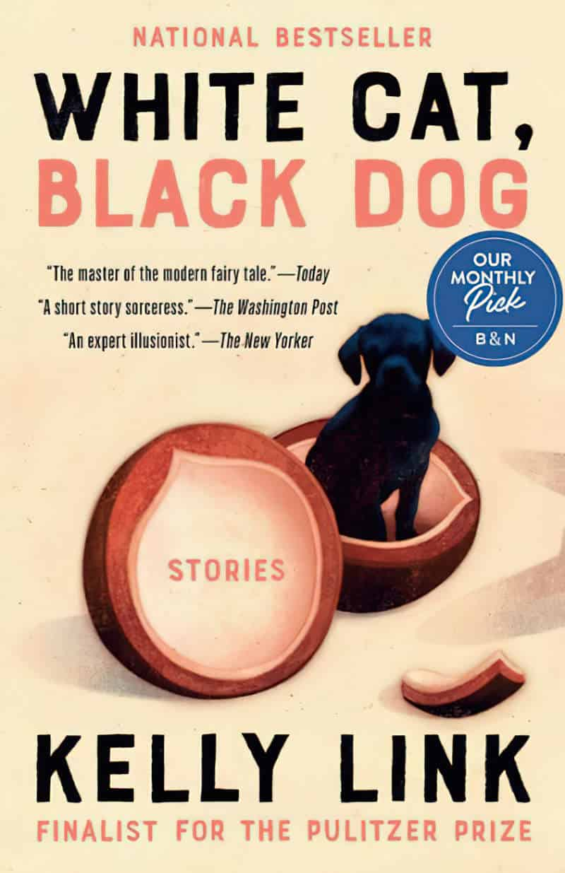
Notice, too, how accent colours really pop (e.g. the red swimming cap on Topics of Conversation.) An accent ‘colour’ might simply be a small amount of black (e.g. the boy’s hair on Early Departures). All of them pop.
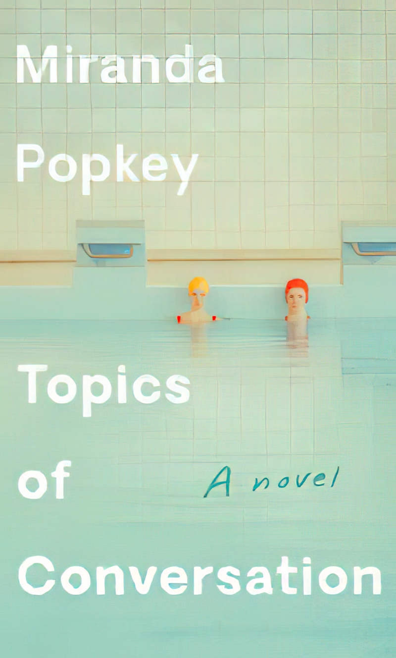


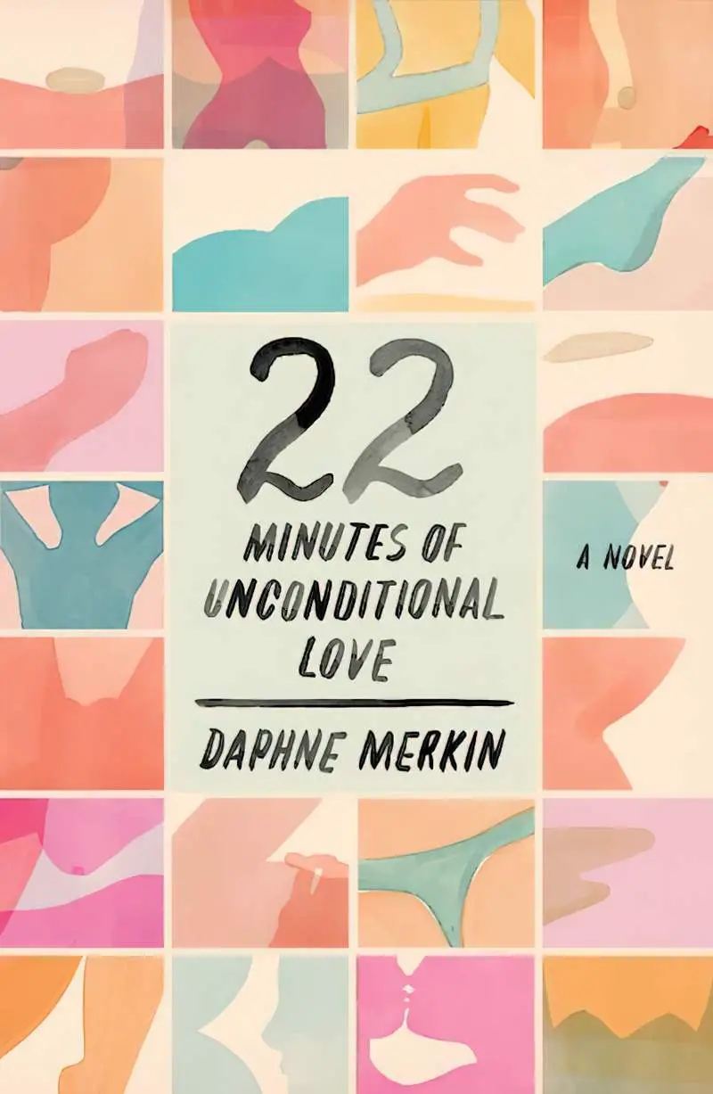


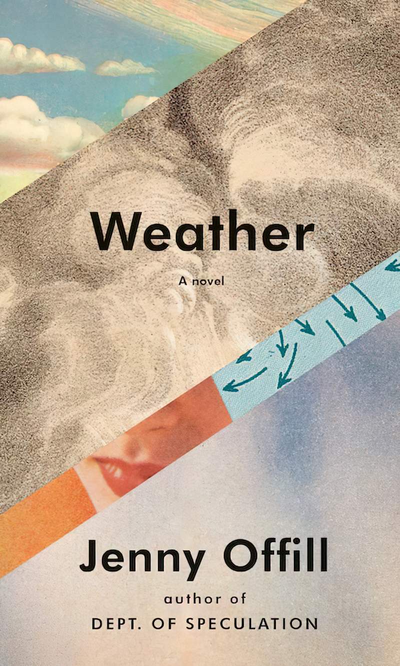


Notice especially how the yellow and red swimming caps of Topics of Conversation appear white when desaturated. The illustrator chose that particular yellow and red mindfully, with no grey mixed in. (I appreciate that the author’s last name just happens to be ‘Popkey’!)
TAKEAWAY DESIGN LESSON
Working with a high key colour palette is similar to working with black and white. When creating an effective high key/low chroma design:
- be sure to make full use of accent colours
- and/or make the text either ~100% black or ~100% white.
- While creating the image, apply a black and white filter to check for pop.
MORE EXAMPLES


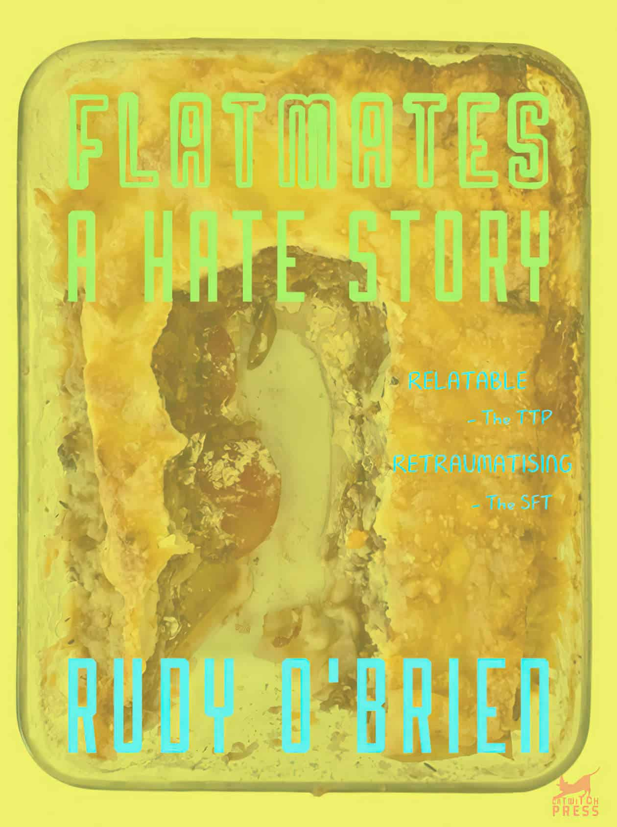
The book cover in the header does not exist, I made it for practice. The lasagne did briefly exist. The photo has ‘white paper’ removed and is set to Average blend mode over a yellow background. The font is the Robolt family.