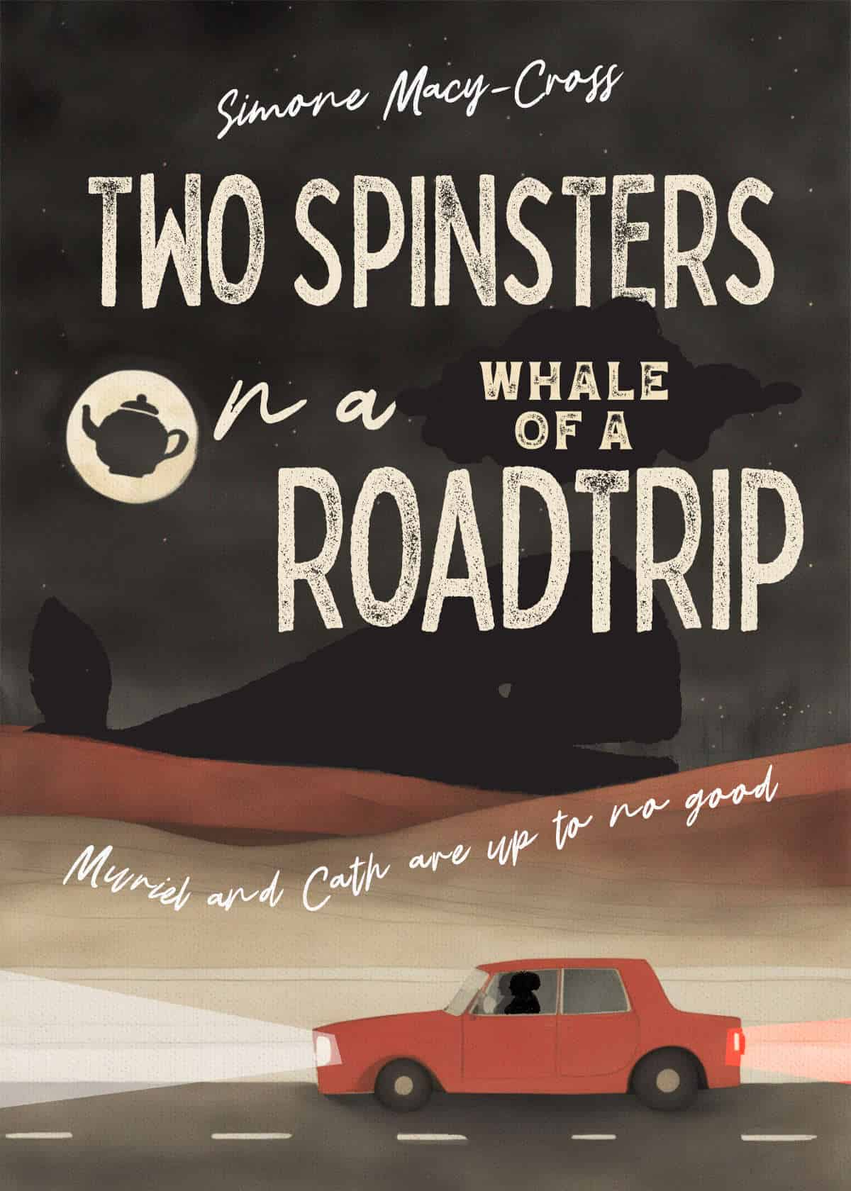
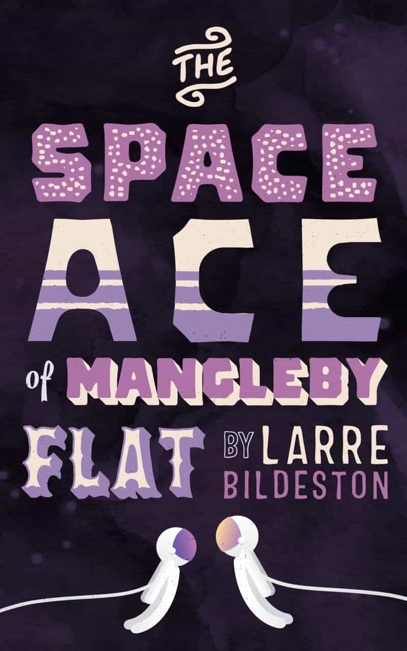
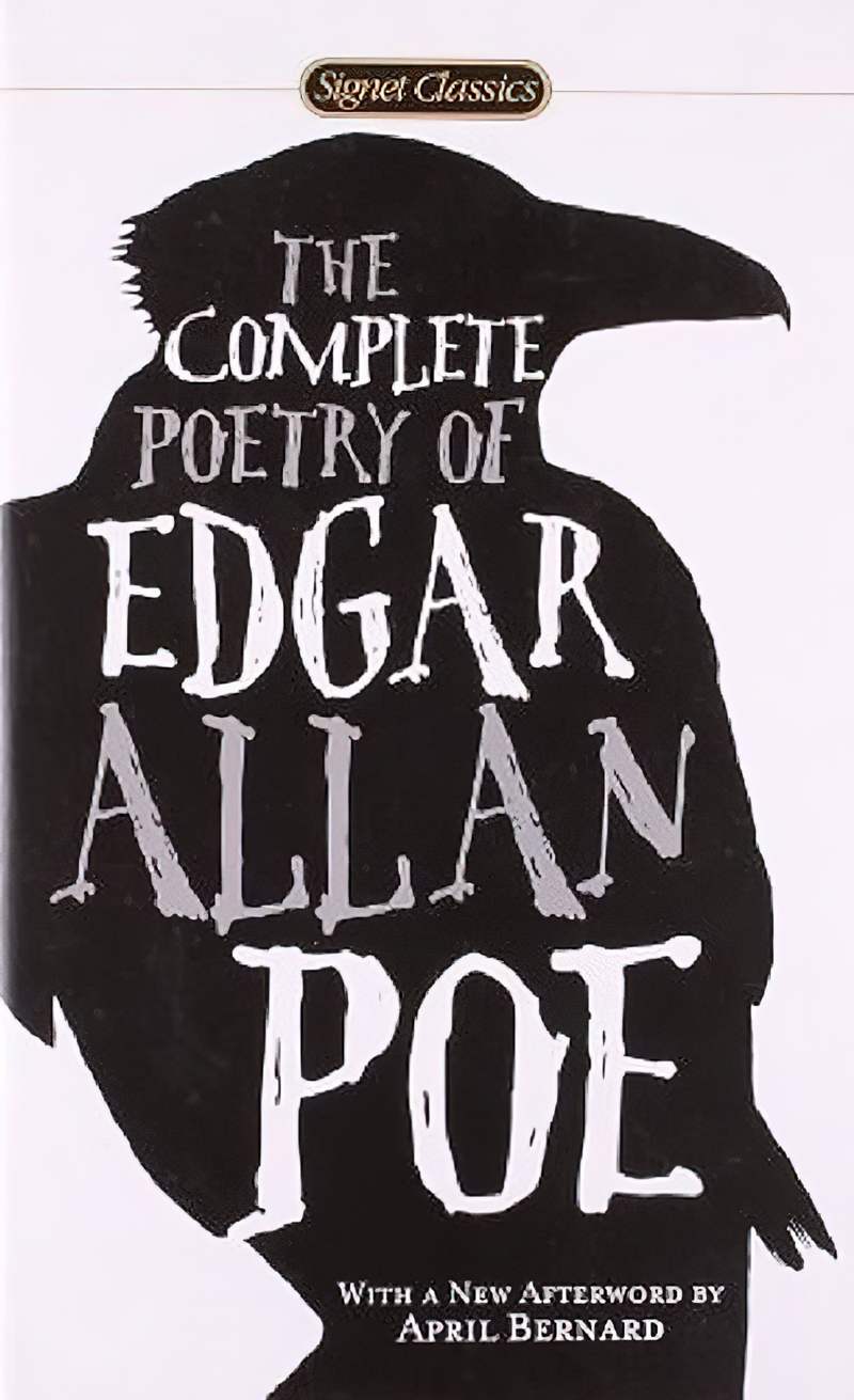
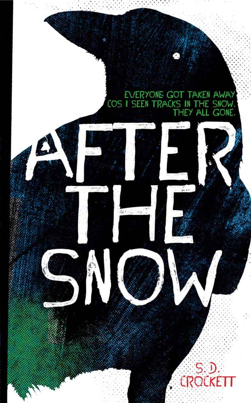
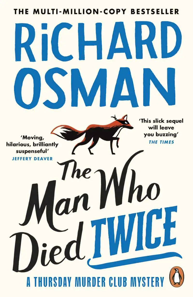
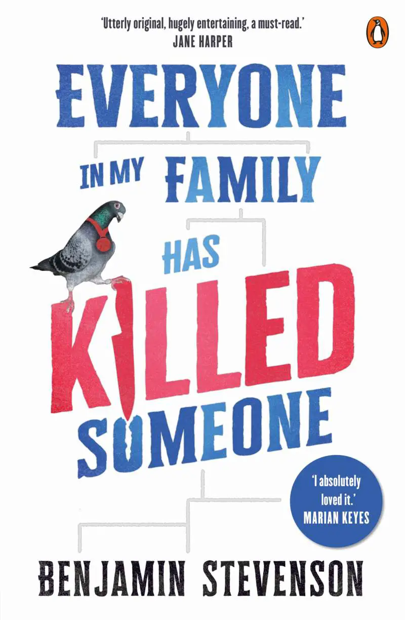
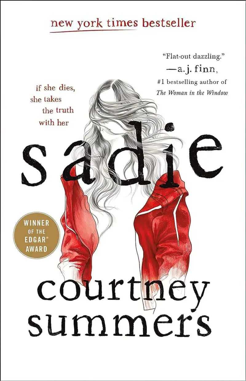
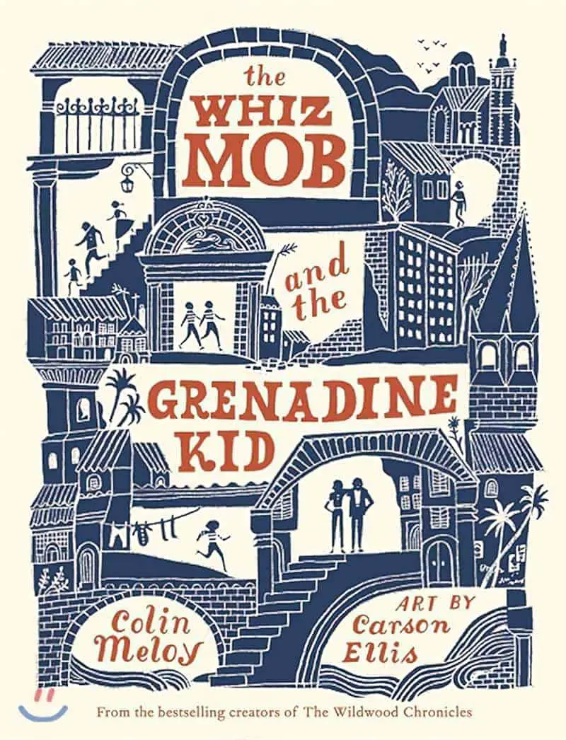
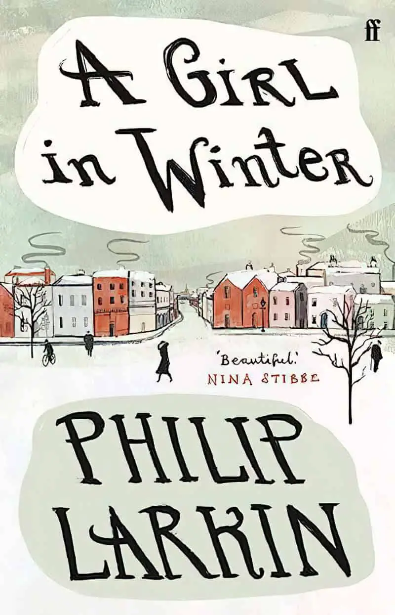
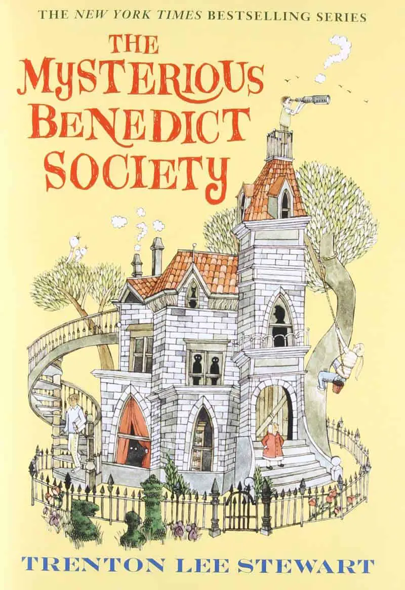
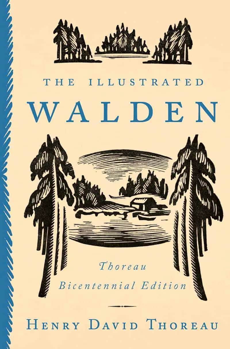
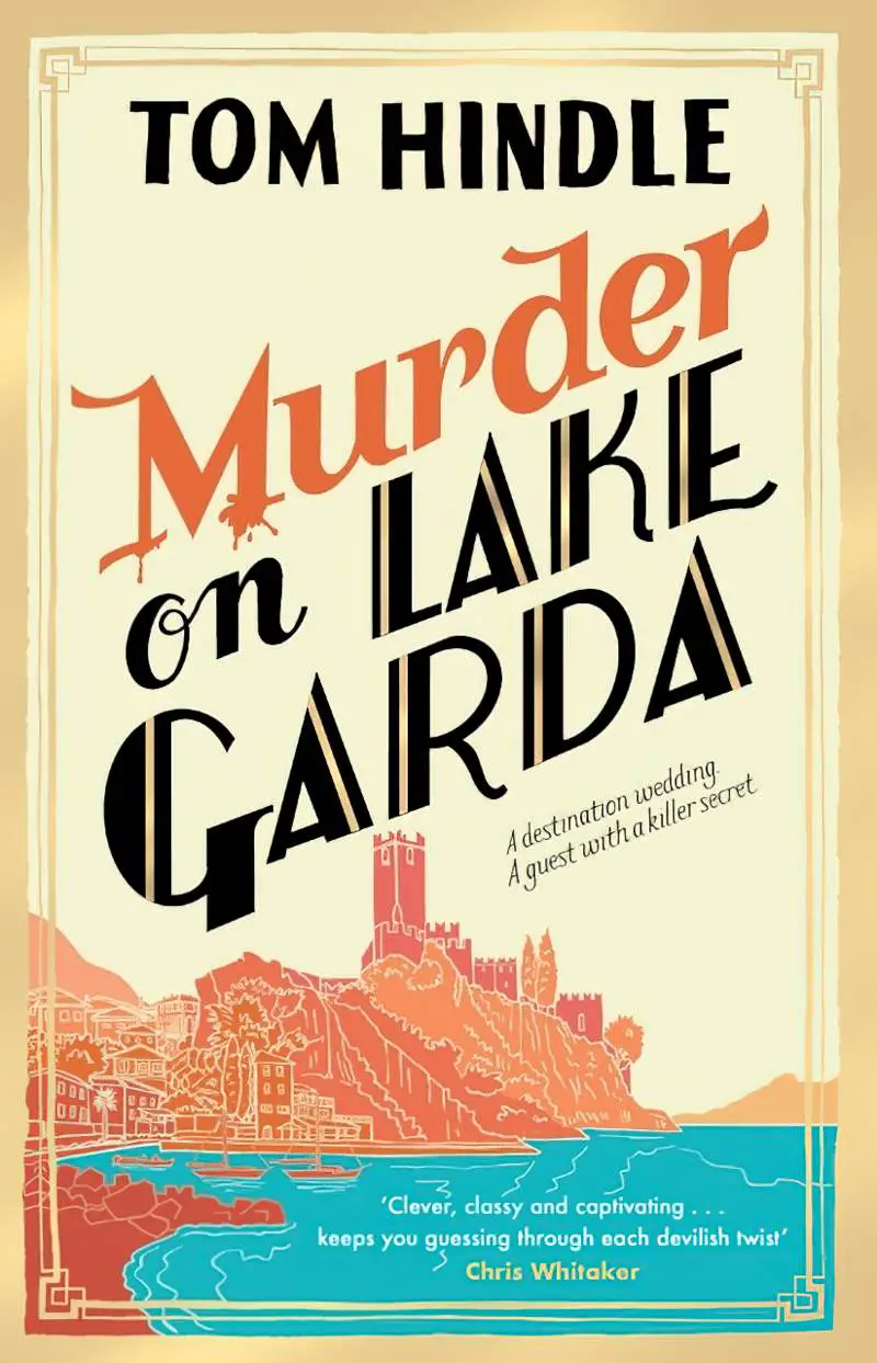
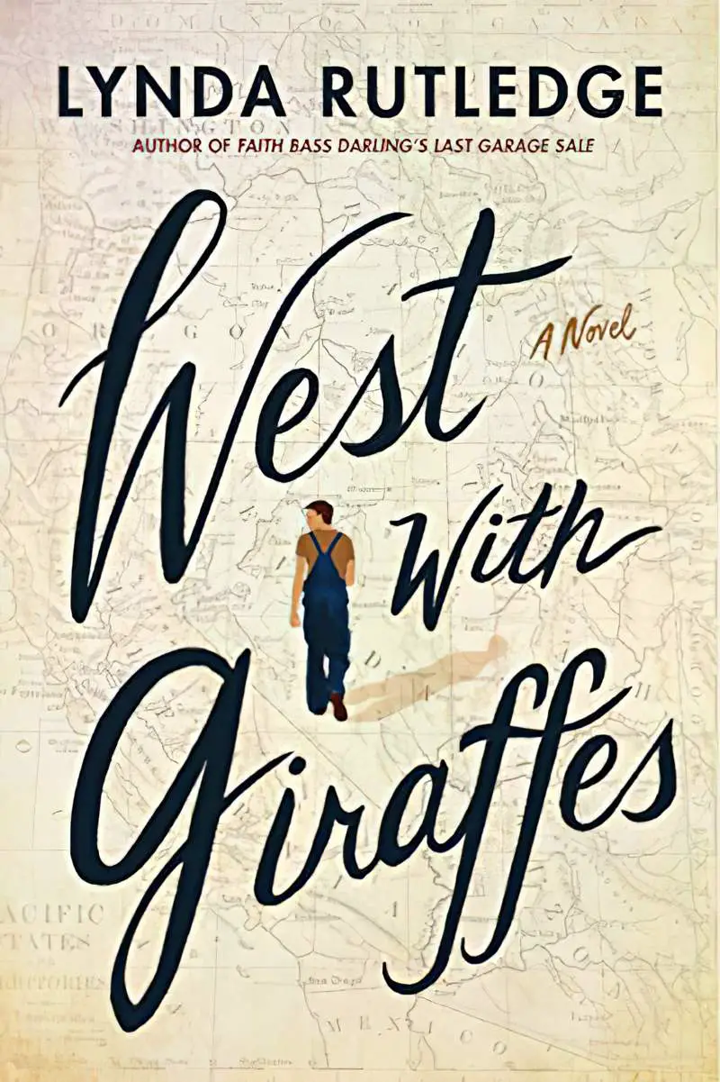
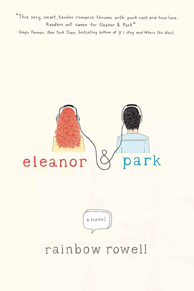
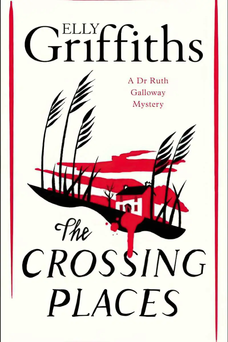
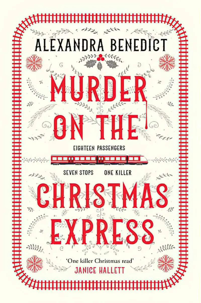
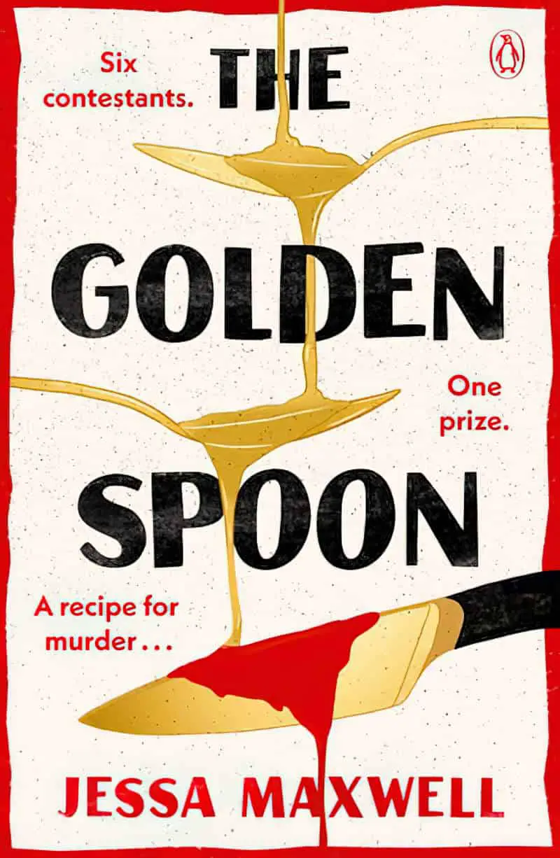
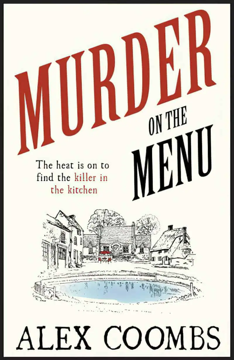
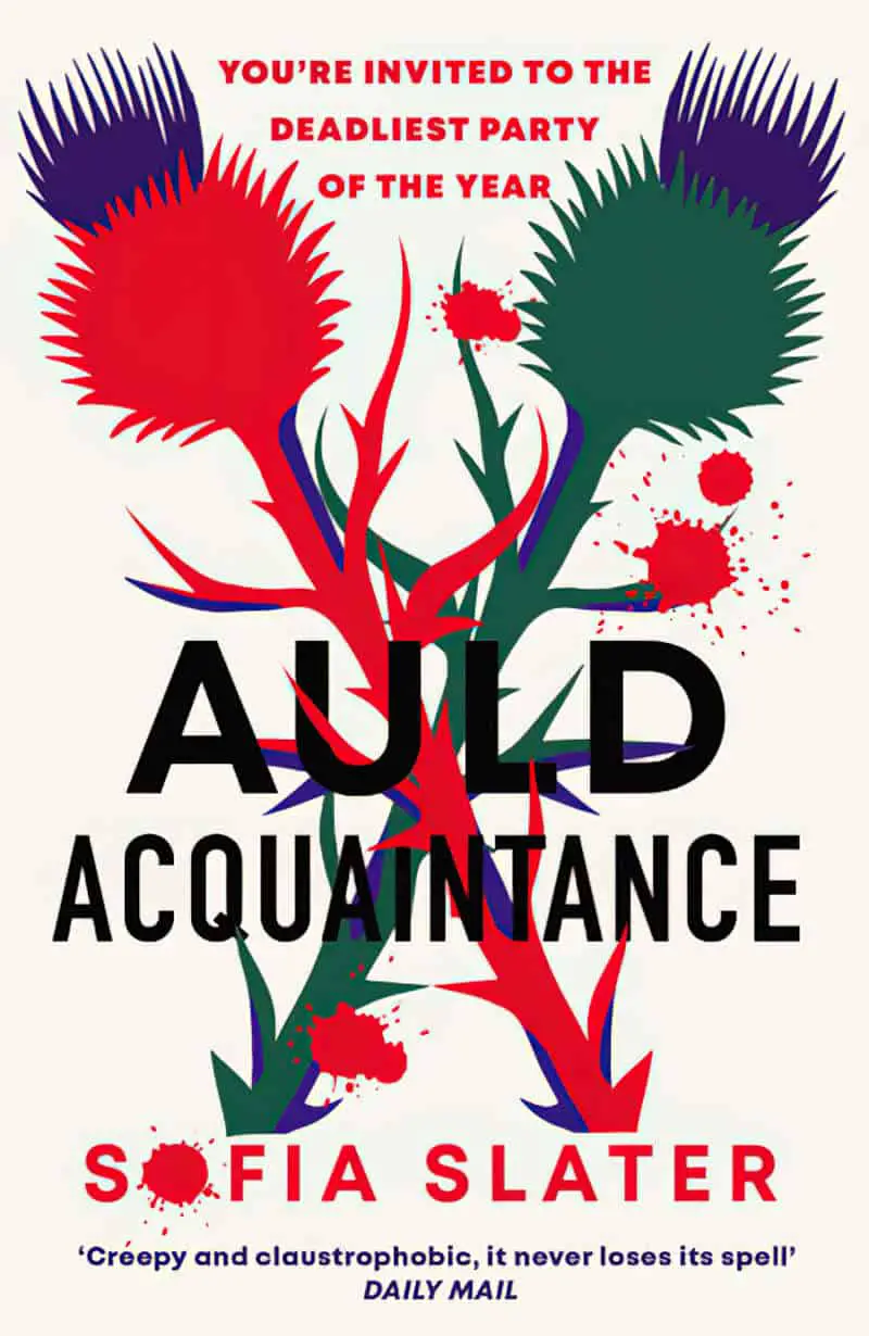
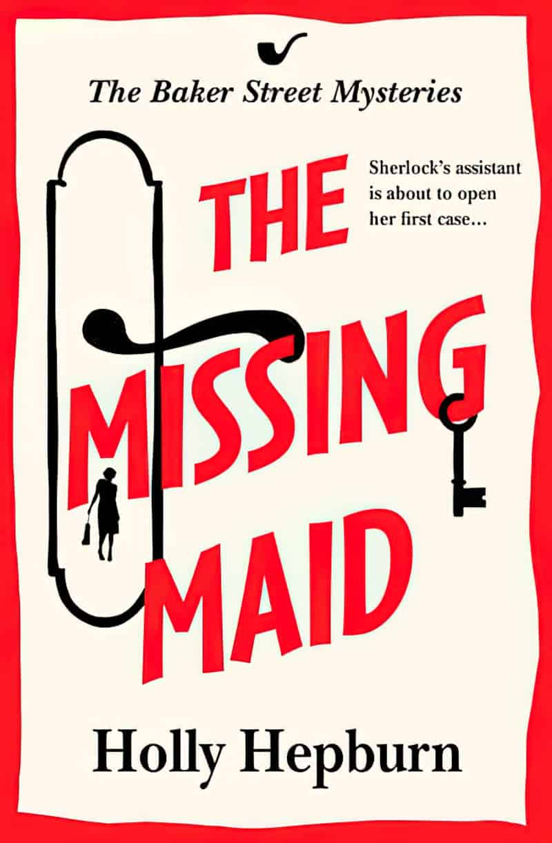
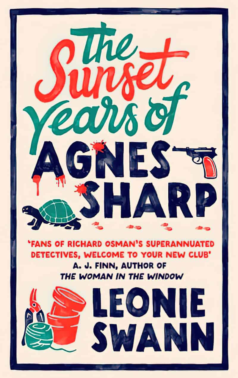
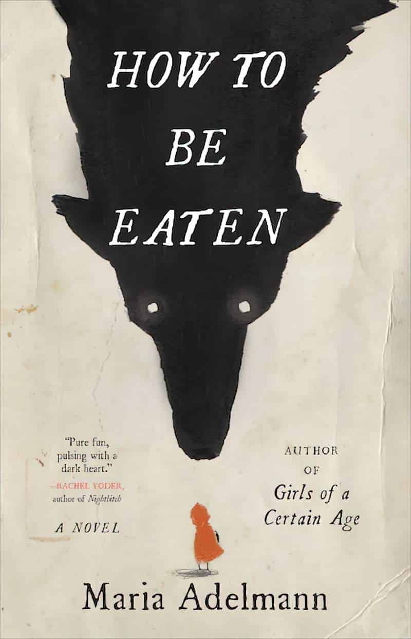
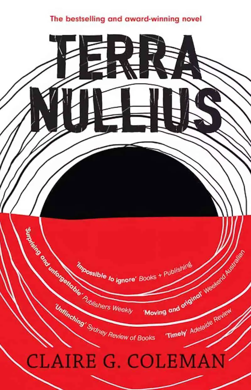
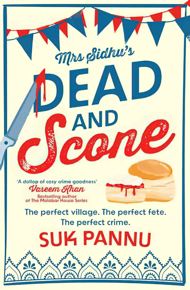
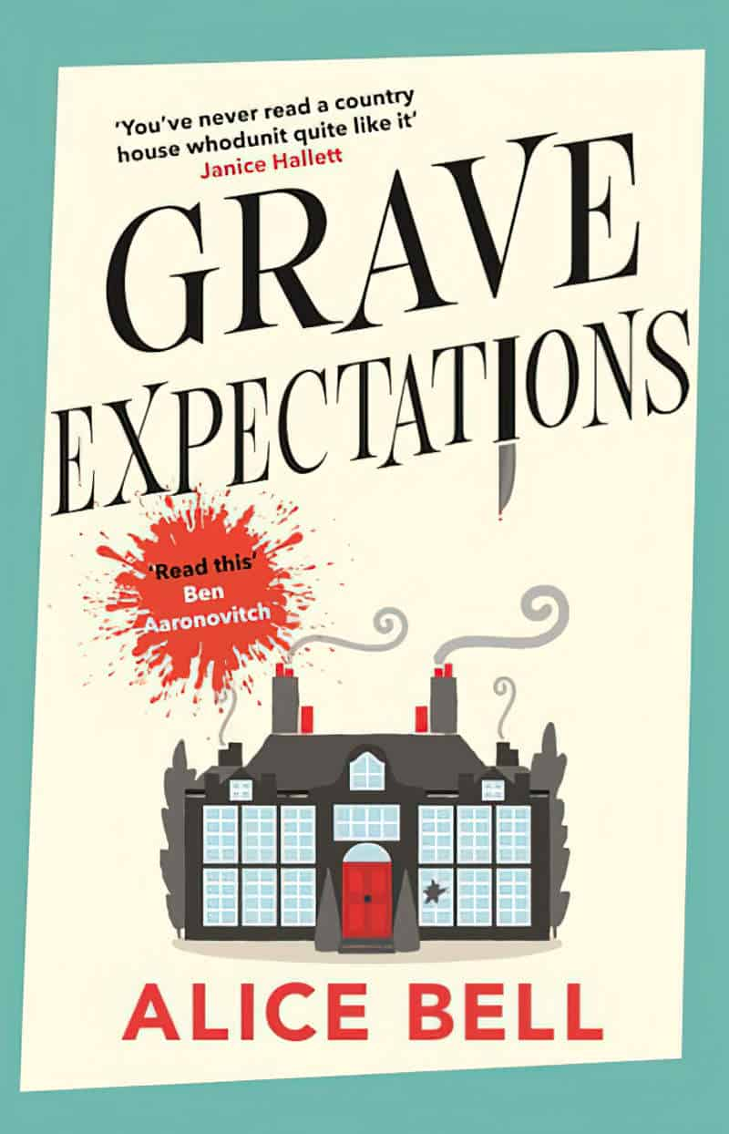
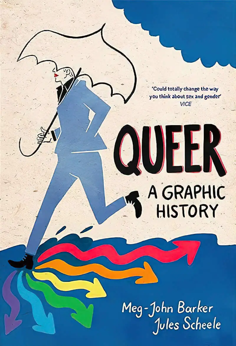
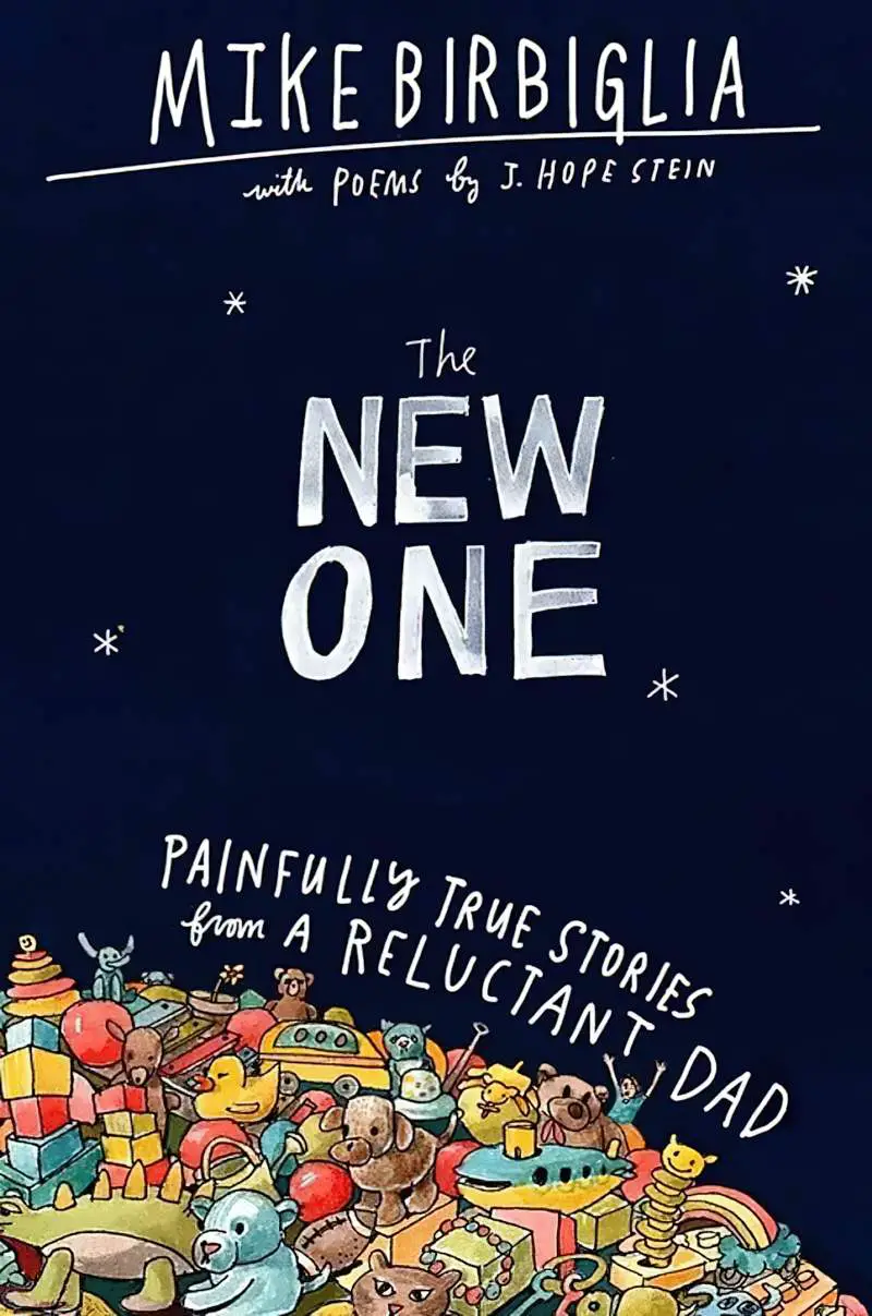
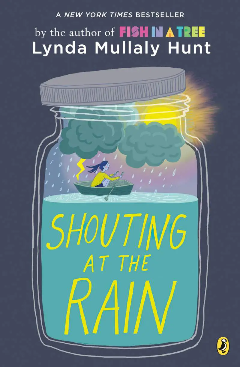
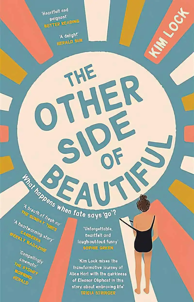
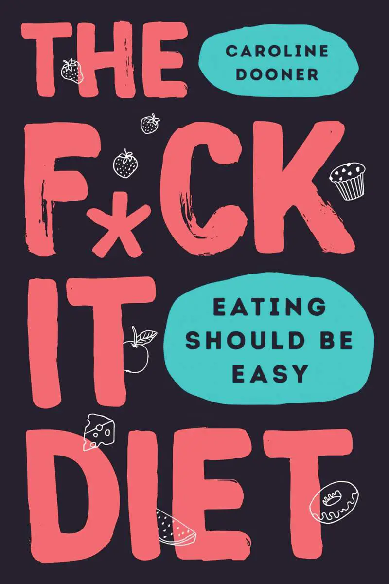
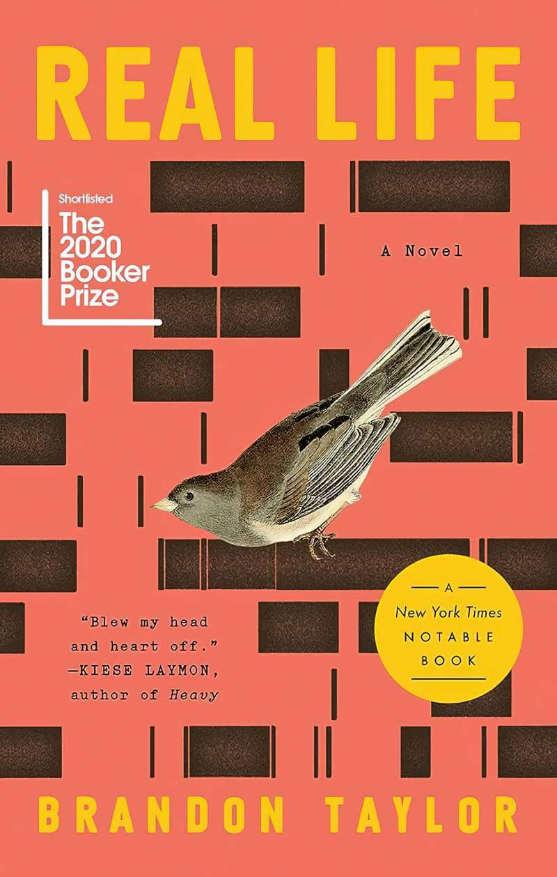
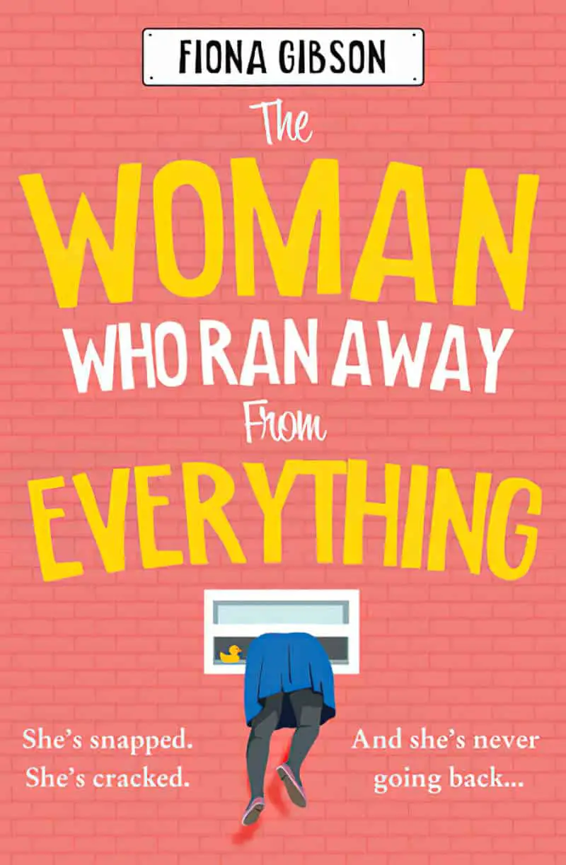
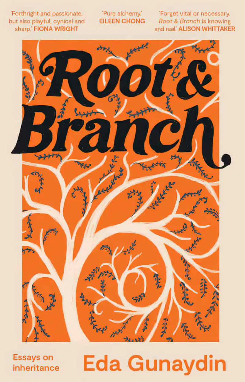
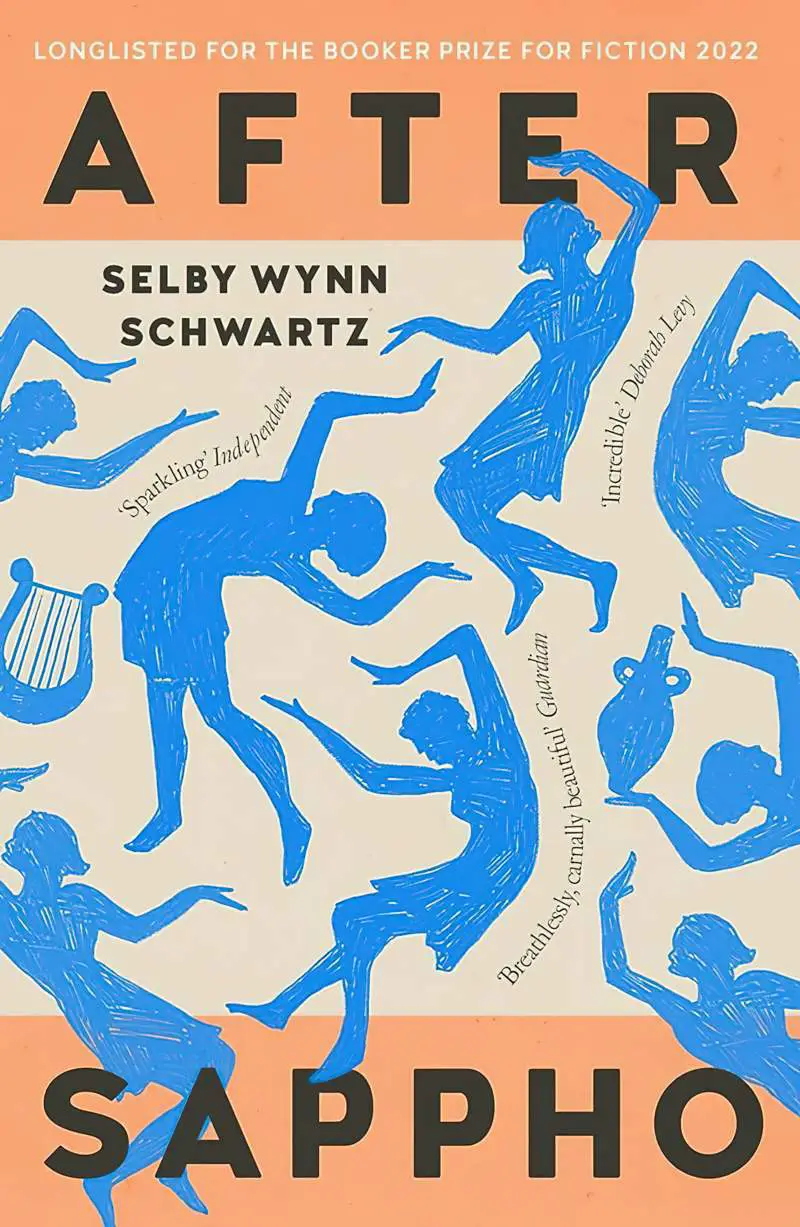
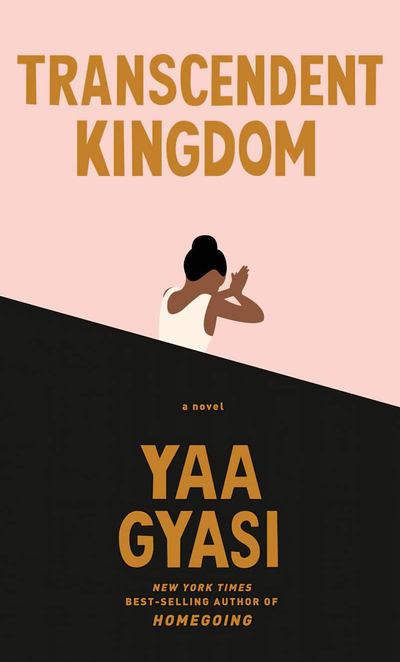
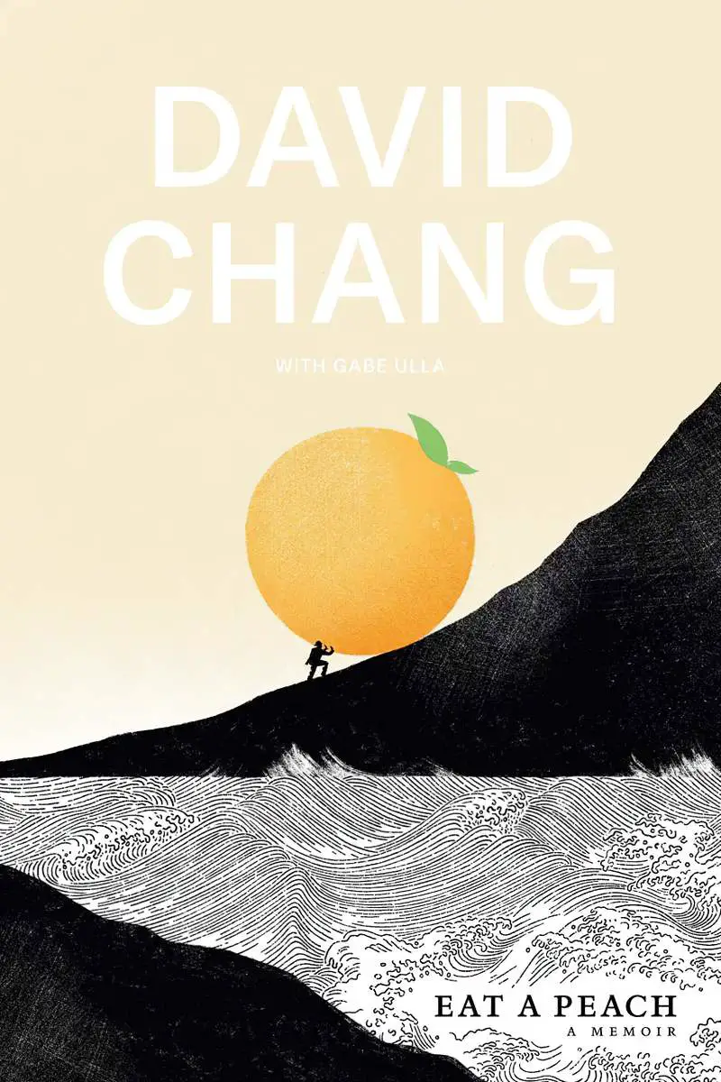
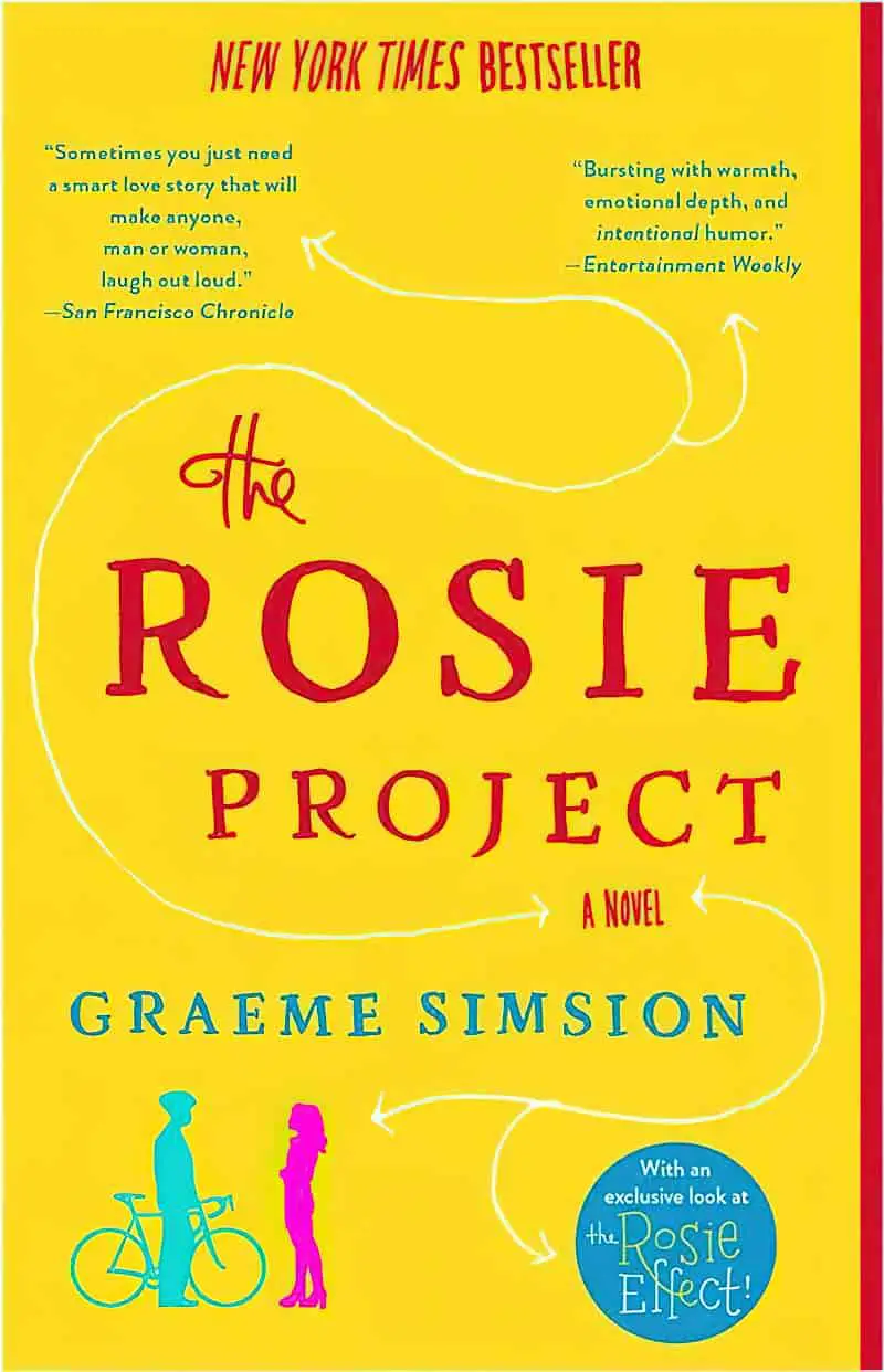
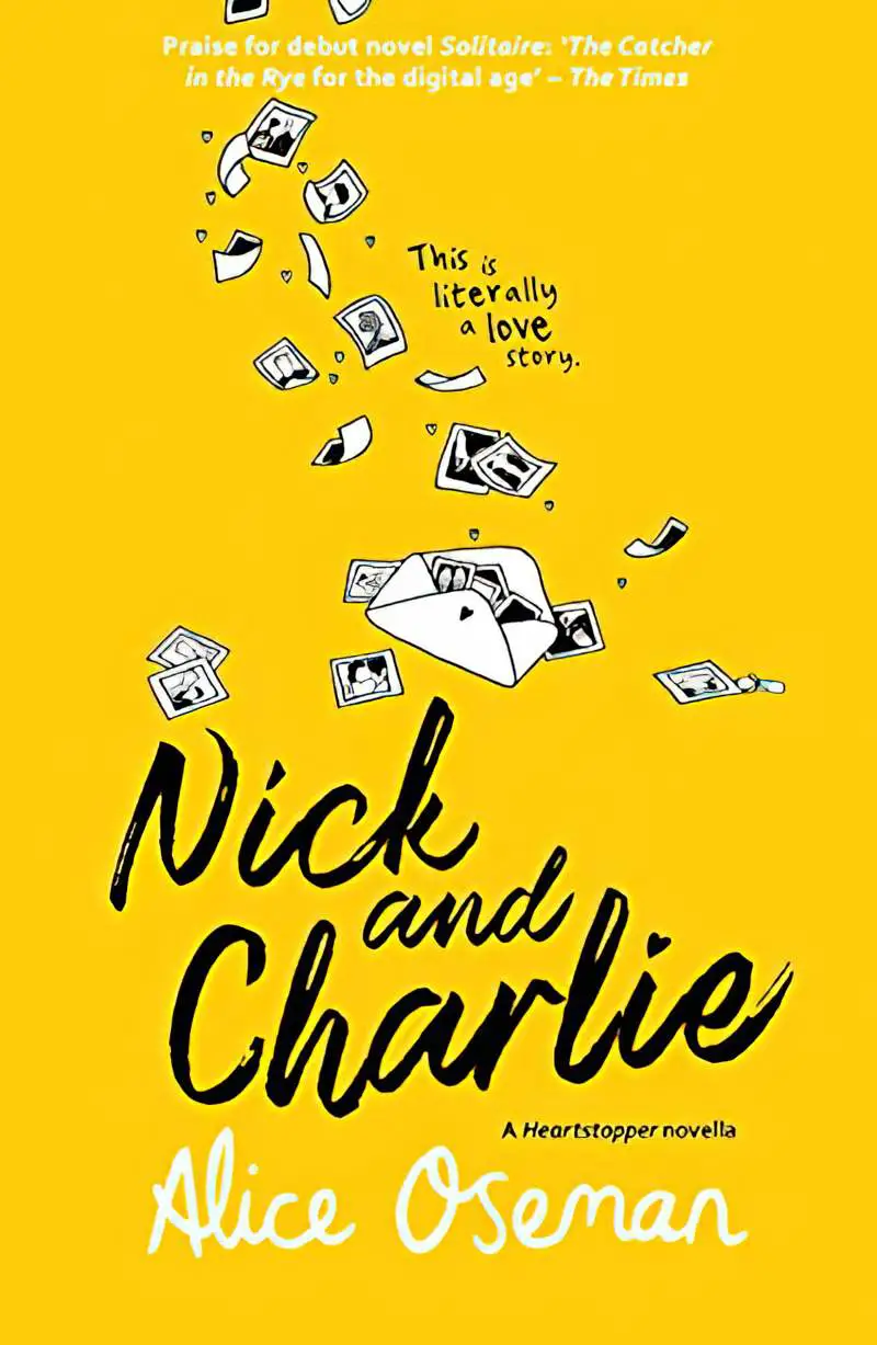
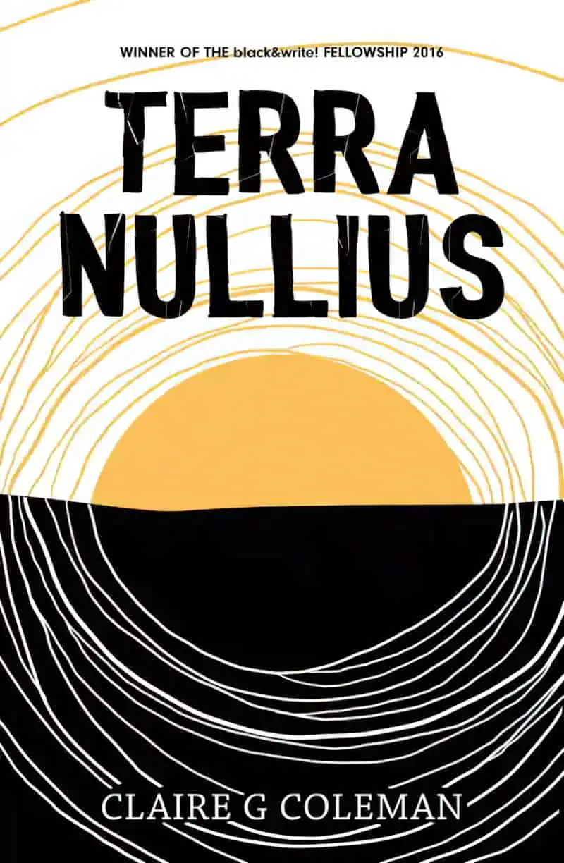
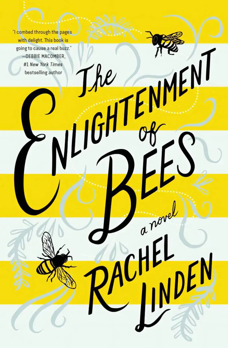
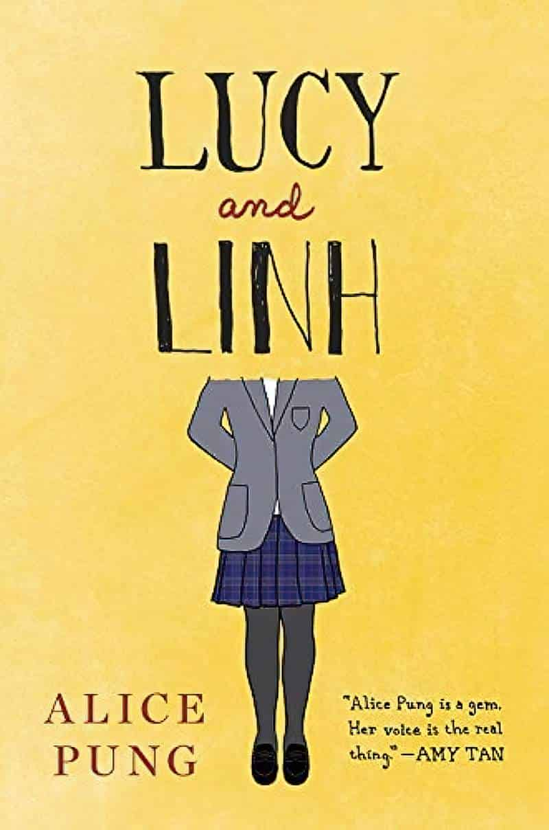
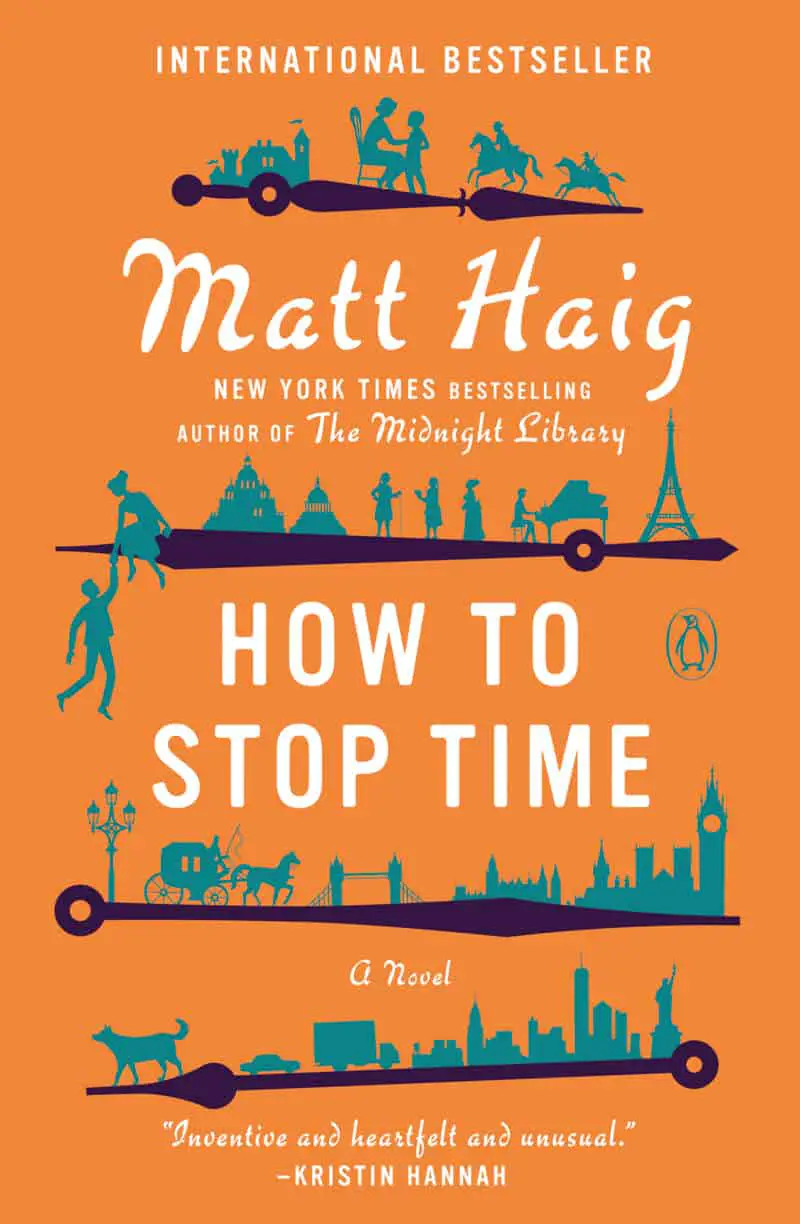
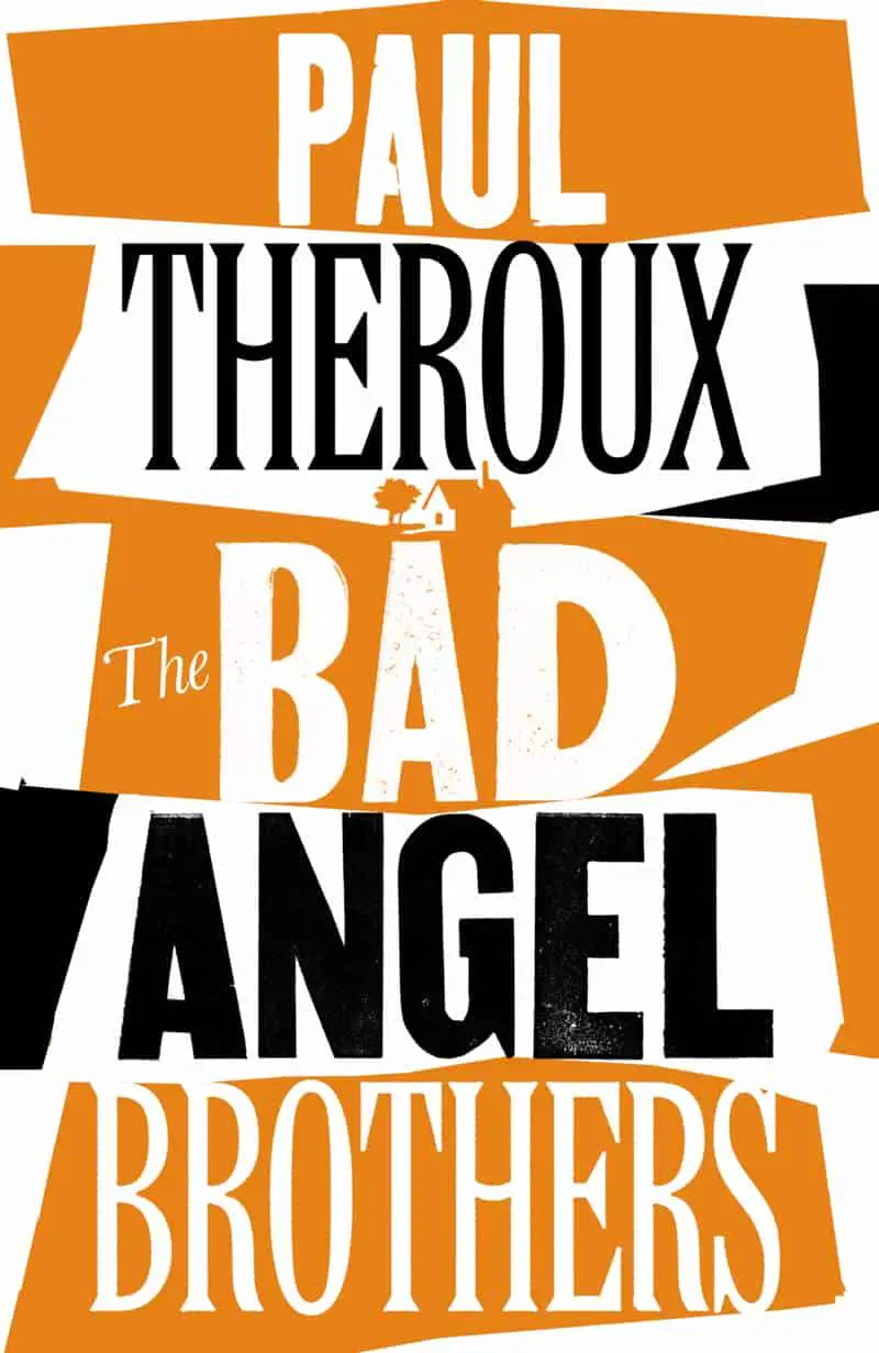
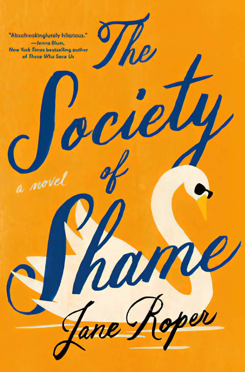
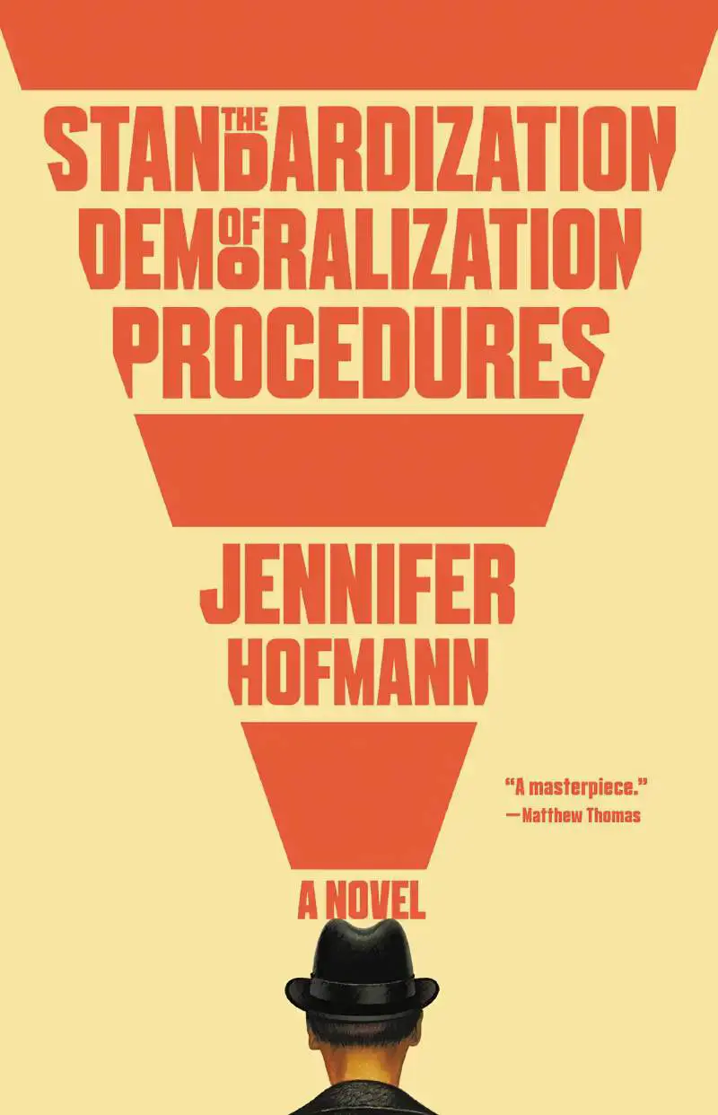
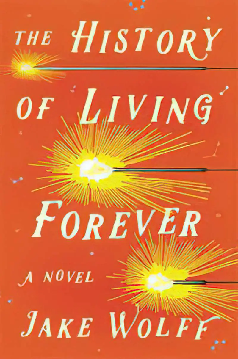
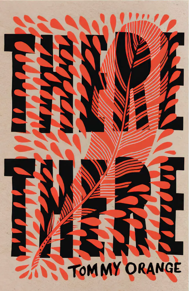
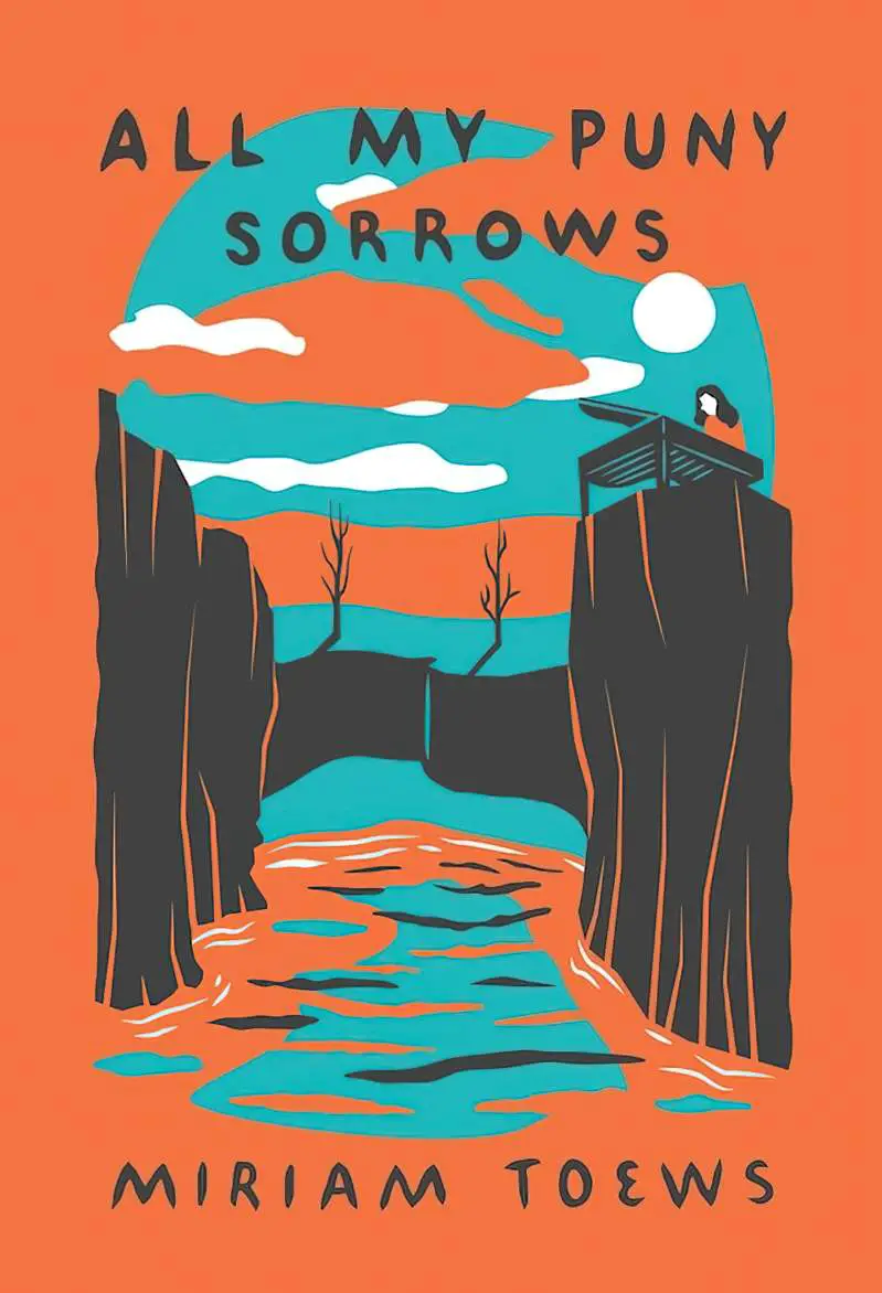
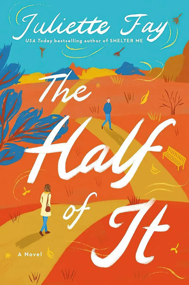
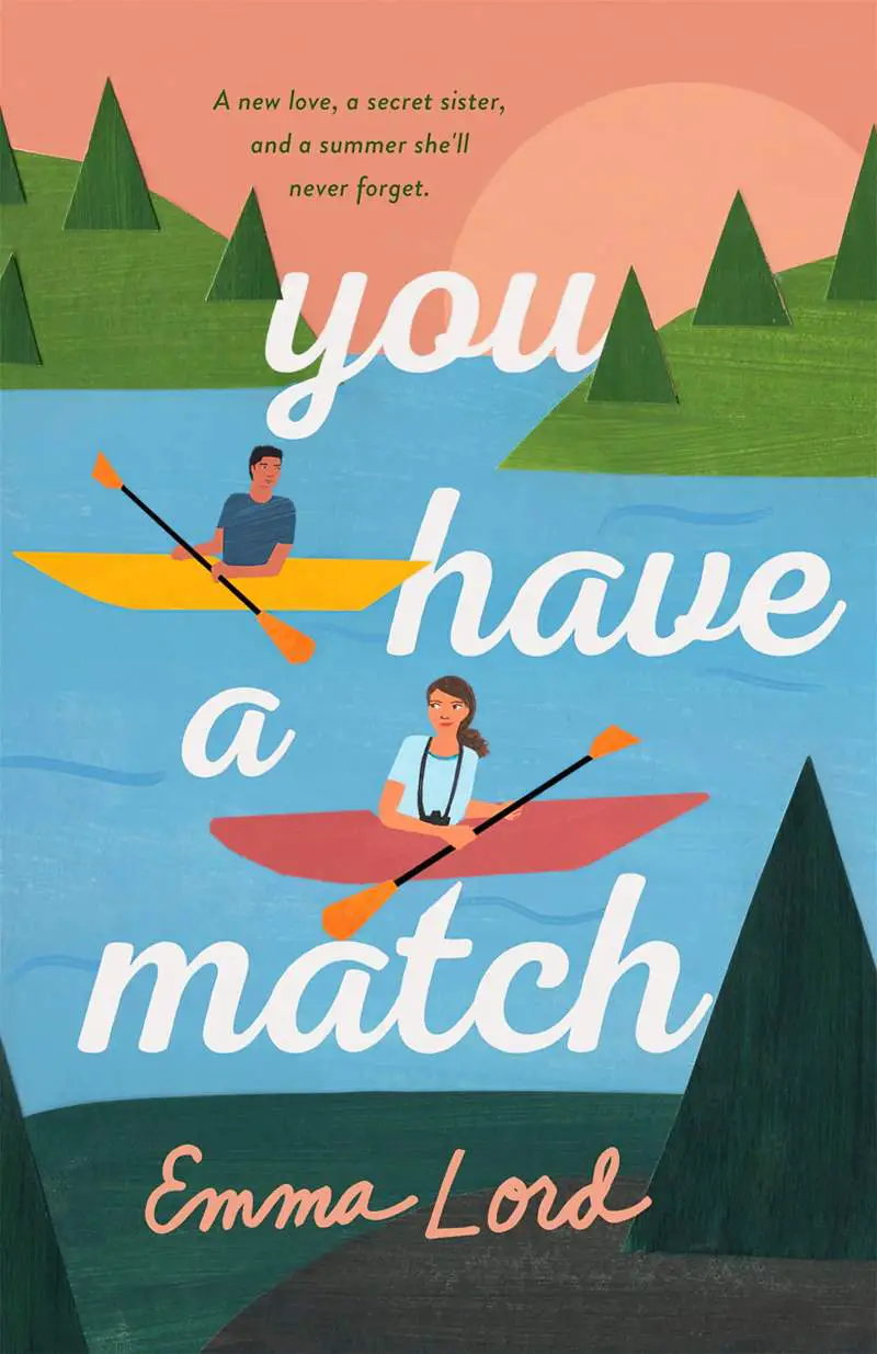
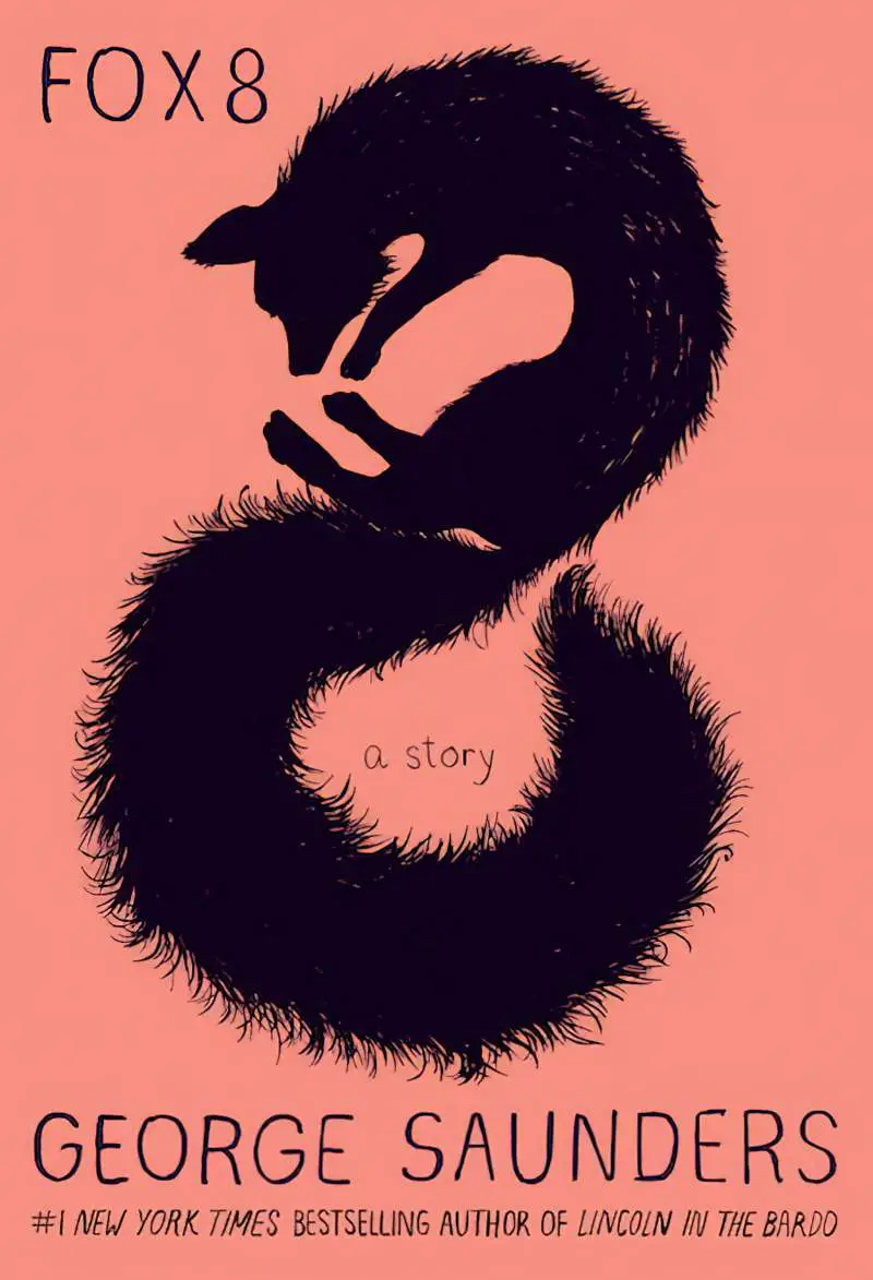
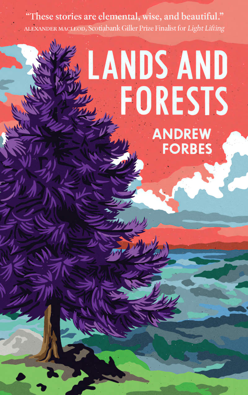
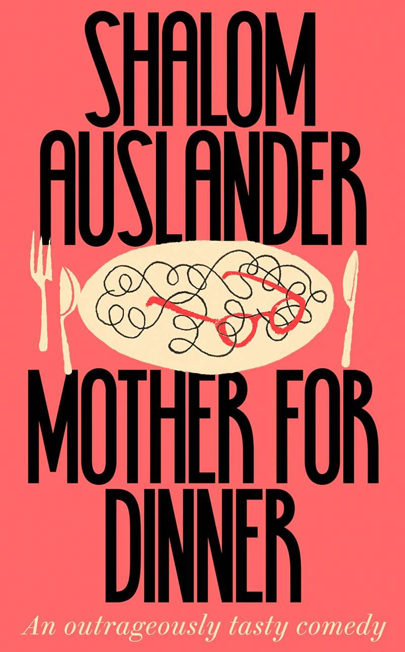
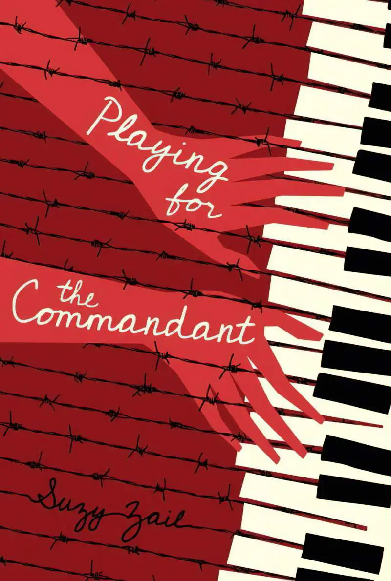
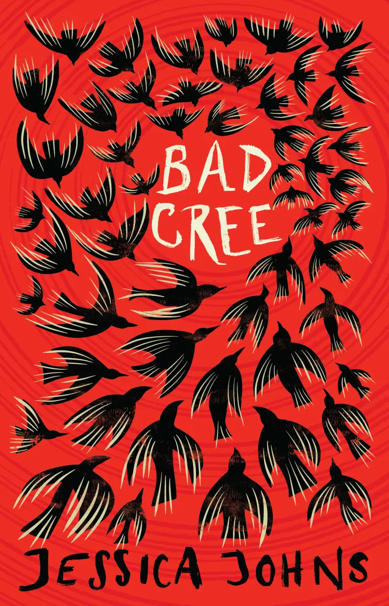
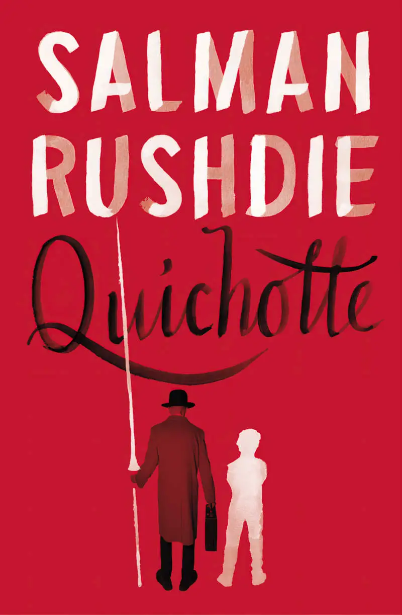
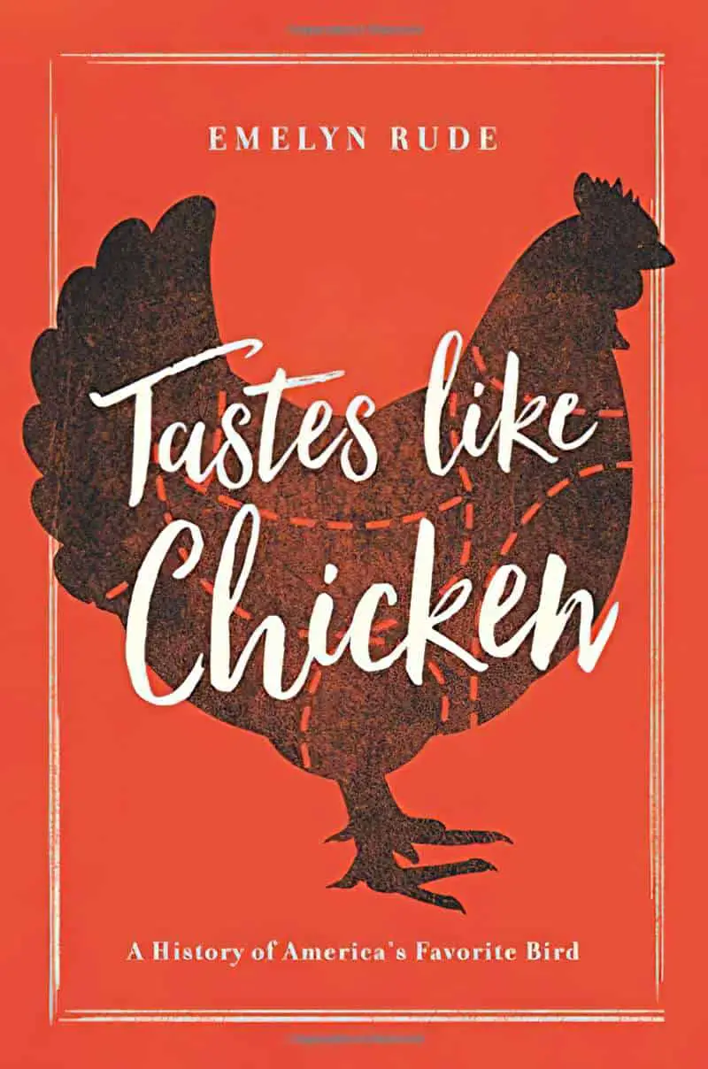
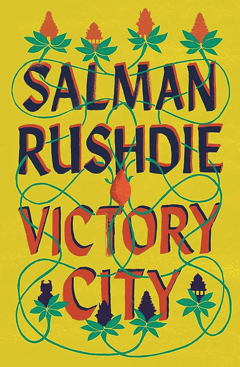
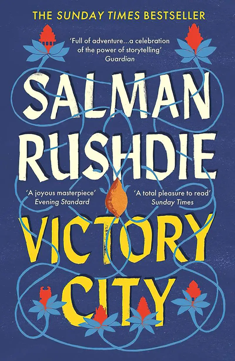
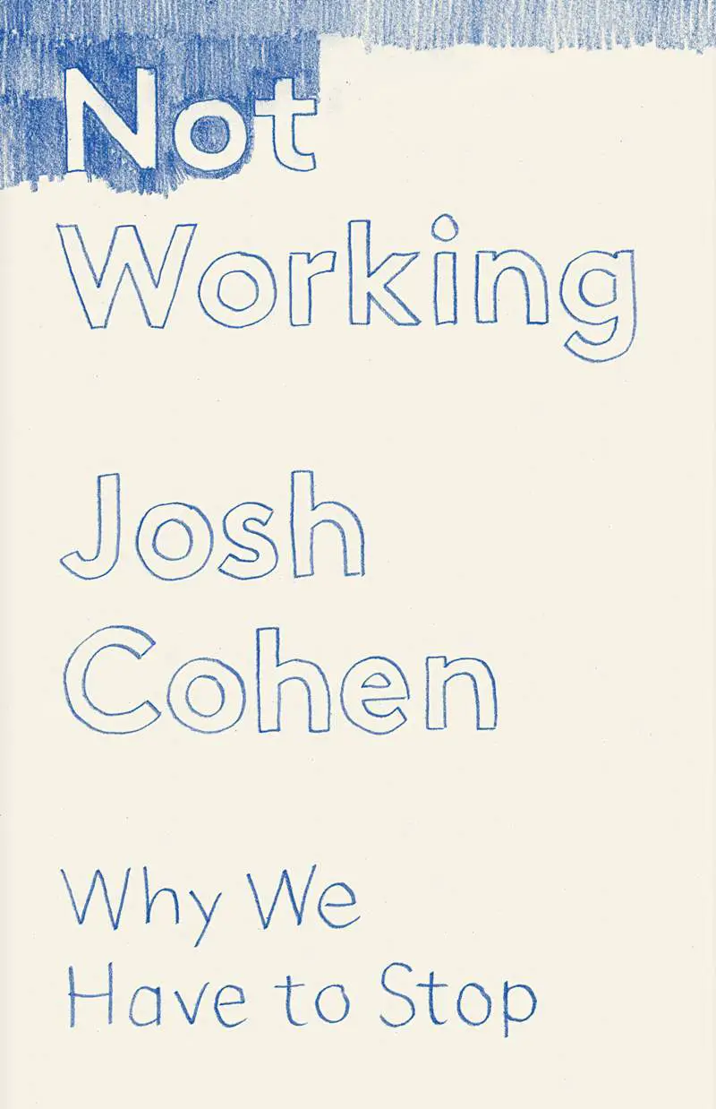
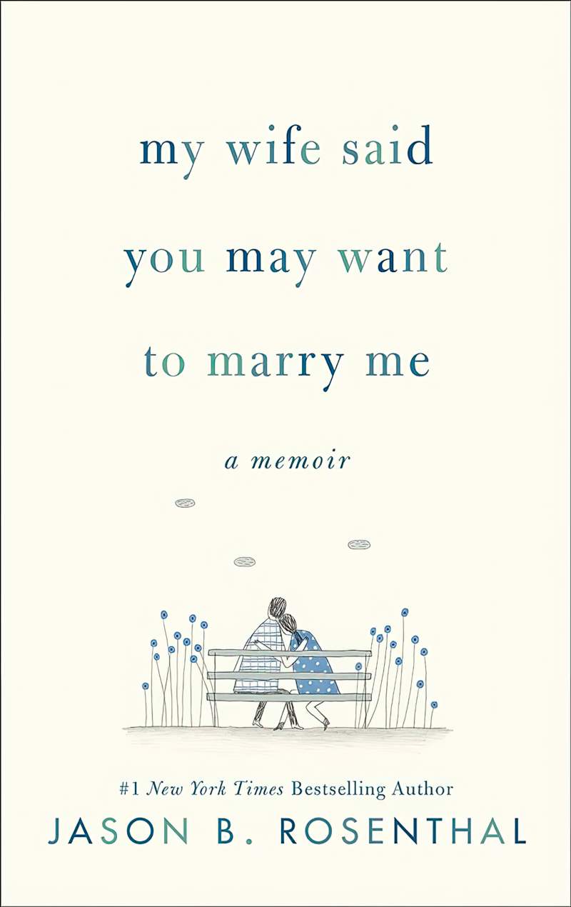
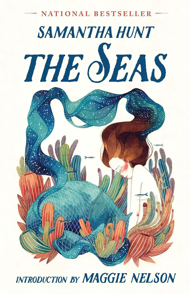
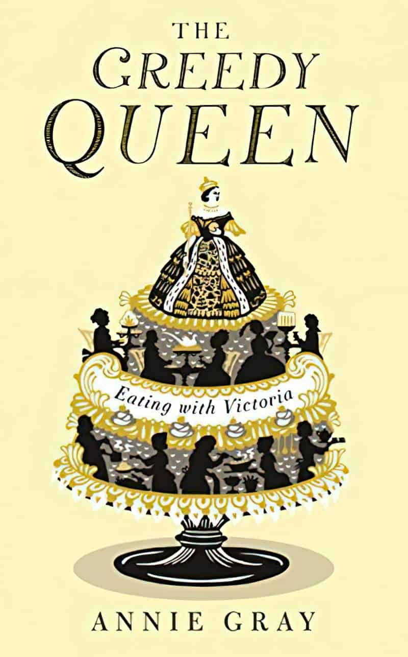
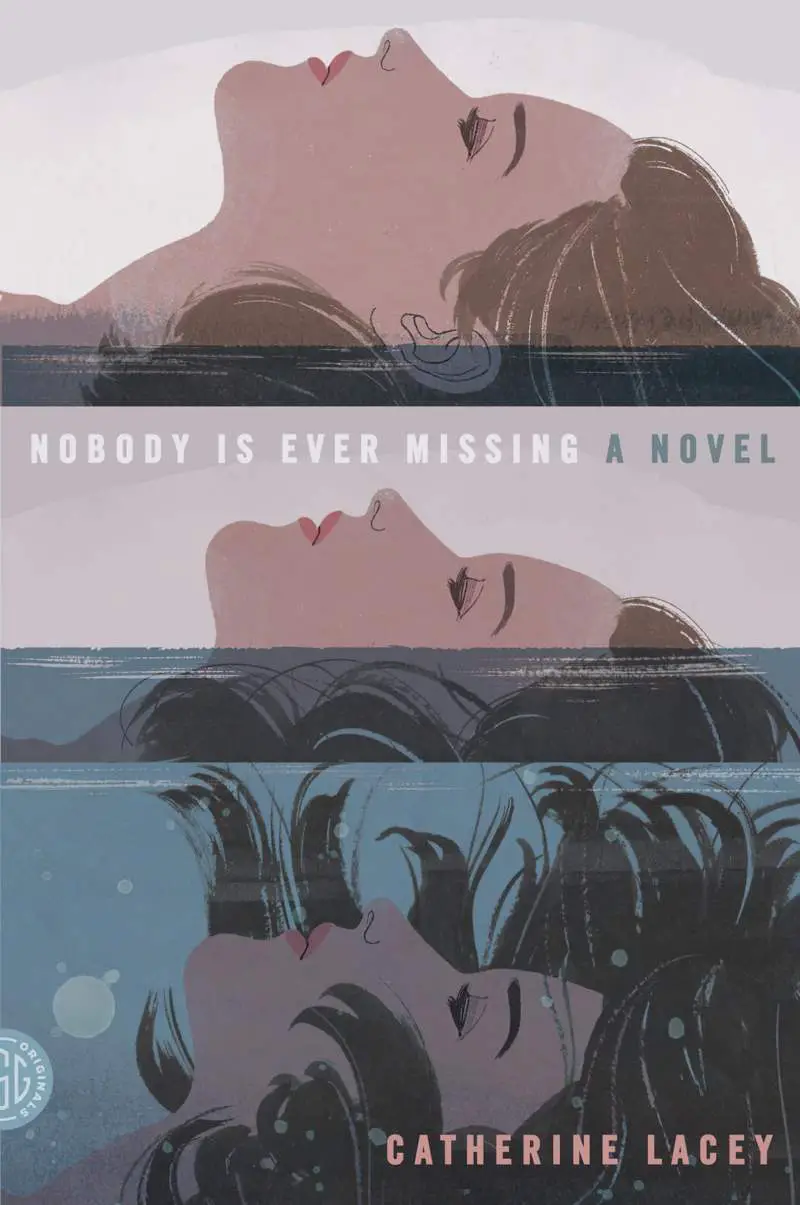
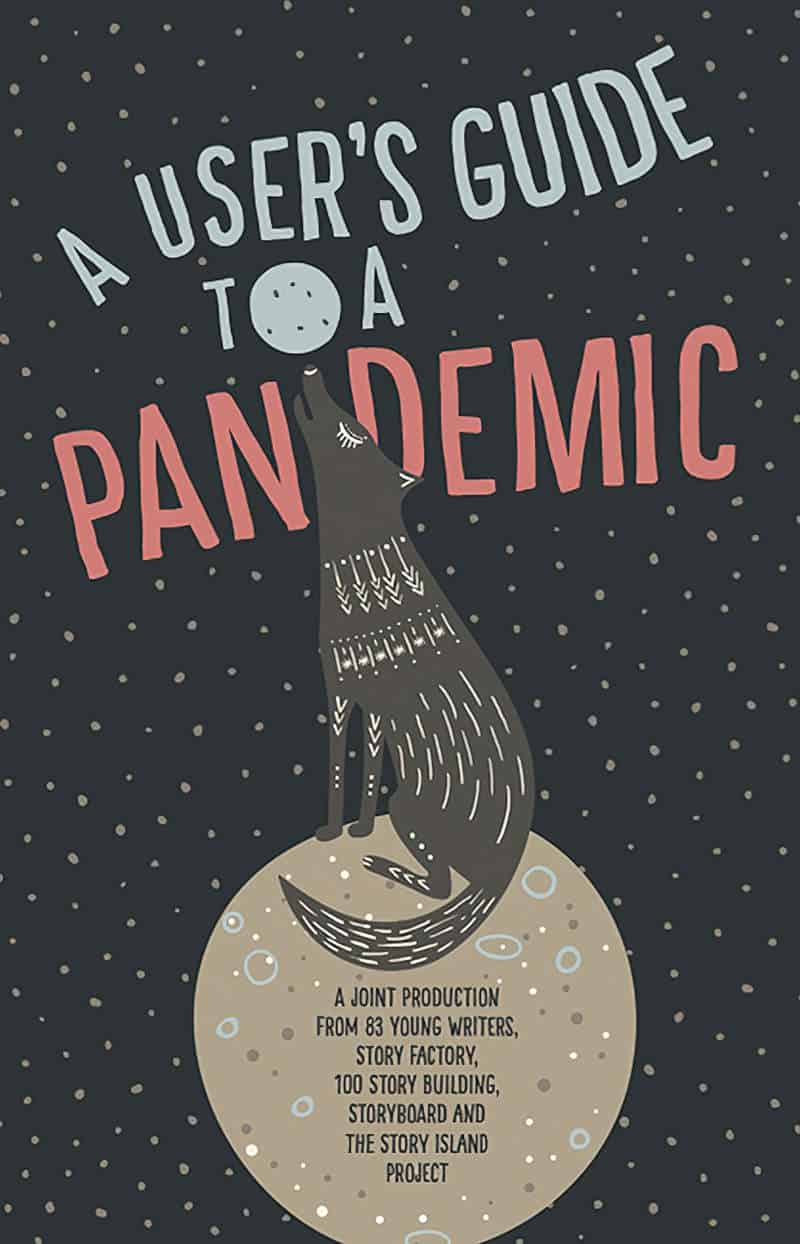
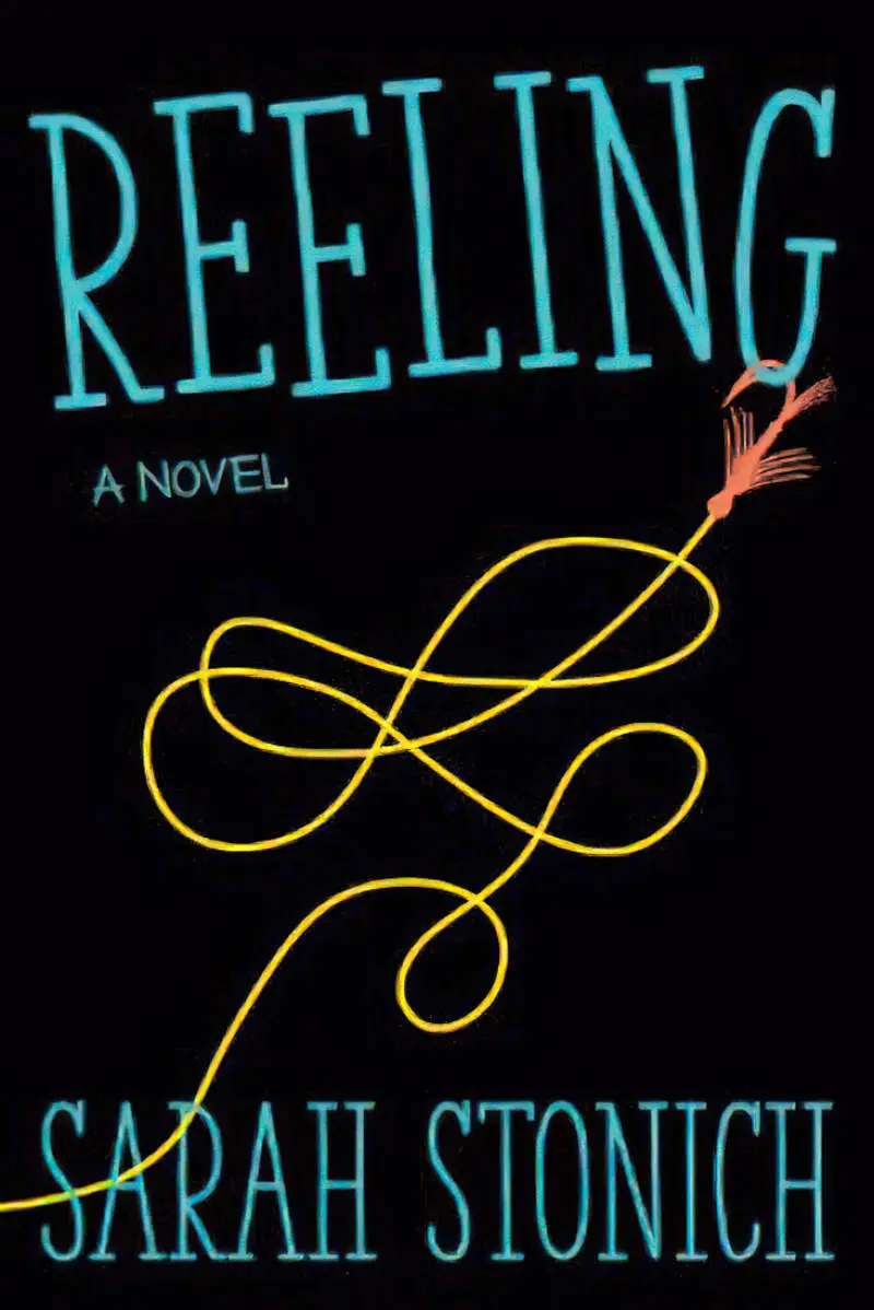
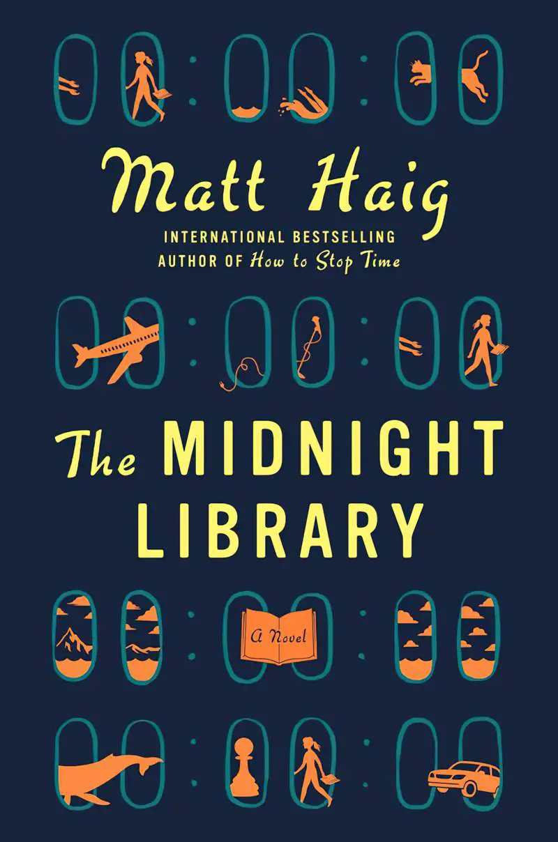
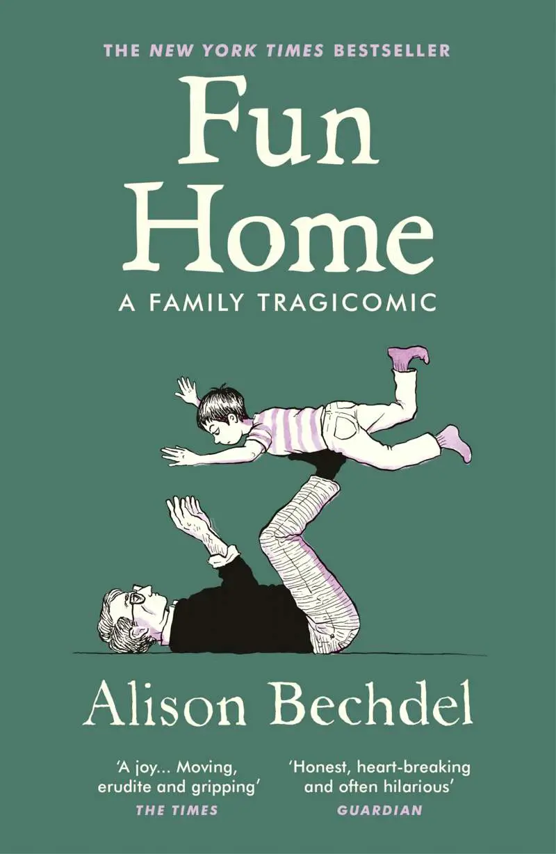
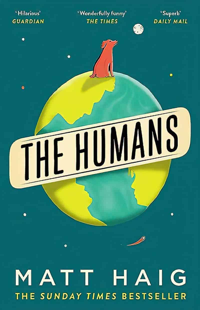
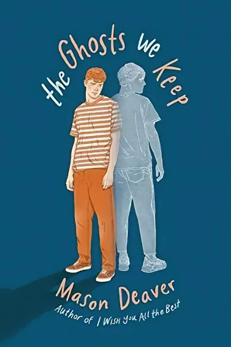
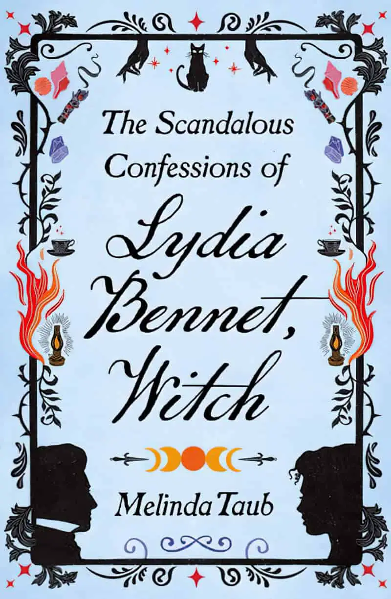
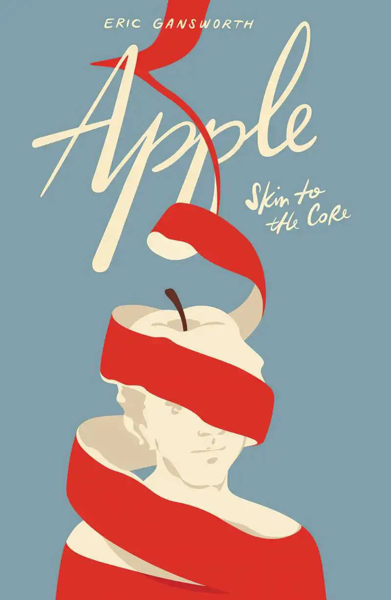
There’s a style of art and illustration, frequently seen on book covers, and I have no idea what to call it. Let’s call it the hand-lettered or hand-drawn look.
Once I line these covers up together, I start to see what unites this style of graphic design:
- The text is often caps or small caps, or it might be an oblique brush script font, or actually hand-lettered by the designer
- There may be some kind of distress on the typography; either the sides are a bit wobbly or there’s some sort of texture embedded into the font
- This style avoids gradients and layer effects such as shadows and glows
- But the designer has probably played with the baseline of the text, or reshaped it to fit around (or inside) the art
- Colours are solid (no blend modes)
- Looks as if it might have been made on an old fashioned printing press
- Colour schemes are simple, maybe three dominant colours, avoiding neon, fluorescent and similar harsh accent colours
- You won’t find geometry and symmetry on these covers because it looks hand-lettered and the art looks hand-drawn, possibly with collage effects, possibly looking like a linocut or woodblock print
- Flat design is also common.
Note: I’m not talking about genuinely hand-lettered design. Here’s an example of that:

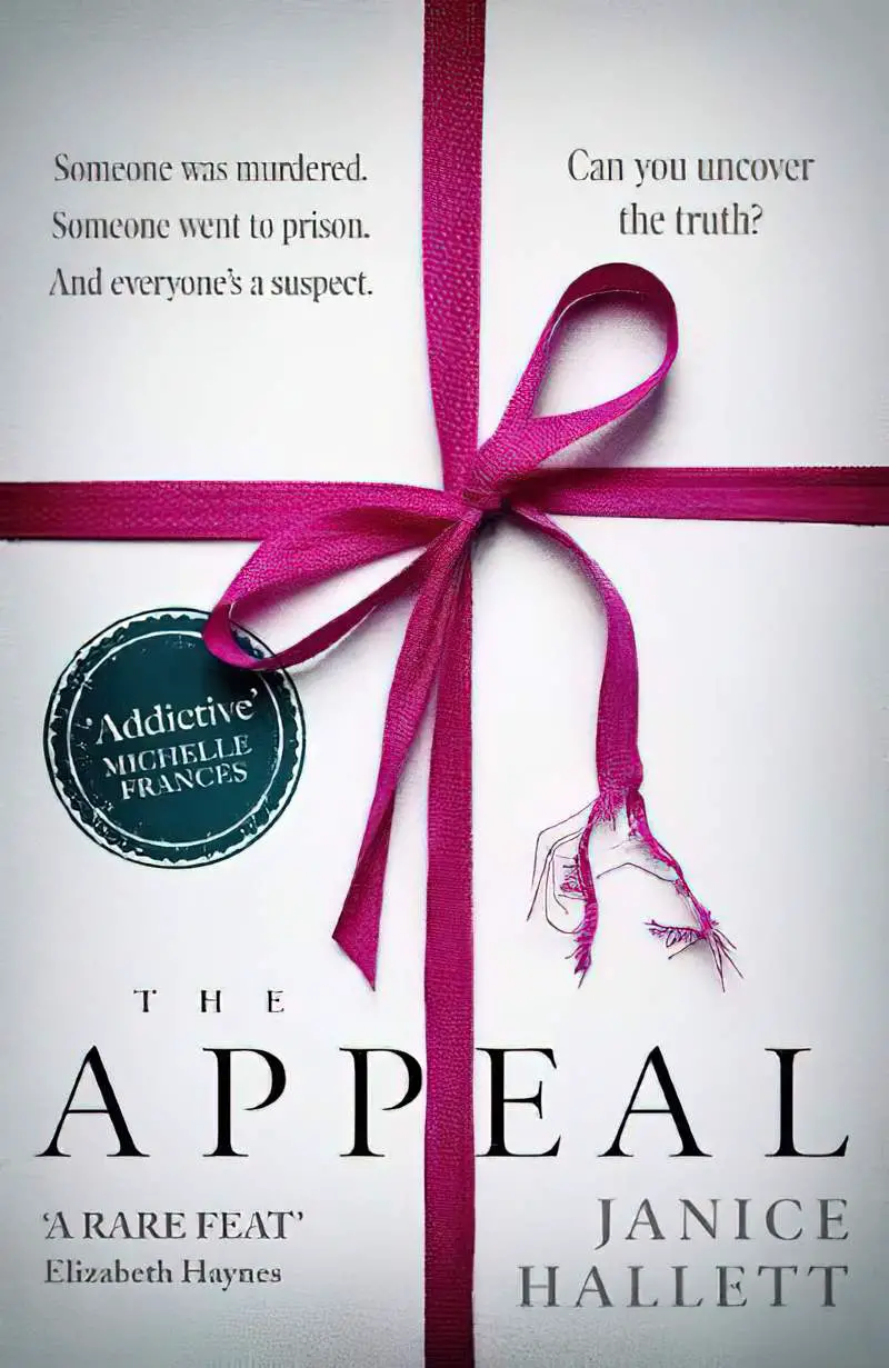
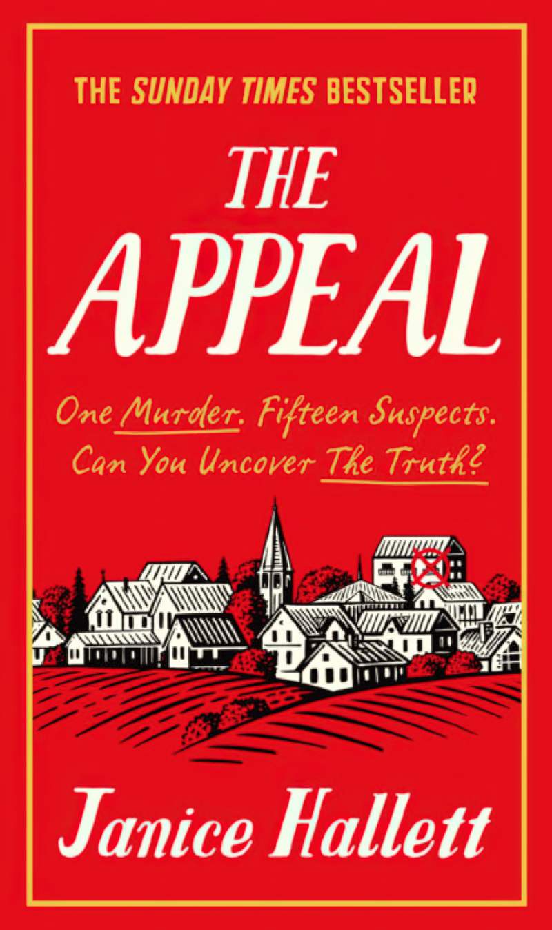
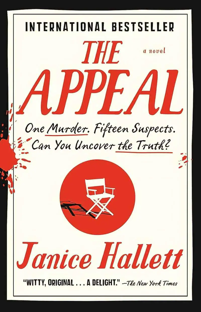
To show you the sort of cover I’m talking about, let’s look at some Janice Hallett novels, which have been published with various covers.
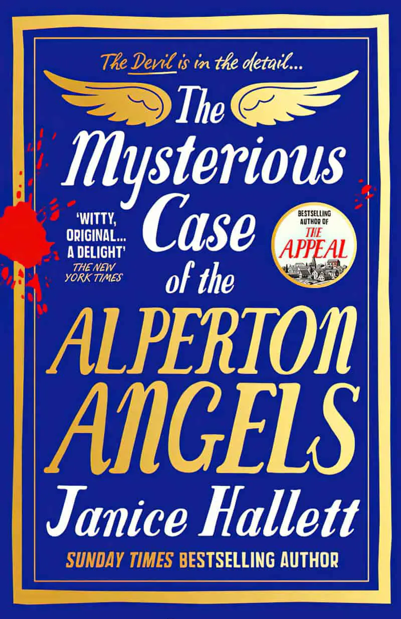
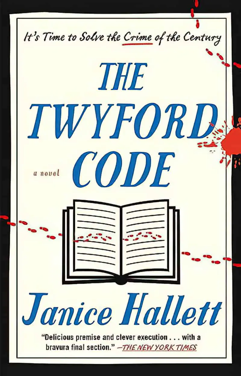
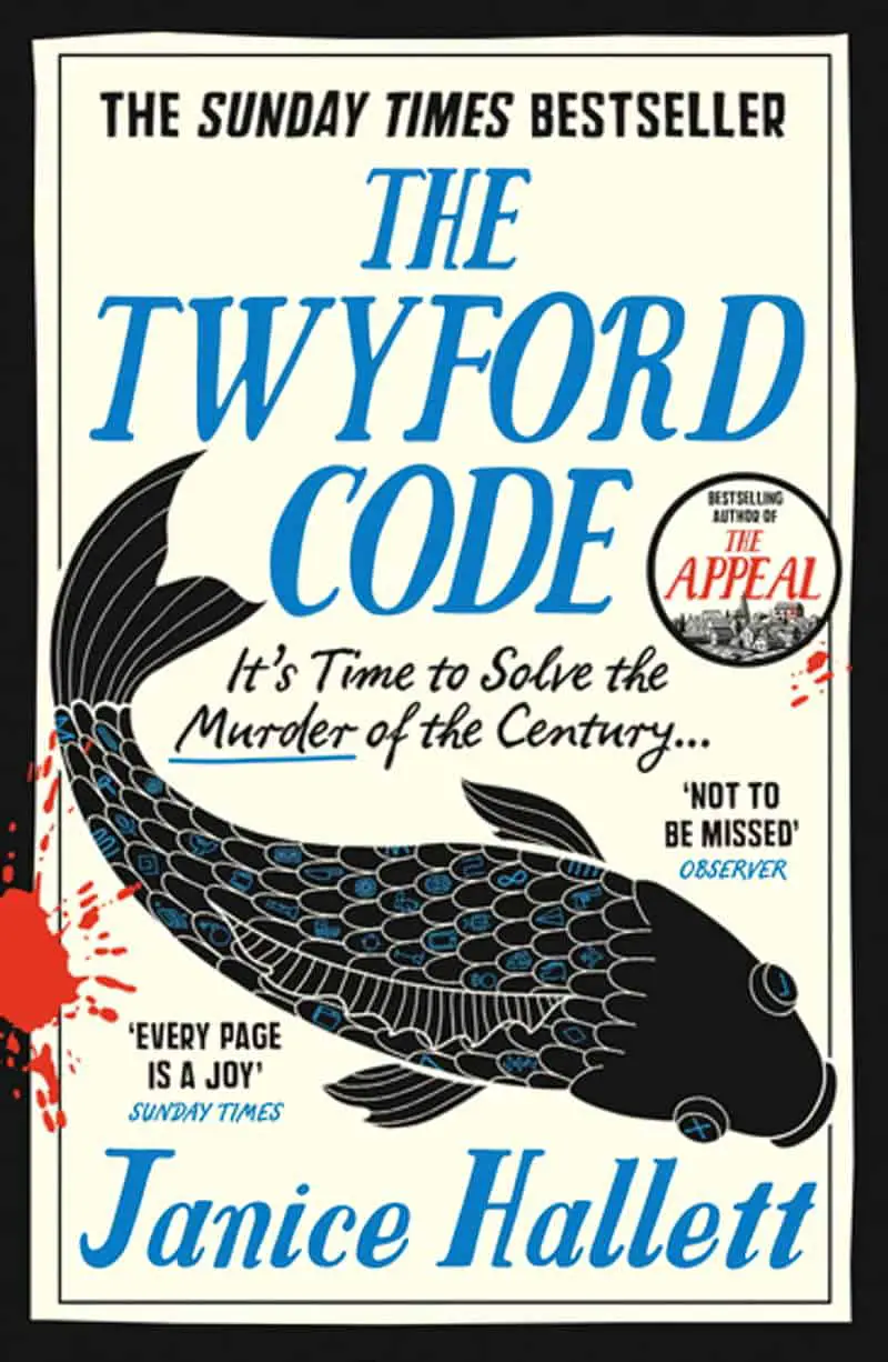
The first of these covers is not at all what I’m talking about; the second two are:
The cover of Alperton Angels without the foiled look looks more in this style than the foiled version:

These two variations on The Twyford Code cover are exactly what I’m talking about:
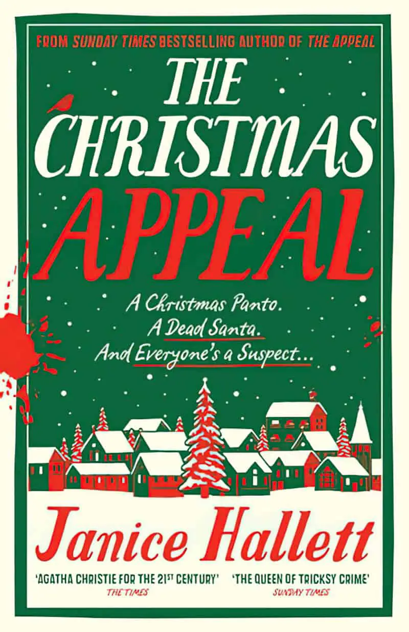

The novels of British comedian Dawn French tend to get this style. See below, different versions:


As does Robert Thorogood:


FONT FAMILIES
Look for fonts which have a ‘stamp’ version in the family. Many of these fonts would look right at home on the cover of a children’s picture book.
THE HAND LETTERED LOOK
- Serif Hand
- Amatic
- Pinto
- Tropicana
- Bimbo
- Unkempt
- Tomahawk
- Thriftshop
- The Hand
- Tahula
- Tall Abbey
- Sunn
- Sunny Monday
- Sunday
- Sue Ellen Francisco
- Stringbeans
- Shortstack
- SB Two and SB Three
- Rohioregular
- Runaway
- Robolt
- Remejug
- Pribambas
- Prevek
- Pompiere
- Pipetton
- Pinto
- Patrick Hand
- Palomino
- One Nine Nine Four
- Neucha
- Mouse Memoirs
- Londrina
- Les Tulipes
- Le Osler
- Hola Bisou
- Gorditas
- Goji Berries
- Gagalin (textured)
- Fresca
- Fox and Bear
- FC Bearhugs
- Echo Soul
- Dessert Menu
- Delius Unicase
- D62 Jack and Zoe
- Coolstory
- Coming Soon
- Chelsea Market
- Chapman
- Carneval
- Bubblegum
- Boogaloo
- Bobby Rough
- BM Hanna
- Bloomsbury
- Big Beauty
- Barrio
- Aristelle
- Adorn
SERIF FONTS FOR A MORE FORMAL LOOK
- Purple Purse
- Pelmeshka
- Midnight Owl
- Fredericka the Great (looks filled in with pencil)
- Fratello Nick Monogram
SANS SERIF FOR A MORE FORMAL LOOK
- Nanami
- Mucho Sans
- Hogar
- Fenway Sans
- Farsan
FOR AN ORNAMENTAL LOOK
- Naive
- Miltonian Tattoo
- Magnolia Merchant
- Frost Caps
- Fairy Tales









































COMPARE AND CONTRAST


