Today I’ll compare two brands of coloured pencil which come in large sets. Prismacolors are the go-to coloured pencil for colouring enthusiasts. How do these compare to off-brand “white label” pencils which sell under a variety of brand names?
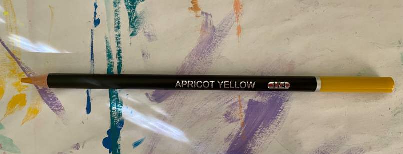
These white label pencils are all made the same way (I’m guessing in the same Chinese factory). They have a black barrel with a coloured end which extends about five centimetres down the barrel. Each pencil has a number as well as a colour name on the barrel. The Brutfuner brand uses metallic silver.
These pencils are currently (from Australia) the cheapest when purchased from Temu but you’ll also find them on Amazon.
In short: Prismacolors and White Label are two completely different coloured pencils to use. They’re both great in their own way, but the white label pencils are significantly more affordable. I purchased mine under the brand name Brutfuner, so I’ll just use that label going forward. A better price point comparison would be Faber Castell’s high end brand: Polychromos. Both are harder pencils which can be sharpened to a fine point and can take a bit of pressure.
THE PRICE DIFFERENCE
In December 2020 I bought a set of 150 Prismacolor pencils listed as “Prismacolor 1800059 Premier Coloured Pencils Set 150 Colored Pencils”. I think I paid about $180 for them at the time, but the price has now gone up. Today, the cheapest I can get them now is $227.95. (That’s Australian dollars.)
Note: these pencils are white-labelled, meaning the exact same pencils sell under different brands: Soucolor, Yover, Shuttle Art and also in Chinese packaging which costs even less. Note that the colours will be written in Chinese on the barrel. (I found a spelling mistake on my English language pencils, which of course sell for more.)
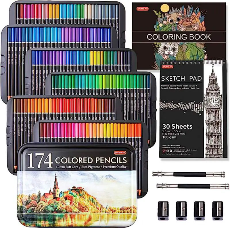
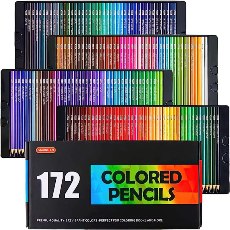
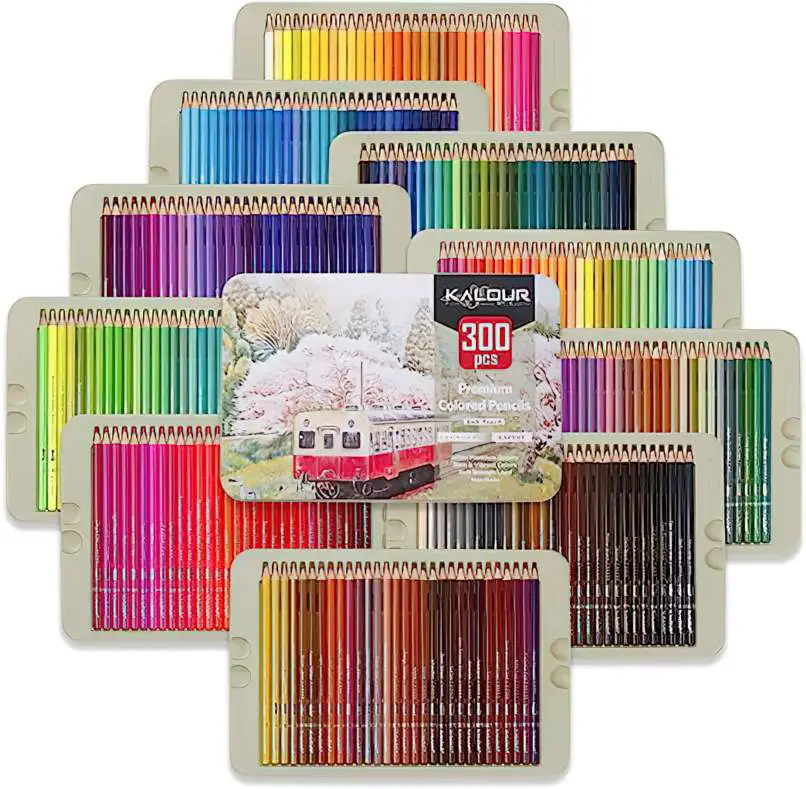
Castle Arts seem to sell the exact same pencils under their own brand and packaging, as do a number of other brand names on Temu.
Some reviewers have compared Kalour and Brutfuner pencils on YouTube on the assumption they are different products. Kalour purports to be lightfast, but we should be very skeptical of that claim. This reviewer found the Brutfuner pencils to be brighter, more pigmented, and softer with better blending. However, it is impossible to compare them in any scientific way because even within a single set (in my case the Brutfuner) there is a big difference between the colours. Some colours lay down colour very well. Others are basically useless. (I’m looking at you, Light Yellow.) The Brutfuner and Kalour brands don’t seem to be utilising the same colour names on the barrels, even if the pencil casing appears to be selling the exact same colour. (As well all know about pencils, the colour of the barrel is only ever an approximation of the lead. That’s why we make swatches when we get a new set.)
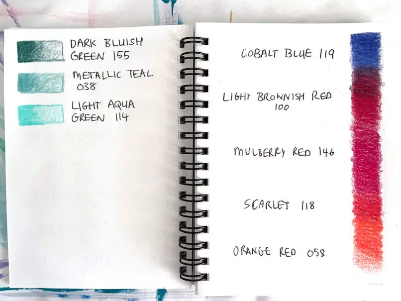
It may be the case that if Kalour and Brutfuner pencils seem different, the same factory may simply be producing varying qualities of batches over time. (If anyone has insider pencil information, let me know.)
PRISMACOLOR: THE “BEST” NON-PROFESSIONAL COLOURED PENCIL
I bought the Prismacolors after doing a bunch of research: As far as amateur colouring goes, Prismacolors are widely considered the best. By ‘amateur’, I mean they’re not lightfast. (Prismacolor is ‘light resistant’, which is not quite the same.) If you’re a professional artist selling artwork which is meant to be hung in the light and last many years, you’ll be using lightfast brands, which are more expensive and generally come in smaller sets. (Think Derwent, Caran d’Ache Luminance, Faber-Castell Polychromos.)
So Prismacolor pencils are not lightfast, but they’re popular with adults who enjoy colouring for fun and relaxation. I figured they’re also good for a kid still learning how to layer colours and so forth. That’s why I bought them. Also, one of my favourite online color palette generators allows you to generate palettes which line up with Prismacolor colours, a functionality I haven’t actually used, but it’s still pretty cool.
PRISMACOLOR AND MANUFACTURING QUALITY
When I sat down with my kid to give the Prismacolors a whirl, I was a little disappointed. Sure, they’re the nicest coloured pencils I’ve ever used as far as the texture goes. They lay down colour really well with this beautiful waxy texture. I can totally see why people love them. But some of the colours suffer from manufacturing issues. A few seem to be full of broken “lead”, and no matter how carefully you sharpen them (using a dedicated Prismacolour sharpener, I might add, which itself only lasted about a year before needing to be replaced), the tip keeps breaking. I’ve since heard long-term fans of Prismacolor talk about a general decline in quality in recent years, so it seems Prismacolor established their excellent reputation, then went downhill. In my opinion, whenever this happens to a company it’s time to support a different brand.
So when it came time to buy more coloured pencils, I did just that.
who are BRUTFUNER?
Apparently the name doesn’t mean anything, but I’m guessing it’s meant to look German. German products are widely associated with quality. As I have since found out, Brutfuner are just one brand selling pencils which are all exactly the same but sold under different labels. They are all made in China. (Where are Prismacolors made? Some sources say Mexico, others China. It’s highly likely they’re made wherever is cheapest for the corporation at the time.)
The Brutfuner Website needs a good edit and also needs a higher search engine ranking. It wasn’t super easy to find — it should ideally appear at the top of results if I search for Brutfuner. Try searching for Faber Castell or Prismacolor and notice what ranks first. Basically, Brutfuner doesn’t have the long-standing reputation of the other bigger brands.
Brutfuner sells a range of different sets: Metallic, Oil Based, Water Based and Sketching pencils. I bought the tin of 180 Brutfuner oily colored pencils, and paid less than half of what it would’ve cost to buy another set of 150 Prismacolors. ($92 instead of $227. And you get 30 extra pencils.)
This set does include about 10 metallic pencils but I have never been a fan of them. Basically, it’s like a bright colour with dirty grey added in. I haven’t yet found a use for metallic pencils, though some artists may use them. I suspect they’re used by kids who think that metallic effects can be achieved by laying down colour with a metallic pencil.
You’ll likely be buying these pencils through another online store anyway. Looking at online reviews, some of these companies take better care of their products. My Brutfuner branded pencils arrived unbroken, and must have been looked after properly. Consumers buying under other labels report broken leads and also broken plastic trays. (If you’ve ever seen a YouTube video of how postal items are sorted in China, you’ll know exactly how this happens!)
FIRST IMPRESSIONS OF THE 180 BRUTFUNER OILY COLOURED PENCILS
THE UNBOXING
CARDBOARD OR TIN?
Whereas the Prismacolors came in a cardboard box (similar to the feel you get when unboxing an Apple device), the Brutfuners come in a black tin with a cardboard wrap.
PRISMACOLORS DO NOT COME PRE-SORTED
When the Prismacolors arrived, they were in a nice box, but they weren’t the slightest bit arranged by colour. At the factory, the pencils had clearly been thrown in randomly. Sorting them into a usable rainbow is an enjoyable task, and I did just that before transferring them to a large zip-up pencil case and throwing away the box, but for that price? No one should have to.
BRUTFUNERS COME PRE-SORTED
The Brutfuners arrived pre-sorted into a usable rainbow. I’m not going to transfer them to a separate case because I think they’re most usable straight out of the tin. The plastic trays are quite flimsy, but I like that they have been designed with finger holes on each side. It’s very easy to pick each tray out of the tin.
This is what 180 pencils looks like when laid across a desk:
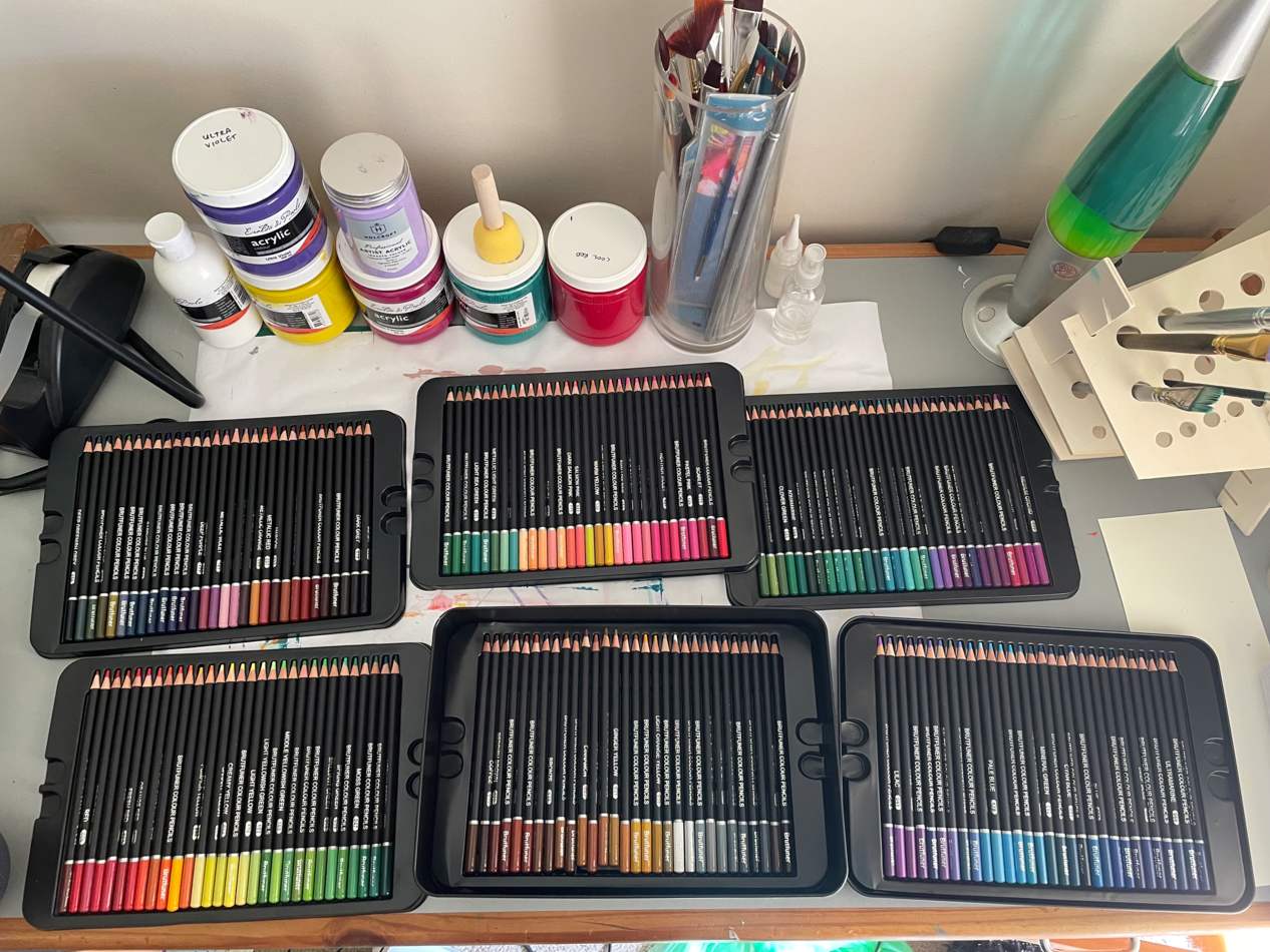
Unless you have a massive desk, you’ll probably want to stack them, as shown in the promotional photos:
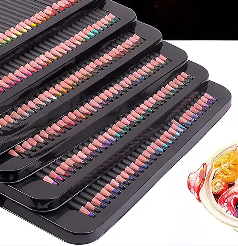
But in reality, they’re not designed for stacking. You end up with a slumped stack which isn’t easy to photograph.
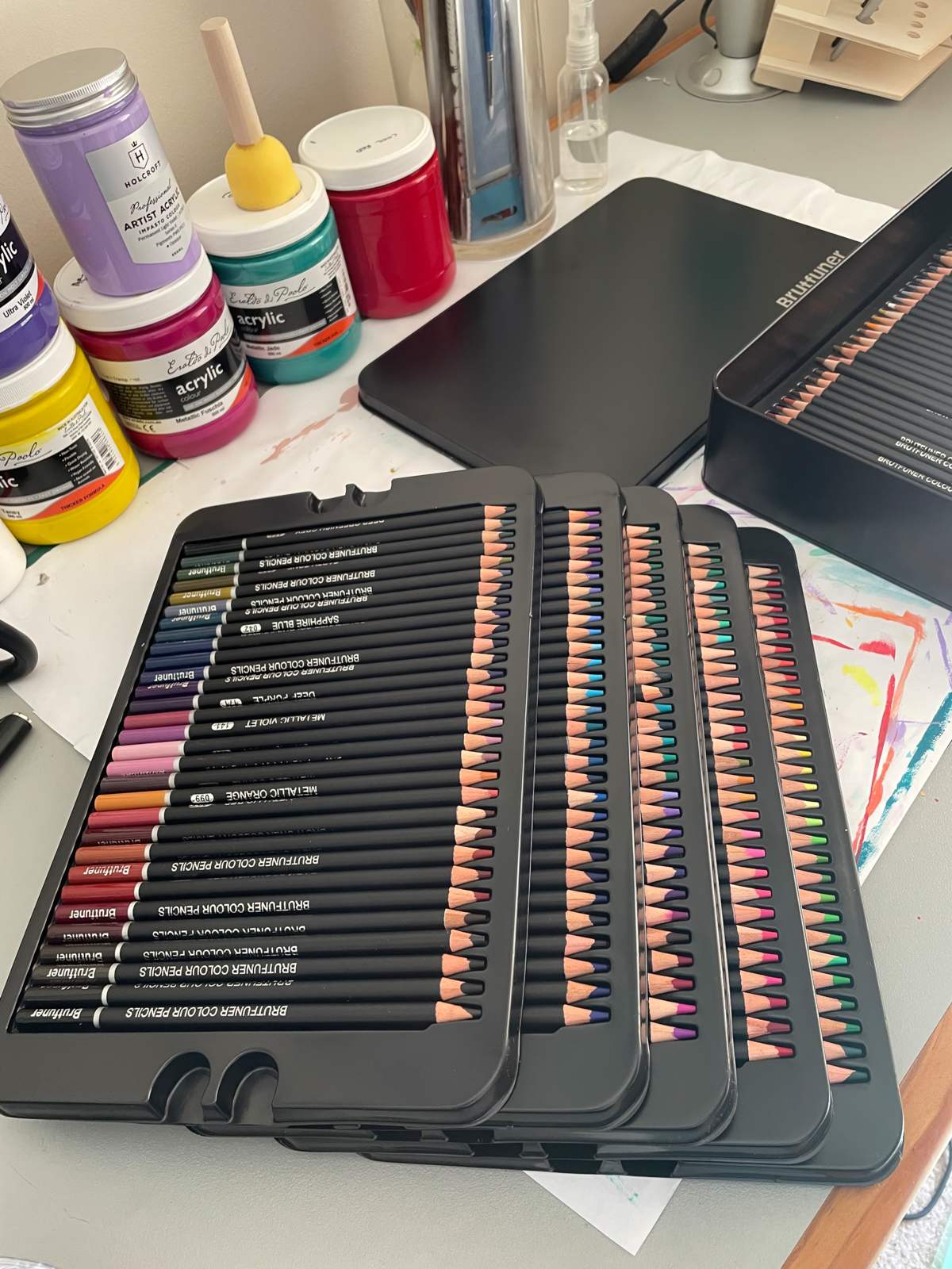
Also, the bottom layer is glued into the tin for some reason. (Probably to do with safe transportation? I see no good reason for it. You could probably get it out if you jimmy it.)
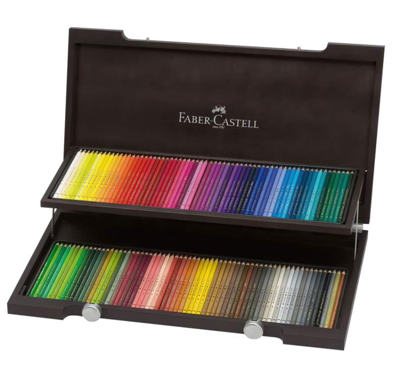
Faber Castell have got packaging sorted. Their Polychromos Colour Pencils come in a two-tier wooden case but then, they only have to worry about housing 120. Consumers pay four times the price. If you ever do splash out on Faber Castell Polychromos Colour Pencils, maybe keep the box and repurpose it for your cheaper pencils when you get your next set?
Such a simple thing, but I like that the Brutfuner set of 180 pencils came with a swatch. You only get one, but you could photocopy it to make swatches of overlaid colour combos.
In any case, it’s a good reminder that with a massive set of pencils, making swatches is usually an important part of the process.
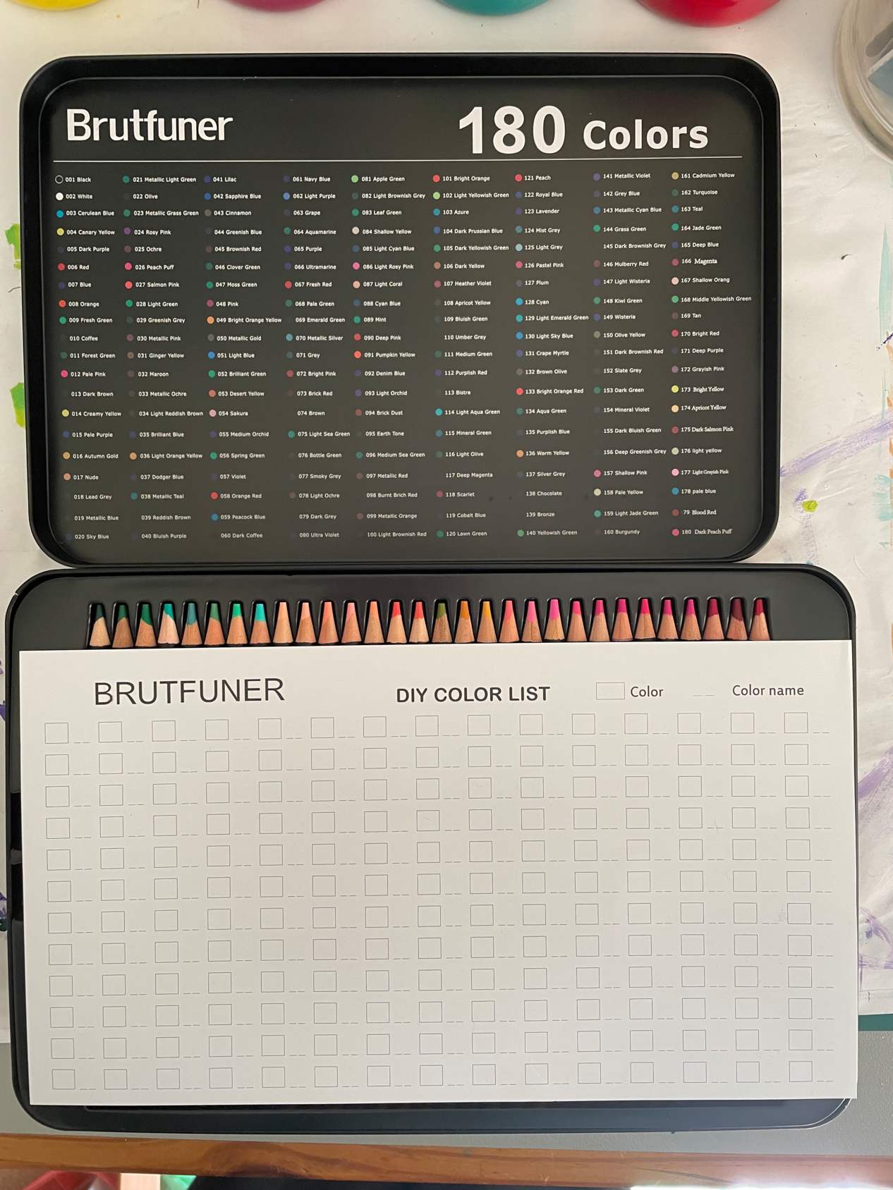
As you can see, there is also a list of colours on the underside of the lid.
THE COLOURING EXPERIENCE
Prismacolours and Brutfuners are completely different. The Prismacolors are creamy, whereas the Brutfuners feel dry. You could probably end up with the same effects, but you’re using a slightly different technique. They both blend very nicely, though you may find you prefer different kind of paper with each brand.
DO YOU LIKE CREAMY?
Although ‘creamy’ sounds good (“delicious”, in fact), you’re not necessarily going to prefer Prismacolors over Brutfuners. You may even enjoy colouring with the Brutfuners more.
BRUTFUNERS: REALLY HIGH QUALITY SCHOOL PENCILS
According to my school-aged kid, compared to the Prismacolors, the Brutfuners are “like really high quality school pencils”. Think Faber Castell Classic sets, Crayola. So if you were hankering after a massive set of Faber Castells Classics, Brutfuners are a good option. Faber Castell Classics are aimed at kids, so the largest set they sell is 60. (Smaller sets are 12, 24, 36 and 48.)
With any set of coloured pencils you’ll get some variation in the “lead” (I’ll just keep using that word). The pale yellow feels so hard it almost scratches the paper rather than laying down colour.
There are also a few minor defects in the manufacturing of the “case” of the pencils, but nothing that would affect its usage, just chips in the paintwork, if that makes sense.
HAND FEEL
To hold in the hand, there is no difference between the Brutfuners and the Prismacolors. They’re both round, so both have a tendency to roll off your desk.
MANUFACTURING QUALITY
Here’s the double bind Prismacolor obviously finds themselves in: In order to get the ‘creamy’ feel, you’re going to end up with “lead” which breaks more easily.
Brutfuners don’t have that creamy feel, so they don’t seem to break as easily. Basically, they’ll last longer than your Prismacolors. But the colouring experience isn’t the same.
OVERALL IMPRESSIONS
Advantages to Prismacolour
The famous creamy colouring experience
There are more online resources available for specific use with Prismacolor (e.g. the ability to make Coolors palettes). This may just be an English-speaking thing. There’s a big English-speaking community around Prismacolor.
Although Prismacolours are more expensive, you can buy them individually. So if there are a few colours you use all the time, you don’t have to buy an entirely new set to get them. At least in Australia, I haven’t seen anywhere to purchase individual Brutfuner replacements. (So don’t lose any!)
ADVANTAGES TO BRUTFUNER
They’re about half the price.
Overall, they’re more like school pencils, so seem a little more robust.
You get more pencils in this similar-sized set. (Note: You can also buy Brutfuner pencils in sets of 260 and 520.) More isn’t necessarily better, but I feel that with media such as pencils (and alcohol markers) where you can’t mix the colours like paint, it’s nice to have that larger range. Honestly, you probably won’t notice the difference between 150 and 180 though, except for the fact that you need more room on your desk if you lay them all out.
They come in a tin, not cardboard (although the cardboard of the Prismacolors is perfectly well-made, and you’d be able to use it for as long as you use the pencils inside.) For environmental reasons, cardboard might be better, actually? Except I doubt I’ll throw this black tin out anytime soon. It’s like a really nice biscuit tin. I’ll find a use for it somehow.
Update: With this many pencils it’s actually easier to transfer them to a large pencilcase. It takes up less room on the desk.
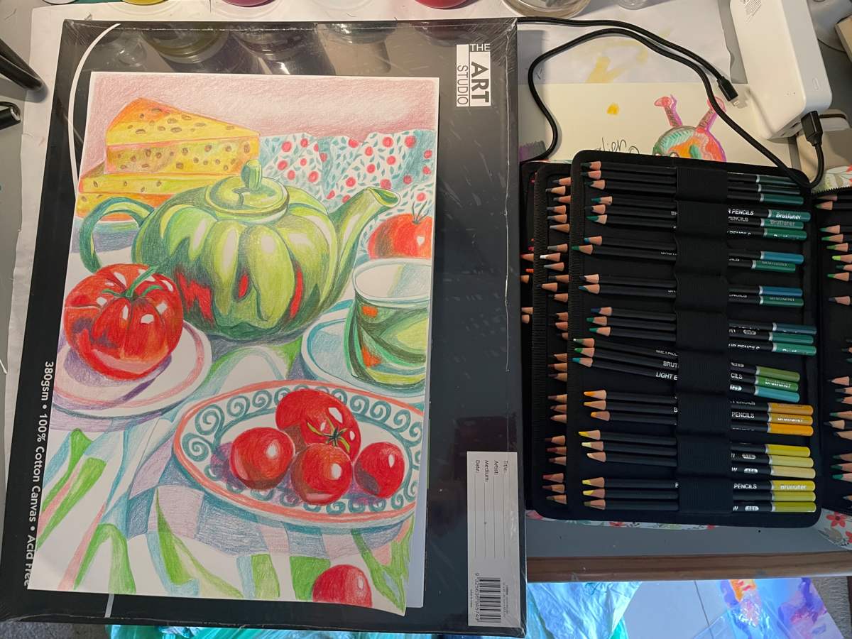
PRISMACOLOR OR BRUTFUNER?
If you’re buying a large set of coloured pencils for a school-aged person who loves stationery and looks after it, Brutfuner large pencil sets are a great option. You won’t find a set of school pencils as large as in these white-label pencils sold under various names, and the quality is about the same.
If you’re buying for someone who really appreciates the sensory aspects of colouring and if you have a little more money to spend, Prismacolor.
Professional artists will be using pencils with a lightfast rating. Even for amateurs, if you plan to keep your work, frame it, gift it, hand it down and so on, these pencils won’t stand the test of time.
LIST OF BRUTFUNER 180 NUMBERS AND COLOURS
Because they don’t seem to exist anywhere else on the Internet:
| 1 | BLACK |
| 2 | WHITE |
| 3 | CERULEAN BLUE |
| 4 | CANARY YELLOW |
| 5 | DARK PURPLE |
| 6 | RED |
| 7 | BLUE |
| 8 | ORANGE |
| 9 | FRESH GREEN |
| 10 | COFFEE |
| 11 | FOREST GREEN |
| 12 | PALE PINK |
| 13 | DARK BROWN |
| 14 | CREAMY YELLOW |
| 15 | PALE PURPLE |
| 16 | AUTUMN GOLD |
| 17 | NUDE |
| 18 | LEAD GREY |
| 19 | METALLIC BLUE |
| 20 | SKY BLUE |
| 21 | METALLIC LIGHT GREEN |
| 22 | OLIVE |
| 23 | METALLIC GRASS GREEN |
| 24 | ROSY PINK |
| 25 | OCHRE |
| 26 | PEACH PUFF |
| 27 | SALMON PINK |
| 28 | LIGHT GREEN |
| 29 | GREENISH GREY |
| 30 | METALLIC PINK |
| 31 | GINGER YELLOW |
| 32 | MAROON |
| 33 | METALLIC OCHRE |
| 34 | LIGHT REDDISH BROWN |
| 35 | BRILLIANT BLUE |
| 36 | LIGHT ORANGE YELLOW |
| 37 | DODGER BLUE |
| 38 | METALLIC TEAL |
| 39 | REDDISH BROWN |
| 40 | BLUISH PURPLE |
| 41 | LILAC |
| 42 | SAPPHIRE BLUE |
| 43 | CINNAMON |
| 44 | GREENISH BLUE |
| 45 | BROWNISH RED |
| 46 | CLOVER GREEN |
| 47 | MOSS GREEN |
| 48 | PINK |
| 49 | BRIGHT ORANGE YELLOW |
| 50 | METALLIC GOLD |
| 51 | LIGHT BLUE |
| 52 | BRILLIANT GREEN |
| 53 | DESERT YELLOW |
| 54 | SAKURA |
| 55 | MEDIUM ORCHID |
| 56 | SPRING GREEN |
| 57 | VIOLET |
| 58 | ORANGE RED |
| 59 | PEACOCK BLUE |
| 60 | DARK COFFEE |
| 61 | NAVY BLUE |
| 62 | LIGHT PURPLE |
| 63 | GRAPE |
| 64 | AQUAMARINE |
| 65 | PURPLE |
| 66 | ULTRAMARINE |
| 67 | FRESH RED |
| 68 | PALE GREEN |
| 69 | EMERALD GREEN |
| 70 | METALLIC SILVER |
| 71 | GREY |
| 72 | BRIGHT PINK |
| 73 | BRICK RED |
| 74 | BROWN |
| 75 | LIGHT SEA GREEN |
| 76 | BOTTLE GREEN |
| 77 | SMOKY GREY |
| 78 | LIGHT OCHRE |
| 79 | DARK GREY |
| 80 | ULTRA VIOLET |
| 81 | APPLE GREEN |
| 82 | LIGHT BROWNISH GREY |
| 83 | LEAF GREEN |
| 84 | SHALLOW YELLOW |
| 85 | LIGHT CYAN BLUE |
| 86 | LIGHT ROSY PINK |
| 87 | LIGHT CORAL |
| 88 | CYAN BLUE |
| 89 | MINT |
| 90 | DEEP PINK |
| 91 | PUMPKIN YELLOW |
| 92 | DENIM BLUE |
| 93 | LIGHT ORCHID |
| 94 | BRICK DUST |
| 95 | EARTH TONE |
| 96 | MEDIUM SEA GREEN |
| 97 | METALLIC RED |
| 98 | BURNT BRICK RED |
| 99 | METALLIC ORANGE |
| 100 | LIGHT BROWNISH |
| 101 | BRIGHT ORANGE |
| 102 | LIGHT YELLOWISH GREEN |
| 103 | AZURE |
| 104 | DARK PRUSSIAN BLUE |
| 105 | DARK YELLOWISH GREEN |
| 106 | DARK YELLOW |
| 107 | HEATHER VIOLET |
| 108 | APRICOT YELLOW |
| 109 | BLUISH GREEN |
| 110 | UMBER GREY |
| 111 | MEDIUM GREEN |
| 112 | PURPLISH RED |
| 113 | BISTRE |
| 114 | LIGHT AQUA GREEN |
| 115 | MINERAL GREEN |
| 116 | LIGHT OLIVE |
| 117 | DEEP MAGENTA |
| 118 | SCARLET |
| 119 | COBALT BLUE |
| 120 | LAWN GREEN |
| 121 | PEACH |
| 122 | ROYAL BLUE |
| 123 | LAVENDER |
| 124 | MIST GREY |
| 125 | LIGHT GREY |
| 126 | PASTEL PINK |
| 127 | PLUM |
| 128 | CYAN |
| 129 | LIGHT EMERALD GREEN |
| 130 | LIGHT SKY BLUE |
| 131 | CRAPE MYRTLE |
| 132 | BROWN OLIVE |
| 133 | BRIGHT ORANGE RED |
| 134 | AQUA GREEN |
| 135 | PURPLISH BLUE |
| 136 | WARM YELLOW |
| 137 | SILVER GREY |
| 138 | CHOCOLATE |
| 139 | BRONZE |
| 140 | YELLOWISH GREEN |
| 141 | METALLIC VIOLET |
| 142 | GREY BLUE |
| 143 | METALLIC CYAN BLUE |
| 144 | GRASS GREEN |
| 145 | DARK BROWNISH GREY |
| 146 | MULBERRY RED |
| 147 | LIGHT WISTERIA |
| 148 | KIWI GREEN |
| 149 | WISTERIA |
| 150 | OLIVE YELLOW |
| 151 | DARK BROWNISH RED |
| 152 | SLATE GREY |
| 153 | DARK GREEN |
| 154 | MINERAL VIOLET |
| 155 | DARK BLUISH GREEN |
| 156 | DEEP GREENISH GREY |
| 157 | SHALLOW PINK |
| 158 | PALE YELLOW |
| 159 | LIGHT JADE GREEN |
| 160 | BURGUNDY |
| 161 | CADMIUM YELLOW |
| 162 | TURQUOISE |
| 163 | TEAL |
| 164 | JADE GREEN |
| 165 | DEEP BLUE |
| 166 | MAGENTA |
| 167 | SHALLOW ORANGE |
| 168 | MIDDLE YELLOWISH GREEN |
| 169 | TAN |
| 170 | BRIGHT RED |
| 171 | DEEP PURPLE |
| 172 | GRAYISH PINK |
| 173 | BRIGHT YELLOW |
| 174 | APRICOT YELLOW |
| 175 | DARK SALMON PINK |
| 176 | LIGHT YELLOW |
| 177 | LIGHT GRAYISH PINK |
| 178 | PALE BLUE |
| 179 | BLOOD RED |
| 180 | DARK PEACH PUFF |
KALOUR 240 NUMBERS AND COLOURS
This is how the colours arrive in the trays. I took pictures for my own reference, but perhaps others can make use of it too, if you like the way they are arranged (because they sure don’t stay like this for long).
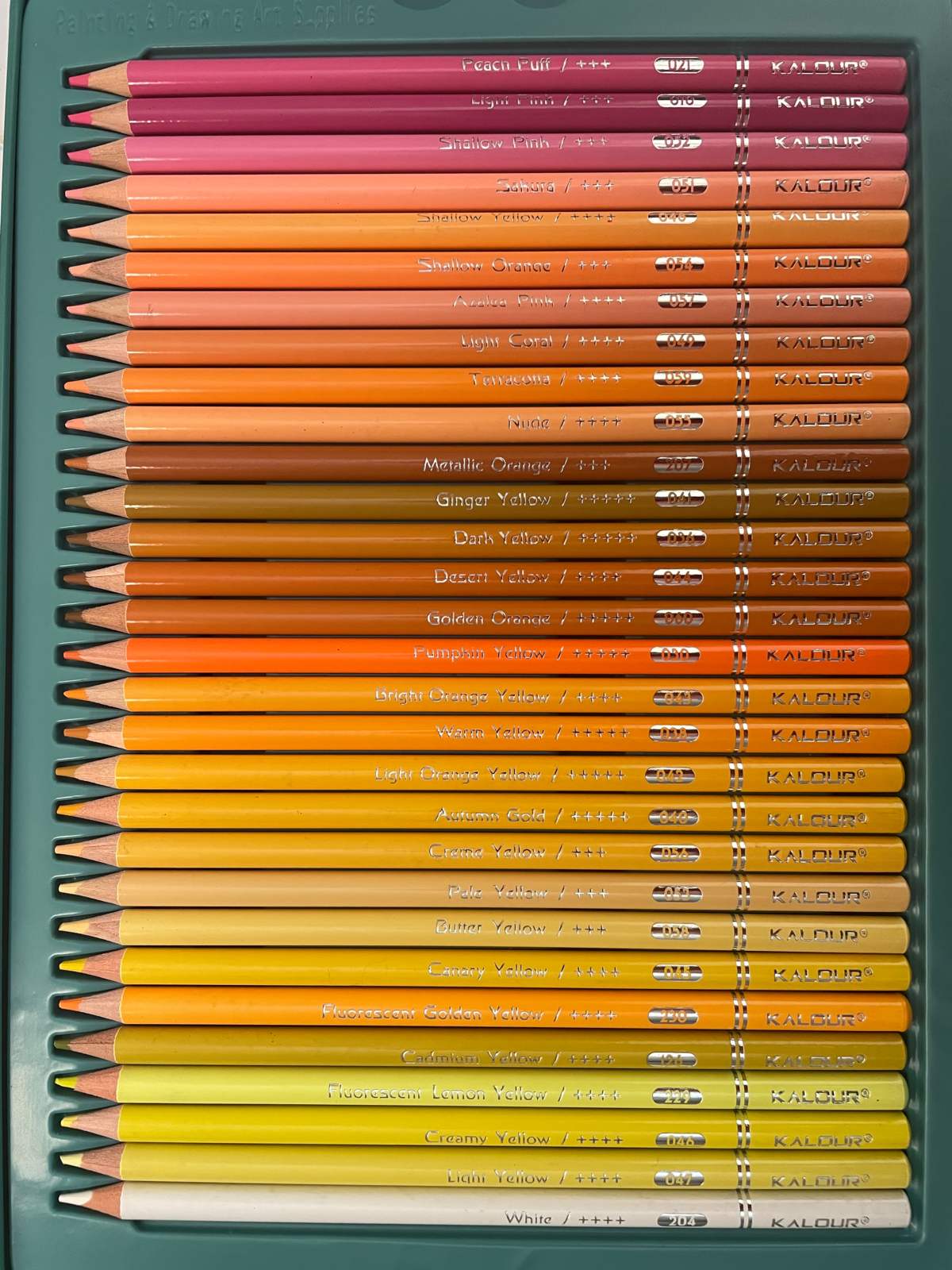
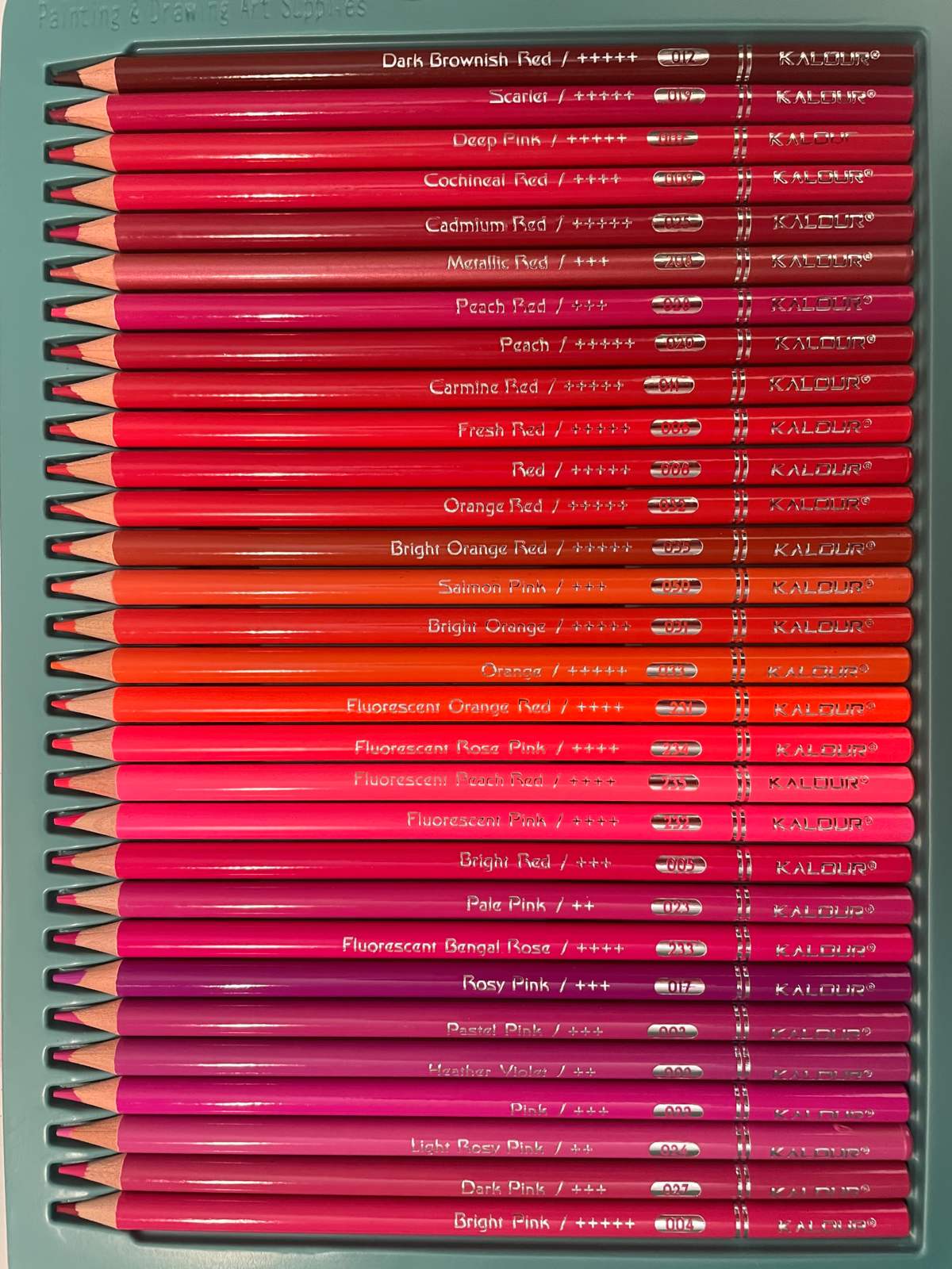
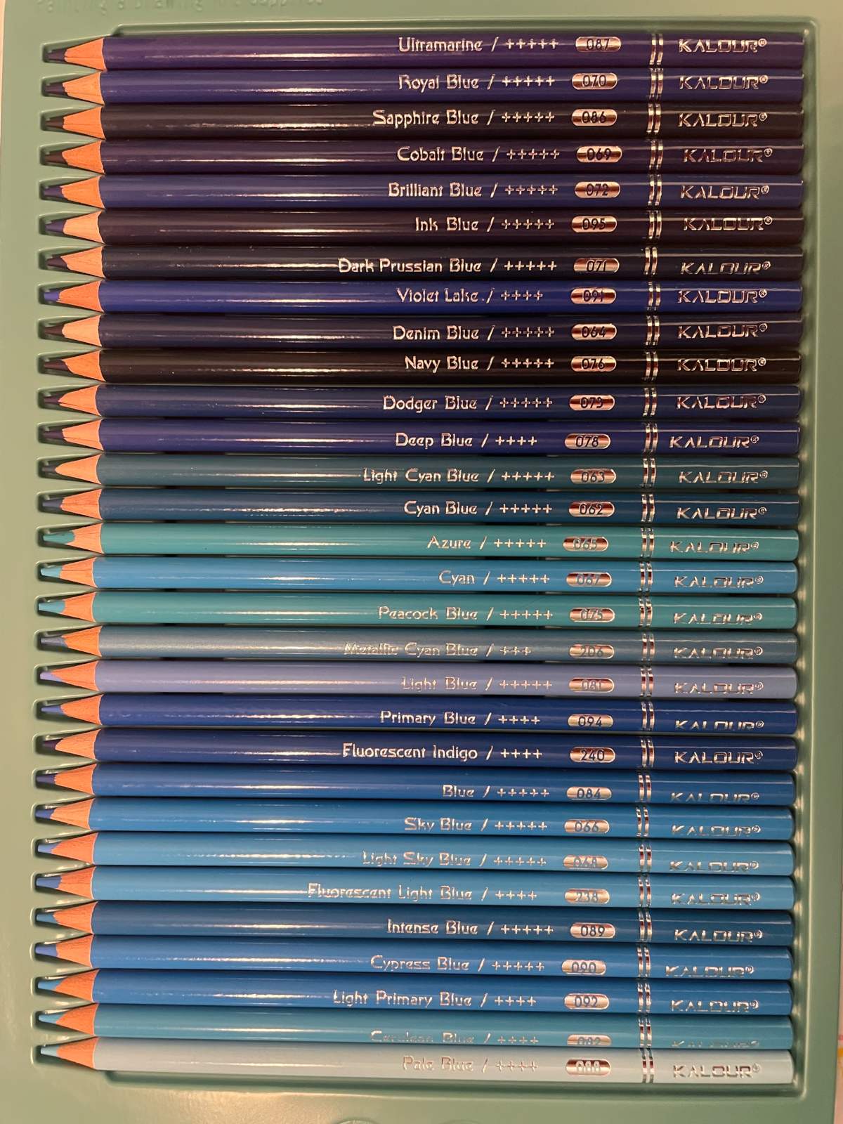
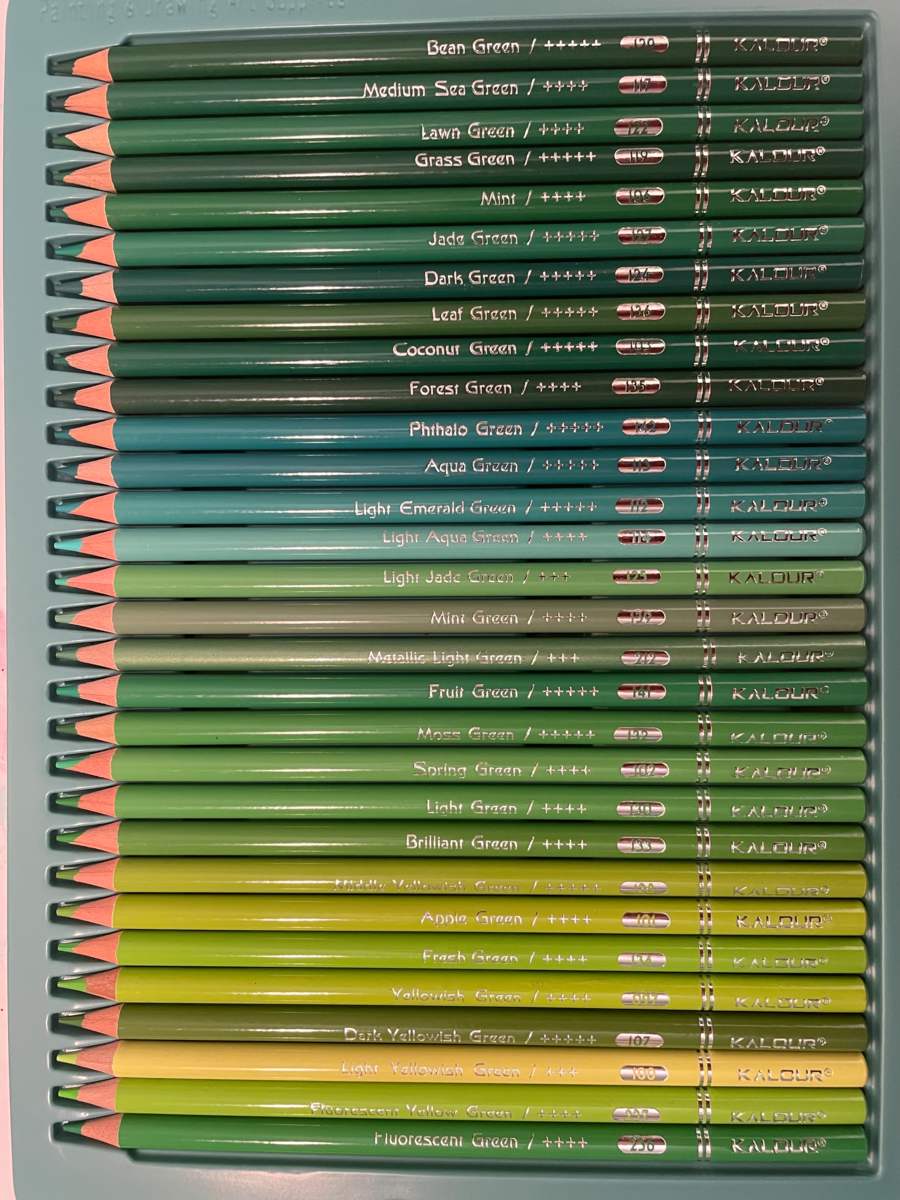
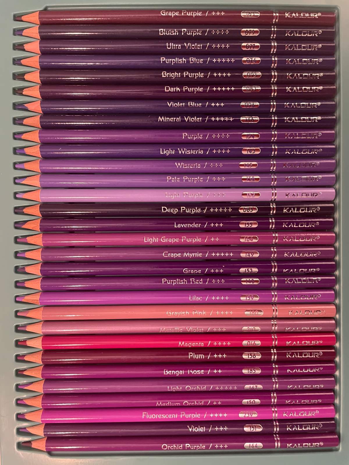
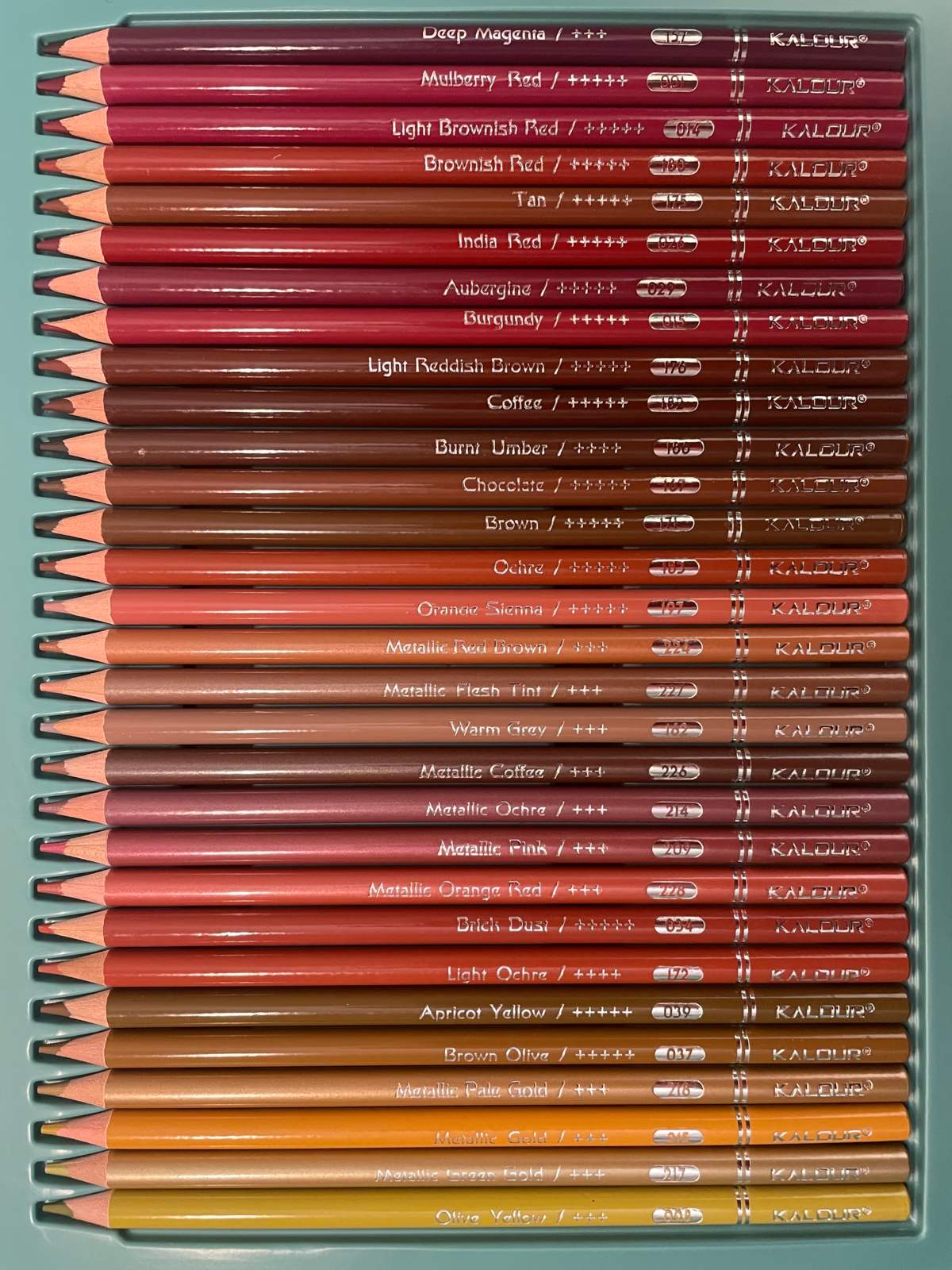
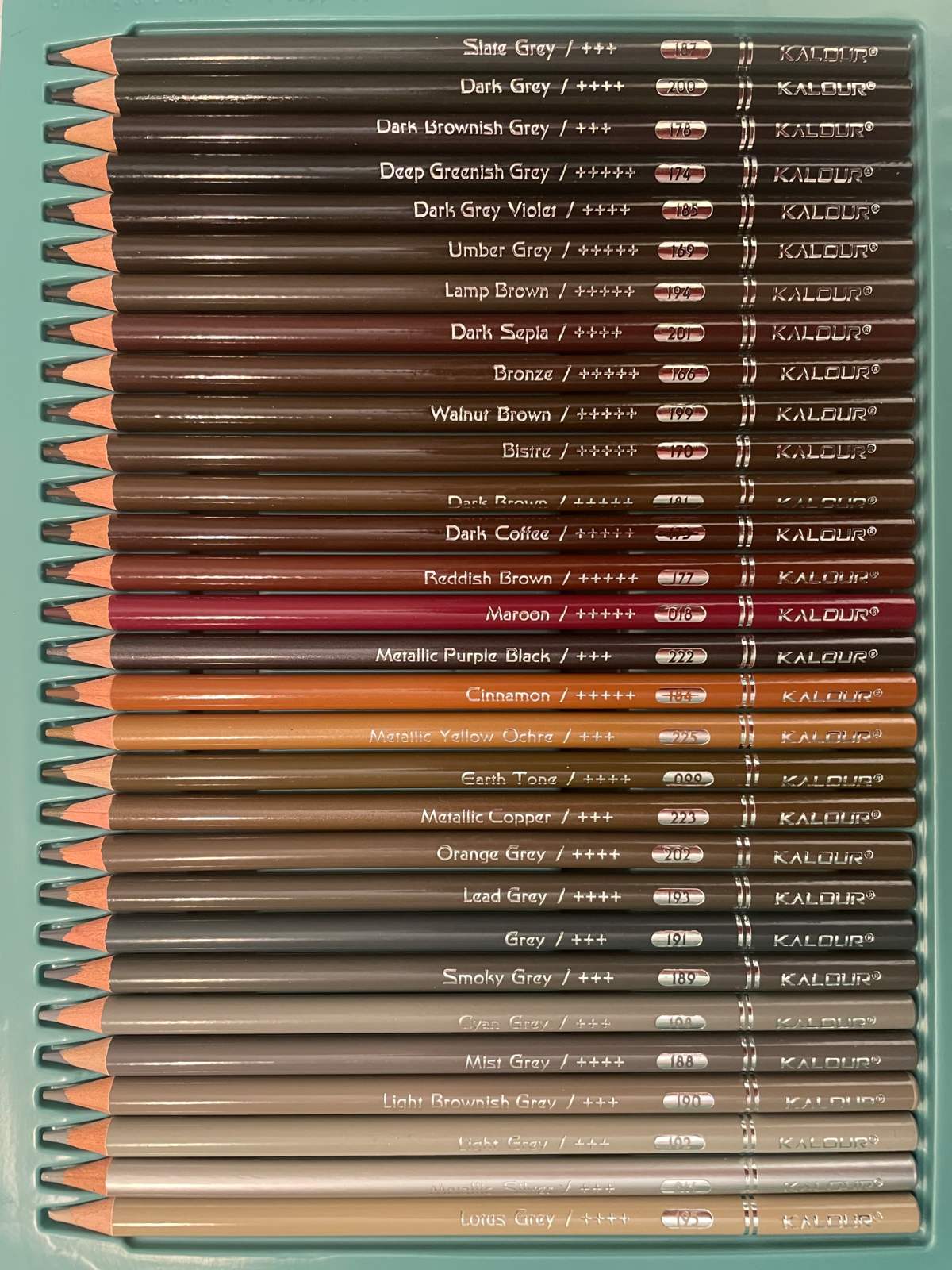
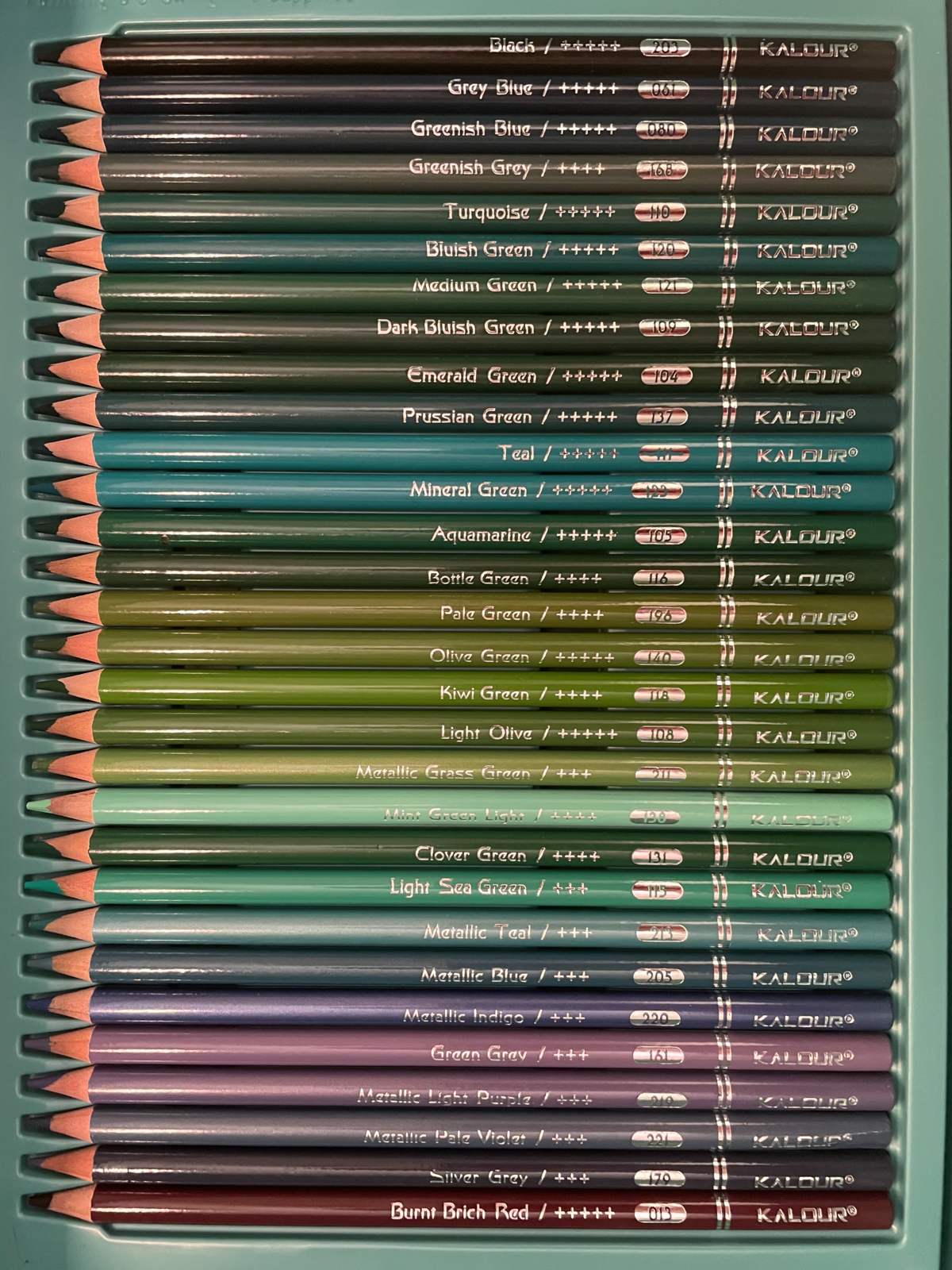
Note that how they come in the trays does not match numerical order.
| KALOUR COLOR NAME TRAY 1 | NUMBER |
| peach puff | 021 |
| light pink | 010 |
| shallow pink | 052 |
| sakura | 051 |
| shallow yellow | 048 |
| shallow orange | 054 |
| azalea pink | 057 |
| light coral | 049 |
| terracotta | 059 |
| nude | 055 |
| metallic orange | 207 |
| ginger yellow | 041 |
| dark yellow | 036 |
| desert yellow | 044 |
| golden orange | 060 |
| pumpkin yellow | 030 |
| bright orange yellow | 043 |
| warm yellow | 038 |
| light orange yellow | 042 |
| autumn gold | 040 |
| creme yellow | 056 |
| pale yellow | 053 |
| butter yellow | 058 |
| canary yellow | 045 |
| fluorescent golden yellow | 230 |
| cadmium yellow | 126 |
| fluorescent lemon yellow | 229 |
| creamy yellow | 046 |
| light yellow | 047 |
| white | 204 |
| KALOUR COLOR NAME TRAY 2 | NUMBER |
| dark brownish red | 012 |
| scarlet | 019 |
| deep pink | 007 |
| cochineal red | 009 |
| cadmium red | 025 |
| metallic red | 208 |
| peach red | 028 |
| peach | 020 |
| carmine red | 011 |
| fresh red | 006 |
| red | 008 |
| orange red | 032 |
| bright orange red | 035 |
| salmon pink | 050 |
| bright ornage | 031 |
| orange | 033 |
| fluorescent orange red | 231 |
| fluorescent rose pink | 234 |
| fluorescent peach red | 235 |
| fluorescent pink | 232 |
| bright red | 005 |
| pale pink | 023 |
| fluorescent bengal rose | 233 |
| rosy pink | 017 |
| pastel pink | 003 |
| heather violet | 002 |
| pink | 022 |
| light rosy pink | 024 |
| dark pink | 027 |
| bright pink | 004 |
| KALOUR COLOR NAME TRAY 3 | COLOUR |
| ultramarine | 087 |
| royal blue | 070 |
| sapphire blue | 086 |
| cobalt blue | 069 |
| brilliant blue | 072 |
| ink blue | 095 |
| dark prussian blue | 071 |
| violet lake | 091 |
| denim blue | 064 |
| navy blue | 076 |
| dodger blue | 073 |
| deep blue | 078 |
| light cyan blue | 063 |
| cyan blue | 062 |
| azure | 065 |
| cyan | 067 |
| peacock blue | 075 |
| metallic cyan blue | 206 |
| light blue | 081 |
| primary blue | 094 |
| fluorescent indigo | 240 |
| blue | 084 |
| sky blue | 066 |
| light sky blue | 068 |
| fluorescent light blue | 238 |
| intense blue | 089 |
| cypress blue | 090 |
| pale blue | 088 |
| light primary blue | 092 |
| cerulean blue | 082 |
| KALOUR COLOR NAME TRAY 4 | COLOUR |
| bean green | 129 |
| medium sea green | 117 |
| lawn green | 122 |
| grass green | 119 |
| mint | 106 |
| jade green | 127 |
| dark green | 124 |
| leaf green | 136 |
| coconut green | 103 |
| forest green | 135 |
| phthalo green | 142 |
| aqua green | 113 |
| light emerald green | 112 |
| light aqua green | 114 |
| light jade green | 125 |
| mint green | 139 |
| metallic light green | 212 |
| fruit green | 141 |
| moss green | 132 |
| spring green | 102 |
| light green | 130 |
| brilliant green | 133 |
| middle yellowish green | 128 |
| apple green | 101 |
| fresh green | 134 |
| yellowish green | 097 |
| dark yellowish green | 107 |
| light yellowish green | 100 |
| fluorescent yellow green | 237 |
| fluorescent green | 236 |
| KALOUR COLOR NAME TRAY 5 | COLOUR |
| grape purple | 163 |
| bluish purple | 079 |
| ultra violet | 077 |
| purplish blue | 074 |
| bright purple | 093 |
| dark purple | 083 |
| violet blue | 096 |
| mineral violet | 146 |
| purple | 154 |
| light wisteria | 143 |
| wisteria | 145 |
| pale purple | 158 |
| light purple | 152 |
| deep purple | 085 |
| lavender | 155 |
| light grape purple | 164 |
| crape myrtle | 149 |
| grape | 153 |
| purplish red | 148 |
| lilac | 159 |
| grayish pink | 160 |
| metallic violet | 210 |
| magenta | 016 |
| plum | 156 |
| bengal rose | 165 |
| light orchid | 147 |
| medium orchid | 150 |
| fluorescent purple | 239 |
| violet | 151 |
| orchid purple | 144 |
| KALOUR COLOR NAME TRAY 6 | COLOUR |
| deep magenta | 157 |
| mulberry red | 001 |
| light brownish red | 014 |
| brownish red | 180 |
| tan | 175 |
| india red | 026 |
| aubergine | 029 |
| burgundy | 015 |
| light reddish brown | 176 |
| coffee | 182 |
| burnt umber | 186 |
| chocolate | 167 |
| brown | 171 |
| ochre | 183 |
| orange sienna | 197 |
| metallic red brown | 224 |
| metallic flesh tint | 227 |
| warm grey | 162 |
| metallic coffee | 226 |
| metallic ochre | 214 |
| metallic pink | 209 |
| metallic orange red | 228 |
| brick dust | 034 |
| light ochre | 172 |
| apricot yellow | 039 |
| brown olive | 037 |
| metallic pale gold | 218 |
| metallic gold | 215 |
| metallic green gold | 217 |
| olive yellow | 098 |
| KALOUR COLOR NAME TRAY 7 | COLOUR |
| slate grey | 187 |
| dark grey | 200 |
| dark brownish grey | 178 |
| deep greenish grey | 174 |
| dark grey violet | 185 |
| umber grey | 169 |
| lamp brown | 194 |
| dark sepia | 201 |
| bronze | 166 |
| walnut brown | 199 |
| bistre | 170 |
| dark brown | 181 |
| dark coffee | 173 |
| reddish brown | 177 |
| maroon | 018 |
| metallic purple black | 222 |
| cinnamon | 184 |
| metallic yellow ochre | 225 |
| earth tone | 099 |
| metallic copper | 223 |
| orange grey | 202 |
| lead grey | 193 |
| grey | 191 |
| smoky grey | 189 |
| cyan grey | 198 |
| mist grey | 188 |
| light brownish grey | 190 |
| light grey | 192 |
| metallic silver | 216 |
| lotus grey | 195 |
| KALOUR COLOR NAME TRAY 8 | COLOUR |
| black | 203 |
| grey blue | 061 |
| greenish blue | 080 |
| greenish grey | 168 |
| turquoise | 110 |
| bluish green | 120 |
| medium green | 121 |
| dark bluish green | 109 |
| emerald green | 104 |
| prussian green | 137 |
| teal | 111 |
| mineral green | 123 |
| aquamarine | 105 |
| bottle green | 116 |
| pale green | 196 |
| olive green | 140 |
| kiwi green | 118 |
| light olive | 108 |
| metallic grass green | 211 |
| mint green light | 138 |
| clover green | 131 |
| light sea green | 115 |
| metallic teal | 213 |
| metallic blue | 205 |
| metallic indigo | 220 |
| green grey | 161 |
| metallic light purple | 219 |
| metallic pale violet | 221 |
| silver grey | 179 |
| burnt brick red | 013 |
The header image is AI generated using SDXL 0.9.
