Edit: August 2022. Forget Wombo, forget Deep Dream Generator. Head on over to Midjourney. My post on Midjourney is here.
Deep Dream Generator is a free web based app which lets you make works of art with the help of artificial intelligence. After messing around with quite a few AI art makers, this is one of the few to return truly impressive results.
You may have already seen people making AI art and posting it through their feeds.
Although most of this post talks about Deep Dream Generator, with a bit about Wombo, I have since discovered an Australian company called NightCafe. Scroll down to the bottom for a bit more on that. NightCafe does a very nice job, and from what I can make out, with fewer unwanted artifacts.
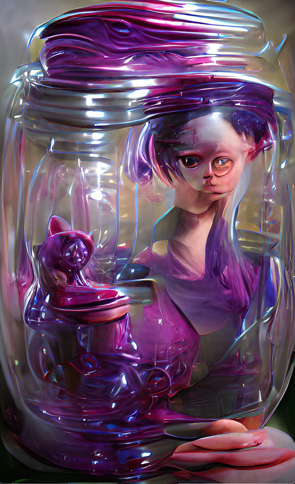
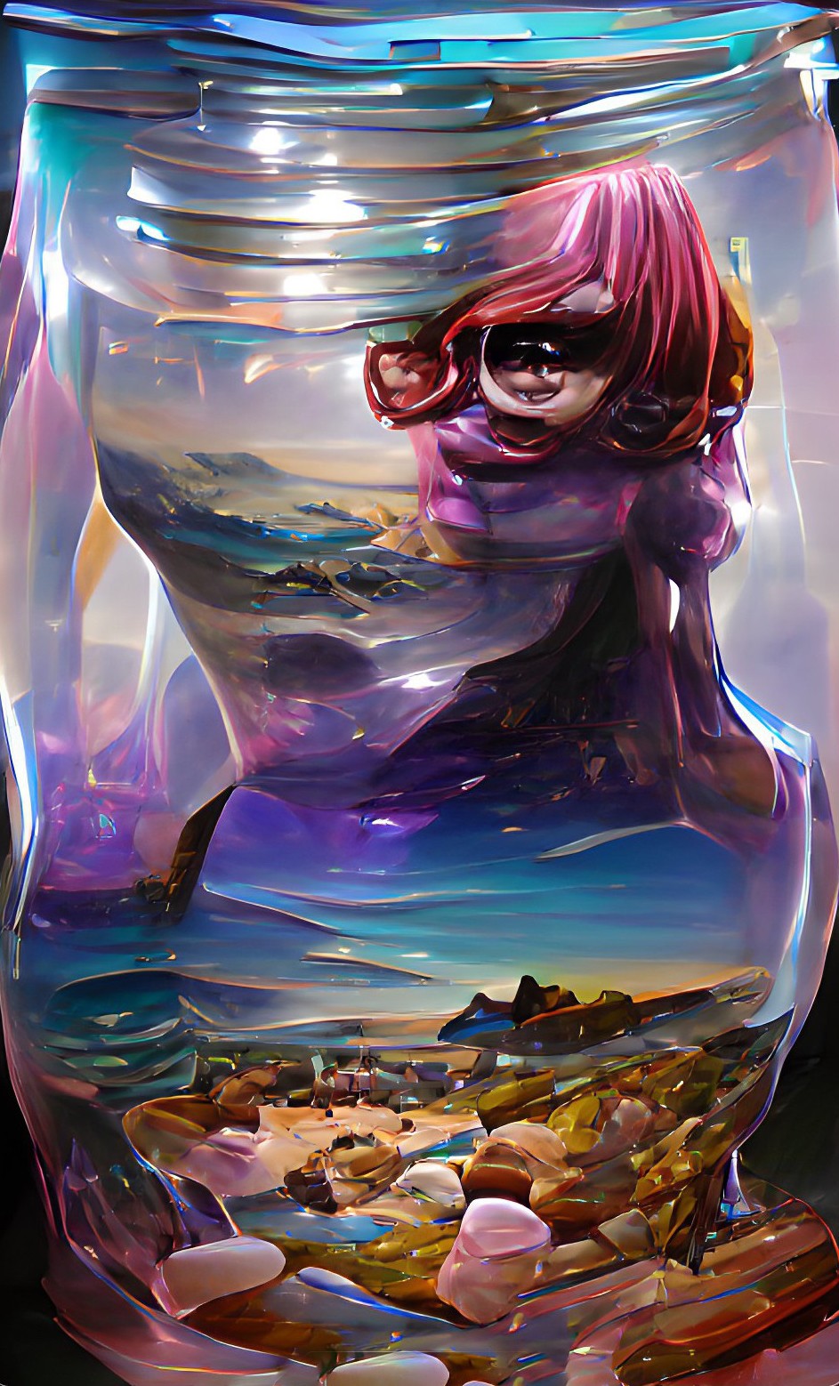
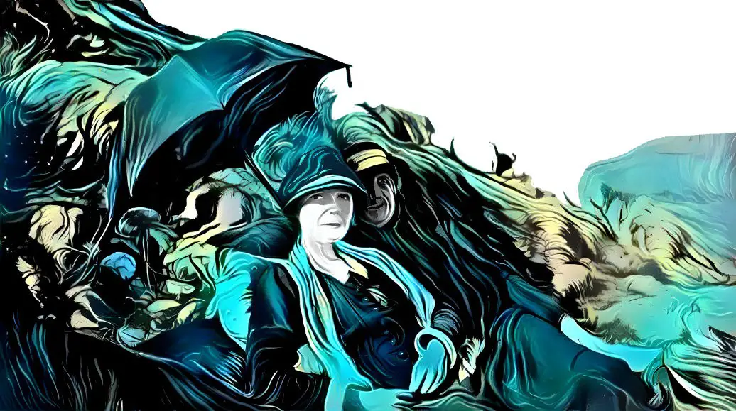
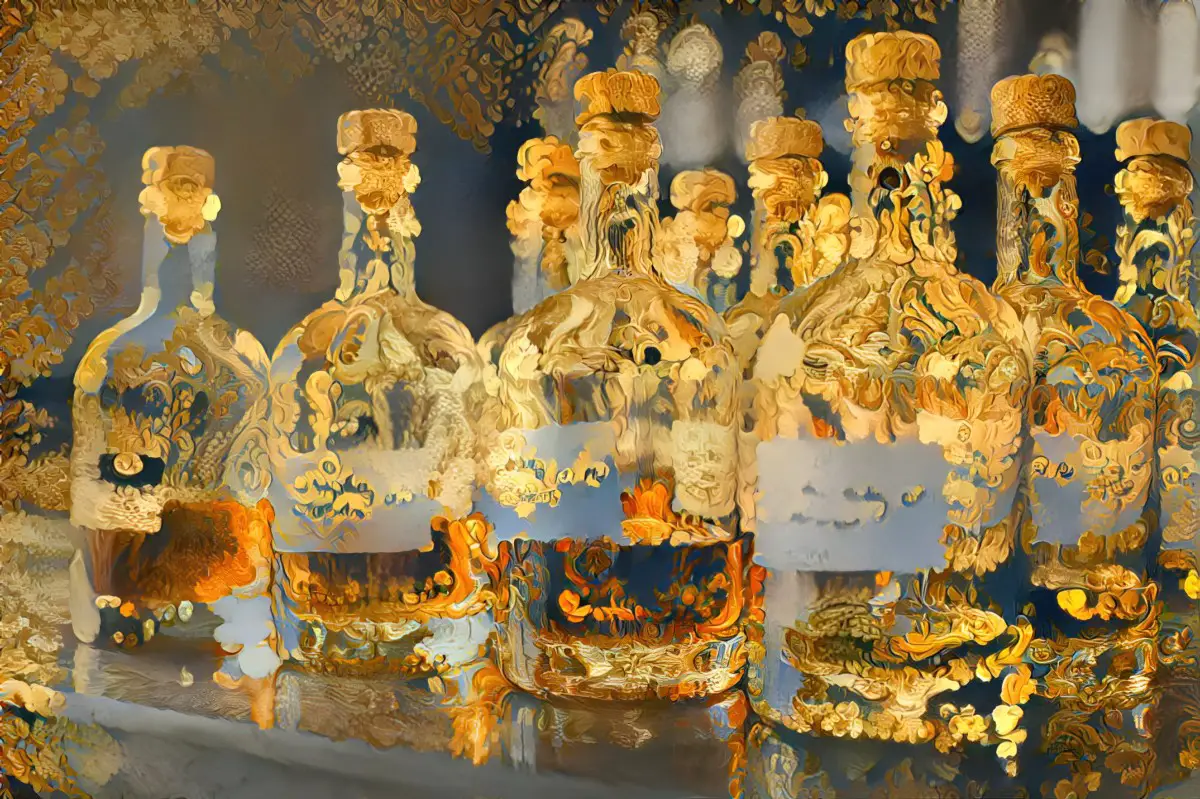
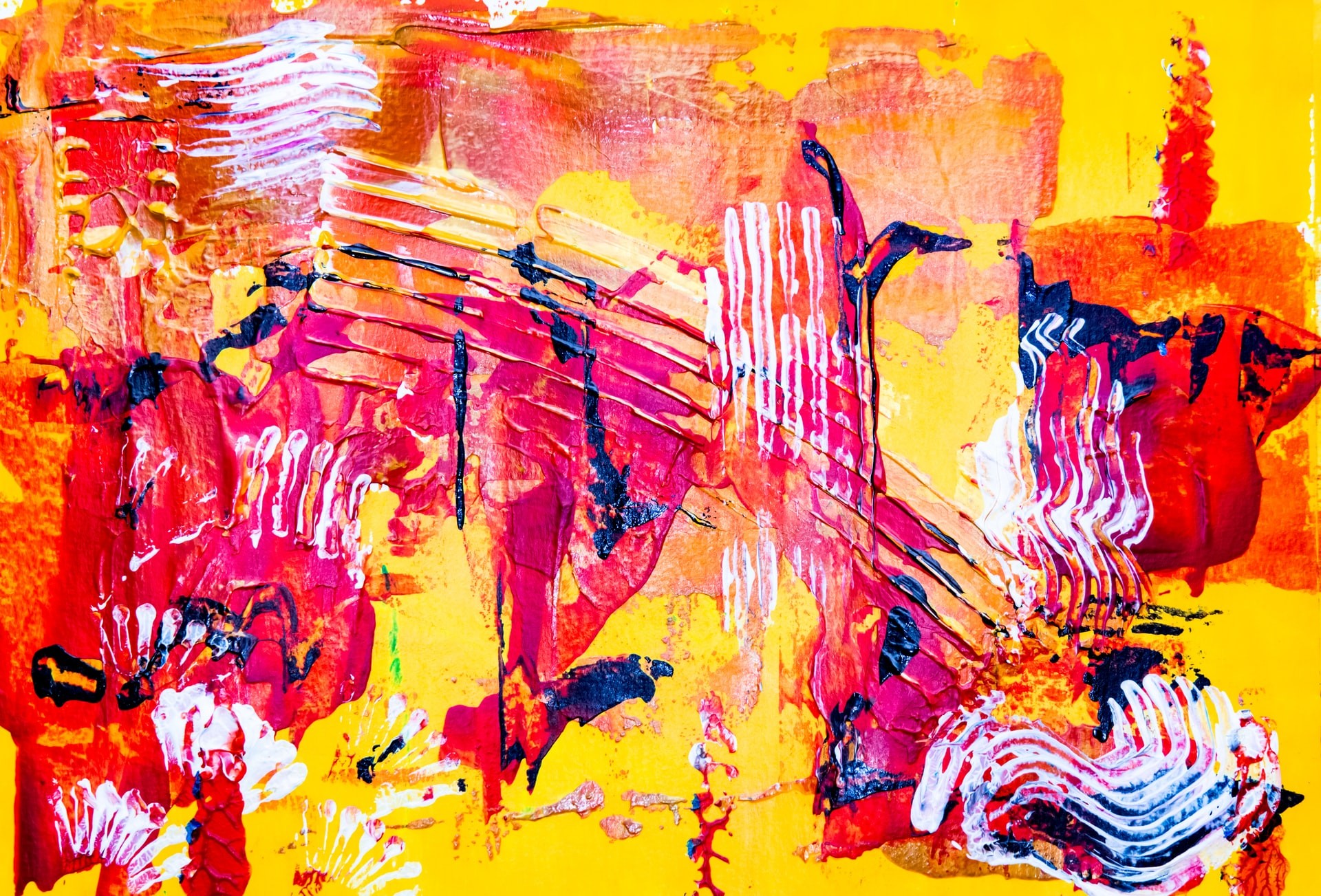
My still life flower experiments with NightCafe Studio.
Important: Note that once you get to your maximum allowed free credits on Deep Dream Generator, you can’t accumulate any more. (The max a free account can accumulate is 70.) However, NightCafe Studio works differently. Even if you don’t use them, they accumulate. (I don’t know if there’s an upper limit… mine are currently at 250 because even if I’m not using NightCafe that day, I pop in to ‘claim’ my credits.)
Update: I’ve just started mucking around with Midjourney, which everyone is talking about recently. It is truly excellent. Apply for an invite if you can. More to come, but for now, Midjourney has some excellent documentation which applies across all AI art generators. See for example:
A Guide To Writing Prompts For Text-To-Image AI
WOMBO.ART
A popular app right now is Wombo, which I have on my iPhone. It crashes a lot, but still works.
Update April 2022: Wombo continues to update its app, adding various new filters and, most recently, the ability to create art from an uploaded photo.
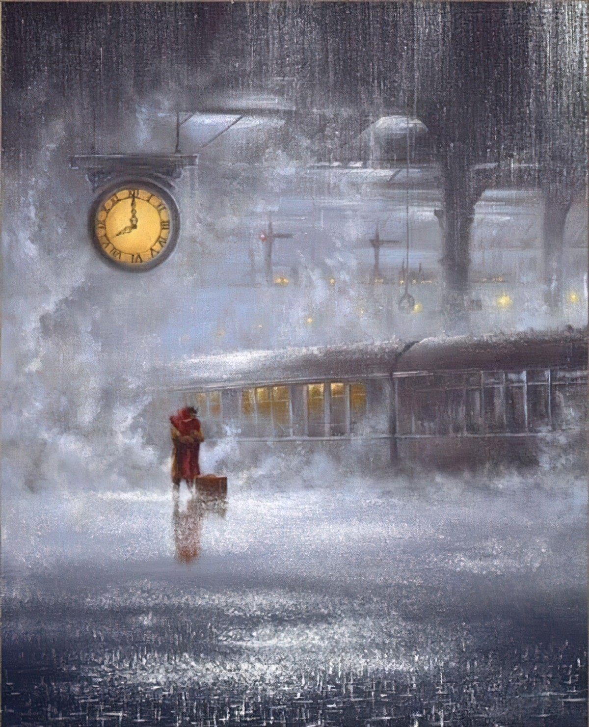
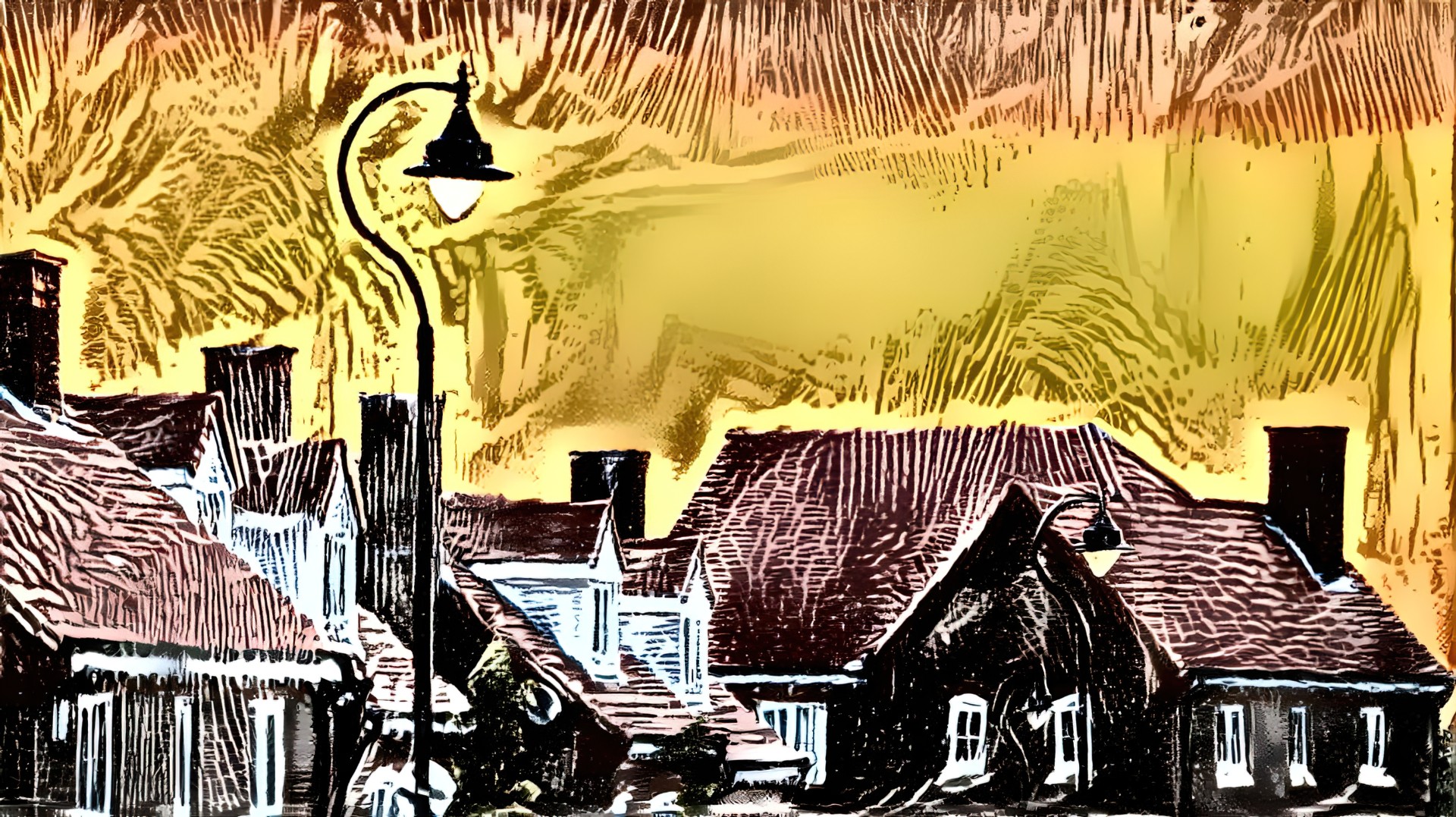
All I did to make the artwork below was type ‘ghost house’ into the field. Then I chose a filter and voila. I got this. Pretty impressive, eh?
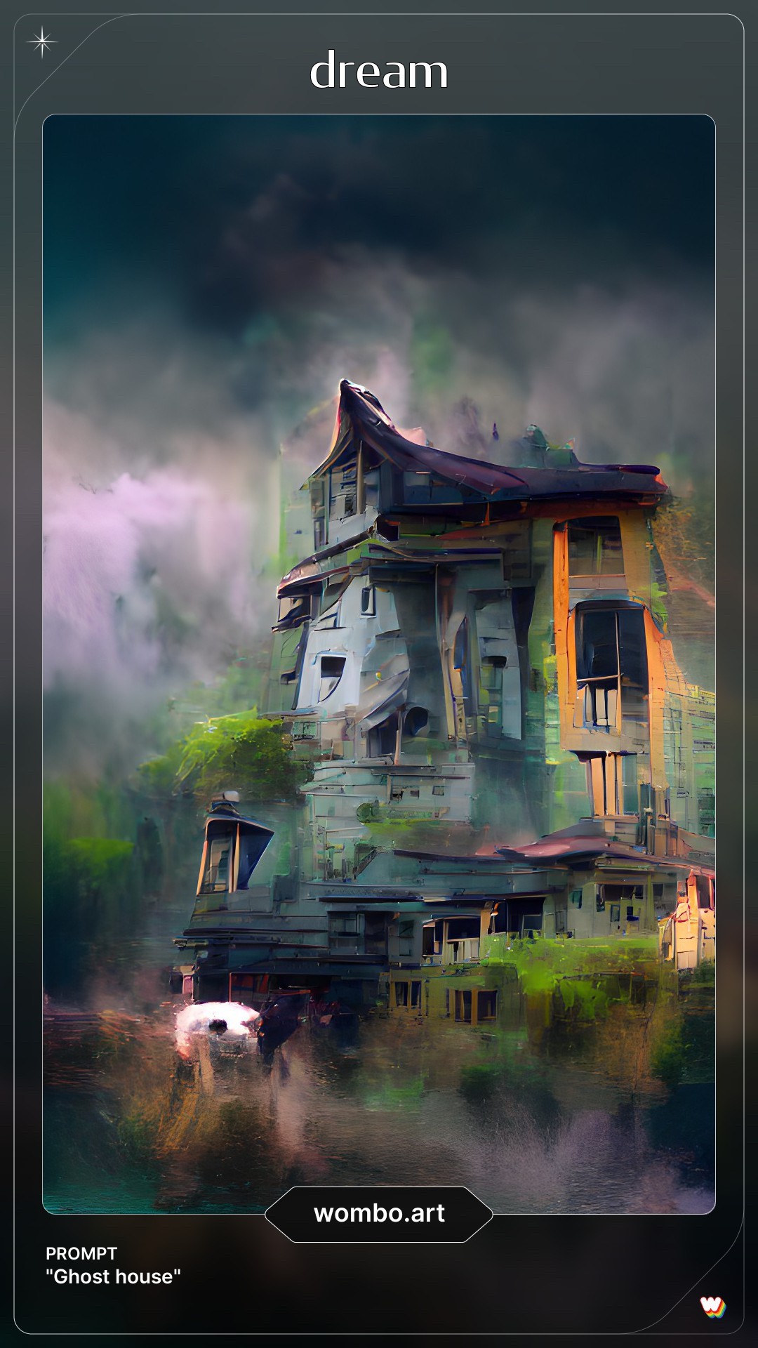
But after a while, you realise Wombo has its limits. (Only about half of their filter options look good in my opinion.) This app is especially good for creating supernatural, kinda freaky looking pictures which look like a still from last night’s nightmare (which is why they called it ‘Dream’.) It turns humans into dark hooded creatures, and text into cool, otherwordly symbolism.
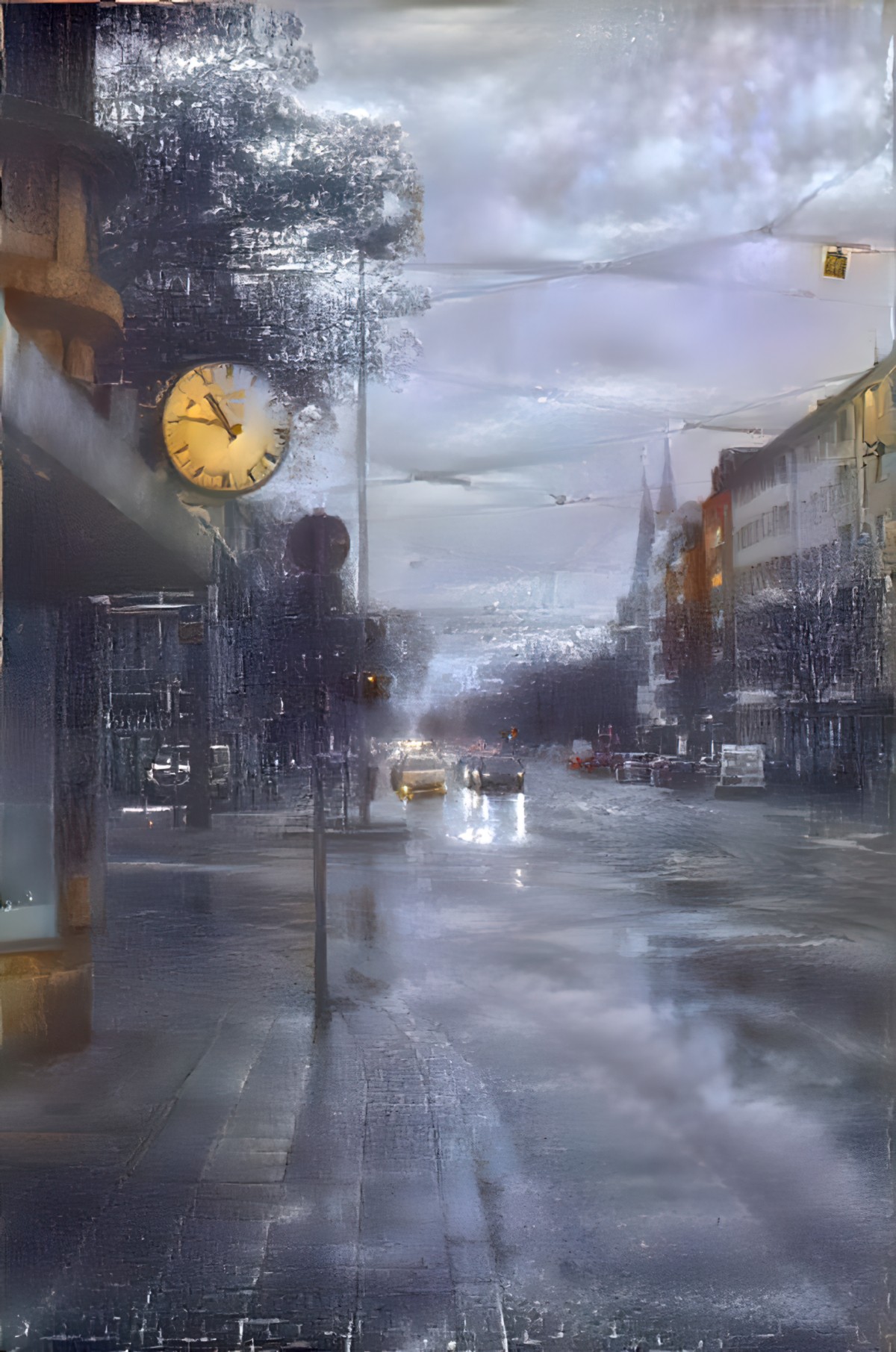
Wombo does an especially good job of cities at night. Here’s what Wombo generated after I typed ‘city at night’. (I’ve cropped it in Affinity Photo to remove the border and Wombo logo which, for some reason, you can’t just pay to have removed.)
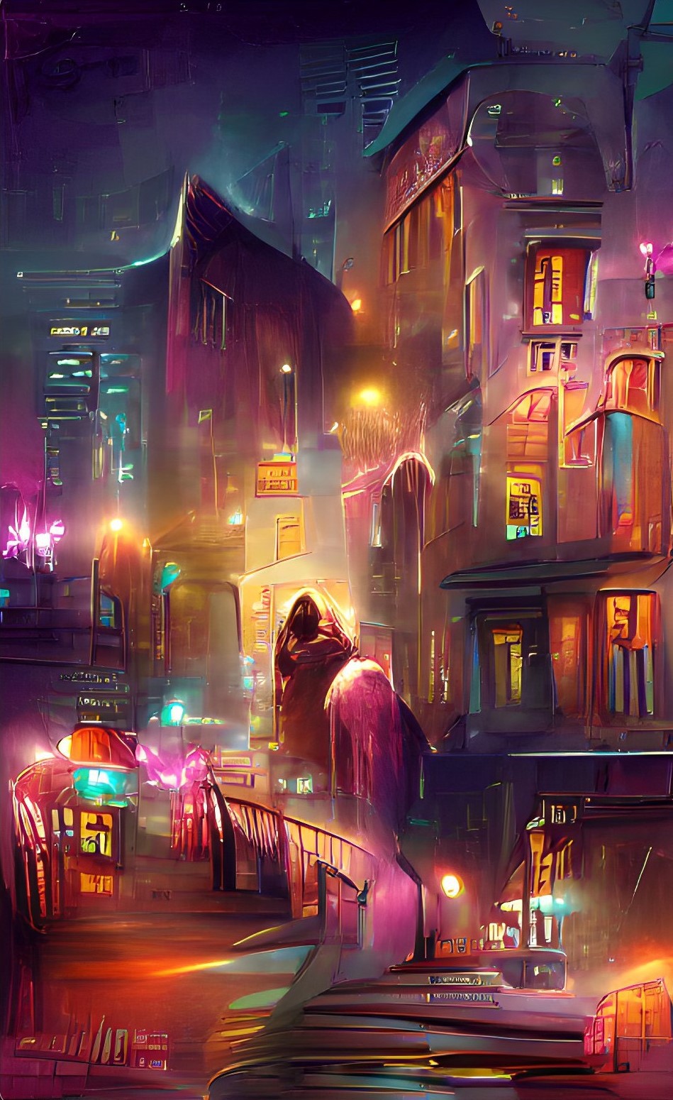
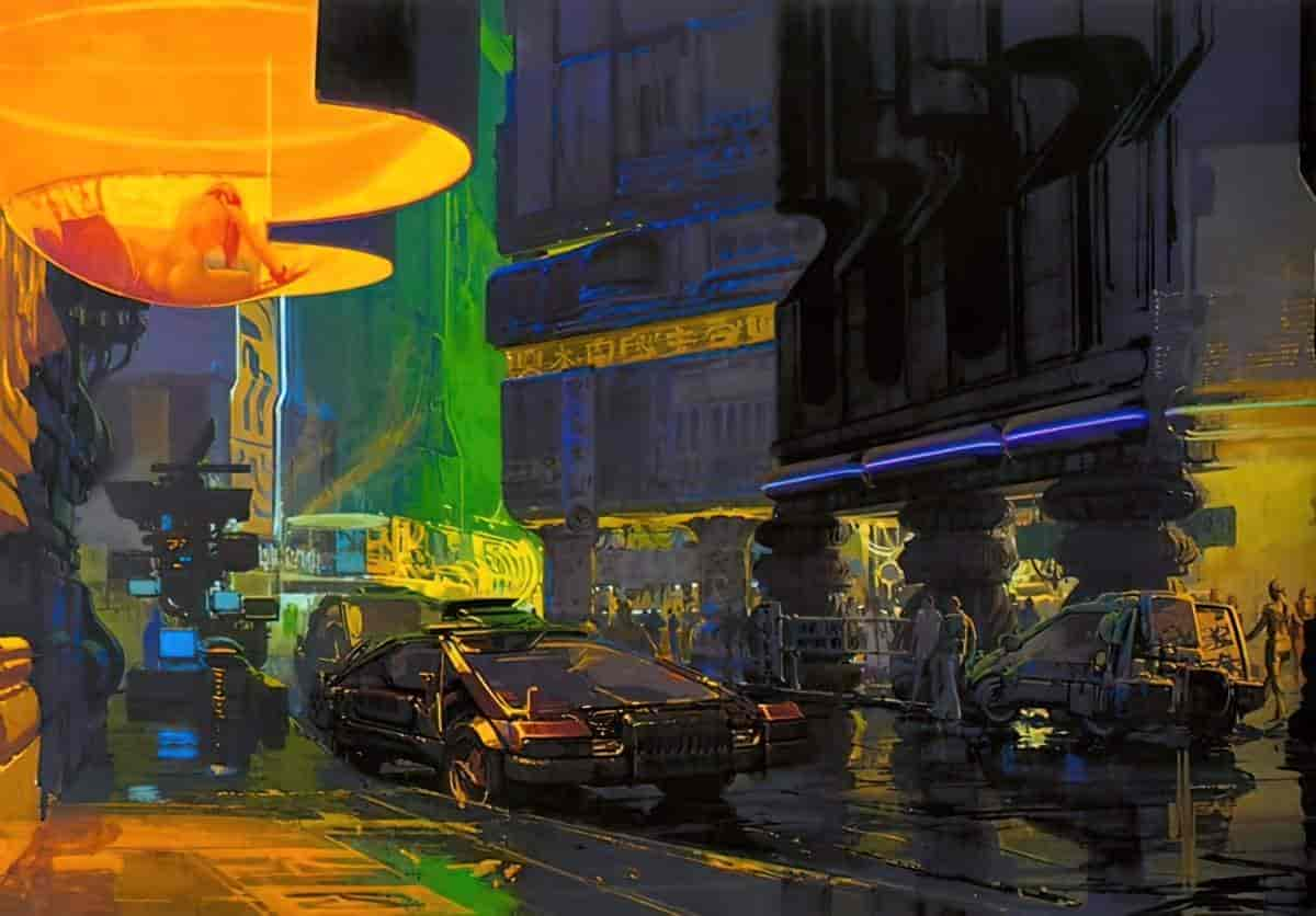
It looks to me kind of like a Syd Mead underpainting. (Here’s Syd Mead, fyi):
I hadn’t asked for those hooded creatures, but the AI decided I needed them.
Here’s the thing about AI generators as of 2021: They’re great at patterns, but useless at composition. They can make a great job of a city at night because of all those bright squares and signs. They do not care if your human eye has a place to settle.
Anyway, those hooded creatures clearly needed to be turned into monsters, and those lines in front were clearly steps into hell, so I spent about an hour fiddling with it in Artrage and ended up with this:
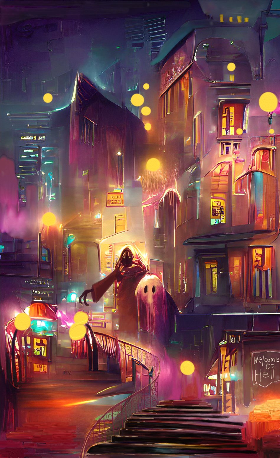
It’s still pretty janky, sure, but I was just playing. And honestly? It felt great to be mucking around on some low stakes piece. This layer addict even kept it all on one layer. Wombo can be excellent as an actual, legitimate art software for making actual proper art if you use it for inspiration.
The downside to Wombo is: synonyms. This app only works with words, so if you want a dystopian look to your work and type ‘subway’, it’s gonna think you talking about sandwiches. Which is how I got this, I think:
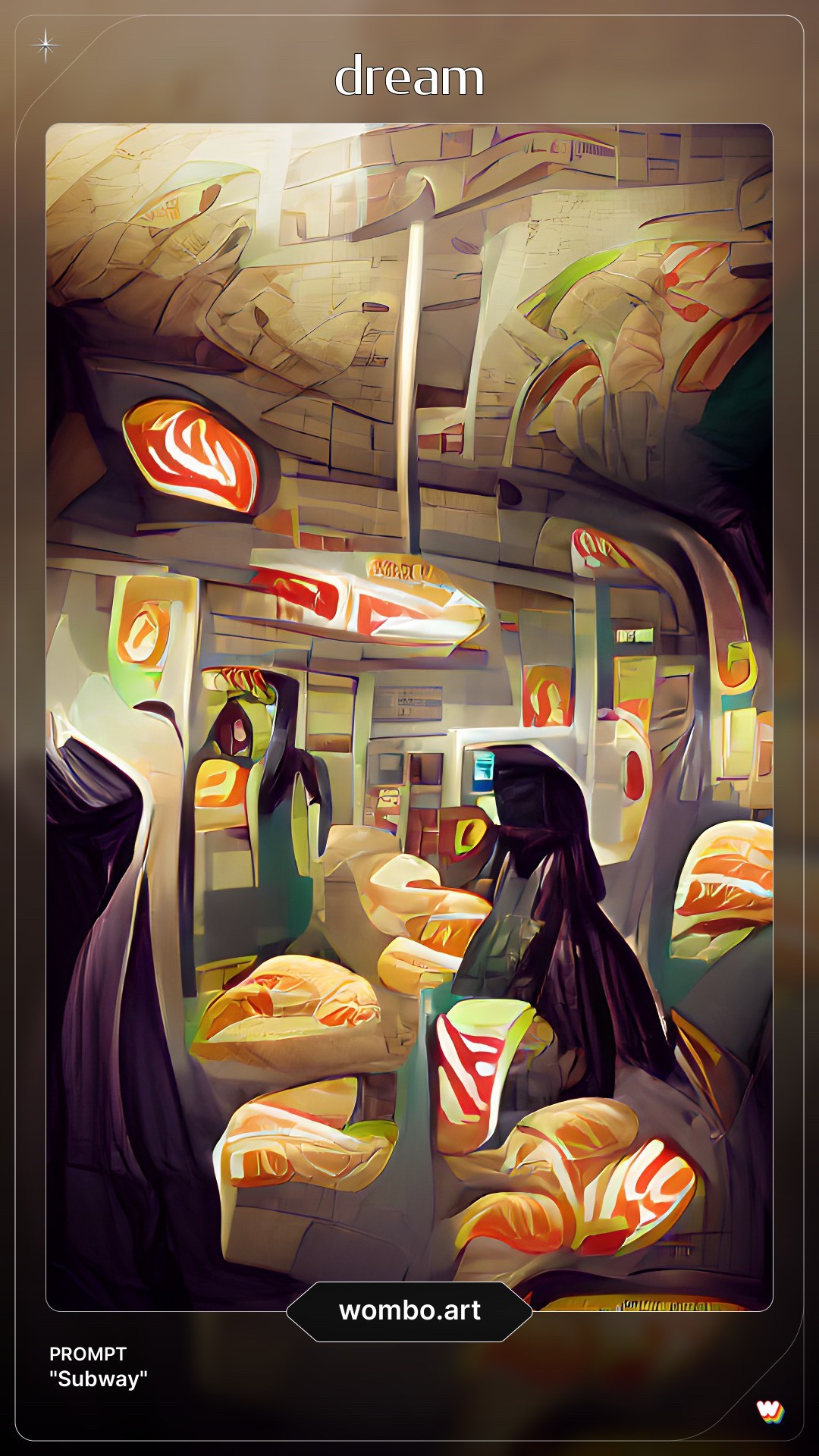
I mean, that’s still pretty cool. The signage even looks like marbled meat. I could turn that into a fantasy night market at some point. But it’s not what I was going for. If you have no idea where to start on a project, or can’t quite visualise something, Wombo can be good. It’s also great for leading you where you never thought you’d go.
I have used it quite a bit to make abstract collages. I might generate 3-5 images in Wombo, cut out the pieces I like and put them together in a new way. That’s what I did for my post on the short story “Miracle Polish“.
There are a few tricks to Wombo. If one of your keywords refers to some type of container, it tends to use the container as a border for the rest of the art. For an example, check out the art I generated for “Rosamund and the Purple Jar“.
However, there’s a sameness to Wombo generated images. Anyone who’s created a few AI artworks using Wombo will instantly recognise when other people do the same. I quickly craved more control over the output.
So I went looking for other AI options. Turns out Wombo was my gateway drug into AI generated art.
DEEP DREAM GENERATOR
We are just a small team of enthusiasts who are trying to build something cool.
Bulgarian developers
Our goal is to make latest developments in AI widely and easily accessible.
Deep Dream Generator works differently from Wombo. You’ll need to do a bit more prep work, but you’ll have more control over the art you get. (I only use the ‘Deep Style’ part of the Deep Dream Generator website.)
This generator doesn’t start with keywords, it starts with images, which you’ll be providing (although there’s a selection of classic works of art you can use from their site if you want your art to look like everyone else’s). If you plan to make art to sell, you need to have the rights to both base image and style image.
Here’s what you’ll need:
- A high res ‘base image’.
- A high res ‘style image’.
You can probably guess what that means. If you want to end up with a picture of a horse, the base image will be of a horse. If you want this horse to look like a cartoon from the 1950s, your ‘style image’ will be a cartoon from the 1950s. Ideally, this style image will have the same basic tonality to the base image of the horse. (The same sort of lights and darks. The style image doesn’t have to be a cartoon composition of a horse, but that seems to help.)
However, you don’t want your base and style images to be too similar. That won’t return an interesting result.
Important takeaway from the image above: This generator doesn’t do well with straight lines. If ever there are powerlines in the image, it will muck them up. (Either erase them or fix them up afterwards in art/photo software.)
I’ve been told that both base and style images should be the same dimension, if possible. If they’re different dimensions, you’ll get more artifacts around the edges of the generated image, which you may or may not want. Both images should be high resolution. If there are unwanted words, artifacts and borders in either image, get rid of those before you upload them. I use Affinity Photo a lot for this. I make heavy use of the inpainting tool, works really well for getting rid of things in a picture you don’t want.
However, I have been experimenting and can’t find all that much improvement in artifacts even when both images are the same dimension. I do think, though, that high res, large photos as base image work really nicely.
More imporantly, Deep Dream Generator does well with base images which cover the entire canvas in detail. Avoid style images which, say, have a white border, or spot illustrations which only cover part of the page.
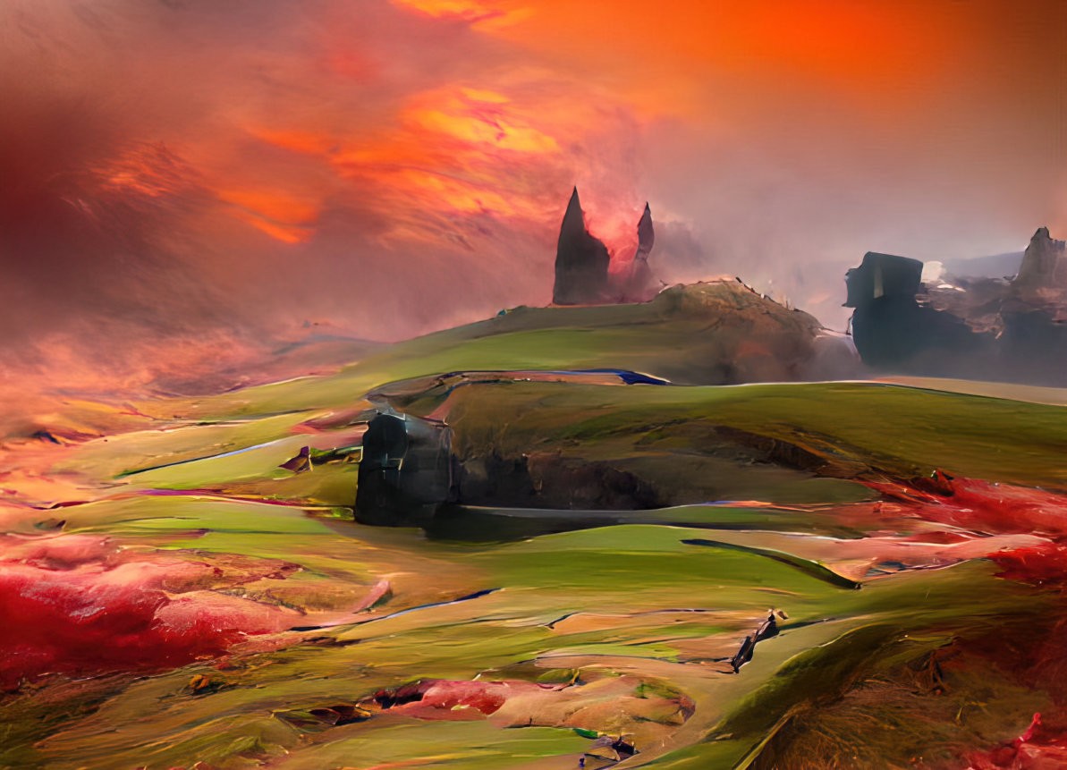
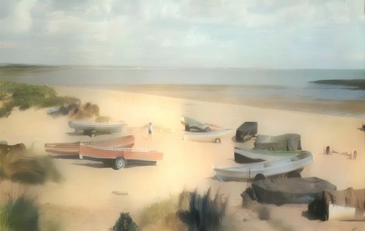
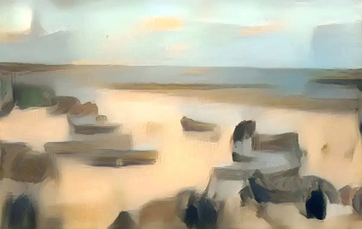
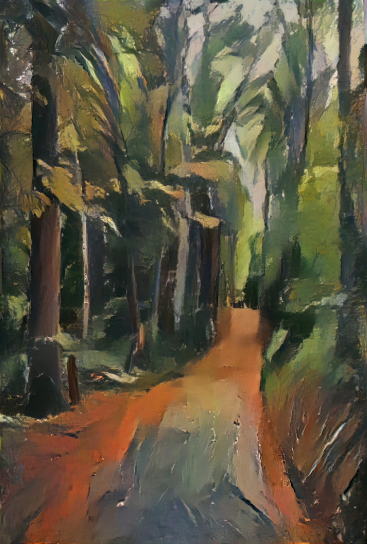
It can do great painterly landscapes.
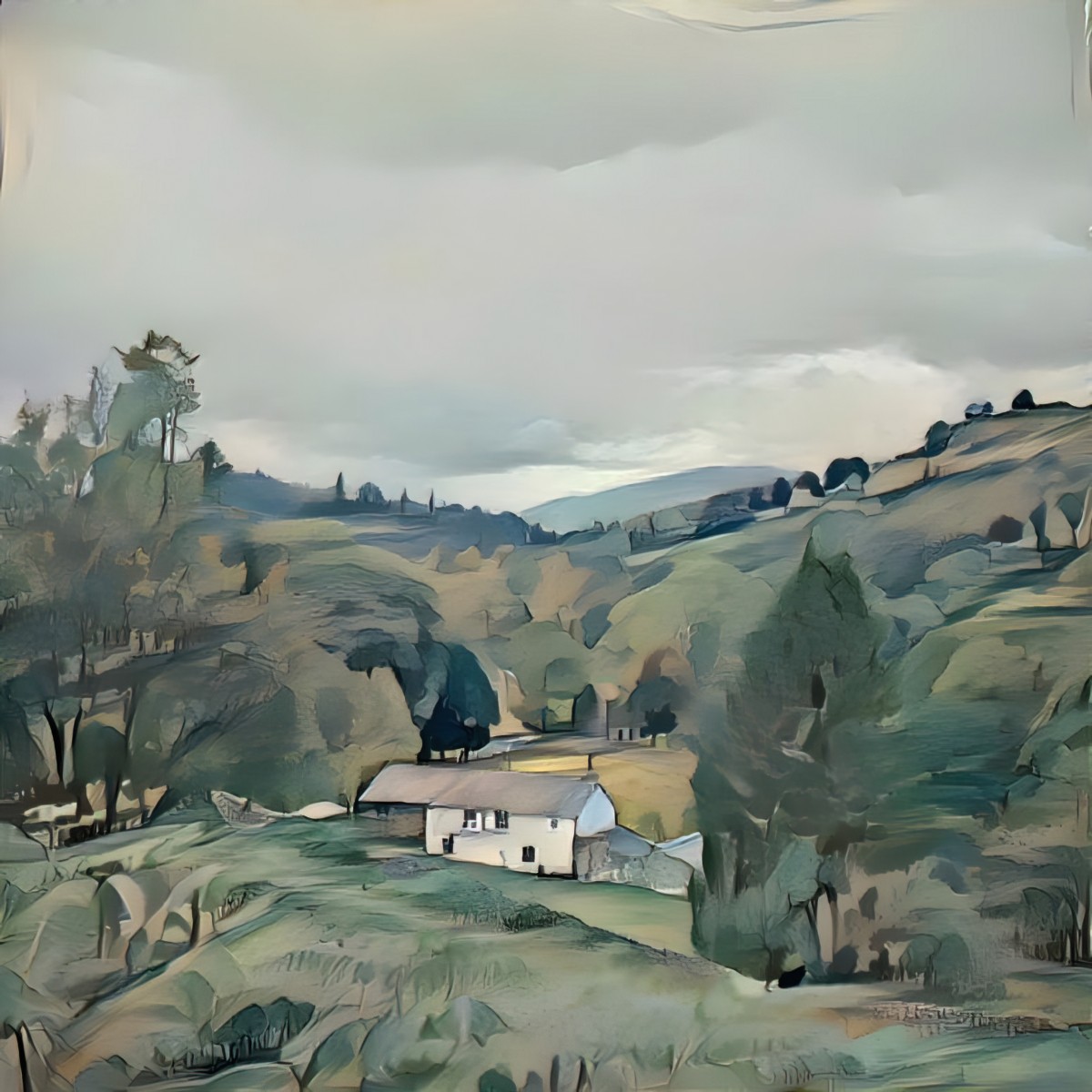
Note that the generator will almost certainly put artifacts in the sky if the sky is clear. The example above isn’t too bad, almost looks like a fold in the paper.
It also does a really good job of landscapes/long shots if you’re using Tonalist painters as your style image. (Whistler, Clarice Marjoribanks Beckett et al.)
The images I’ve far less success with interiors. Interiors generally contain large areas of blankness (tables, walls, floors).
It does its very best work (in my opinion) when the close up has a clean background. That means black or white. If you upload a .png base image with transparency as background, the generator doesn’t touch the transparency, and you’ll get a nice, crisp white background. I made a bunch of portraits for authors Janet Frame and John Cheever using this method. I’m especially pleased with this header of Katherine Mansfield at the beach.
I made a few manual modifications to those pictures. I removed the colour from John Cheever’s and Katherine Mansfield’s face. This gives the viewer’s eyes somewhere to settle. Teeth also need to be whitened.
That said, your art skills will still be required. AI art generators still have their limits.
For instance. Humans care about eyes. Artificial intelligence does not prioritise eyes over other roundy-shaped things. And, as you’ll know if you’ve ever made art, ever, get one small thing wrong about an eye and the portrait looks rubbish, or creepy, or nothing like the subject.
So it’s highly likely that when your AI has done its work, you’ll be opening the image in your digital art software and doing a bit of freehand painting. But not much! I can do 10 of these portraits in a day using Deep Dream Generator. But creating all of those beautiful wrinkles would take me an entire day for a single one.
The generator doesn’t do well at all with base images which don’t have much of a tonal gradation. You’ll end up with an absolute fizzer: It’ll be all base image (if it’s dark and tonally flat) or all style image (if it’s light and tonally flat).
But the image below is great because it contains the entire tonal range from white to black.
GETTING STARTED WITH DEEP DREAM GENERATOR
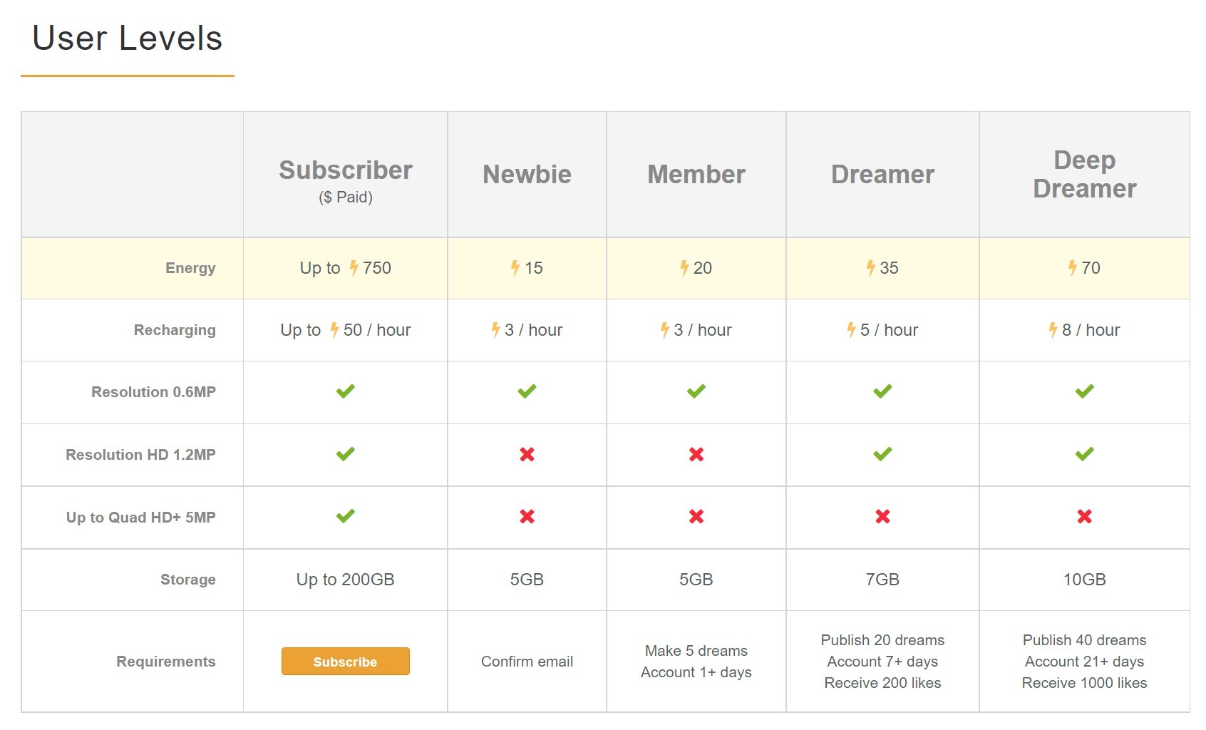
When you first sign up for Deep Dream Generator, they call you a ‘Newbie’ and give you fifteen energy points to play with. They say that once you’ve made five artworks (‘dreams’) and you’ve had your account for longer than a day they’ll up your allowance to 20 energy points per hour. But for me it took more like a week and a lot more than five dreams.
What does this energy point thing mean?
In effect, it means you don’t overload their server by making AI art all day and neglecting to eat and shower.
It means you can make two good or four pretty rubbish dreams at once, then wait until the points get back up to a maximum of fifteen (or twenty or whatever).
You can become a subscriber and do a lot more right away, but if you’re on a computer all day anyway, you can still make around 6-8 dreams per day by spreading your AI art sessions across the day.
WHICH SETTINGS SHOULD I CHOOSE?
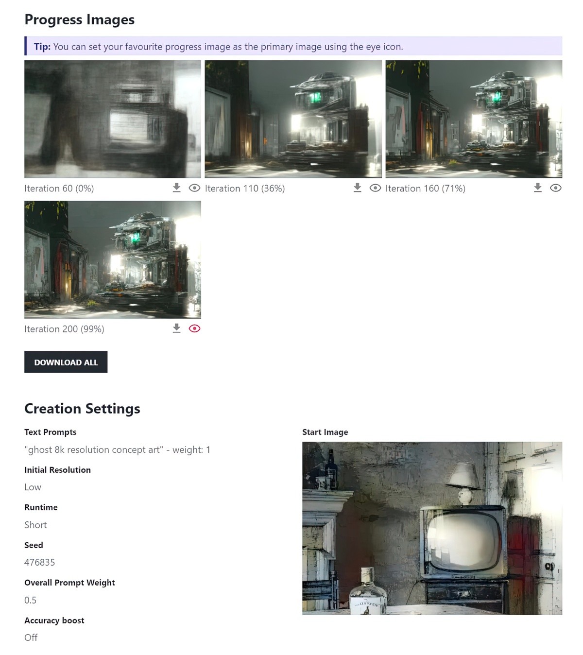
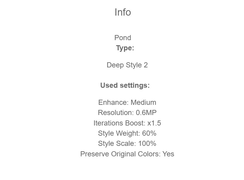
Here’s a screenshot of the default settings. Note that if you leave the settings like this, you’ll be using five energy points. (Hence the minus five at the bottom.)
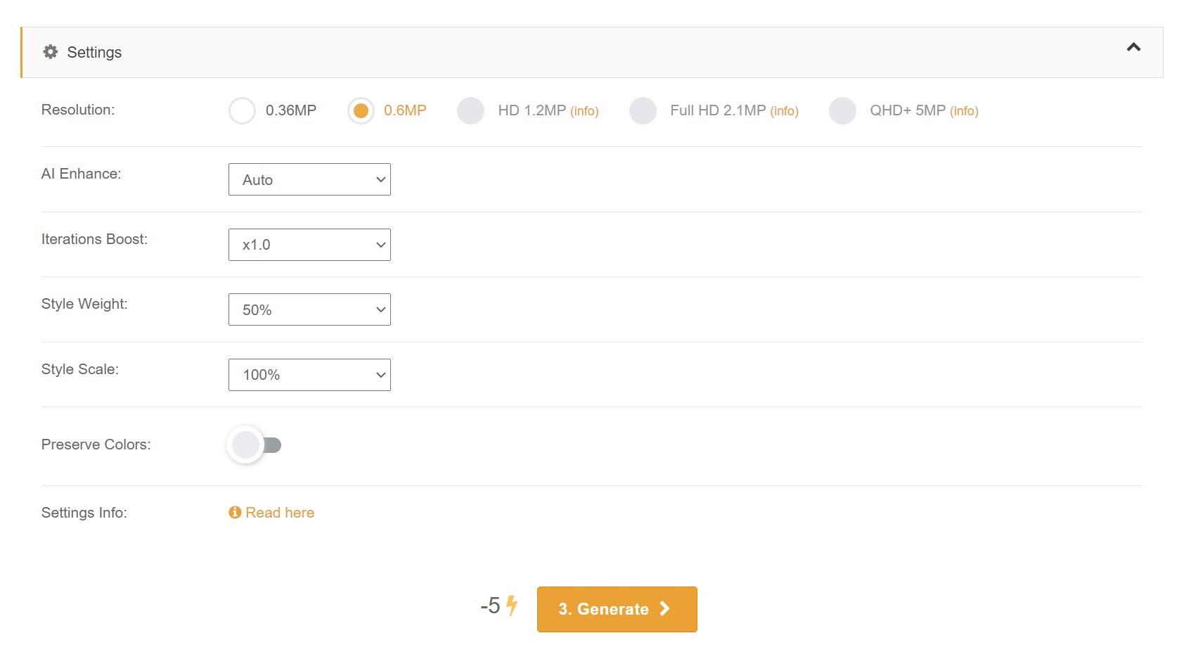
If you’re happy with the colours of the base image and don’t want the generator to take colours from the style image, turn on the ‘Preserve Colors’ button.
But even if you’re not happy with how the colours come out (I’m rarely entirely happy) you can put it into Photoshop or Affinity Photo or another art software, create a layer above, set the Blend Mode to ‘Color’ and recolour it (or parts of it) very easily. This process is akin to colouring in, with the same Zen to it.
You might want to leave the settings as is and try a few dreams to see if they’re going to work. If you get absolute rubbish, you’ve only wasted five points. But as you get more of a sense of what’s probably going to work, you’ll want to use more points on one dream to create a better work of art.
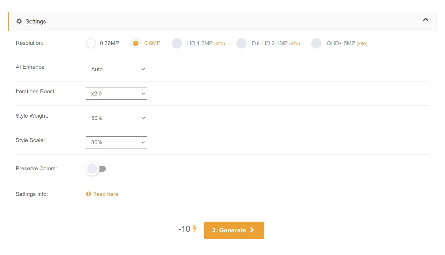
This costs twice as many energy points. Note how I’ve only changed two things.
- Iterations boost is now 2.0. An iterations boost of 1.5 is also good, but 2.0 may return slightly brighter colours and clearer lines.
- The style scale is now at 80% and I’ve picked that only because many of the artworks in the ‘Best’ feed make use of this setting. Results will vary.
You might also choose Extra Smooth from the AI Enhance dropdown menu. The following two images were processed with very similar photographs and the exact same style image. The first is set to ‘auto’, the second to ‘extra smooth’. Hopefully this clarifies the difference.
Here is the style image, a travel poster from the Golden Age. I’ve chopped the writing off because the writing will only mess things up.
AUTO AI ENHANCE
EXTRA SMOOTH AI ENHANCE
There’s not much difference at all but it looks a little less pencil sketched, perhaps. The Extra Smooth option uses a few extra energy points.
STYLE WEIGHT
Just so you know, you can go into anyone’s public images and check which settings they’ve used. Most people keep the style weight at fifty percent. If you go under that, you’re not likely to get an interesting image; the result will look too much like your base image and not enough like your style image.
But if you keep it at fifty percent, the generator basically keeps the large shapes the same as your base image, and you don’t always want that.
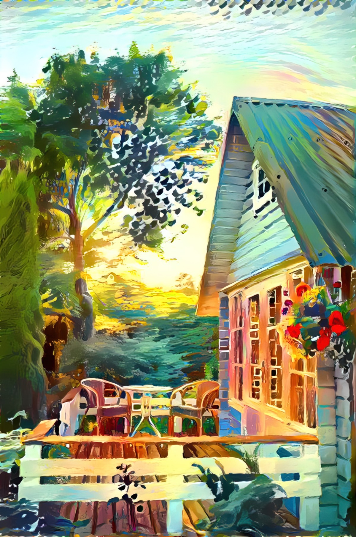
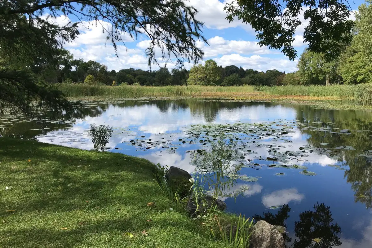
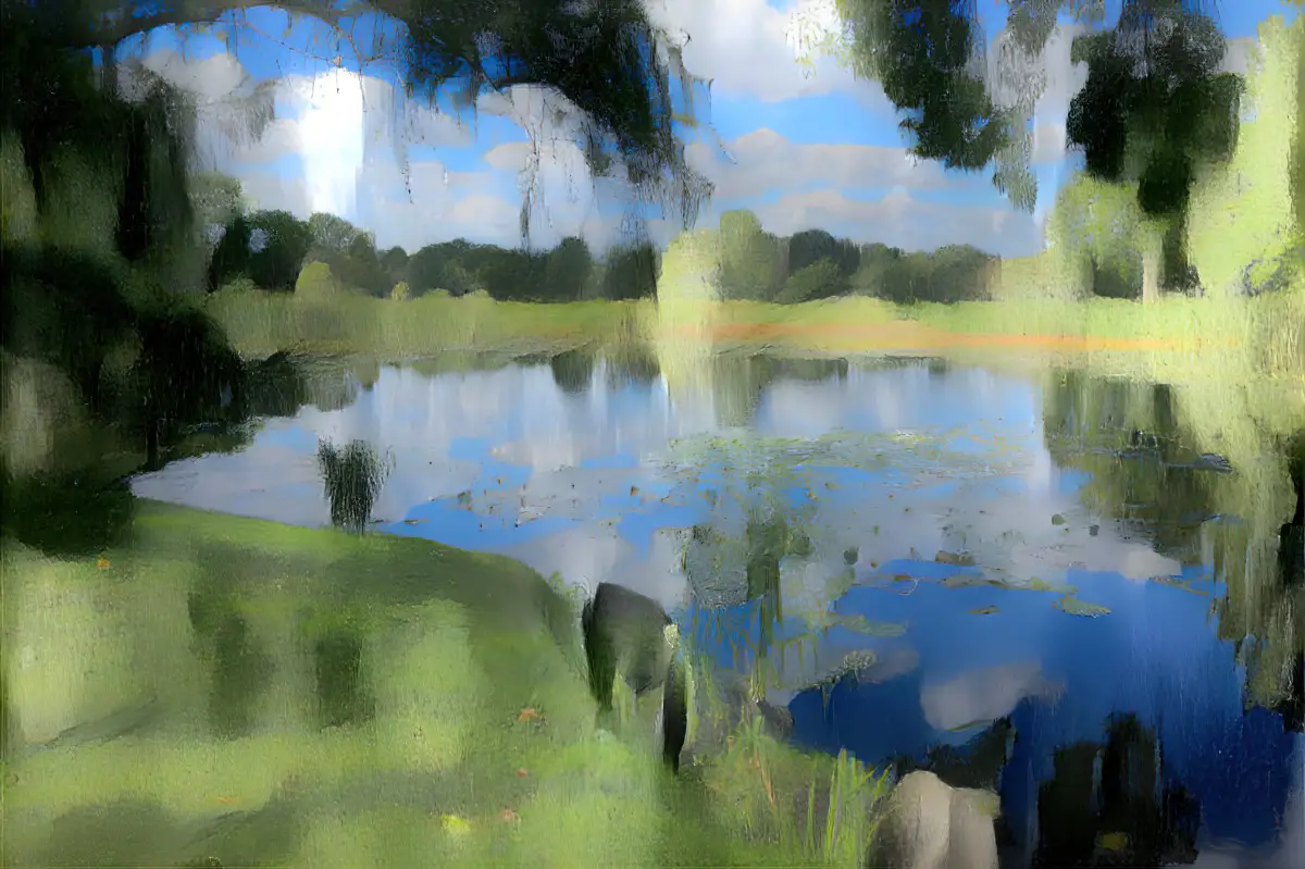
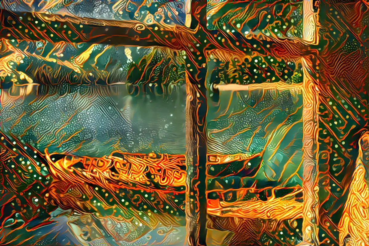
Here’s an example of what I’m talking about. Here’s my base image. A pretty unremarkable photo of a pond.
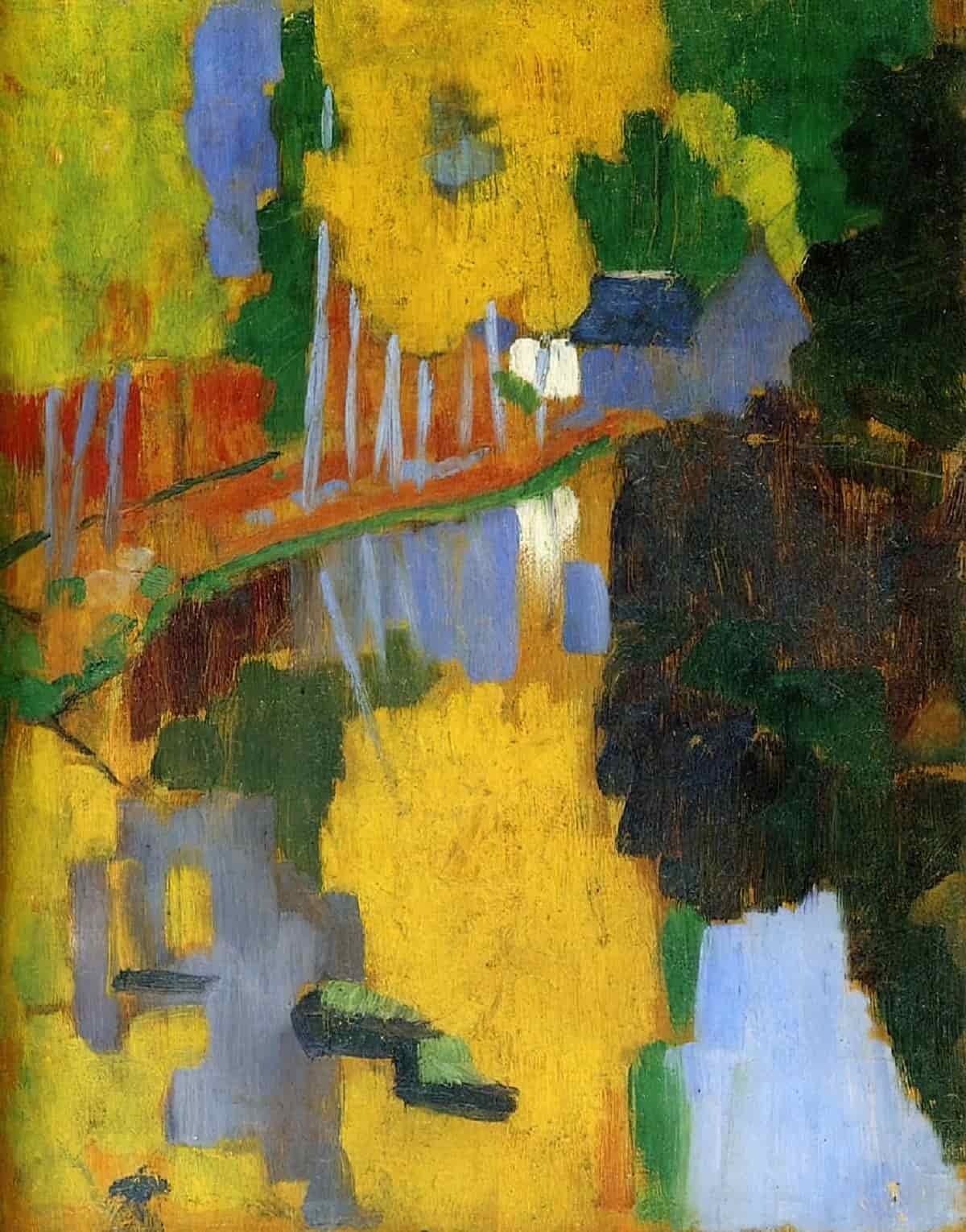
Here’s my style image, a completely different sort of art, being Symbolist post-Impressionism, which is pretty far removed from Realism.
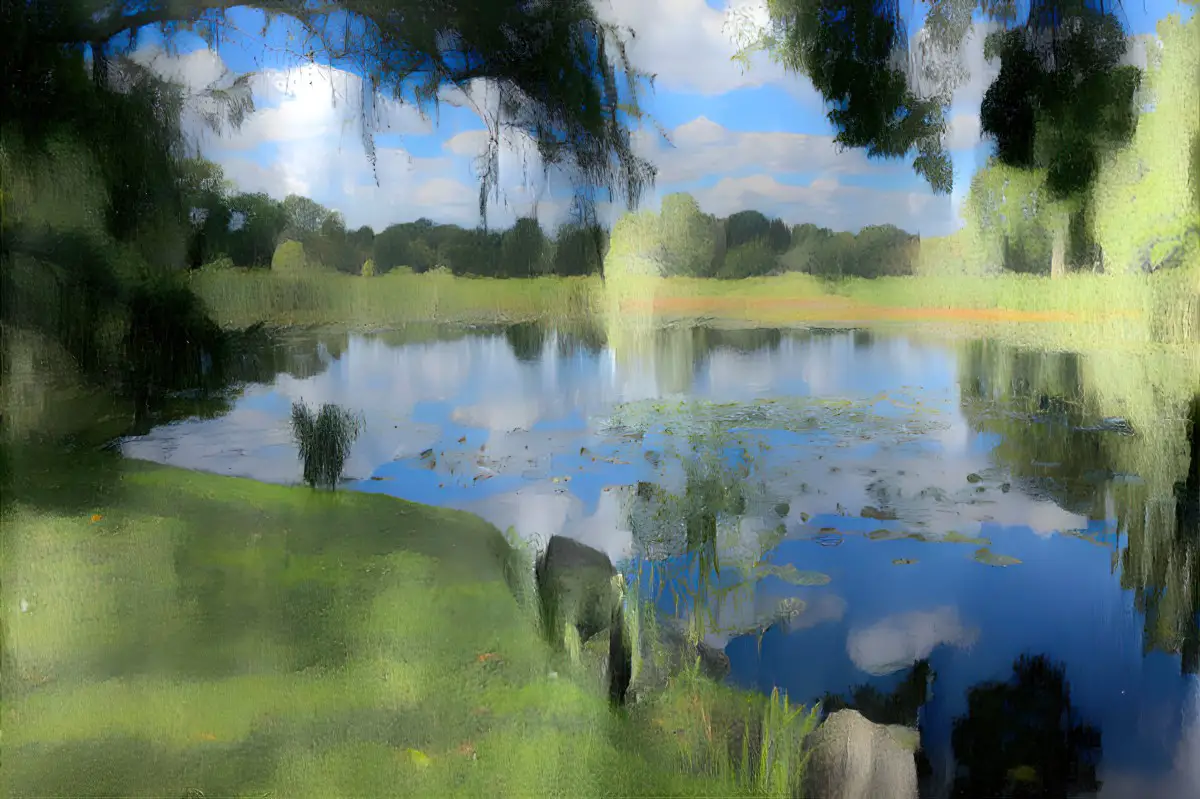
If I keep the style weight at 50%, the generator will borrow some of the brush stroke-y look and, if I didn’t keep the colours, it would try to map the colours onto my base image. Like so:
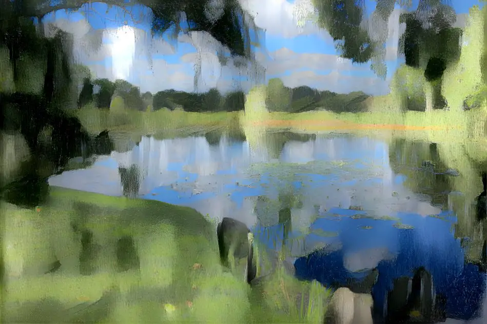
But what if I want the shapes of that pond to morph a bit? Then I’d bump the style weight up to maybe 60%, like I did here. Now the generator takes the shapes and morphs them into each other a bit.
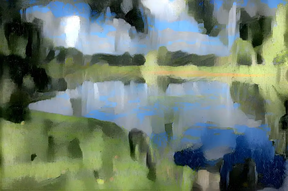
Now here’s the exact same images with the same settings except for the style weight, which I’ve upped to 70%. The difference is very subtle.

Now you can probably see why most people don’t mess around much with style weight. There isn’t much in it. In fact, I can really only see a difference if I compare the 50% style weight to the 90%.
Yet here’s one of my examples in which bumping the style weight from 50% to 90% really did make a difference. If the 50% setting basically throws you a recoloured image and you want the shapes morphed, then you might try bumping up the style weight percentage.
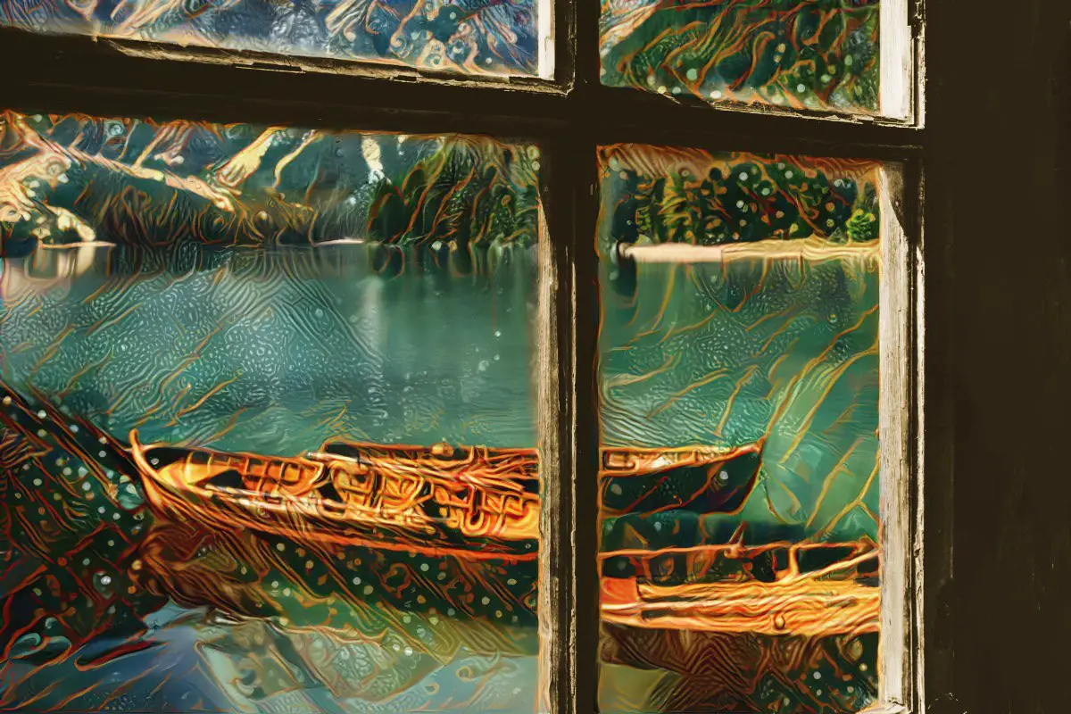
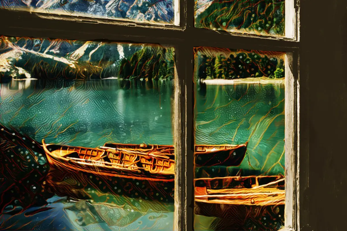
I started with an old postcard:
I used this for a style image:
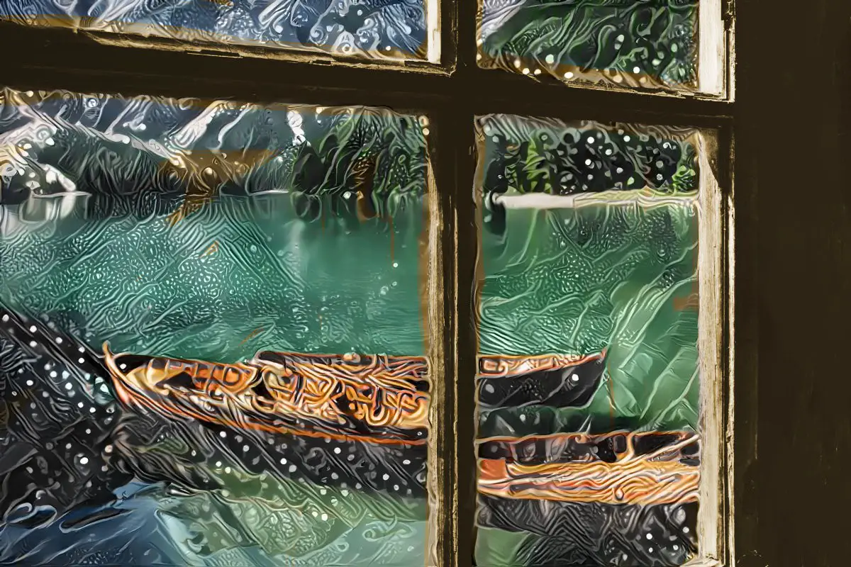
At 50% style weight all it did was take the colours from Wilson Steer’s painting and made the boats blurry:
So I upped the style weight to 90% and got something else which I still consider rubbish, but you can see what tinkering (sometimes) does:
Why is the difference between these two boat pictures so noticeable when bumping up the style weight, and not with the image of the lake? Well, just guessing: The style image I used for the lake was pretty darn abstract already, so 50% style weight already returns something abstract. Upping the style weight on that one isn’t going to do much. Bumping style weight up higher than 50% only seems to have a noticeable effect for less ‘painterly’ or ‘abstract’ style images.
ITERATIONS BOOST
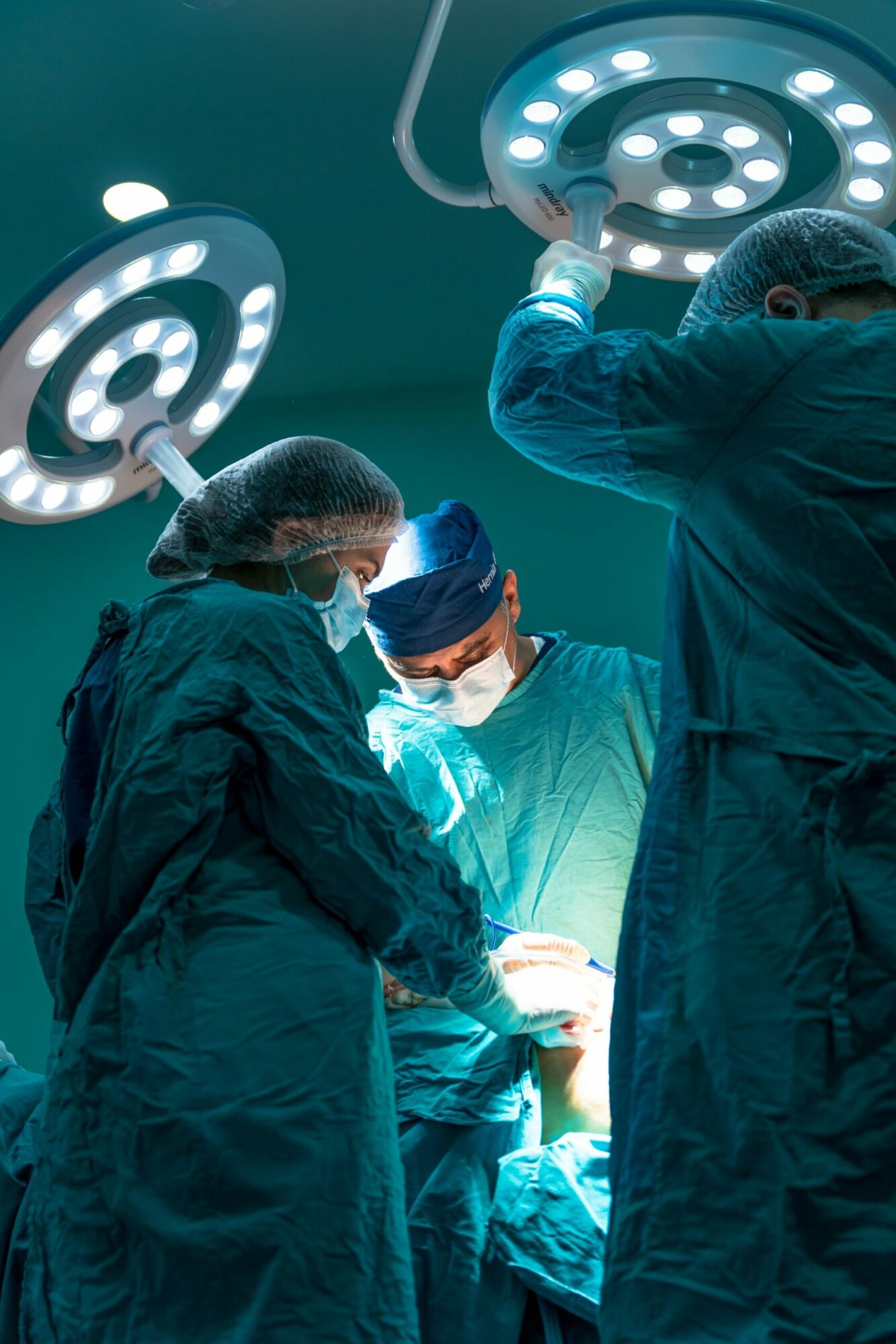
Here are two images which I tried to blend. I haven’t come up with anything especially interesting but you might like to see how changing the iterations boost changes the result. I used this stock image of some surgeons as a base:
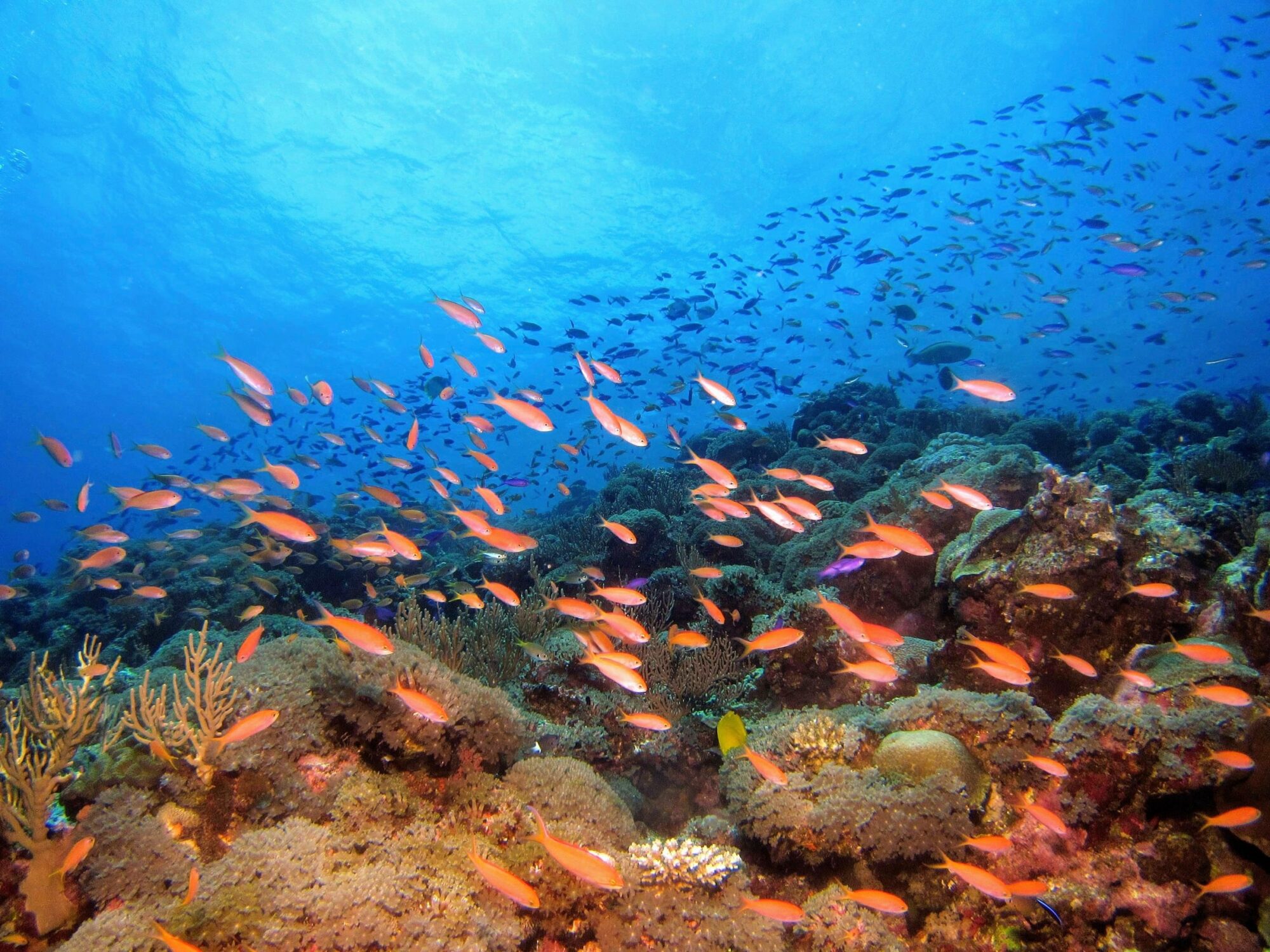
And this image of fish as a style:
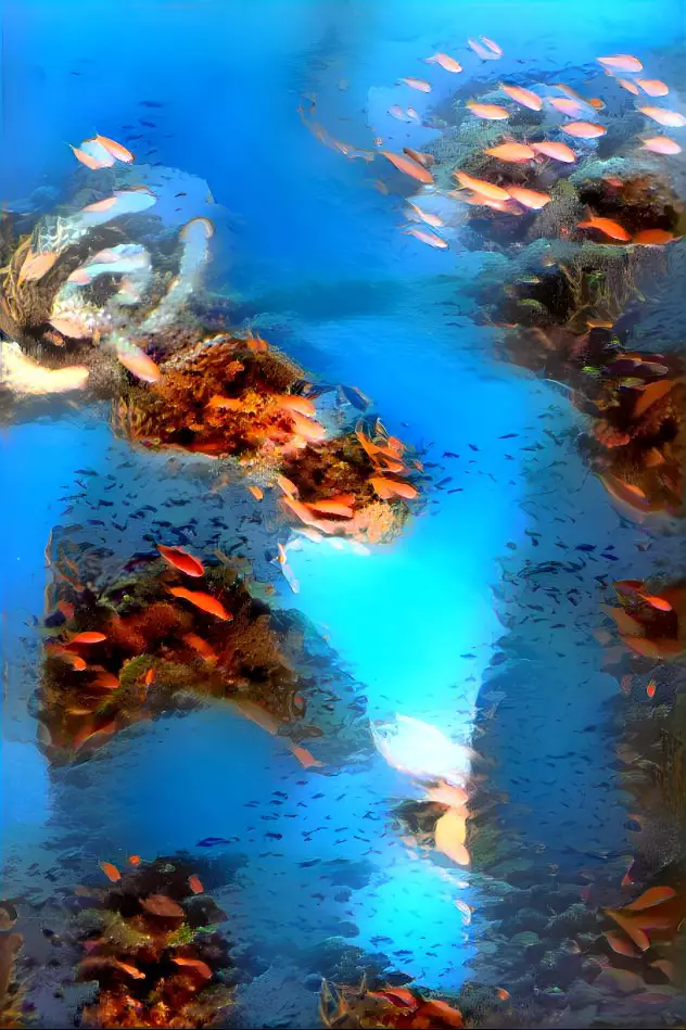
Here’s what the generator came up with when I used an iterations boost of x1:
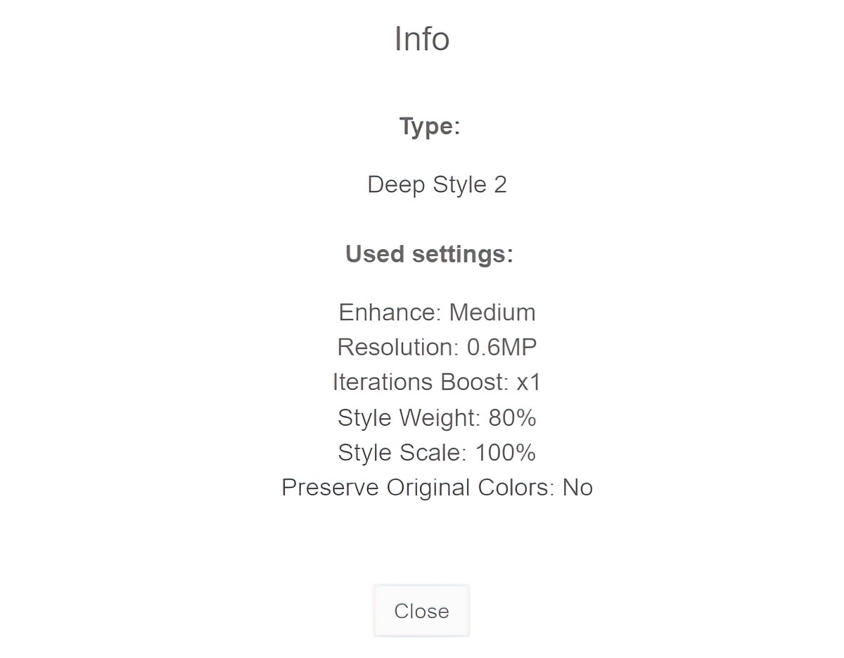
Now here it is again but the only thing I changed on the second go-around was the iterations boost, which I upped to x2. This costs more energy points. It is a slightly different image but do you get a ‘better’ result? Not necessarily.
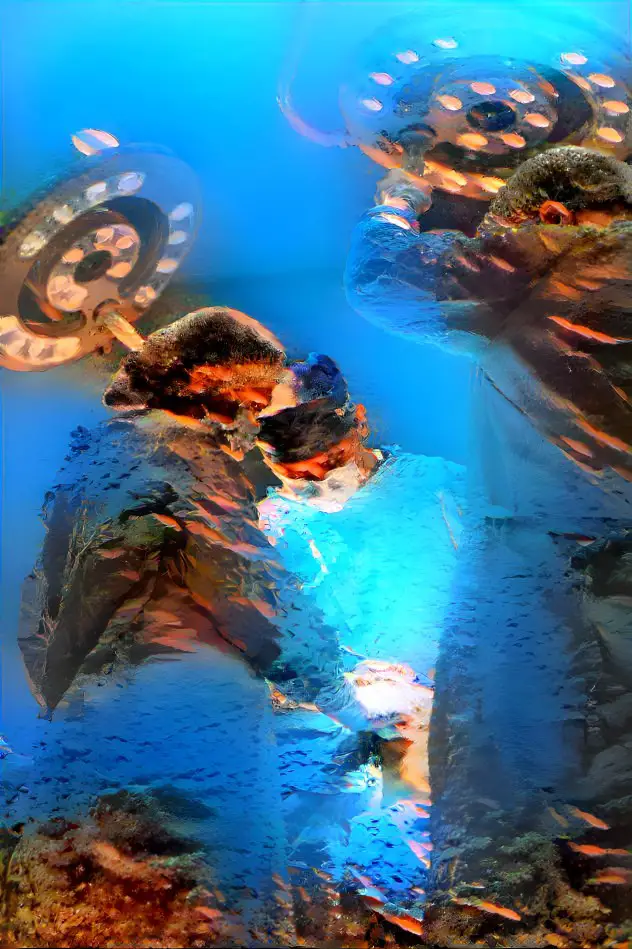
IMAGE SIZES
Note that I don’t have a paid subscription and am unable to create a resolution larger than 0.6MP without using a large bulk of daily credits.
That’s not a problem for me because I have an excellent piece of software called Topaz Gigapixel AI, in which I use another kind of artificial intelligence to enlarge small images at low resolutions and turn them into something very nice to look at. Alternatively, you can have a go at using a noise reduction filter in art software. (That said, Topaz works far better than any noise reduction in my art software.)
Some people upscale using REAL ESRGAN. This runs on commandline if you’re into that. (I paid for Gigapixel because it’s simple, for absolute dummies.)
You may have noticed another few options for making art with this website. One of them is Thin Style. To me it looks like a commonly used and pretty ugly Photoshop filter, though others may get better results from it.
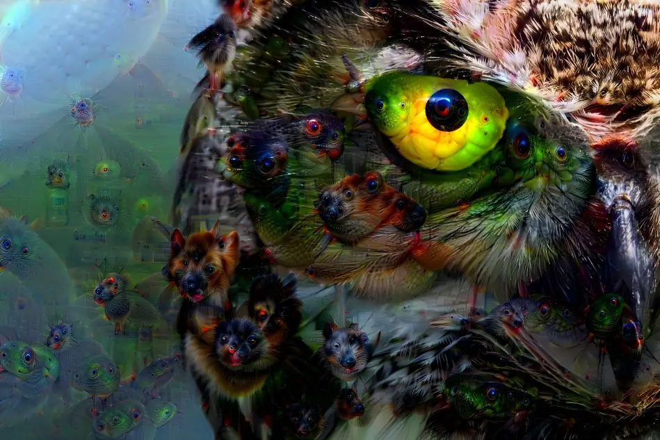
The other option is Deep Dream. This is just weird. I put in an owl and it turned some of its feathers into dogs for no reason at all. Its eyeball is… a fish?
COMBINING AI GENERATORS
There’s nothing stopping you combining different AI art generators. This Reddit thread is currently challenging users to change Wombo art into something that looks more like a painting.
HOW DOES IT DO WITH LINE DRAWINGS?
We already know it does a crap job with straight lines.
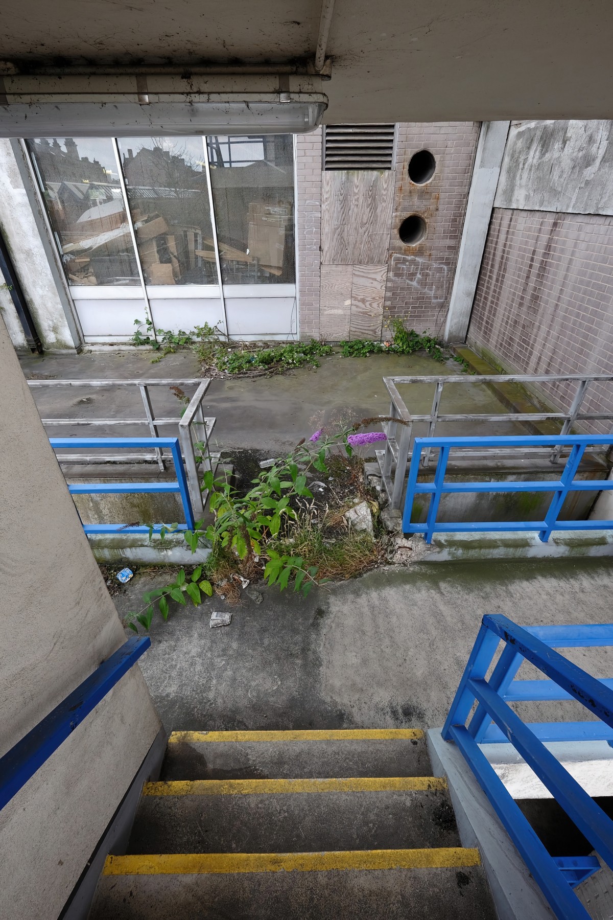
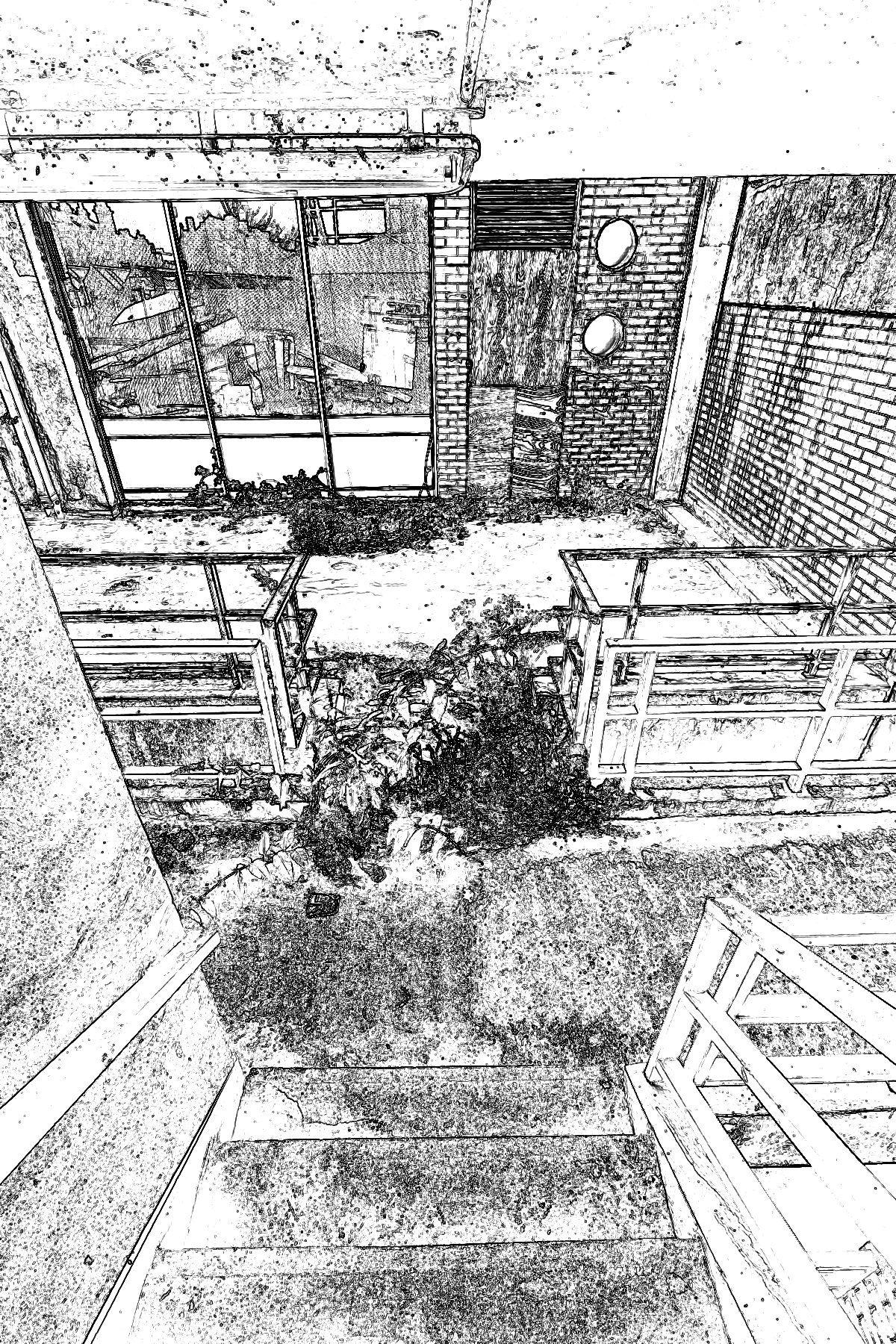
Anyway, I decided to combine two images of stairs.
Here’s the base image (from Archillect)
Now for the style image. Although both are of stairs, they’re not actually that similar. However, I’m going to try it anyway.
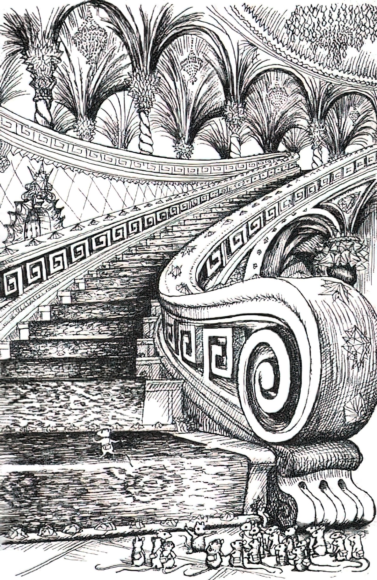
The result was ugly as hell.
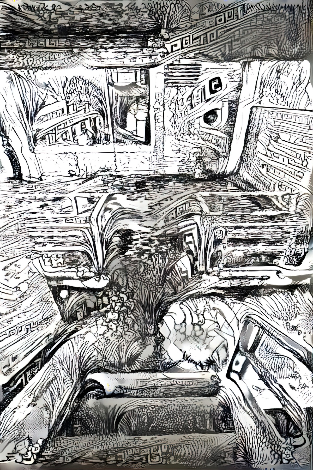
But because I’m still learning how this works, I wondered if the Deep Dream Generator might have more luck with photos if I use Affinity Photo to detect edges first. Here’s what that looks like. Filters > Detect > Detect Edges > Inverse (Control I) > Duplicate Layer (Control J) > Blend Mode > Multiply (try that last step a few times until you get nice, clear, thick edges in a variety of thicknesses. At some point I also put on a Brightness/Contrast filter and upped the brightness until those mid-tones were gone.
Let’s stick this baby through the dream generator instead of the original photo. Okay, now we’re cooking with gas. This looks a little more interesting. We’re no longer left with that distinctively ‘I detected my edges’ look which anyone who’s ever used photo editing software will recognise immediately.
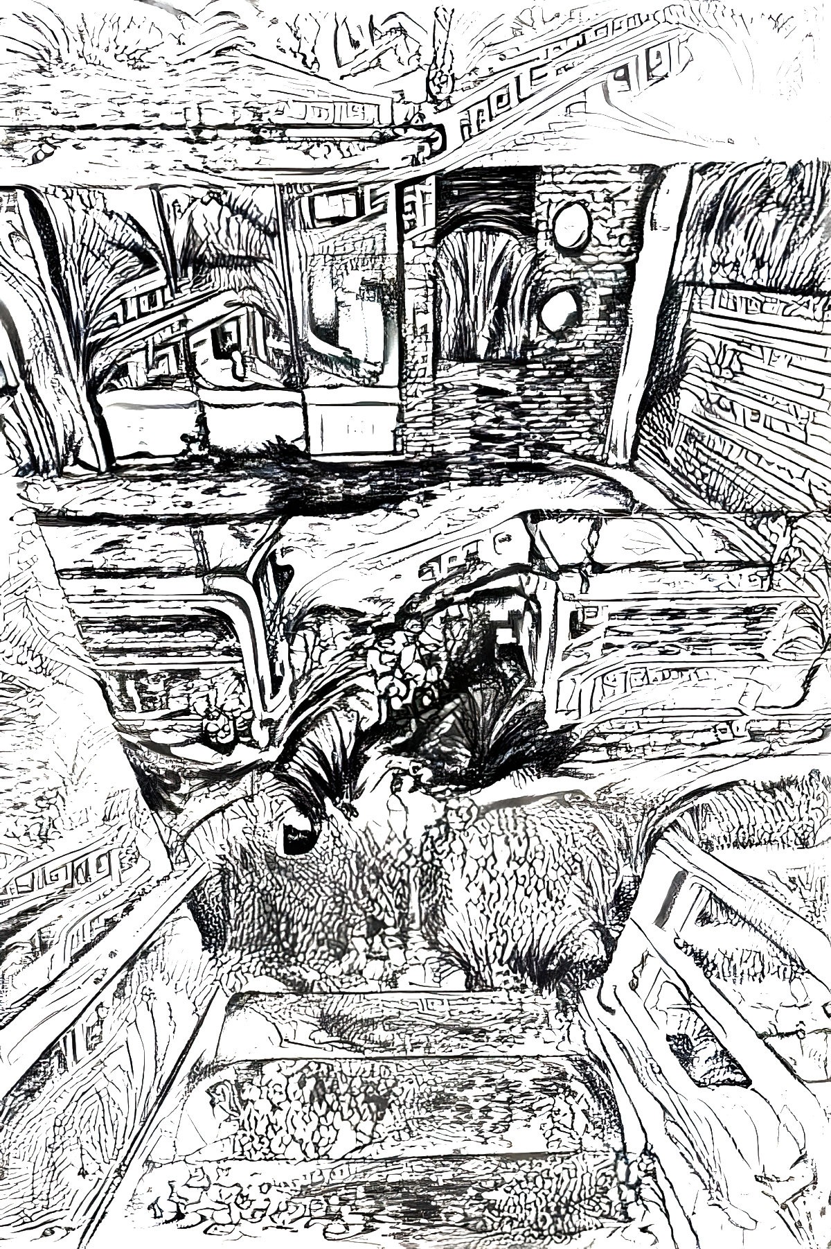
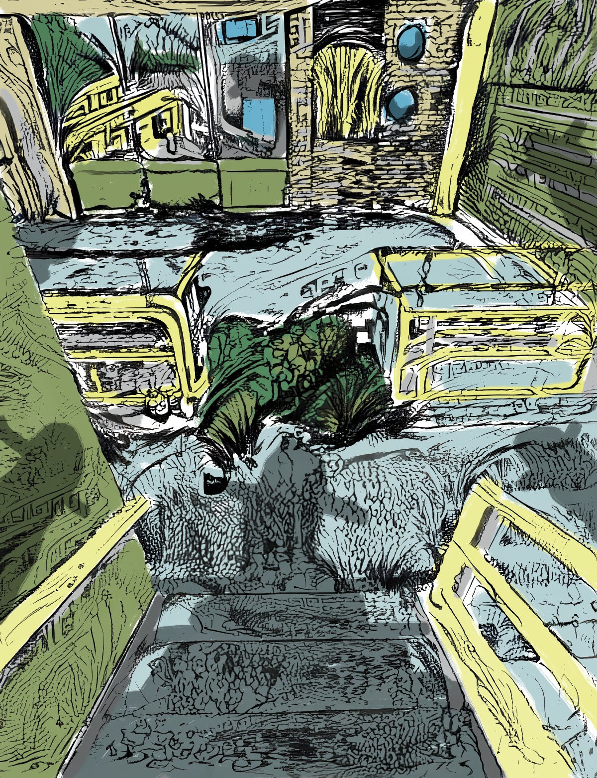
If you put this image back into Affinity Photo, Filters > Colors > Erase White Paper now you can put a layer below and start painting some colours into it. Again, I’m just mucking around. I only spent five minutes on these colours, but now I can see how the Deep Dream Generator can be useful in the process of creating digital line drawings, which look mighty ugly at first.
CAN DEEP DREAM GENERATOR COLORISE A LINE DRAWING?
Here’s what I started with for this experiment.
Using various style images the generator returned the following.
This one didn’t work at all. The Georgia O’Keefe barns I used for a style image didn’t have nearly enough detail on them.
But when I used a highly detailed style image of some houses, one of which was facing the same general direction as the line drawing house, I got this:
Perhaps if we’re trying to fill line drawings, we have more success with highly detailed style images. Using 20th century fine art of houses I also got these:
USING DREAM GENERATOR TO COLORIZE OLD BLACK AND WHITE PHOTOS
I didn’t think this was going to work well at all, but here’s my first attempt at pasting a painterly style onto a 1910s photo of Wellington’s Old Wharf. (First I made the photo as high-res as I could get it in Topaz Gigapixel.)
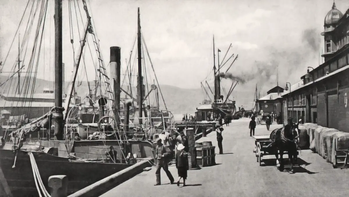
I used a painting by Walter Farndon because that also has boats in it, and the basic colours I want. But the shapes in this are much bigger than the shapes in the photo so I decreased the style style scale to 60%. This has an iterations boost of 1.2. Everything else is left on the default settings.
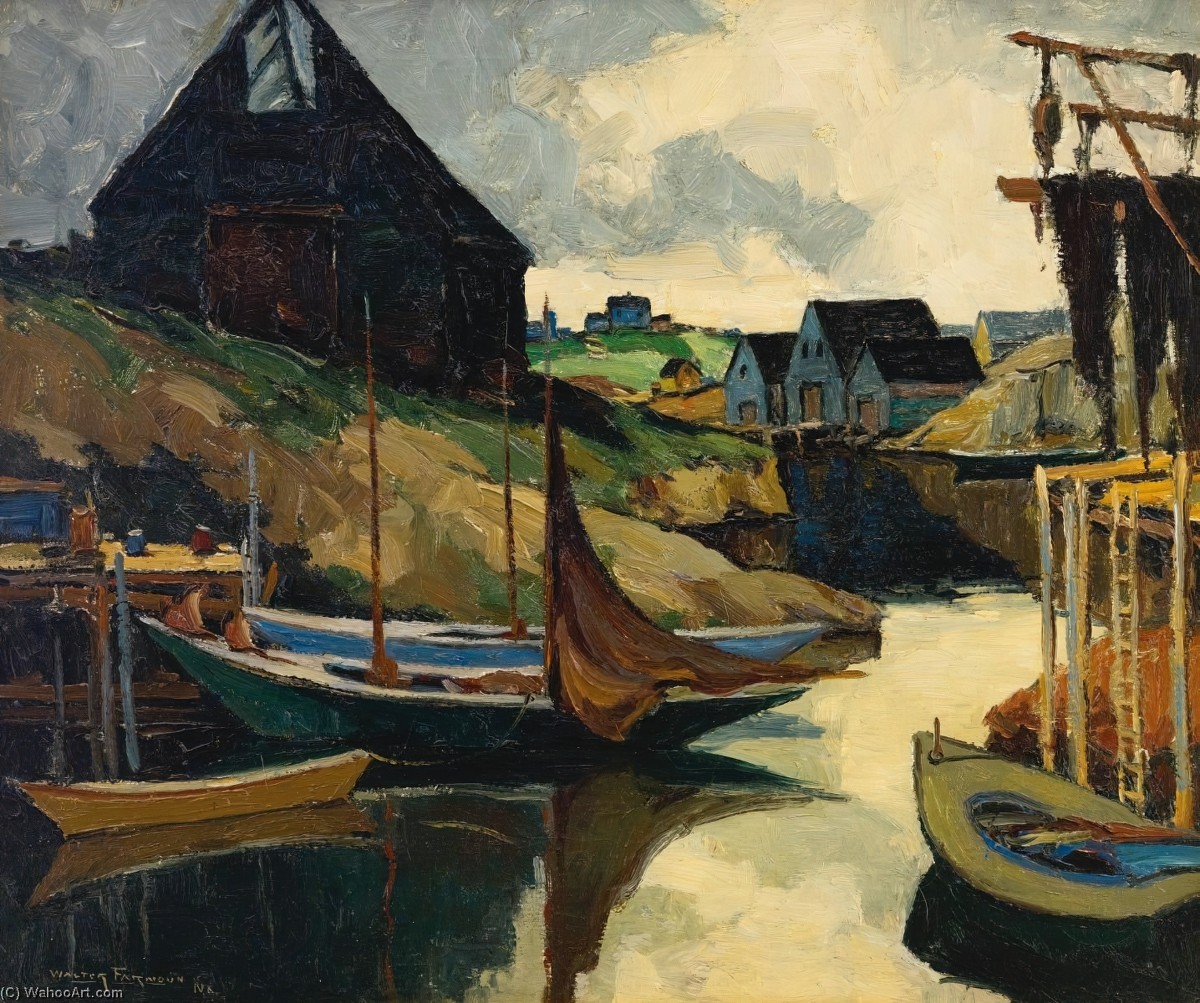
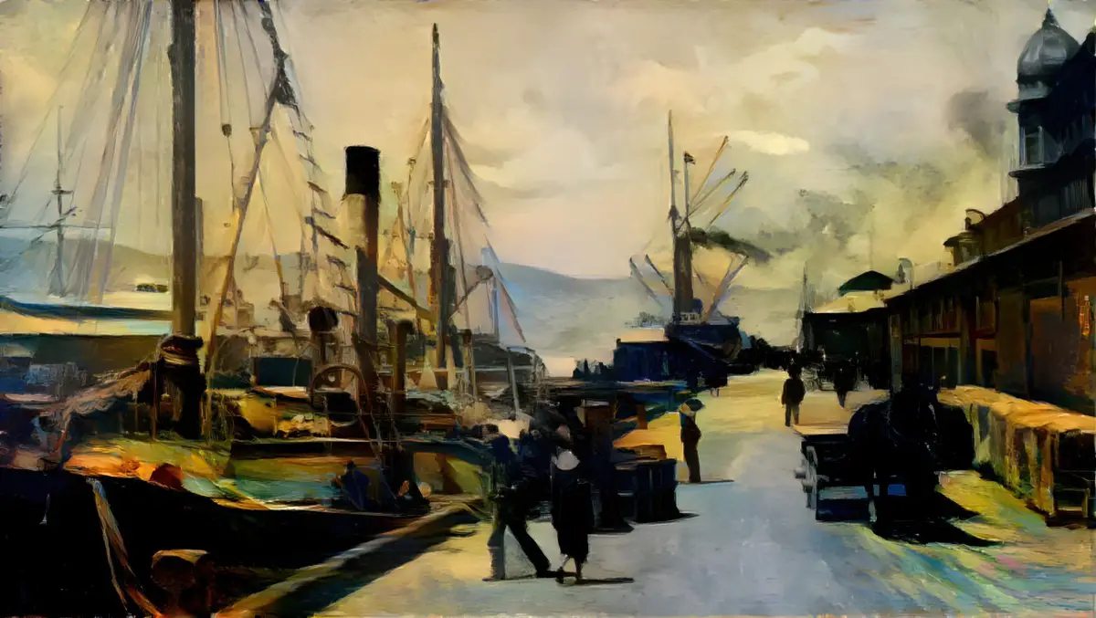
And here’s what I got.
If you want, tidy up the painting in Affinity Photo or Photoshop using the original photo as your reference. It might look great with a bit of white linework. But this looks good enough to me. We get the general idea of 1910s Wellington.
Now I’ll try a portrait. This is a portrait of Polish painter Tamara de Lempicka (1898-1980), circa 1929. (I’ve removed the grey background and touched the photo up a little.)
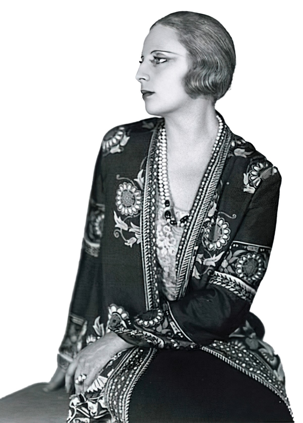
Even if you don’t recognise the artist herself, you’ll know her artwork. It’s very distinctive.
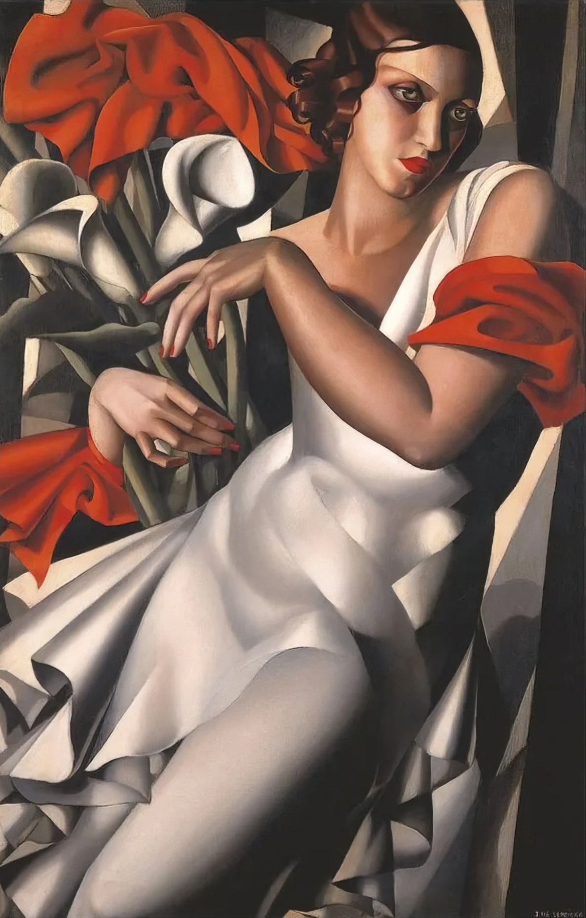
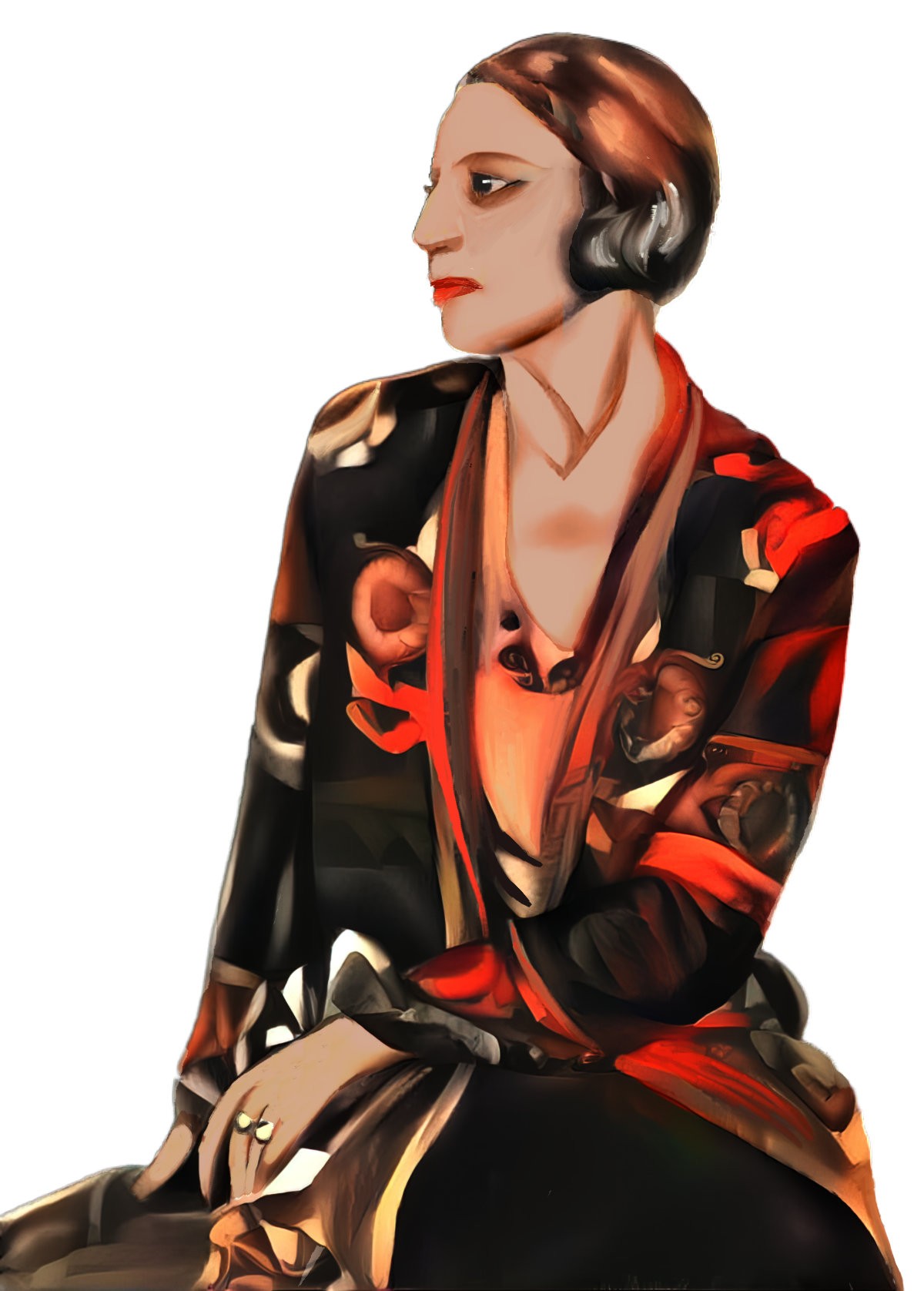
Tamara looks quite a lot like her subjects. What happens if I apply de Lempicka style to the artist herself using Dream Generator? Combining the two images above using 1.2 iterations and a 60% style weight, the generator comes up with this. (If you give it a png, it’ll give you back a png, by the way.)
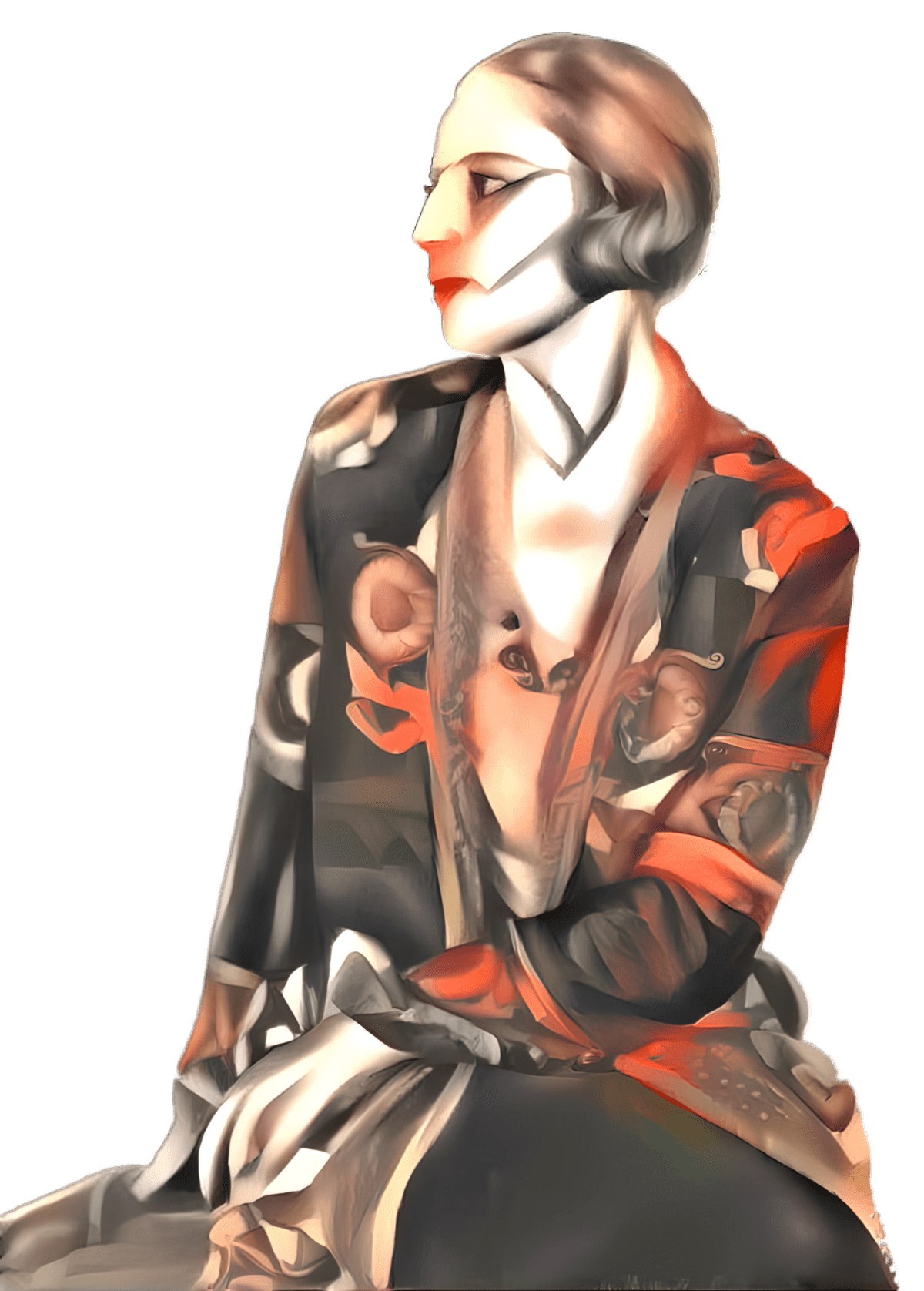
This still doesn’t quite look like the artist’s style and it’s also messed up the hand. So I put it back into Affinity Photo and made it look darker and smoother. I also fixed the hand manually, and took the yellow out of her skin tone etc.
BLACK AND WHITE AS BASE PHOTO PREPARATION
The more I use this generator, the more I understand how poorly it does when the base image contains little contrast. Take the following photo of a cottagey home interior. I wanted to turn it into something more painterly.
As style image, I used a street scene by Japanese painter Takanori Oguisu.
Using 60% style weight and 1.5 iterations, I got this washed out rubbish.
So inside my photo software, I added a black and white adjustment layer to the photo. It was immediately clear just how little tonal contrast this lovely cottagey interior actually has, despite those colourful flowers and all that detail. So I added a curves adjustment layer, pulling down in the middle to increase the black. Now I’m using this as the base image.
Using the exact same style painting by Takanori Oguisu, this time the generator gives me something far closer to what I want:
Long story short, if your base image contains little contrast, fix that first in your photo software. Unless you’re after that dreamy look, this preparatory step will return far better results. The generator works with tonal contrast and you’re simply giving it more to work with.
USING ONLY PART OF AN AI GENERATED IMAGE
If you keep the base image, put it through the generator, place it on top of the base image in Photoshop (or similar), then you can create a mask and erase the parts of the AI generated image you don’t want.
I don’t really like either of the results, generated from a couple of the ‘popular styles’ I was trying out. But if I only apply that pattern to the glass, I might get a kind of stained-glass window effect.
Here’s another one. First the base image (again from Unsplash).
I used this etching for the style image but kept the colours of the base.
The result:
But for me the sky is a bit busy so I got rid of the sky texture in Affinity Photo.
I used that same style image on a photo of a lighthouse:
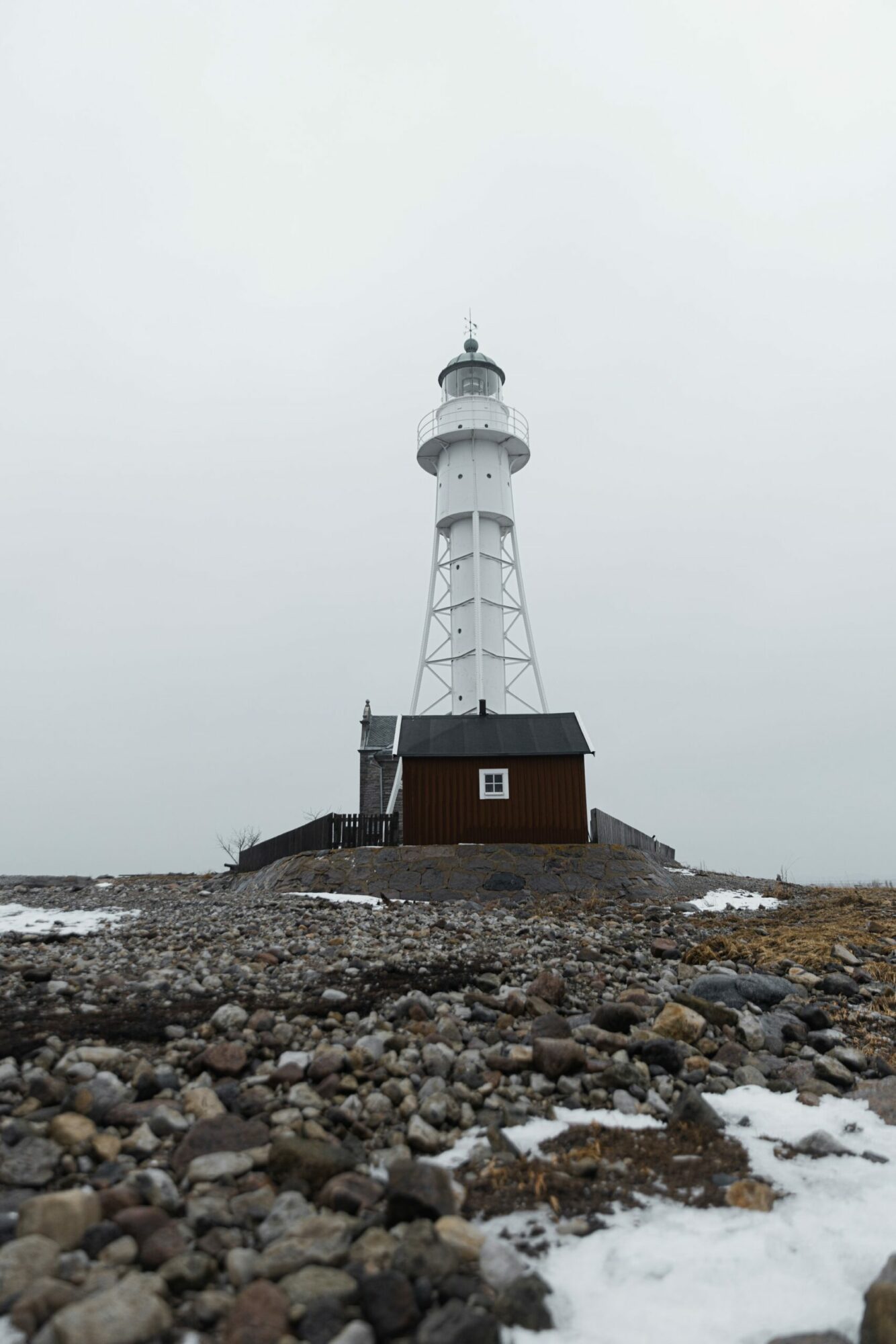
I didn’t turn on the ‘preserve colour’ option so the generator gave me a black and white image. Inside Affinity Photo I removed the white paper: Filters > Colours > Erase White Paper. Then I put my own colour layer behind the black strokes. The generator did a fantastic job of rendering those stones. Something like this only takes about ten minutes.
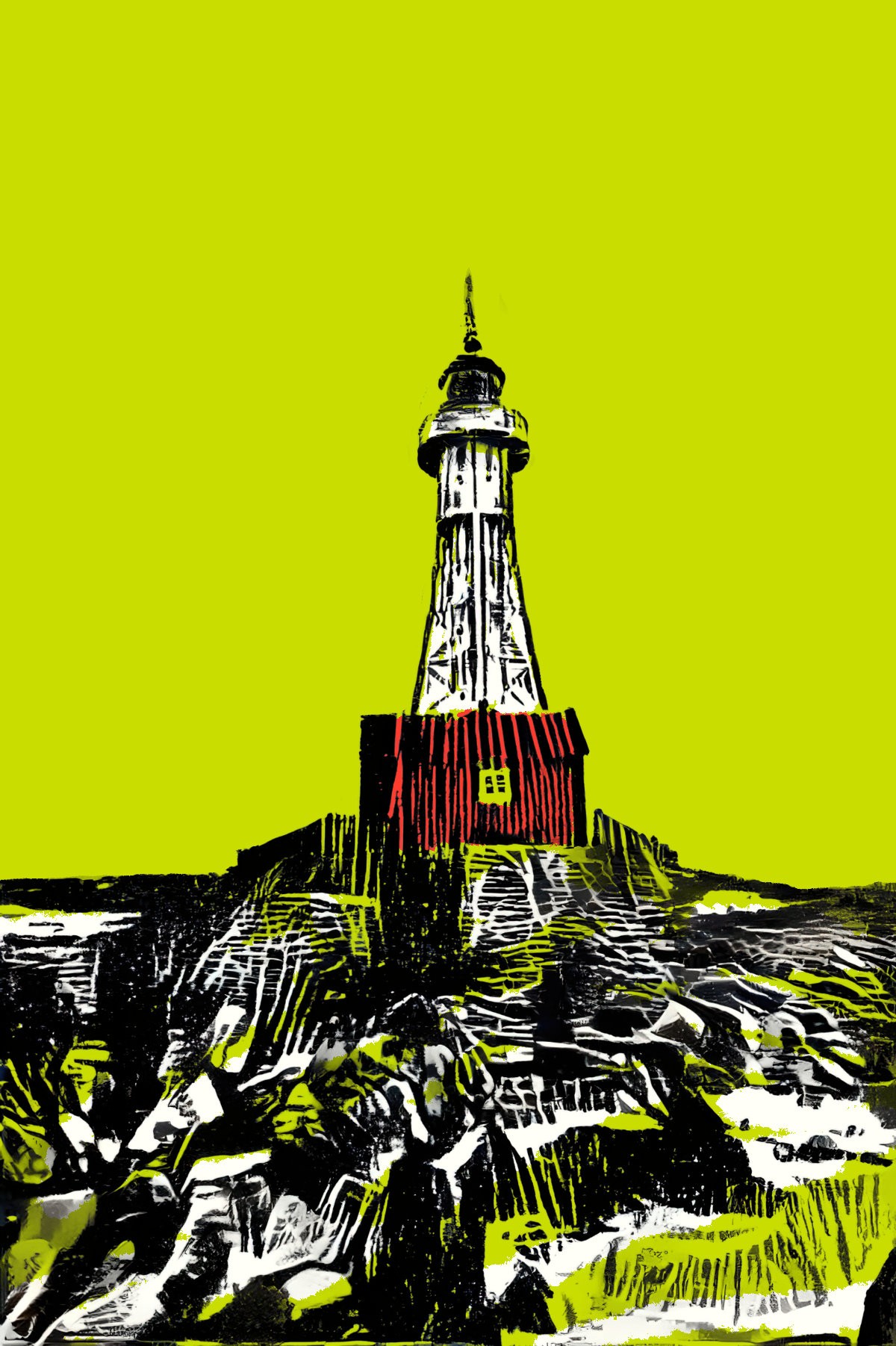
On the topic of lighthouses, typing ‘lighthouse monster’ into Wombo returned this when using the Etching filter. I don’t imagine Dream Generator will come up with anything amazing with if we next run it through there, because the light and dark isn’t sufficiently distinct.
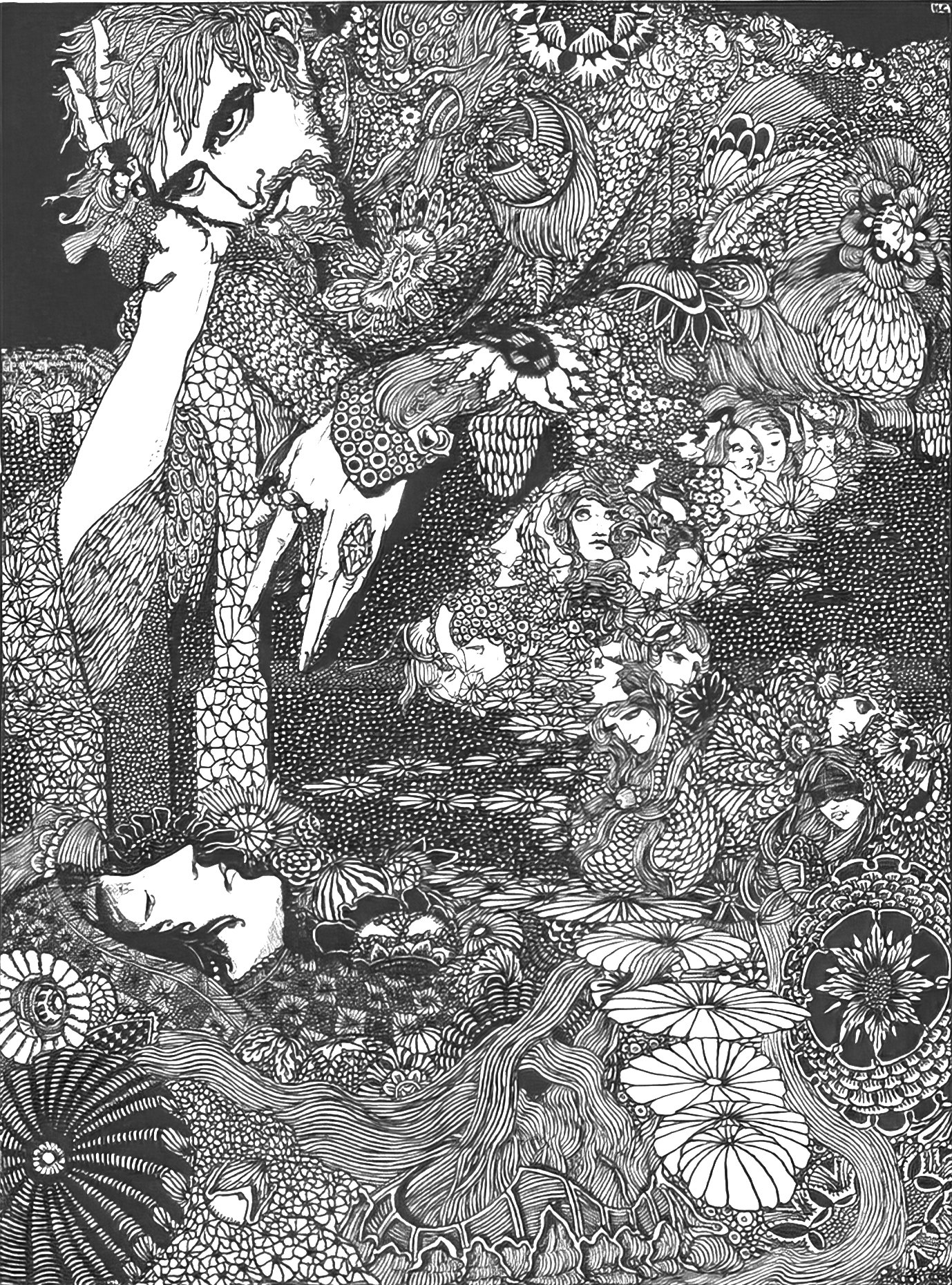
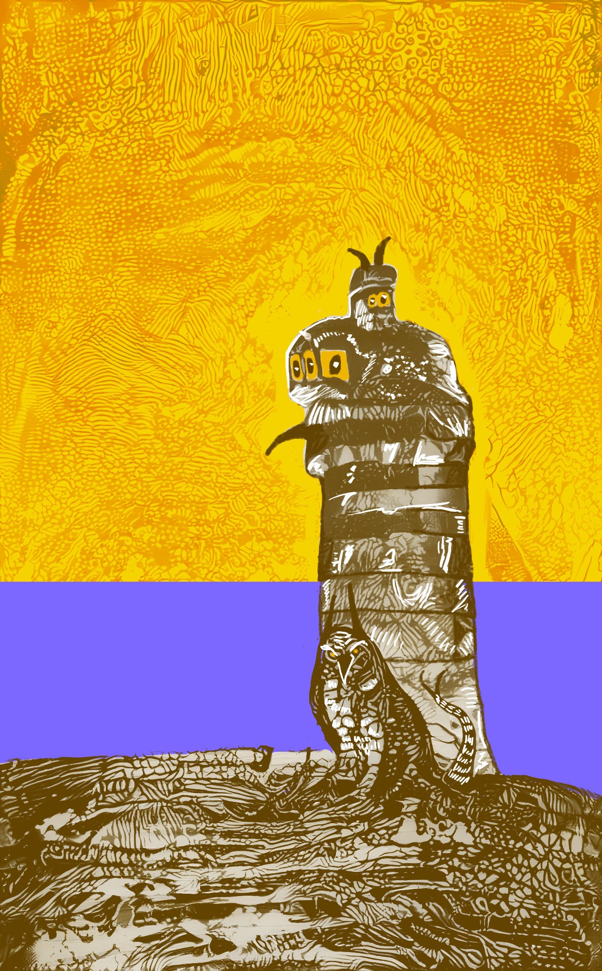
But I tried anyway, using a highly detailed Harry Clarke illustration for style, and because the detail is so very small, I set the style size to 120%, when normally you’d bump styles down a bit to 80%.
The Dream generator gave me this:
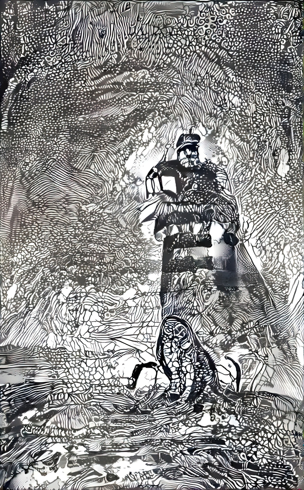
I think the ‘monster’ looks like an owl, so I turned into a giant owl’s lighthouse. I may keep going with this later, if I find a use for it, but I want to demonstrate how even the pretty rubbish images might have something of use in them.
USING DREAM GENERATOR TO UNIFY A STYLE
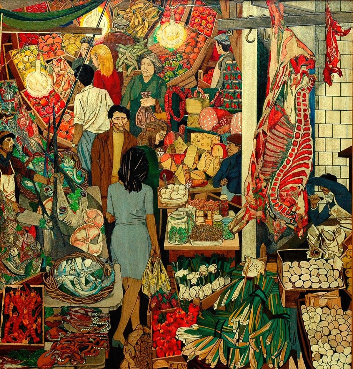
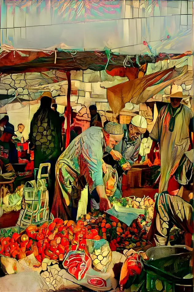
I’m especially fond of this 1974 illustration of La Vucciria Palermos Market by Renato Guttuso. When I say I’m fond of it, I love the colours and the busy-ness of it. I’m going to try and apply this palette to linework to another busy photo of a market.
Here are various photographs of markets from Unsplash, which are by different photographers and are therefore different styles.
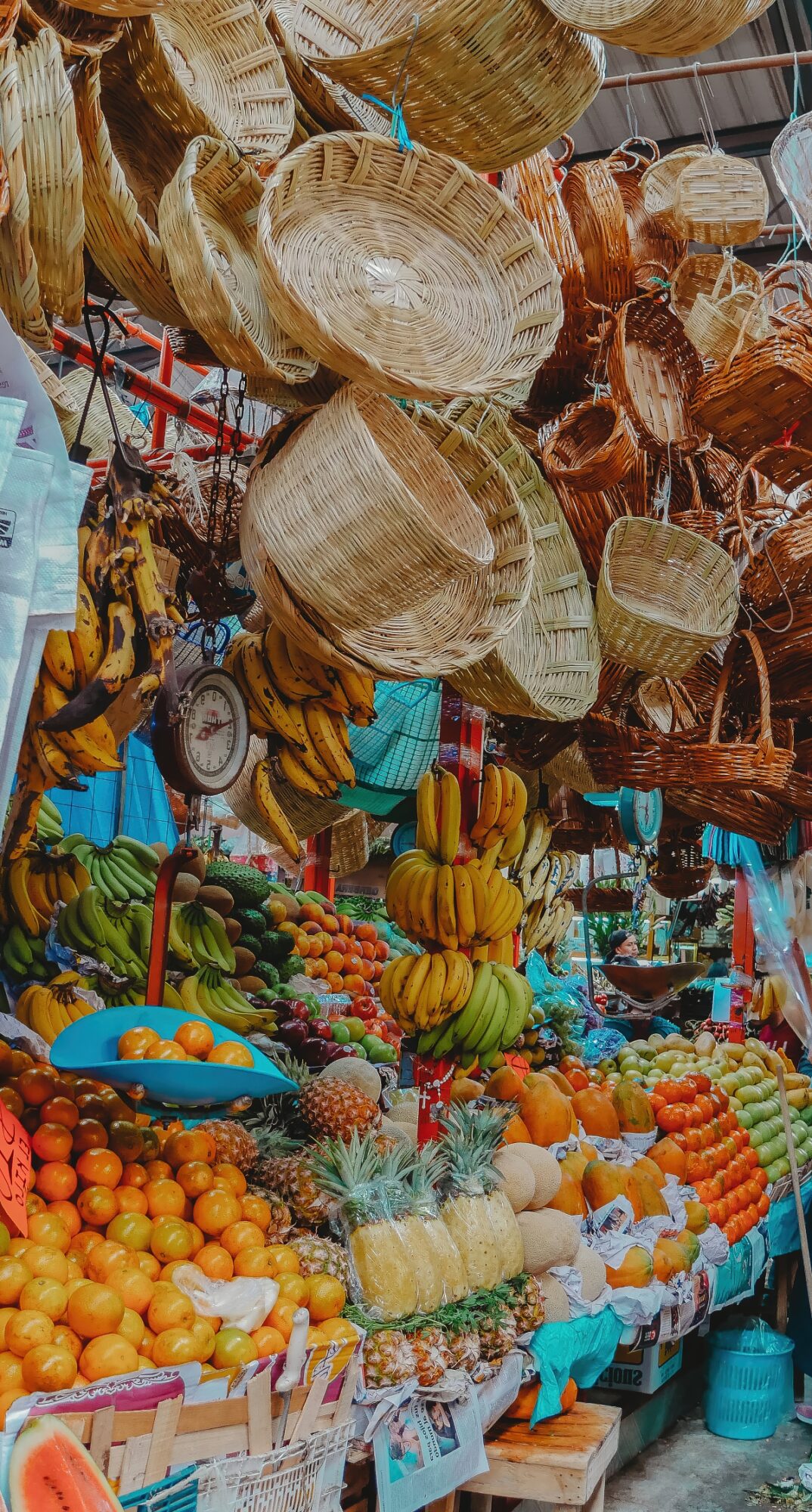
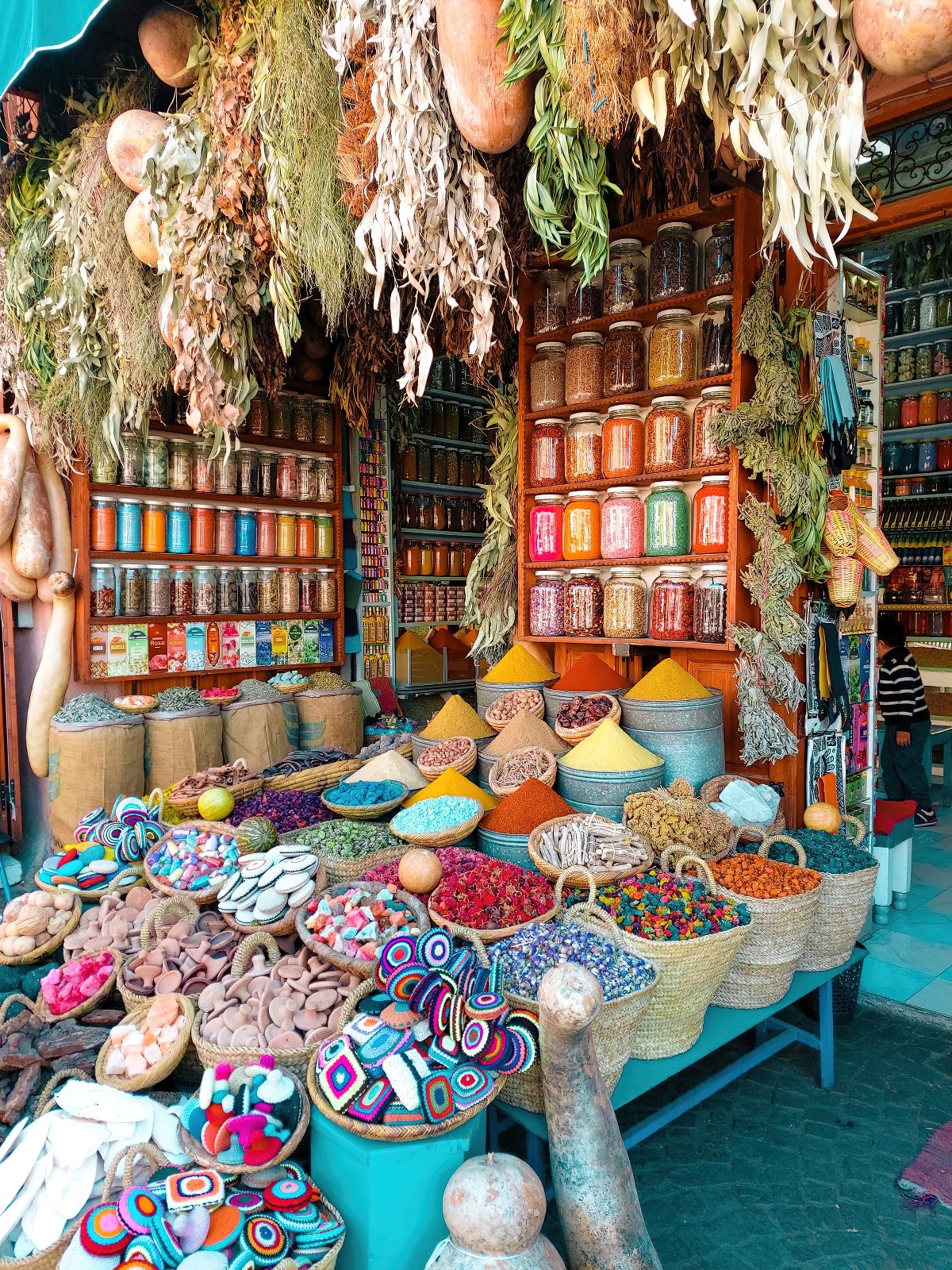
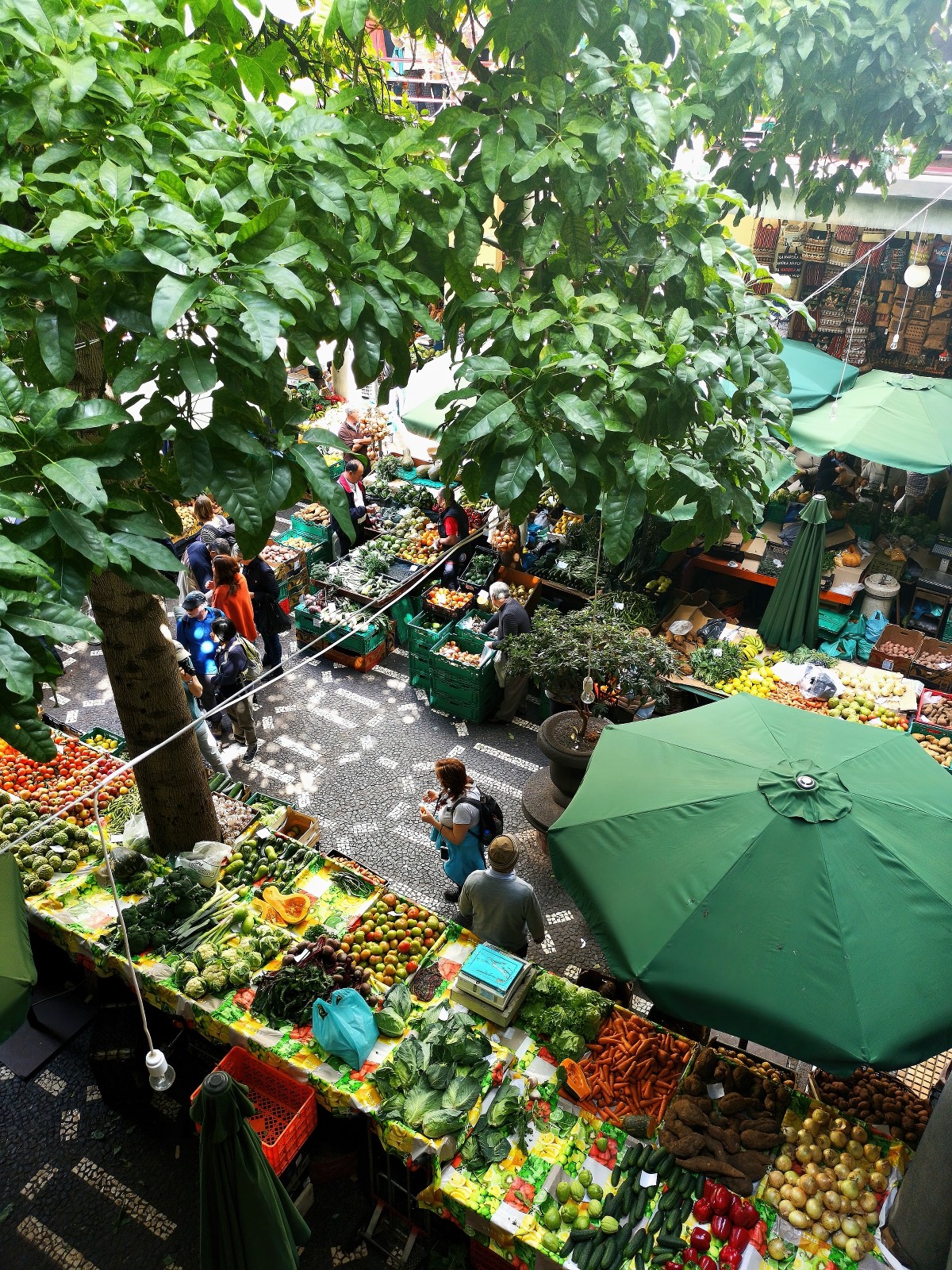
And here are the same images with the Renato Guttuso painting applied at 1.2 iterations and 60% style weight. Now they could all be different scenes of the same market.
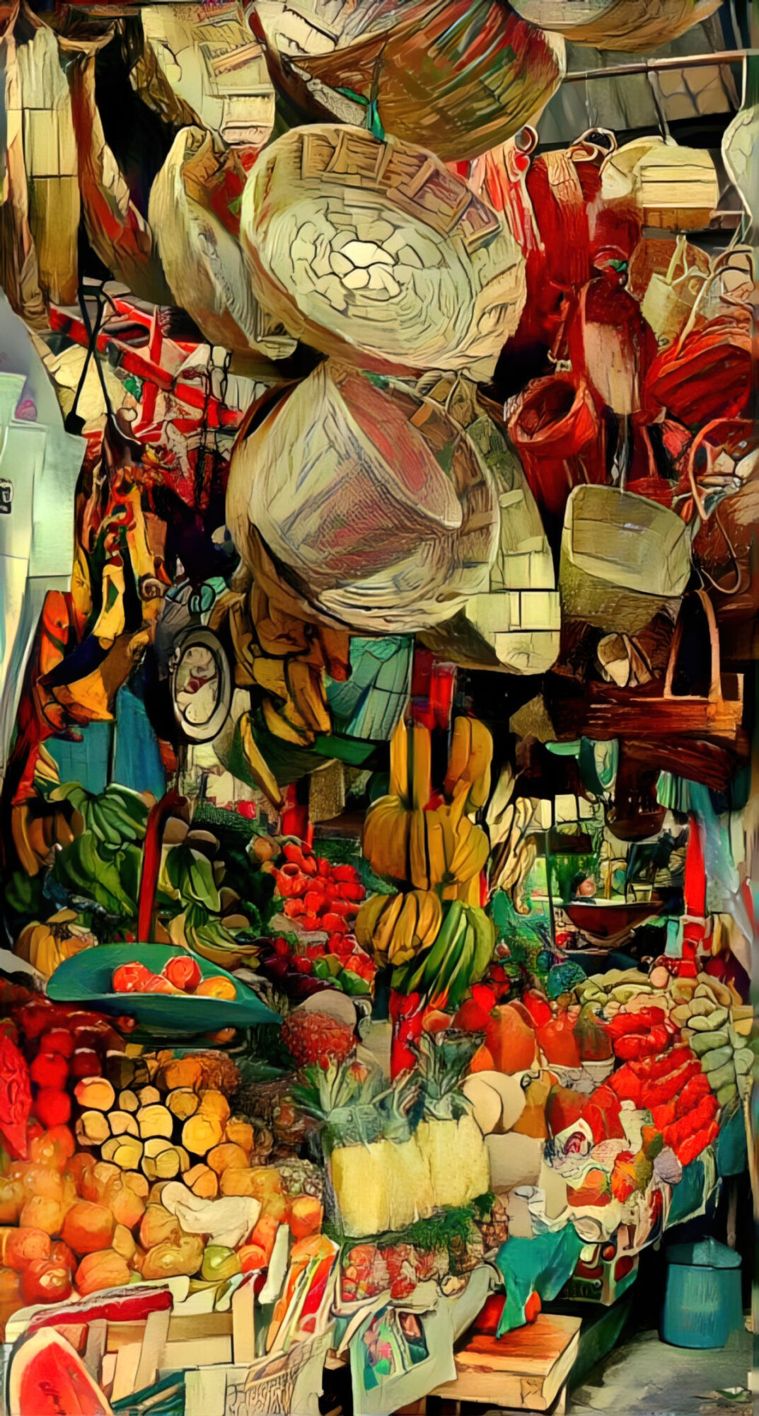
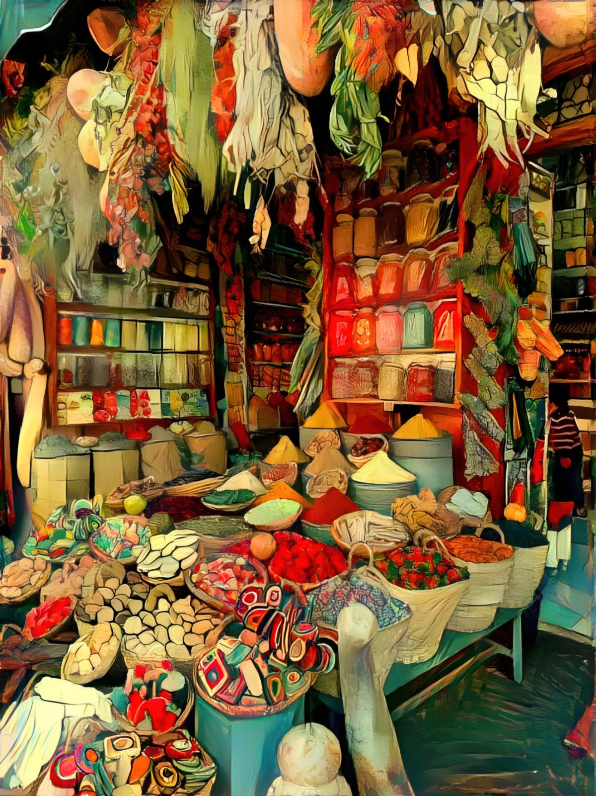
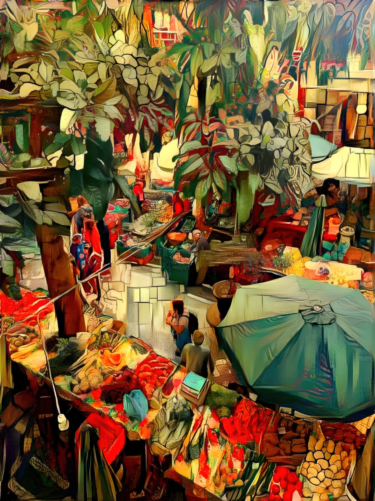
The trick to using the Dream Generator when applying busy styles like these: The base image must also be busy. If you’re trying to apply a busy illustration to, say, a photo with blank walls and a mostly blank table top, the generator will try to apply the busy-ness to every blank surface and you’ll end up with a mess.
The following photo will show you what I’m talking about. Another photo of a market. This is a nice, busy, highly detailed image, but there’s a smooth surface at the top. (Well, it’s the sky.) Because the style image doesn’t have any smooth surfaces, the generator will try to turn it into something.
Here’s what it does. Look what it did to the sky. It ends up looking like gridded shrink wrap, with washed out versions of the desired colour palette. (Where the base image is dark, you’ll get the brightest, most true colours from the style image.)
To avoid this, you can first remove the sky in Affinity Photo/Photoshop using the selection tool, then export as a png. That way, the generator knows not to touch that part. Alternatively, you can fix it after it’s done its thing.
IS THIS ‘REAL’ ART?
Art produced by artificial intelligence is frequently described as ‘Surreal’, but Surreal means the opposite to how many people use it, and isn’t just a spaghetti-at-the-wall admixture of imagery. So when AI makes art, it’s not yet Surreal. The human must make it Surreal (if that’s what you’re going for.)
I’m excited to see where AI will be taking us next. At the moment, plenty of human input is still required, but there’s no need to feel like a cheat for making use of AI. It can speed up some very mundane drawing tasks.
On that note, I’ll leave you with something Edward Gorey once said. Apparently he absolutely hated drawing wallpaper and he’d cast works aside for months because he couldn’t stand the sight of them. He’d finish them off once he was forced to.
That’s pretty unfortunate given as how Gorey had a very intensive style, full of handdrawn hatching. (You’d think he’d have changed his style, wouldn’t you?)
Perhaps in the near future, artists will upload 30-50 images to an AI generator and speed up subsequent projects.
SOMETHING BIZARRE
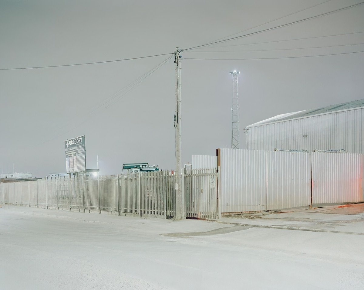
Using Deep Dream Generator, I tried to combine a photo of a snowy fence with an image from my computer, which just so happens to be by Vincent Van Gogh. I doubted this would work as there aren’t enough tonal ranges in the base photo, but I was experimenting.
Here’s the photo:
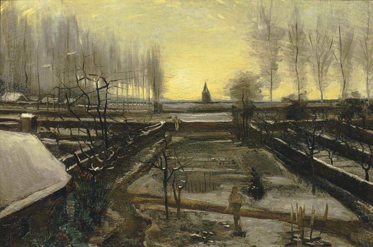
And here’s the painting I was trying to use as the style image. Note that the file name is: Vincent-van-Gogh-Dutch-1853-1890-The-parsonage-garden-in-the-snow-January-1885-Nuenen
However, Deep Dream Generator gave me this.
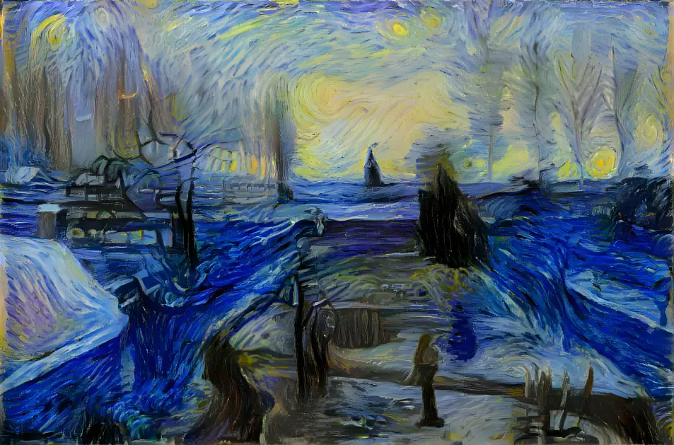
You’ll recognise immediately that the engine has tried to use a Van Gogh painting all right, just not the right one! So what does this mean for users? Does this mean Deep Dream Generator is taking notice of how we name our uploaded files? Every art generator software out there seems to use Van Gogh as the exemplar style image, so maybe this is a glitch specific to having Van Gogh in the file name. Whichever way you slice it, the engine purports to be looking at your pictures when making its decisions, not your file names, so this is bizarre behaviour.
All this to say: I don’t know how this engine works at all. But it’s sure fun trying it out.
FOR FURTHER INVESTIGATION
I also checked out Hotpot.ai. Like Wombo, the free version uses keywords. Compared to Deep Dream Generator it takes f o r e v e r to process, but there’s a paid version which lets you skip the queue and download better resolution images. I didn’t do much with it before giving up but as an example, I typed in ‘teapot monster’, checked Photorealistic style and got this (which I have enlarged at my end using Gigapixel).
Below is an image generated from ‘skateboarder inside a snow globe’.
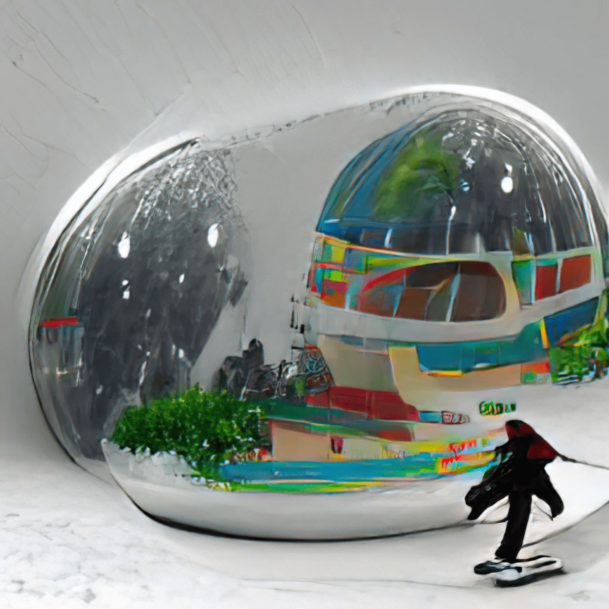
As you can see, it’s quite different from how Deep Dream Generator works, and the art is different again from Wombo. You may find it useful.
Night Cafe: Another Decent Option
NightCafe Studio allows both main options for creating AI artworks: One method works like Wombo (with the words); the other like Deep Dream Generator (with the self-provided base image and possibly self-provided style image).
NOTES ON NIGHTCAFE
- It doesn’t encourage NFTs, which are the devil, imo. That’s the one thing which makes me hesitate before recommending NightCafe.
- Here’s the link to their list of tips, which took me a while to find. These tips apply equally to creating AI generated artworks using other websites such as Deep Dream Generator.
- You only get five free credits per day. You are meant to do more hustle, garnering likes by sharing on social. Oh, you can pay for credits, of course. (Even if you don’t buy credits you get some recharging: “Buy or Earn credits to keep creating, or come back after 11:00 am for your daily 5 credit top up.”
- I wondered whose time zone they were talking about; turns out they meant mine. Sure enough, 11am Eastern Daylight Savings Australian time, they gave me another five credits.
- If you buy credits, the cost depends on how many you buy at once. This is because it costs someone money for computer power. If you’ve got a spare $500 or so you can buy 10000 credits for a fraction of a cent.
- The low res images are lower res than Deep Dream Generators low res images to the point where you can’t achieve such good results by using separate AI software to make them look great. (I’m sure that’s a careful calibration on their part!)
- Deep Dream Generator lets you choose to keep the colours in your base image. At first I thought NightCafe didn’t allow that option. THEN I WORKED OUT THERE IS A RADIO BUTTON WHICH TAKES YOU TO MORE OPTIONS.
- Among these ‘more options’ are some very basic functionality which should probably not be hidden? I don’t know, maybe people get confused by them? But coming from Deep Dream Generator, they made complete sense.
- NightCafe makes it easier for you to use more than one image as style image. If you want to do that with Deep Dream Generator you make a single image collage in photo software first, then import as a single image for style. Note that uploading more than one style image in NightCafe will cost more credits.
- If only using one image for style in NightCafe, there’s an option to add a mask.
Where I Like Night Cafe Over Deep Dream Generator
- Deep Dream Generator simply doesn’t allow you to generate an image using words. So there’s that.
- I’m not personally interested, but Night Cafe allows you to pay credits for a timelapse video showing how the AI is working on your images.
- I’M ACTUALLY STARTING TO THINK NIGHT CAFE DOES A BETTER JOB THAN DEEP DREAM GENERATOR
Here’s an example of a living room I crossed with a cryptobotanical illustration as style.
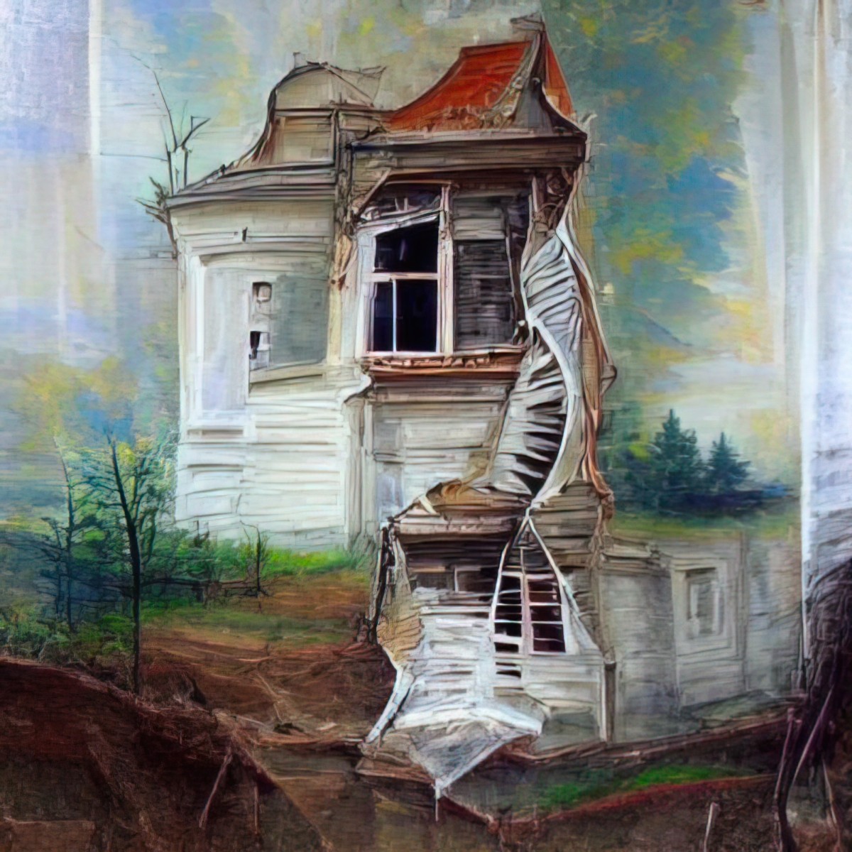
And below is an artwork Night Cafe Studio returned using my words: “an abandoned house with a staircase and windows detailed painting”. It’s… pretty interesting. I wouldn’t have thought to put the staircase on the outside of the house, but Night Cafe AI thinks ‘outside the box’.
If you like how Wombo works, I reckon you’ll be interested in giving Night Cafe a whirl because it does the same thing but does not have that distinctive Wombo look.
Okay, Night Cafe works really quite well with the style images.
I used this free stock image from Unsplash:
And applied the style from the 1961 Russian painting below:
Using one credit, it gave me this:
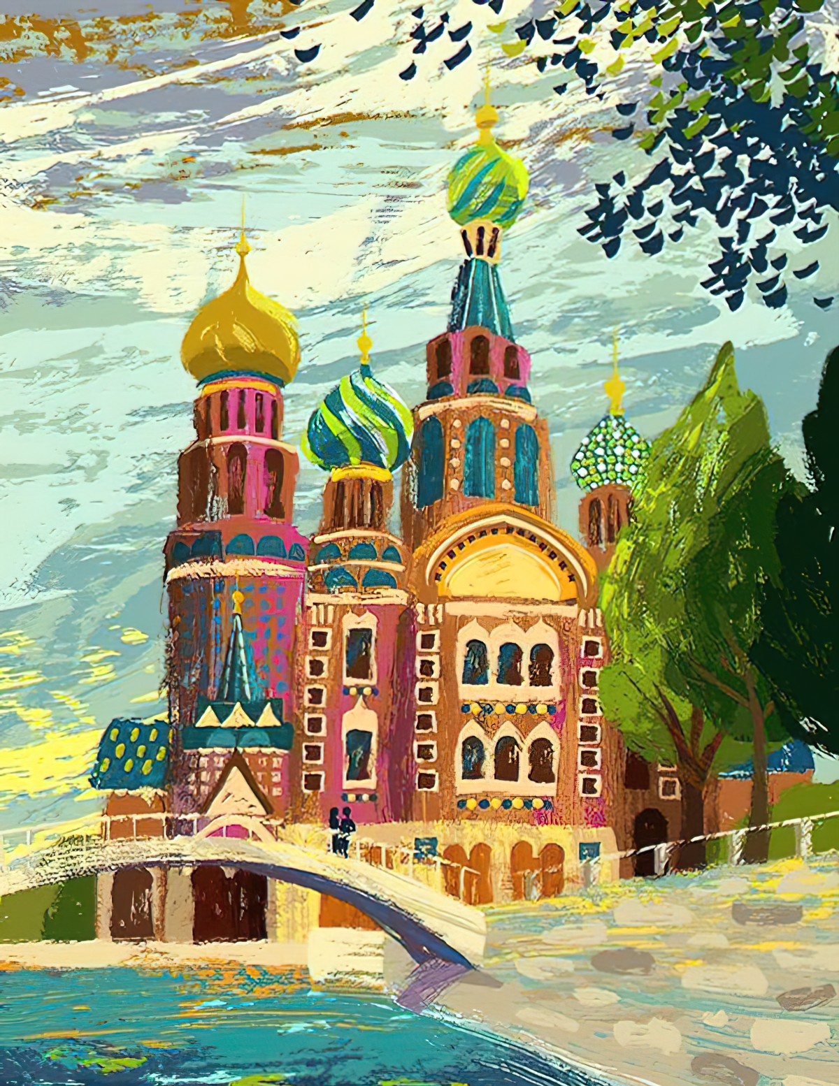
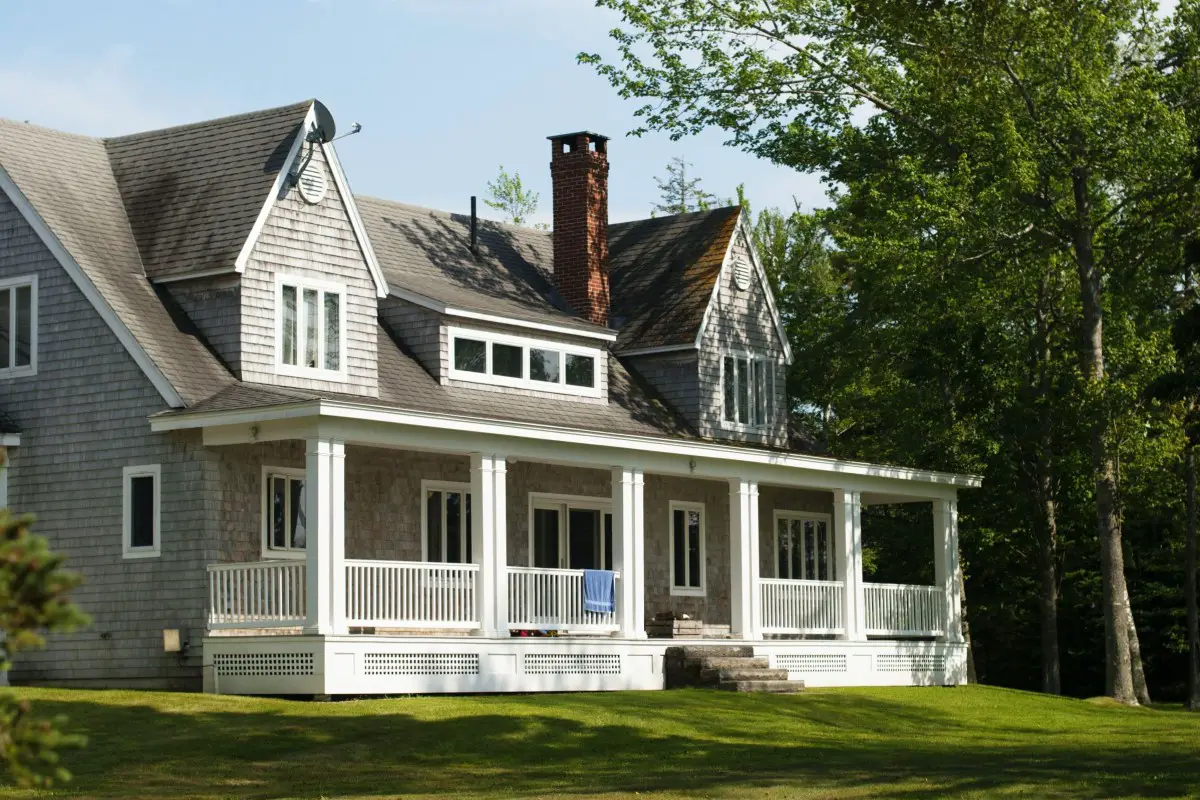
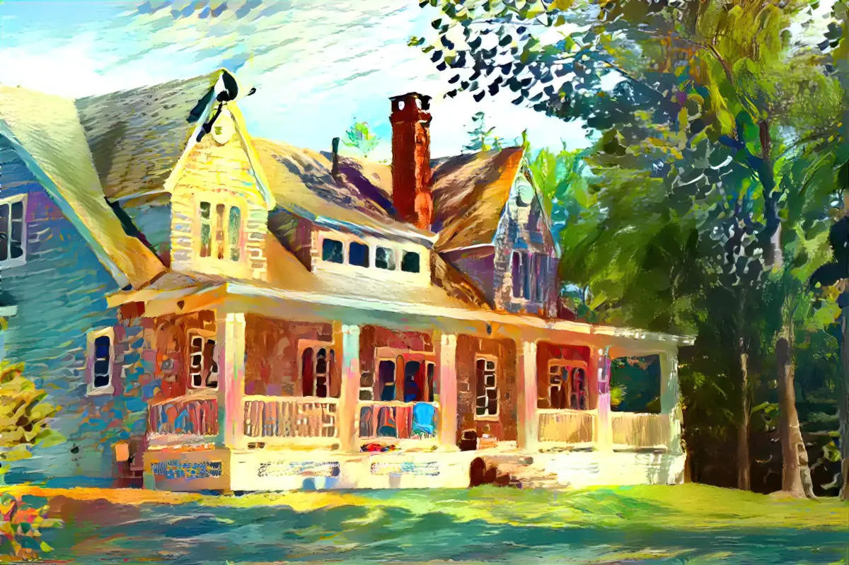
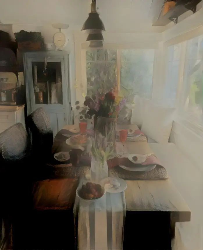
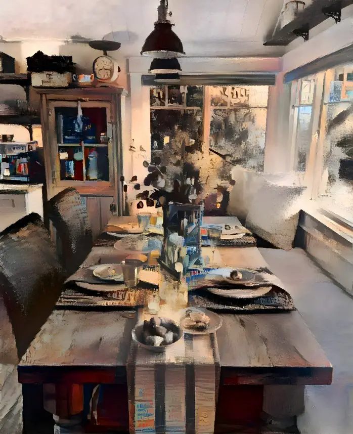
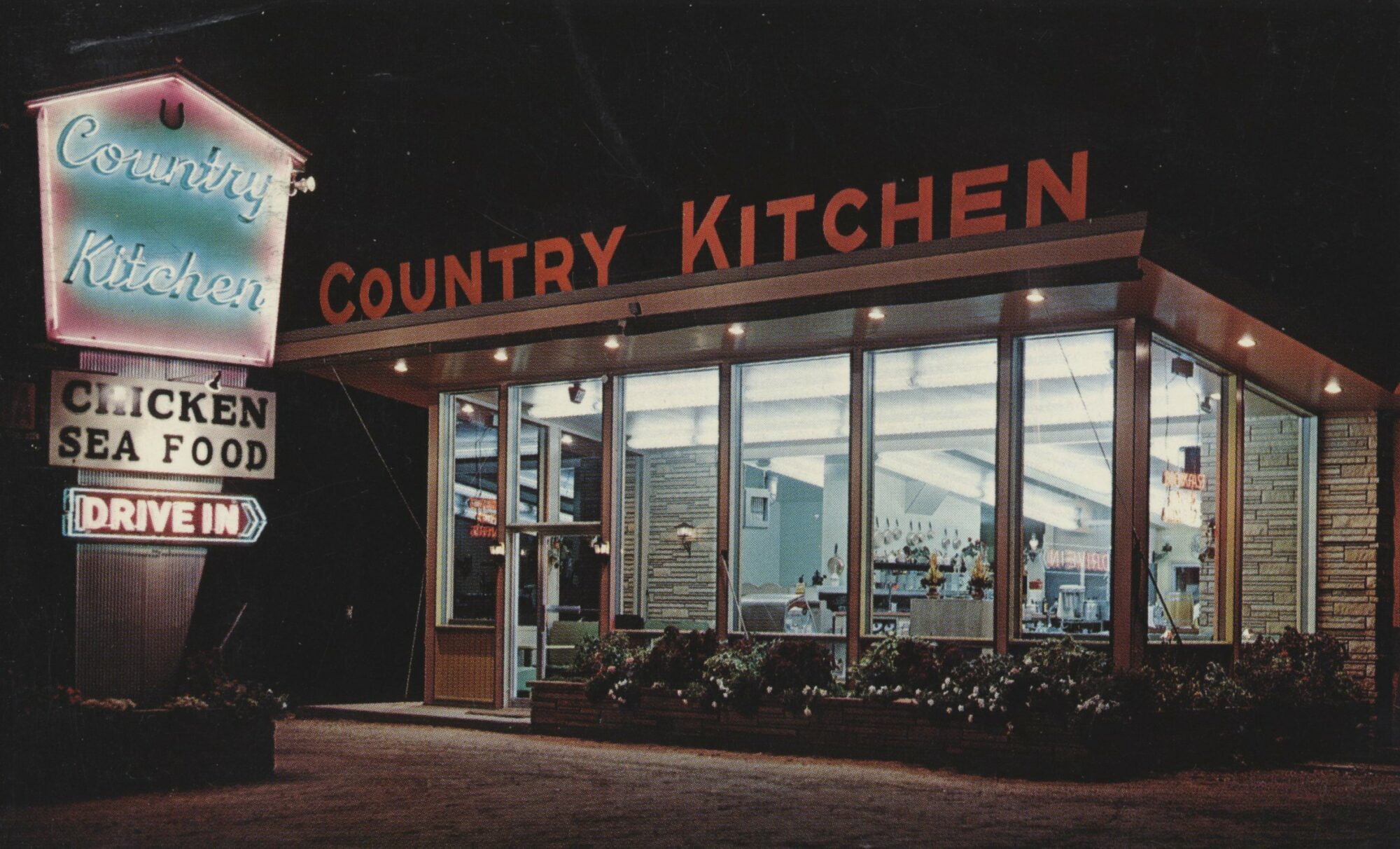
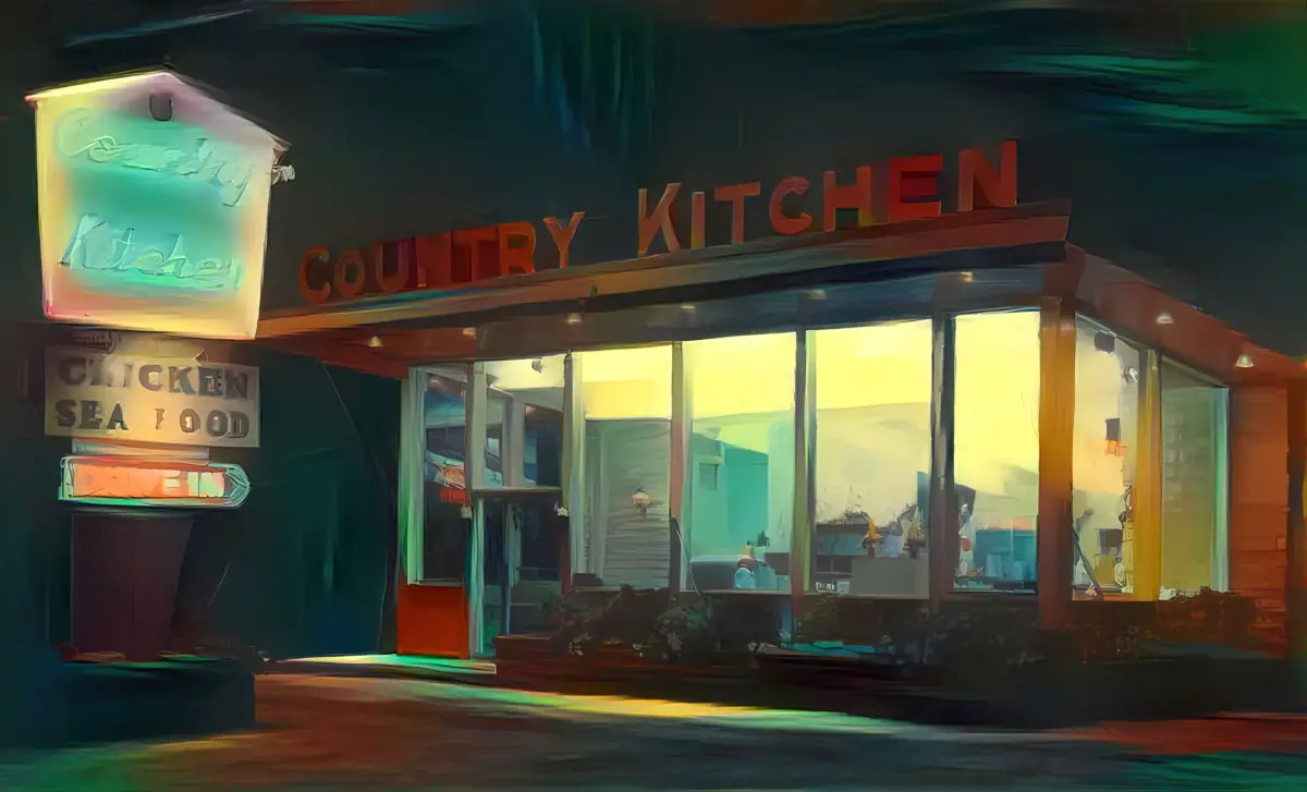
Now for a compare and contrast. I’ll use a retro postcard of a Wisconsin Country Kitchen as base image:
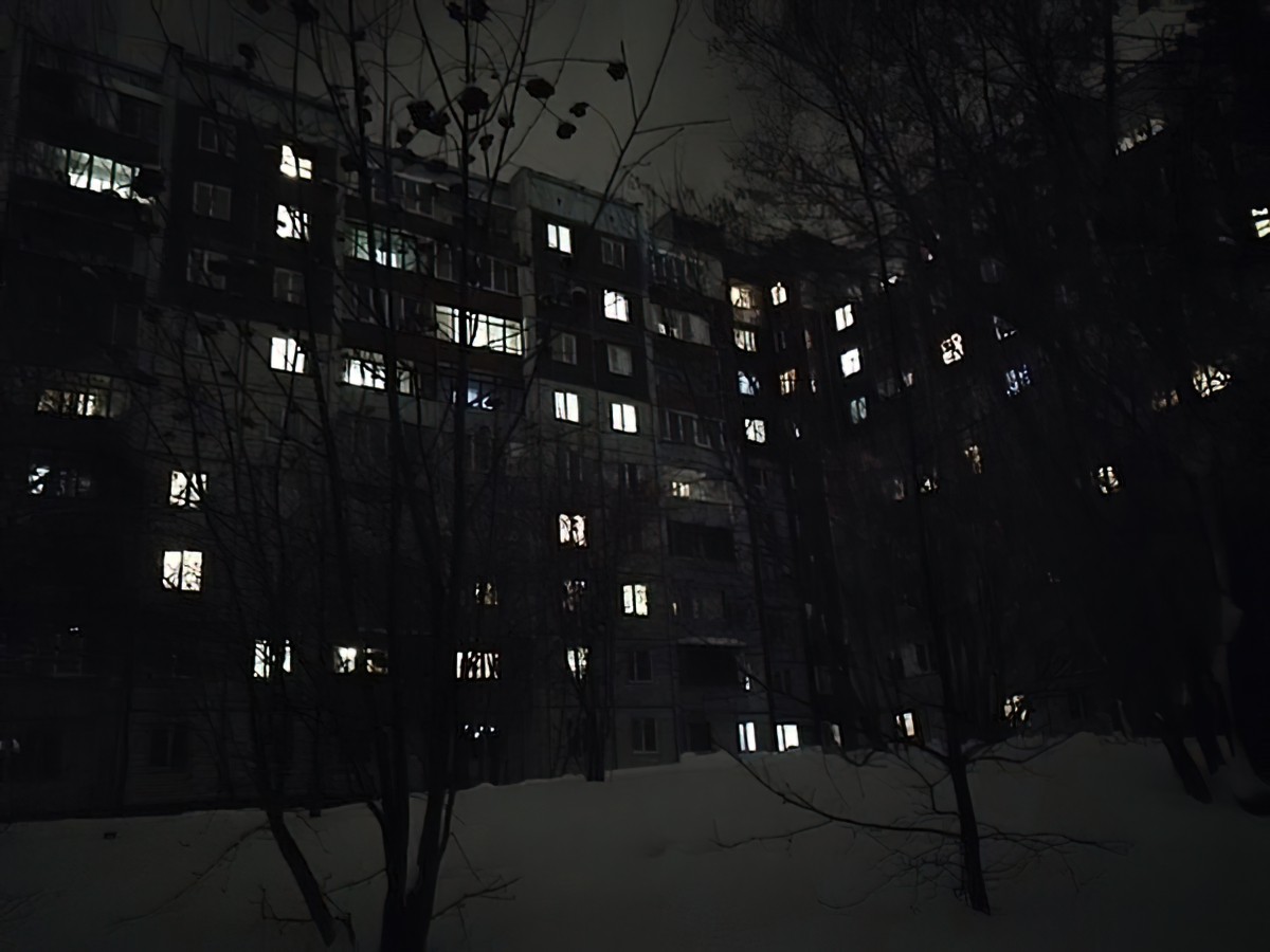
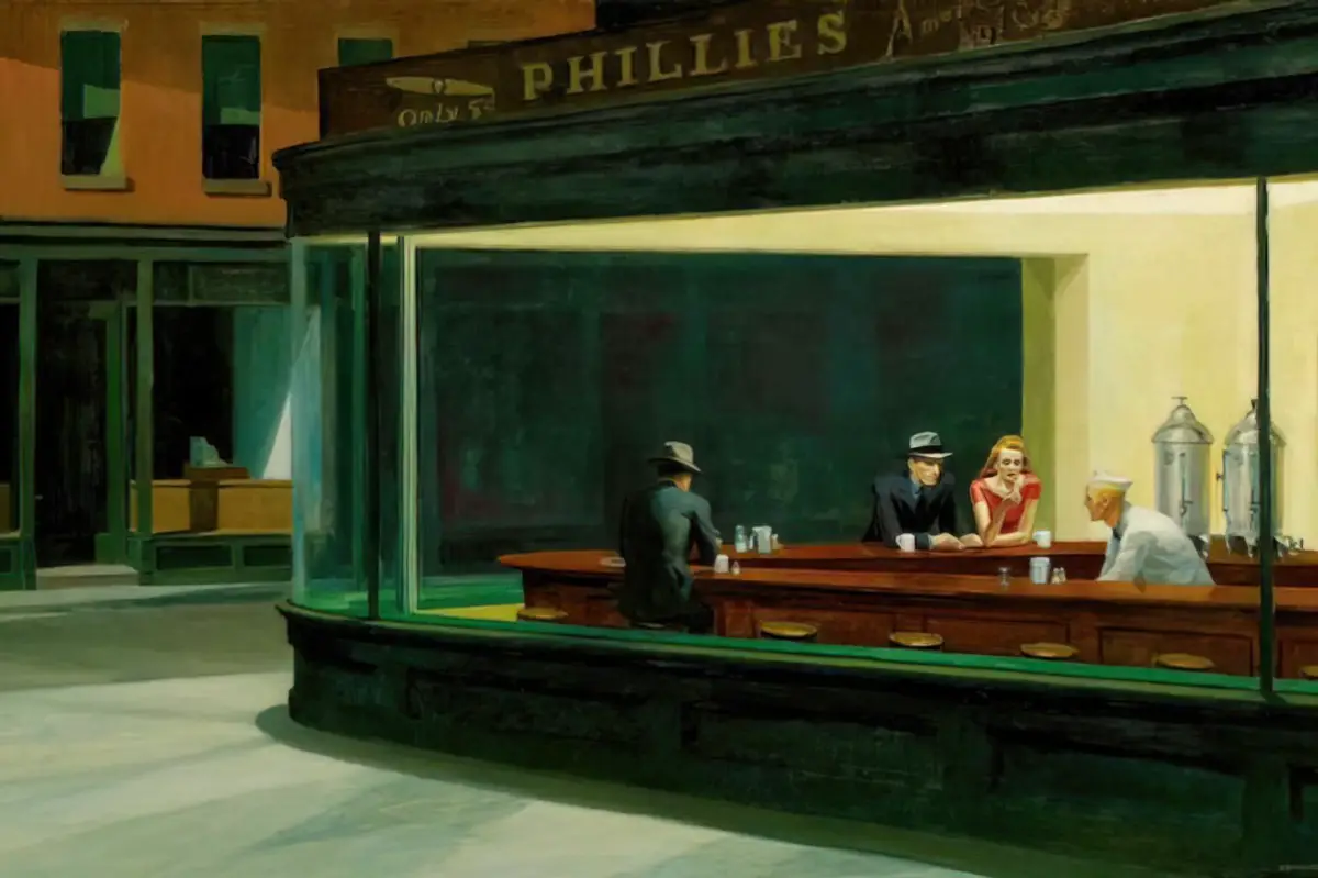
This reminds me of Edward Hopper’s famous Nighthawks at the Diner painting, so I’ll use that as base:
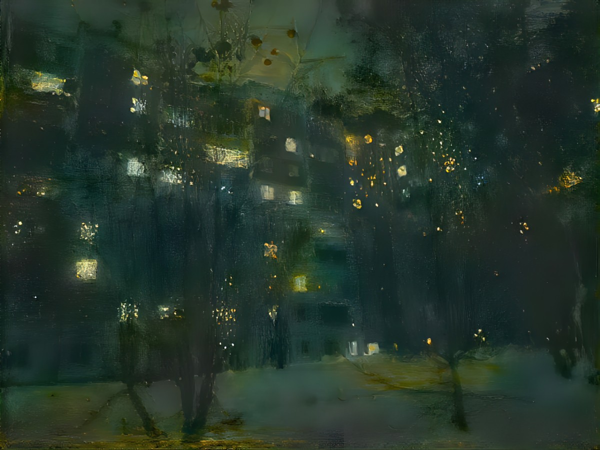
This is what Deep Dream Generator gives me, using only 6 credits. (I’ve put it through Topaz Gigapixel because I don’t like uploading rubbish images to my blog):
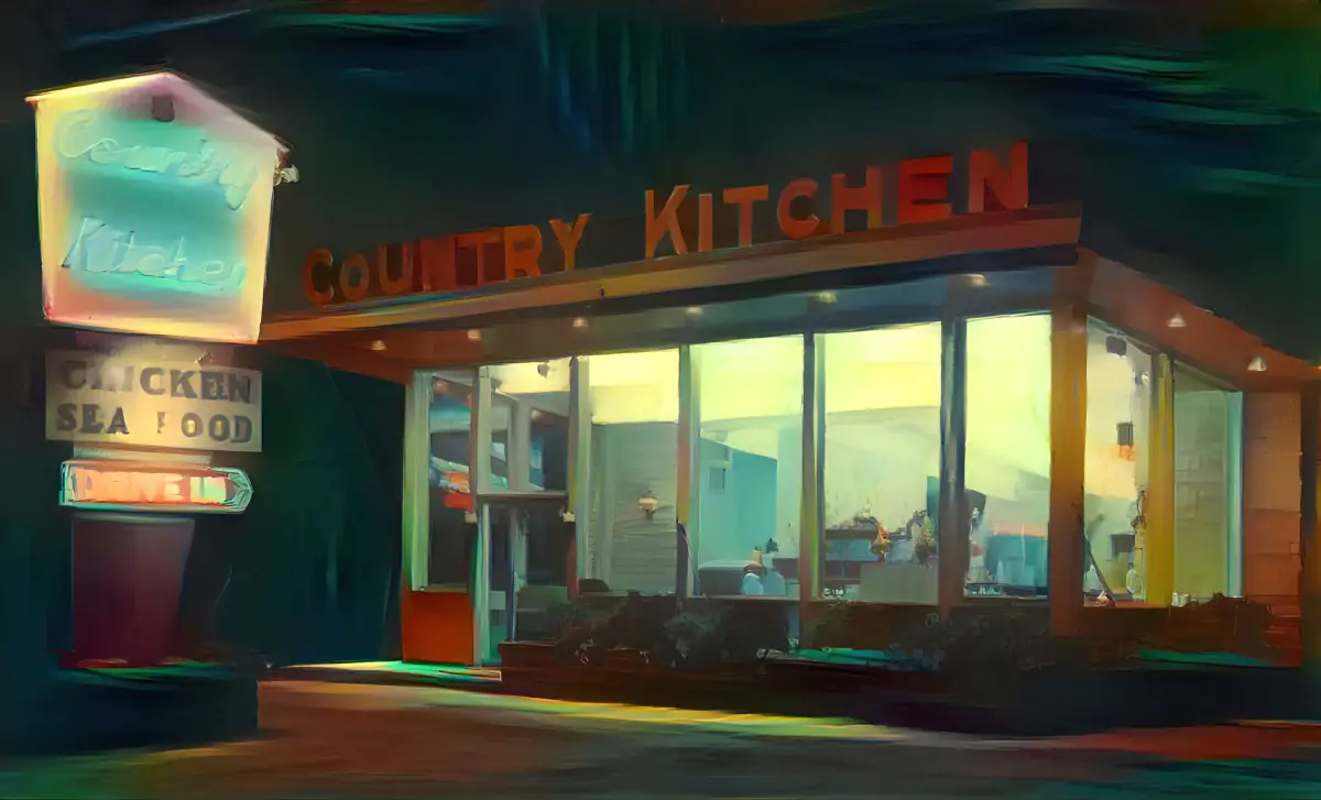
(When I got enough credits back I decided to run the same again but this time using 13 credits, 2.0 iterations, smooth style. Do you think it’s worth the extra credits? I don’t.)
Now I’ll use the same base image, same Hopper painting and a single credit over at Night Cafe. This is what it returns:
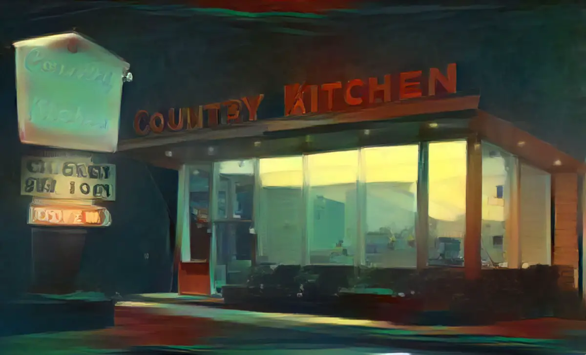
The Deep Dreamer colours are a little brighter, and Deep Dreamer does a better job picking up the writing on the sign. However, the Night Cafe result is a little more painterly, so it depends on what you want. In my opinion both of them need some manual tidying up, and the results are similar.
UPDATE: NightCafe Studio now allows you to upload your own base image and work with that.
Also, this took me a while to find because you have to scroll down on the DOWNLOAD page, but NightCafe Studio lets you download different (earlier) iterations of an image. This is great, because I frequently find it goes a little too far.