A British company has produced a “strange, alien” material so black that it absorbs all but 0.035 per cent of visual light, setting a new world record. To stare at the “super black” coating made of carbon nanotubes – each 10,000 times thinner than a human hair – is an odd experience. It is so dark that the human eye cannot understand what it is seeing. Shapes and contours are lost, leaving nothing but an apparent abyss.
If it was used to make one of Chanel’s little black dresses, the wearer’s head and limbs might appear to float incorporeally around a dress-shaped hole.
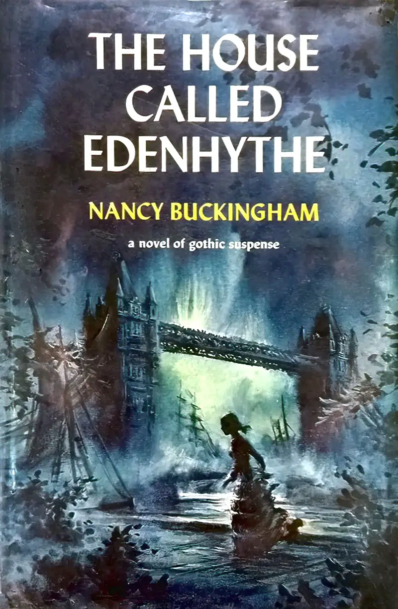
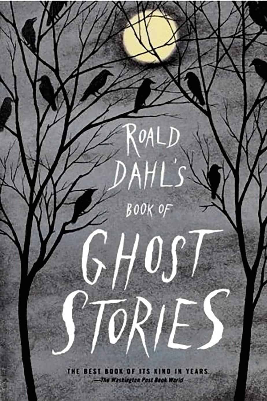
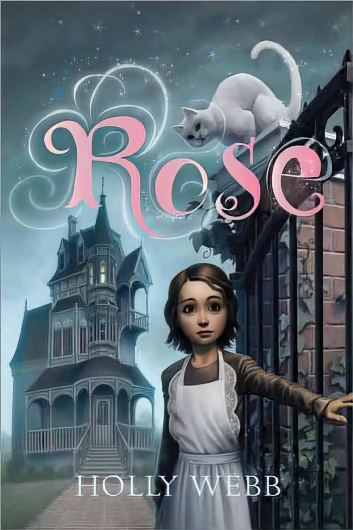
Blackest Is The New Black
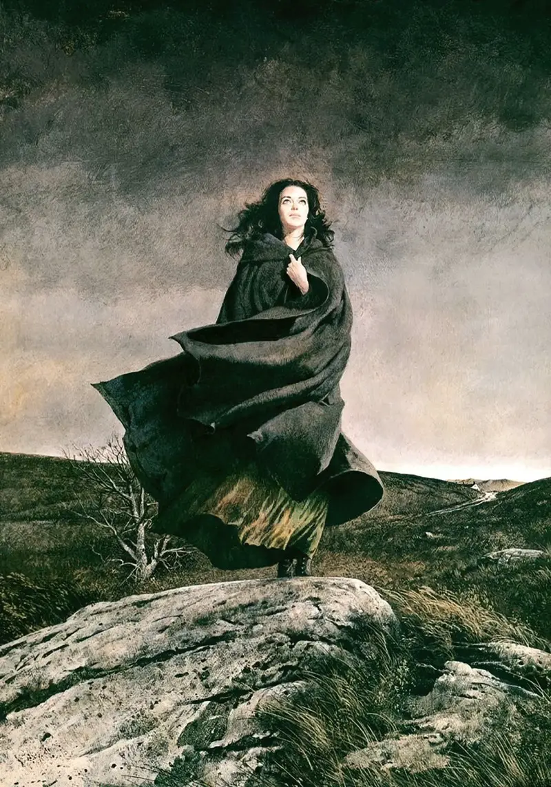
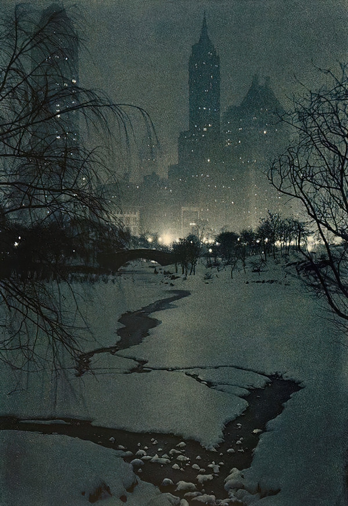
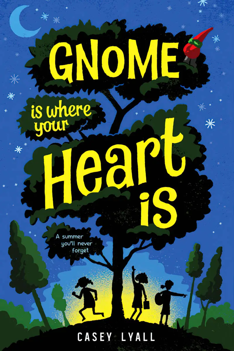
The Colours Of Night
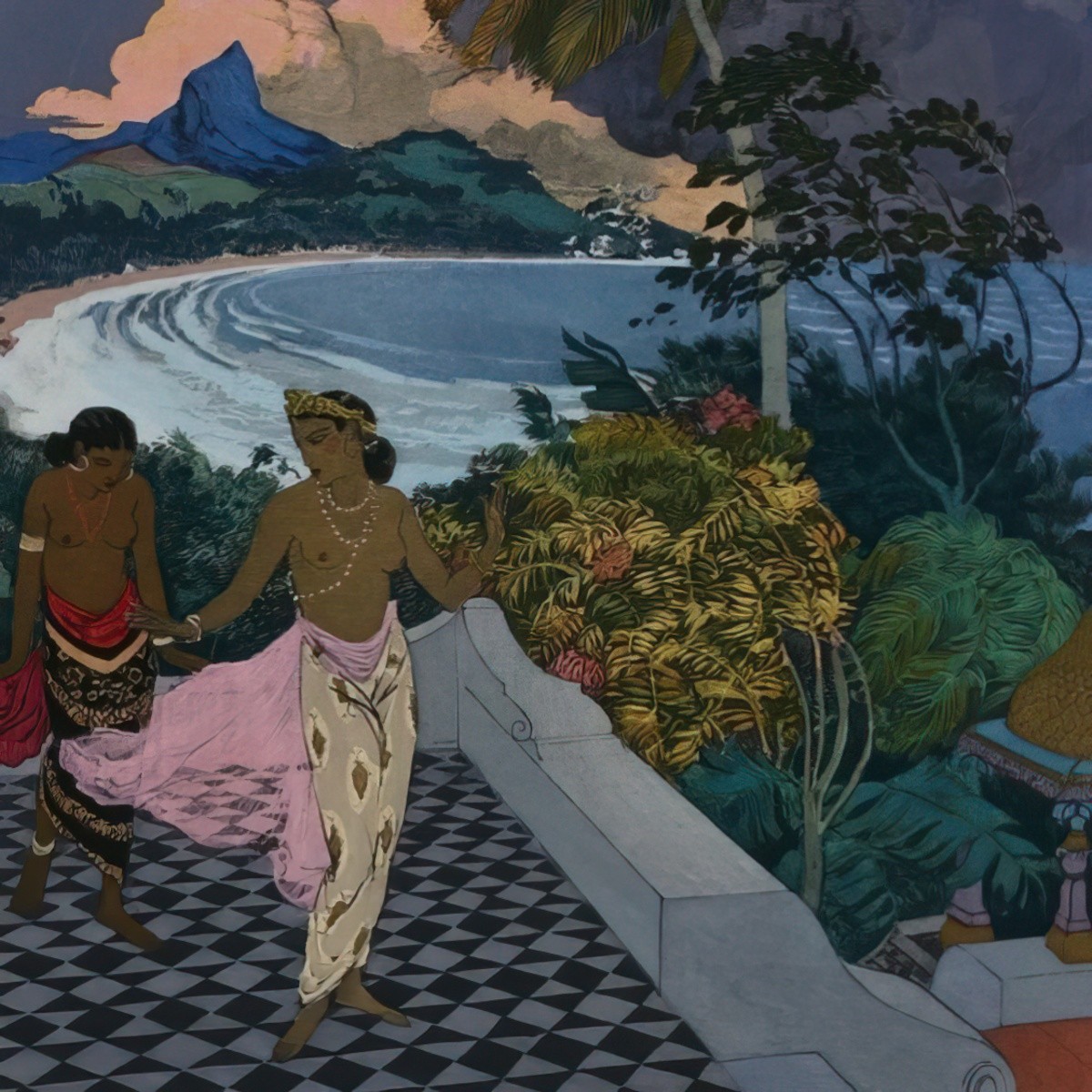
I have a Pinterest board called ‘Night’, because I’m interested in all the different ways artists show a viewer darkness, when in reality, night is the absence of light. If you’d never had much exposure to art then you’d be forgiven for thinking that a board full of night would look like a sheet of black. Not so! As Vincent Van Gogh apparently said, ‘I often think that the night is more alive and more richly coloured than the day.’
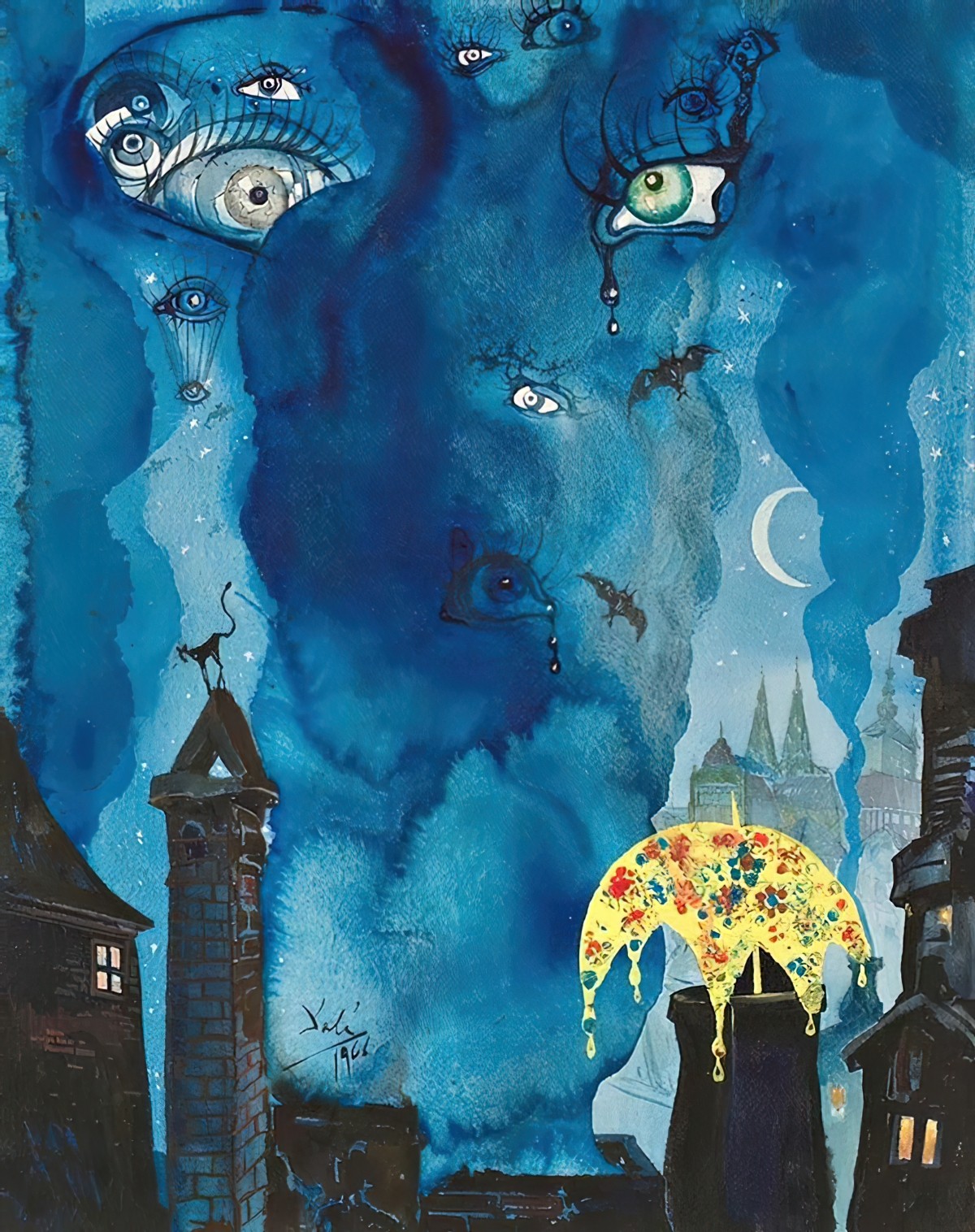
Apart from black and dark blue, various other colours depict darkness:
- Purple
- All the different shades of blue
- A little more surprisingly: greens
- Sepia tones
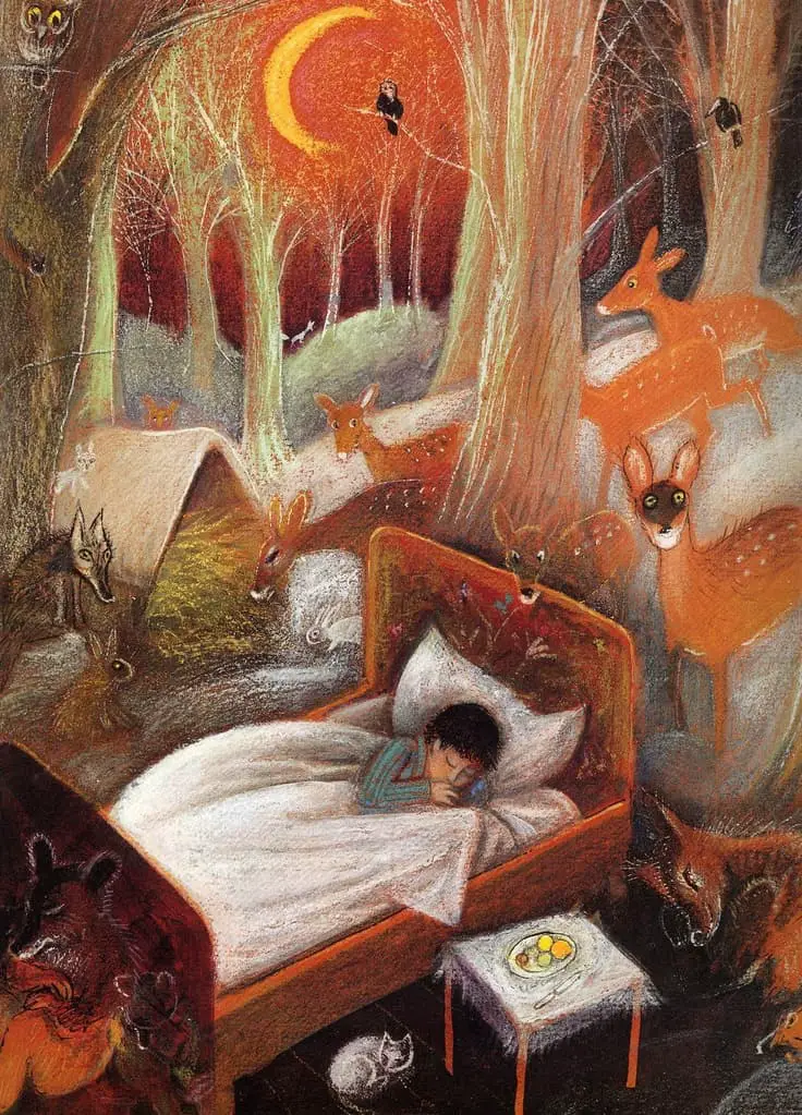
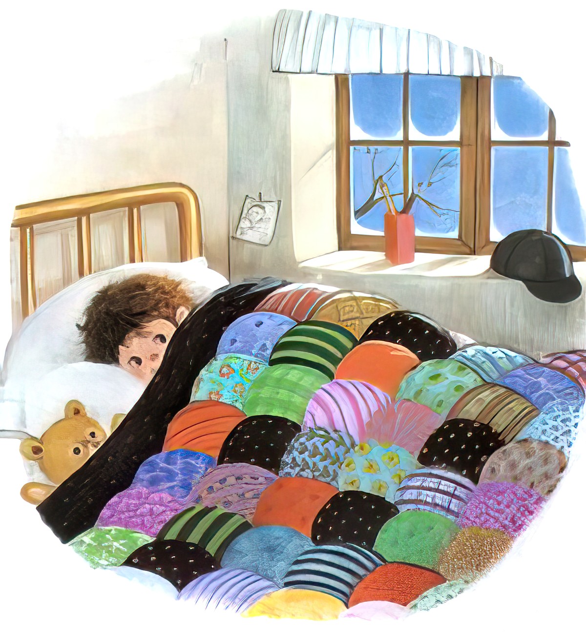
- Orange (see Józef Wilkón’s picture of a boy sleeping outside in a bed. The sky (which he imagines) is orange.
How do illustrators depict night time without losing colour and form and interest?
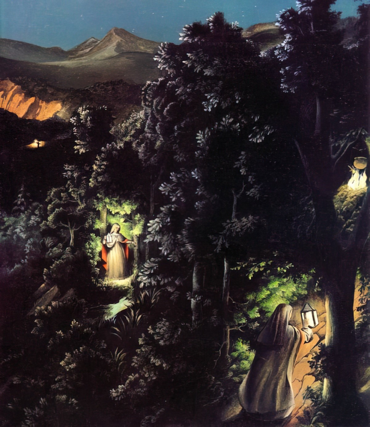
Of course, there has to be a light source from somewhere, even if it’s just from a few stars. And there is always a light source. Light commonly comes from:
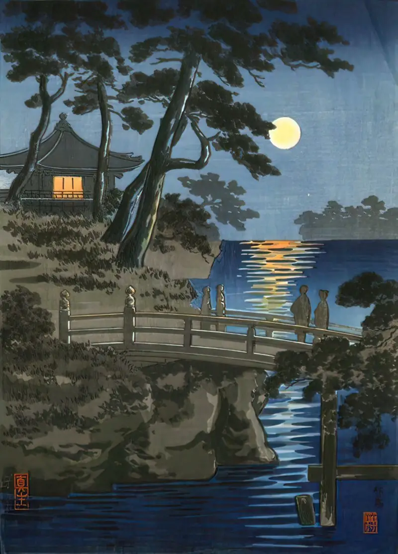
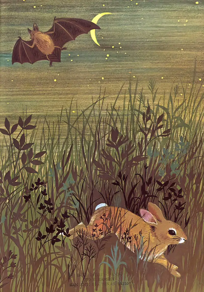
- Moonlight
- Lightning
- Light coming out of windows
- Street lamps or electric lamps
- Torches and lanterns
- Candles
- Fire
- Phosphorescent insects
- Through keyholes and crevices
A light source can also be entirely made up:
- From special objects, for example from the inside of open books, to light up the character’s face. The light may technically come from some reflected light on a white page, though can be exaggerated. Fantasy scenes are best suited for much exaggeration.
- From a light source which is presumed to be slightly off-stage. Film noir is a good thing to study because you’ll find that shadows appear from unlikely light sources. Light can be artistically manipulated. A light doesn’t really have to exist in real life for the artist to make use of a convenient light source — but it’s unlikely to work unless the artist is manipulating light with purpose.
Other Tricks
There are other tricks illustrators use to depict the darkness of night even when there isn’t a strong light source in the world of the narrative. Borrowing a film term, you might call these tricks non-diegetic sources of light.
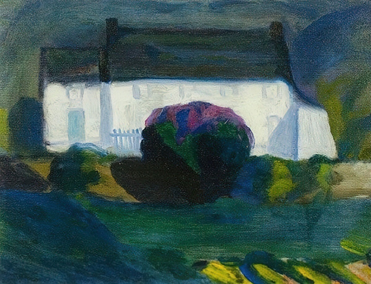
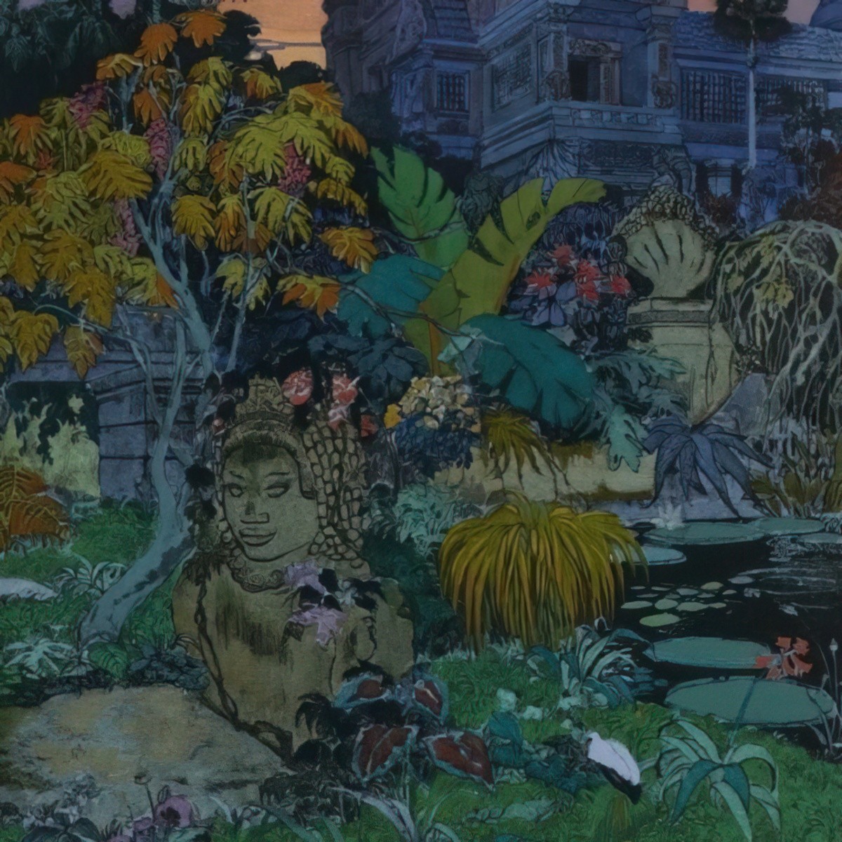
1. At night scenes lose their colour, and so a simple desaturation can work to convey darkness. To maintain the focal point of the painting, an artist can desaturate some things and not others. Desaturation can be used alone to convey darkness. In fact, look at the picture and if it weren’t for the hues, it’s as light-coloured as a daytime equivalent.
2. The desaturation can take on a sepia tone, or ochre, or turquoise etc. In digital art this is easily done. Add a layer of colour over top of all the other layers (gradient, if you like) then set it to multiply. Lower the opacity to the desired amount of new hue. This same trick can be effective for daylight scenes as well, in which you can take the colour of the sky, then set it to about 5 percent opacity. This gives a unifying effect to a picture which may otherwise look quite ununified due to different elements being on different layers, or painted at different times.
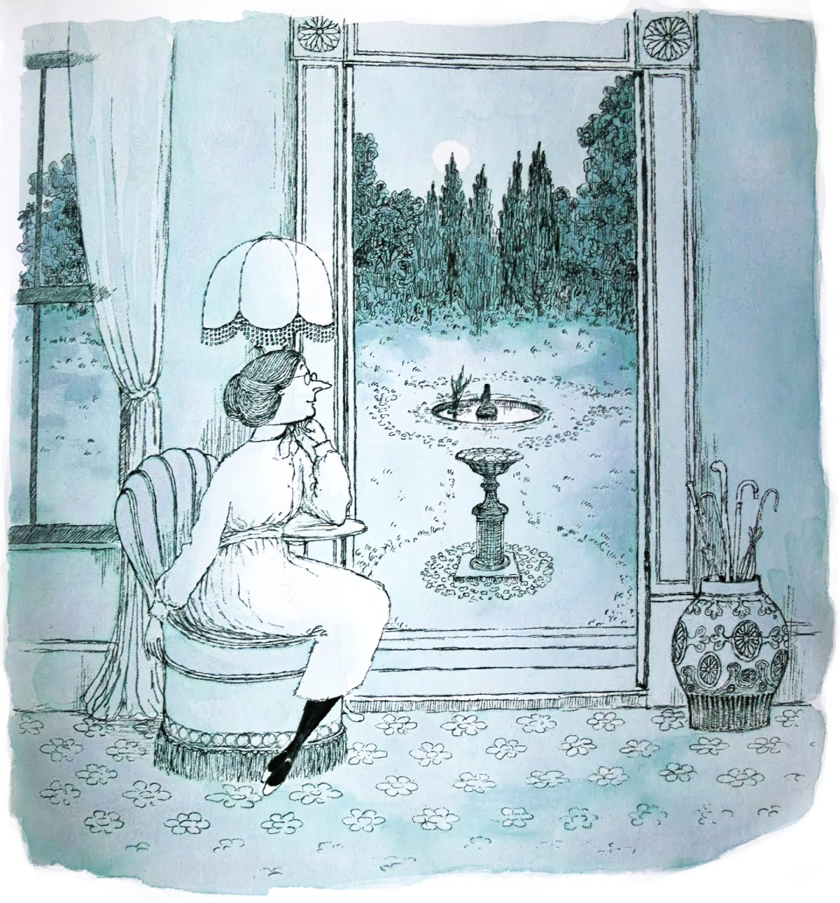
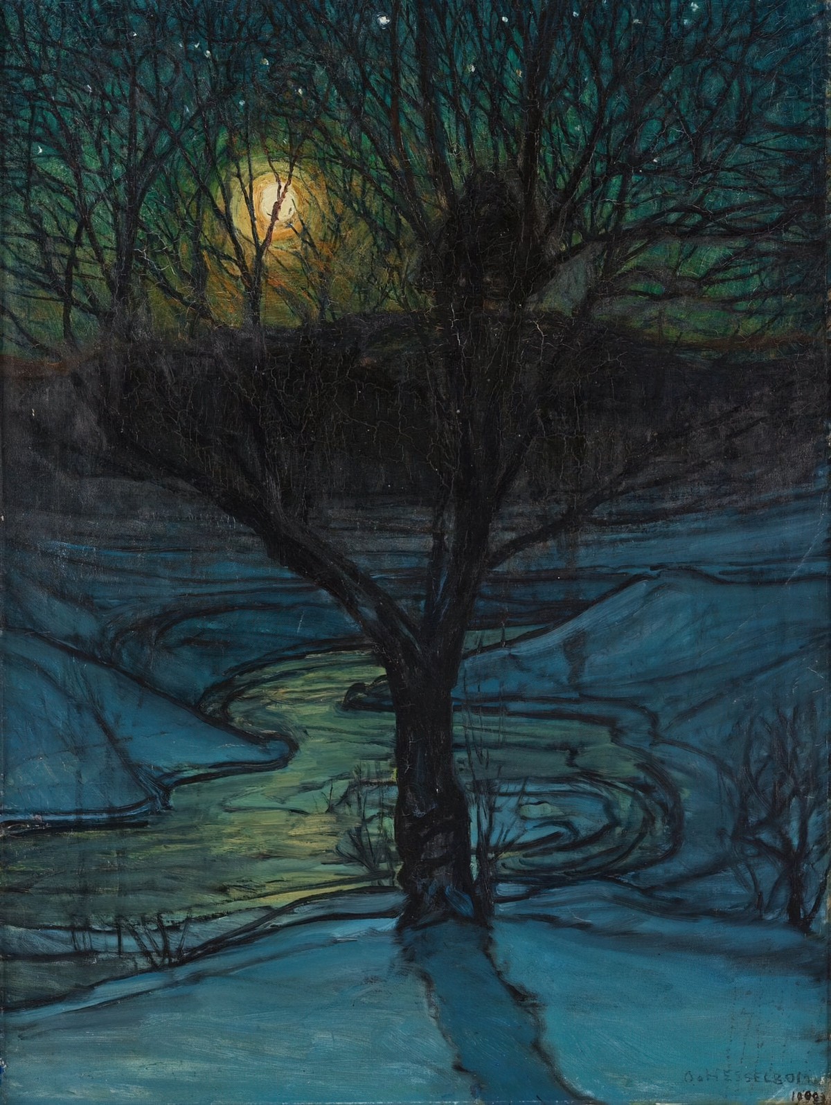
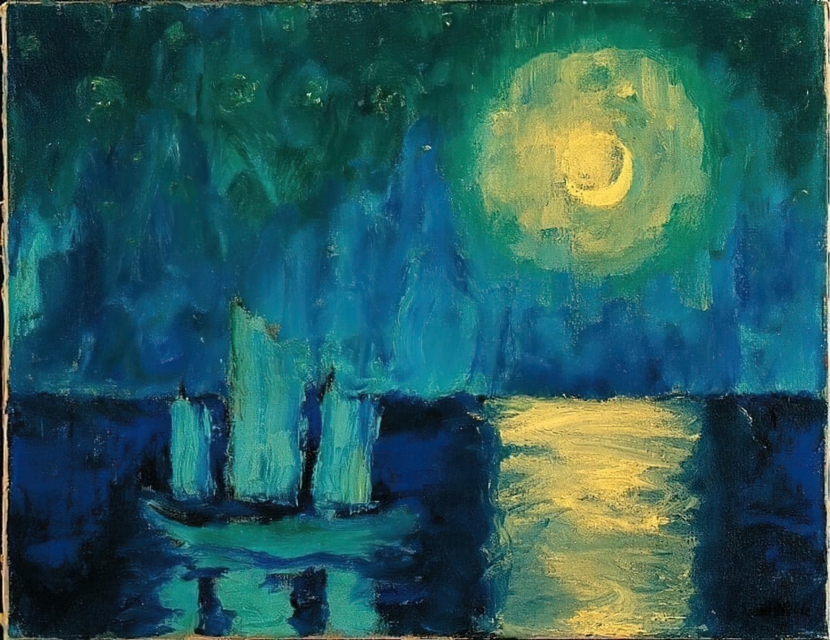
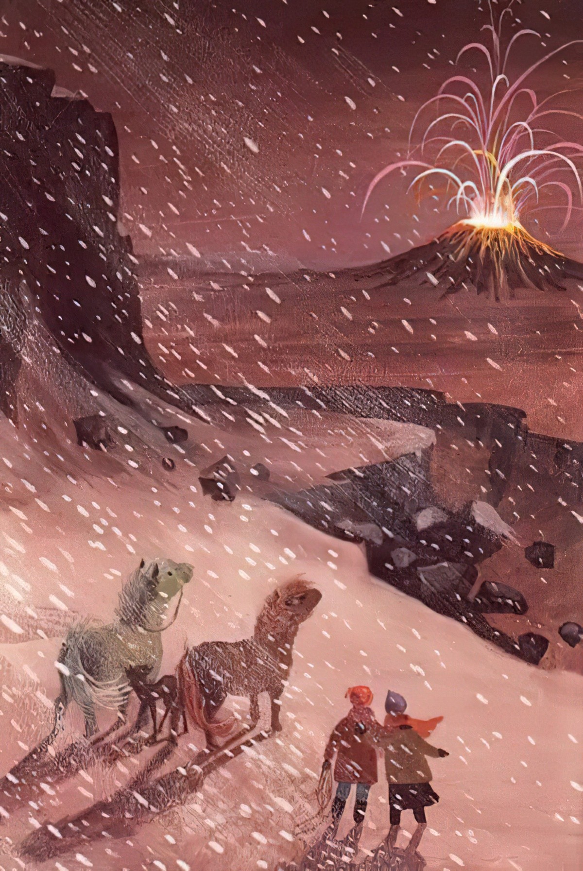
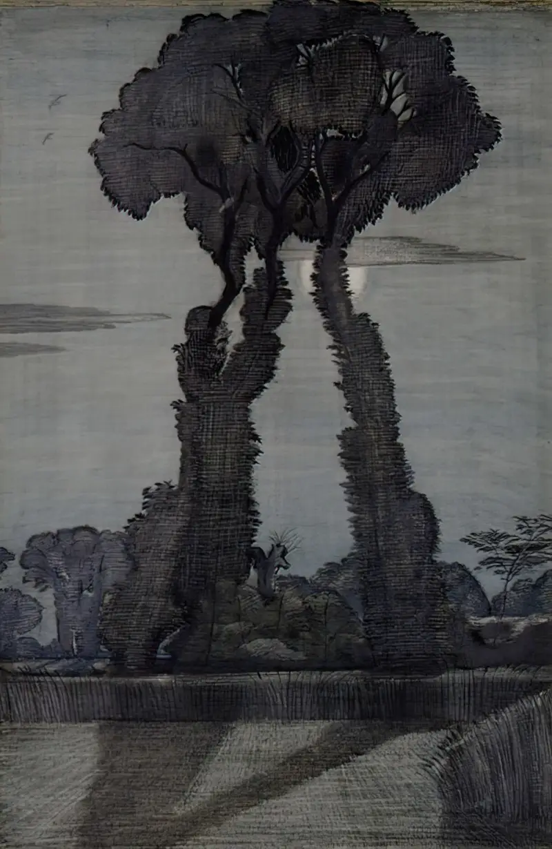
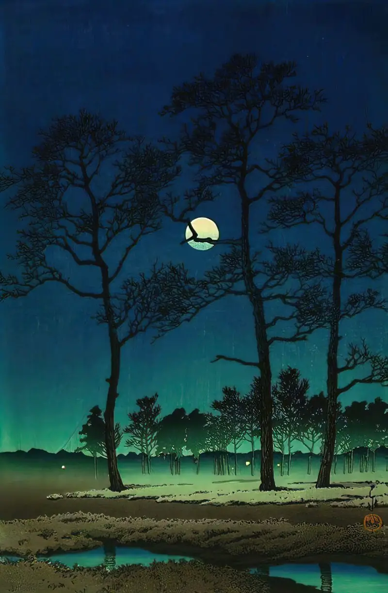
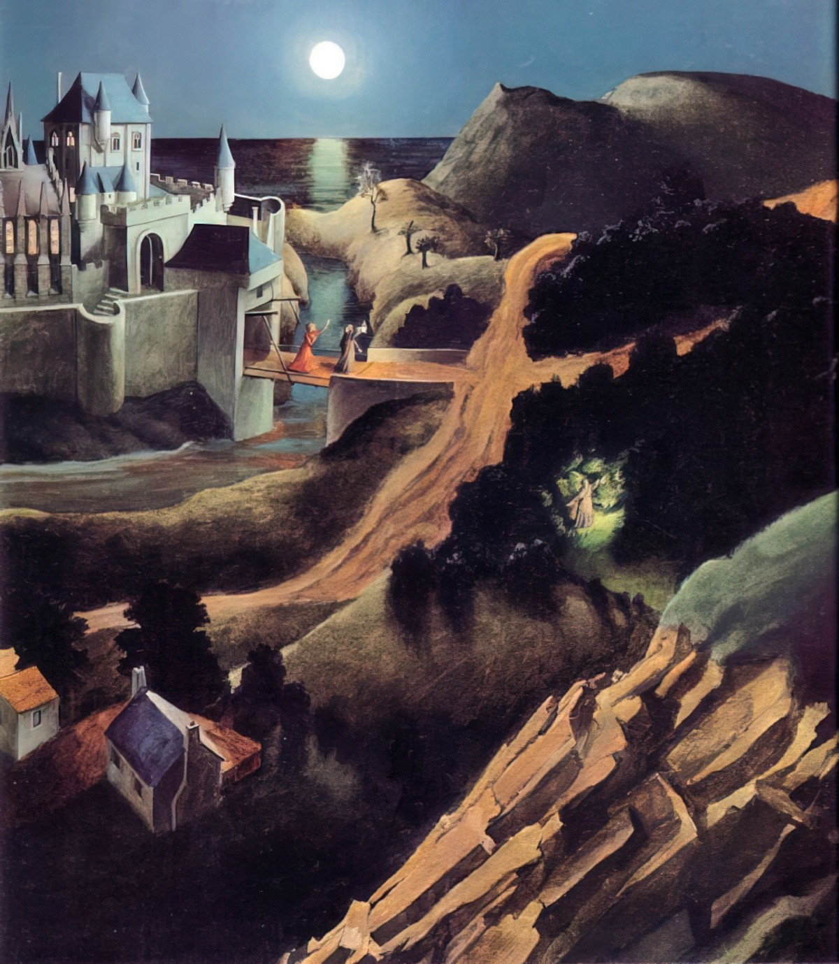
3. A lot of artists make the moon bigger than is possible here on Earth. (Earlier in 2014 we saw the moon at it’s biggest in years, and it still wasn’t nearly as big as seen in many story books!) The moon can seem almost as bright as the sun, especially if reflecting off something light, like a blanket of snow. In illustrations where the moon might be mistaken for a sun, a crescent moon can be preferences. (Because the sun is never ‘crescent’.)
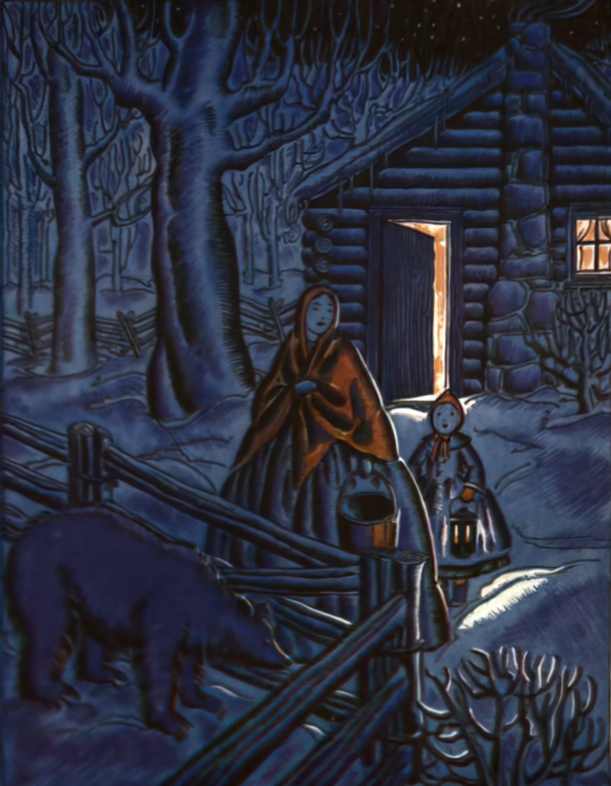
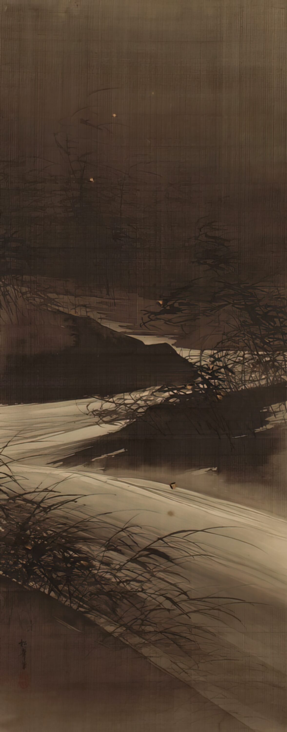
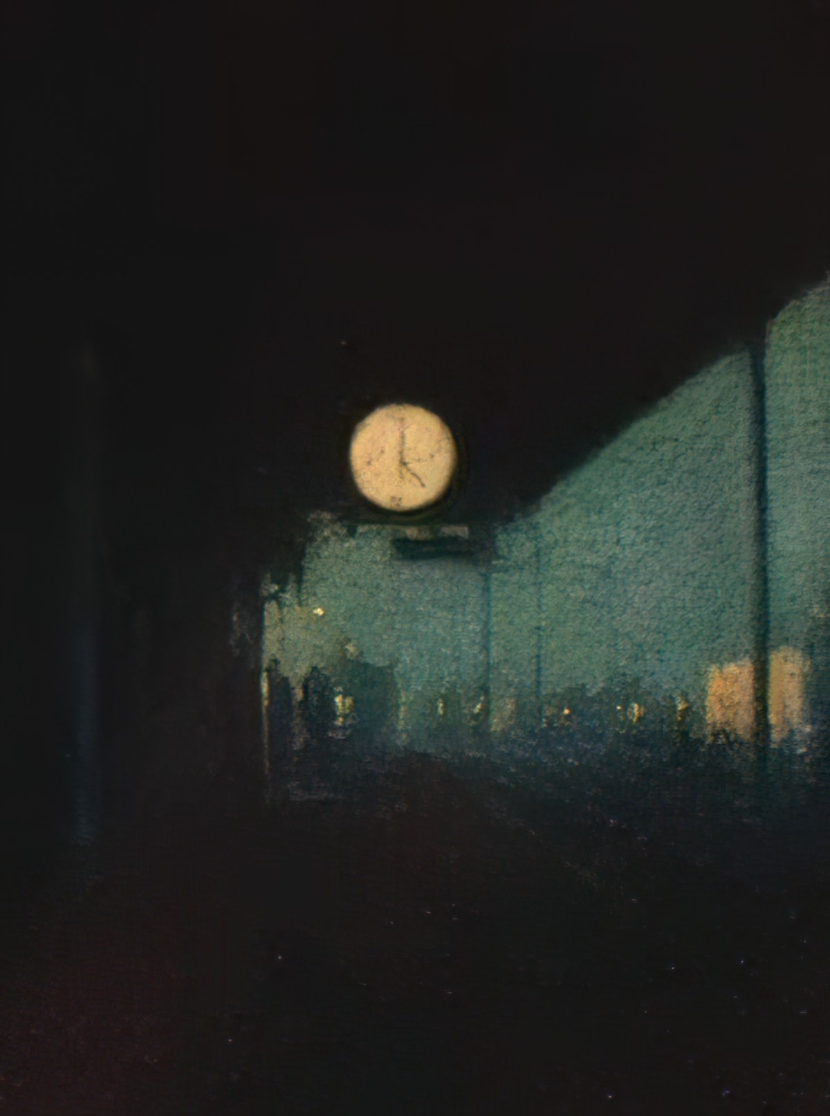
Although in real life the moon is sometimes visible during the day, this isn’t conventional in illustrations, where sun equals day and moon equals night. Even in night scenes without a moon in sight assume the presence of a moon. For example, in the Japanese Fireflies over the Uji River by Moonlight, artist Suzuki Shonen doesn’t show the moon — this would compete for attention with the fireflies, yet the moonlight reflecting off the road is evident, and the artist includes ‘moonlight’ in the title of the work.
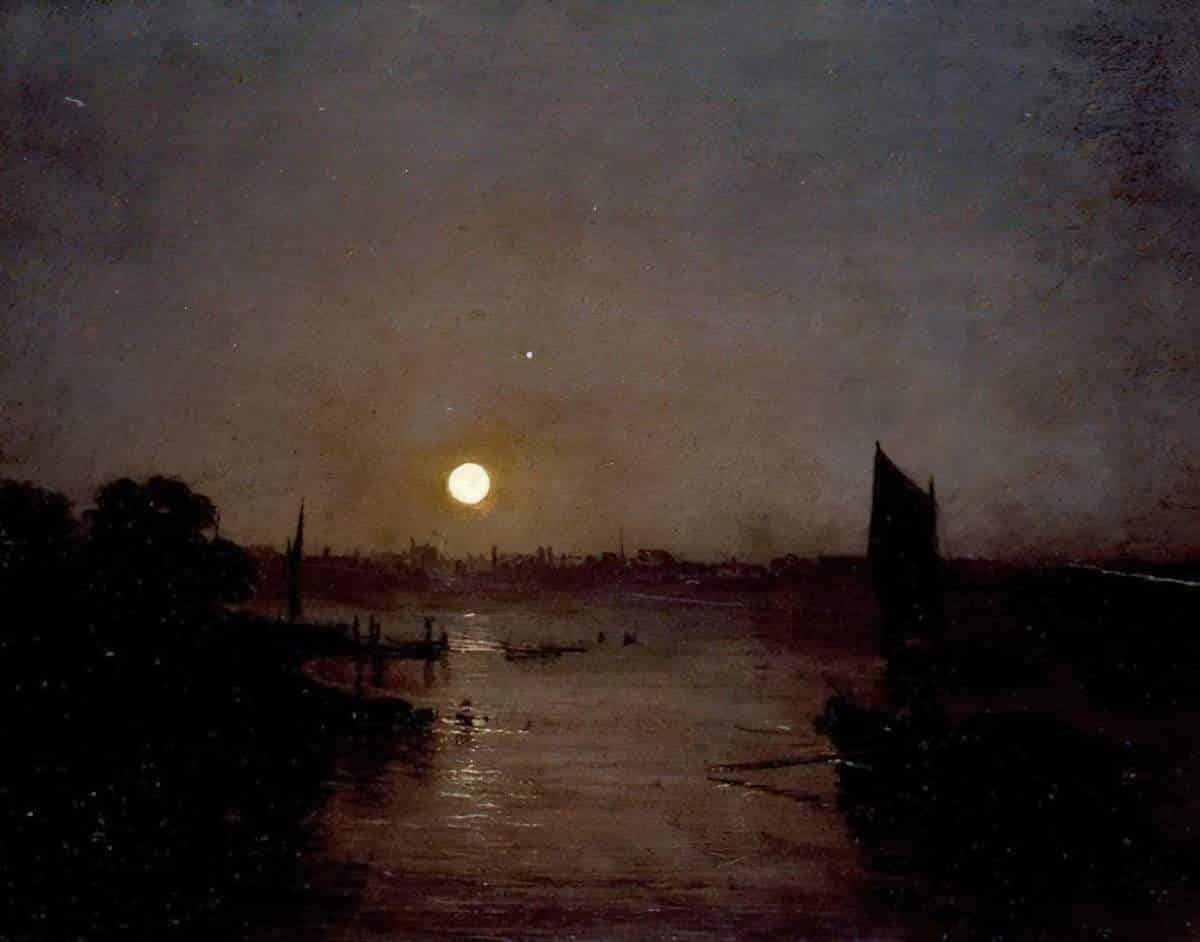
4. If you’re not painting the dead of night, it’s convenient to add a band of sky colour on the horizon. A band of orange or yellow in the sky can tell us something about the time of day as well as lending colour to an otherwise monotone scene. Even in illustrations which are not set at sunrise or sundown, there is often an inexplicable light source coming from behind some houses or trees. The sky often gets lighter towards the horizon. In this case, it’s the top of the sky which gives the reader the night-time cues.
5. Some illustrations do nothing whatsoever with the hue or tone to convey darkness, apart from showing a character in bed, or telling us in the words that it is night-time. This seems to work! (See illustration by Gyo Fujikawa, in which the blue of the sky outside might be used equally to depict a bright, sunny day.) See also the book cover The Terrible Thing That Happened To Barnaby Brocket by John Boyne, illustrated by Oliver Jeffers. The turquoise and the purple form a limited palette which the reader is used to associating with night-time. The shades themselves are bright — and therefore appropriate on a book cover for children.
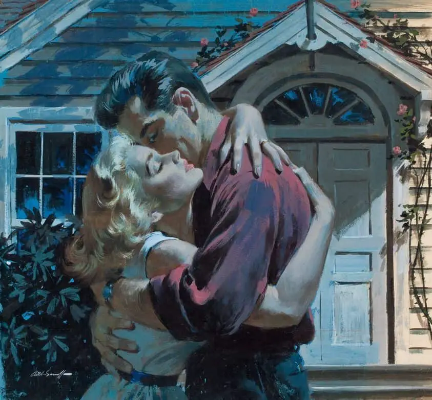
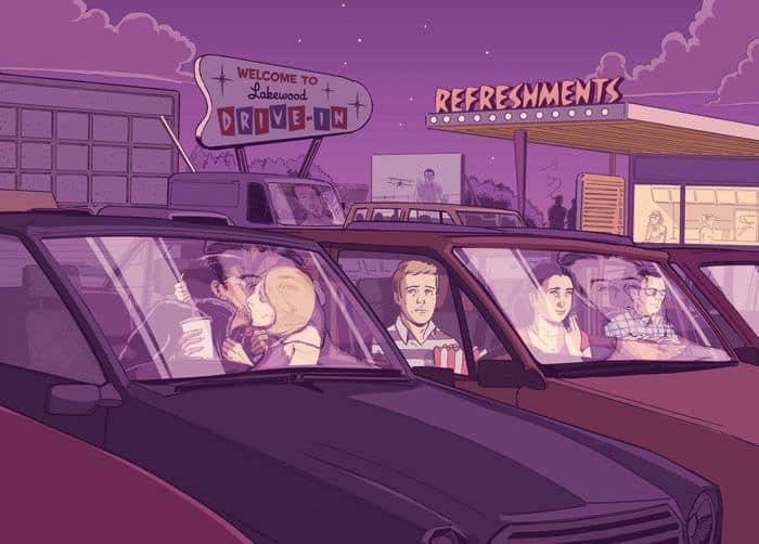
6. The pink illustration by Guy Shield shows young lovers kissing at the drive-in. This example shows that it doesn’t really matter what palette you use, as long as it’s a limited one, it can suggest the desaturation of night. The viewer also knows that it is night-time because that’s when teenagers used to go to drive-in movies. So the surrounding narrative is also important.
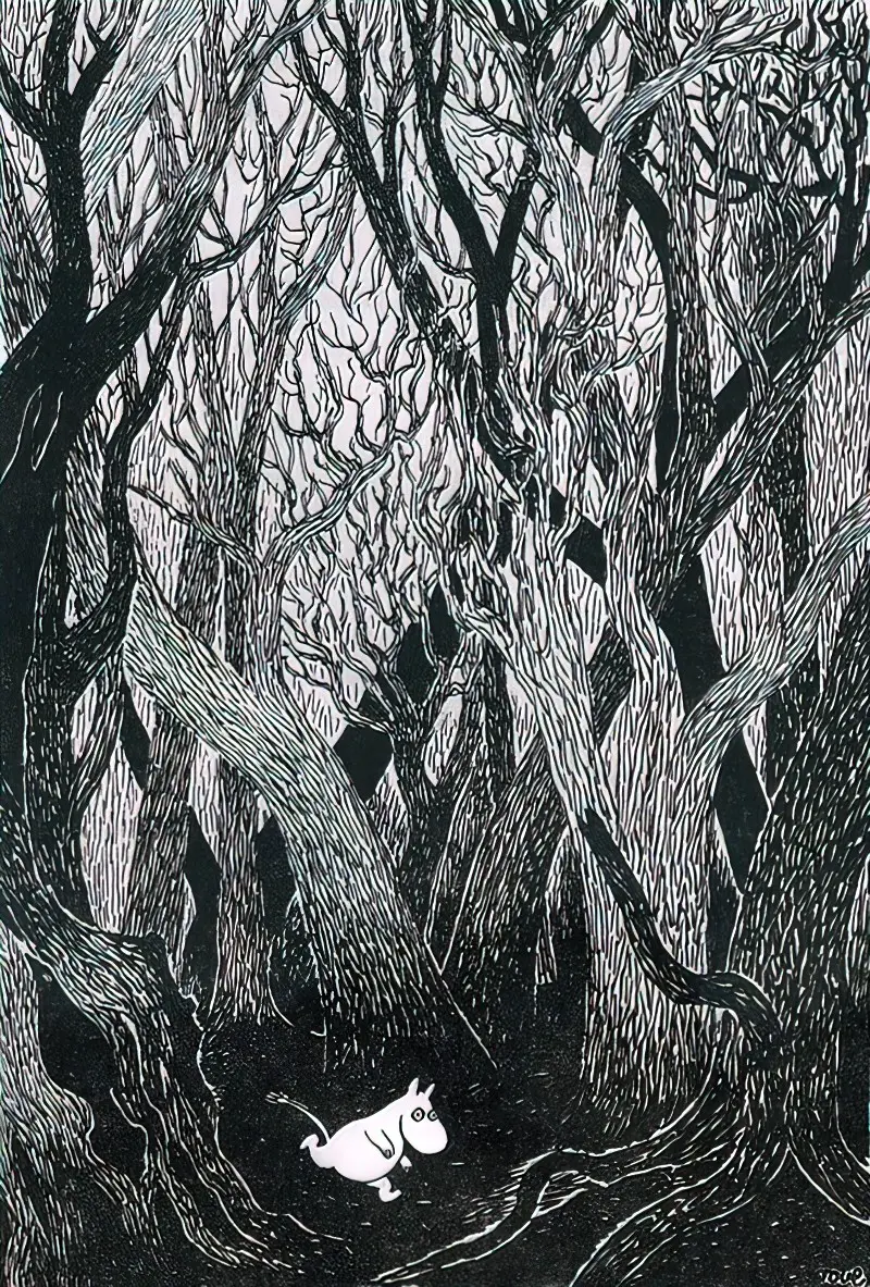
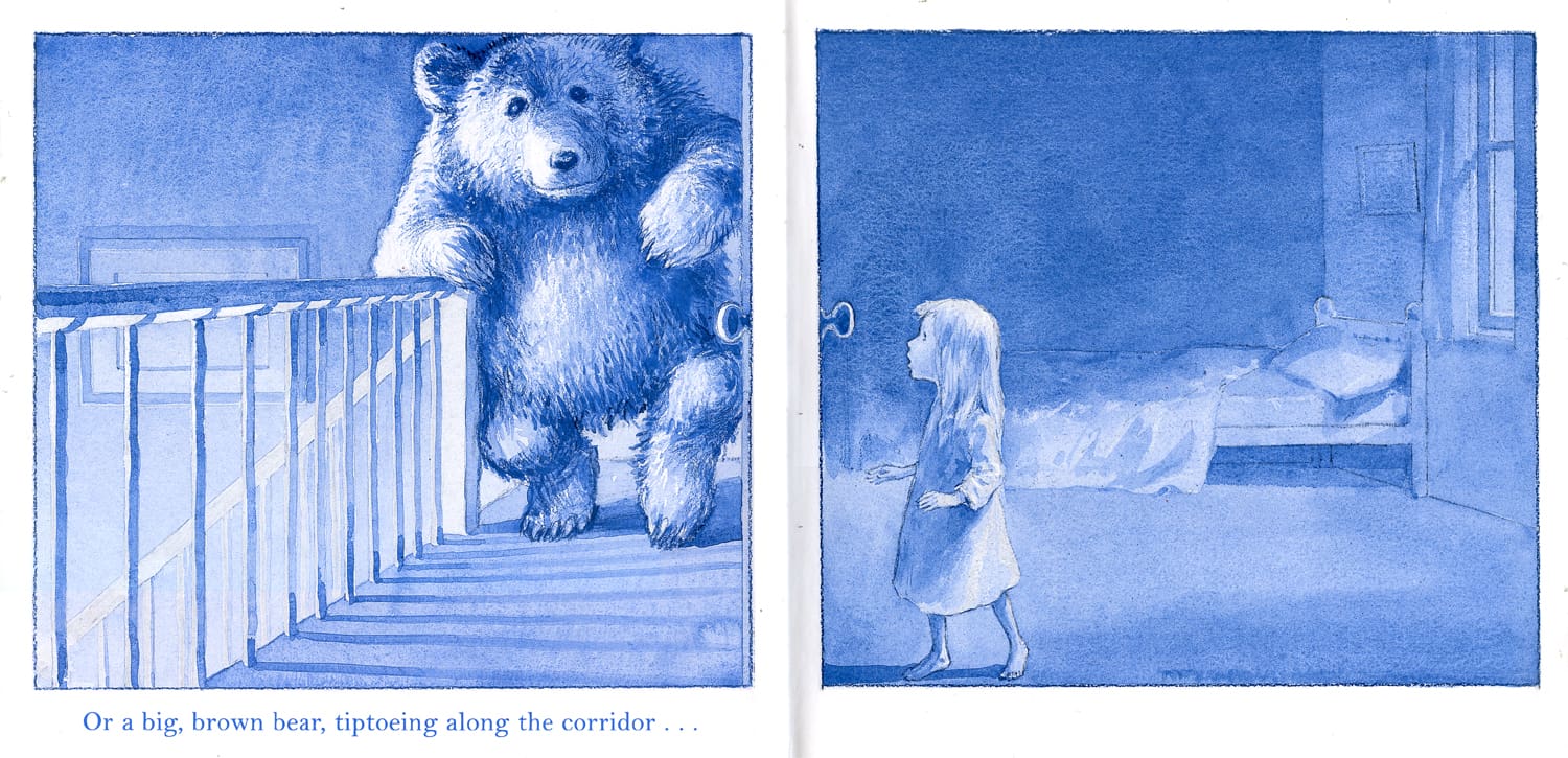
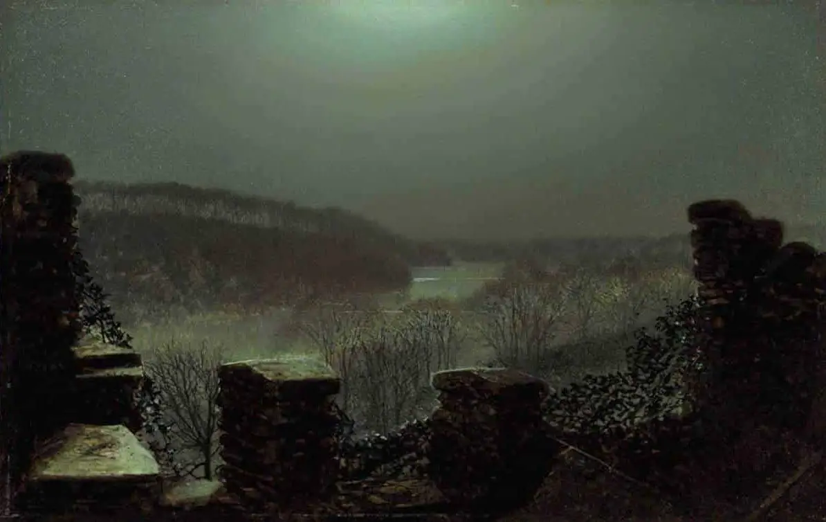
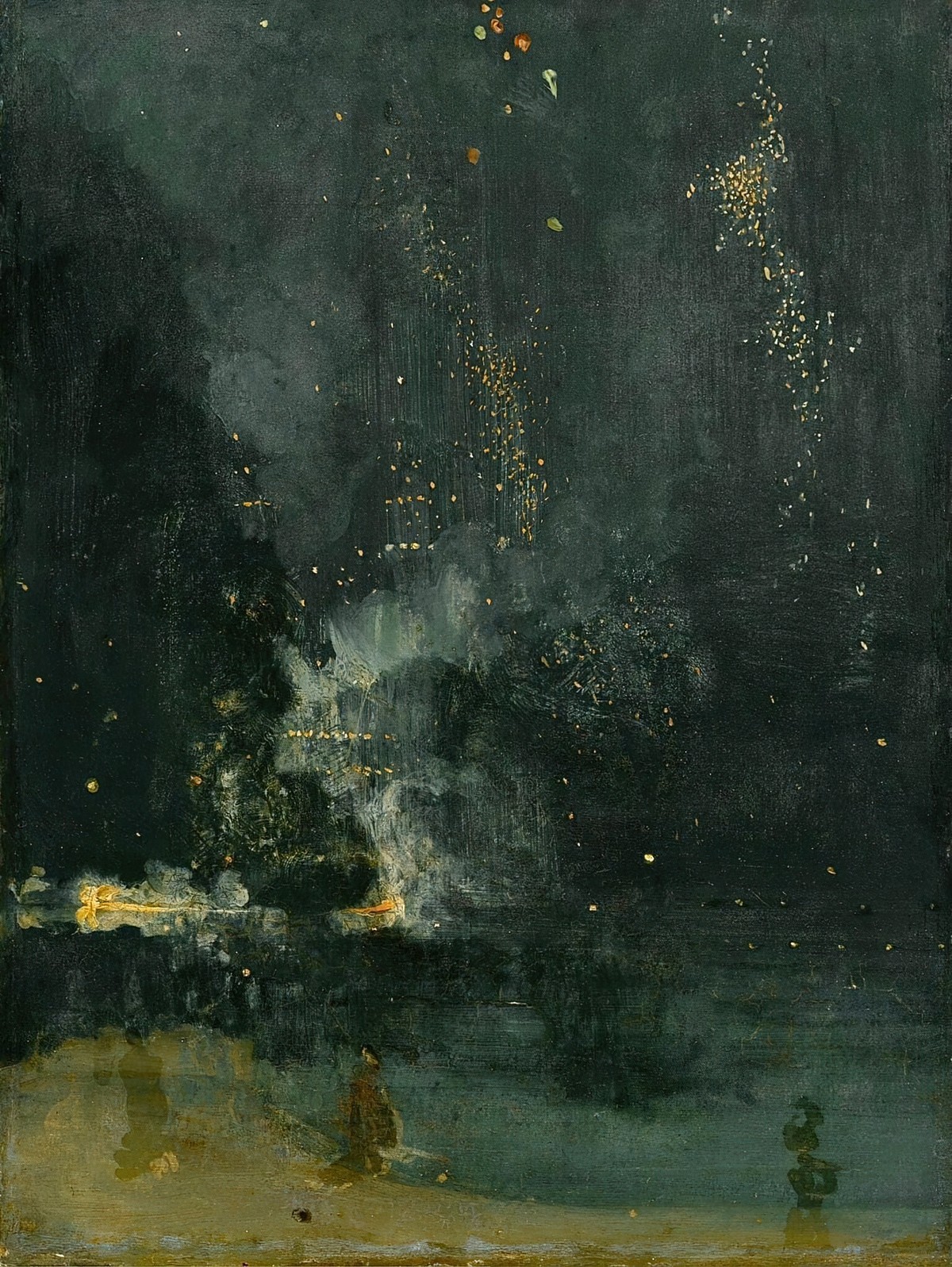
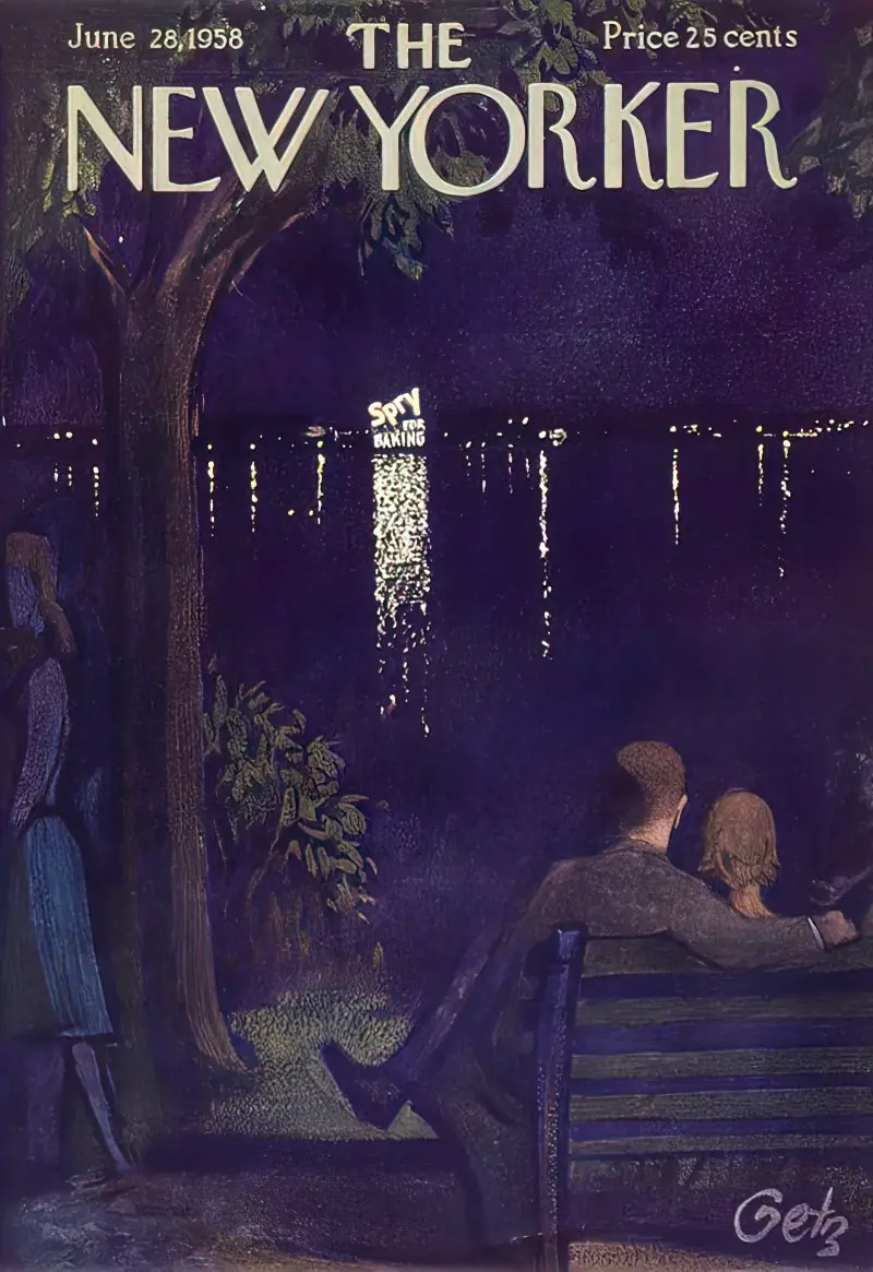
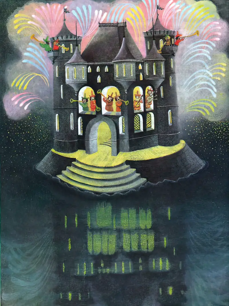
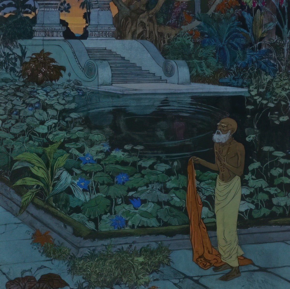
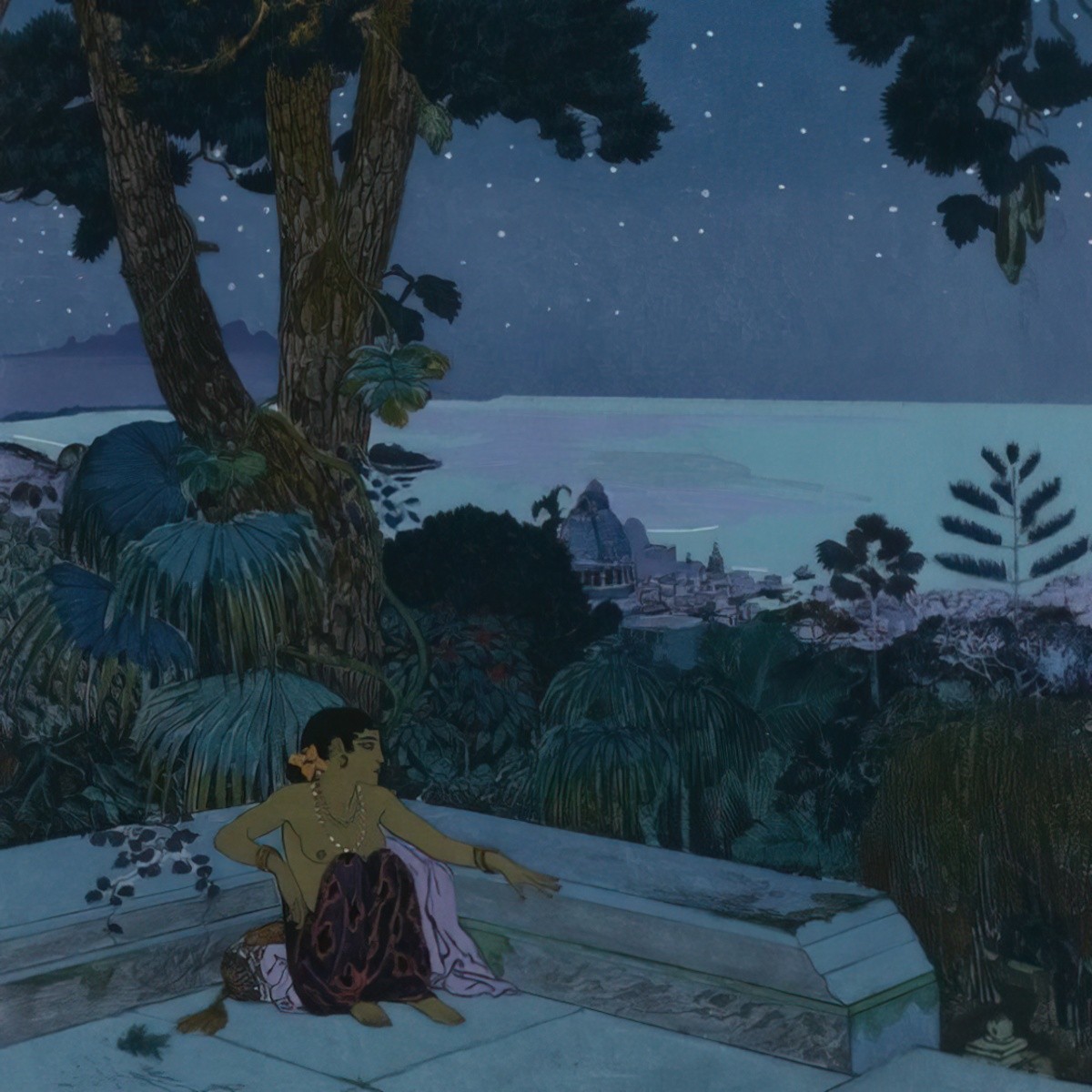
7. In night time scenes some tonal diversity is still necessary — a wider range of tones makes it easier to create interest. With a little imagination, lighter tones can be exaggerated or made up. An imaginary light source is one thing, but there are also rain droplets on a window which may collectively add up to quite a light painting if there is something lighting them up. Fog and mist are also light in colour, and so a light horizon might be put down to that. Cities seem to light up from below, even in the dead of night. Bodies of water are reflective, and provide sources of light by virtue of reflection. (Presumably a moon.) In any case, a strong contrast between the foreground and the background helps greatly with night scenes. The foreground can be in silhouette (popular at the moment in games such as World Of Goo and also on young adult book covers, all influenced by Lotte Reiniger). In this case the background will be more or less in full colour. Alternatively, the foreground can be light against a dark background.
Illustrations for children generally depict the night-time in vibrant colours. The art below is closer to the real world desaturation of darkness.
Total Darkness
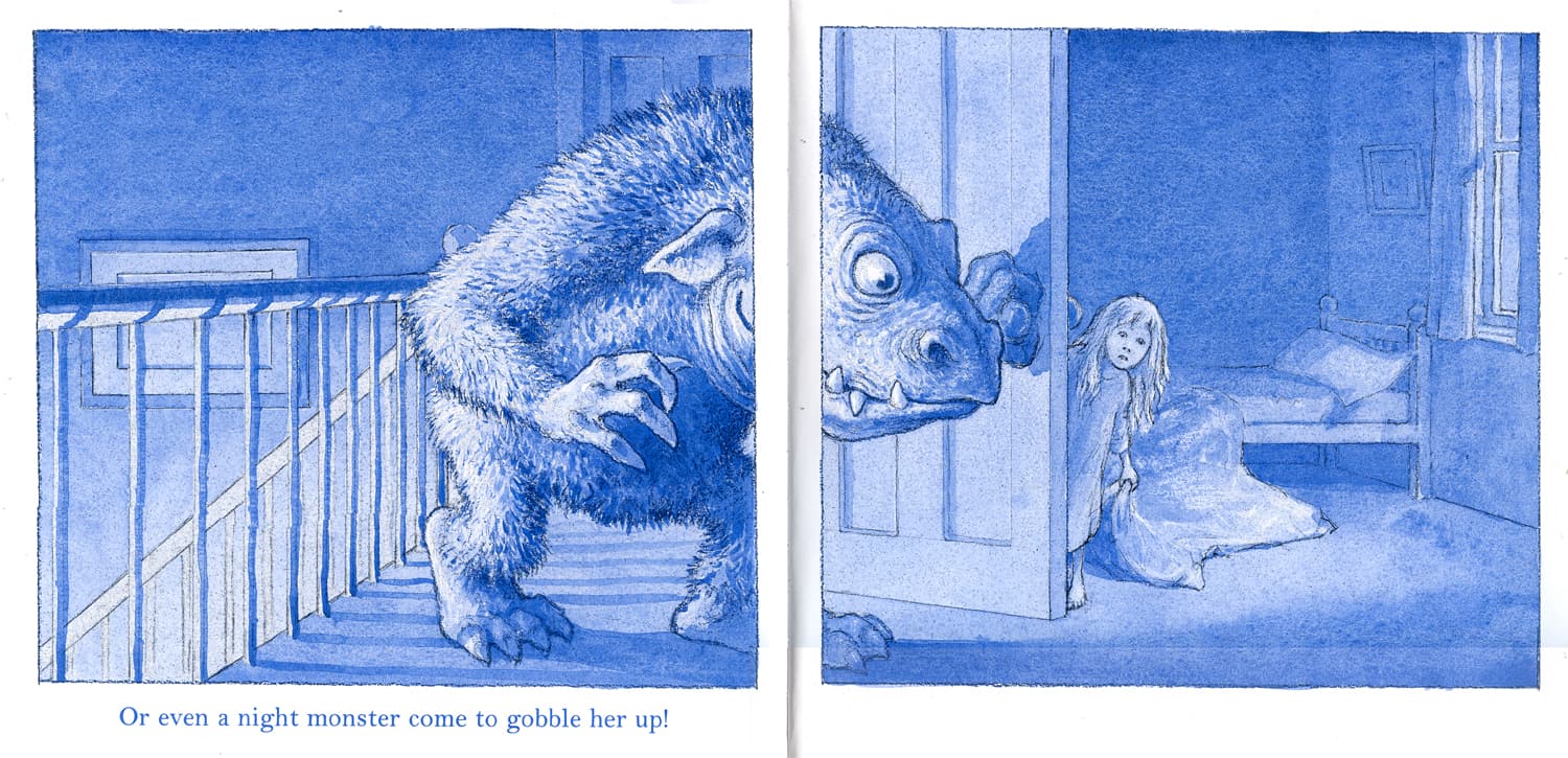
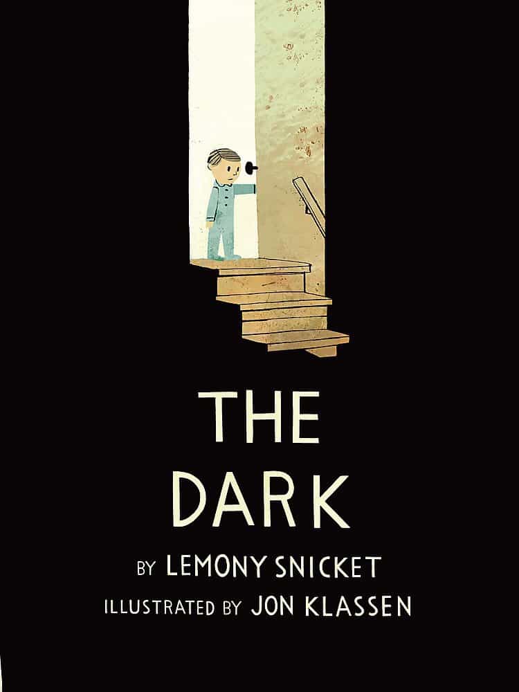
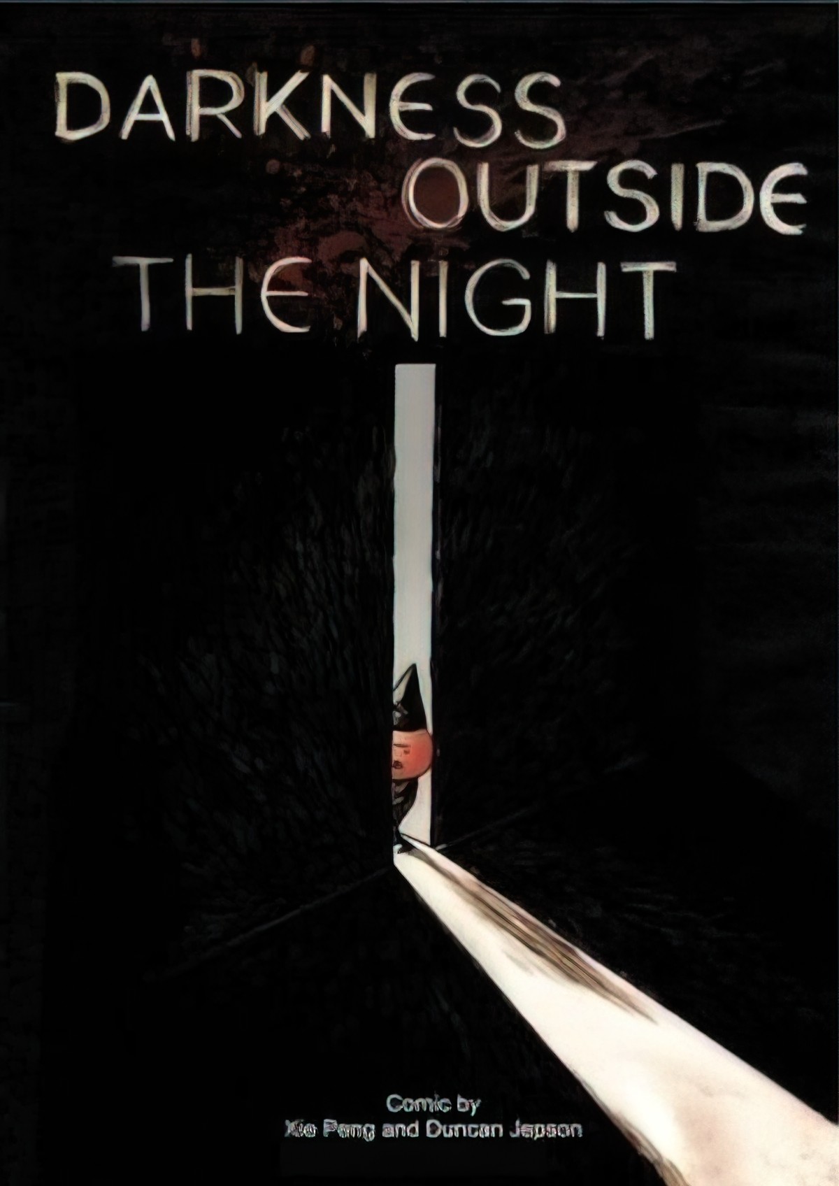
What about when the illustrator wants to depict true darkness, possibly because the darkness itself is part of the story? How do we show darkness while still showing some sort of picture? Jon Klassen worked with this exact problem when he illustrated The Dark by Lemony Snicket. He got around it by making use of the a silhouette technique. The light parts are surrounded by large blocks of black, in which neither the viewer nor the character sees anything at all, at least not until illuminated by chinks of light.
The same technique has been used by a variety of illustrators:
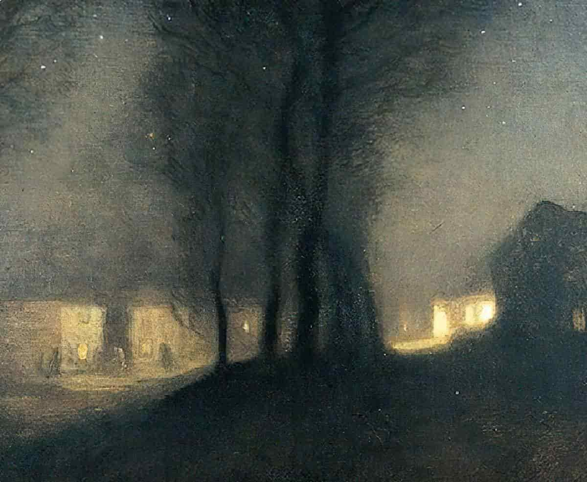
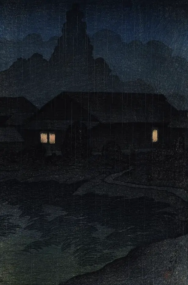
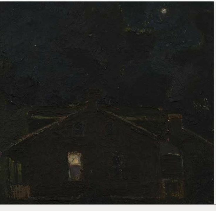
Strawberry Hill by Kurt Knobelsdorf is a painting of a house at night which is also very dark, even though there is indeed a light source coming from one of the windows and a small moon in the sky. Tsuta Spa, Mutsu 1919 by Kawase Hasui is a Japanese example of something very similar — a genuinely dark picture of dark. Even so, the three squares of light give the picture enough interest to warrant it being look-at worthy.
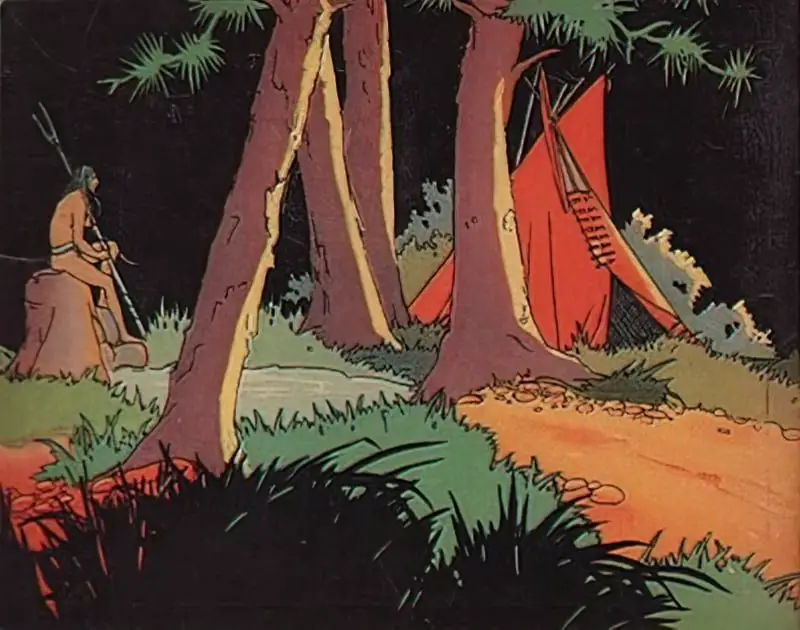
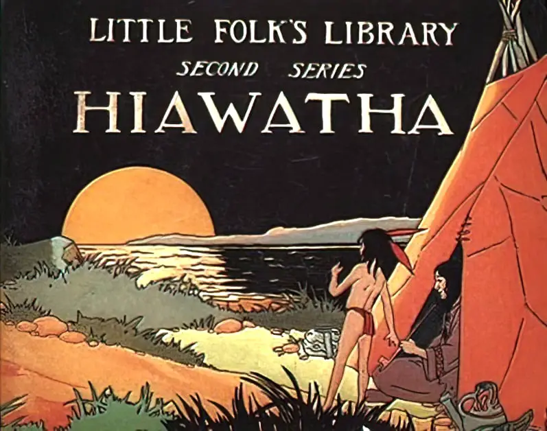
Hiawatha Newson & Company in 1928
RELATED READING
Finding The Perfect Balance Of Darkness In Horror Films
THE WAY HOME IN THE NIGHT BY AKIKO MIYAKOSHI
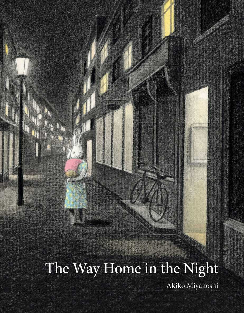
A mother rabbit and her young bunny are on their way home in the dark night. “My mother carries me through the quiet streets,” the bunny explains. “Most of our neighbors are already home.” The bunny can see their lights in the windows, and hear and smell what they might be doing: talking on the phone, pulling a pie out of the oven, having a party, saying goodbye. When they reach home, the father rabbit tucks the bunny into bed. But the bunny continues to wonder about the neighbors’ activities. “Are the party guests saying goodnight? Is the person on the phone getting ready for bed?” And what of the footsteps that can be heard in the street as the bunny falls asleep? “Will she take the last train home?”
This beautiful picture book captures the magical wonder a child feels at being outside in the night. Award-winning author and illustrator Akiko Miyakoshi’s softly focused black-and-white illustrations with just a touch of neutral colour have a dreamlike quality, just right for nodding off to sleep with. The book is intriguing in that it contains twice-told stories, once as they are observed and second as the bunny imagines them. This offers a perfect prompt for young children to create extensions of other stories they have read or heard. A deeper reading could encourage critical thinking by comparing the different pastimes of the neighbours or, ultimately, what it means to be home.
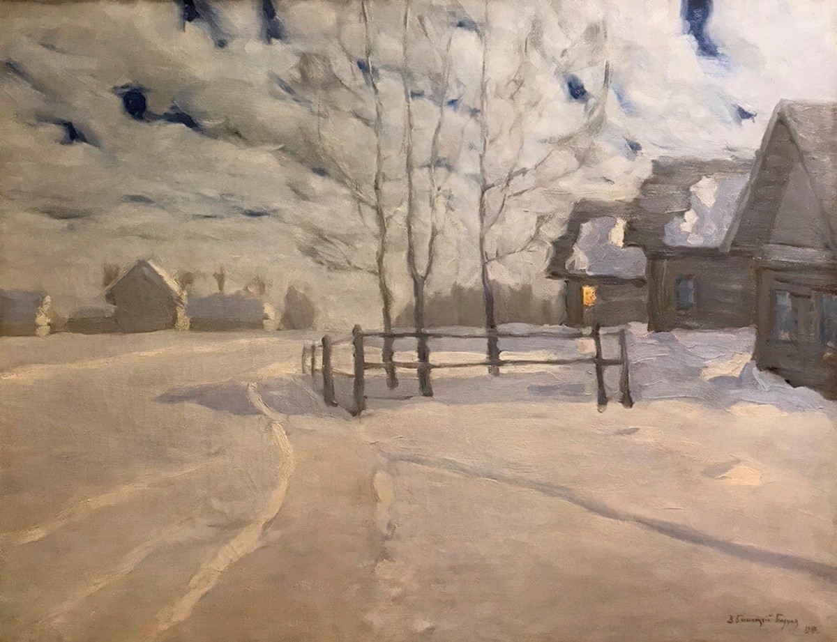
Header painting: Witold Byalynitsky-Birulya (1872-1957) Moonlight Night, 1919